文章目录
-
- 盒模型:Box-Model。
- [浮动:float 第一种打破文档流的规则的方式](#浮动:float 第一种打破文档流的规则的方式)
- 定位:第二种打破文档流的规则的方式
- 布局
盒模型:Box-Model。
在css中,将任意一个元素,都视作一个盒子(可以层层嵌套)。
总宽度=内容区域宽+左右内边距+左右边框+左右外边距
总高度=内容区高宽+上下内边距+上下边框+上下外边距
在CSS中,所有的HTML元素都可以被看作是一个盒子,这个盒子由内容区、内边距(padding)、边框(border)和外边距(margin)组成。通过盒模型,浏览器能够确定元素的大小以及元素与其他元素之间的间距。
具体来说,盒模型由以下几个部分构成:
1、内容区(Content):这是盒子的核心区域,包含元素的文本、图片等内容。它的大小由元素的 width 和 height 属性决定。
2、内边距(Padding):位于内容区和边框之间的区域。它为内容提供了空白空间,不影响元素的实际大小,但会影响盒子的总体占用空间。
3、边框(Border):包围内边距的边框区域,可以设置不同的宽度、样式和颜色。它会占用空间并影响元素的整体尺寸。
4、外边距(Margin):在元素的边框之外,创建元素之间的间距。外边距不会影响元素的尺寸,但会影响元素的定位。
margin:外边距 ,可以单独分别指定四个方向的边距:
html
            margin-left: 10px;
            margin-right: 20px;
            margin-top: 30px;
            margin-bottom: 40px;
padding:内边距,也可以单独指定四个方向的。
html
 			padding-top: 10px;
            padding-bottom: 20px;
            padding-left: 30px;
            padding-right: 40px;
写的参数不同,代表的不同:
java
4:上,右,下,左
3:上,左右,下
2:上下,左右
1:上下左右
代码示例:
html
<!DOCTYPE html>
<html lang="en">
<head>
    <meta charset="UTF-8">
    <meta name="viewport" content="width=device-width, initial-scale=1.0">
    <title>盒模型</title>
    <style>
        .outer{

            /* 内容区域 */
            width: 300px;
            height: 200px;

            background-color: pink;
            border: 10px solid green;
            /* 外边距:margin */
            margin:30px;
            /* 内边距: */
            padding: 30px;

            /*四个单独写:分别指定上下左右外边距,每个方向都可以单独指定*/
            /* margin-top: 30px;
            margin-bottom: 30px;
            margin-left: 30px;
            margin-right: 30px; */
            /*写四个 顺时针方向  上右下左 */
            /* margin: 10px 20px 30px 40px; */
            /* 写三个 :上 左 右 */
            /* margin: 10px 20px 30px; */
            /* 写两个 上下 左右 */

            /*四个单独写:分别指定上下左右内边距,每个方向都可以单独指定 */
            /* padding-top: 20px;
            padding-bottom: 20px;
            padding-left: 20px;
            padding-right: 20px; */

            /*分别指定上下左右边框,每个方向都可以单独指定 */
            /* border-top: 10px solid green;
            border-bottom: 10px solid green;
            border-left: 10px solid green;
            border-right: 10px solid green; */

            /* 边框的宽度、style、color可以直接写四个方向的 */
            /* border-width: 10px 10px 10px 10px;
            border-style: solid solid solid solid;
            border-color: green; */

        }
    </style>
</head>
<body>
    <div class="outer"></div>
</body>
</html>
如何给块元素添加背景图片
background-img
html
<!DOCTYPE html>
<html lang="en">
<head>
    <meta charset="UTF-8">
    <meta name="viewport" content="width=device-width, initial-scale=1.0">
    <title>Document</title>
    <style>
        .outer{
            width: 800px;
            height: 900px;
            background-color: pink;
            background-image: url(./imgs/壁纸.jpeg);
            /* 平铺模式 */
            /* 不平铺 */
            background-repeat:no-repeat ;
            /* 横向平铺 */
            /* background-repeat: repeat-x; */
            /* 纵向平铺 */
            /* background-repeat: repeat-y; */

             /* 大小  宽 高 */
            /* 背景图的尺寸 */
            /* background-size: 30px 30px; */
            /* background-size: auto 50px; */
            /* 缩放到背景图片正好能被包含,确保整个背景图片都显示在元素背景中,
            以最小边为基础(缩放),图片不会被裁剪,但这可能导致元素中留有空白区域。 */
            background-size: contain;
            /* 缩放到正好覆盖整个元素背景 */
            /* background-size: cover; */
            /* 控制位置 */
            /* background-position: 10px 100px; */
            /* background-position:  center; */
            /* background-position: 10% center; */

            /* 或者 上面四个background合并成一条语句,最常用: */
            background: url(imgs/壁纸.jpeg) no-repeat center center

        }
    </style>
</head>
<body>
    <div class="outer"></div>
</body>
</html>
浮动:float 第一种打破文档流的规则的方式
入门示例:
html
<!DOCTYPE html>
<html lang="en">
<head>
    <meta charset="UTF-8">
    <meta name="viewport" content="width=device-width, initial-scale=1.0">
    <title>浮动</title>
    <style>
        .d1{
            width:10px;
            height: 20px;
            background-color: pink;
        }
        .d2{
            width:30px;
            height: 40px;
            background-color: green;
        }
        .d3{
            width:35px;
            height: 45px;
            background-color: yellow;
        }

    </style>
</head>

<body>
    <div class="d1"></div>
    <div class="d2"></div>
    <div class="d3"></div>
</body>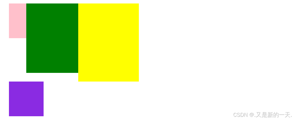
</html>如上示例代码我们写了三个盒子,div是块元素,要占满一整行的,显示效果如下:
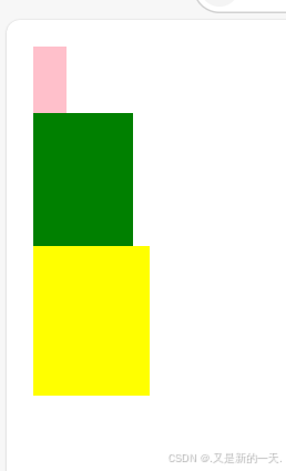
上述效果其实就是文档流的默认规则
文档流的默认规则:
1.块元素从下向右排列,独占一行。
2.行内元素从左右排列,无大小。
打破文档流的默认规则:
比如我们想要两个框并列,就需要打破文档流的默认规则,采用的方式:浮动
浮动:float,浮动顺序与声明的顺序无关,与boday里面的结构有关
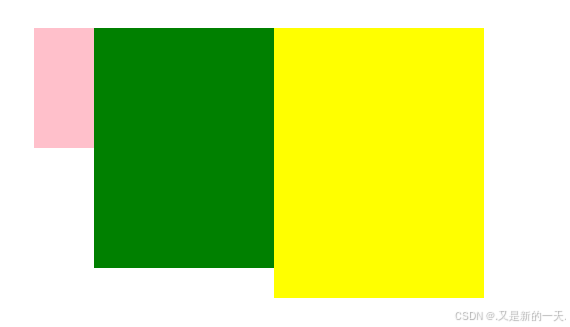
给上述代码每个盒子部分里面添加浮动,代码如下:
html
<!DOCTYPE html>
<html lang="en">
<head>
    <meta charset="UTF-8">
    <meta name="viewport" content="width=device-width, initial-scale=1.0">
    <title>浮动</title>
    <style>
        .d1{
            width:10px;
            height: 20px;
            background-color: pink;
            /* 添加浮动,向左浮动 */
            float: left;

        }
        .d2{
            width:30px;
            height: 40px;
            background-color: green;
            float: left;
        }
        .d3{
            width:35px;
            height: 45px;
            background-color: yellow;
            float: left;
        }

    </style>
</head>

<body>
    <div class="d1"></div>
    <div class="d2"></div>
    <div class="d3"></div>
</body>
</html>
浮动的意义:打破文档流的默认规则
浮动的缺点(副作用):
html
<!DOCTYPE html>
<html lang="en">
<head>
    <meta charset="UTF-8">
    <meta name="viewport" content="width=device-width, initial-scale=1.0">
    <title>浮动</title>
    <style>
        .d1{
            width:10px;
            height: 20px;
            background-color: pink;
            /* 添加浮动,向左浮动 */
            float: left;

        }
        .d2{
            width:30px;
            height: 40px;
            background-color: green;
            float: left;
        }
        .d3{
            width:35px;
            height: 45px;
            background-color: yellow;
            float: left;
        }

        .d4{
            width: 10px;
            height: 10px;
            background-color: blueviolet;
        }
    </style>
</head>

<body>
    <div class="d1"></div>
    <div class="d2"></div>
    <div class="d3"></div>
    <div class="d4"></div>
</body>
</html>
我们加入第四个盒子,不设置浮动,则遵循默认文档流规则,前三个盒子相当于浮动起来了,相当于浮动起来的把没有浮动的盖住了。
右键检查,会发现是存在我们新建立的第四个盒子的,只是被盖住了:
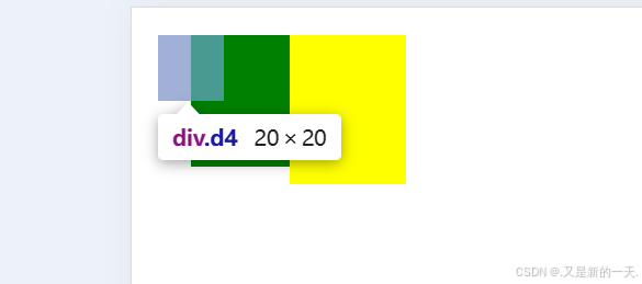
实际开发中,这通常不是我们想要的效果。我们通常会需要在下一行继续显示,解决上述浮动副作用的办法:
清除浮动:clear
清除浮动的三个规则:
1.必须使用块元素。(用div最好,因为他本身没有任何样式)
2.必须在所有浮动元素的后面。
3.必须和浮动元素是兄弟
代码示例:
html
<!DOCTYPE html>
<html lang="en">
<head>
    <meta charset="UTF-8">
    <meta name="viewport" content="width=device-width, initial-scale=1.0">
    <title>浮动</title>
    <style>
        .d1{
            width:10px;
            height: 20px;
            background-color: pink;
            /* 添加浮动,向左浮动 */
            float: left;

        }
        .d2{
            width:30px;
            height: 40px;
            background-color: green;
            float: left;
        }
        .d3{
            width:35px;
            height: 45px;
            background-color: yellow;
            float: left;
        }

        .d4{
            width: 20px;
            height: 20px;
            background-color: blueviolet;
        }

        .clear{
            clear: both;
        }

    </style>
</head>

<body>
    <div class="d1"></div>
    <div class="d2"></div>
    <div class="d3"></div>
    <div class="clear"></div>
    <div class="d4"></div>
</body>
</html>
显示结果:
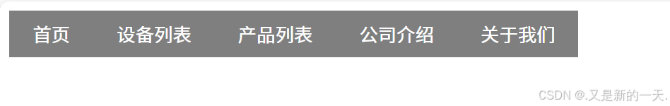
浮动应用实例---横向菜单
html
<!DOCTYPE html>
<html lang="en">

<head>
    <meta charset="UTF-8">
    <meta name="viewport" content="width=device-width, initial-scale=1.0">
    <title>横向菜单</title>
    <style>
        .nav {
            /* 列表的格式类型设置成空 */
            list-style-type: none;
            margin: 0;
            padding: 0;
        }

        /* 将nav下面的li向左浮动,实现横向排布 */
        .nav>li {
            float: left;
            background-color: rgba(0, 0, 0, 0.5);
            padding: 8px 20px;
        }

        /* 设置鼠标悬停效果 */
        .nav>li:hover {
            background-color: chocolate;
        }

        /* 设置超链接的装饰和颜色 */
        .nav>li>a {
            text-decoration: none;
            color: #fff;
        }

        /* 清浮动的另外一种"完美方式" */
        .nav::after {
            content: "";
            /* display:表示将元素显示成什么格式 */
            display: block;
            clear: both;
            width: 0;
        }
    </style>
</head>

<body>
    <ul class="nav">
        <li><a href="#">首页</a></li>
        <li><a href="#">设备列表</a></li>
        <li><a href="#">产品列表</a></li>
        <li><a href="#">公司介绍</a></li>
        <li><a href="#">关于我们</a></li>
    </ul>
</body>

</html>
展示效果:
display:表示将元素显示成什么格式
定位:第二种打破文档流的规则的方式
position:
1.static:静态定位,不定位,默认文档流(没啥用)
2.absolute: 绝对定位。上下左右:top、left、right、bottom
3.relative:相对定位
4.fixed:固定定位
定位的参照物:
1.绝对定位:最近的祖先元素中,非static定位的元素。如果没有,则以body为参照。
2.相对定位:以其自身未偏移前的位置为参照物。
3.固定定位:以用户的视区为参照物。
html
<!DOCTYPE html>
<html lang="en">

<head>
    <meta charset="UTF-8">
    <meta name="viewport" content="width=device-width, initial-scale=1.0">
    <title>Document</title>
    <style>
        .outer {
            width: 140px;
            height: 140px;
            background-color: pink;
            /* position: absolute; 用于定位
            下面四个用于指定具体的位置:
            在有尺寸的情况下这四个不能同时生效,只能有两个生效,左上/右下/左下..这种...
            具体生效几个取决于我们自己,如果指定了宽高,只能两个生效
            如果把高度和宽度去掉,那么四个方位都能生效
            top:200px;
            left:100px;
            right:100px;
            bottom:100px;
            */
            margin-top: 200px;
            margin-left: 100px;
        }a
        .inner {
            width: 100px;
            height: 100px;
            background-color: gold;
            position: fixed;
            top: 20px;
            left: 30px;
        }
    </style>
</head>

<body>
    <div class="outer">
        <div class="inner"></div>
    </div>
    <p>段落</p>
    <p>段落</p>
    <p>段落</p>
    <p>段落</p>
    <p>段落</p>
    <p>段落</p>
    <p>段落</p>
    <p>段落</p>
    <p>段落</p>
    <p>段落</p>
    <p>段落</p>
    <p>段落</p>
    <p>段落</p>
    <p>段落</p>
    <p>段落</p>
    <p>段落</p>
    <p>段落</p>
    <p>段落</p>
    <p>段落</p>
    <p>段落</p>
    <p>段落</p>
    <p>段落</p>
    <p>段落</p>
    <p>段落</p>
    <p>段落</p>
    <p>段落</p>
    <p>段落</p>
    <p>段落</p>
    <p>段落</p>
    <p>段落</p>
    <p>段落</p>
    <p>段落</p>
    <p>段落</p>
    <p>段落</p>
    <p>段落</p>
    <p>段落</p>
    <p>段落</p>
    <p>段落</p>
    <p>段落</p>
    <p>段落</p>
    <p>段落</p>
    <p>段落</p>
    <p>段落</p>
    <p>段落</p>
    <p>段落</p>
    <p>段落</p>
    <p>段落</p>
    <p>段落</p>
    <p>段落</p>
    <p>段落</p>
    <p>段落</p>
    <p>段落</p>
    <p>段落</p>
    <p>段落</p>
    <p>段落</p>
</body>

</html>
布局
一个html页面的设计编写过程,就是布局的过程。
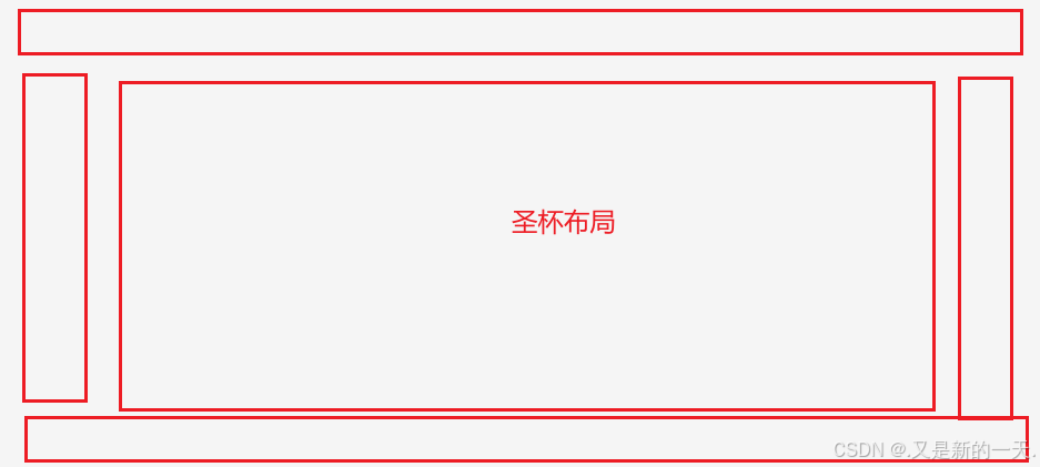
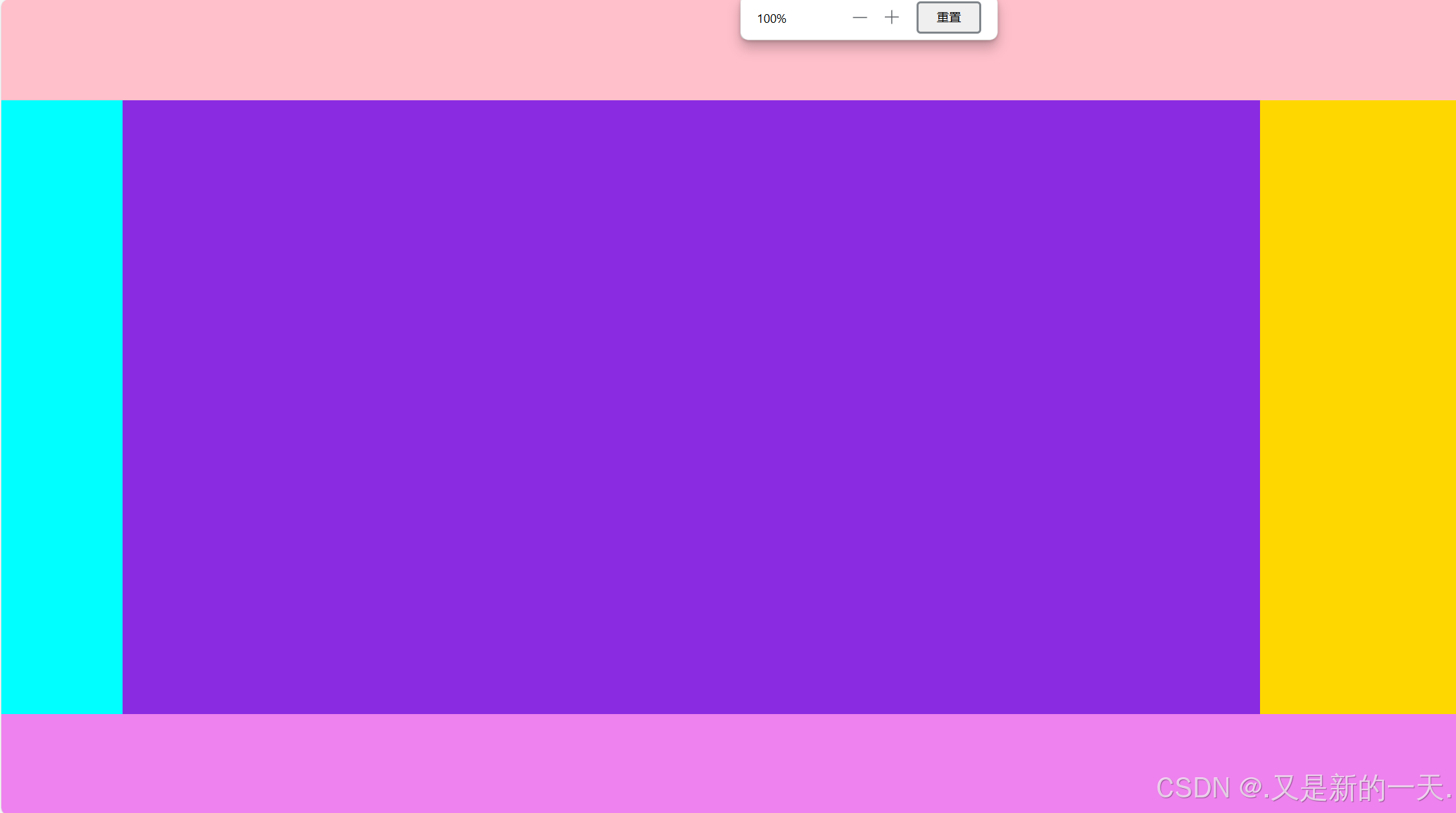
圣杯布局
上下左右,可以根据自己的需要删减。
html
<!DOCTYPE html>
<html lang="en">
<head>
    <meta charset="UTF-8">
    <meta name="viewport" content="width=device-width, initial-scale=1.0">
    <title>圣杯布局</title>
    <style>
        /* 整个页面,占满可视区域 */
        html,body{
            height: 100%;
            margin: 0;
        }

        /* 布局,div默认占满一整行,所有只设置height即可 */
        .layout{
            height: 100%;
        }

        /* 设置上部 */
        .header{
            height: 100px;
            background-color: pink;
        }

        /* 设置中 */
        .center{
            /* 计算中间的高度:可视区域100%-上部区域-下部区域,-两边必须有空格 */
            height: calc(100% - 200px);
            background-color:aquamarine;
        }

        /* 设置下 */
        .footer{
            height: 100px;
            background-color: violet;
        }

        /* 中间的div水平排序:浮动 */
        .center>div{
            float:left;
        }

        /* 清除浮动 */
        .center::after{
            content: "";
            display: block;
            clear: both;
            width: 0;
        }
        /* 设置中间部分的左、中、右 */
        .center>.lft{
            width: 120px;
            height: 100%;
            background-color: aqua;
        }
        .center>.rgt{
            width: 200px;
            height: 100%;
            background-color: gold;
        }
        .center>.main{
            width: calc(100% - 320px);
            height: 100%;
            background-color: blueviolet;
        }
    </style>
</head>
<body>
    <div class="layout">

        <!-- 上 -->
        <div class="header"></div>
        <!-- 中 -->
        <div class="center">
            <!-- 中又分成左中右: -->
            <div class="lft"></div>
            <div class="main"></div>
            <div class="rgt"></div>
        </div>
        <!-- 下 -->
        <div class="footer"></div>

    </div>
</body>
</html>
实现效果:上、(左中右)、下
可以根据自己需要删减。
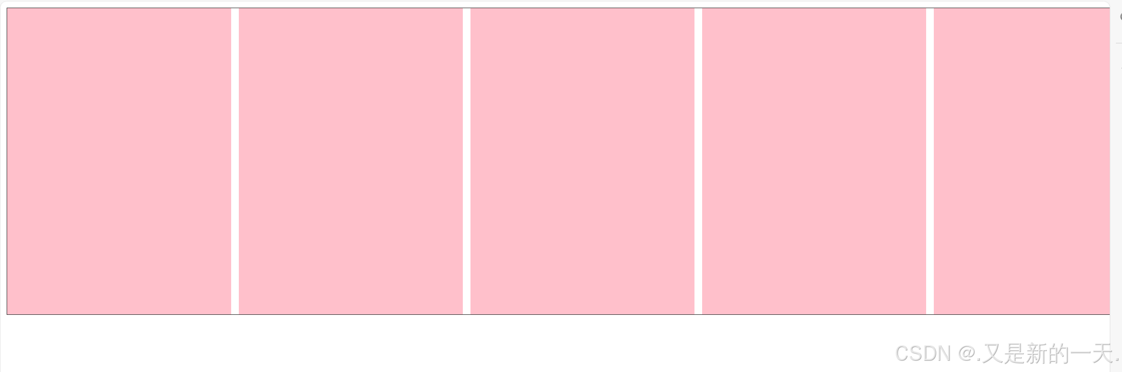
等分布局(很常见)
html
<!DOCTYPE html>
<html lang="en">

<head>
    <meta charset="UTF-8">
    <meta name="viewport" content="width=device-width, initial-scale=1.0">
    <title>等分布局</title>
    <style>
        .outer {
            width: 1500px;
            height: 400px;
            border: 1px solid #333;
            margin: 0 auto;
        }

        /* 向左浮动 */
        .outer>.item {
            float: left;
            background-color: pink;
            /*五等分 */
            width: calc(20% - 8px);
            height: 100%;
            margin-right: 10px;
        }

        .outer>.item:last-child {
            margin-right: 0;
        }

        /* 清除浮动 */
        .outer::after {
            content: "";
            display: block;
            clear: both;
            width: 0;
        }
    </style>
</head>

<body>
    <div class="outer">
        <div class="item"></div>
        <div class="item"></div>
        <div class="item"></div>
        <div class="item"></div>
        <div class="item"></div>
    </div>
</body>

</html>
实现效果如下: