[echarts]横向柱状图

前言

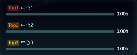
接到一个需求,需要展示一个横向的柱状图,按数量从大到小排序,并定时刷新

使用react配合echarts进行实现。

react引入echarts

javascript 复制代码
import React, { useEffect, useRef } from 'react';
import * as echarts from 'echarts';
import DeviceApi from '@/api/screen/DeviceApi';

const CenterRank = (props) => {
    const chartRef = useRef(null);

    const initEcharts = () => {
        if (chartRef.current) {
            const chart = echarts.init(chartRef.current);

            const option = {
                legend: {
                    show: true
                },
                grid: {  //控制图形大小
                    top: '12%',
                    left: '3%',
                    right: '8%',
                    bottom: '3%',
                    containLabel: true
                },
                xAxis: {
                    max: 'dataMax',
                    type: 'value',
                    boundaryGap: [0, 0.01],
                    axisLine: {
                        show: false
                    },
                    axisTick: {
                        show: false
                    },
                    splitLine: {
                        show: false
                    },
                    axisLabel: {
                        show: false
                    }
                },
                yAxis: [
                    {
                        type: 'category',
                        data: [],
                        inverse: true,
                        animationDuration: 0,
                        animationDurationUpdate: 500,
                        axisLabel: {
                            show: true,
                            inside: true,
                            interval: 0,
                            splitNumber: 50,
                            textStyle: {
                                color: '#9FFFFD',
                                verticalAlign: 'bottom',
                                fontSize: '0.8rem',
                                align: 'left',
                                padding: [0, 0, 8, -5]   //y轴在柱子上方
                            },
                            formatter: function (value) {
                                const top = value.split(' ')[0];
                                const center = value.split(' ')[1];
                                if (value.startsWith("Top1") || value.startsWith("Top2") || value.startsWith("Top3")) {
                                    return '{' + top + '|' + top + '}' + ' {center|' + center + '}';
                                } else {
                                    return '{other|' + top + '}' + ' {center|' + center + '}';
                                }
                            },
                            rich: {  //富文本样式,配置Top1 2 3的不同样式
                                Top1: {
                                    padding: 2,
                                    color: '#FA5151',
                                    backgroundColor: 'rgba(250,81,81,0.24)',
                                },
                                Top2: {
                                    padding: 2,
                                    color: '#FF8F1F',
                                    backgroundColor: 'rgba(255,143,31,0.24)',
                                },
                                Top3: {
                                    padding: 2,
                                    color: '#FFC300',
                                    backgroundColor: 'rgba(255,195,0,0.24)',
                                },
                                other: {
                                    padding: 2,
                                    color: '#9FFFFD',
                                    backgroundColor: 'rgba(159,255,253,0.24)',
                                },
                            }
                        },
                        axisLine: {
                            show: false
                        },
                        axisTick: {
                            show: false
                        },
                        splitLine: {
                            show: false
                        }
                    },
                    {  //配两个y轴,可以做出label在柱子末端展示的效果
                        type: 'category',
                        position: 'top',
                        data: [],
                        axisLabel: {
                            show: true,
                            color: '#fff',
                            formatter: (value, index) => {
                            return `${value}h`;
                        },
                        },
                        axisLine: {
                            show: false
                        },
                        axisTick: {
                            show: false
                        },
                    },
                ],
                series: [
                    {
                        realtimeSort: true,
                        type: 'bar',
                        data: [],
                        label: {
                            show: false,
                            position: 'right',
                            valueAnimation: true,
                            formatter: '{c}h',
                            fontSize: '0.8rem',
                            color: '#fff'
                        },
                        barWidth: 6,   // 条形的宽度
                        itemStyle: {
                            borderRadius: 0,
                            color: function (params) {  // 设置颜色为线性渐变
                                return new echarts.graphic.LinearGradient(
                                    1, 0, 0, 0,
                                    [
                                        { offset: 0, color: '#2FFFFD' },
                                        { offset: 1, color: 'rgba(47,255,253,0)' }
                                    ],
                                    false
                                );
                            },
                        },
                        showBackground: true,  //柱子的背景色
                        backgroundStyle: {
                            color: 'rgba(159,255,253,0.3)'
                        }
                    }
                ],
                animationDuration: 3000,
                animationDurationUpdate: 5000,
                animationEasing: 'linear',
                animationEasingUpdate: 'linear'
            };

            chart.setOption(option);

            const fetchData = async () => {
                try {
                    const response = await DeviceApi.getUsageRank();

                    response.sort((a, b) => b.occupyTime - a.occupyTime)  //根据occupyTime进行排序
                    const data = { labels: response.map(item => item.orgName), values: response.map(item => item.occupyTime) }
                    data.labels = data.labels.map((item, index) => {
                        return `Top${index + 1} ${item}`
                    })

                    chart.setOption({
                        yAxis: [
                            {
                                data: data.labels
                            },
                            {
                                data: response.map(item => item.occupyTime).reverse()
                            }
                        ],
                        series: [{
                            data: data.values
                        }]
                    });
                } catch (error) {
                    console.error('Error fetching data:', error);
                }
            }

            fetchData();
            const intervalId = setInterval(fetchData, 60 * 60 * 1000);  //1小时刷新一次

            window.addEventListener('resize', chart.resize);

            return () => {
                window.removeEventListener('resize', chart.resize);
                clearInterval(intervalId);
                chart.dispose();
            };
        }
    };

    useEffect(() => {
        initEcharts();
    }, []);
    return (
        <div title="使用时长排名">
            <div ref={chartRef} style={{ height: '100%', width: '100%' }} />
        </div>
    )
}

export default CenterRank;

最终效果

相关推荐
tianxinw2 天前
uniapp x + vue3 实现echarts图表
前端·uni-app·vue·echarts
前端_Danny3 天前
用 ECharts markLine 实现节假日标注
前端·信息可视化·echarts
叫我:松哥3 天前
基于Flask+ECharts+Bootstrap构建的微博智能数据分析大屏
人工智能·python·信息可视化·数据分析·flask·bootstrap·echarts
Cherry的跨界思维5 天前
【AI测试全栈:Vue核心】22、从零到一:Vue3+ECharts构建企业级AI测试可视化仪表盘项目实战
vue.js·人工智能·echarts·vue3·ai全栈·测试全栈·ai测试全栈
该用户加载中6 天前
echarts柱状图实现斜切以及label展示
echarts
叫我:松哥6 天前
基于机器学习的地震风险评估与可视化系统,采用Flask后端与Bootstrap前端,系统集成DBSCAN空间聚类算法与随机森林算法
前端·算法·机器学习·flask·bootstrap·echarts·聚类
林恒smileZAZ7 天前
【Vue3】我用 Vue 封装了个 ECharts Hooks
前端·vue.js·echarts
@AfeiyuO7 天前
Vue3 高德地图
vue·echarts
小林攻城狮7 天前
echarts 参考线实现数据项之间的差异值标注
前端·echarts
@AfeiyuO8 天前
Vue3 中国地图
vue·echarts