文章目录
- [ECharts 使用总结](#ECharts 使用总结)
-
- 概述
- 常用API
- 配置项
-
- 基础配置
- [title 配置标题](#title 配置标题)
- [tooltip 提示框配置](#tooltip 提示框配置)
- [legend 图例配置](#legend 图例配置)
- [grid 网格配置](#grid 网格配置)
- 分类轴
- 数值轴
- 折线图series配置
- 柱状图series配置
- 饼图series配置
- [visualMap 视觉映射](#visualMap 视觉映射)
- [toolbox 工具栏配置](#toolbox 工具栏配置)
- 响应式
- 用法
ECharts 使用总结
概述
ECharts(EnterpriseCharts):企业级数据图标。一个基于 JavaScript 的开源可视化图表库。
- ECharts 底层依赖轻量级的 ZRender 图形库。
- Canvas、SVG 双引擎一键切换。
- Canvas 适合绘制图形元素较多数据量较大的图表,如:热力图、特效、地理坐标系、平行坐标系等。
- SVG 内存占用更低、适配性/扩展性更好,缩放图表不模糊。
常用API
初始化
const chart = echarts.init(domElement, theme?, options?)
设置配置
chart.setOption(option, notMerge?, lazyUpdate?)
调整大小
chart.resize()
事件监听
chart.on(eventName, handler) // 监听事件
chart.off(eventName, handler) // 取消监听
销毁实例
chart.dispose()
配置项
文档:https://echarts.apache.org/zh/option.html#title
javascript
const option = {
    // 全局配置:
    backgroundColor: "#fff",
    animation: true,
    // 组件配置:
    title: {},
    tooltip: {},
    legend: {},
    grid: {},
    xAxis: {},
    yAxis: {},
    toolbox: {},
    dataZoom: {},
    visualMap: {},
    // 系列配置(核心数据展示):
    series: [
        {
            type: "bar",
            data: [],
        }
    ]
}
基础配置
- title.show:是否显示标题
- legend.show:是否显示图例
- tooltip.show:是否显示提示框
- grid.show:是否显示网格
- xAxis.axisLabel.show:是否显示X轴标签
- yAxis.axisLabel.show:是否显示Y轴标签
- series.label.show:是否显示叔局标签
- backgroundColor:配置图表的背景 颜色
title 配置标题
javascript
const titleConfig = {
	text: "主标题",
    subtext: "副标题",
    left: "center",
    top: 10,
    textStyle: {
        color: "#333",
        fontSize: 18,
        fontWeight: "bold",
    },
    subtextStyle: {
        color: "#666",
        fontSize: 14,
	}
}- text:主标题
- subtext:副标题
- left:距离左边位置,取值:
- string:left、center、right
- number:px、%
- top:距离顶部位置,取值:
- string:top、middle、bottom
- number:px、%
- textStyle:主标题样式
- subtextStyle:副标题样式
tooltip 提示框配置
javascript
const tooltipConfig = {
    trigger: "axis",
    axisPointer: {
        type: "cross",
        crossStyle: {
            color: "#999"
        }
    },
    formatter: "{b}:{c}",
    backgroundColor: "rgba(0,0,0,0.7)",
    textStyle: {
        color: "#fff"
    }
}- trigger:触发类型,取值:
- item:数据项触发,主要用于无轴图标,如饼图、散点图等
- axis:坐标轴触发,主要用于有轴图标,如折线图、柱状图等
- none:不触发
- axisPointer:指示器样式
- axisPointer.type:指示器类型,取值:
- line:直线指示器
- cross:十字指示器
- shadow:阴影指示器
- none:无
- formatter:格式化:
- {a}:系列名
- {b}:数据名
- {c}:数值
- {d}:百分比
legend 图例配置
javascript
const legendConfig = {
    data: ["系列1","系列2"],
    orient: "horizontal",
    left: "center",
    top: "top",
    textStyle: {
        color: "#333"
    },
    selected: {
        "系列1": true,
        "系列2": false
    }
}-
data:图例数据
-
type:图例类型,取值:
- plain:普通图例
- scroll:可滚动图例
-
itemWidth:图例宽度
-
itemGap:图例间距
-
orient:布局:取值:
- horizontal
- vertical
-
left:位置
-
top:位置
-
textStyle:图例样式
-
textStyle.overflow:文字超出处理,取值:
- truncate:截断
- break:换行
- breakAll:换行,换行,跟 break 不同,breakAll 还会强制单词内换行
-
textStyle.ellipsis:仅在设置
overflow:"truncate"时生效,用于显示末尾文本 -
selected:默认选择状态
-
icon:图例的icon类型,取值:
- circle/rect/roundRect/triangle/diamond/pin/arrow/none
- 支持 url,格式:
"image://图片的url",例如:icon: 'image://https://www.baidu.com/img/flexible/logo/pc/result@2.png' - 支持 base64,格式:
image://图片的base64,例如:image://data:image/gif;base64,R0lGODlhEAAQAMQAAORHHOVSKudfOulrSOp3WOyDZu6QdvCchPGolfO0o/XBs/fNwfjZ0frl3/zy7////wAAAAAAAAAAAAAAAAAAAAAAAAAAAAAAAAAAAAAAAAAAAAAAAAAAAAAAAAAAAAAAACH5BAkAABAALAAAAAAQABAAAAVVICSOZGlCQAosJ6mu7fiyZeKqNKToQGDsM8hBADgUXoGAiqhSvp5QAnQKGIgUhwFUYLCVDFCrKUE1lBavAViFIDlTImbKC5Gm2hB0SlBCBMQiB0UjIQA7
grid 网格配置
javascript
const gridConfig = {
    left: "10%",
    right: "10%",
    top: 60px,
    bottom: 60px,
    containLabel: true,
    backgroundColor: "#f5f5f5",
    borderColor: "#ddd"
}- left:距离左边
- right:距离右边
- top:距离顶部
- bottom:距离地步
- containLabel:是否包含坐标轴标签
- backgroundColor:网格背景色
- borderColor:网格边框颜色
分类轴
javascript
const categoryAxisConfig = {
    type: "category",
    data: ["周一","周二","周三"],
    boundaryGap: false,
    axisTick: {
        alignWidthLabel: true
    },
    axisLabel: {
        color: "#666",
        fontSize: 12,
        rotate: 45
    },
    axisLine: {
        lineStyle: {
            color: "#ddd"
        }
    },
    splitLine: {
        show: true,
        lineStyle: {
            color: "#f0f0f0",
            type: "dashed"
        }
    }
}- type:轴类型,取值:
- category
- value
- time
- log
- data:坐标轴数据
- boundaryGap:坐标轴两边留白
- axisTick:刻度线样式
- axisTick.alignWithLabel:刻度线是否与标签对齐
- axisLabel:坐标轴标签样式
- axisLine:坐标轴轴线样式
- splitLine:分割线样式
数值轴
javascript
const valueAxisConfig = {
    type: "value",
    min: 0,
    max: 100,
    interval: 20,
    axisLabel: {
        formatter: `{value}%`
    },
    splitArea: {
        show: true,
        areaStyle: {
            color: ["rgba(250,250,250,0.3)","rgba(200,200,200,0.3)"]
        }
    }
}- type:轴类型
- min:最小值
- max:最大值
- interval:刻度间隔
- axisLabel:标签样式
- splitArea:分隔区样式
折线图series配置
javascript
const lineSeriesConfig = {
    name: "销售额",
    type: "line",
    data: [100,200,300,400,500],
    smooth: true,
    symbol: "circle",
    symbolSize: 8,
    lineStyle: {
        color: "#5470c6",
        width: 3,
        type: "solid"
    },
    areaStyle: {
        color: {
            type: "linear",
            x: 0, y: 0, x2: 0, y2: 1,
            colorStops: [
                {
                    offset: 0, color: "rgba(84,112,198,0.5)"
                },{
                    offset: 1, color: "rgba(84,112,198,0.1)"
                }
            ]
        }
    },
    emphasis: {
        focus: "series"
    }
}- name:系列名称
- type:图表类型,取值:
- line:折线图
- bar:柱状图
- pie:饼状图
- scatter:散点图
- data:图表数据
- smooth:是否平滑曲线
- symbol:标记点类型,取值:
- circle:圆形
- rect:矩形
- triangle:三角形
- symblSize:标记点大小
- lineStyle:折线样式
- areaStyle:填充区域样式
- emphasis:高亮样式
柱状图series配置
javascript
const barSeriesConfig = {
    name: "销售额",
    type: "bar",
    data: [100,200,300,400,500],
    barWidth: "60%",
    barGap: "20%",
    barCategoryGap: "30%",
    itemStyle: {
        color: LinearGradient(0, 0, 0, 1, [
          { offset: 0, color: '#83bff6' },
          { offset: 0.5, color: '#188df0' },
          { offset: 1, color: '#188df0' }
        ]),
        borderRadius: [4,4,0,0]
    },
    label: {
        show: true,
        position: "top",
        color: "#333",
        fontSize: 12
    }
}- barWidth:柱子宽度
- barGap:柱子间距
- barCategoryGap:类目间距
- label:标签样式
- itemStyle:柱子样式
饼图series配置
javascript
const pieSeriesConfig = {
    name: "销售占比",
    type: "pie",
    radius: ["40%","70%"],
    center: ["50%","50%"],
    roseType: "area",
    itemStyle: {
        borderRadius: 10,
        borderColor: "#fff",
        borderWidth: 2
    },
    label: {
        show: true,
        formatter: "{b}:{c}({d}%)",
        fontSize: 12
    },
    emphasis: {
        itemStyle: {
            shadowBlur: 10,
            shadowOffsetX: 0,
            shadowColor: "rgba(0,0,0,0.5)"
        }
    }
}- radius:饼图半径,
[内半径,外半径] - center:饼图中心位置
- roseType:饼图样式,取值
- false:饼图
- "radius":玫瑰图样式1
- "area":玫瑰图样式2
- itemStyle:扇形样式
- label:标签颜色
- emphasis:高亮样式
visualMap 视觉映射
javascript
const visualMapConfig = {
    type: "continuous",
    min: 0,
    max: 100,
    left: "left",
    top: "bottom",
    text: ["高", "低"],
    calculable: true,
    inRange: ['#50a3ba', '#eac736', '#d94e5d']
}- type:类型,取值:
- continuous:连续型
- piecewise:分段型
- min:最小值
- max:最大值
- left:距离左边距离
- top:距离顶部距离
- text:两端的文本
- calculable:是否可交互
- inRange:颜色范围
toolbox 工具栏配置
javascript
const toolboxConfig = {
    show: true,
    feature: {
        dataZoom: {
            yAxisIndex: "none"
        },
        dataView: {
            readOnly: false
        },
        magicType: {
            type: ["line","bar"]
        },
        restore: {},
        saveAsImage: {
            pixelRatio: 2,
            backgroundColor: "#fff"
        }
    },
    right: 20,
    top: 10
}- feature.dataZoom:数据缩放
- feature.dataView:数据视图
- feature.magicType:动态类型切换,取值:
- line:折线图
- bar:柱状图
- stack:堆叠模式
- feature.restore:重置
- feature.saveAsImage:保存图片
- left/right/top/bottom:距离左右顶底的距离
响应式
方式一:resize
使用窗口 resize 事件监听。
javascript
function handleResize() {
  chartInstance.resize();
}

onMounted(() => {
  if (chartRef.value) {
    window.addEventListener("resize", handleResize);
  }
});

onUnmounted(() => {
  window.removeEventListener("resize", handleResize);
});
方式二:ResizeObserver
ResizeObserver 可以更精确的监听元素尺寸变化,适合复杂布局场景。
javascript
onMounted(() => {
  if (wrapRef.value) {
    resizeObserver = new ResizeObserver(() => {
      chartInstance.resize();
    });
    resizeObserver.observe(wrapRef.value);
  }
});

onUnmounted(() => {
  if (resizeObserver) {
    resizeObserver.disconnect();
    resizeObserver = null;
  }
});
用法
折线图
简单使用:
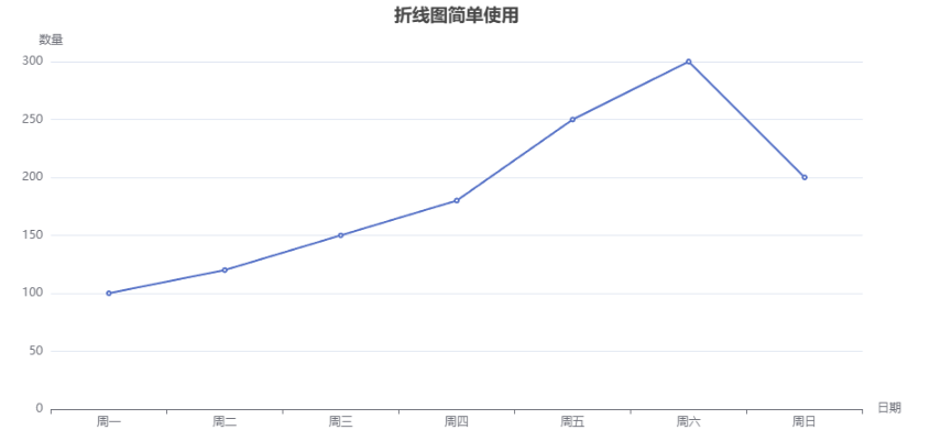
vue
<script setup>
import * as echarts from "echarts";
import {onMounted, onUnmounted, useTemplateRef} from "vue";

const wrapRef = useTemplateRef("wrapRef");
const chartRef = useTemplateRef("chartRef");
let chartInstance;
let resizeObserver;

function initChart() {
  chartInstance = echarts.init(chartRef.value);
  const option = {
    title: {
      show: true,
      text: "折线图简单使用",
      left: "center",
    },
    xAxis: {
      type: "category",
      name: "日期",
      data: ["周一", "周二", "周三", "周四", "周五", "周六", "周日"],
    },
    yAxis: {
      type: "value",
      name: "数量"
    },
    tooltip: {
      show: true,
      formatter: "{b} - {c}",
    },
    series: [{
      data: [100, 120, 150, 180, 250, 300, 200],
      type: "line",
    }]
  };
  chartInstance.setOption(option);
}

onMounted(() => {
  if (chartRef.value) {
    initChart();
  }
  if (wrapRef.value) {
    resizeObserver = new ResizeObserver(() => {
      chartInstance.resize();
    });
    resizeObserver.observe(wrapRef.value);
  }
});

onUnmounted(() => {
  if (resizeObserver) {
    resizeObserver.disconnect();
    resizeObserver = null;
  }
  if (chartInstance) {
    chartInstance.dispose();
    chartInstance = null;
  }
});
</script>

<template>
  <div ref="wrapRef" class="wrap">
    <div ref="chartRef" class="chart"></div>
  </div>
</template>
多条折线组合使用:
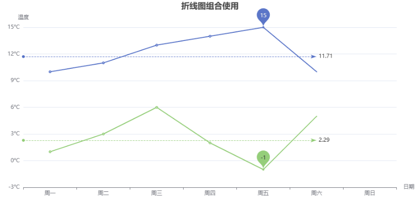
vue
<script setup>
import * as echarts from "echarts";
import {onMounted, onUnmounted, useTemplateRef} from "vue";

const chartRef = useTemplateRef("chartRef");
let chartInstance;

function initChart() {
  chartInstance = echarts.init(chartRef.value);
  const option = {
    title: {
      show: true,
      text: "折线图组合使用",
      left: "center",
    },
    xAxis: {
      type: "category",
      name: "日期",
      data: ["周一", "周二", "周三", "周四", "周五", "周六", "周日"],
      axisLine: {
        show: true,
        onZero: false,
      }
    },
    yAxis: {
      type: "value",
      name: "温度",
      axisLabel: {
        formatter: "{value}°C",
      },
    },
    series: [
      {
        name: "最高气温",
        type: "line",
        data: [10, 11, 13, 14, 15, 10, 9],
        markLine: { // 标记线
          data: [
            {type: "average", name: "最高气温平均值"}
          ]
        },
        markPoint: { // 标记点
          data: [
            {type: "max", name: "最高气温"},
          ]
        }
      },
      {
        name: "最低气温",
        type: "line",
        data: [1, 3, 6, 2, -1, 5, 0],
        markLine: { // 标记线
          data: [
            {type: "average", name: "最低气温平均值"}
          ]
        },
        markPoint: { // 标记点
          data: [
            {type: "min", name: "最低气温"},
          ]
        }
      }
    ]
  };
  chartInstance.setOption(option);
}

function handleResize() {
  chartInstance.resize();
}

onMounted(() => {
  if (chartRef.value) {
    initChart();
    window.addEventListener("resize", handleResize);
  }
});

onUnmounted(() => {
  window.removeEventListener("resize", handleResize);
  if (chartInstance) {
    chartInstance.dispose();
    chartInstance = null;
  }
});
</script>

<template>
  <div class="wrap">
    <div ref="chartRef" class="chart"></div>
  </div>
</template>
柱状图
简单实用:
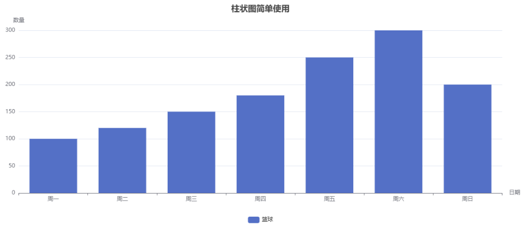
vue
<script setup>
import {onMounted, onUnmounted, useTemplateRef} from "vue";
import * as echarts from "echarts";

const chartRef = useTemplateRef("chartRef");
let chartInstance;

function initChart() {
  chartInstance = echarts.init(chartRef.value);
  const option = {
    title: {
      show: true,
      text: "柱状图简单使用",
      left: "center",
    },
    xAxis: {
      type: "category",
      name: "日期",
      data: ["周一", "周二", "周三", "周四", "周五", "周六", "周日"],
    },
    yAxis: {
      type: "value",
      name: "数量"
    },
    legend: {
      bottom: 0
    },
    series: [{
      data: [100, 120, 150, 180, 250, 300, 200],
      type: "bar",
      name: "篮球"
    }]
  };
  chartInstance.setOption(option);
}

onMounted(() => {
  initChart();
});
onUnmounted(() => {
  chartInstance.dispose();
});
</script>

<template>
  <div class="wrap">
    <div ref="chartRef" class="chart"></div>
  </div>
</template>
多条柱状图使用:
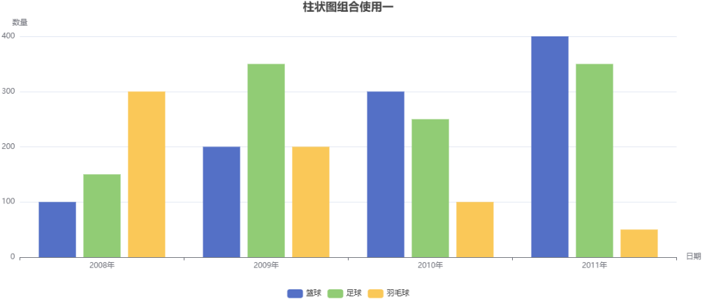
vue
<script setup>
import * as echarts from "echarts";
import {onMounted, onUnmounted, useTemplateRef} from "vue";

const chartRef = useTemplateRef("chartRef");
let chartInstance;

function initChart() {
  chartInstance = echarts.init(chartRef.value);
  const option = {
    title: {
      show: true,
      text: "柱状图组合使用一",
      left: "center",
    },
    xAxis: {
      type: "category",
      name: "日期",
      data: ["2008年", "2009年", "2010年", "2011年"],
    },
    yAxis: {
      type: "value",
      name: "数量"
    },
    legend: {
      bottom: 0
    },
    series: [
      {
        data: [100, 200, 300, 400],
        type: "bar",
        name: "篮球"
      },
      {
        data: [150, 350, 250, 350],
        type: "bar",
        name: "足球"
      },
      {
        data: [300, 200, 100, 50],
        type: "bar",
        name: "羽毛球"
      }
    ]
  };
  chartInstance.setOption(option);
}

onMounted(() => {
  initChart();
});
onUnmounted(() => {
  chartInstance.dispose();
});
</script>

<template>
  <div class="wrap">
    <div ref="chartRef" class="chart"></div>
  </div>
</template>
dataset使用:
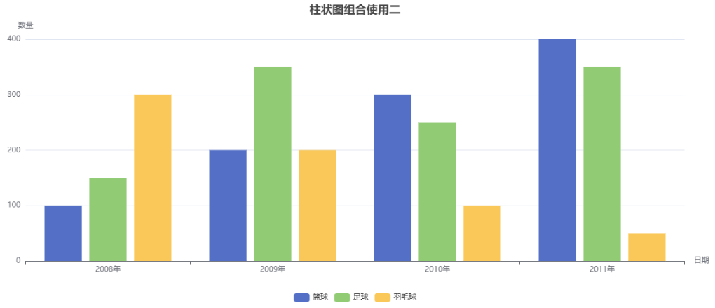
vue
<script setup>
import * as echarts from "echarts";
import {onMounted, onUnmounted, useTemplateRef} from "vue";

const chartRef = useTemplateRef("chartRef");
let chartInstance;

function initChart() {
  chartInstance = echarts.init(chartRef.value);
  const option = {
    title: {
      show: true,
      text: "柱状图组合使用二",
      left: "center",
    },
    xAxis: {
      type: "category",
      name: "日期",
    },
    yAxis: {
      type: "value",
      name: "数量"
    },
    legend: {
      bottom: 0
    },
    dataset: {
      source: [
        ["product", "篮球", "足球", "羽毛球"],
        ["2008年", 100, 150, 300],
        ["2009年", 200, 350, 200],
        ["2010年", 300, 250, 100],
        ["2011年", 400, 350, 50],
      ]
    },
    series: [
      {type: "bar"},
      {type: "bar"},
      {type: "bar"}
    ]
  };
  chartInstance.setOption(option);
}

onMounted(() => {
  initChart();
});
onUnmounted(() => {
  chartInstance.dispose();
});
</script>

<template>
  <div class="wrap">
    <div ref="chartRef" class="chart"></div>
  </div>
</template>
折线图+柱状图使用:
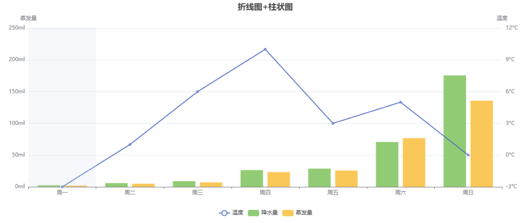
vue
<script setup>
import * as echarts from "echarts";
import {onMounted, onUnmounted, useTemplateRef} from "vue";

const chartRef = useTemplateRef("chartRef");
let chartInstance;

function initChart() {
  chartInstance = echarts.init(chartRef.value);
  const option = {
    title: {
      text: "折线图+柱状图",
      left: "center"
    },
    legend: {
      bottom: 0
    },
    tooltip: {
      trigger: "axis",
      axisPointer: {
        type: "shadow",
        crossStyle: {
          color: "red"
        }
      }
    },
    xAxis: [
      {
        type: "category",
        data: ["周一", "周二", "周三", "周四", "周五", "周六", "周日"],
      }
    ],
    yAxis: [
      {
        type: "value",
        name: "蒸发量",
        min: 0,
        max: 250,
        interval: 50,
        axisLabel: {
          formatter: "{value}ml"
        }
      },
      {
        type: "value",
        name: "温度",
        axisLabel: {
          formatter: "{value}°C"
        }
      }
    ],
    series: [
      {
        type: "line",
        name: "温度",
        yAxisIndex: 1, // 指定第几根轴线
        data: [-3, 1, 6, 10, 3, 5, 0]
      },
      {
        type: "bar",
        name: "降水量",
        data: [2.6, 5.9, 9.0, 26.4, 28.7, 70.7, 175.6, 182.2, 48.7, 18.8, 6.0, 2.3]
      },
      {
        type: "bar",
        name: "蒸发量",
        data: [2.0, 4.9, 7.0, 23.2, 25.6, 76.7, 135.6, 162.2, 32.6, 20.0, 6.4, 3.3]
      }
    ]
  };
  chartInstance.setOption(option);
}

onMounted(() => {
  initChart();
});
onUnmounted(() => {
  chartInstance.dispose();
});
</script>

<template>
  <div class="wrap">
    <div ref="chartRef" class="chart"></div>
  </div>
</template>
堆叠柱状图:
vue
<script setup>
import * as echarts from "echarts";
import {onMounted, onUnmounted, useTemplateRef} from "vue";

const chartRef = useTemplateRef("chartRef");
let chartInstance;

function initChart() {
  chartInstance = echarts.init(chartRef.value);
  const option = {
    title: {
      text: "堆叠柱状图",
      left: "center"
    },
    tooltip: {
      trigger: "axis",
      axisPointer: {
        type: "shadow"
      }
    },
    legend: {
      data: ["直接销售", "渠道销售", "线上销售"],
      top: 30
    },
    grid: {
      left: "3%",
      right: "4%",
      bottom: "3%",
      top: "15%",
      containLabel: true
    },
    xAxis: {
      type: "category",
      data: ["Q1", "Q2", "Q3", "Q4"],
      axisTick: {
        alignWithLabel: true
      }
    },
    yAxis: {
      type: "value"
    },
    series: [
      {
        name: "直接销售",
        type: "bar",
        stack: "销售渠道",
        barWidth: "20%",
        barGap: "10%",
        data: [320, 332, 301, 334],
        itemStyle: {
          color: "#5470c6"
        }
      },
      {
        name: "渠道销售",
        type: "bar",
        stack: "销售渠道",
        barWidth: "20%",
        barGap: "10%",
        data: [120, 132, 101, 134],
        itemStyle: {
          color: "#91cc75"
        }
      },
      {
        name: "线上销售",
        type: "bar",
        stack: "销售渠道",
        barWidth: "20%",
        barGap: "10%",
        data: [220, 182, 191, 234],
        itemStyle: {
          color: "#fac858"
        }
      }
    ]
  };
  chartInstance.setOption(option);
}

onMounted(() => {
  initChart();
});
onUnmounted(() => {
  chartInstance.dispose();
});
</script>

<template>
  <div class="wrap">
    <div ref="chartRef" class="chart"></div>
  </div>
</template>
饼状图
简单使用:
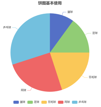
vue
<script setup>
import * as echarts from "echarts";
import {onMounted, onUnmounted, useTemplateRef} from "vue";

const chartRef = useTemplateRef("chartRef");
let chartInstance;

function initPieChart() {
  chartInstance = echarts.init(chartRef.value);
  const option = {
    title: {
      text: "饼图基本使用",
      left: "center",
    },
    tooltip: {
      trigger: "item",
    },
    legend: {
      bottom: 0,
    },
    series: [
      {
        type: "pie",
        name: "运动占比",
        data: [
          {value: 100, name: "篮球"},
          {value: 150, name: "足球"},
          {value: 200, name: "羽毛球"},
          {value: 250, name: "网球"},
          {value: 300, name: "乒乓球"},
        ]
      }
    ]
  };
  chartInstance.setOption(option);
}

onMounted(() => {
  initPieChart();
});

onUnmounted(() => {
  chartInstance.dispose();
});
</script>

<template>
  <div class="wrap">
    <div ref="chartRef" class="chart"></div>
  </div>
</template>
环形图使用:
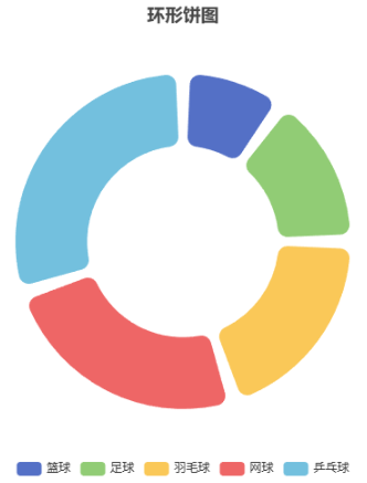
vue
<script setup>
import * as echarts from "echarts";
import {onMounted, onUnmounted, useTemplateRef} from "vue";

const chartRef = useTemplateRef("chartRef");
let chartInstance;

function initPieChart() {
  chartInstance = echarts.init(chartRef.value);
  const option = {
    title: {
      text: "环形饼图",
      left: "center",
    },
    legend: {
      bottom: 0
    },
    series: [
      {
        type: "pie",
        name: "运动占比",
        radius: ["40%", "70%"],
        label: {
          show: false,
          position: "center",
        },
        labelLine: {
          show: false,
        },
        padAngle: 5,
        itemStyle: {
          borderRadius: 10
        },
        data: [
          {value: 100, name: "篮球"},
          {value: 150, name: "足球"},
          {value: 200, name: "羽毛球"},
          {value: 250, name: "网球"},
          {value: 300, name: "乒乓球"},
        ],
        emphasis: {
          label: {
            show: true,
            fontSize: 40,
            fontWeight: "bold"
          }
        }
      }
    ],
  };
  chartInstance.setOption(option);
}

onMounted(() => {
  initPieChart();
});

onUnmounted(() => {
  chartInstance.dispose();
});
</script>

<template>
  <div class="wrap">
    <div ref="chartRef" class="chart"></div>
  </div>
</template>