写在开头
Hello everyone! 🤠
今天是 2025 年 08 月 03 日 下午,这周总算迎来了好天气。虽说有点热,但总归比下雨天舒服多了,特别适合出去晒晒太阳。🌞
最近我总感觉自己像是得了脊椎病,脖子老是不舒服,脑袋也晕乎乎的。每次只要长时间坐在电脑前,或者低头玩手机,难受的感觉就会加重。不过还好,多运动运动就能缓解不少。看来以后真得少碰电脑、手机这类电子产品,多到室外去接触接触大自然才行,要是能不上班就好了,唉。😓😓😓
还有,周末去一个大学舍友那儿玩,他之前脖子落枕了,去医院看了一下,花了 1600 元。。。
看的中医,医生给开了很多中医药包,一包里面的东西有:
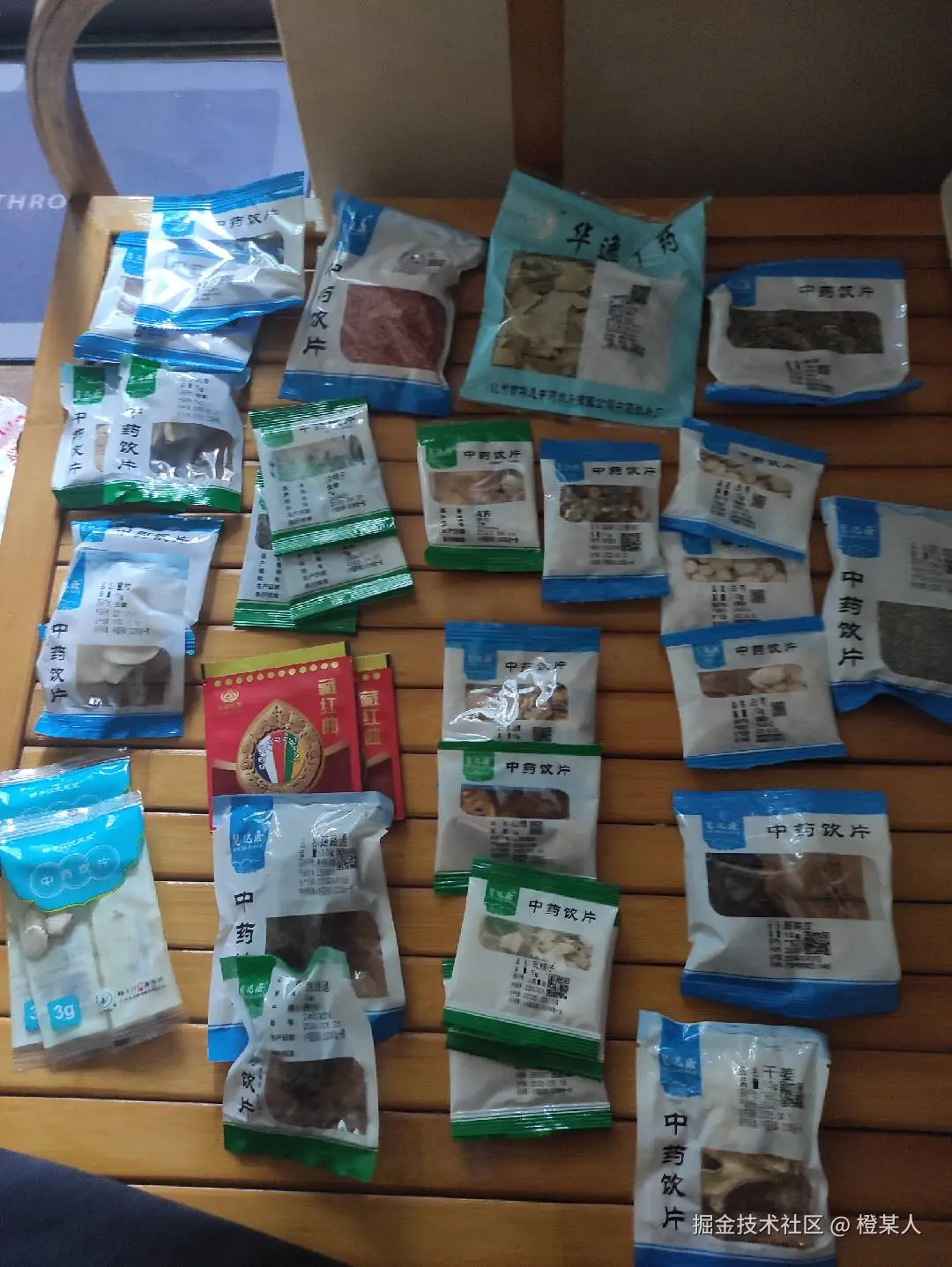
😕看着有点吓人,得把这些东西全放进一个锅里熬。所幸,最后是治好了,现在还剩下两包这样的药,这一堆药材看着属实是让人头皮发麻。
然后呢,再次重申,各位好朋友们,身体健康才是第一要务,其他一切都是次要的❗❗❗
好❗回到正题,本次要分享的是关于一种样式的布局,看着有趣就记录下来。请诸君按需食用哈。
🎯需求背景
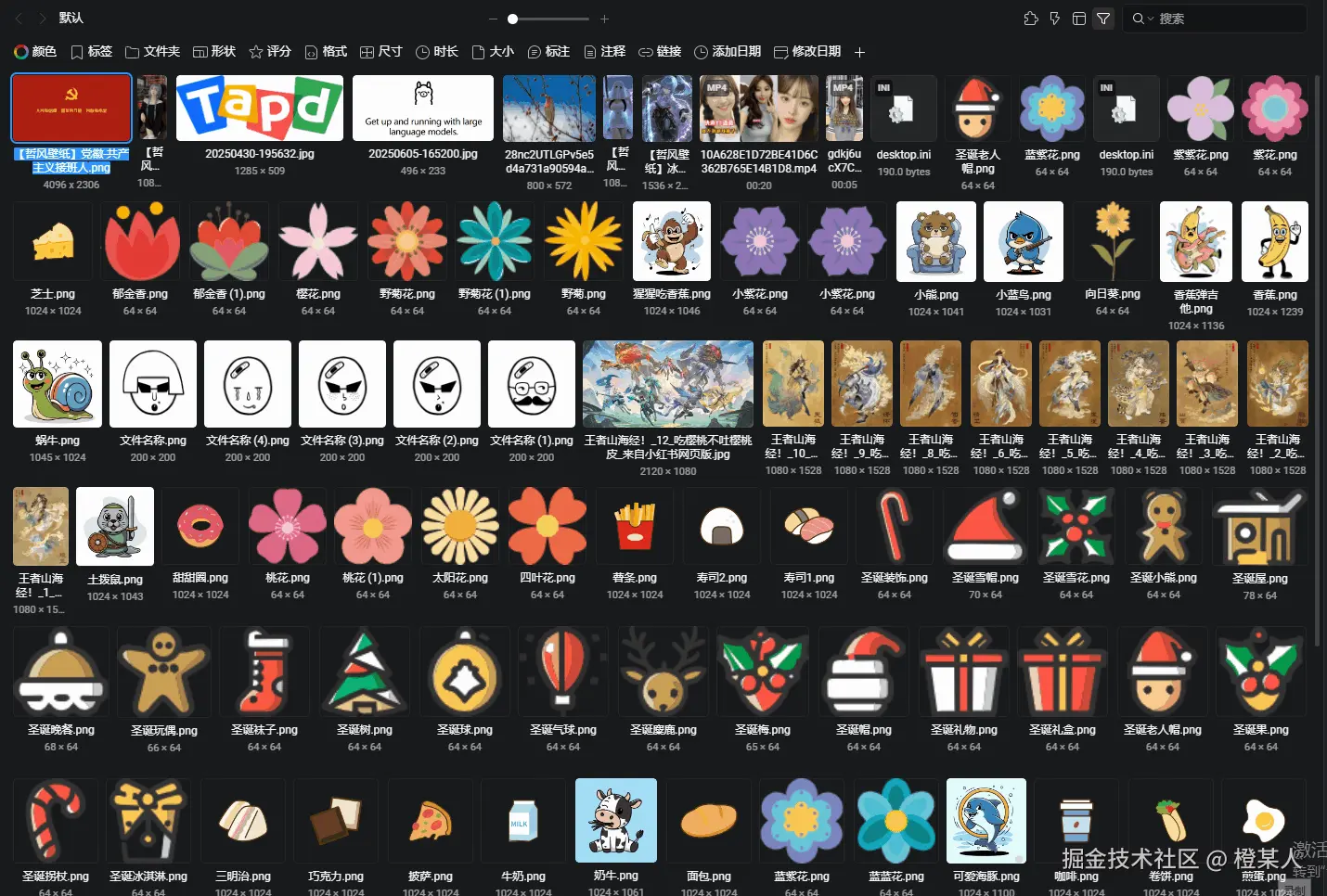
最近,小编在做一个多文件管理的需求。在文件展示的页面布局方面,产品经理不希望采用传统的固定尺寸或瀑布流形式,而是让小编参考 Eagle 软件的这种文件页面布局设计,如下:
看着是挺有趣的。🤔🤔🤔
从视觉效果来看,这种布局有三个显著特点:
- 每一行的高度是可变的,可由用户自行调整,增强用户体验度;
- 每一行的所有文件高度完全一致,呈现出整齐划一的视觉效果,整体观感简洁美观;
- 每个文件(尤其是图片、视频等类型)都能保持原始的宽高比例,同时又能完美填充容器宽度,在保证内容完整性的前提下,既保留了文件本身的比例特征,又留有合理的间距设计,实现了空间的最大化利用,让页面布局既规整又高效。
🧠原理分析
围绕这三点核心特点,咱们再来进行更细致的分析。
第一步:理解问题🤔
想象咱现在有一堆不同大小的照片要贴到墙上:
- 有的是横图(宽比高大)。
- 有的是竖图(高比宽大)。
- 有的是方图(差不多一样大)。
但是,你希望:
- 每一行的照片高度都一样 (看起来整齐)。
- 每一行都刚好填满墙的宽度 (不浪费空间)。
- 照片不能变形 (保持原来的比例)。
第二步:解决思路💡
🎪步骤1:统一高度
现在假设有三张不同尺寸的照片,如下:
- A照片:200×300,比例为2:3。
- B照片:400×200,比例为2:1。
- C照片:300×450,比例为2:3。
现在按照第一点的要求,统一高度,假设统一高度为200,则可以得到:
- A照片:133×200,比例为2:3。
- B照片:400×200,比例为2:1。
- C照片:133×200,比例为2:3。
如图:
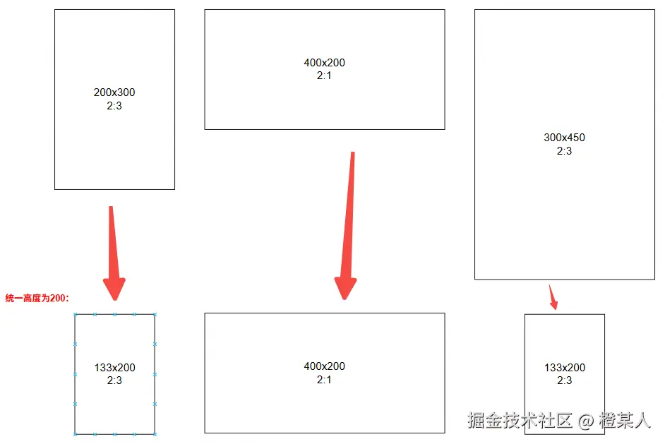
如何算的?
- A照片:原来200宽300高,现在要200高,所以宽度 = 200 ÷ 300 × 200 = 133
- B照片:原来400宽200高,现在要200高,所以宽度 = 400 ÷ 200 × 200 = 400
- C照片:原来300宽450高,现在要200高,所以宽度 = 300 ÷ 450 × 200 = 133
很简单吧,利用比例计算就行。😋
🎪步骤2:智能分组
假设,现在你的墙总宽度是 600:
- 第一行尝试:A(133) + B(400) = 533 < 600 (✅ 还能放)。
- 继续放:A(133) + B(400) + C(133) = 666 > 600 (❌ 放不下)。
所以,三种照片一种放两行:
- 第一行:A + B (总宽533)。
- 第二行:C (总宽133)。
可以想象在玩俄罗斯方块游戏一样。📟
🎪步骤3:等比例缩放到刚好贴边
- 第一行:A(133) + B(400) = 533,但墙宽是60。
- 缩放比例 = 600 ÷ 533 = 1.126
最终结果:
- A: 133 × 1.126 = 150
- B: 400 × 1.126 = 450
总宽度为 150 + 450 = 600 完美贴边!✅
第三步:用大白话总结🎉
这个算法简单解释:
- 先把所有照片 "拉" 成一样高。
- 从左到右排队,排满一行就换行。
- 每一行的照片最后都 "拉伸" 一下,填满一整行。
从上面分析,我们可以得到一些关键的计算公式 📐:
js
// 第1步:计算理想宽度
理想宽度 = 原图宽度 ÷ 原图高度 × 目标高度

// 第3步:计算缩放比例
缩放比例 = 容器宽度 ÷ 这一行所有照片理想宽度之和

// 每张照片的最终宽度
最终宽度 = 理想宽度 × 缩放比例
🛠️基础实现
了解完原理后,咱们来用代码实现实现,从最简单的创建HTML结构开始,这里小编先用几个 div 来演示:
html
<!DOCTYPE html>
<html>
<body>
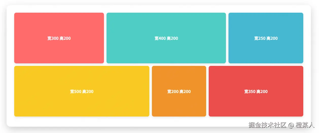
<div class="container">
<div class="grid-row">
<div class="grid-item" data-width="300" data-height="200" style="background-color: #ff6b6b;">宽300 高200</div>
<div class="grid-item" data-width="400" data-height="200" style="background-color: #4ecdc4;">宽400 高200</div>
<div class="grid-item" data-width="250" data-height="200" style="background-color: #45b7d1;">宽250 高200</div>
</div>
<div class="grid-row">
<div class="grid-item" data-width="500" data-height="200" style="background-color: #f9ca24;">宽500 高200</div>
<div class="grid-item" data-width="200" data-height="200" style="background-color: #f0932b;">宽200 高200</div>
<div class="grid-item" data-width="350" data-height="200" style="background-color: #eb4d4b;">宽350 高200</div>
</div>
</div>
</body>
</html>整点样式:
css
* {
    margin: 0;
    padding: 0;
    box-sizing: border-box;
}
body {
    font-family: 'Arial', sans-serif;
    background: linear-gradient(135deg, #667eea 0%, #764ba2 100%);
    min-height: 100vh;
    padding: 20px;
}
.container {
    max-width: 1200px;
    margin: 0 auto;
    background: white;
    border-radius: 15px;
    padding: 30px;
    box-shadow: 0 10px 30px rgba(0,0,0,0.2);
}
.grid-row {
    display: flex;
    margin-bottom: 10px;
    gap: 10px;
}
.grid-item {
    display: flex;
    align-items: center;
    justify-content: center;
    color: white;
    font-weight: bold;
    font-size: 16px;
    border-radius: 8px;
    box-shadow: 0 4px 8px rgba(0,0,0,0.1);
    transition: transform 0.3s ease;
}
.grid-item:hover {
    transform: translateY(-5px);
    box-shadow: 0 8px 16px rgba(0,0,0,0.2);
}
到了最关键的部分❗等高不等宽布局的核心思想:
- 固定行高:每一行的高度都是固定的(比如200px)
- 计算比例:根据原始宽高比例计算在固定高度下的宽度
- 缩放适配:将计算出的宽度按比例缩放以适应容器宽度
核心公式👉👉👉:理想宽度 = 原图宽度 ÷ 原图高度 × 目标高度
js
function initGridLayout() {
    const container = document.querySelector('.container');
    const rows = document.querySelectorAll('.grid-row');
    const fixedHeight = 200; // 固定行高

    rows.forEach(row => {
        const items = row.querySelectorAll('.grid-item');
        const containerWidth = container.offsetWidth - 60; // 减去padding

        // 第一步:计算每个item在固定高度下的理想宽度之和
        let totalIdealWidth = 0;
        const itemData = [];

        items.forEach(item => {
            const originalWidth = parseInt(item.dataset.width);
            const originalHeight = parseInt(item.dataset.height);

            // 根据固定高度计算每个item理想宽度
            // const idealWidth = originalWidth / originalHeight * fixedHeight;
            const idealWidth = originalWidth * (fixedHeight / originalHeight);
            totalIdealWidth += idealWidth;

            itemData.push({
                element: item,
                idealWidth: idealWidth,
                originalWidth: originalWidth,
                originalHeight: originalHeight
            });
        });

        // 第二步:计算缩放比例以适应容器宽度
        const availableWidth = containerWidth - (items.length - 1) * 10; // 减去gap
        const scale = availableWidth / totalIdealWidth;

        // 第三步:应用计算结果
        itemData.forEach(data => {
            // 缩放适配
            const finalWidth = data.idealWidth * scale;
            data.element.style.width = finalWidth + 'px';
            data.element.style.height = fixedHeight + 'px';
            data.element.style.flexShrink = '0'; // 防止被压缩
        });
    });
}

// 页面加载完成后初始化
document.addEventListener('DOMContentLoaded', initGridLayout);
眼尖的小伙伴有没有发现小编代码中:
const idealWidth = originalWidth * (fixedHeight / originalHeight);这句代码和咱们开始推导的公式是不一样的?🤔
其实,两者是等价的,只是这样子写能避免精度问题,并且可读性会稍微好点。
(fixedHeight / originalHeight)很明显是一个缩放比例,先算比例,再乘以宽度,逻辑更清晰。咱们记住,不管如何写,核心思想:
js新宽度 = 原宽度 × 缩放比例 缩放比例 = 新高度 ÷ 原高度
达到的效果:
有点那味了哈!🤔
🚀进阶学习
现在咱们已经完成了最基础的代码实现,但是,还有两个问题:
- 固定两行限制 :目前是写死的两行(
grid-row),无法适应不同内容。 - 无法动态调整 :高度改变时无法智能重新分组。
让我们再来进阶学习一番解决这些问题,实现真正的智能分组 + 动态布局 !🙈
📋第一步:重构HTML结构
首先,我们需要改变HTML结构,去掉固定的行,让所有项都在一个容器中,后面再通过 JS 来动态生成这些项:
html
<div class="container">
    <div class="control-panel">
        <label>调整统一高度:</label>
        <input type="range" id="heightSlider" min="100" max="400" value="200" step="10" />
        <span id="heightValue">200px</span>
    </div>
    <div class="grid-container" id="gridContainer">
        <!-- 所有项都会通过JS动态分组到这里 -->
    </div>
</div>
移除了一些固定的结构,上面咱们还增加了一个滑块,用于来控制高度的变化。
🎨 第二步:再增加点样式
css
.control-panel {
    background-color: #f8f9fa;
    padding: 20px;
    border-radius: 10px;
    margin-bottom: 30px;
    text-align: center;
}
.control-panel label {
    font-weight: bold;
    margin-right: 10px;
}
#heightSlider {
    width: 300px;
    margin: 0 10px;
}
#heightValue {
    font-weight: bold;
    color: #007bff;
}🔛第三步:滑块控制高度变化
先处理一下滑块的行为,让它变化的时候把数值传入核心的方法中:
js
/** @name 滑动操作 **/
function setupHeightControl() {
    const heightSlider = document.getElementById("heightSlider");
    const heightValue = document.getElementById("heightValue");

    heightSlider.addEventListener("input", function () {
        const newHeight = parseInt(this.value);
        heightValue.textContent = newHeight + "px";

        // 🔥 重新计算布局,看下面⬇
        smartGridLayout(newHeight);
    });
}
document.addEventListener("DOMContentLoaded", () => {
    setupHeightControl();
});
第四步:动态创建DOM
把前面固定的DOM通过动态来创建:
js
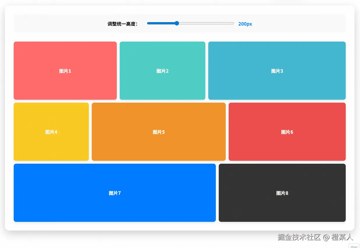
const imageData = [
    { width: 300, height: 200, color: '#ff6b6b', text: '图片1' },
    { width: 250, height: 200, color: '#4ecdc4', text: '图片2' },
    { width: 400, height: 200, color: '#45b7d1', text: '图片3' },
    { width: 180, height: 200, color: '#f9ca24', text: '图片4' },
    { width: 320, height: 200, color: '#f0932b', text: '图片5' },
    { width: 280, height: 200, color: '#eb4d4b', text: '图片6' },
    { width: 350, height: 200, color: '#007bff', text: '图片7' },
    { width: 220, height: 200, color: '#333333', text: '图片8' },
];

/**
 * @name 创建DOM元素,并计算理想宽度
 * @param {number} fixedHeight - 目标高度
 * @returns {Array} - 包含元素和理想宽度的对象数组
 */
function createGridItems(fixedHeight) {
    return imageData.map((data, index) => {
        // 创建DOM元素
        const element = document.createElement('div');
        element.className = 'grid-item';
        element.style.backgroundColor = data.color;
        element.textContent = data.text;

        // 📐计算理想宽度:理想宽度 = 原图宽度 ÷ 原图高度 × 目标高度
        const idealWidth = data.width * (fixedHeight / data.height);

        return {
            element: element,
            idealWidth: idealWidth,
            originalWidth: data.width,
            originalHeight: data.height
        };
    });
}🧠第五步:核心算法解析
这是整个方案的核心部分,使用 贪心算法 实现智能分组:
js
/**
 * @name 制作网格布局
 * @description 主控制函数,协调整个布局流程
 * @param {number} customHeight - 自定义高度,默认200px
 */
function smartGridLayout(customHeight = 200) {
    const container = document.querySelector(".container");
    const gridContainer = document.getElementById("gridContainer");

    // 清空现有布局
    gridContainer.innerHTML = "";

    // 动态生成所有item数据
    const allItems = createGridItems(customHeight);

    // 计算容器可用宽度
    const containerWidth = container.offsetWidth - 60; // 减去padding
    const gap = 10;
    // 智能分组算法
    const rows = smartGrouping(allItems, containerWidth, gap);

    // 渲染每一行
    rows.forEach((rowItems, rowIndex) => {
        const rowElement = document.createElement("div");
        rowElement.className = "grid-row";

        // 计算这一行的缩放比例
        const totalIdealWidth = rowItems.reduce((sum, item) => sum + item.idealWidth, 0);
        const availableWidth = containerWidth - (rowItems.length - 1) * gap;
        const scale = availableWidth / totalIdealWidth;

        // 应用样式到每个item
        rowItems.forEach(itemData => {
            const finalWidth = itemData.idealWidth * scale;
            itemData.element.style.width = finalWidth + "px";
            itemData.element.style.height = customHeight + "px";
            rowElement.appendChild(itemData.element);
        });

        gridContainer.appendChild(rowElement);
    });
}
/**
 * @name 智能分组算法 - 贪心策略
 * @description 使用贪心策略将items分组到不同行中
 * @param {Array} items - 所有item数据
 * @param {number} containerWidth - 容器宽度
 * @param {number} gap - 项目间距
 * @returns {Array} 分组后的二维数组
 */
function smartGrouping(items, containerWidth, gap) {
    const rows = [];
    let currentRow = [];
    let currentRowWidth = 0;

    for (let i = 0; i < items.length; i++) {
        const item = items[i];
        const itemWidth = item.idealWidth;
        const gapWidth = currentRow.length > 0 ? gap : 0;

        // 检查当前行是否还能放下这个item
        if (currentRowWidth + gapWidth + itemWidth <= containerWidth) {
            // 能放下,加入当前行
            currentRow.push(item);
            currentRowWidth += gapWidth + itemWidth;
        } else {
            // 放不下,开始新行
            if (currentRow.length > 0) {
                rows.push(currentRow);
            }
            currentRow = [item];
            currentRowWidth = itemWidth;
        }
    }
    // 添加最后一行
    if (currentRow.length > 0) {
        rows.push(currentRow);
    }
    return rows;
}

// 页面加载完成后初始化-入口
document.addEventListener("DOMContentLoaded", () => {
    setupHeightControl();
    // 初始化也要执行一次
    smartGridLayout();
});
应该不复杂哈,结合上面的学习,小编把整个功能拆分成了四个函数,最核心就是 smartGrouping 函数,虽然涉及到一点算法思维(贪心策略),但说白了就是一个 "能放就放,放不下就换行" 的朴素逻辑啦。
其实,可以理解为就像在玩俄罗斯方块一样,一行放满了就开始下一行,就是这样!🎮
最终的效果:
⚡实际应用
现在这个 DEMO 已经做得差不多了,接下来咱们需要把它用到实际的业务场景中,比如,开头咱们提及的多种文件上传场景,在上传各种文件后,能有一个不一样的布局展示。
咱们还是分步骤一步一步来完成哈,GO❗🏃
📋第一步:重构HTML结构
首先,咱们需要添加文件上传功能,让用户可以选择任意类型的文件:
html
<div class="container">
    <!-- 上传区域 -->
    <div class="upload-section">
        <button class="upload-btn" onclick="document.getElementById('fileInput').click()">选择文件</button>
        <button class="clear-btn" onclick="clearAllFiles()">清空所有</button>
        <input type="file" id="fileInput" multiple>
    </div>
    <!-- 高度控制面板 -->
    <div class="control-panel">
        <label for="heightSlider">调整统一高度:</label>
        <input type="range" id="heightSlider" min="100" max="400" value="200" step="10" />
        <span id="heightValue">200px</span>
    </div>
    <!-- 网格容器 -->
    <div class="grid-container" id="gridContainer"></div>
</div>
现在可以上传任何类型的文件,包括图片、视频、文档等。
🎨 第二步:完善样式设计
css
.upload-section {
    margin-bottom: 30px;
    text-align: center;
}
.upload-btn {
    background: #007bff;
    color: white;
    border: none;
    padding: 12px 24px;
    border-radius: 8px;
    cursor: pointer;
    font-size: 16px;
    margin-right: 15px;
}
.upload-btn:hover {
    background: #0056b3;
}
.clear-btn {
    background: #dc3545;
    color: white;
    border: none;
    padding: 12px 24px;
    border-radius: 8px;
    cursor: pointer;
    font-size: 16px;
}
.grid-item img, .grid-item video {
    width: 100%;
    height: 100%;
    object-fit: cover;
}
.file-icon {
    font-size: 32px;
    margin-bottom: 8px;
}
.file-name {
    font-size: 12px;
    text-align: center;
    word-break: break-all;
    max-width: 100%;
}📤第三步:文件上传系统
实现文件选择和处理逻辑,支持多种文件类型:
js
// 存储上传的文件数据
let uploadedFiles = [];

/**
 * @name 处理文件选择
 */
function handleFileSelect(event) {
    const files = Array.from(event.target.files);
    processFiles(files);
}

/**
 * @name 处理文件数据
 * @param {Array} files - 文件列表
 */
function processFiles(files) {
    files.forEach(file => {
        if (file.type.startsWith('image/')) {
            processImageFile(file);
        } else if (file.type.startsWith('video/')) {
            processVideoFile(file);
        } else {
            processOtherFile(file);
        }
    });
}

// 文件选择事件绑定
document.addEventListener("DOMContentLoaded", function () {
    const fileInput = document.getElementById('fileInput');
    fileInput.addEventListener('change', handleFileSelect);
});📸第四步:文件识别
根据不同文件类型,获取真实尺寸或设置默认尺寸:
js
/**
 * @name 处理图片文件
 * @param {File} file - 图片文件
 */
function processImageFile(file) {
    const reader = new FileReader();
    reader.onload = function(e) {
        const img = new Image();
        img.onload = function() {
            const fileData = {
                id: Date.now() + Math.random(),
                type: 'image',
                width: this.naturalWidth,  // 获取图片真实宽度
                height: this.naturalHeight, // 获取图片真实高度
                url: e.target.result,
                name: file.name
            };
            uploadedFiles.push(fileData);
            updateLayout();
        };
        img.src = e.target.result;
    };
    reader.readAsDataURL(file);
}

/**
 * @name 处理视频文件
 * @param {File} file - 视频文件
 */
function processVideoFile(file) {
    const reader = new FileReader();
    reader.onload = function(e) {
        const video = document.createElement('video');
        video.onloadedmetadata = function() {
            const fileData = {
                id: Date.now() + Math.random(),
                type: 'video',
                width: this.videoWidth || 300,   // 获取视频真实宽度
                height: this.videoHeight || 400, // 获取视频真实高度
                url: e.target.result,
                name: file.name
            };
            uploadedFiles.push(fileData);
            updateLayout();
        };
        video.src = e.target.result;
    };
    reader.readAsDataURL(file);
}

/**
 * @name 处理其他文件
 * @param {File} file - 其他文件
 */
function processOtherFile(file) {
    const fileTypeConfig = {
        'application/pdf': { icon: '📄', color: '#dc3545' },
        'application/msword': { icon: '📝', color: '#007bff' },
        'application/vnd.openxmlformats-officedocument.wordprocessingml.document': { icon: '📝', color: '#007bff' },
        'application/vnd.ms-excel': { icon: '📊', color: '#28a745' },
        'application/vnd.openxmlformats-officedocument.spreadsheetml.sheet': { icon: '📊', color: '#28a745' },
        'text/plain': { icon: '📄', color: '#6c757d' },
        'audio/mpeg': { icon: '🎵', color: '#e83e8c' },
        'default': { icon: '📁', color: '#6c757d' }
    };
    const config = fileTypeConfig[file.type] || fileTypeConfig['default'];
    // 无尺寸文件默认正方形
    const fileData = {
        id: Date.now() + Math.random(),
        type: 'document',
        width: 200,
        height: 200,
        color: config.color,
        icon: config.icon,
        name: file.name
    };
    uploadedFiles.push(fileData);
    updateLayout();
}⏰第五步:动态布局更新
修改 createGridItems 函数,支持动态文件数据:
js
/**
 * @name 创建DOM元素,并计算理想宽度
 * @param {number} fixedHeight - 目标高度
 * @returns {Array} - 包含元素和理想宽度的对象数组
 */
function createGridItems(fixedHeight) {
    return uploadedFiles.map((fileData) => {
        const element = document.createElement('div');
        element.className = 'grid-item';
        if (fileData.type === 'image') {
            // 🖼️ 图片文件:直接显示图片
            const img = document.createElement('img');
            img.src = fileData.url;
            img.alt = fileData.name;
            element.appendChild(img);
        } else if (fileData.type === 'video') {
            // 🎬 视频文件:显示视频播放器
            const video = document.createElement('video');
            video.src = fileData.url;
            video.controls = true;
            video.muted = true;
            element.appendChild(video);
        } else {
            // 📄 文档文件:显示图标和文件名
            element.style.backgroundColor = fileData.color;
            element.innerHTML = `
                <div class="file-icon">${fileData.icon}</div>
                <div class="file-name">${fileData.name}</div>
            `;
        }
        // 📐 根据文件自身尺寸计算理想宽度
        const idealWidth = fileData.width * (fixedHeight / fileData.height);
        return {
            element: element,
            idealWidth: idealWidth
        };
    });
}

/**
 * @name 更新布局
 */
function updateLayout() {
    const heightSlider = document.getElementById("heightSlider");
    const currentHeight = parseInt(heightSlider.value);
    smartGridLayout(currentHeight);
}

/**
 * @name 清空所有文件
 */
function clearAllFiles() {
    uploadedFiles = [];
    updateLayout();
    document.getElementById('fileInput').value = '';
}🎯第六步:核心算法保持不变
咱们前面的的 smartGrouping 和 smartGridLayout 核心函数,因为它们已经足够通用,可以处理任何类型的数据啦。
最终效果:

📊优化性能
在前面的章节中,咱们已经基本实现了整体期望的功能。但是,仔细观察上一小节中的效果图,能发现了一个明显的性能问题:当上传图片、视频等文件后,每次调整高度滑块时,视频都会先变黑屏,然后重新加载。虽然图片看不太出来,但视频的重新加载现象非常明显。
随着文件数量的增加和用户交互的频繁,这种性能问题会逐渐显现,用户体验会大打折扣。这可不太行,咱们必须要做一些性能优化工作了。
🎯 在优化之前,我们先来分析一下原版本存在的性能瓶颈:
- DOM 频繁重建:每次调整滑块时,都会清空容器并重新创建所有 DOM 元素。
- 频繁的 DOM 操作:使用
innerHTML = ""清空容器会触发大量重排和重绘 - 滑块事件过于频繁:用户拖动滑块时会触发大量布局更新
🚀第一步:实现 DOM 元素缓存
首先,咱们引入 DOM 元素缓存机制,避免重复创建相同的元素:
javascript
// DOM 元素缓存
let cachedElements = new Map();

function createGridItems(fixedHeight) {
    return uploadedFiles.map((fileData) => {
        let element = cachedElements.get(fileData.id);

        if (!element) {
            // 只在第一次创建DOM元素
            element = document.createElement('div');
            element.className = 'grid-item';

            if (fileData.type === 'image') {
                const img = document.createElement('img');
                img.src = fileData.url;
                img.alt = fileData.name;
                element.appendChild(img);
            } else if (fileData.type === 'video') {
                const video = document.createElement('video');
                video.src = fileData.url;
                video.controls = true;
                video.muted = true;
                element.appendChild(video);
            } else {
                element.style.backgroundColor = fileData.color;
                element.innerHTML = `
                    <div class="file-icon">${fileData.icon}</div>
                    <div class="file-name">${fileData.name}</div>
                `;
            }

            // 缓存DOM元素
            cachedElements.set(fileData.id, element);
        }

        const idealWidth = fileData.width * (fixedHeight / fileData.height);

        return {
            element: element,
            idealWidth: idealWidth
        };
    });
}

/**
 * @name 清空所有文件
 */
function clearAllFiles() {
    // ...
    // 清理全部DOM缓存
    cachedElements.clear();
}
这里小编采用了 Map 数据结构来缓存已创建的 DOM 元素(AI推荐的,其实感觉弄个对象也行🤔就是要加判断),通过文件的唯一ID作为键值,ID用的是 Date.now() + Math.random(),也可换成其他方式,问题不大。这样子缓存起来能实现对元素的复用,每个文件的 DOM 元素只会创建一次,后续只需要调整样式属性即可。
⚡第二步:优化 DOM 操作策略
接下来,我们优化 DOM 操作,避免频繁的 innerHTML 清空和大量重排:
js
function smartGridLayout(customHeight = 200) {
    const container = document.querySelector(".container");
    const gridContainer = document.getElementById("gridContainer");

    // 优化:精确移除子元素,避免innerHTML清空
    while (gridContainer.firstChild) {
        gridContainer.removeChild(gridContainer.firstChild);
    }

    if (uploadedFiles.length === 0) return;

    const allItems = createGridItems(customHeight);
    const containerWidth = container.offsetWidth - 60;
    const gap = 10;
    const rows = smartGrouping(allItems, containerWidth, gap);

    // 使用文档片段优化DOM插入性能
    const fragment = document.createDocumentFragment();

    rows.forEach((rowItems) => {
        // ...
    });

    // 一次性插入所有行,减少重排
    gridContainer.appendChild(fragment);
}
优化要点 :
- 使用
removeChild替代innerHTML = ""进行精确的 DOM 移除。 - 引入
DocumentFragment文档片段,先在内存中构建完整的 DOM 结构。 - 最后一次性插入到页面,大幅减少重排和重绘次数
🎛️第三步:添加防抖优化
最后,滑块拖动时的频繁触发问题,咱们可以整上防抖函数:
js
/**
 * @name 防抖函数
 * @param {Function} func - 需要防抖的函数
 * @param {number} wait - 等待时间(毫秒)
 * @returns {Function} - 防抖后的函数
 */
function debounce(func, wait) {
    let timeout;
    return function executedFunction(...args) {
        const later = () => {
            clearTimeout(timeout);
            func(...args);
        };
        clearTimeout(timeout);
        timeout = setTimeout(later, wait);
    };
}

// 创建防抖版本的布局更新函数
const debouncedLayout = debounce((newHeight) => {
    smartGridLayout(newHeight);
}, 100);

// 应用到滑块事件
heightSlider.addEventListener("input", function () {
    const newHeight = parseInt(this.value);
    heightValue.textContent = newHeight + "px";
    debouncedLayout(newHeight); // 使用防抖
});这里到底要加防抖 好呢?还是节流好呢?又或者是不加呢?
其实,各有好处,看业务场景,小编最后交由产品经理决定,结果就是我们不加。😋
最终效果:

这次操作起来就比较顺畅啦,完美。🎉🎉🎉
📝总结
终于写完啦!😅 稍微有点长,但通过这篇文章,小编带大家从零开始实现了一个完整的等高不等宽自适应网格布局。
Em...这个布局虽然一开始看起来复杂,但是一步一步分解下来其实也不难理解。关键是要理解等高 和自适应宽度这两个核心概念,然后通过数学计算来实现布局的自动调整。
其实,......也没有什么好总结的,但如果你后续想进一步优化,还可以考虑:
- 虚拟滚动(处理大量数据)
- 懒加载(提升首屏性能)
- 动画过渡(增强用户体验)
- ...
就这样子啦。
至此,本篇文章就写完啦,撒花撒花。

希望本文对你有所帮助,如有任何疑问,期待你的留言哦。
老样子,点赞+评论=你会了,收藏=你精通了。