在后台管理系统、工作台类应用中,常常需要 左侧导航 + 右侧内容区 的页面布局,同时右侧又可能包含 顶部区域(搜索栏 / 工具栏)+ 主体内容区。 为了避免重复编写布局逻辑,这里封装了一个通用的 GiPageLayout 组件,提供灵活的插槽与属性配置。
功能与特性
-
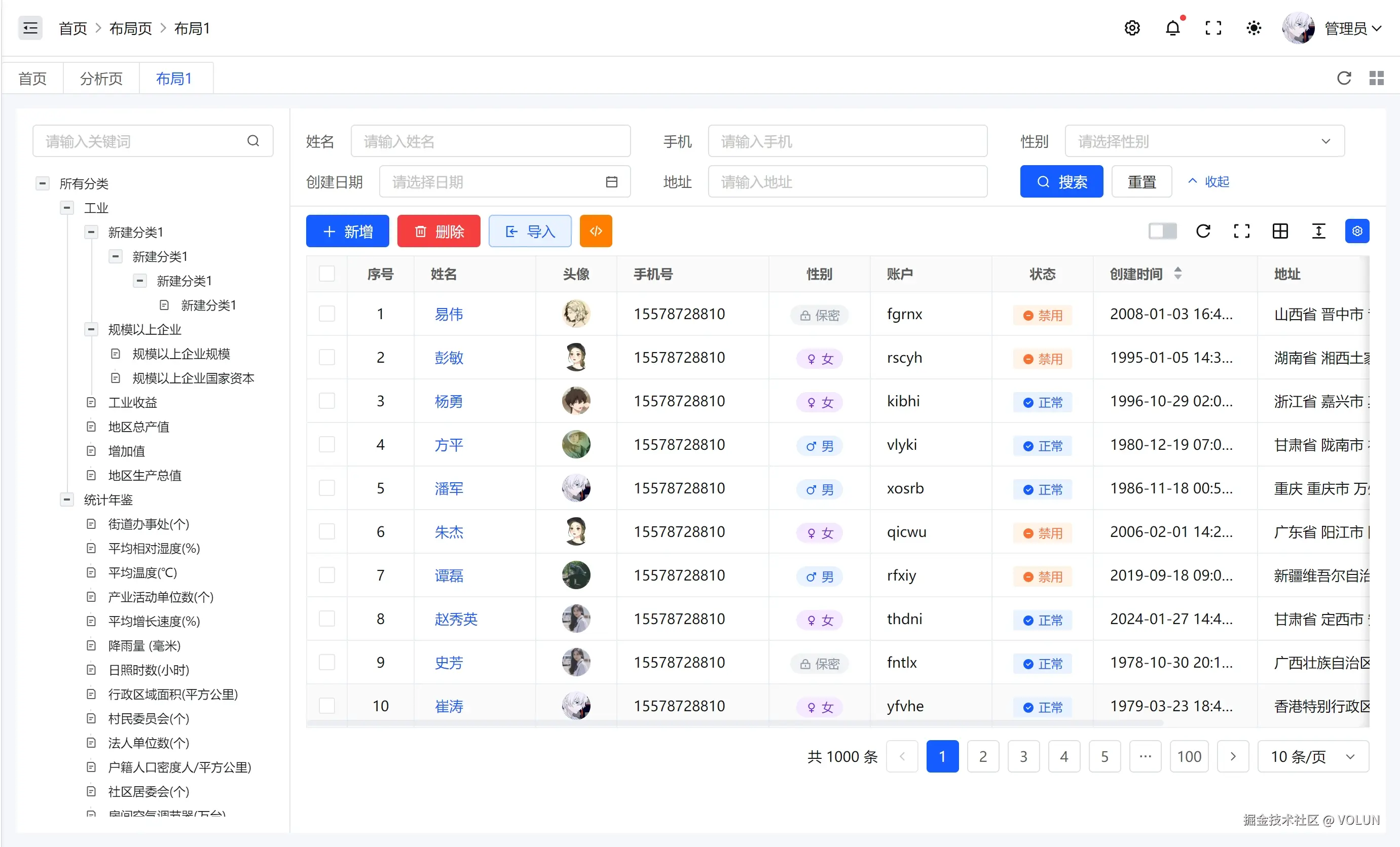
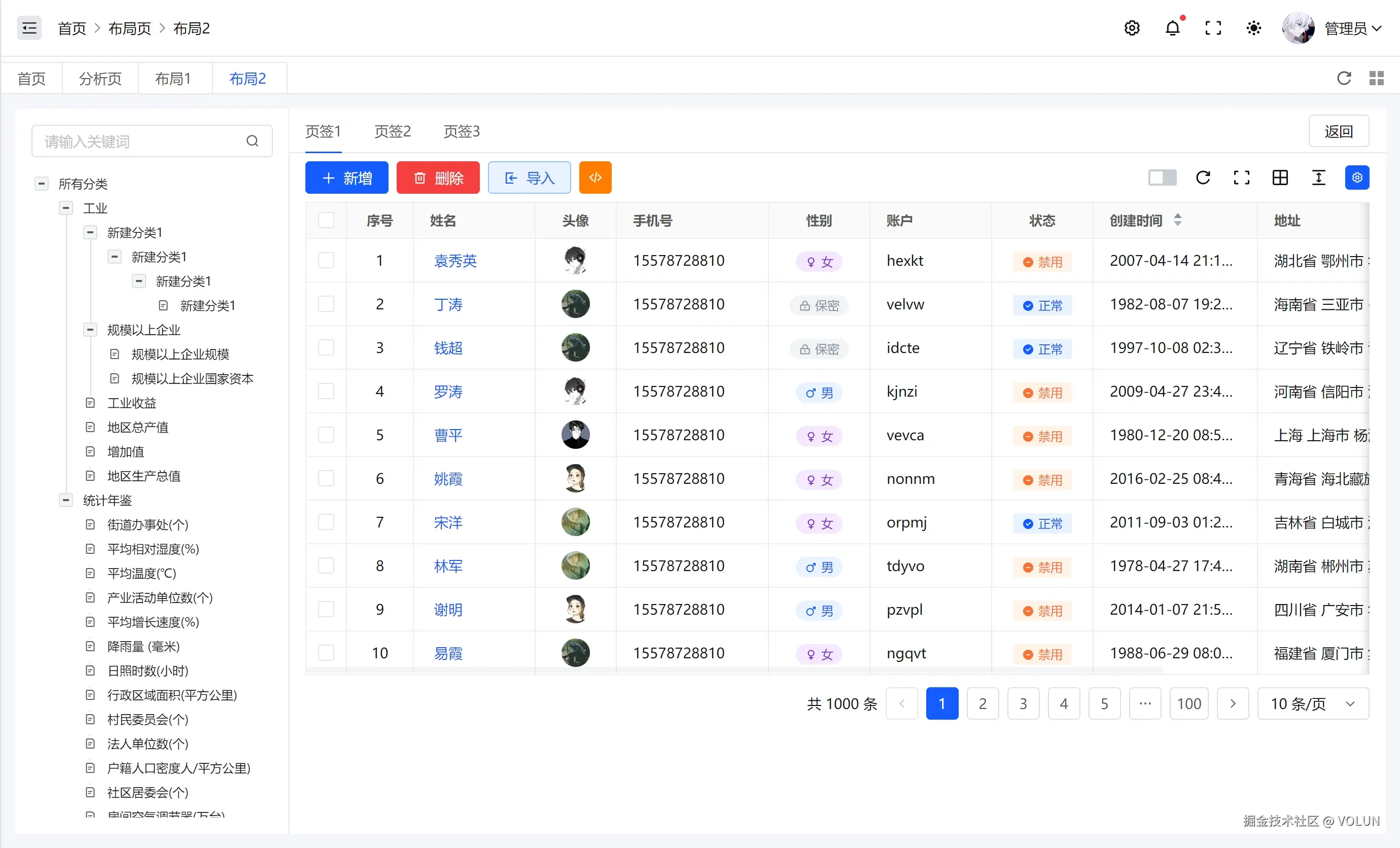
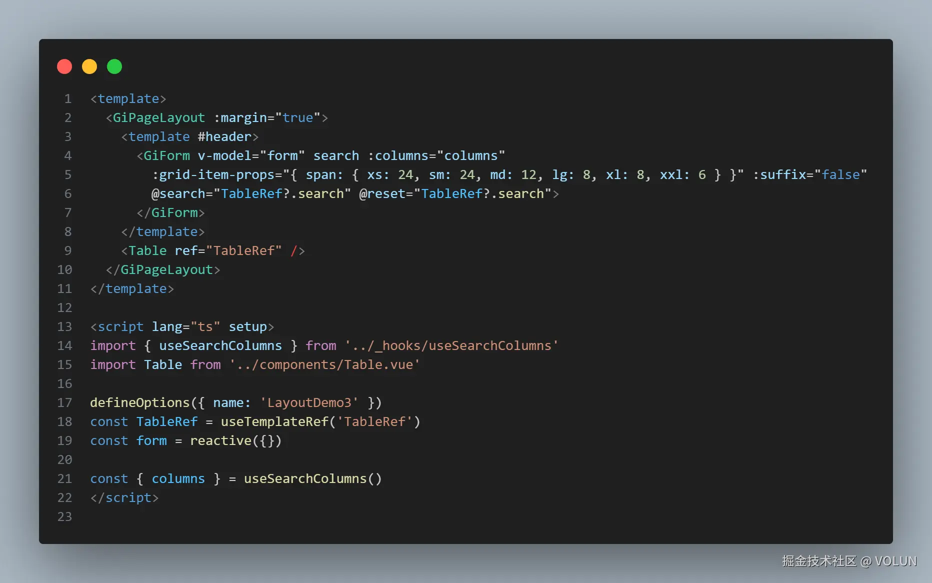
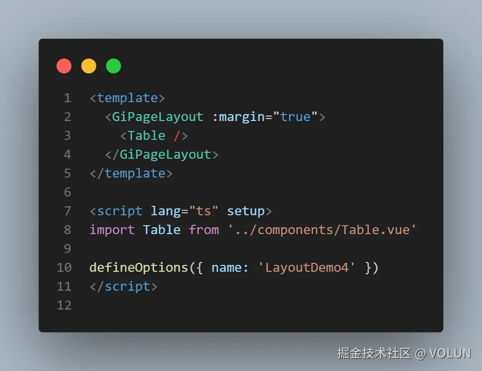
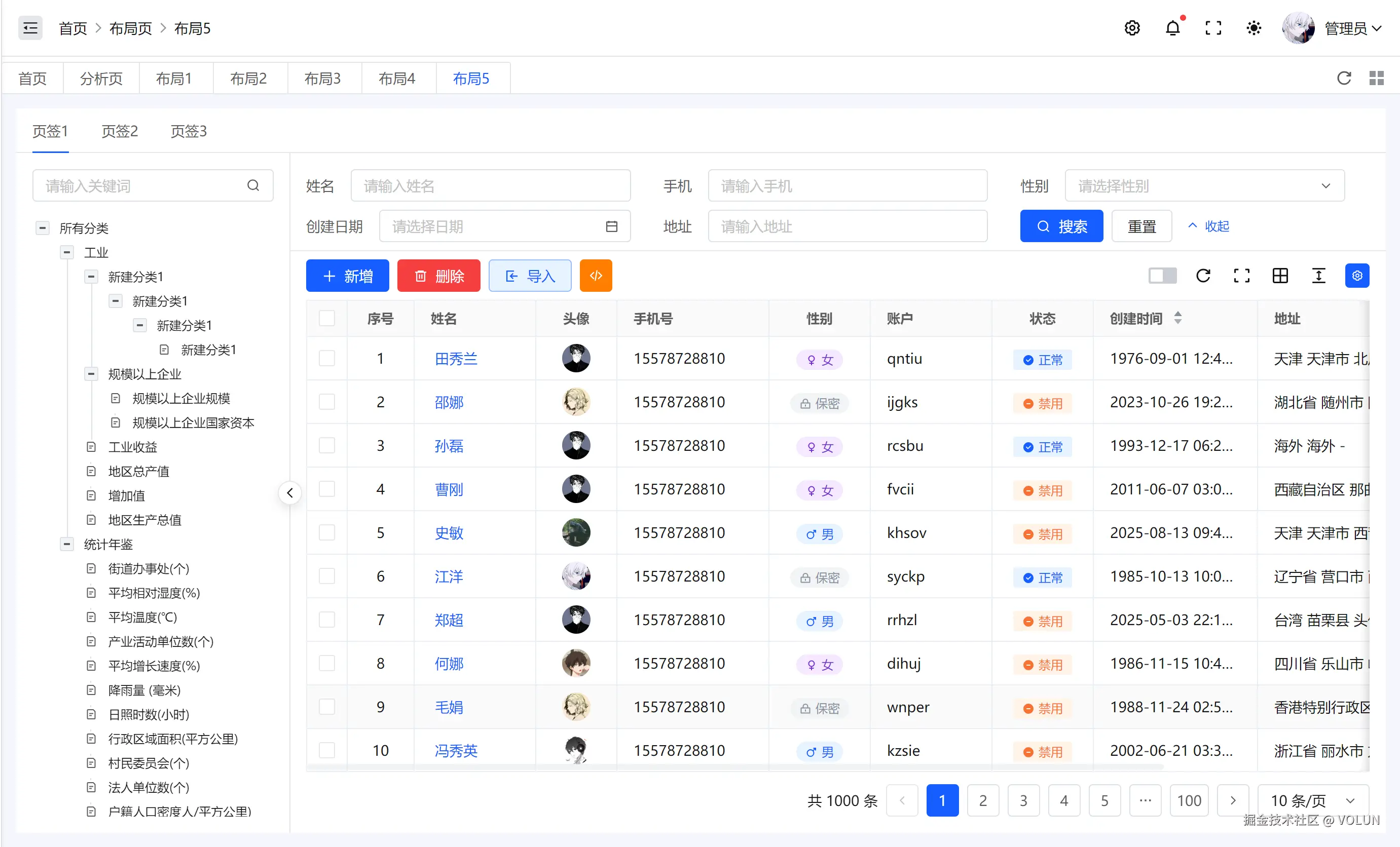
左右分栏布局: 左侧(可折叠/隐藏) 右侧(包含 header 区域 + body 区域)
-
插槽灵活: left:放置侧边栏内容(如菜单、筛选条件) header:放置工具栏、搜索栏 default:页面主体内容
-
自适应移动端: 在移动端自动收起左侧栏 通过 SplitButton 控制展开/折叠
-
交互增强: 左侧可拖拽调整宽度(基于 Arco a-split) 支持折叠动画,体验更自然
-
样式定制: leftStyle、headerStyle、bodyStyle 三个 props 允许外部控制布局样式 是否显示边框、内边距、margin 由 props 控制
组件 Props 说明
| 属性 | 类型 | 默认值 | 说明 |
|---|---|---|---|
| size | string |
'270px' |
左侧区域宽度 |
| margin | boolean |
false |
是否增加外边距 |
| inner | boolean |
false |
是否内部布局(去除额外 padding) |
| headerBordered | boolean |
true |
是否显示 header 底部边框 |
| leftStyle | CSSProperties |
{} |
左侧区域样式 |
| headerStyle | CSSProperties |
{} |
头部区域样式 |
| bodyStyle | CSSProperties |
{} |
主体区域样式 |
| collapsed | boolean |
false |
是否默认折叠左侧 |
插槽 Slots
| 插槽名 | 说明 |
|---|---|
left |
左侧栏内容 |
header |
顶部工具栏 |
default |
主体内容 |
交互逻辑
-
折叠/展开: 通过 SplitButton 控制 size,大于 20px 时认为展开,否则为收起状态。
-
动画处理: 使用 collapseing 状态在折叠/展开时添加过渡效果。
-
移动端优化: 在移动端浏览器环境下(xe-utils 判断),默认收起左侧栏。
样式设计
整体:flex 布局,高度 100% 占满容器
header 与 body:header 固定在顶部,body 填充剩余空间
分割线 trigger:定制化 trigger 样式,鼠标 hover / active 时加亮
折叠过渡:通过 transition: flex-basis 0.3s 平滑动画
演示
布局1
布局2
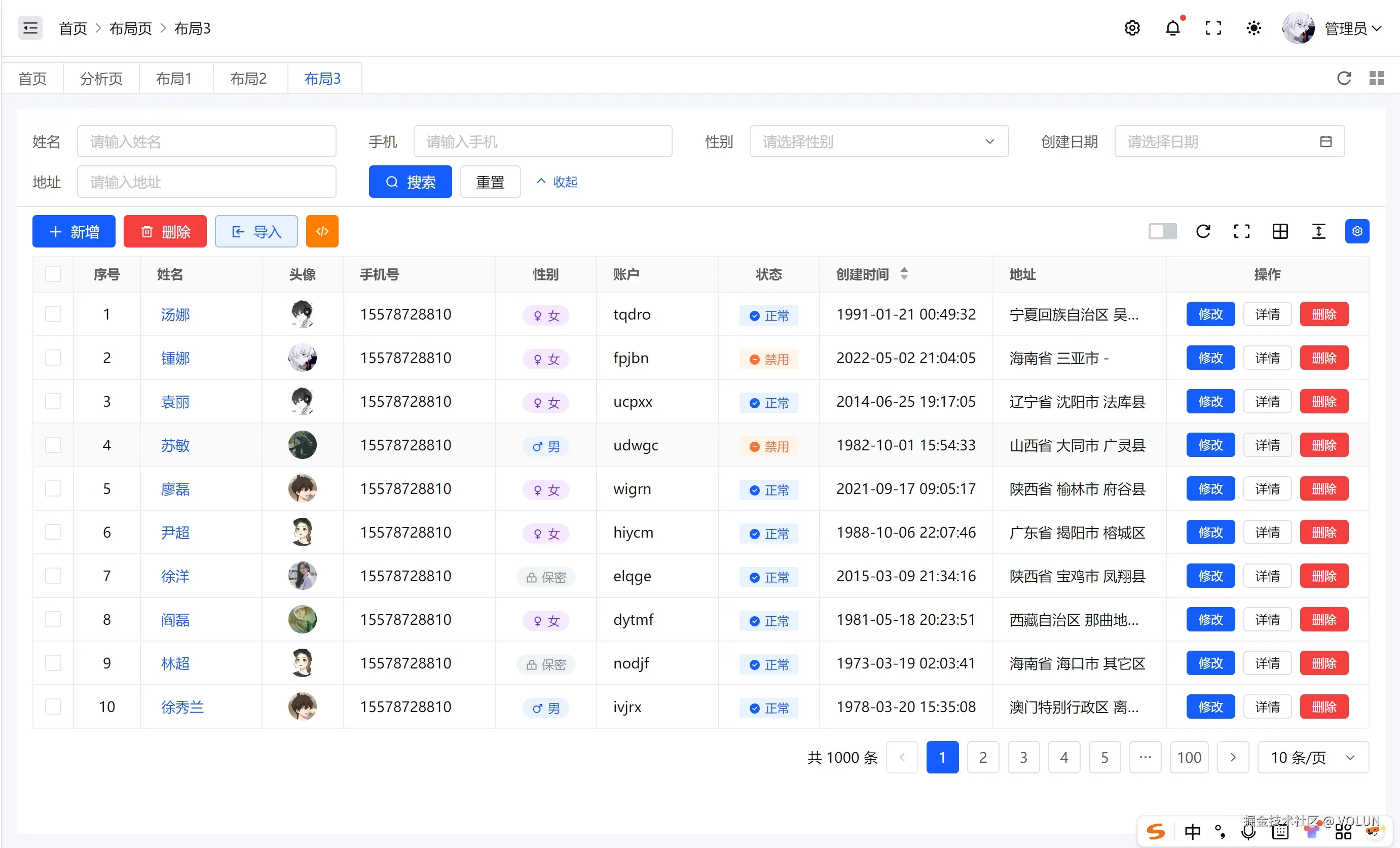
布局3
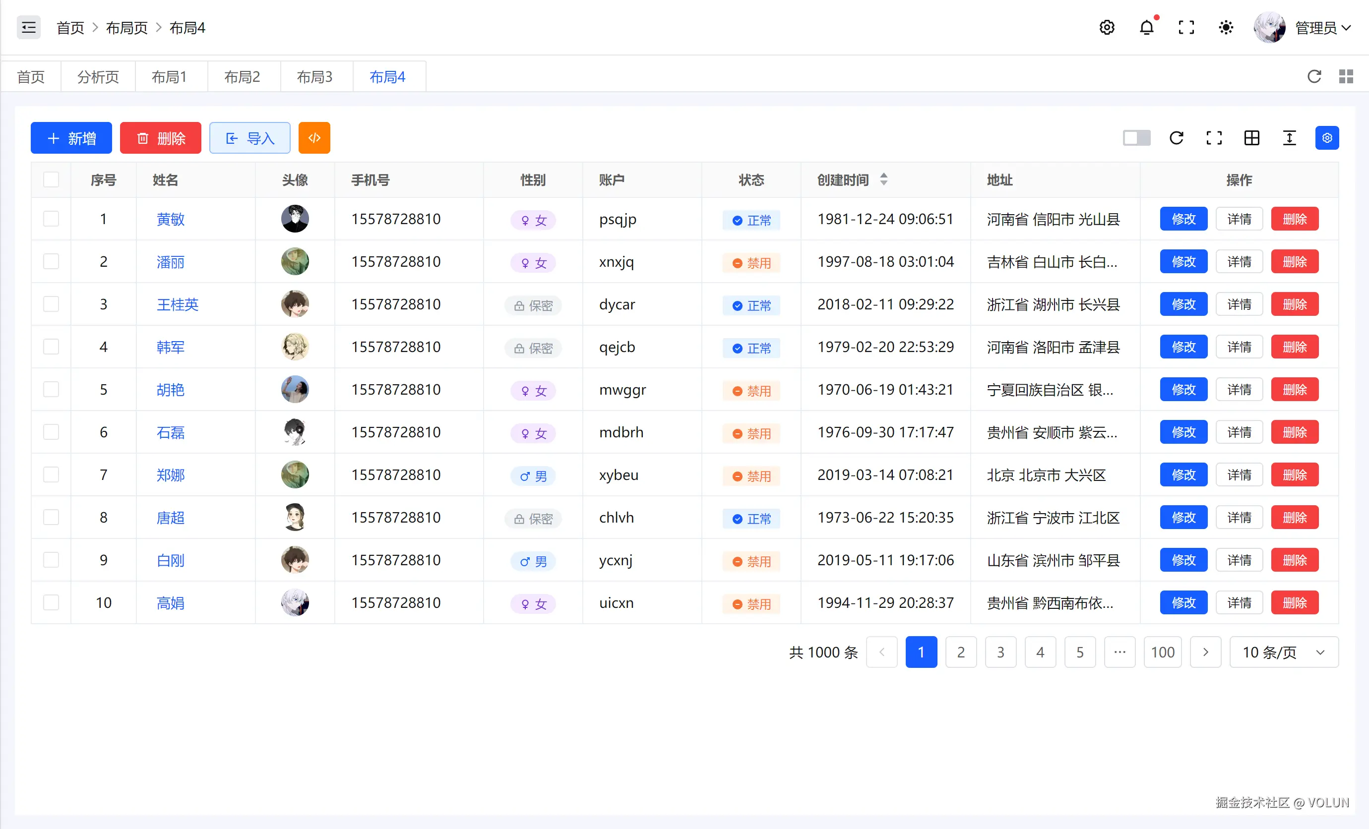
布局4
布局5
总结
GiPageLayout 组件封装了常见的后台布局模式:左侧导航 + 顶部工具栏 + 主体内容。 相比直接写布局,它具备:
-
可扩展性好:插槽式设计,内容与布局解耦
-
体验优化:支持拖拽、折叠动画、移动端适配
-
可定制:支持样式覆盖与 props 配置
非常适合在 中后台系统 中作为统一的页面容器使用。
源码
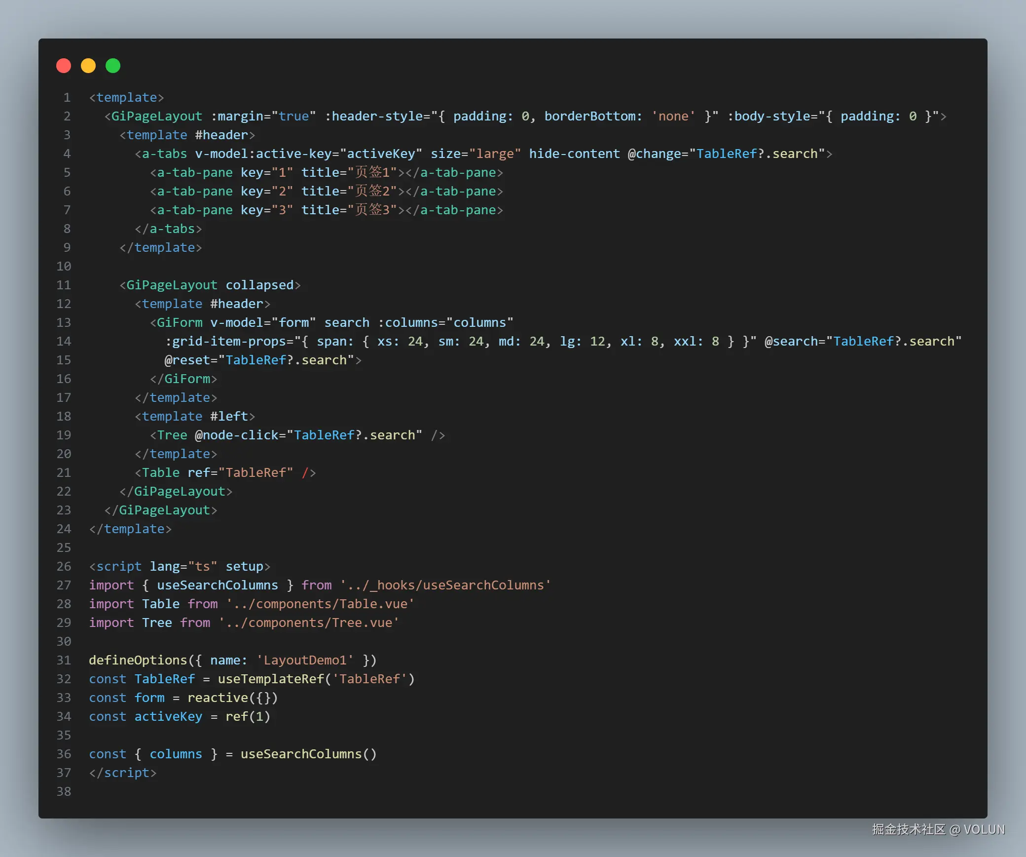
index.vue
vue
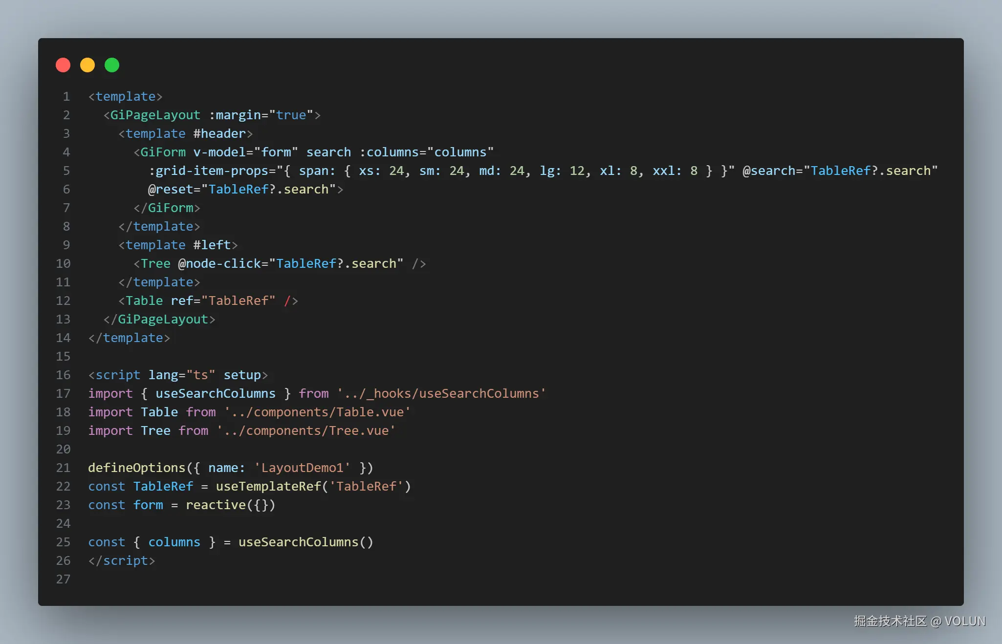
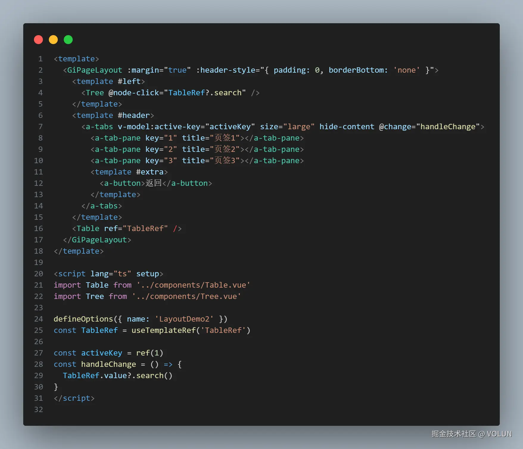
<template>
  <a-split v-model:size="size" class="gi-page-layout" :class="getClass" min="1px" max="600px" :disabled="!slots.left">
    <template #first>
      <div v-if="slots.left" class="gi-page-layout__left" :style="props.leftStyle">
        <slot name="left"></slot>
      </div>
    </template>
    <template #second>
      <div v-if="slots.header" class="gi-page-layout__header" :style="props.headerStyle">
        <slot name="header"></slot>
      </div>
      <div class="gi-page-layout__body" :style="props.bodyStyle">
        <slot></slot>
      </div>
    </template>
    <template v-if="props.collapsed || isMobile" #resize-trigger-icon>
      <SplitButton :collapsed="parseInt(size) < 20" @click="handleClick"></SplitButton>
    </template>
  </a-split>
</template>

<script setup lang='ts'>
import type { CSSProperties } from 'vue'
import { browse } from 'xe-utils'
import SplitButton from './SplitButton.vue'

defineOptions({ name: 'GiPageLayout' })

const props = withDefaults(defineProps<Props>(), {
  size: '270px',
  margin: false,
  inner: false,
  headerBordered: true,
  leftStyle: () => ({}),
  headerStyle: () => ({}),
  bodyStyle: () => ({}),
  collapsed: false
})

/** 组件插槽定义 */
defineSlots<{
  header: () => void
  left: () => void
  default: () => void
}>()

const slots = useSlots()
const isMobile = browse().isMobile ?? false
const size = ref(isMobile ? '0px' : props.size)
const collapseing = ref(false)

const getClass = computed(() => {
  return {
    'gi-page-layout--disabled': !slots.left,
    'gi-page-layout--margin': props.margin,
    'gi-page-layout--inner': props.inner,
    'gi-page-layout--has-header': slots.header,
    'gi-page-layout--header-bordered': props.headerBordered,
    'gi-page-layout--collapseing': collapseing.value
  }
})

/** 组件属性定义 */
interface Props {
  size?: string
  margin?: boolean
  inner?: boolean
  headerBordered?: boolean
  leftStyle?: CSSProperties
  headerStyle?: CSSProperties
  bodyStyle?: CSSProperties
  collapsed?: boolean
}

function handleClick() {
  collapseing.value = true
  setTimeout(() => {
    collapseing.value = false
  }, 300)
  size.value = Number.parseInt(size.value) > 20 ? '0px' : props.size
}
</script>

<style lang='scss' scoped>
:deep(.arco-split-pane) {
  height: 100%;
  overflow: hidden;
  display: flex;
  flex-direction: column;
}

:deep(.arco-split-trigger) {
  position: relative;
}

:deep(.arco-split-trigger-icon-wrapper) {
  position: absolute;
  top: 50%;
  left: 50%;
  transform: translate(-50%, -50%);
  width: 16px;
  height: 100%;
  background-color: transparent;

  .arco-split-trigger-icon {
    display: none;
  }

  &:hover,
  &:active {
    &::before {
      width: 2px;
      background-color: var(--color-primary-light-2);
    }
  }

  &::before {
    content: '';
    width: 1px;
    height: 100%;
    position: absolute;
    top: 0;
    left: 50%;
    transform: translateX(-50%);
    background-color: var(--color-border-2);
  }
}

.gi-page-layout {
  flex: 1;
  width: auto;
  height: 100%;
  display: flex;
  overflow: hidden;
  box-sizing: border-box;
  background-color: var(--color-bg-1);
}

.gi-page-layout--margin {
  margin: $margin;
}

.gi-page-layout--has-header {
  .gi-page-layout__body {
    padding-top: 8px;
  }
}

.gi-page-layout--inner {
  .gi-page-layout__header {
    padding: 0;
  }

  .gi-page-layout__body {
    padding-left: 0;
    padding-right: 0;
    padding-bottom: 0;
  }
}

.gi-page-layout--header-bordered {
  .gi-page-layout__header {
    border-bottom: 1px solid var(--color-border);
  }
}

.gi-page-layout--disabled {
  :deep(> .arco-split-pane-first) {
    display: none;
  }
}

.gi-page-layout--collapseing {
  :deep(> .arco-split-pane-first) {
    transition: flex-basis 0.3s;
  }
}

.gi-page-layout__left {
  height: 100%;
  padding: $padding;
  display: flex;
  flex-direction: column;
  overflow: hidden;
  box-sizing: border-box;
}

.gi-page-layout__header {
  box-sizing: border-box;
  padding: $padding;
  padding-bottom: 0;
}

.gi-page-layout__body {
  padding: $padding;
  flex: 1;
  display: flex;
  flex-direction: column;
  overflow: hidden;
  box-sizing: border-box;
}
</style>
SplitButton.vue
vue
<!--
  @file GiSplitButton 组件 - 分割面板切换按钮
  @description 提供可折叠面板的切换按钮,支持多种样式和交互效果
-->
<template>
  <div class="gi-split-button" :class="buttonClass" @click="handleClick">
    <icon-right v-if="collapsed" :size="iconSize" />
    <icon-left v-else :size="iconSize" />
  </div>
</template>

<script setup lang="ts">
import { computed } from 'vue'

/** 按钮类型 */
type ButtonType = 'default' | 'circle'

/** 组件属性定义 */
interface Props {
  /** 是否折叠状态 */
  collapsed?: boolean
  /** 按钮类型 */
  type?: ButtonType
  /** 图标大小 */
  iconSize?: number
  /** 是否禁用 */
  disabled?: boolean
}

/** 组件事件定义 */
interface Emits {
  (e: 'click'): void
  (e: 'update:collapsed', value: boolean): void
}

const props = withDefaults(defineProps<Props>(), {
  collapsed: false,
  type: 'circle',
  iconSize: 14,
  disabled: false
})

const emit = defineEmits<Emits>()

/** 计算按钮类名 */
const buttonClass = computed(() => [
  `gi-split-button--${props.type}`,
  {
    'is-collapsed': props.collapsed,
    'is-disabled': props.disabled
  }
])

/** 处理点击事件 */
const handleClick = () => {
  if (props.disabled) return
  emit('click')
  emit('update:collapsed', !props.collapsed)
}
</script>

<style lang="scss" scoped>
.gi-split-button {
  position: absolute;
  top: 50%;
  transform: translateY(-50%);
  display: flex;
  justify-content: center;
  align-items: center;
  z-index: 2;
  border: 1px solid var(--color-border-2);
  background-color: var(--color-bg-1);
  box-sizing: border-box;
  cursor: pointer;
  transition: all 0.3s cubic-bezier(0.4, 0, 0.2, 1);
  will-change: transform, background-color, border-color;

  &.is-disabled {
    cursor: not-allowed;
    opacity: 0.6;
    pointer-events: none;
  }

  &--default {
    width: 18px;
    height: 40px;
    left: 0;
    box-shadow: 2px 0 6px rgba(0, 0, 0, 0.1);
  }

  &--circle {
    width: 24px;
    height: 24px;
    border-radius: 50%;
    left: -4px;
    overflow: hidden;
    box-shadow: 0 4px 10px rgba(0, 0, 0, 0.1);
  }
}
</style>