给于2个div块状元素的布局
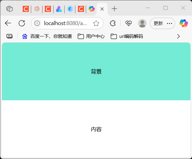
方案1:横向并排(Flex Row)
<template>
  <div class="container">
    <div class="background">背景</div>
    <div class="panel">内容</div>
  </div>
</template>

<script>
export default { name: 'FlexRowLayout' };
</script>

<style scoped>
.container {
  display: flex;
  height: 100vh;
}
.background {
  flex: 1;
  background: #74ebd5;
}
.panel {
  flex: 1;
  background: #fff;
  display: flex;
  justify-content: center;
  align-items: center;
}
</style>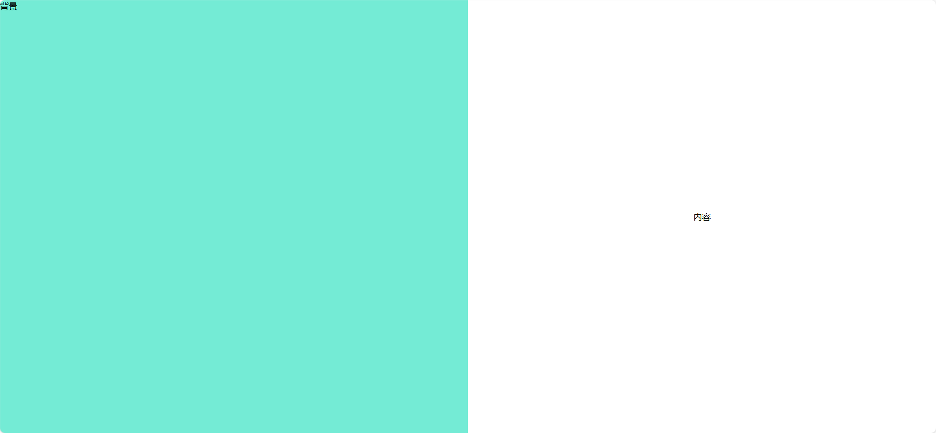
方案2:纵向堆叠(Flex Column)
<template>
  <div class="container">
    <div class="background">背景</div>
    <div class="panel">内容</div>
  </div>
</template>

<script>
export default { name: 'FlexColumnLayout' };
</script>

<style scoped>
.container {
  display: flex;
  flex-direction: column;
  height: 100vh;
}
.background {
  flex: 1;
  background: #9face6;
}
.panel {
  flex: 1;
  background: #fff;
  display: flex;
  justify-content: center;
  align-items: center;
}
</style>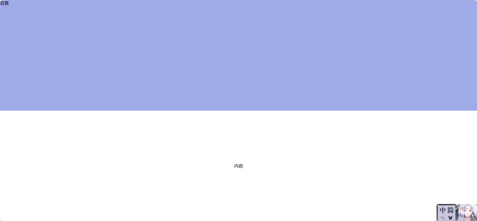
方案3:层叠覆盖(绝对定位)
<template>
  <div class="container">
    <div class="background"></div>
    <div class="panel">内容</div>
  </div>
</template>

<script>
export default { name: 'OverlayLayout' };
</script>

<style scoped>
.container {
  position: relative;
  width: 100vw;
  height: 100vh;
}
.background {
  position: absolute;
  width: 100%;
  height: 100%;
  background: #74ebd5;
  z-index: 0;
}
.panel {
  position: absolute;
  width: 400px;
  height: 300px;
  background: white;
  top: 50%;
  left: 50%;
  transform: translate(-50%, -50%);
  z-index: 1;
  box-shadow: 0 0 20px rgba(0,0,0,0.2);
}
</style>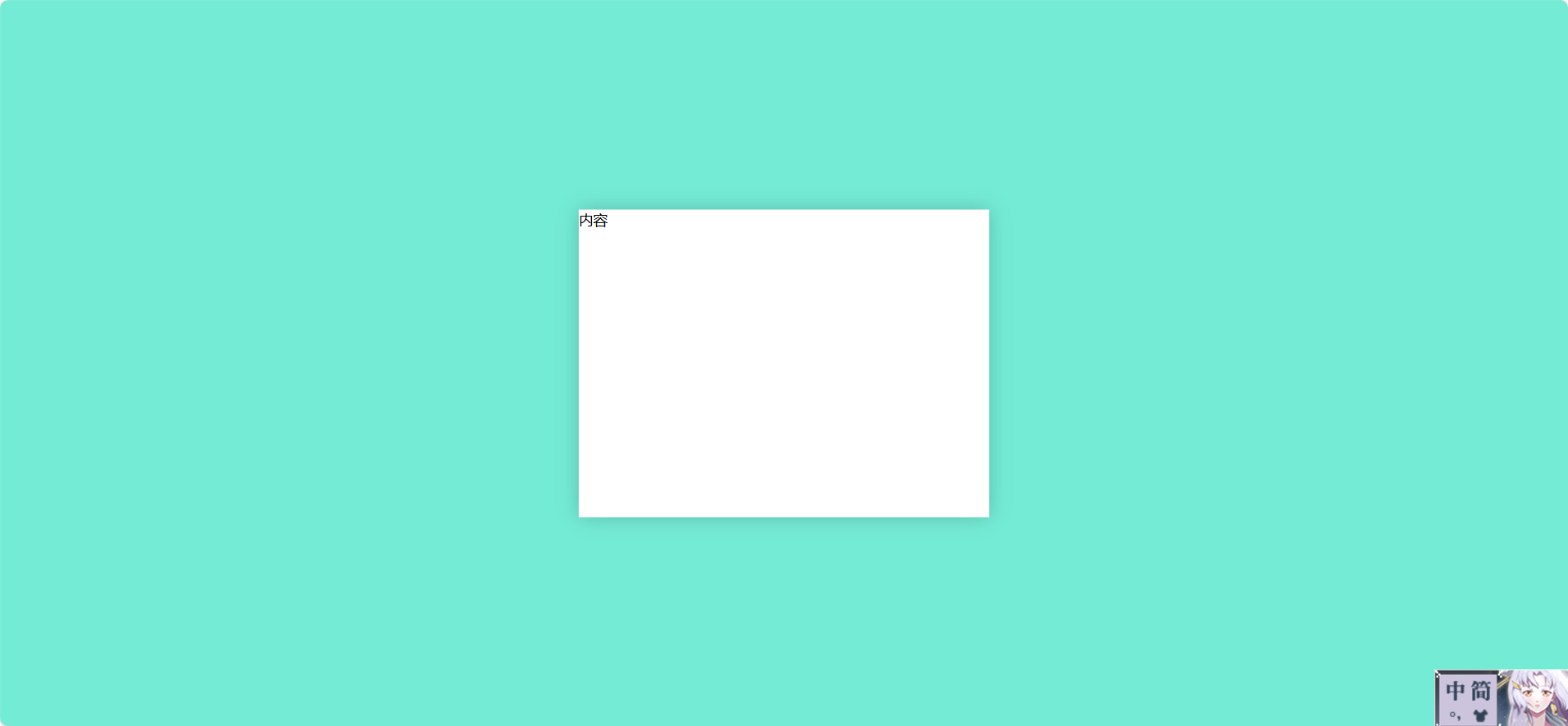
方案4:左右对齐(float)
<template>
  <div class="container">
    <div class="background">背景</div>
    <div class="panel">内容</div>
  </div>
</template>

<script>
export default { name: 'FloatLayout' };
</script>

<style scoped>
.container {
  height: 100vh;
}
.background {
  float: left;
  width: 50%;
  height: 100%;
  background: #74ebd5;
}
.panel {
  float: right;
  width: 50%;
  height: 100%;
  background: #fff;
  display: flex;
  justify-content: center;
  align-items: center;
}
</style>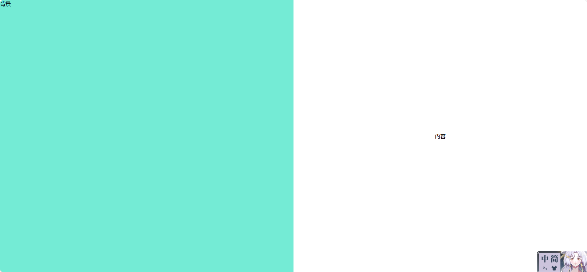
方案5:Grid 网格布局
<template>
  <div class="container">
    <div class="background">背景</div>
    <div class="panel">内容</div>
  </div>
</template>

<script>
export default { name: 'GridLayout' };
</script>

<style scoped>
.container {
  display: grid;
  grid-template-columns: 1fr 1fr;
  height: 100vh;
}
.background {
  background: #74ebd5;
}
.panel {
  background: #fff;
  display: flex;
  justify-content: center;
  align-items: center;
}
</style>
方案6:固定浮动按钮 + 居中内容
<template>
  <div class="container">
    <div class="background"></div>
    <div class="panel">内容</div>
    <button class="float-btn" @click="toggle">切换</button>
  </div>
</template>

<script>
export default {
  name: 'FloatingButtonLayout',
  data() {
    return { center: true };
  },
  methods: {
    toggle() {
      this.center = !this.center;
    }
  }
};
</script>

<style scoped>
.container {
  position: relative;
  width: 100vw;
  height: 100vh;
}
.background {
  position: absolute;
  width: 100%;
  height: 100%;
  background: #9face6;
  z-index: 0;
}
.panel {
  position: absolute;
  width: 400px;
  height: 300px;
  background: white;
  z-index: 1;
  transition: all 0.3s ease;
  top: 50%;
  left: 50%;
  transform: translate(-50%, -50%);
}
.container:not(.center) .panel {
  left: 60px;
  top: 50%;
  transform: translateY(-50%);
}
.float-btn {
  position: fixed;
  top: 20px;
  right: 20px;
  z-index: 999;
}
</style>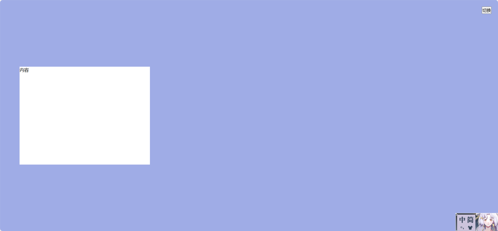
方案 7:卡片悬浮 + 背景渐变
效果:背景是渐变色,内容块居中悬浮,带阴影和圆角。
<template>
  <div class="container">
    <div class="background"></div>
    <div class="card">欢迎回来!</div>
  </div>
</template>

<script>
export default { name: 'CardFloatLayout' };
</script>

<style scoped>
.container {
  position: relative;
  width: 100vw;
  height: 100vh;
}
.background {
  position: absolute;
  width: 100%;
  height: 100%;
  background: linear-gradient(135deg, #667eea, #764ba2);
}
.card {
  position: absolute;
  top: 50%;
  left: 50%;
  transform: translate(-50%, -50%);
  width: 360px;
  padding: 40px;
  background: white;
  border-radius: 12px;
  box-shadow: 0 20px 40px rgba(0,0,0,0.3);
}
</style>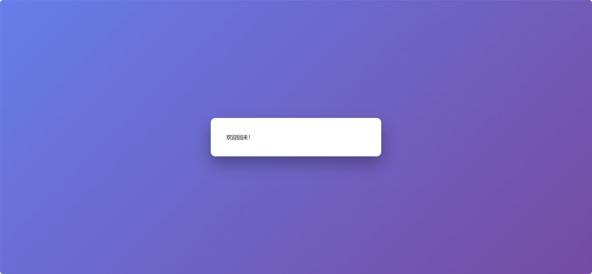
方案 8:背景视频 + 登录框
效果:背景是自动播放的视频,登录框居中覆盖。
<template>
  <div class="container">
    <video class="background" autoplay muted loop>
      <source src="your-video.mp4" type="video/mp4" />
    </video>
    <div class="panel">登录</div>
  </div>
</template>

<script>
export default { name: 'VideoBackgroundLayout' };
</script>

<style scoped>
.container {
  position: relative;
  width: 100vw;
  height: 100vh;
  overflow: hidden;
}
.background {
  position: absolute;
  width: 100%;
  height: 100%;
  object-fit: cover;
}
.panel {
  position: absolute;
  top: 50%;
  left: 50%;
  transform: translate(-50%, -50%);
  background: rgba(255,255,255,0.9);
  padding: 30px;
  border-radius: 10px;
  box-shadow: 0 0 20px rgba(0,0,0,0.3);
}
</style>
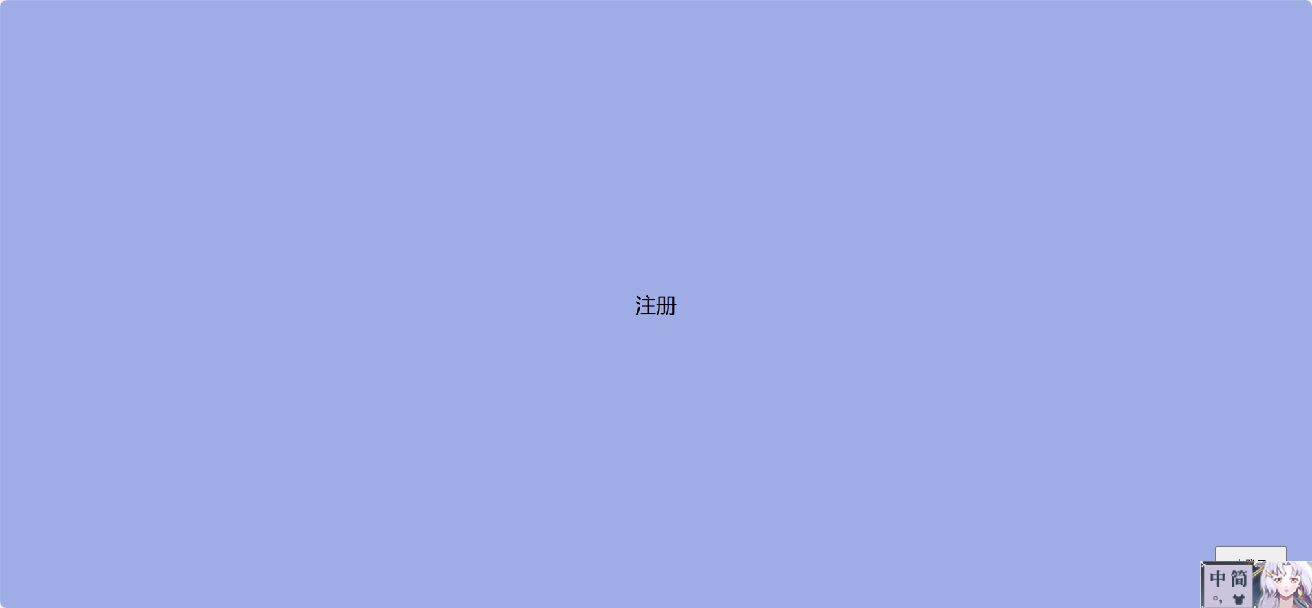
方案 9:左右滑动切换布局(登录/注册)
效果:两个块分别是登录和注册界面,通过按钮滑动切换。
<template>
  <div class="container">
    <div class="slider" :class="{ active: isRegister }">
      <div class="panel login">登录</div>
      <div class="panel register">注册</div>
    </div>
    <button class="toggle-btn" @click="isRegister = !isRegister">
      {{ isRegister ? '去登录' : '去注册' }}
    </button>
  </div>
</template>

<script>
export default {
  name: 'SlideSwitchLayout',
  data() {
    return { isRegister: false };
  }
};
</script>

<style scoped>
.container {
  position: relative;
  width: 100vw;
  height: 100vh;
  overflow: hidden;
}
.slider {
  display: flex;
  width: 200%;
  height: 100%;
  transition: transform 0.5s ease;
}
.slider.active {
  transform: translateX(-50%);
}
.panel {
  width: 50%;
  display: flex;
  justify-content: center;
  align-items: center;
  font-size: 24px;
  background: #f0f0f0;
}
.login {
  background: #74ebd5;
}
.register {
  background: #9face6;
}
.toggle-btn {
  position: fixed;
  bottom: 30px;
  right: 30px;
  padding: 10px 20px;
}
</style>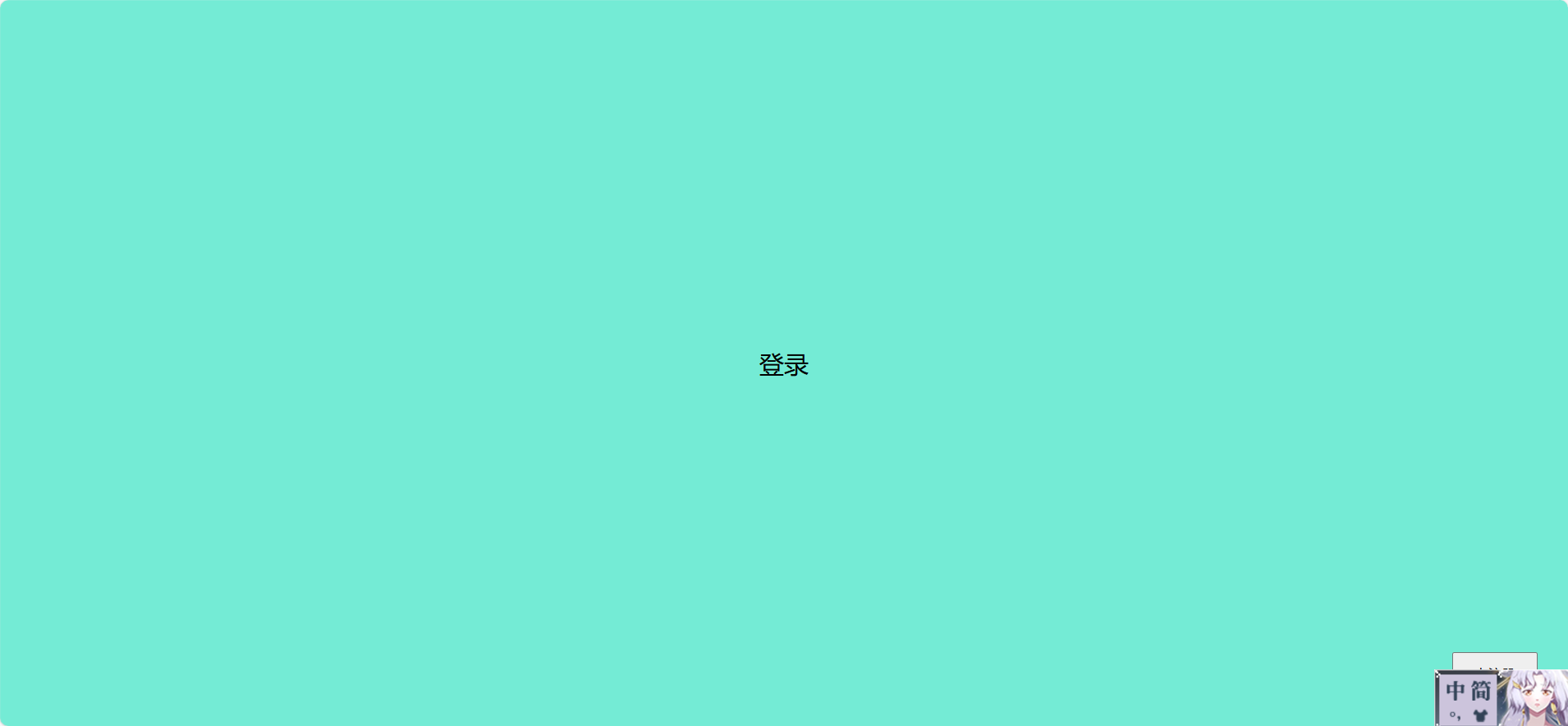
点击右下按钮会转到去注册
方案 10:响应式折叠布局(移动端优化)
效果:大屏幕左右并排,小屏幕上下堆叠。
<template>
  <div class="container">
    <div class="background">背景</div>
    <div class="panel">内容</div>
  </div>
</template>

<script>
export default { name: 'ResponsiveLayout' };
</script>

<style scoped>
.container {
  display: flex;
  flex-direction: row;
  height: 100vh;
}
.background, .panel {
  flex: 1;
  display: flex;
  justify-content: center;
  align-items: center;
}
.background {
  background: #74ebd5;
}
.panel {
  background: #fff;
}
@media (max-width: 768px) {
  .container {
    flex-direction: column;
  }
}
</style>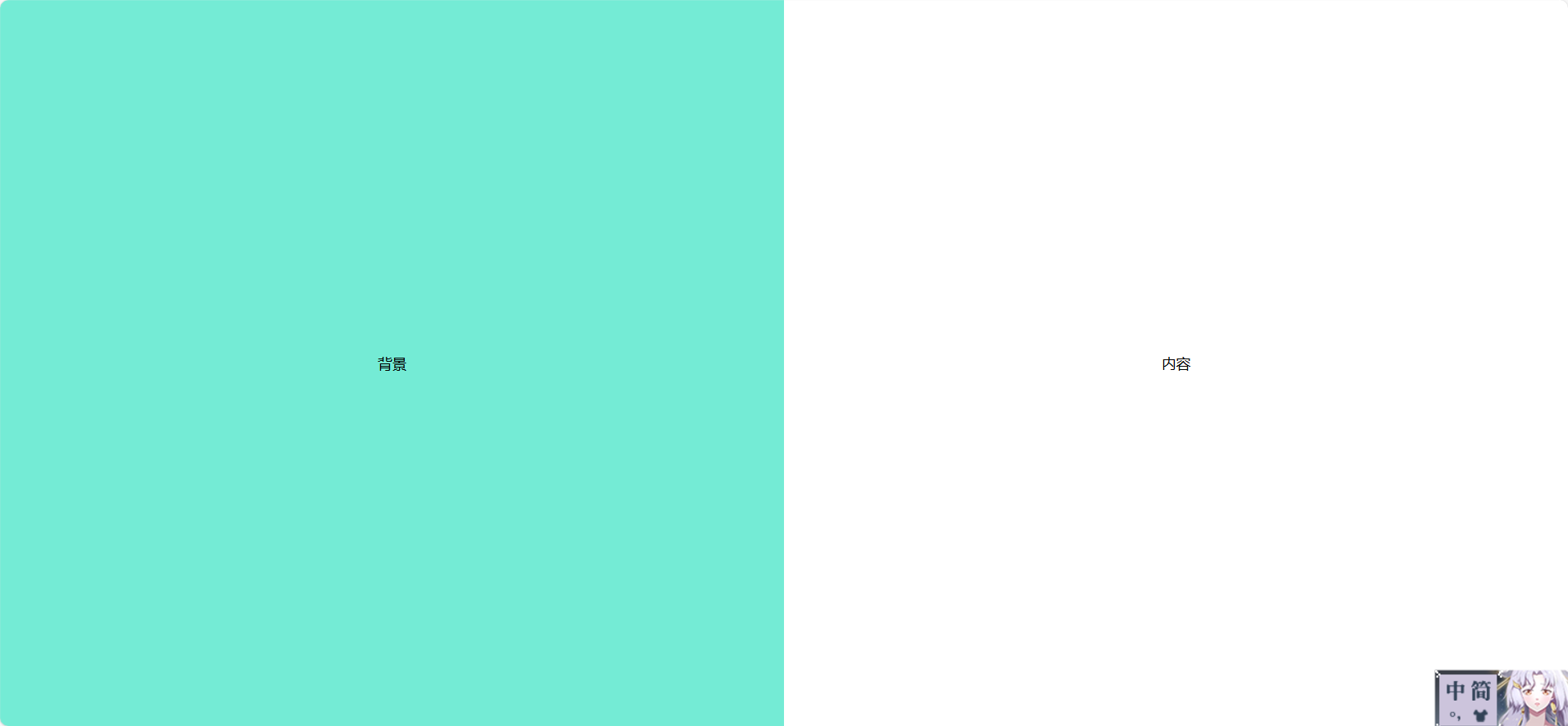
方案 11:分屏滑动布局(左右滑入)
效果:两个块初始隐藏,页面加载时从左右滑入,制造动态分屏感。
<template>
  <div class="container">
    <div class="left" :class="{ active: show }">左侧内容</div>
    <div class="right" :class="{ active: show }">右侧内容</div>
  </div>
</template>

<script>
export default {
  name: 'SplitSlideLayout',
  data() {
    return { show: false };
  },
  mounted() {
    setTimeout(() => (this.show = true), 300);
  }
};
</script>

<style scoped>
.container {
  position: relative;
  width: 100vw;
  height: 100vh;
  overflow: hidden;
}
.left, .right {
  position: absolute;
  width: 50%;
  height: 100%;
  top: 0;
  transition: transform 0.6s ease;
  display: flex;
  justify-content: center;
  align-items: center;
  font-size: 24px;
  color: white;
}
.left {
  left: 0;
  background: #667eea;
  transform: translateX(-100%);
}
.right {
  right: 0;
  background: #764ba2;
  transform: translateX(100%);
}
.left.active {
  transform: translateX(0);
}
.right.active {
  transform: translateX(0);
}
</style>
方案 12:登录框拖拽布局
效果:用户可以拖动登录框在页面任意位置,增强交互性。
<template>
  <div class="container">
    <div class="background"></div>
    <div
      class="panel"
      :style="{ top: y + 'px', left: x + 'px' }"
      @mousedown="startDrag"
    >
      拖我试试
    </div>
  </div>
</template>

<script>
export default {
  name: 'DraggableLogin',
  data() {
    return { x: 200, y: 200, dragging: false, offsetX: 0, offsetY: 0 };
  },
  methods: {
    startDrag(e) {
      this.dragging = true;
      this.offsetX = e.clientX - this.x;
      this.offsetY = e.clientY - this.y;
      document.addEventListener('mousemove', this.onDrag);
      document.addEventListener('mouseup', this.stopDrag);
    },
    onDrag(e) {
      if (this.dragging) {
        this.x = e.clientX - this.offsetX;
        this.y = e.clientY - this.offsetY;
      }
    },
    stopDrag() {
      this.dragging = false;
      document.removeEventListener('mousemove', this.onDrag);
      document.removeEventListener('mouseup', this.stopDrag);
    }
  }
};
</script>

<style scoped>
.container {
  position: relative;
  width: 100vw;
  height: 100vh;
}
.background {
  position: absolute;
  width: 100%;
  height: 100%;
  background: #9face6;
}
.panel {
  position: absolute;
  width: 300px;
  height: 200px;
  background: white;
  border-radius: 8px;
  box-shadow: 0 0 20px rgba(0,0,0,0.3);
  cursor: move;
  display: flex;
  justify-content: center;
  align-items: center;
}
</style>
方案 13:背景渐变切换 + 登录框淡入
效果:背景颜色渐变切换,登录框淡入,适合欢迎页或品牌展示。
<template>
  <div class="container" :class="bgClass">
    <div class="panel">欢迎回来</div>
  </div>
</template>

<script>
export default {
  name: 'GradientSwitchLayout',
  data() {
    return { bgClass: 'bg1' };
  },
  mounted() {
    setInterval(() => {
      this.bgClass = this.bgClass === 'bg1' ? 'bg2' : 'bg1';
    }, 3000);
  }
};
</script>

<style scoped>
.container {
  position: relative;
  width: 100vw;
  height: 100vh;
  transition: background 1s ease;
}
.bg1 {
  background: linear-gradient(to right, #ff9a9e, #fad0c4);
}
.bg2 {
  background: linear-gradient(to right, #a1c4fd, #c2e9fb);
}
.panel {
  position: absolute;
  top: 50%;
  left: 50%;
  transform: translate(-50%, -50%);
  background: white;
  padding: 40px;
  border-radius: 10px;
  box-shadow: 0 0 30px rgba(0,0,0,0.2);
  animation: fadeIn 1s ease;
}
@keyframes fadeIn {
  from { opacity: 0; transform: translate(-50%, -60%); }
  to { opacity: 1; transform: translate(-50%, -50%); }
}
</style>
方案 14:左右互换布局方案(Float 或 Flex)
✅ 效果说明
-
两个块并排显示:左边是 A,右边是 B。
-
点击按钮后,A 和 B 互换位置。
-
可用于登录页、信息展示页、对比页等场景。
💡 Vue 2 示例代码
<template>
  <div class="container">
    <div :class="leftClass">左侧内容</div>
    <div :class="rightClass">右侧内容</div>
    <button class="switch-btn" @click="swap">切换位置</button>
  </div>
</template>

<script>
export default {
  name: 'SwapLayout',
  data() {
    return {
      swapped: false
    };
  },
  computed: {
    leftClass() {
      return this.swapped ? 'block right' : 'block left';
    },
    rightClass() {
      return this.swapped ? 'block left' : 'block right';
    }
  },
  methods: {
    swap() {
      this.swapped = !this.swapped;
    }
  }
};
</script>

<style scoped>
.container {
  position: relative;
  width: 100vw;
  height: 100vh;
}
.block {
  position: absolute;
  width: 50%;
  height: 100%;
  display: flex;
  justify-content: center;
  align-items: center;
  font-size: 24px;
  transition: all 0.4s ease;
}
.left {
  left: 0;
  background: #74ebd5;
}
.right {
  right: 0;
  background: #9face6;
}
.switch-btn {
  position: fixed;
  bottom: 30px;
  right: 30px;
  padding: 10px 20px;
  z-index: 999;
}
</style>
🧠 技术要点
-
使用
position: absolute+left/right控制位置。 -
用
computed动态切换类名实现互换。 -
加上
transition实现平滑过渡。
🚀 可扩展方向
-
加入动画:滑动、淡入淡出、翻转。
-
内容块支持 slot 或组件嵌套。
-
响应式适配:小屏幕下上下堆叠。
-
多种布局模式切换:并排、覆盖、居中。