1.transition过渡
可以为一个元素在不同状态之间进行切换时添加过渡效果,实现不同状态间的变化效果。通过触发事件(鼠标悬停、点击等),在两个状态间切换。
1.1 使用
语法:transition: property duration timing-function delay;
-
property :过渡属性(如
background-color,all表示所有属性)。 -
duration :持续时间(如
0.3s),必须设置。 -
timing-function :速度曲线(
ease、linear、cubic-bezier()等)。 -
delay :延迟时间(如
0.2s)
示例代码:表示当鼠标悬停在img标签时,宽高从200×200变为500×400。
html
<style>
    img {
        width:200px;
        height:200px;

        transition:all 1s;
        /*all表示对自身所有属性都加上过渡效果,若要单独让某个属性添加过渡则写具体的css属性,1s表示过渡效果的时间*/
    }
    img:hover {
        width:500px;
        height:400px;
    }
</style>

<img src="#">
2. animation动画
通过关键帧定义复杂动画序列,支持自动播放和循环,允许在复数个状态间进行切换,且可以在页面加载时自动开始运行,不需要事件触发。
2.1 使用
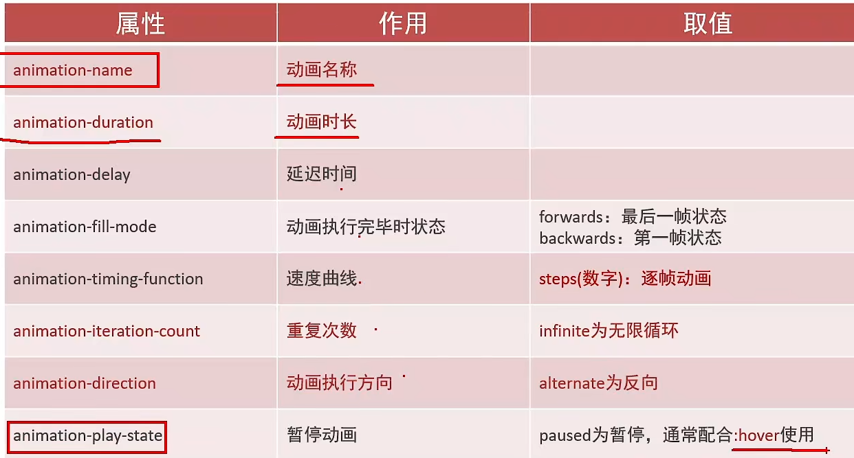
语法:animation: name duration timing-function delay iteration-count direction fill-mode;
-
name :
@keyframes定义的动画名。 -
iteration-count :播放次数(
infinite为无限循环)。 -
direction :播放方向(
alternate交替播放)。 -
fill-mode :动画结束状态(
forwards保留最后一帧)。
代码示例:修改box盒子的background-color属性,从红色变为黄色。
html
<style>
	@keyframes example {
 /* from(等价于 0%):动画起始状态;to(等价于 100%):动画结束状态,可通过百分比定义中间状态(如 50% {background-color: blue;} */
  		from {background-color: red;}
  		to {background-color: yellow;}
}

.box {
  width: 100px;
  height: 100px;
  background-color: red;
    /* 引用关键帧,过渡时间为5s, infinite为动画无限循环 */
  animation: example 5s infinite;
}
</style>