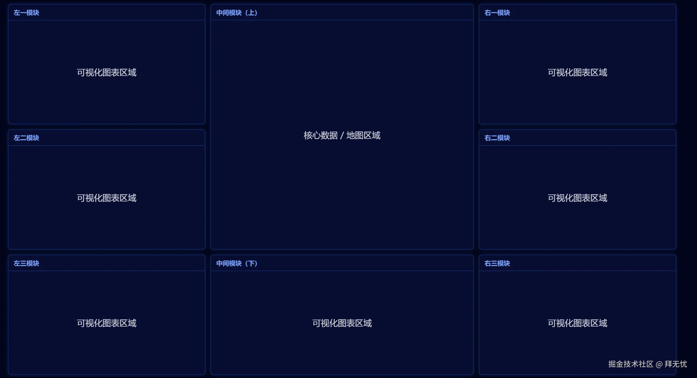
 大屏可视化布局(桌面三列,移动/平板单列) 大屏缩放容器(桌面端等比缩放;移动/平板关闭缩放)
xml
<!DOCTYPE html>
<html lang="zh-CN">
<head>
  <meta charset="UTF-8" />
  <meta name="viewport" content="width=device-width, initial-scale=1.0" />
  <title>大屏可视化布局(桌面三列,移动/平板单列)</title>
  <style>
    /* 重置与基础样式 */
    * { margin: 0; padding: 0; box-sizing: border-box; }
    html, body { height: 100%; }
    body {
      background-color: #010419;
      color: #fff;
      font-family: "Microsoft YaHei", -apple-system, BlinkMacSystemFont, "Segoe UI", Roboto, "Helvetica Neue", Arial, sans-serif;
    }

    /* 大屏缩放容器(桌面端等比缩放;移动/平板关闭缩放) */
    .screen-container {
      width: 1920px;   /* 设计稿宽度 */
      height: 1080px;  /* 设计稿高度 */
      position: absolute;
      top: 0;
      left: 0;
      transform-origin: 0 0;
      transition: transform 0.25s ease;
    }

    /* 主布局:桌面端使用 CSS Grid,确保底部三块等高、横向对齐 */
    .main-grid {
      width: 100%;
      height: 100%;
      padding: 15px;
      display: grid;
      grid-template-columns: 3fr 4fr 3fr;  /* 左3 : 中4 : 右3 */
      grid-template-rows: 1fr 1fr 1fr;     /* 三行等高,确保底部行高度一致 */
      gap: 15px;
      grid-template-areas:
        "left1  centerTop    right1"
        "left2  centerTop    right2"
        "left3  centerBottom right3";
    }

    /* 将各模块绑定到命名区域 */
    #left-1        { grid-area: left1; }
    #left-2        { grid-area: left2; }
    #left-3        { grid-area: left3; }
    #center-top    { grid-area: centerTop; }
    #center-bottom { grid-area: centerBottom; }
    #right-1       { grid-area: right1; }
    #right-2       { grid-area: right2; }
    #right-3       { grid-area: right3; }

    /* 面板通用样式 */
    .panel {
      background: rgba(20, 31, 107, 0.3);
      border: 1px solid #1a3a8b;
      border-radius: 8px;
      box-shadow: 0 0 10px rgba(26, 58, 139, 0.5);
      display: flex;
      flex-direction: column;
      min-width: 0; /* 防止内部内容撑破容器 */
      overflow: hidden;
    }
    .panel-title {
      padding: 10px 15px;
      font-size: 18px;
      font-weight: bold;
      color: #79a1fa;
      border-bottom: 1px solid #1a3a8b;
      white-space: nowrap;
      overflow: hidden;
      text-overflow: ellipsis;
    }
    .panel-content {
      flex: 1;
      padding: 15px;
      display: flex;
      justify-content: center;
      align-items: center;
      font-size: 24px;
      opacity: 0.8;
      -webkit-overflow-scrolling: touch;
      overscroll-behavior: contain;
    }

    /* 移动端 + 平板:统一单列 */
    @media (max-width: 1024px) {
      /* 关闭等比缩放,交由响应式布局 */
      .screen-container {
        position: static;
        width: 100%;
        height: auto;
        transform: none !important;
        top: 0;
        left: 0;
      }

      .main-grid {
        grid-template-columns: 1fr;
        grid-auto-rows: auto;
        /* 单列下的展示顺序(可按需调整) */
        grid-template-areas:
          "centerTop"
          "centerBottom"
          "left1"
          "left2"
          "left3"
          "right1"
          "right2"
          "right3";
        gap: 12px;
        padding: 12px;
      }

      .panel {
        min-height: clamp(200px, 28vh, 360px);
      }
      .panel-title {
        font-size: clamp(16px, 2.6vw, 18px);
      }
      .panel-content {
        font-size: clamp(14px, 2.8vw, 18px);
      }
    }
  </style>
</head>
<body>
  <div class="screen-container" id="screen-container">
    <div class="main-grid">
      <!-- 左边三块 -->
      <div class="panel" id="left-1">
        <div class="panel-title">左一模块</div>
        <div class="panel-content">可视化图表区域</div>
      </div>
      <div class="panel" id="left-2">
        <div class="panel-title">左二模块</div>
        <div class="panel-content">可视化图表区域</div>
      </div>
      <div class="panel" id="left-3">
        <div class="panel-title">左三模块</div>
        <div class="panel-content">可视化图表区域</div>
      </div>

      <!-- 中间两块(上方跨两行) -->
      <div class="panel" id="center-top">
        <div class="panel-title">中间模块(上)</div>
        <div class="panel-content">核心数据 / 地图区域</div>
      </div>
      <div class="panel" id="center-bottom">
        <div class="panel-title">中间模块(下)</div>
        <div class="panel-content">可视化图表区域</div>
      </div>

      <!-- 右边三块 -->
      <div class="panel" id="right-1">
        <div class="panel-title">右一模块</div>
        <div class="panel-content">可视化图表区域</div>
      </div>
      <div class="panel" id="right-2">
        <div class="panel-title">右二模块</div>
        <div class="panel-content">可视化图表区域</div>
      </div>
      <div class="panel" id="right-3">
        <div class="panel-title">右三模块</div>
        <div class="panel-content">可视化图表区域</div>
      </div>
    </div>
  </div>

  <script>
    // 桌面端大屏自适应等比缩放;移动/平板(<=1024px)关闭缩放
    function handleScreenResize() {
      const container = document.getElementById('screen-container');
      if (!container) return;

      const designWidth = 1920;
      const designHeight = 1080;
      const clientWidth = document.documentElement.clientWidth;
      const clientHeight = document.documentElement.clientHeight;

      // 移动 + 平板使用响应式单列,不缩放
      const BREAKPOINT = 1024;
      if (clientWidth <= BREAKPOINT) {
        container.style.transform = 'none';
        container.style.top = '0';
        container.style.left = '0';
        return;
      }

      const scale = Math.min(clientWidth / designWidth, clientHeight / designHeight);
      const realWidth = designWidth * scale;
      const realHeight = designHeight * scale;
      const top = (clientHeight - realHeight) / 2;
      const left = (clientWidth - realWidth) / 2;

      container.style.transform = `scale(${scale})`;
      container.style.top = `${top}px`;
      container.style.left = `${left}px`;
    }

    window.addEventListener('load', handleScreenResize);
    window.addEventListener('resize', handleScreenResize);
  </script>
</body>
</html>