利用径向柱图探索西班牙语学习数据
python
import matplotlib as mpl
import matplotlib.pyplot as plt
from matplotlib.cm import ScalarMappable
from matplotlib.lines import Line2D
import matplotlib.patches as mpatches
from matplotlib.patches import Patch
from textwrap import wrap

import numpy as np
import pandas as pd
from mpl_toolkits.axes_grid1.inset_locator import inset_axes
数据探索
以下数据如果有需要的同学可关注公众号HsuHeinrich,回复【数据可视化】自动获取~
python
df = pd.read_csv('https://raw.githubusercontent.com/holtzy/The-Python-Graph-Gallery/master/static/data/polar_data.csv')
df.head()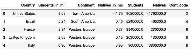
Country:国家地区
Continent:大陆
Students_in_mil:学习者人数(百万)
Natives_in_mil:母语人数(百万)
绘制径向柱图
python
# 基本变量

# 颜色
COLORS = ['#914F76','#A2B9B6','tan','#4D6A67','#F9A03F','#5B2E48','#2B3B39']
cmap = mpl.colors.LinearSegmentedColormap.from_list("my color", COLORS, N=7)

# 颜色标准化
NUMBERS = df['Cont_code'].values
norm = mpl.colors.Normalize(vmin= NUMBERS.min(), vmax= NUMBERS.max())
COLORS = cmap(norm(NUMBERS))
python
# 字体初始化
plt.rcParams.update({"font.family": "Times"}) # 默认字体
plt.rcParams["text.color"] = "#1f1f1f" # 默认字体颜色
plt.rc("axes", unicode_minus=False) # 处理减号在特殊字体不可用的情况,禁用并改为连字符

# 初始化布局
fig, ax = plt.subplots(figsize=(7, 12.6), subplot_kw={"projection": "polar"})

# 设置图形和周的背景色
fig.patch.set_facecolor("white")
ax.set_facecolor("white")

ax.set_theta_offset(1.2 * np.pi / 2) # 默认偏移量
ax.set_ylim(0, 45000000)
ax.set_yscale('symlog', linthresh=500000) # y轴对称对数缩放:绝对值小于linthresh,则使用线性缩放,否则使用对数缩放

# 条形图
ANGLES = np.linspace(0.05, 2*np.pi - 0.05, len(df), endpoint = False)
LENGTHS = df['Students'].values
ax.bar(ANGLES, LENGTHS,
       color=COLORS, alpha=0.5,
       width=0.3, zorder=11,
       label='Spanish Learners')

# 添加虚线辅助参考各国家位置
ax.vlines(ANGLES, 0, 45000000, color="#1f1f1f", ls=(0, (4, 4)), zorder=11)

# 添加点表示母语西班牙语的人数
MEAN_GAIN = df['Natives'].values
ax.scatter(ANGLES, MEAN_GAIN, s=80, color= COLORS, zorder=11, label = 'Native Spanish Speakers')

# 添加Country的标签
REGION = ["\n".join(wrap(r, 5, break_long_words=False)) for r in df['Country'].values]

# 设置刻度位置、刻度标签
ax.set_xticks(ANGLES)
ax.set_xticklabels(REGION, size=12)
ax.set_yticks(np.arange(0,45000000,
                        step=5000000))

# 标题与副标题
plt.suptitle('Top Countries with Spanish Learners',
             size = 20, y = 0.95)
plt.title('And their Native Spanish Speaking Population',
          style = 'italic', size = 14, pad = 85)

# 添加参考线:1M~45M
PAD = 10
ax.text(-0.75 * np.pi / 2, 1000000 + PAD, "1M", ha="right", size=12)
ax.text(-0.75 * np.pi / 2, 5000000 + PAD, "5M", ha="right", size=11)
ax.text(-0.75 * np.pi / 2, 10000000 + PAD, "10M", ha="right", size=10)
ax.text(-0.75 * np.pi / 2, 20000000 + PAD, "20M ", ha="right", size=9)
ax.text(-0.75 * np.pi / 2, 30000000 + PAD, "30M ", ha="right", size=8)
ax.text(-0.75 * np.pi / 2, 46000000 + PAD, "45M ", ha="right", size=7)
XTICKS = ax.xaxis.get_major_ticks()
for tick in XTICKS:
    tick.set_pad(12)

# 添加来源信息
caption = "\n".join(["Created adapting a tutorial from Yan Holtz: https://python-graph-gallery.com/web-circular-barplot-with-matplotlib/",
                     "Data compiled from various sources including:",
                     "https://www.statista.com/statistics/991020/number-native-spanish-speakers-country-worldwide/",
                     "https://cvc.cervantes.es/lengua/espanol_lengua_viva/pdf/espanol_lengua_viva_2022.pdf",
                     "https://www.wordspath.com/spanish-speaking-countries-in-europe/#:~:text=More%20than%2084%20million%20people,them%20are%20native%20Spanish%20speakers."
])
fig.text(0, 0.1, caption, fontsize=10, ha="left", va="baseline")

# 调整底部布局
fig.subplots_adjust(bottom=0.175)

# 自定义图例
legend_elements = [Line2D([0], [0], marker='o', color='w', label='Native Spanish Speaking Population',
                          markerfacecolor='gray', markersize=12),
                          Line2D([0],[0] ,color = 'lightgray', lw = 3, label = 'Spanish Learners'),
                          mpatches.Patch(color='tan', label='North America', alpha = 0.8),
                          mpatches.Patch(color='#F9A03F', label='South America', alpha = 0.8),
                          mpatches.Patch(color='#2B3B39', label='West Europe', alpha = 0.8),
                          mpatches.Patch(color='#914F76', label='West Africa', alpha = 0.8),
                          mpatches.Patch(color='#914F76', label='Central Africa', alpha = 0.8),
                          mpatches.Patch(color='#4D6A67', label='North Europe', alpha = 0.8),
                          mpatches.Patch(color='#A2B9B6', label='East Europe', alpha = 0.8)]
ax.legend(handles=legend_elements,
          loc='upper right',
          bbox_to_anchor=(1.4, 1),
          fontsize = 'small')

plt.show()
参考:Polar chart with custom style and annotations
共勉~