css3 学习笔记
- CSS简介
- css编写位置分类
- 样式初始化
- 字体
- [css 继承性](#css 继承性)
- 表单伪类选择器
- 伪元素选择器
- 属性选择器
- CSS优先级
- 盒子模型
- 字体图标
- [CSS 布局](#CSS 布局)
-
- [display 转换](#display 转换)
- 弹性布局
- display:flex
- justify-content
- align-items
- flex-direction
- flex-wrap
CSS简介
- CSS(Cascading Style Sheets,层叠样式表)。是用来控制网页在浏览器中的显示外观的语言。CSS3 现在已被大部分现代浏览器支持,而下一版的CSS4仍在开发中。
css编写位置分类
-
内联样式表(行内样式表):样式写到标签内部,可以控制当前标签的样式,特殊情况使用。

-
内部样式表:写到
<head>标签中,脱离结构,可以控制当前页面的所有标签,较为常用。
-
外部样式表:单独新建一个CSS文件,完全脱离结构,可以控制整个网站的所有标签,最常用。
样式初始化
- 浏览器对 HTML 元素有默认样式(如: margin、padding、font-size),不同浏览器的默认样式可能不一致,导致浏览器兼容性问题。
- 初始化的核心目的:
- 统一浏览器默认样式,消除差异。
- 减少后续开发中的冗余代码
- 提高代码可维护性
- 最佳实践:
- 使用 Normalize.css
- 官网:https://necolas.github.io/normalize.css/
- Normalize_8.0.1.css 文件内容
css
/*! normalize.css v8.0.1 | MIT License | github.com/necolas/normalize.css */

/* Document
   ========================================================================== */

/**
 * 1. Correct the line height in all browsers.
 * 2. Prevent adjustments of font size after orientation changes in iOS.
 */

html {
  line-height: 1.15; /* 1 */
  -webkit-text-size-adjust: 100%; /* 2 */
}

/* Sections
   ========================================================================== */

/**
 * Remove the margin in all browsers.
 */

body {
  margin: 0;
}

/**
 * Render the `main` element consistently in IE.
 */

main {
  display: block;
}

/**
 * Correct the font size and margin on `h1` elements within `section` and
 * `article` contexts in Chrome, Firefox, and Safari.
 */

h1 {
  font-size: 2em;
  margin: 0.67em 0;
}

/* Grouping content
   ========================================================================== */

/**
 * 1. Add the correct box sizing in Firefox.
 * 2. Show the overflow in Edge and IE.
 */

hr {
  box-sizing: content-box; /* 1 */
  height: 0; /* 1 */
  overflow: visible; /* 2 */
}

/**
 * 1. Correct the inheritance and scaling of font size in all browsers.
 * 2. Correct the odd `em` font sizing in all browsers.
 */

pre {
  font-family: monospace, monospace; /* 1 */
  font-size: 1em; /* 2 */
}

/* Text-level semantics
   ========================================================================== */

/**
 * Remove the gray background on active links in IE 10.
 */

a {
  background-color: transparent;
}

/**
 * 1. Remove the bottom border in Chrome 57-
 * 2. Add the correct text decoration in Chrome, Edge, IE, Opera, and Safari.
 */

abbr[title] {
  border-bottom: none; /* 1 */
  text-decoration: underline; /* 2 */
  text-decoration: underline dotted; /* 2 */
}

/**
 * Add the correct font weight in Chrome, Edge, and Safari.
 */

b,
strong {
  font-weight: bolder;
}

/**
 * 1. Correct the inheritance and scaling of font size in all browsers.
 * 2. Correct the odd `em` font sizing in all browsers.
 */

code,
kbd,
samp {
  font-family: monospace, monospace; /* 1 */
  font-size: 1em; /* 2 */
}

/**
 * Add the correct font size in all browsers.
 */

small {
  font-size: 80%;
}

/**
 * Prevent `sub` and `sup` elements from affecting the line height in
 * all browsers.
 */

sub,
sup {
  font-size: 75%;
  line-height: 0;
  position: relative;
  vertical-align: baseline;
}

sub {
  bottom: -0.25em;
}

sup {
  top: -0.5em;
}

/* Embedded content
   ========================================================================== */

/**
 * Remove the border on images inside links in IE 10.
 */

img {
  border-style: none;
}

/* Forms
   ========================================================================== */

/**
 * 1. Change the font styles in all browsers.
 * 2. Remove the margin in Firefox and Safari.
 */

button,
input,
optgroup,
select,
textarea {
  font-family: inherit; /* 1 */
  font-size: 100%; /* 1 */
  line-height: 1.15; /* 1 */
  margin: 0; /* 2 */
}

/**
 * Show the overflow in IE.
 * 1. Show the overflow in Edge.
 */

button,
input { /* 1 */
  overflow: visible;
}

/**
 * Remove the inheritance of text transform in Edge, Firefox, and IE.
 * 1. Remove the inheritance of text transform in Firefox.
 */

button,
select { /* 1 */
  text-transform: none;
}

/**
 * Correct the inability to style clickable types in iOS and Safari.
 */

button,
[type="button"],
[type="reset"],
[type="submit"] {
  -webkit-appearance: button;
}

/**
 * Remove the inner border and padding in Firefox.
 */

button::-moz-focus-inner,
[type="button"]::-moz-focus-inner,
[type="reset"]::-moz-focus-inner,
[type="submit"]::-moz-focus-inner {
  border-style: none;
  padding: 0;
}

/**
 * Restore the focus styles unset by the previous rule.
 */

button:-moz-focusring,
[type="button"]:-moz-focusring,
[type="reset"]:-moz-focusring,
[type="submit"]:-moz-focusring {
  outline: 1px dotted ButtonText;
}

/**
 * Correct the padding in Firefox.
 */

fieldset {
  padding: 0.35em 0.75em 0.625em;
}

/**
 * 1. Correct the text wrapping in Edge and IE.
 * 2. Correct the color inheritance from `fieldset` elements in IE.
 * 3. Remove the padding so developers are not caught out when they zero out
 *    `fieldset` elements in all browsers.
 */

legend {
  box-sizing: border-box; /* 1 */
  color: inherit; /* 2 */
  display: table; /* 1 */
  max-width: 100%; /* 1 */
  padding: 0; /* 3 */
  white-space: normal; /* 1 */
}

/**
 * Add the correct vertical alignment in Chrome, Firefox, and Opera.
 */

progress {
  vertical-align: baseline;
}

/**
 * Remove the default vertical scrollbar in IE 10+.
 */

textarea {
  overflow: auto;
}

/**
 * 1. Add the correct box sizing in IE 10.
 * 2. Remove the padding in IE 10.
 */

[type="checkbox"],
[type="radio"] {
  box-sizing: border-box; /* 1 */
  padding: 0; /* 2 */
}

/**
 * Correct the cursor style of increment and decrement buttons in Chrome.
 */

[type="number"]::-webkit-inner-spin-button,
[type="number"]::-webkit-outer-spin-button {
  height: auto;
}

/**
 * 1. Correct the odd appearance in Chrome and Safari.
 * 2. Correct the outline style in Safari.
 */

[type="search"] {
  -webkit-appearance: textfield; /* 1 */
  outline-offset: -2px; /* 2 */
}

/**
 * Remove the inner padding in Chrome and Safari on macOS.
 */

[type="search"]::-webkit-search-decoration {
  -webkit-appearance: none;
}

/**
 * 1. Correct the inability to style clickable types in iOS and Safari.
 * 2. Change font properties to `inherit` in Safari.
 */

::-webkit-file-upload-button {
  -webkit-appearance: button; /* 1 */
  font: inherit; /* 2 */
}

/* Interactive
   ========================================================================== */

/*
 * Add the correct display in Edge, IE 10+, and Firefox.
 */

details {
  display: block;
}

/*
 * Add the correct display in all browsers.
 */

summary {
  display: list-item;
}

/* Misc
   ========================================================================== */

/**
 * Add the correct display in IE 10+.
 */

template {
  display: none;
}

/**
 * Add the correct display in IE 10.
 */

[hidden] {
  display: none;
}
字体
- font-family
- font 简写属性在一个声明中设置多个字体属性
- 语法:
js
font:font-style font-weight font-size/line-height font-family;

// 例子:
font: italic 500 100px/100px 'Microsoft YaHei', Helvetica, Areal;
css 继承性
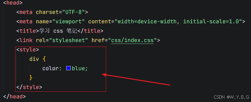
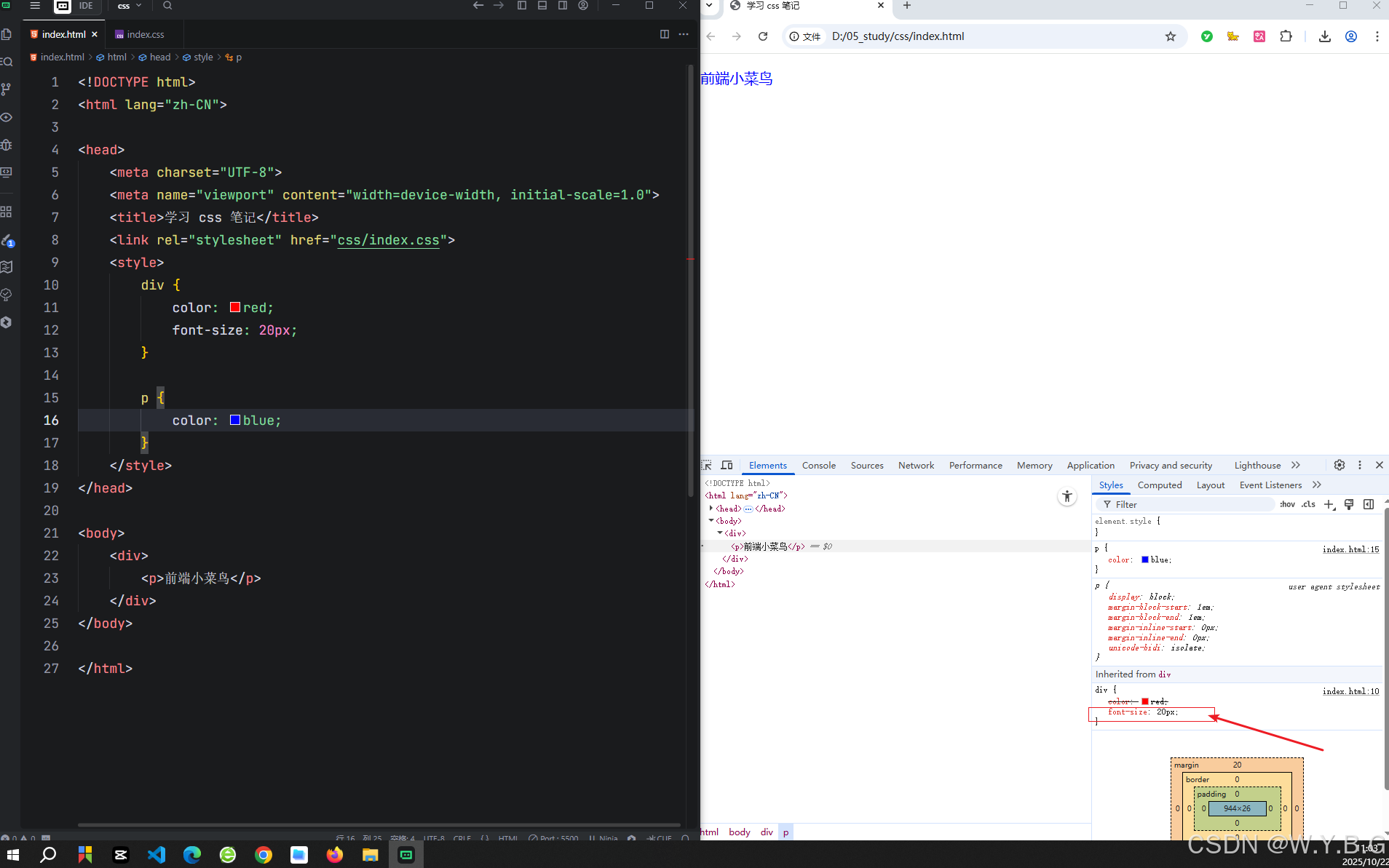
- 子元素自动继承父元素的某些css样式属性。
- 主要继承跟文字相关的样式属性,比如字体、颜色、文本对齐等。
- 但是子元素定义自己样式,会优先自己样式。
Chrome 浏览器查看继承样式方法
表单伪类选择器
:disabled:表单禁用
js
button:disabled {
    background: rgba(0, 0, 0, 0.5);
}:checked:选中状态,单选复选按钮
js
input:checked+label {
  color: red;
}

// html
<input type="checkbox" id="agree">
<label for="agree">同意注册协议</label>
伪元素选择器
- 选择元素的特定部分(使用双冒号 ::)
::before:元素内插入伪元素,作为第一个元素
js
div::before {
	content:"开始";
	color:red;
}::after:元素内插入伪元素,作为最后一个元素
js
div::after{
	content:"结束";
	color:red;
}
属性选择器
-
根据元素的属性特征来精准定位元素,从而实现更灵活的样式控制。
-
使用场景
- 表单样式控制
- 图标字体控制
- 国际化语言适配等等
| 属性选择器 |作用 |
|--|--|
| 属性 | 匹配包含指定属性的元素 |
| 属性=值 | 匹配属性值等于指定值的元素 |
| 属性\^=值 | 匹配属性值以指定字符串开头的元素 |
| 属性\&=值 | 匹配属性值为指定字符串结尾的元素 |
| 属性\*=值 | 匹配属性值任意位置包含指定字符串的元素 |
-
例子
js
[type=checkbox],[type=radio] {
	box-sizing:border-box;
	padding:0;
}

[class*=iconfont]{
font-family:iconfont !important;
}

// 英文
[lang="en"] {
	font-family:"Times New Roman";
}
// 中文
[lang="zh-CN"] {
	font-family:"微软雅黑";
}

// 只选择有class属性的a标签
a[class]{
	color:red;
}

a[class]{
	color:red;
}
CSS优先级
- 浏览器通过优先级来判断哪些属性值与一个元素最为相关。优先级是基于不同种类选择器组成的匹配规则。
- 原则:
- 优先级相等的时候,CSS中最后的那个声明的样式将会被应用到元素上。(层叠遵循就近原则)
- 其余判断那个选择器权重高,优先执行那个样式。
- 权重是 4 位一组,是分开的层级,不能进位。
| 选择器类型 | 示例 | 权重值 | 优先级说明 |
|---|---|---|---|
| !important | color:Red !important; | 无限大 | 强制覆盖所有规则(慎用) |
| 内联样式 | <div style="color:red">前端小菜鸟</div> |
(1,0,0,0) | 行内样式权重最高(1,0,0,0) |
| ID选择器 | #myid | (0,1,0,0) | 每个ID增加 0,1,0,0 |
| 类/属性/伪类 | .class,type="text" | (0,0,1,0) | 每个类/属性/伪类增加 0,0,1,0 |
| 类型(标签)/伪元素 | div,::after | (0,0,0,1) | 每个标签/伪元素增减 0,0,0,1 |
| 通配符/继承 | *,继承的样式 | (0,0,0,0) | 通配符和继承权重最低 |
- 权重叠加
- 权重是累加的,每个选择器的层级权重相加。
- 例子:
js
#nav .item a 的权重为?
// id    					0,1,0,0
// 类   				    0,0,1,0
// 类型(元素)    0,0,0,1
// 累加后 : 0,1,1,1
盒子模型
- 所有的元素都被一个个的"盒子"包围的,学会盒子模型可以实现准确布局、处理元素排列的关键。
- 在CSS中,我们有几种类型的盒子,一般分为区块盒子 和行内盒子。
区块盒子(block)
- 盒子会产生换行
- width 和 height 属性可以发挥作用
- 不设置宽度则默认和是父元素空间的100%
- 内边距、外边距和边框会撑大元素
- 常见的比如:div、p、h、ul、table等
区块盒子(block)
- 盒子不会产生换行
- width 和 height 属性将不起作用
- 垂直方向的内边距、外边距不起效果
- 水平方向的内边距、外边距会有效果
- 常见的比如:span、em、a、strong等
盒子背景
- background:用于设置元素背景相关属性,包括背景颜色、背景图片、背景位置、背景重复方式等。
| 属性 | 作用 | 常用值 | 示例代码 |
|---|---|---|---|
| background-color | 设置元素背景颜色 | 颜色名称、十六进制、RGB、透明度 | background-color |
| background-image | 设置背景图片 | url(image.jpg) | background-image:url(bg.jpg) |
| background-repeat | 控制背景图片是否重复 | repeat(默认)、no-repeat、repeat-x、repeat-y | background-repeat:no-repeat; |
| background-position | 定位背景图片位置 | x y(如center top,或者 px、%单位) | background-position:center |
| background-size | 调整背景图片尺寸 | 默认 auto、cover(覆盖)、contian(包含)或者跟px 、% | background-size:cover; |
| background-attachment | 背景是否随页面滚动 | scroll(默认)、fixed(不会滚动) | background-attachment:fixed |
- 背景复合写法
css
background:颜色 图片 重复 固定 位置/尺寸;- 视差效果例子
html
<!DOCTYPE html>
<html lang="zh-CN">

<head>
    <meta charset="UTF-8">
    <meta name="viewport" content="width=device-width, initial-scale=1.0">
    <title>学习 css 笔记</title>
    <link rel="stylesheet" href="css/index.css">
    <style>
        * {
            padding: 0;
            margin: 0;
            overflow-x: hidden;
            box-sizing: border-box;
        }

        .box {
            width: 1920px;
            height: 1080px;
            margin: 0 auto;
            padding: 0;
        }

        .box1 {
            background: url(./images/banner01.png) no-repeat fixed center center;
            background-size: cover;
        }

        .box2 {
            background: url(./images/banner02.png) no-repeat fixed center center;
            background-size: cover;
        }

        .box3 {
            background: url(./images/banner03.png) no-repeat fixed center center;
            background-size: cover;
        }

        .box4 {
            background: url(./images/banner04.png) no-repeat fixed center center;
            background-size: cover;
        }

        .content {
            background: rgba(0, 0, 0, 0.7);
            color: #fff;
            padding: 20px;
        }
    </style>
</head>

<body>
    <div class="box box1">
        <div class="content">
            近年来,岚皋县立足县域实际,抓住"村BA"赛事,以低成本、高情感的群众性活动为切入点,深度融合"农文旅体商",全面激发消费活力。通过小城办大赛,优化资源配置,增强乡村振兴动力,实现了现象级传播"流量"与经济效益"增量"的双赢,探索出一条"赛事搭台、经济唱戏、群众受益"的特色县域经济发展之路。
            近年来,岚皋县立足县域实际,抓住"村BA"赛事,以低成本、高情感的群众性活动为切入点,深度融合"农文旅体商",全面激发消费活力。通过小城办大赛,优化资源配置,增强乡村振兴动力,实现了现象级传播"流量"与经济效益"增量"的双赢,探索出一条"赛事搭台、经济唱戏、群众受益"的特色县域经济发展之路。
        </div>
    </div>
    <div class="box box2">
        <div class="content">
            近年来,岚皋县立足县域实际,抓住"村BA"赛事,以低成本、高情感的群众性活动为切入点,深度融合"农文旅体商",全面激发消费活力。通过小城办大赛,优化资源配置,增强乡村振兴动力,实现了现象级传播"流量"与经济效益"增量"的双赢,探索出一条"赛事搭台、经济唱戏、群众受益"的特色县域经济发展之路。
            近年来,岚皋县立足县域实际,抓住"村BA"赛事,以低成本、高情感的群众性活动为切入点,深度融合"农文旅体商",全面激发消费活力。通过小城办大赛,优化资源配置,增强乡村振兴动力,实现了现象级传播"流量"与经济效益"增量"的双赢,探索出一条"赛事搭台、经济唱戏、群众受益"的特色县域经济发展之路。
        </div>
    </div>
    <div class="box box3">
        <div class="content">
            近年来,岚皋县立足县域实际,抓住"村BA"赛事,以低成本、高情感的群众性活动为切入点,深度融合"农文旅体商",全面激发消费活力。通过小城办大赛,优化资源配置,增强乡村振兴动力,实现了现象级传播"流量"与经济效益"增量"的双赢,探索出一条"赛事搭台、经济唱戏、群众受益"的特色县域经济发展之路。
            近年来,岚皋县立足县域实际,抓住"村BA"赛事,以低成本、高情感的群众性活动为切入点,深度融合"农文旅体商",全面激发消费活力。通过小城办大赛,优化资源配置,增强乡村振兴动力,实现了现象级传播"流量"与经济效益"增量"的双赢,探索出一条"赛事搭台、经济唱戏、群众受益"的特色县域经济发展之路。
        </div>
    </div>
    <div class="box box4">
        <div class="content">
            近年来,岚皋县立足县域实际,抓住"村BA"赛事,以低成本、高情感的群众性活动为切入点,深度融合"农文旅体商",全面激发消费活力。通过小城办大赛,优化资源配置,增强乡村振兴动力,实现了现象级传播"流量"与经济效益"增量"的双赢,探索出一条"赛事搭台、经济唱戏、群众受益"的特色县域经济发展之路。
            近年来,岚皋县立足县域实际,抓住"村BA"赛事,以低成本、高情感的群众性活动为切入点,深度融合"农文旅体商",全面激发消费活力。通过小城办大赛,优化资源配置,增强乡村振兴动力,实现了现象级传播"流量"与经济效益"增量"的双赢,探索出一条"赛事搭台、经济唱戏、群众受益"的特色县域经济发展之路。
        </div>
    </div>
</body>

</html>
背景渐变
- 在CSS中,可以通过lineer-gradient*(线性渐变)和radial-gradient**(径向渐变)为元素添加渐变背景
| 属性/方法 | 描述 | 示例代码 |
|---|---|---|
| linear-gradient(方向,颜色1 位置,颜色2 位置 ...) | 线性渐变(方向可控) | background: linear-gradient(90deg, red 30%, yellow 100%); background: linear-gradient(45deg, red, yellow); |
| radial-gradient(形状,颜色1,颜色2 ...) | 径向渐变(形状和位置可控) |
-
线性渐变:
- 1、方向。可以是方位名词,也可以是 deg(角度)
- 2、位置。色标的位置。不是必须写的。
-
文件添加渐变背景例子
css
background-image: linear-gradient(180deg, red 10%, yellow 30%, blue 100%);  /* 设置背景渐变*/
/* 文字背景裁剪,以文字为裁剪区域 */
-webkit-background-clip: text; /* 兼容性写法,照顾谷歌老版本浏览器 -webkit-*/
background-clip: text; /* 文字范围裁剪背景*/
/* 文字背景设置为透明 */
color: transparent; /*文本填充颜色设置为透明。还可以 -webkit-text-fill-color: transparent; 这样写 */
盒子阴影
- box-shadow:属性用于在元素的框架上添加阴影效果。
- 使用场景:
- 盒子添加阴影,效果更立体。
- 鼠标经过元素显示阴影,更加突出元素。
- 语法:
- box-shadow:X 轴偏移量 Y 轴偏移量 模糊半径 扩散半径 颜色
- 多个属性用空格隔开
- X 轴偏移量和 Y 轴偏移量是必须要写,其余可以省略采取默认值。
- 默认是外阴影,如果改为内阴影要写 inset
- 例子
css
// 盒子阴影:x y 模糊距离 扩散距离 阴影颜色
box-shadow: 10px 20px 15px 30px rgba(0, 0, 0, .1);
过度
- transition:用于在元素的属性值发生变化时,平滑地过度(而不是瞬间切换)。
- 场景:
- 鼠标经过图片放大
- 表单获得焦点,输入框边框
- 语法:
- transition:过度属性 过度时间
- 过度属性如果都要变化可以写 all
- 过度时间单位是秒S ,比如0.2S等
- 例子:
css
// 过度写到盒子身上,谁做过度给谁加
div {
    width: 200px;
    height: 200px;
    background: #f00;
    margin: 200px;
    transition: all 0.3s;
}

div:hover {
    box-shadow: 2px 2px 10px 4px #000;
}
单行文字溢出显示省略号
css
overflow: hidden;
white-space: nowrap;
text-overflow: ellipsis;
多行文字溢出显示省略号
- 容器高度必须跟两行文字高度一样
css
display: -webkit-box;
-webkit-box-orient: vertical;
-webkit-line-clamp: 2;
overflow: hidden;
text-overflow: ellipsis;
字体图标
- 字体图标(Icon Fonts)是一种将图标以字体形式嵌入网页的技术,允许开发者像使用文字一样通过 CSS 控制图标的样式(如颜色、大小、阴影等)
- 使用场景:
- 导航菜单单图标
- 按钮操作图标
- 结合动画效果
- 优势:
- 适量缩放:无损放大缩小
- 样式灵活:通过 CSS 直接修改颜色、大小、阴影等属性
- 减少 HTTP 请求:一个字体文件可包含多个图标,比多张图片更高效
- 兼容性好:支持所有现代浏览器,甚至部分旧版浏览器。
- 阿里巴巴图标库
CSS 布局
- CSS布局是网页设计的核心技术之一,用于控制元素在页面中的排列方式。
- 正常布局(normal)
- 模式转换布局(display)
- 弹性布局(flexbox)
- 网格布局(grid)
- 定义布局(positon)
- 多列布局(column)
- 每种技术都有它们的用途,各有优缺点,相互辅助。
- 简单布局:优先使用 Flexbox (一维)或 Grid (二维)。
- 复杂响应式布局:使用 Gird + 媒体查询
- 文本内容分栏:多列布局(column-count)
- 兼容旧浏览器:浮动布局 或 Flexbox 的降级方案
- CSS Grid 逐渐成为主流,支持更负责的布局场景
display 转换
- display 属性允许我们更改默认的显示方式此属性。
- display:block; 转换为区块元素(常用);能独占一行;宽高能撑满父容器宽度;
- display:inline; 转换为行内元素(罕见);不能独占一行;宽高由内容决定;
- display:inline-block;转换为行内块元素(较少);不能独占一行;宽高不能由内容决定(可覆盖);
弹性布局
- Flexbox 是 CSS 弹性哈子布局模块(Flexible Box Layout Module)的缩写,可以快速实现元素的对齐、分布和空间分配。
- 弹性盒子核心:
- 父控子 :
- 1、父控子(亲父子):父盒子控制子盒子如何布局。
- 2、父盒子称为容器,子盒子称为项目。
- 主轴和交叉轴:
- 1、主轴默认水平方向;
- 2、交叉轴默认垂直方向,可以更改
容器(父盒子)属性
| 属性 | 作用 | 示例 |
|---|---|---|
| display | 定义元素为 Flex 容器 | .container{display:flex;} |
| flex-direction | 定义主轴方向(项目排列方向) | .container{flex-direction:row} |
| flex-wrap | 控制是否换行 | .container{flex-wrap:wrap;} |
| justify-content | 定义主轴上的对齐方式(整体布局) | .container{justify-content:center;} |
| align-items | 定义交叉轴上的对齐方式(单行时整体对齐) | .container{align-items:center;} |
| align-content | 定义多行时交叉轴上的对齐方式(仅当flex-wrap:wrap 且 内容换行时生效) | .container{align-content:space-between;} |
项目(子盒子)属性
| 属性 | 作用 | 示例 |
|---|---|---|
| order | 定义项目的排列顺序(默认0,数值越小越靠前) | .item { order:-1;} |
| flex-grow | 定义项目的放大比例(默认0,即不放大) | .item { flex-grow:1;} |
| flex-shrink | 定义项目的缩小比例(默认1,空间不足时等比缩小) | .item { flex-shrink:0;} |
| flex-basis | 定义项目在主轴方向上的初始大小(优先级高于 width/height) | .item { flex-basis:200px;} |
| flex | flex-grow/flex-shrink/flex-basis的缩写 | .item { flex:1;} |
| align-self | 覆盖容器的 align-items ,单独定义某个项目的交叉轴对齐方式 | .item { align-self:center;} |
display:flex
- 容器(父盒子)设置 display:flex 可以让子盒子按照主轴方式排列。
- 如果子元素有大小,则按照给定大小来显示
- 如果子元素没有大小,则拉伸充满父容器(高度)
- 若子元素总宽度超过容器宽度,默认会压缩子元素
开发中大部分情况下,父容器设置 display:flex,子元素设定大小。
- 例子:
html
<!DOCTYPE html>
<html lang="zh-CN">

<head>
    <meta charset="UTF-8">
    <meta name="viewport" content="width=device-width, initial-scale=1.0">
    <title>Document</title>
    <style>
        div.wrap {
            display: flex;
            justify-content: space-between;
        }

        [class^="box"] {
            width: 100px;
            height: 100px;
            background: pink;
            border: 1px #000 solid;
        }
    </style>
</head>

<body>
    <div class="wrap">
        <div class="box1"></div>
        <div class="box2"></div>
        <div class="box3"></div>
        <div class="box4"></div>
    </div>
</body>

</html>
justify-content
- 定义主轴上的对齐方式
| 属性值 | 效果 | 示例 | 例子 |
|---|---|---|---|
| flex-start | 左对齐(默认) | 子元素靠左排列 | 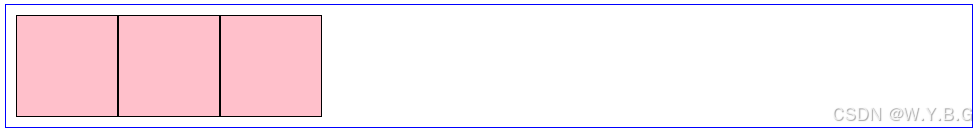 |
| flex-end | 右对齐 | 子元素靠右排列 | 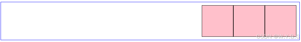 |
| center | 居中对齐 | 子元素居中 | 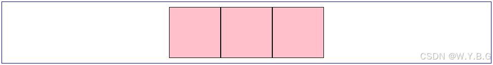 |
| space-between | 两端对齐 | 首个子元素放置于起点末尾元素放置于终点 | 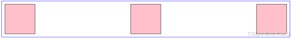 |
| space-around | 项目两侧间隔相等 | 每个子元素周围分配相同的空间 | 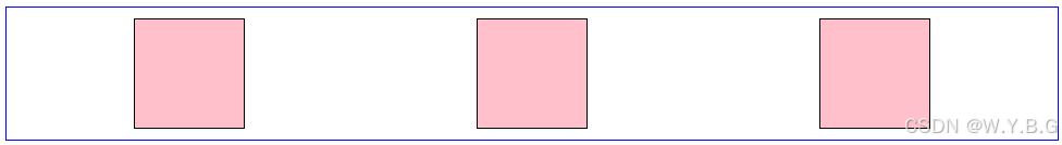 |
| space-evenly | 项目间隔均匀分布 | 每个子元素之间的间隔相等 | 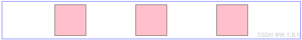 |
align-items
- 定义交叉轴上的对齐方式(单行时整体对齐)
| 属性值 | 作用描述 | 例子 |
|---|---|---|
| flex-start | 项目在交叉轴起点对齐(默认值) | 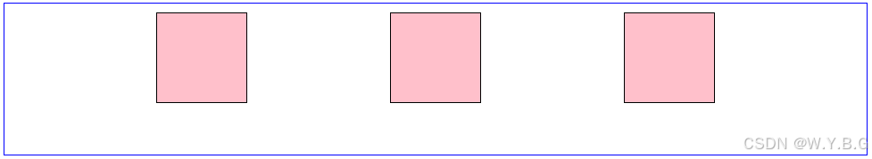 |
| flex-end | 项目在交叉轴终点对齐 | 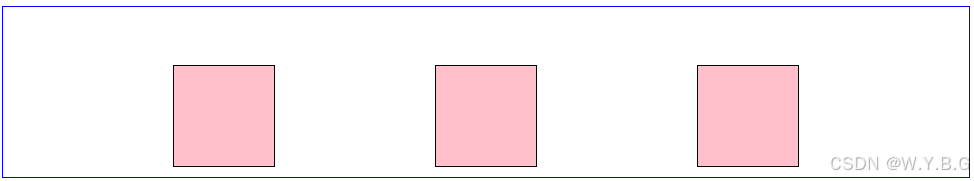 |
| center | 项目在交叉轴居中对齐 | 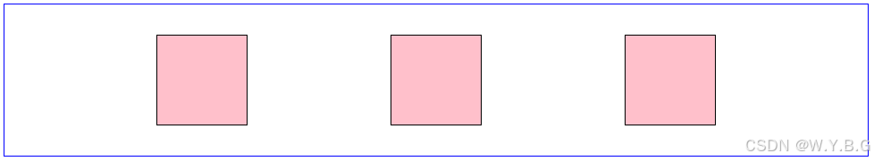 |
| stretch | 项目拉伸填充整个容器高度(需子项目无固定高度) | 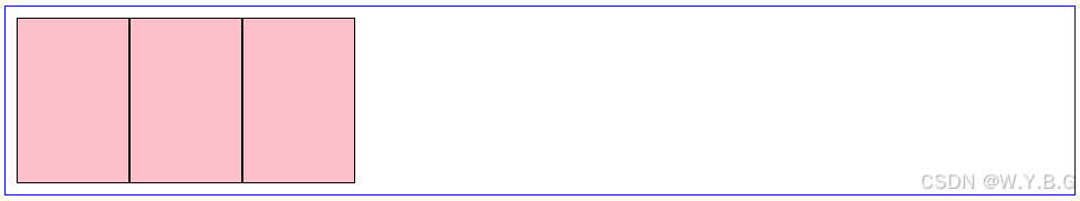 |
flex-direction
- 定义主轴方向(改变主轴方向)
| 属性值 | 描述 | 示例效果 | 代码示例 | 例子 |
|---|---|---|---|---|
| row | 默认值。子元素沿水平主轴(从左到右)排列 | A B C(横向排列) | .container{flex-direction:row;} | 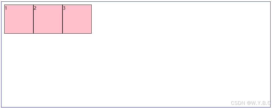 |
| row-reverse | 子元素沿水平主轴反向排列(从右到左) | C B A (反向横向排列) | .container{flex-direction:row-reverse;} | 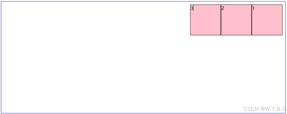 |
| column | 子元素沿垂直主轴(从上到下)排列 | A B C (纵向排列) | .container{flex-direction:column;} | 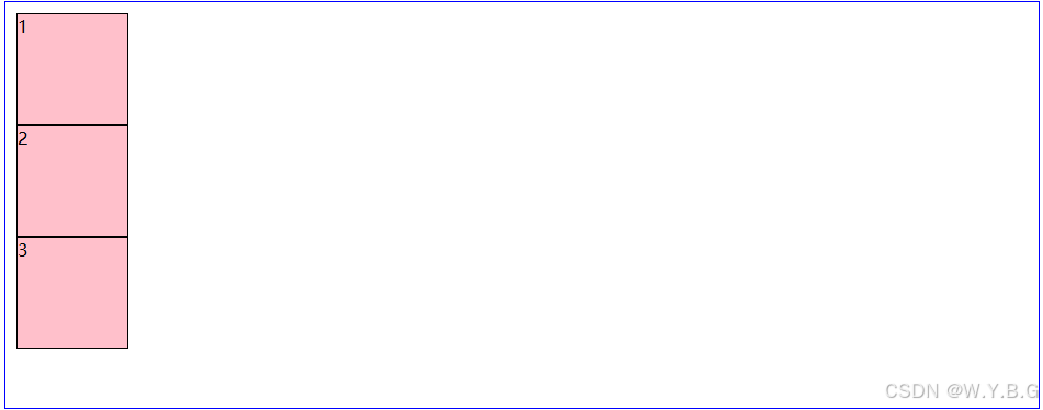 |
| column-reverse | 子元素沿垂直主轴反向排列(从下到上) | C B A (反向纵向排列) | .container{flex-direction:column-reverse;} | 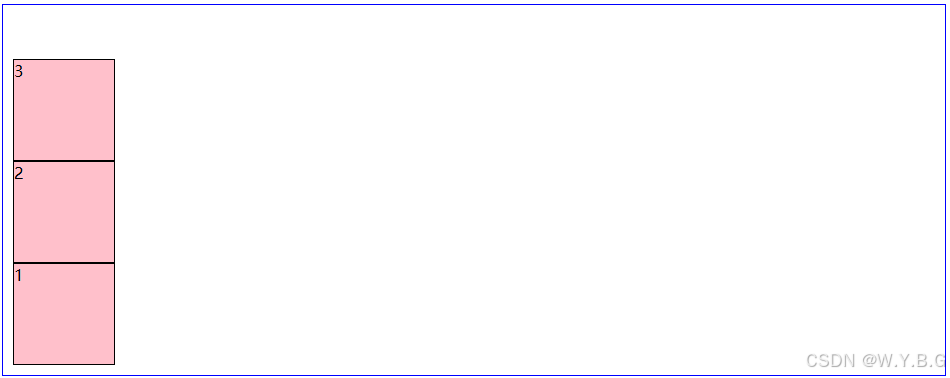 |
flex-wrap
- 控制是否换行
| 属性值 | 排列效果 |
|---|---|
| nowrap | 不换行(全部横向排列,可能被压缩) |
| wrap | 换行 |
| wrap-reverse | 翻转(了解即可) |