大家好!今天给大家分享一个实用的Vue3旋转菜单组件。组件颜值高,而且交互体验也很好,非常适合用在各种需要展示多个功能入口的场景。
我们直接来看下效果图:
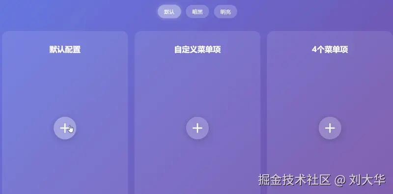
实现的效果: 1、圆形展开动画 :点击中心按钮,菜单项会以圆形轨迹展开 2、多种主题 :支持默认、暗黑、明亮三种主题风格 3、完全可定制 :菜单项数量、大小、半径都可以自定义 4、平滑动画 :使用贝塞尔曲线实现流畅的展开/收起动画 5、悬停提示:鼠标悬停显示功能提示
这种设计既节省空间,又充满动感,能给用户带来惊喜的交互体验。
核心实现原理
1. 圆形布局计算
旋转菜单最核心的就是菜单项的定位计算。我们使用三角函数来计算每个菜单项在圆形上的位置:
javascript
const getItemStyle = (index) => {
  if (!isOpen.value) {
    return {
      transform: 'translate(0, 0)',
      opacity: '0'
    }
  }

  // 计算每个菜单项的角度
  const angle = (index * 2 * Math.PI) / menuItems.value.length
  // 使用三角函数计算x、y坐标
  const x = Math.cos(angle) * props.radius
  const y = Math.sin(angle) * props.radius

  return {
    transform: `translate(${x}px, ${y}px)`,
    opacity: '1'
  }
}数学小知识:
Math.cos(angle)计算角度的余弦值Math.sin(angle)计算角度的正弦值2 * Math.PI是一个完整的圆周(360度)
2. 组件结构设计
html
<!-- CircularMenu.vue -->
<template>
  <div class="circular-menu-container">
    <!-- 中心切换按钮 -->
    <div class="menu-toggle" :class="{ active: isOpen }" @click="toggleMenu">
      <div class="toggle-icon"></div>
    </div>

    <!-- 菜单项容器 -->
    <div class="menu-items">
      <!-- 动态生成的菜单项 -->
      <div
        v-for="(item, index) in menuItems"
        :key="index"
        class="menu-item"
        :style="getItemStyle(index)"
        @click="handleItemClick(item)"
      >
        <i :class="item.icon"></i>
        <span class="tooltip">{{ item.tooltip }}</span>
      </div>
    </div>
  </div>
</template>
完整代码详解
核心菜单组件 (CircularMenu.vue)
html
<template>
  <div class="circular-menu-container">
    <!-- 中心切换按钮 -->
    <!-- active类控制打开状态的样式 -->
    <div class="menu-toggle" :class="{ active: isOpen }" @click="toggleMenu">
      <div class="toggle-icon"></div>
    </div>

    <!-- 菜单项容器 -->
    <div class="menu-items">
      <!-- 遍历菜单项数组 -->
      <div
        v-for="(item, index) in menuItems"
        :key="index"
        class="menu-item"
        :style="getItemStyle(index)"  <!-- 动态计算位置 -->
        @click="handleItemClick(item)"  <!-- 点击事件 -->
      >
        <!-- Font Awesome图标 -->
        <i :class="item.icon"></i>
        <!-- 悬停提示文字 -->
        <span class="tooltip">{{ item.tooltip }}</span>
      </div>
    </div>
  </div>
</template>

<script setup>
import { ref, computed } from 'vue'

// 定义组件接收的属性
const props = defineProps({
  // 菜单项数组,默认提供6个常用选项
  items: {
    type: Array,
    default: () => [
      { icon: 'fas fa-home', tooltip: '首页', action: 'home' },
      { icon: 'fas fa-search', tooltip: '搜索', action: 'search' },
      { icon: 'fas fa-cog', tooltip: '设置', action: 'settings' },
      { icon: 'fas fa-envelope', tooltip: '消息', action: 'messages' },
      { icon: 'fas fa-heart', tooltip: '收藏', action: 'favorites' },
      { icon: 'fas fa-user', tooltip: '个人资料', action: 'profile' }
    ]
  },
  // 菜单展开半径,控制菜单项离中心的距离
  radius: {
    type: Number,
    default: 120
  },
  // 每个菜单项的大小
  itemSize: {
    type: Number,
    default: 60
  },
  // 主题样式
  theme: {
    type: String,
    default: 'default',
    // 验证器,确保只接收指定的主题值
    validator: (value) => ['default', 'dark', 'light'].includes(value)
  }
})

// 定义组件发出的事件
const emit = defineEmits(['item-click'])

// 响应式数据:菜单是否打开
const isOpen = ref(false)

// 计算属性:获取菜单项
const menuItems = computed(() => props.items)

// 切换菜单打开/关闭状态
const toggleMenu = () => {
  isOpen.value = !isOpen.value
}

// 计算每个菜单项的位置样式
const getItemStyle = (index) => {
  // 如果菜单关闭,所有项都集中在中心并隐藏
  if (!isOpen.value) {
    return {
      transform: 'translate(0, 0)',
      opacity: '0'
    }
  }

  // 计算当前项在圆环上的角度
  // 将圆环平均分配给每个菜单项
  const angle = (index * 2 * Math.PI) / menuItems.value.length
  // 使用三角函数计算x、y坐标
  const x = Math.cos(angle) * props.radius
  const y = Math.sin(angle) * props.radius

  return {
    transform: `translate(${x}px, ${y}px)`,  // 移动到计算出的位置
    opacity: '1'  // 显示菜单项
  }
}

// 处理菜单项点击
const handleItemClick = (item) => {
  // 向父组件传递点击事件
  emit('item-click', item)

  // 添加点击动画效果
  const event = window.event
  if (event && event.target.closest('.menu-item')) {
    const menuItem = event.target.closest('.menu-item')
    const originalTransform = menuItem.style.transform
    // 添加缩放动画
    menuItem.style.transform = originalTransform + ' scale(0.9)'
    // 300毫秒后恢复原状
    setTimeout(() => {
      menuItem.style.transform = originalTransform
    }, 300)
  }
}
</script>

<style scoped>
/* 菜单容器 */
.circular-menu-container {
  position: relative;
  width: 100%;
  height: 400px;  /* 固定高度确保有足够空间展开 */
  display: flex;
  justify-content: center;
  align-items: center;
  perspective: 1000px;  /* 3D透视效果 */
}

/* 中心切换按钮样式 */
.menu-toggle {
  position: absolute;
  width: 70px;
  height: 70px;
  border-radius: 50%;  /* 圆形 */
  cursor: pointer;
  z-index: 100;  /* 确保在最上层 */
  display: flex;
  justify-content: center;
  align-items: center;
  transition: all 0.3s ease;  /* 平滑过渡 */
  box-shadow: 0 4px 20px rgba(0, 0, 0, 0.2);  /* 阴影效果 */
}

/* 切换图标(汉堡菜单→X) */
.toggle-icon {
  position: relative;
  width: 30px;
  height: 30px;
  transition: all 0.3s ease;
}

/* 使用伪元素创建两条线 */
.toggle-icon::before,
.toggle-icon::after {
  content: '';
  position: absolute;
  width: 100%;
  height: 4px;
  border-radius: 2px;
  transition: all 0.3s ease;
  top: 50%;
  left: 0;
}

/* 关闭状态:显示为两条平行线(汉堡菜单) */
.menu-toggle:not(.active) .toggle-icon::before {
  transform: translateY(-50%);
}

.menu-toggle:not(.active) .toggle-icon::after {
  transform: translateY(-50%) rotate(90deg);
}

/* 打开状态:显示为X */
.menu-toggle.active .toggle-icon::before {
  transform: translateY(-50%) rotate(45deg);
}

.menu-toggle.active .toggle-icon::after {
  transform: translateY(-50%) rotate(-45deg);
}

/* 菜单项容器 */
.menu-items {
  position: absolute;
  width: 100%;
  height: 100%;
  display: flex;
  justify-content: center;
  align-items: center;
}

/* 单个菜单项样式 */
.menu-item {
  position: absolute;
  width: v-bind(itemSize + 'px');  /* 使用Vue的CSS变量绑定 */
  height: v-bind(itemSize + 'px');
  border-radius: 50%;  /* 圆形按钮 */
  display: flex;
  justify-content: center;
  align-items: center;
  font-size: 24px;
  cursor: pointer;
  /* 使用贝塞尔曲线实现弹性动画 */
  transition: all 0.5s cubic-bezier(0.68, -0.55, 0.265, 1.55);
  opacity: 0;  /* 默认隐藏 */
  transform: translate(0, 0);  /* 默认位置在中心 */
  box-shadow: 0 5px 15px rgba(0, 0, 0, 0.1);  /* 柔和阴影 */
  backdrop-filter: blur(5px);  /* 毛玻璃效果 */
  border: 2px solid rgba(255, 255, 255, 0.3);  /* 半透明边框 */
}

/* 悬停效果 */
.menu-item:hover {
  transform: scale(1.1);  /* 轻微放大 */
  box-shadow: 0 0 20px rgba(255, 255, 255, 0.4);  /* 发光效果 */
}

/* 提示文字样式 */
.tooltip {
  position: absolute;
  background: rgba(0, 0, 0, 0.7);
  color: white;
  padding: 5px 10px;
  border-radius: 5px;
  font-size: 14px;
  opacity: 0;  /* 默认隐藏 */
  transition: opacity 0.3s;
  pointer-events: none;  /* 防止干扰鼠标事件 */
  white-space: nowrap;  /* 不换行 */
  top: -40px;  /* 在菜单项上方显示 */
  left: 50%;
  transform: translateX(-50%);  /* 水平居中 */
}

/* 悬停时显示提示 */
.menu-item:hover .tooltip {
  opacity: 1;
}

/* ========== 主题样式 ========== */

/* 默认主题(紫色渐变) */
.theme-default .menu-toggle {
  background: rgba(255, 255, 255, 0.2);
}

.theme-default .menu-toggle:hover {
  background: rgba(255, 255, 255, 0.3);
}

.theme-default .toggle-icon::before,
.theme-default .toggle-icon::after {
  background: white;
}

.theme-default .menu-item {
  background: rgba(255, 255, 255, 0.2);
  color: white;
}

.theme-default .menu-item:hover {
  background: rgba(255, 255, 255, 0.3);
}

/* 暗黑主题 */
.theme-dark .menu-toggle {
  background: rgba(0, 0, 0, 0.7);
}

.theme-dark .menu-toggle:hover {
  background: rgba(0, 0, 0, 0.8);
}

.theme-dark .toggle-icon::before,
.theme-dark .toggle-icon::after {
  background: white;
}

.theme-dark .menu-item {
  background: rgba(0, 0, 0, 0.7);
  color: white;
}

.theme-dark .menu-item:hover {
  background: rgba(0, 0, 0, 0.8);
}

/* 明亮主题 */
.theme-light .menu-toggle {
  background: rgba(255, 255, 255, 0.9);
}

.theme-light .menu-toggle:hover {
  background: white;
}

.theme-light .toggle-icon::before,
.theme-light .toggle-icon::after {
  background: #333;
}

.theme-light .menu-item {
  background: rgba(255, 255, 255, 0.9);
  color: #333;
  border: 2px solid rgba(0, 0, 0, 0.1);
}

.theme-light .menu-item:hover {
  background: white;
}

/* ========== 响应式设计 ========== */
@media (max-width: 768px) {
  .circular-menu-container {
    height: 350px;  /* 移动端减小高度 */
  }

  .menu-toggle {
    width: 60px;
    height: 60px;  /* 移动端减小按钮大小 */
  }

  .menu-item {
    width: 50px;
    height: 50px;
    font-size: 20px;  /* 移动端减小图标 */
  }
}
</style>
演示页面 (example.vue)
html
<template>
  <div :class="currentTheme">
    <div class="container">
      <h1>Vue3 旋转菜单</h1>

      <!-- 主题切换控件 -->
      <div class="controls">
        <button
          v-for="theme in themes"
          :key="theme"
          class="control-btn"
          :class="{ active: currentTheme === theme }"
          @click="currentTheme = theme"
        >
          {{ getThemeName(theme) }}
        </button>
      </div>

      <!-- 演示区域 -->
      <div class="demo">
        <!-- 演示1:默认配置 -->
        <div class="demo-section">
          <h2>默认配置</h2>
          <CircularMenu @item-click="handleMenuClick" />
        </div>

        <!-- 演示2:自定义菜单项 -->
        <div class="demo-section">
          <h2>自定义菜单项</h2>
          <CircularMenu
            :items="customItems"
            radius="150"
            item-size="70"
            :theme="currentTheme"
            @item-click="handleMenuClick"
          />
        </div>

        <!-- 演示3:4个菜单项 -->
        <div class="demo-section">
          <h2>4个菜单项</h2>
          <CircularMenu
            :items="fourItems"
            radius="100"
            :theme="currentTheme"
            @item-click="handleMenuClick"
          />
        </div>
      </div>

    </div>
  </div>
</template>

<script setup>
import { ref } from 'vue'
import CircularMenu from '@/components/CircularMenu.vue'

// 当前主题
const currentTheme = ref('theme-default')

// 可用主题列表
const themes = ['theme-default', 'theme-dark', 'theme-light']

// 获取主题显示名称
const getThemeName = (theme) => {
  const names = {
    'theme-default': '默认',
    'theme-dark': '暗黑',
    'theme-light': '明亮'
  }
  return names[theme] || theme
}

// 自定义菜单项配置(社交媒体图标)
const customItems = [
  { icon: 'fab fa-github', tooltip: 'GitHub', action: 'github' },
  { icon: 'fab fa-linkedin', tooltip: 'LinkedIn', action: 'linkedin' },
  { icon: 'fab fa-youtube', tooltip: 'YouTube', action: 'youtube' },
  { icon: 'fab fa-instagram', tooltip: 'Instagram', action: 'instagram' },
  { icon: 'fab fa-tiktok', tooltip: 'TikTok', action: 'tiktok' },
  { icon: 'fab fa-reddit', tooltip: 'Reddit', action: 'reddit' }
]

// 4个菜单项的配置
const fourItems = [
  { icon: 'fas fa-music', tooltip: '音乐', action: 'music' },
  { icon: 'fas fa-video', tooltip: '视频', action: 'video' },
  { icon: 'fas fa-gamepad', tooltip: '游戏', action: 'game' },
  { icon: 'fas fa-book', tooltip: '阅读', action: 'read' }
]

// 处理菜单项点击事件
const handleMenuClick = (item) => {
  lastClicked.value = `${item.tooltip} (${item.action})`
  console.log('菜单项被点击:', item)
  // 这里可以添加具体的业务逻辑
}
</script>

<style scoped>
.container {
  margin: 0 auto;
  text-align: center;
  color: white;
  padding: 20px;
}

h1 {
  margin-bottom: 30px;
  font-size: 2.5rem;
  text-shadow: 2px 2px 4px rgba(0, 0, 0, 0.3);
}

/* 控制按钮区域 */
.controls {
  margin-bottom: 40px;
  display: flex;
  justify-content: center;
  gap: 15px;
  flex-wrap: wrap;
}

.control-btn {
  background: rgba(255, 255, 255, 0.2);
  border: none;
  color: white;
  padding: 10px 20px;
  border-radius: 30px;
  cursor: pointer;
  font-size: 1rem;
  transition: all 0.3s ease;
  backdrop-filter: blur(5px);  /* 毛玻璃效果 */
}

.control-btn:hover {
  background: rgba(255, 255, 255, 0.3);
  transform: translateY(-2px);  /* 悬停上浮效果 */
}

.control-btn.active {
  background: rgba(255, 255, 255, 0.4);
  box-shadow: 0 0 15px rgba(255, 255, 255, 0.3);  /* 激活状态发光 */
}

/* 演示区域布局 */
.demo {
  display: flex;
  gap: 20px;
  justify-content: center;
  flex-wrap: wrap;
  margin-bottom: 30px;
}

.demo-section {
  background: rgba(255, 255, 255, 0.1);
  border-radius: 20px;
  padding: 20px;
  backdrop-filter: blur(10px);
  width: 350px;
  min-height: 450px;
  display: flex;
  flex-direction: column;
  align-items: center;
}

.demo-section h2 {
  margin-bottom: 20px;
  font-size: 1.5rem;
  height: 40px;
}

/* 状态显示面板 */
.status-panel {
  background: rgba(255, 255, 255, 0.1);
  border-radius: 15px;
  padding: 20px;
  backdrop-filter: blur(10px);
  max-width: 600px;
  margin: 0 auto;
}

.status-panel h3 {
  margin-bottom: 10px;
  font-size: 1.3rem;
}

.status-panel p {
  font-size: 1.1rem;
  color: #ffeaa7;  /* 强调色 */
}

/* ========== 页面主题样式 ========== */

.theme-default {
  background: linear-gradient(135deg, #667eea, #764ba2);
}

.theme-dark {
  background: linear-gradient(135deg, #2c3e50, #34495e);
}

.theme-light {
  background: linear-gradient(135deg, #74b9ff, #0984e3);
  color: #333;
}

.theme-light .control-btn {
  color: #333;
  background: rgba(255, 255, 255, 0.7);
}

.theme-light .control-btn:hover {
  background: rgba(255, 255, 255, 0.9);
}

.theme-light .demo-section,
.theme-light .status-panel {
  background: rgba(255, 255, 255, 0.2);
}
</style>组件的图标可以自定义,我用的是Font Awesome,所以需要在入口文件index.html引入以下css:
html
<link rel="stylesheet" href="https://cdnjs.cloudflare.com/ajax/libs/font-awesome/6.4.0/css/all.min.css">没有引入的话,无法显示哦~
技术要点解析
1. Vue3 Composition API 使用
使用了 <script setup> 语法糖,这是 Vue3 的最新特性:
javascript
// 定义Props
const props = defineProps({ ... })

// 定义Emits
const emit = defineEmits(['item-click'])

// 响应式数据
const isOpen = ref(false)

// 计算属性
const menuItems = computed(() => props.items)
2. CSS 动画技巧
贝塞尔曲线:
css
transition: all 0.5s cubic-bezier(0.68, -0.55, 0.265, 1.55);这个曲线实现了回弹效果,让动画更有趣味性。
毛玻璃效果:
css
backdrop-filter: blur(5px);这是现代CSS特性,实现半透明模糊背景。
适用场景
这个旋转菜单组件非常适合以下场景:
1. 移动端应用
社交App :快速分享到不同平台 工具类App:多功能工具箱
2. 后台管理系统
数据看板 :多种视图切换 快捷操作:批量操作、导出等功能
3. 创意网站
作品集网站 :项目分类展示 互动网站 :游戏功能菜单 营销页面:多渠道分享
4. 特殊场景
VR/AR界面 :3D空间中的菜单交互 大屏展示 :数据可视化控制 智能设备:物联网设备控制界面
扩展建议
想要进一步增强这个组件,也可以考虑:
- 添加触控支持:针对移动设备优化手势操作
- 声音反馈:点击时添加音效
- 键盘导航:支持键盘操作
- 更多动画:入场、退场动画
- 图标自定义:支持图片、SVG等更多图标类型
- 拖拽排序:允许用户自定义菜单项顺序
完整代码已经测试通过,可以直接复制使用。记得安装Font Awesome 图标库哦!
更多实用组件,可以看我的Github组件地址 : github.com/1344160559-...
本文首发于公众号:程序员刘大华,专注分享前后端开发的实战笔记。关注我,少走弯路,一起进步!
📌往期精彩
《MySQL 为什么不推荐用雪花ID 和 UUID 做主键?》