这样的提示
我直接上代码了。组件如下
<template>
<div class="smart-alert" :class="alertClasses">
<div class="alert-content">
<div class="alert-icon">
<slot name="icon">
<component :is="typeIcon" />
</slot>
</div>
<div class="alert-message">
<div class="alert-title" v-if="title || $slots.title">
<slot name="title">
{{ title }}
</slot>
</div>
<div class="alert-description">
<slot>
{{ message }}
</slot>
</div>
</div>
</div>
<div class="alert-actions">
<slot name="action">
<el-button v-if="actionText" :type="actionType" link @click="handleAction">
{{ actionText }}
</el-button>
</slot>
<el-button v-if="closable" link class="alert-close" @click="handleClose">
<el-icon><Close /></el-icon>
</el-button>
</div>
</div>
</template>
<script setup>
import { computed } from 'vue';
import { ElIcon, ElButton } from 'element-plus';
import { InfoFilled, SuccessFilled, WarningFilled, CircleCloseFilled, Close } from '@element-plus/icons-vue';
const props = defineProps({
// 提示类型
type: {
type: String,
default: 'info',
validator: (value) => ['info', 'success', 'warning', 'error'].includes(value),
},
// 标题
title: {
type: String,
default: '',
},
// 消息内容
message: {
type: String,
default: '',
},
// 操作按钮文字
actionText: {
type: String,
default: '',
},
// 操作按钮类型
actionType: {
type: String,
default: 'primary',
},
// 是否可关闭
closable: {
type: Boolean,
default: false,
},
// 是否显示图标
showIcon: {
type: Boolean,
default: true,
},
// 自定义类名
customClass: {
type: String,
default: '',
},
});
const emit = defineEmits(['action', 'close']);
const typeConfig = {
info: { icon: InfoFilled, color: '#409eff', bg: 'linear-gradient(135deg, #ecf5ff 0%, #f0f7ff 100%)', border: '#d4e3ff' },
success: { icon: SuccessFilled, color: '#67c23a', bg: 'linear-gradient(135deg, #f0f9eb 0%, #f5fbf0 100%)', border: '#e1f3d8' },
warning: { icon: WarningFilled, color: '#e6a23c', bg: 'linear-gradient(135deg, #fdf6ec 0%, #fef9f0 100%)', border: '#faecd8' },
error: { icon: CircleCloseFilled, color: '#f56c6c', bg: 'linear-gradient(135deg, #fef0f0 0%, #fef5f5 100%)', border: '#fde2e2' },
};
const typeIcon = computed(() => typeConfig[props.type].icon);
const alertClasses = computed(() => {
return [
`smart-alert--${props.type}`,
{
'smart-alert--closable': props.closable,
'smart-alert--no-icon': !props.showIcon,
},
props.customClass,
];
});
const alertStyles = computed(() => {
const config = typeConfig[props.type];
return {
'--alert-color': config.color,
'--alert-bg': config.bg,
'--alert-border': config.border,
};
});
const handleAction = () => {
emit('action');
};
const handleClose = () => {
emit('close');
};
</script>
<style scoped lang="less">
.smart-alert {
display: flex;
align-items: flex-start;
justify-content: space-between;
padding: 16px;
background: var(--alert-bg, linear-gradient(135deg, #ecf5ff 0%, #f0f7ff 100%));
border: 1px solid var(--alert-border, #d4e3ff);
border-radius: 8px;
box-shadow: 0 2px 12px rgba(0, 0, 0, 0.08);
transition: all 0.3s ease;
.alert-content {
display: flex;
align-items: flex-start;
flex: 1;
gap: 12px;
.alert-icon {
display: flex;
align-items: center;
color: var(--alert-color, #409eff);
font-size: 18px;
margin-top: 1px;
flex-shrink: 0;
:deep(svg) {
width: 1em;
height: 1em;
}
}
.alert-message {
flex: 1;
.alert-title {
color: var(--alert-color, #409eff);
font-size: 14px;
font-weight: 600;
line-height: 1.4;
margin-bottom: 4px;
}
.alert-description {
color: #606266;
font-size: 14px;
line-height: 1.5;
word-break: break-word;
:deep(*) {
margin: 0;
}
}
}
}
.alert-actions {
display: flex;
align-items: flex-start;
gap: 8px;
flex-shrink: 0;
margin-left: 12px;
:deep(.el-button) {
color: var(--alert-color, #409eff);
font-size: 14px;
padding: 4px 8px;
height: auto;
&:hover {
background: rgba(var(--alert-color-rgb), 0.1);
}
&.alert-close {
color: #909399;
&:hover {
background: rgba(144, 147, 153, 0.1);
}
}
}
}
// 无图标样式
&.smart-alert--no-icon {
.alert-content {
.alert-icon {
display: none;
}
}
}
}
// 类型样式
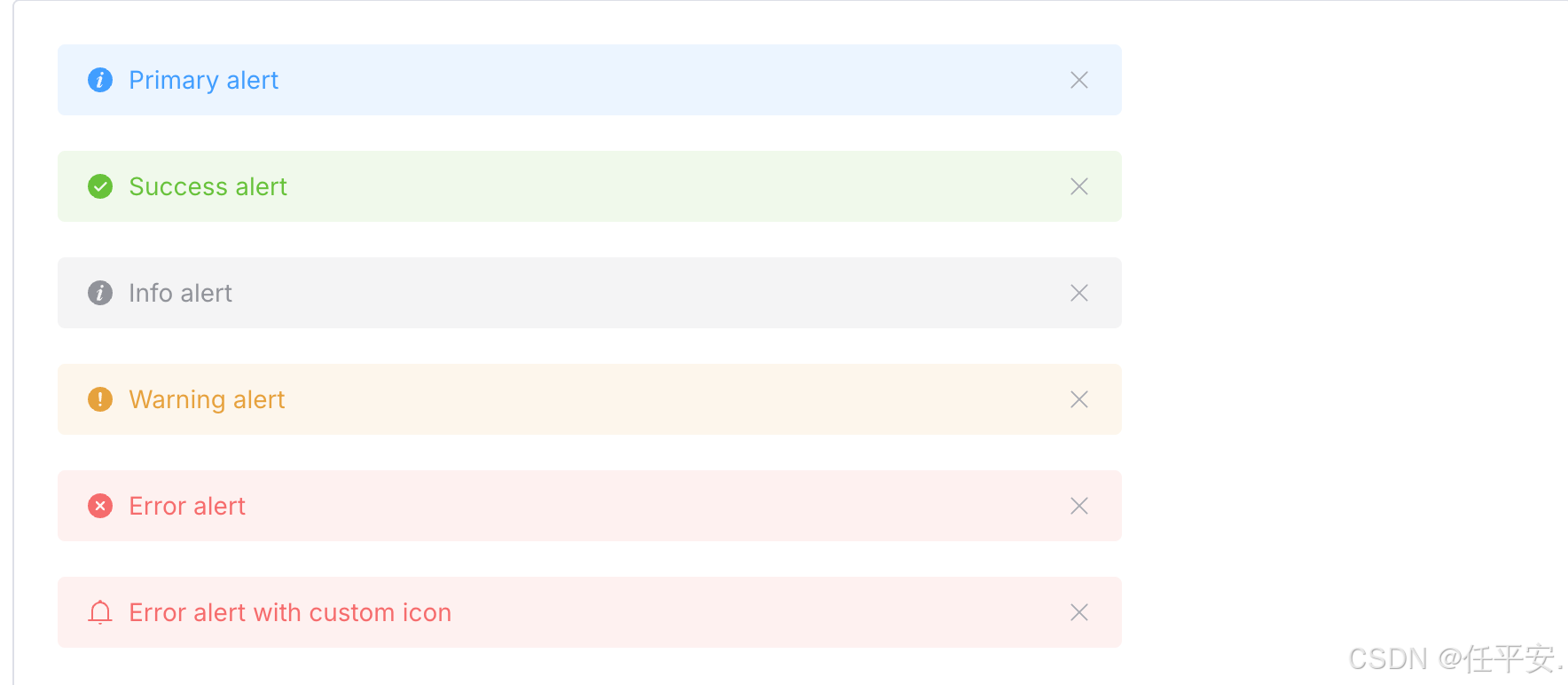
.smart-alert--info {
--alert-color: #409eff;
--alert-bg: linear-gradient(135deg, #ecf5ff 0%, #f0f7ff 100%);
--alert-border: #d4e3ff;
}
.smart-alert--success {
--alert-color: #67c23a;
--alert-bg: linear-gradient(135deg, #f0f9eb 0%, #f5fbf0 100%);
--alert-border: #e1f3d8;
}
.smart-alert--warning {
--alert-color: #e6a23c;
--alert-bg: linear-gradient(135deg, #fdf6ec 0%, #fef9f0 100%);
--alert-border: #faecd8;
}
.smart-alert--error {
--alert-color: #f56c6c;
--alert-bg: linear-gradient(135deg, #fef0f0 0%, #fef5f5 100%);
--alert-border: #fde2e2;
}
</style>父组件中使用
<SmartAlert
    type="success"
    title="操作成功"
    message="您的作品已成功发布"
    action-text="查看作品"
    closable
    @action="handleViewWork"
    @close="handleClose"
  />
当然以上涉及的方法都可以不用的
也可以只显示一个 message 信息