模仿elementUI 中Carousel 走马灯卡片模式 type="card" 的自定义轮播组件 图片之间有宽度
elementUI 自带的样式不满足条件 尝试很多方法 无法精准控制样式 于是自己写一套组件使用
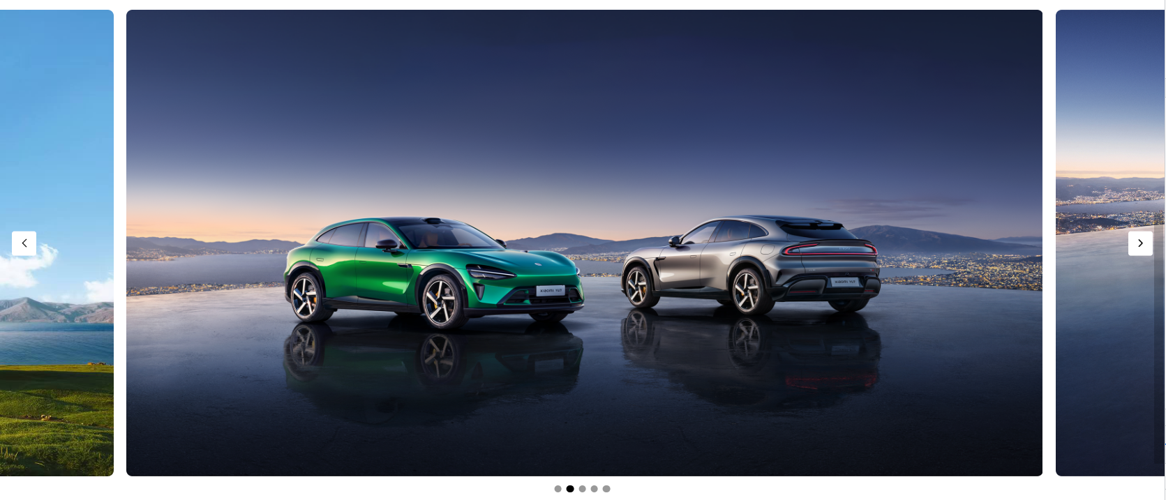
效果图如下:
html代码如下:(代码中的图片自己准备哈)
javascript
<div class="core-box">
	<div class="swiper-box">
		<!-- 左侧按钮 -->
		<div class="prev-btn" v-show="swiperIndex!=-1" @click="changeSwiper(-1)">
			<img src="@/assets/image/l-arr.png" alt="">
		</div>
		<!-- 右侧按钮 -->
		<div class="next-btn" v-show="swiperIndex!=swiperList.length-2" @click="changeSwiper(1)">
			<img src="@/assets/image/r-arr.png" alt="">
		</div>
		<!-- 中间圆点 -->
		<div class="dot-box">
			<div class="dot" :class="[index==(swiperIndex+1)?'active':'']"
			v-for="(item,index) in swiperList.length" :key="index"
			@click="dotFun(index)"></div>
		</div>
		<!-- 轮播图 -->
		<div class="swiper-list"
		:style="{width:((swiperList.length-1)*100+'%'), left: swiperLeft, transition: transition}">
			<div class="swiper-item" v-for="(item, index) in swiperList" :key="index"
			:style="{'background-image': `url(${item.banner})`}"></div>
		</div>
	</div>
 </div>
css代码如下:
javascript
.core-box{
	margin-top: 30px;
	padding-bottom: 40px;
	.swiper-box{
		height: 770px;
		position: relative;
		// overflow: hidden;
		.swiper-list{
			display: flex;
			width: 400%;
			height: 770px;
			overflow-x: auto;
			position: absolute;
			top: 0;
			left: -25%;
			transition: all 0.3s;
			padding: 0 20px;
			.swiper-item{
				display: flex;
				align-content: center;
				flex-wrap: wrap;
				width: 100%;
				height: 770px;
				background: url('@/assets/bann2.jpeg') no-repeat center center;
				background-size: 100% 100%;
				border-radius: 10px;
				margin-right: 20px;
				&:last-child{
					margin-right: 0;
				}
				&.active{
					opacity: 1;
				}
			}
		}
		.prev-btn, .next-btn{
			width: 40px;
			height: 40px;
			border-radius: 4px;
			position: absolute;
			left: 20px;
			top: 50%;
			transform: translateY(-50%);
			z-index: 9;
			cursor: pointer;
			background-color: #fff;
			display: flex;
			align-items: center;
			justify-content: center;
			img{
				width: 25px;
				height:25px;
			}
		}
		.next-btn{
			left: unset;
			right: 20px;
		}
		.dot-box{
			height: 40px;
			position: absolute;
			left: 50%;
			bottom: -40px;
			transform: translateX(-50%);
			z-index: 9;
			cursor: pointer;
			display: flex;
			align-items: center;
			justify-content: center;
			.dot{
				width: 12px;
				height: 12px;
				margin: 0 4px;
				background-color: #000;
				border-radius: 50%;
				opacity: 0.4;
			}
			.dot.active{
				background-color: #000;
				opacity: 1;
			}
		}
	}
}
js代码如下:
javascript
<script setup>
import { ref  } from 'vue';
// 轮播的列表
let swiperList =ref([
	{ banner: '../src/assets/9.jpg' },
    { banner: '../src/assets/1.png' },
    { banner: '../src/assets/11.png'},
    { banner: '../src/assets/22.jpg' },
	{ banner: '../src/assets/22.jpg' },
])
let swiperIndex =ref(0)//初始滚动下标
let transition = ref('all 0.3s')
// 计算偏移量 中间显示完全 两边的图片占比大小
let Px  = (((swiperList.value.length-1)/swiperList.value.length)-(1-((swiperList.value.length-1)/swiperList.value.length))/2)*100
//每一张图片占比大小
let PxL  = ((swiperList.value.length-1)/swiperList.value.length)*100

let swiperLeft = ref(`-${Px}%`)//初始移动位置
// 点击左右切换按钮
function changeSwiper(type){
	// 点击右侧
	if (type === 1) {
		swiperIndex.value++
		// 判断是否是最后一个图片
		if (swiperIndex.value == swiperList.value.length-2) {
			swiperLeft.value = -(swiperList.value.length-2)*100+'%'
      	}else{
			swiperLeft.value = -(PxL*swiperIndex.value*1+Px)+'%'
		}
	}else{
		swiperIndex.value--
		//判断是否是第一张图片
		if (swiperIndex.value == -1) {
			swiperLeft.value = '0%'
      	}else{
			swiperLeft.value = -(PxL*swiperIndex.value*1+Px)+'%'
		}
	}
}
// 点击圆滑点切换图片
function dotFun(val){
	swiperIndex.value = val-1
	if (swiperIndex.value == -1) {
		swiperLeft.value = '0%'
	}else if(swiperIndex.value == swiperList.value.length-2){
		swiperLeft.value = -(swiperList.value.length-2)*100+'%'
	}else{
		swiperLeft.value = -(PxL*swiperIndex.value*1+Px)+'%'
	}
}
</script>
ok 这些就可以实现想要的效果 如果想封装组件自己完成哈