CSS定位全解析:从静态到粘性,掌握元素布局的核心技巧
在网页开发中,CSS定位是控制元素布局的核心技术之一。不同的定位方式可以让元素在页面上以各种方式排列和交互。本文将深入解析CSS中的各种定位方式,帮助前端开发者彻底掌握这一重要概念。
1. 文档流与定位基础
在深入探讨各种定位方式之前,我们需要理解什么是文档流。文档流是HTML元素默认的布局方式:块级元素垂直排列,行内元素水平排列,遵循从上到下、从左到右的自然顺序。
xml
<!DOCTYPE html>
<html lang="en">
<head>
    <meta charset="UTF-8">
    <meta name="viewport" content="width=device-width, initial-scale=1.0">
    <title>文档流示例</title>
    <style>
        * { margin: 0; padding: 0; }
        .block {
            width: 200px;
            height: 100px;
            background-color: pink;
            margin: 10px;
        }
    </style>
</head>
<body>
    <div class="block">块级元素1</div>
    <div class="block">块级元素2</div>
    <span>行内元素1</span>
    <span>行内元素2</span>
</body>
</html>
2. 相对定位(Relative Positioning)
相对定位是相对于元素在文档流中的原始位置进行定位。
xml
<!DOCTYPE html>
<html lang="en">
<head>
    <meta charset="UTF-8">
    <meta name="viewport" content="width=device-width, initial-scale=1.0">
    <title>Relative 相对定位</title>
    <style>
        *{
            margin: 0;
            padding: 0;
        }
        .parent{
            width: 500px;
            height: 500px;
            background-color: pink;
            position: relative;
            left: 100px;
            top:100px;
        }
        .child{
            width: 300px;
            height: 200px;
            background-color: skyblue;
            position: absolute;
        }
        .box{
            width: 100px;
            height: 100px;
            background-color: red;
        }
    </style>
</head>
<body>
    <div class="parent">
        <div class="child"></div>
    </div>
    <div class="box"></div>
</body>
</html>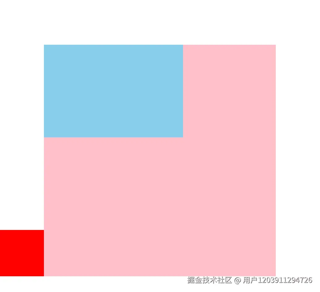
特点分析:
- 不会脱离文档流,原始位置继续被占用
- 后面的元素依然以标准流方式对待它
- 通过top、bottom、left、right属性进行微调
- 常用于微调元素位置或作为绝对定位元素的参考容器
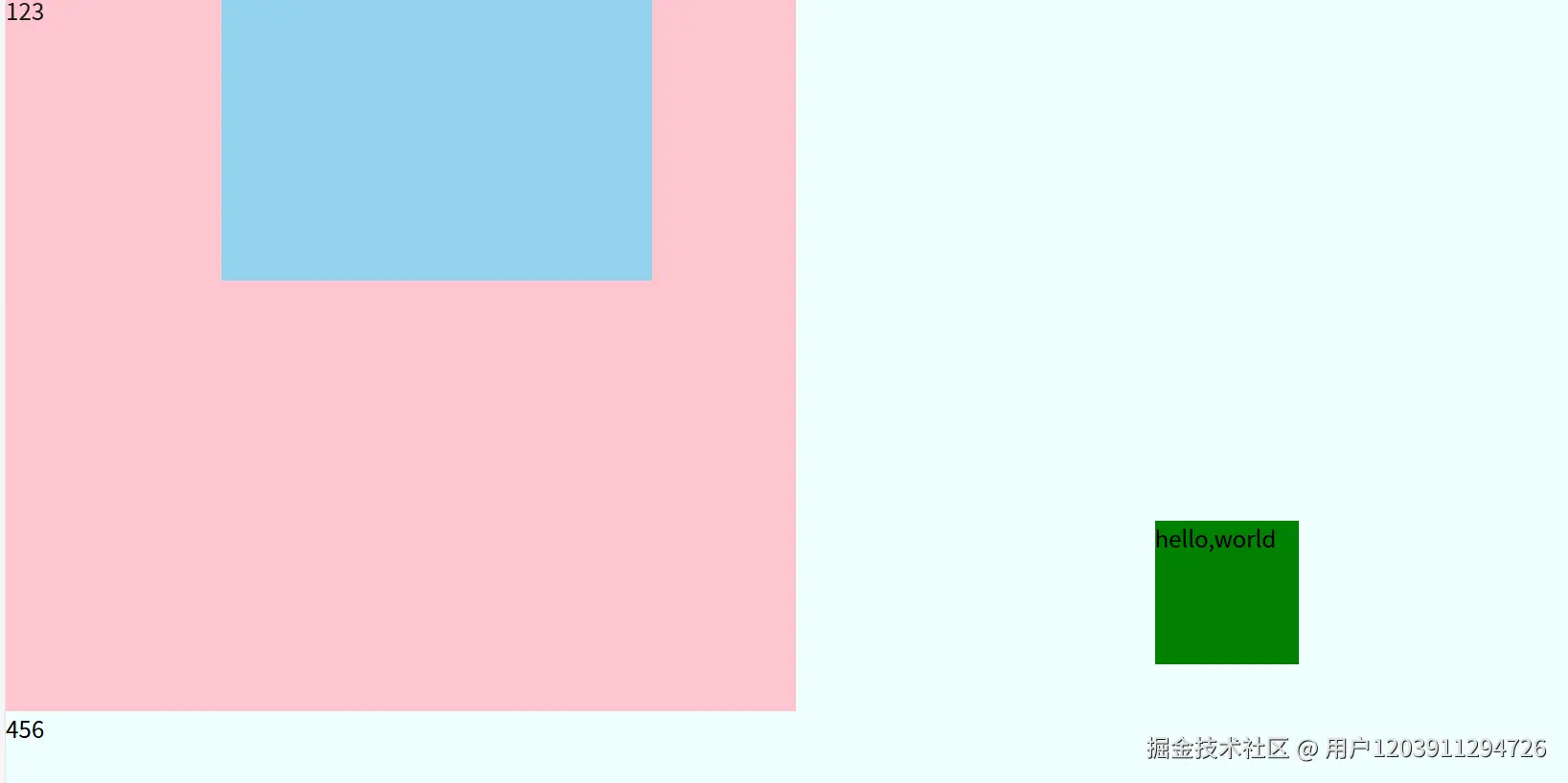
3. 绝对定位(Absolute Positioning)
绝对定位元素会脱离文档流,不再占用原始空间。
xml
<!DOCTYPE html>
<html lang="en">
<head>
    <meta charset="UTF-8">
    <meta name="viewport" content="width=device-width, initial-scale=1.0">
    <title>绝对定位示例</title>
    <style>
        *{
            margin: 0;
            padding: 0;
        }
        body{
            background-color: azure;
        }
        .parent{
            opacity: 0.9;
            width: 550px;
            height: 500px;
            background-color: pink;
            position: relative;
        }
        .child{
            width: 300px;
            height: 200px;
            background-color: skyblue;
            position: absolute;
            right: 100px;
        }
        .box{
            width: 100px;
            height: 100px;
            background-color: green;
            position: absolute;
            left: 50%;
            top: 50%;
            transform: translate(-50%,-50%);
        }
    </style>
</head>
<body>
    <div class="parent">
        <div class="child"></div>
        <div>123</div>
    </div>
    <div class="box">hello,world</div>
    <div>456</div>
</body>
</html>
关键特性:
- 脱离文档流,不占用空间
- 相对于最近的非static定位祖先元素定位
- 如果没有符合条件的祖先元素,则相对于初始包含块(通常是body)
- 常用于创建浮动元素、对话框、下拉菜单等
居中技巧: 使用绝对定位实现元素居中是一种常见技巧:
css
.center {
    position: absolute;
    left: 50%;
    top: 50%;
    transform: translate(-50%, -50%);
}
4. 固定定位(Fixed Positioning)
固定定位元素相对于浏览器窗口进行定位,不随页面滚动而移动。
xml
<!DOCTYPE html>
<html lang="en">
<head>
    <meta charset="UTF-8">
    <meta name="viewport" content="width=device-width, initial-scale=1.0">
    <title>固定定位示例</title>
    <style>
        *{
            margin: 0;
            padding: 0;
        }
        body{
            height: 2000px;
        }
        .parent{
            width: 500px;
            height: 500px;
            background-color: pink;
        }
        .box{
            width: 100px;
            height: 100px;
            background-color: green;
        }
        .child{
            width: 300px;
            height: 200px;
            background-color: blue;
            position: fixed;
            right: 100px;
            bottom: 100px;
        }
    </style>
</head>
<body>
    <div class="parent"></div>
    <div class="box"></div>
    <div class="child">固定定位元素</div>
</body>
</html>
应用场景:
- 固定导航栏
- 回到顶部按钮
- 侧边广告栏
- 模态对话框
5. 粘性定位(Sticky Positioning)
粘性定位是相对定位和固定定位的混合体,在跨越特定阈值前为相对定位,之后为固定定位。
xml
<!DOCTYPE html>
<html lang="en">
<head>
    <meta charset="UTF-8">
    <meta name="viewport" content="width=device-width, initial-scale=1.0">
    <title>粘性定位示例</title>
    <style>
        *{
            margin: 0;
            padding: 0;
        }
        .parent{
            width: 500px;
            height: 500px;
            background-color: pink;
        }
        .child{
            width: 300px;
            height: 200px;
            background-color: blue;
        }
        .box{
            width: 100px;
            height: 100px;
            background-color: green;
            position: sticky;
            top: 100px;
        }
        body{
            height: 2000px;
        }
    </style>
</head>
<body>
    <div class="parent">
        <div class="child"></div>
    </div>
    <div class="box">hello,world</div>
</body>
</html>
使用要点:
- 必须指定top、bottom、left或right至少一个阈值
- 在父容器内滚动时生效
- 兼容性较好,但需要测试目标浏览器支持情况
- 常用于表格标题固定、导航栏滚动固定等场景
6. 静态定位(Static Positioning)
静态定位是元素的默认定位方式,元素遵循正常的文档流。
xml
<!DOCTYPE html>
<html lang="en">
<head>
    <meta charset="UTF-8">
    <meta name="viewport" content="width=device-width, initial-scale=1.0">
    <title>静态定位示例</title>
    <style>
        *{
            margin: 0;
            padding: 0;
        }
        .parent{
            width: 500px;
            height: 500px;
            background-color: pink;
            left: 100px;
            top: 100px;
            position: absolute;
        }
        .child{
            width: 300px;
            height: 200px;
            background-color: blue;
        }
        .box{
            width: 100px;
            height: 100px;
            background-color: green;
        }
    </style>
</head>
<body>
    <div class="parent">
        <div class="child"></div>
    </div>
    <div class="box">hello,world</div>
    <script>
        const oParent = document.querySelector('.parent');
        setTimeout(()=>{
            oParent.style.position='static';
        },5000)
    </script>
</body>
</html>
重要特性:
- 默认定位方式,元素处于正常文档流中
- 忽略top、bottom、left、right和z-index属性
- 常用于取消元素的定位属性
7. 定位实战技巧与注意事项
7.1 z-index与层叠上下文
定位元素会创建新的层叠上下文,z-index属性控制垂直方向上的堆叠顺序:
css
.element {
    position: relative;
    z-index: 10; /* 数值越大,显示在越上层 */
}
7.2 定位与响应式设计
在使用定位时需要考虑响应式设计:
css
@media (max-width: 768px) {
    .fixed-element {
        position: relative;
        right: auto;
        bottom: auto;
    }
}
7.3 性能考虑
- •过多使用固定定位和绝对定位可能影响页面性能
- •变换动画时考虑使用transform而不是定位属性
- •避免在滚动事件中频繁修改定位属性
8. 总结
CSS定位是前端开发中的核心技能,不同的定位方式适用于不同的场景:
- •静态定位:默认布局方式,适用于大多数常规布局
- •相对定位:微调元素位置,保持文档流结构
- •绝对定位:创建浮动元素,精确定位
- •固定定位:相对于视口固定,适合导航和广告
- •粘性定位:滚动时切换定位方式,增强用户体验
掌握这些定位方式并理解它们的适用场景,将帮助你创建出更加精美和功能丰富的网页布局。在实际开发中,根据具体需求选择合适的定位方式,并注意兼容性和性能问题,才能打造出优秀的用户体验。 希望本文能帮助你深入理解CSS定位,如果有任何疑问或想法,欢迎在评论区交流讨论!