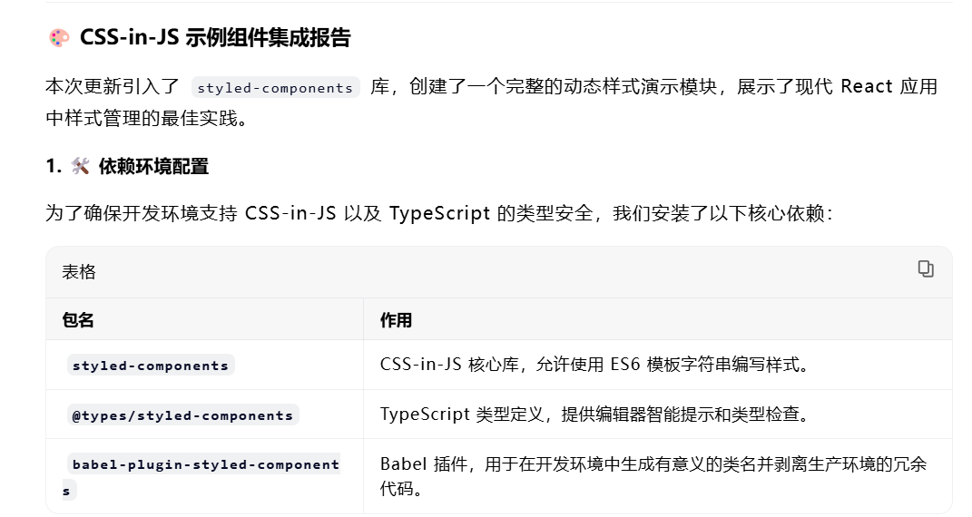
CssInJs.tsx
javascript
import React, { useState } from 'react'
import styled from 'styled-components'

// 定义主题类型接口 - 规范主题配色方案的类型
interface Theme {
  primaryColor: string    // 主色调
  secondaryColor: string  // 辅助色
  dangerColor: string     // 危险/错误状态色
  backgroundColor: string // 背景色
  textColor: string       // 文本色
}

// 创建默认主题配置 - 统一应用的色彩风格
const theme: Theme = {
  primaryColor: '#007bff',    // 蓝色主调
  secondaryColor: '#6c757d',  // 灰色辅助色
  dangerColor: '#dc3545',     // 红色危险色
  backgroundColor: '#f8f9fa', // 浅灰背景
  textColor: '#212529'        // 深灰文本
}

// 按钮组件Props类型接口 - 定义按钮的可配置属性
interface ButtonProps {
  variant?: 'primary' | 'secondary' | 'danger' // 按钮样式变体
  size?: 'small' | 'medium' | 'large'          // 按钮尺寸
  active?: boolean                             // 是否激活状态
  disabled?: boolean                            // 是否禁用状态
}

// 卡片组件Props类型接口 - 定义卡片的可配置属性
interface CardProps {
  elevation?: number // 卡片阴影层级(控制立体感)
}

// 容器组件 - 应用主容器,控制全局布局和背景
const Container = styled.div`
  padding: 20px;
  background-color: ${theme.backgroundColor}; // 引用主题背景色
  min-height: 100vh; // 占满整个视口高度
`

// 页头组件 - 页面标题样式
const Header = styled.h1`
  color: ${theme.textColor}; // 引用主题文本色
  text-align: center; // 文字居中
  margin-bottom: 30px; // 底部间距
`

// 控制区容器 - 包裹所有交互控制组件,统一布局
const ControlsWrapper = styled.div`
  display: flex; // 弹性布局
  flex-wrap: wrap; // 自动换行(适配小屏幕)
  gap: 15px; // 组件间距
  justify-content: center; // 水平居中
  margin-bottom: 30px; // 底部间距
  padding: 20px; // 内边距
  background-color: #e9ecef; // 浅灰背景
  border-radius: 8px; // 圆角
`

// 样式化按钮组件 - 支持多变体、多尺寸、状态控制
const StyledButton = styled.button<ButtonProps>`
  // 内边距 - 根据size属性动态调整
  padding: ${props => {
    switch (props.size) {
      case 'small': return '6px 12px' // 小尺寸内边距
      case 'large': return '18px 36px' // 大尺寸内边距
      default: return '12px 24px' // 默认(中)尺寸内边距
    }
  }};

  // 字体大小 - 根据size属性动态调整
  font-size: ${props => {
    switch (props.size) {
      case 'small': return '12px' // 小尺寸字体
      case 'large': return '20px' // 大尺寸字体
      default: return '16px' // 默认(中)尺寸字体
    }
  }};

  // 背景色 - 优先处理禁用状态,再根据variant属性调整
  background-color: ${props => {
    if (props.disabled) return '#ccc' // 禁用状态灰色
    switch (props.variant) {
      case 'secondary': return theme.secondaryColor // 辅助色
      case 'danger': return theme.dangerColor // 危险色
      default: return theme.primaryColor // 默认主色调
    }
  }};

  color: white; // 文字白色
  border: none; // 无边框
  border-radius: 4px; // 圆角
  cursor: ${props => props.disabled ? 'not-allowed' : 'pointer'}; // 鼠标指针样式
  opacity: ${props => props.disabled ? 0.6 : 1}; // 禁用状态透明度降低
  transform: ${props => props.active ? 'scale(1.05)' : 'scale(1)'}; // 激活状态轻微放大
  transition: all 0.3s ease; // 所有属性过渡动画(0.3秒,缓动效果)
  font-weight: bold; // 字体加粗

  // hover状态 - 非禁用时添加放大和阴影效果
  &:hover {
    transform: ${props => !props.disabled ? 'scale(1.05)' : 'none'};
    box-shadow: ${props => !props.disabled ? '0 4px 8px rgba(0,0,0,0.2)' : 'none'};
  }

  // focus状态 - 聚焦时添加外边框(提升可访问性)
  &:focus {
    outline: 2px solid ${theme.primaryColor};
    outline-offset: 2px;
  }
`

// 卡片组件 - 内容容器,支持阴影层级控制
const Card = styled.div<CardProps>`
  background: white; // 白色背景
  padding: 20px; // 内边距
  border-radius: 8px; // 圆角
  // 阴影效果 - 根据elevation属性动态计算(默认2级)
  box-shadow: ${props =>
    `0 ${props.elevation || 2}px ${props.elevation ? props.elevation * 2 : 4}px rgba(0,0,0,0.1)`};
  margin: 20px auto; // 上下间距,水平居中
  max-width: 600px; // 最大宽度(限制卡片宽度)
  transition: box-shadow 0.3s ease; // 阴影过渡动画

  // hover状态 - 阴影加深(提升交互感)
  &:hover {
    box-shadow: ${props =>
      `0 ${Math.min((props.elevation || 2) * 2, 12)}px ${Math.min((props.elevation || 2) * 4, 24)}px rgba(0,0,0,0.15)`};
  }
`

// 卡片标题组件 - 卡片内标题样式
const CardTitle = styled.h2`
  margin-top: 0; // 清除默认上边距
  color: ${theme.textColor}; // 引用主题文本色
  border-bottom: 2px solid ${theme.primaryColor}; // 底部主色调边框
  padding-bottom: 10px; // 底部内边距(与边框间距)
`

// 特性列表组件 - 自定义列表样式
const FeatureList = styled.ul`
  padding-left: 20px; // 左侧内边距(调整列表缩进)

  li {
    margin-bottom: 10px; // 列表项底部间距
    line-height: 1.5; // 行高(提升可读性)
  }

  // 列表项前缀 - 添加对勾图标
  li::before {
    content: "✓"; // 对勾符号
    color: ${theme.primaryColor}; // 主色调
    font-weight: bold; // 加粗
    display: inline-block; // 行内块级(便于控制宽度)
    width: 1em; // 宽度(与文字对齐)
    margin-left: -1em; // 左移(实现自定义缩进)
  }
`

// 切换开关容器 - 包裹开关和文字,控制布局
const ToggleContainer = styled.div`
  display: flex; // 弹性布局
  align-items: center; // 垂直居中
  gap: 10px; // 组件间距
`

// 切换开关组件 - 自定义开关样式(基于checkbox)
const ToggleSwitch = styled.label<{ checked: boolean }>`
  position: relative; // 相对定位(用于内部绝对定位元素)
  display: inline-block; // 行内块级
  width: 60px; // 开关宽度
  height: 34px; // 开关高度

  // 隐藏原生checkbox
  input {
    opacity: 0; // 透明
    width: 0; // 宽度为0
    height: 0; // 高度为0
  }

  // 开关背景滑块
  span {
    position: absolute; // 绝对定位(覆盖整个label)
    cursor: pointer; // 鼠标指针(手型)
    top: 0;
    left: 0;
    right: 0;
    bottom: 0;
    background-color: ${props => props.checked ? theme.primaryColor : '#ccc'}; // 选中/未选中背景色
    transition: .4s; // 过渡动画(0.4秒)
    border-radius: 34px; // 圆角(圆形滑块)

    // 开关按钮(圆形)
    &::before {
      position: absolute; // 绝对定位
      content: ""; // 空内容(纯样式元素)
      height: 26px; // 按钮高度
      width: 26px; // 按钮宽度
      left: 4px; // 左偏移
      bottom: 4px; // 底偏移
      background-color: white; // 白色背景
      transition: .4s; // 过渡动画
      border-radius: 50%; // 圆形
      transform: ${props => props.checked ? 'translateX(26px)' : 'translateX(0)'}; // 选中时右移
    }
  }
`

// 主组件 - CSS-in-JS演示入口
const CssInJsDemo: React.FC = () => {
  // 状态管理 - 控制按钮和卡片的动态样式
  const [buttonVariant, setButtonVariant] = useState<ButtonProps['variant']>('primary') // 按钮变体
  const [buttonSize, setButtonSize] = useState<ButtonProps['size']>('medium')          // 按钮尺寸
  const [isButtonActive, setIsButtonActive] = useState(false)                          // 按钮激活状态
  const [isButtonDisabled, setIsButtonDisabled] = useState(false)                      // 按钮禁用状态
  const [cardElevation, setCardElevation] = useState(2)                                // 卡片阴影层级
  const [darkMode, setDarkMode] = useState(false)                                      // 深色模式开关

  return (
    <Container>
      <Header>CSS-in-JS 示例 (Styled Components)</Header>

      {/* 控制区 - 用于调整组件样式参数 */}
      <ControlsWrapper>
        {/* 切换按钮变体(primary/secondary) */}
        <StyledButton
          variant={buttonVariant === 'primary' ? 'secondary' : 'primary'}
          onClick={() => setButtonVariant(buttonVariant === 'primary' ? 'secondary' : 'primary')}
        >
          切换主题: {buttonVariant === 'primary' ? 'Secondary' : 'Primary'}
        </StyledButton>

        {/* 切换按钮尺寸(medium/large) */}
        <StyledButton
          size={buttonSize === 'medium' ? 'large' : 'medium'}
          onClick={() => setButtonSize(buttonSize === 'medium' ? 'large' : 'medium')}
        >
          切换大小: {buttonSize === 'medium' ? 'Large' : 'Medium'}
        </StyledButton>

        {/* 按钮激活状态切换开关 */}
        <ToggleContainer>
          <span>激活状态:</span>
          <ToggleSwitch checked={isButtonActive}>
            <input
              type="checkbox"
              checked={isButtonActive}
              onChange={() => setIsButtonActive(!isButtonActive)}
            />
            <span />
          </ToggleSwitch>
        </ToggleContainer>

        {/* 按钮禁用状态切换开关 */}
        <ToggleContainer>
          <span>禁用状态:</span>
          <ToggleSwitch checked={isButtonDisabled}>
            <input
              type="checkbox"
              checked={isButtonDisabled}
              onChange={() => setIsButtonDisabled(!isButtonDisabled)}
            />
            <span />
          </ToggleSwitch>
        </ToggleContainer>

        {/* 调整卡片阴影层级(2-12级,步长2) */}
        <StyledButton
          onClick={() => setCardElevation(cardElevation >= 12 ? 2 : cardElevation + 2)}
        >
          卡片阴影: {cardElevation} 级
        </StyledButton>

        {/* 深色模式切换开关 */}
        <ToggleContainer>
          <span>深色模式:</span>
          <ToggleSwitch checked={darkMode}>
            <input
              type="checkbox"
              checked={darkMode}
              onChange={() => setDarkMode(!darkMode)}
            />
            <span />
          </ToggleSwitch>
        </ToggleContainer>
      </ControlsWrapper>

      {/* 演示卡片1 - CSS-in-JS特性介绍 */}
      <Card elevation={cardElevation}>
        <CardTitle>关于 CSS-in-JS</CardTitle>
        <FeatureList>
          <li>将CSS直接写在JavaScript/TypeScript组件中</li>
          <li>支持动态样式,可以根据组件状态改变样式</li>
          <li>自动处理浏览器前缀</li>
          <li>避免CSS类名冲突</li>
          <li>支持主题和变量</li>
          <li>具备完整的TypeScript类型支持</li>
          <li>样式与组件紧密耦合,便于维护</li>
        </FeatureList>

        {/* 动态样式按钮 - 应用上方控制区的所有状态 */}
        <StyledButton
          variant={buttonVariant}
          size={buttonSize}
          active={isButtonActive}
          disabled={isButtonDisabled}
          onClick={() => alert('按钮被点击了!')}
          // 内联样式 - 深色模式下覆盖背景色和文本色
          style={{
            marginTop: '20px',
            backgroundColor: darkMode ? '#343a40' : undefined,
            color: darkMode ? '#f8f9fa' : undefined
          }}
        >
          动态样式按钮
        </StyledButton>
      </Card>

      {/* 演示卡片2 - CSS-in-JS使用方法 */}
      <Card elevation={cardElevation}>
        <CardTitle>使用方法</CardTitle>
        <FeatureList>
          <li>使用styled.[element]创建样式化组件</li>
          <li>通过props传递样式参数</li>
          <li>使用模板字符串编写CSS</li>
          <li>在组件中像普通React组件一样使用</li>
          <li>支持伪类、媒体查询等CSS特性</li>
          <li>可以继承和扩展其他样式组件</li>
        </FeatureList>
      </Card>
    </Container>
  )
}

export default CssInJsDemo
vite.config.ts
javascript
import { defineConfig } from 'vite'
import react from '@vitejs/plugin-react'

// https://vite.dev/config/
export default defineConfig({
  plugins: [
    react({
      babel: {
        plugins: [
          [
            'babel-plugin-styled-components',
            {
              displayName: true,
              fileName: false
            }
          ]
        ]
      }
    })
  ],
})