App Store数据分析:价格、类别与用户评分的深度洞察
引言
在移动应用经济蓬勃发展的今天,了解应用市场的价格分布、类别特征以及用户评分模式对于开发者、投资者和市场分析师都具有重要意义。本文基于App Store的6,660个应用数据,通过Python的数据分析工具,深入探索了应用市场的多个维度特征。
数据概览与预处理
本次分析的数据集包含了6,660个App Store应用,涵盖了23个不同类别。在数据预处理阶段,我们进行了以下关键操作:
python
import pandas as pd
import numpy as np
import matplotlib.pyplot as plt
import seaborn as sns

# 设置中文字体显示
plt.rcParams['font.sans-serif'] = ['SimHei', 'Arial Unicode MS', 'DejaVu Sans']
plt.rcParams['axes.unicode_minus'] = False

# 数据读取与预处理
df = pd.read_excel('applestore.xlsx')
df['price'] = pd.to_numeric(df['price'], errors='coerce')
df['user_rating'] = pd.to_numeric(df['user_rating'], errors='coerce')
df['rating_count_tot'] = pd.to_numeric(df['rating_count_tot'], errors='coerce')

# 数据清洗与特征工程
df = df[df['price'] >= 0]
df = df[df['price'] <= 50]
df = df[df['user_rating'] >= 0]
df['is_paid'] = df['price'] > 0预处理后的数据显示,应用商店中共有6,660个应用,其中免费应用占54.5%(3,633个),付费应用占45.5%(3,027个)。平均价格为1.67,中位数为0.00,反映出应用市场以免费或低价为主的特性。
价格分布分析
使用matplotlib进行价格分布可视化
matplotlib作为Python的基础绘图库,提供了丰富的自定义选项,能够创建各种类型的图形并精确控制图形的各个元素。
python
# 使用matplotlib绘制价格分布图
plt.figure(figsize=(15, 10))

# 价格分布直方图
plt.subplot(2, 2, 1)
plt.hist(df['price'], bins=50, alpha=0.7, color='skyblue', edgecolor='black')
plt.title('所有App价格分布 (matplotlib)')
plt.xlabel('价格 ($)')
plt.ylabel('应用数量')
plt.grid(True, alpha=0.3)

# 价格分布箱线图
plt.subplot(2, 2, 2)
plt.boxplot(df['price'], vert=True, patch_artist=True)
plt.title('价格分布箱线图 (matplotlib)')
plt.ylabel('价格 ($)')
plt.grid(True, alpha=0.3)

# 免费vs付费比例饼图
plt.subplot(2, 2, 3)
paid_counts = df['is_paid'].value_counts()
labels = ['免费应用', '付费应用']
colors = ['lightgreen', 'lightcoral']
plt.pie(paid_counts, labels=labels, autopct='%1.1f%%', colors=colors, startangle=90)
plt.title('免费vs付费应用比例 (matplotlib)')

# 价格累积分布函数图
plt.subplot(2, 2, 4)
sorted_prices = np.sort(df['price'])
y_vals = np.arange(1, len(sorted_prices)+1) / len(sorted_prices)
plt.plot(sorted_prices, y_vals, linewidth=2, color='orange')
plt.title('价格累积分布函数 (matplotlib)')
plt.xlabel('价格 ($)')
plt.ylabel('累积比例')
plt.grid(True, alpha=0.3)

plt.tight_layout()
plt.savefig('price_distribution_matplotlib.png', dpi=300, bbox_inches='tight')
plt.show()
从图1可以看出,价格分布呈现典型的"长尾分布"特征。大部分应用集中在0-5的价格区间,少数高价应用拉高了整体平均价格。免费应用数量略多于付费应用,反映出应用商店以免费模式为主的市场特征。
使用seaborn进行价格分布可视化
seaborn在matplotlib的基础上进行了更高层次的封装,提供了更简洁的接口和更多美观的默认样式,能够快速生成具有专业外观的统计图形。
python
# 使用seaborn绘制价格分布图
plt.figure(figsize=(15, 10))

# 直方图与密度曲线
plt.subplot(2, 2, 1)
sns.histplot(data=df, x='price', bins=50, kde=True, color='skyblue')
plt.title('所有App价格分布 (seaborn)')
plt.xlabel('价格 ($)')
plt.ylabel('应用数量')

# 箱线图
plt.subplot(2, 2, 2)
sns.boxplot(data=df, y='price', color='lightblue')
plt.title('价格分布箱线图 (seaborn)')
plt.ylabel('价格 ($)')

# 免费vs付费计数图
plt.subplot(2, 2, 3)
paid_palette = ['lightgreen', 'lightcoral']
sns.countplot(data=df, x='is_paid', hue='is_paid', palette=paid_palette, legend=False)
plt.title('免费vs付费应用数量 (seaborn)')
plt.xlabel('应用类型')
plt.xticks([0, 1], ['免费', '付费'])
plt.ylabel('数量')

# 小提琴图
plt.subplot(2, 2, 4)
sns.violinplot(data=df, y='price', color='lightyellow')
plt.title('价格分布小提琴图 (seaborn)')
plt.ylabel('价格 ($)')

plt.tight_layout()
plt.savefig('price_distribution_seaborn.png', dpi=300, bbox_inches='tight')
plt.show()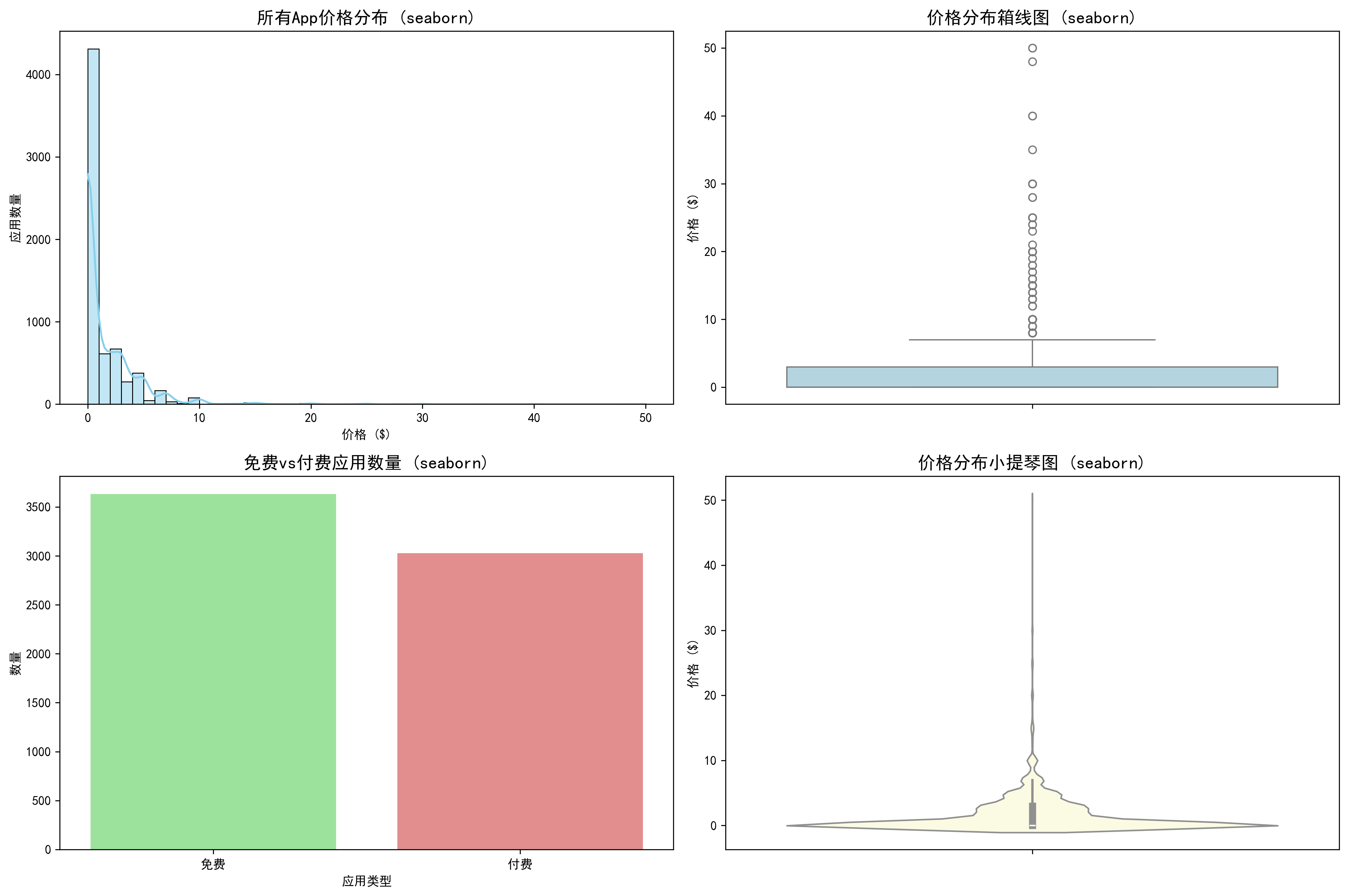
图2通过密度曲线和小提琴图更直观地展示了价格分布的密度特征。seaborn绘制的图形清晰显示了价格主要集中在$0附近,随着价格升高,应用数量急剧减少。
不同类别App价格分布分析
使用matplotlib进行类别价格分布分析
python
# 选择应用数量较多的前15个类别进行分析
top_genres = df['prime_genre'].value_counts().head(15).index
df_top_genres = df[df['prime_genre'].isin(top_genres)]

# 使用matplotlib绘制各类别价格分布
plt.figure(figsize=(16, 10))

# 各类别价格中位数条形图
plt.subplot(2, 2, 1)
genre_median_prices = df_top_genres.groupby('prime_genre')['price'].median().sort_values(ascending=False)
plt.bar(genre_median_prices.index, genre_median_prices.values, color='lightsteelblue', alpha=0.8)
plt.title('各类别App价格中位数 (matplotlib)')
plt.xlabel('应用类别')
plt.ylabel('价格中位数 ($)')
plt.xticks(rotation=45, ha='right')
plt.grid(True, alpha=0.3)

# 各类别价格分布箱线图
plt.subplot(2, 2, 2)
genre_data = [df_top_genres[df_top_genres['prime_genre'] == genre]['price'] for genre in top_genres]
try:
    plt.boxplot(genre_data, tick_labels=top_genres, vert=True)
except TypeError:
    plt.boxplot(genre_data, labels=top_genres, vert=True)
plt.title('各类别价格分布箱线图 (matplotlib)')
plt.xlabel('应用类别')
plt.ylabel('价格 ($)')
plt.xticks(rotation=45, ha='right')
plt.grid(True, alpha=0.3)

# 各类别付费比例条形图
plt.subplot(2, 2, 3)
genre_paid_ratio = df_top_genres.groupby('prime_genre')['is_paid'].mean().sort_values(ascending=False)
plt.bar(genre_paid_ratio.index, genre_paid_ratio.values * 100, color='lightcoral', alpha=0.8)
plt.title('各类别付费应用比例 (matplotlib)')
plt.xlabel('应用类别')
plt.ylabel('付费应用比例 (%)')
plt.xticks(rotation=45, ha='right')
plt.grid(True, alpha=0.3)

# 各类别应用数量条形图
plt.subplot(2, 2, 4)
genre_counts = df_top_genres['prime_genre'].value_counts()
plt.bar(genre_counts.index, genre_counts.values, color='lightgreen', alpha=0.8)
plt.title('各类别应用数量 (matplotlib)')
plt.xlabel('应用类别')
plt.ylabel('应用数量')
plt.xticks(rotation=45, ha='right')
plt.grid(True, alpha=0.3)

plt.tight_layout()
plt.savefig('genre_price_distribution_matplotlib.png', dpi=300, bbox_inches='tight')
plt.show()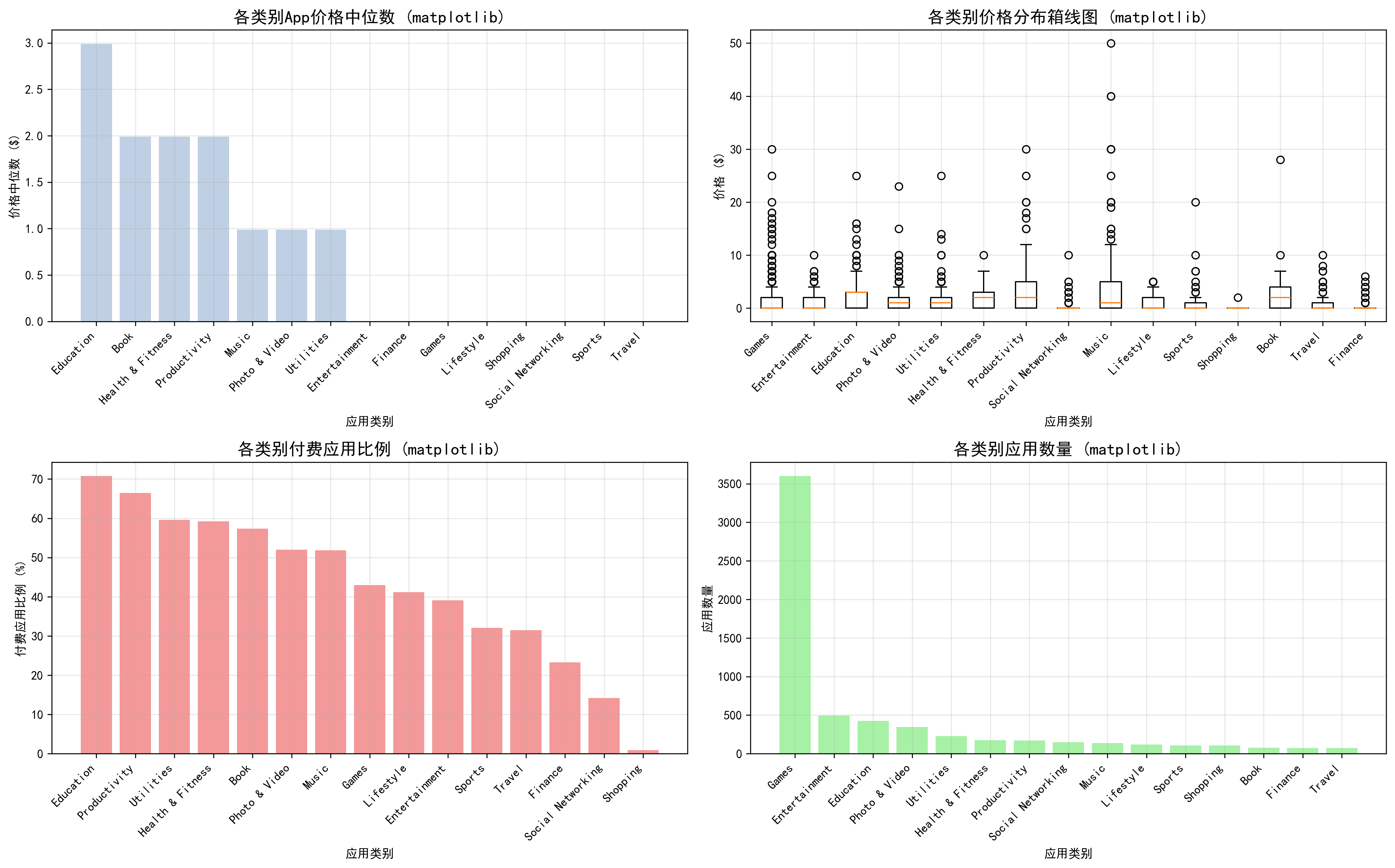
图3通过多个子图全面展示了各类别应用的价格特征。从价格中位数条形图可以看出,不同类别间的价格差异明显。箱线图进一步揭示了各类别内部的价格分布范围,某些类别虽然中位数价格较低,但存在较多高价应用。
使用seaborn进行类别价格分布分析
python
# 使用seaborn绘制各类别价格分布
plt.figure(figsize=(16, 12))

# 各类别价格分布小提琴图
plt.subplot(2, 2, 1)
sns.violinplot(data=df_top_genres, x='prime_genre', y='price',
               hue='prime_genre', palette='Set3', legend=False, dodge=False)
plt.title('各类别价格分布小提琴图 (seaborn)')
plt.xlabel('应用类别')
plt.ylabel('价格 ($)')
plt.xticks(rotation=45, ha='right')

# 各类别价格中位数点图
plt.subplot(2, 2, 2)
sns.pointplot(data=df_top_genres, x='prime_genre', y='price', estimator=np.median,
              palette='viridis', errorbar=None, hue='prime_genre', legend=False)
plt.title('各类别价格中位数 (seaborn)')
plt.xlabel('应用类别')
plt.ylabel('价格中位数 ($)')
plt.xticks(rotation=45, ha='right')

# 各类别免费/付费分布堆叠条形图
plt.subplot(2, 2, 3)
genre_paid_counts = pd.crosstab(df_top_genres['prime_genre'], df_top_genres['is_paid'])
genre_paid_counts = genre_paid_counts.reindex(top_genres)
genre_paid_counts.plot(kind='bar', stacked=True, color=['lightgreen', 'lightcoral'], ax=plt.gca())
plt.title('各类别免费/付费应用分布 (seaborn)')
plt.xlabel('应用类别')
plt.ylabel('应用数量')
plt.legend(['免费', '付费'])
plt.xticks(rotation=45, ha='right')

# 各类别价格区间分布热力图
plt.subplot(2, 2, 4)
price_bins = pd.cut(df_top_genres['price'], bins=[0, 0.01, 1, 5, 10, 20, 50],
                   labels=['免费', '$0-1', '$1-5', '$5-10', '$10-20', '$20+'])
genre_price_heatmap = pd.crosstab(df_top_genres['prime_genre'], price_bins)
genre_price_heatmap = genre_price_heatmap.reindex(top_genres)
sns.heatmap(genre_price_heatmap, annot=True, fmt='d', cmap='YlOrRd', cbar_kws={'label': '应用数量'})
plt.title('各类别价格区间分布热力图 (seaborn)')
plt.xlabel('价格区间')
plt.ylabel('应用类别')

plt.tight_layout()
plt.savefig('genre_price_distribution_seaborn.png', dpi=300, bbox_inches='tight')
plt.show()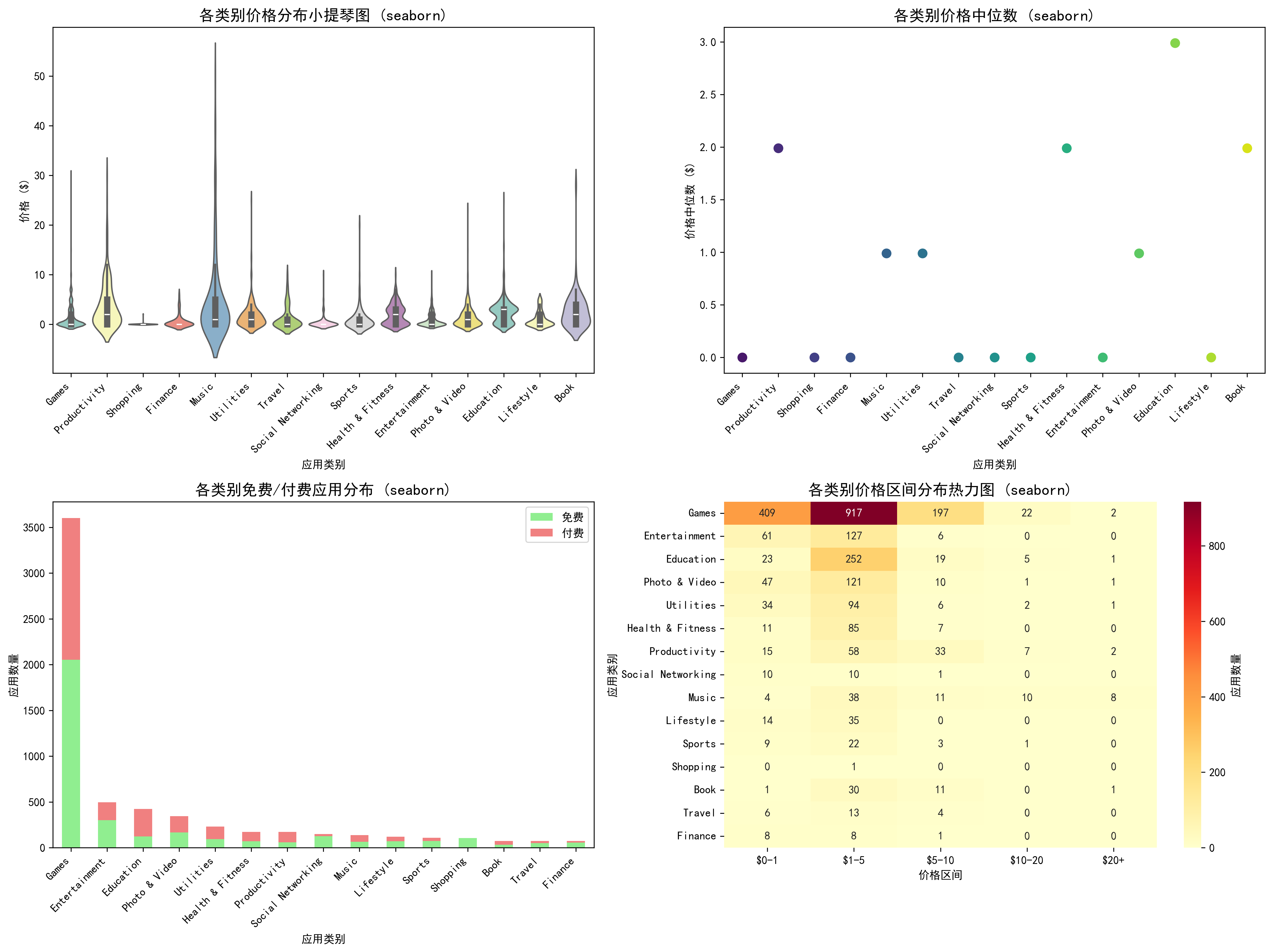
图4通过热力图清晰展示了各价格区间在不同类别中的分布情况。小提琴图则生动呈现了各类别价格分布的密度特征,部分类别呈现出双峰或多峰分布,反映了该类应用可能存在不同的定价策略细分。
免费与付费应用用户评分对比分析
使用matplotlib进行免费付费评分对比分析
python
# 使用matplotlib绘制免费vs付费应用评分对比
df_with_ratings = df_top_genres[df_top_genres['user_rating'] > 0]
plt.figure(figsize=(16, 10))

# 各类别免费vs付费应用平均评分分组条形图
plt.subplot(2, 2, 1)
free_ratings = df_with_ratings[df_with_ratings['price'] == 0].groupby('prime_genre')['user_rating'].mean()
paid_ratings = df_with_ratings[df_with_ratings['price'] > 0].groupby('prime_genre')['user_rating'].mean()
x = np.arange(len(top_genres))
width = 0.35
plt.bar(x - width/2, free_ratings.reindex(top_genres), width, label='免费应用', alpha=0.7, color='lightblue')
plt.bar(x + width/2, paid_ratings.reindex(top_genres), width, label='付费应用', alpha=0.7, color='lightcoral')
plt.title('各类别免费vs付费应用平均评分 (matplotlib)')
plt.xlabel('应用类别')
plt.ylabel('平均评分')
plt.xticks(x, top_genres, rotation=45, ha='right')
plt.legend()
plt.grid(True, alpha=0.3)

# 免费vs付费应用评分分布直方图
plt.subplot(2, 2, 2)
free_ratings_all = df_with_ratings[df_with_ratings['price'] == 0]['user_rating']
paid_ratings_all = df_with_ratings[df_with_ratings['price'] > 0]['user_rating']
plt.hist(free_ratings_all, bins=20, alpha=0.6, label='免费应用', color='lightblue', density=True)
plt.hist(paid_ratings_all, bins=20, alpha=0.6, label='付费应用', color='lightcoral', density=True)
plt.title('免费vs付费应用评分分布 (matplotlib)')
plt.xlabel('用户评分')
plt.ylabel('密度')
plt.legend()
plt.grid(True, alpha=0.3)

# 评分中位数差异条形图
plt.subplot(2, 2, 3)
free_median = df_with_ratings[df_with_ratings['price'] == 0].groupby('prime_genre')['user_rating'].median()
paid_median = df_with_ratings[df_with_ratings['price'] > 0].groupby('prime_genre')['user_rating'].median()
rating_diff = paid_median.reindex(top_genres) - free_median.reindex(top_genres)
colors = ['red' if x < 0 else 'green' for x in rating_diff]
plt.bar(rating_diff.index, rating_diff.values, color=colors, alpha=0.7)
plt.axhline(y=0, color='black', linestyle='-', alpha=0.3)
plt.title('付费vs免费应用评分中位数差异 (matplotlib)')
plt.xlabel('应用类别')
plt.ylabel('评分差异 (付费 - 免费)')
plt.xticks(rotation=45, ha='right')
plt.grid(True, alpha=0.3)

# 评分箱线图对比
plt.subplot(2, 2, 4)
free_data = [df_with_ratings[(df_with_ratings['price'] == 0) & (df_with_ratings['prime_genre'] == genre)]['user_rating'] for genre in top_genres]
paid_data = [df_with_ratings[(df_with_ratings['price'] > 0) & (df_with_ratings['prime_genre'] == genre)]['user_rating'] for genre in top_genres]
positions = np.arange(len(top_genres)) * 2
try:
    plt.boxplot(free_data, positions=positions - 0.3, widths=0.5, patch_artist=True,
               boxprops=dict(facecolor='lightblue', alpha=0.7), tick_labels=top_genres)
    plt.boxplot(paid_data, positions=positions + 0.3, widths=0.5, patch_artist=True,
               boxprops=dict(facecolor='lightcoral', alpha=0.7))
except TypeError:
    plt.boxplot(free_data, positions=positions - 0.3, widths=0.5, patch_artist=True,
               boxprops=dict(facecolor='lightblue', alpha=0.7))
    plt.boxplot(paid_data, positions=positions + 0.3, widths=0.5, patch_artist=True,
               boxprops=dict(facecolor='lightcoral', alpha=0.7))
    plt.xticks(positions, top_genres, rotation=45, ha='right')
plt.title('各类别免费vs付费应用评分分布 (matplotlib)')
plt.xlabel('应用类别')
plt.ylabel('用户评分')
plt.legend(['免费', '付费'], loc='upper right')
plt.grid(True, alpha=0.3)

plt.tight_layout()
plt.savefig('free_vs_paid_ratings_matplotlib.png', dpi=300, bbox_inches='tight')
plt.show()
图5通过分组条形图清晰展示了各类别中免费与付费应用的评分差异。从评分中位数差异条形图可以看出,在某些类别中付费应用评分高于免费应用(绿色柱),而在另一些类别中情况相反(红色柱)。箱线图组合则全面展示了评分分布的集中趋势和离散程度。
使用seaborn进行免费付费评分对比分析
python
# 使用seaborn绘制免费vs付费应用评分对比
df_with_ratings = df_top_genres[df_top_genres['user_rating'] > 0].copy()
df_with_ratings['app_type'] = df_with_ratings['price'].apply(lambda x: '免费' if x == 0 else '付费')
plt.figure(figsize=(16, 12))

# 各类别免费vs付费应用评分分布小提琴图
plt.subplot(2, 2, 1)
sns.violinplot(data=df_with_ratings, x='prime_genre', y='user_rating', hue='app_type',
               split=True, palette={'免费': 'lightblue', '付费': 'lightcoral'})
plt.title('各类别免费vs付费应用评分分布 (seaborn)')
plt.xlabel('应用类别')
plt.ylabel('用户评分')
plt.xticks(rotation=45, ha='right')
plt.legend(title='应用类型')

# 免费vs付费应用评分分布密度图
plt.subplot(2, 2, 2)
sns.kdeplot(data=df_with_ratings, x='user_rating', hue='app_type',
           palette={'免费': 'lightblue', '付费': 'lightcoral'}, fill=True, alpha=0.6)
plt.title('免费vs付费应用评分分布密度 (seaborn)')
plt.xlabel('用户评分')
plt.ylabel('密度')

# 各类别评分热力图
plt.subplot(2, 2, 3)
rating_pivot = df_with_ratings.pivot_table(values='user_rating', index='prime_genre', columns='app_type', aggfunc='mean')
sns.heatmap(rating_pivot.reindex(top_genres), annot=True, fmt='.2f', cmap='RdYlGn', cbar_kws={'label': '平均评分'})
plt.title('各类别免费vs付费应用平均评分热力图 (seaborn)')
plt.xlabel('应用类型')
plt.ylabel('应用类别')

# 评分分布点图
plt.subplot(2, 2, 4)
sns.stripplot(data=df_with_ratings, x='prime_genre', y='user_rating', hue='app_type',
             palette={'免费': 'lightblue', '付费': 'lightcoral'}, alpha=0.6, jitter=True)
plt.title('各类别免费vs付费应用评分分布点图 (seaborn)')
plt.xlabel('应用类别')
plt.ylabel('用户评分')
plt.xticks(rotation=45, ha='right')
plt.legend(title='应用类型')

plt.tight_layout()
plt.savefig('free_vs_paid_ratings_seaborn.png', dpi=300, bbox_inches='tight')
plt.show()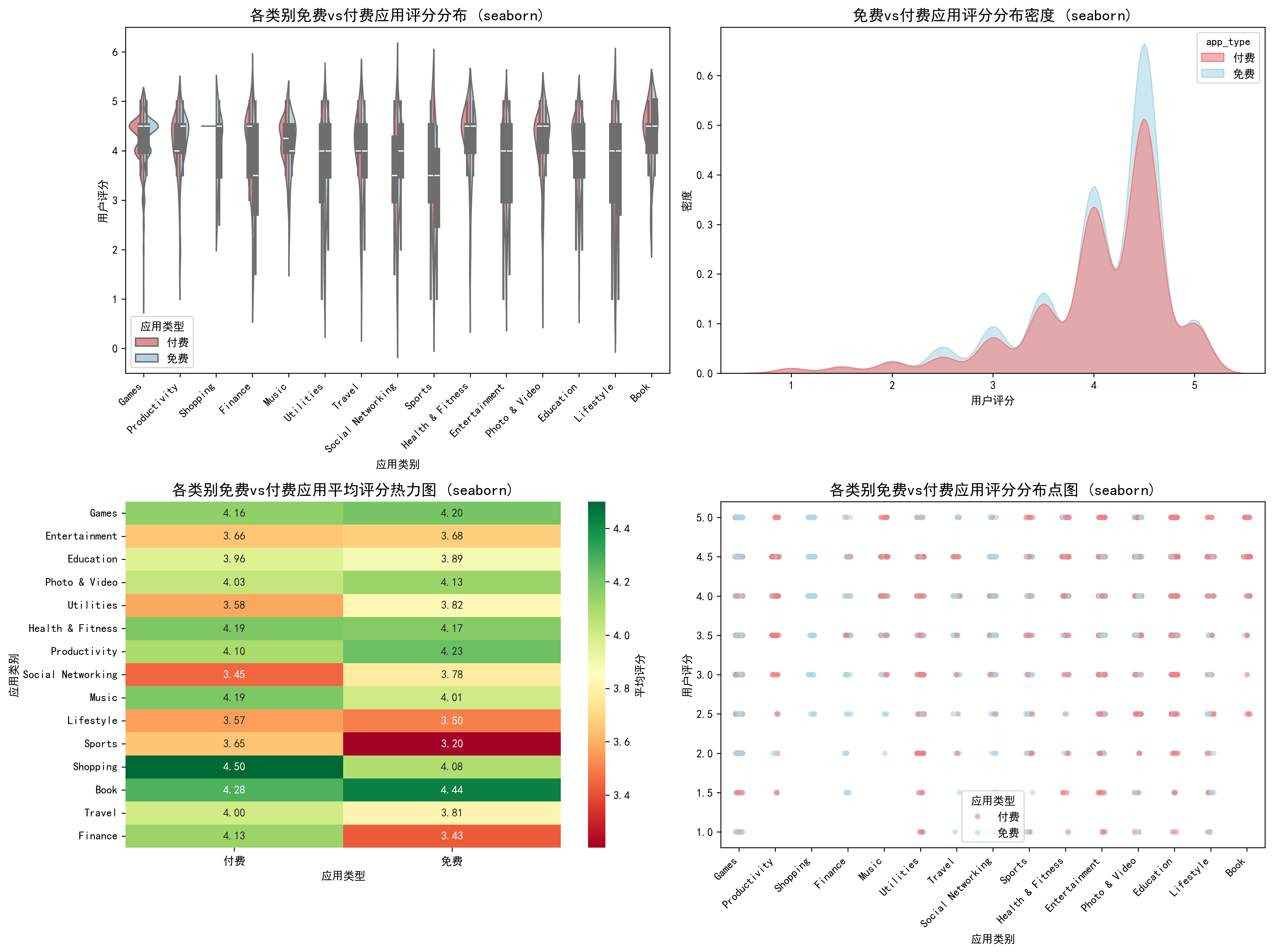
图6通过分裂小提琴图直观展示了免费与付费应用在各类别中的评分分布差异。密度曲线图显示两类应用的评分分布形状相似,但付费应用的评分分布略向左偏移。热力图则从另一个角度呈现了各类别中免费与付费应用的平均评分对比。
综合结论与商业启示
基于上述分析,可以得出以下重要结论:
市场结构特征:
- 应用商店呈现明显的"免费为主、付费为辅"的市场格局,免费应用占比54.5%
- 游戏类应用占据半壁江山(54.1%),是应用生态的核心组成部分
- 不同类别的商业化模式存在显著差异,教育类应用的付费比例最高(70.8%),社交网络类最低(14.2%)
定价策略建议:
- 对于新应用,建议采用免费或低价策略以快速获取用户
- 专业工具和教育类应用可以适当提高定价,用户对价格敏感度较低
- 社交和娱乐类应用更适合采用免费+内购的混合商业模式
用户体验洞察:
- 价格与评分的相关系数仅为0.037,表明价格不是影响用户评分的主要因素
- 免费应用的平均评分数量(21,651)远高于付费应用(4,127),说明免费应用拥有更广泛的用户基础
- 健康健身类和生产力类应用的平均评分较高(均为4.18/5),而生活方式类应用评分相对较低(3.53/5)
这些分析结果为应用开发者提供了有价值的市场参考,有助于制定更合理的产品定位、定价策略和用户体验优化方向。通过matplotlib和seaborn两个可视化库的结合使用,我们不仅能够从多个角度深入分析数据特征,还能够以专业美观的方式呈现分析结果,为决策提供有力支持。
技术总结
本次数据分析项目展示了Python在数据科学领域的强大能力。通过pandas进行数据处理,matplotlib和seaborn进行数据可视化,我们能够从原始数据中提取有价值的商业洞察。两种可视化库各有优势:matplotlib提供了更高的自定义灵活性,适合需要精细控制的场景;而seaborn则提供了更美观的默认样式和更简洁的API,适合快速生成统计图表。
对于希望深入学习数据分析的读者,建议掌握以下技能:
- 数据清洗与预处理的基本方法
- 统计描述与探索性数据分析
- 多种数据可视化技术的应用场景
- 从分析结果中提取商业洞察的能力
通过这样的数据分析实践,我们不仅能够更好地理解市场现状,还能够为未来的产品开发和市场策略提供数据驱动的决策支持。