本文参与了华为官方活动:HarmonyOS赋能资源丰富度建设
前言
在上一篇中,讲解了鸿蒙ArkTS基础语法 ,本篇将会讲解ArkUI相关的知识点。
1、ArkUI介绍
ArkUI:Ability kit在UIAbility组件可以使用ArkUI提供的组件,事件,动效,状态管理等能力。
我们先来看看ArkUI的基本结构
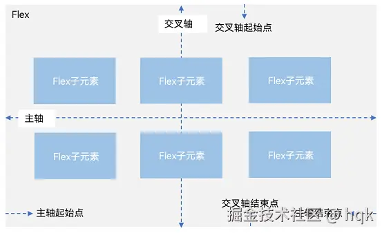
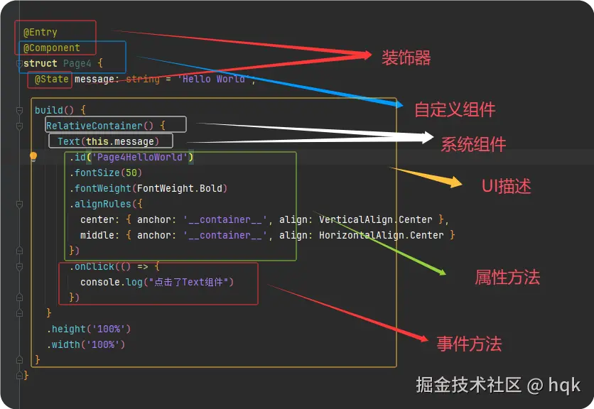 如图所示:
如图所示:
-
ArkUI基本结构包含:装饰器 、自定义组件 、系统组件 、以及组件内一系列属性方法与事件方法等
-
装饰器:用于装饰类、结构、方法以及变量,并赋予对应的含义。如上图所示
@Entry、@Component和@State都是装饰器@Entry:表示该自定义组件为入口组价@Component:表示自定义组件@State:表示组件中的状态变量,状态变量变化会触发UI刷新
-
UI描述:以声明式的方法来描述UI的结构,如上图所示 build()方法中的代码块
-
自定义组件:可复用的UI模块,可组合其他组件,如上图所示被
@Component修饰的struct Page4 -
属性方法:组件可以通过链式调用对应组件的多项属性方法,如
id()、width()、fontSize()等 -
事件方法:组件可以通过链式调用设置多个事件的响应逻辑,如
onClick()
当我们掌握了 ArkUI 的基本结构后,会发现 UI的最终呈现其实是由一个个组件拼起来的。
所以在理解"框架怎么组织 UI"之后,我们下一步就需要弄清楚:"真正构成 UI 的那些组件有哪些?它们各自怎么用?"
因此,下面我们就正式进入ArkUI的组件学习部分,我们将通过一系列小案例由浅入深逐步对ArkUI进行讲解。
2、ArkUI组件讲解
ArkUI系统组件又分为:容器组件、基础组件。
2.1 容器组件
容器组件顾名思义类似于一个容器一样,可以装下不同的组件。那该如何使用呢?那么就迎来了第一个容器组件Row
2.1.1 Row容器组件
我们先来看第一个小案例:
ArkTS
@Entry
@Component
struct Index {
  build() {
    Row({space: 20}){
      Text("字符串1").width(100).height(100).backgroundColor(Color.Pink)
      Text("字符串2").width(100).height(100).backgroundColor(Color.Red)
      Text("字符串3").width(100).height(100).backgroundColor(Color.Blue).fontColor(Color.White)
    }
    .width('100%')
    .height('100%')
    .border({color:Color.Red, style: BorderStyle.Dashed, width:1})
    .backgroundColor(Color.Yellow)
    .justifyContent(FlexAlign.SpaceEvenly)
    .alignItems(VerticalAlign.Center)
  }
}
运行效果图:
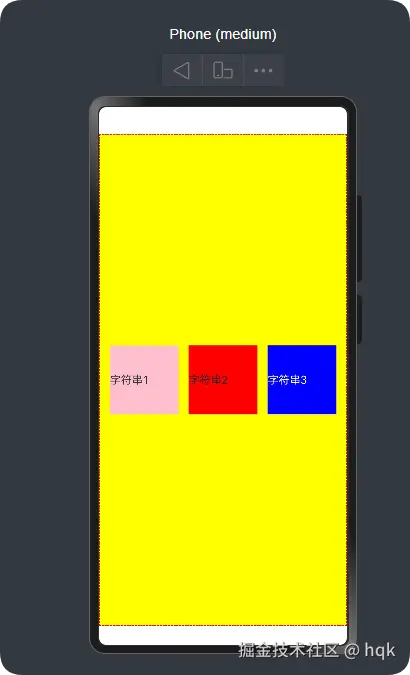
在这个案例中:
Row{}里面包含了三个组件,并且这三个组件是水平排列Row{}设置了不同的属性{space: 20}表示容器内组件之间的间距为20vp,这个vp就好比Android里面的dp单位.width('100%').height('100%'),表示宽高都是100%,充满整个屏幕border({color:Color.Red, style: BorderStyle.Dashed, width:1})给这个Row组件设置了边框以及边框属性.justifyContent(FlexAlign.SpaceEvenly)给这个Row组件设置了水平对齐方式,这个属性方法它和这个Row{}组件是同一种对齐方向.alignItems(VerticalAlign.Center)给这个Row组件设置了垂直对齐方式,这个属性方法它和这个Row{}组件是相反的对齐方向
看到这是不是会想:那我咋知道这些组件有哪些方法?然后这些方法又该如何赋值呢?不可能每个组件我都要去死记硬背涩!
2.1.1.1 源码剖析
所谓的授人以鱼不如授人以渔!我这将一步一步的带你去剖析源码,就算以后遇到陌生组件也能让你更快的熟悉并使用它!
如图所示
按住Ctrl+鼠标左键点击Row,你将会看到这样的代码
php
declare const Row: RowInterface;继续按住Ctrl+鼠标左键点击RowInterface,将会是如下代码:
css
interface RowInterface {
    (value?: {
        space?: string | number;
    }): RowAttribute;
}
这里只看到刚刚 Row({space: 20})这句代码的使用方式
value?有?修饰说明了这个value可为空,而这个值的类型是{space?: string | number;}这样的结构体{space?: string | number;}这样的结构体里面只有space?变量,而且这个变量也有?修饰,说明了这个space也可为空,而这个值类型是string | number,说明了,如果值不为空的话,那么space要么是string要么是number
所以在使用Row组件时,构造方法里面可以传{space?: string | number;} 这样的结构体
然而这里没看到想要的属性方法,继续往下看,按住Ctrl+鼠标左键点击RowAttribute,将会是如下代码:
scala
declare class RowAttribute extends CommonMethod<RowAttribute> {

 //Called when the vertical alignment is set.
 alignItems(value: VerticalAlign): RowAttribute;

 //Called when the horizontal alignment is set.
 justifyContent(value: FlexAlign): RowAttribute;

 reverse(isReversed: Optional<boolean>): RowAttribute;

}到这里我们看到Row组件特有的属性alignItems、justifyContent、reverse,对应属性方法的值范围,可以继续按照刚刚的方式往下看
不过在这里面我们就只看到这三个属性方法,上面案例里的width以及其他的属性方法呢?
我们看到class RowAttribute extends CommonMethod<RowAttribute>这句代码,在上一篇基础语法中,讲解了这是继承关系,也就是RowAttribute拥有了CommonMethod所有非私有的属性以及方法
那继续按住Ctrl+鼠标左键点击CommonMethod,将会是如下代码:
scss
declare class CommonMethod<T> {
  //....省略部分代码
  width(value: Length): T;

  height(value: Length): T;

  padding(value: Padding | Length | LocalizedPadding): T

  background(builder: CustomBuilder, options?: {
    align?: Alignment;
  }): T;

  border(value: BorderOptions): T;

  backgroundColor(value: ResourceColor): T;
//....省略部分代码在这里我们就看到了我们案例上使用的所有属性方法了。这里可以总结出:组件都有它自己独有的属性,并且非独有(公共)属性通过extends CommonMethod<T> 方式获得
这里我们熟悉了Row组件,继续下一个组件
2.1.2 Column容器组件
我们接着来看案例:
ArkTS
@Entry
@Component
struct ColumnPage {
  build() {
    Column({space: 20}){
      Row().width(100).height(100).backgroundColor(Color.Pink)
      Row().width(100).height(100).backgroundColor(Color.Yellow)
      Row().width(100).height(100).backgroundColor(Color.Blue)
      Row().width(100).height(100).backgroundColor(Color.Green)
    }
    .width('100%')
    .height('100%')
    .backgroundColor(Color.Gray)
    .justifyContent(FlexAlign.SpaceEvenly)
    .alignItems(HorizontalAlign.End)
  }
}
运行效果图:
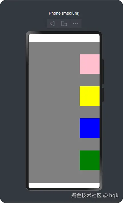
在这个案例中:
Column{}里面包含了四个组件,并且这四个组件是垂直排列.justifyContent(FlexAlign.SpaceEvenly)给这个Column组件设置了垂直对齐方式,这个属性方法它和这个Column{}组件是同一种对齐方向.alignItems(HorizontalAlign.End)给这个Column组件设置了水平对齐方式,这个属性方法它和这个Column{}组件是相反的对齐方向
这个Column列组件与Row行组件是相反的,特别注意Column的.alignItems(HorizontalAlign.End)属性方法里面是HorizontalAlign,而Row的.alignItems(VerticalAlign.Center)是VerticalAlign。
OK,我们继续下一个组件!
2.1.3 Flex容器组件
Flex(弹性组件)提供更加有效的方式对容器中的子元素进行排列、对齐和分配剩余空间。
容器默认存在主轴与交叉轴,子元素默认沿主轴排列,子元素在主轴方向的尺寸称为主轴尺寸,在交叉轴方向的尺寸称为交叉轴尺寸。
既然Flex容器可以改变子元素在主轴与交叉轴排列,那么我们就能复刻Row组件以及Column组件
注意:
- 当Flex容器为
Row、RowReverse排列时,主轴与交叉轴就为图中所示; - 当Flex容器为
Column、ColumnReverse排列时,图中的主轴变交叉轴,交叉轴变主轴
2.1.3.1 复刻Row组件
ArkTS
import { LengthMetrics } from '@kit.ArkUI';

@Entry
@Component
struct FlexiblePage {
  build() {
    Flex({
      direction: FlexDirection.Row,
      justifyContent: FlexAlign.Start,
      alignItems: ItemAlign.Start,
      wrap: FlexWrap.NoWrap,
      space: { main: LengthMetrics.vp(20), cross: LengthMetrics.vp(30) }
    }) {
      Column().width(100).height(200).backgroundColor(Color.Pink)
      Column().width(100).height(200).backgroundColor(Color.Red)
      Column().width(100).height(200).backgroundColor(Color.Blue)

      Column().width(100).height(200).backgroundColor(Color.White)
      Column().width(100).height(200).backgroundColor(Color.Green)
      Column().width(100).height(200).backgroundColor(Color.Orange)
    }
    .margin({ top: 10 })
    .width('100%')
    .height('100%')
    .backgroundColor(Color.Gray)
  }
}
运行效果图:
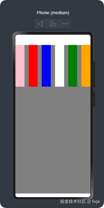
在这个案例中
- 使用
direction: FlexDirection.Row让Flex组件成功复刻了Row组件特性 - 当然
justifyContent与alignItems也具备了Row组件特性
刚刚复刻了Row组件,来试试复刻Column组件
2.1.3.2 复刻Column组件
ArkTS
import { LengthMetrics } from '@kit.ArkUI';

@Entry
@Component
struct FlexiblePage {
  build() {
   复刻了`Column`组件
   - ({
      direction: FlexDirection.Column,
      justifyContent: FlexAlign.Start,
      alignItems: ItemAlign.Start,
      wrap: FlexWrap.NoWrap,
      space: { main: LengthMetrics.vp(20), cross: LengthMetrics.vp(30) }
    }) {
      Column().width(100).height(200).backgroundColor(Color.Pink)
      Column().width(100).height(200).backgroundColor(Color.Red)
      Column().width(100).height(200).backgroundColor(Color.Blue)

      Column().width(100).height(200).backgroundColor(Color.White)
      Column().width(100).height(200).backgroundColor(Color.Green)
      Column().width(100).height(200).backgroundColor(Color.Orange)
    }
    .margin({ top: 10 })
    .width('100%')
    .height('100%')
    .backgroundColor(Color.Gray)
  }
}
运行效果:
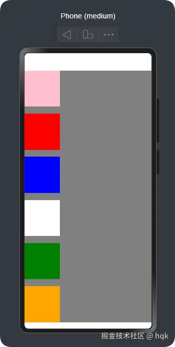
在这个案例中
- 仅仅改变了
direction的值,成功的复刻了Column组件 - 对应
justifyContent与alignItems也具备了Column组件特性 - 案例里面
wrap表示是否多行,NoWrap也就是不允许,读者可以自行测试多行效果,这里不在赘述 space设置元素之间的间距。main主轴元素之间间距;cross交叉轴之间的间距(注意不同的direction的值,主轴、交叉轴不同哟)
OK,我们继续下一个!
2.2.4 Stack容器组件
Stack案例:
ArkTS
@Entry
@Component
struct StackPage {
  @State message: string = 'Hello World';

  build() {
    Stack({alignContent: Alignment.Center}) {
      Column().width('90%').height('90%').backgroundColor(Color.Pink).zIndex(1)
      Column().width('50').height('50').backgroundColor(Color.Blue).zIndex(3)
      Column().width('150').height('150').backgroundColor(Color.Green).zIndex(2)
    }
    .height('100%')
    .width('100%')
  }
}
运行效果:
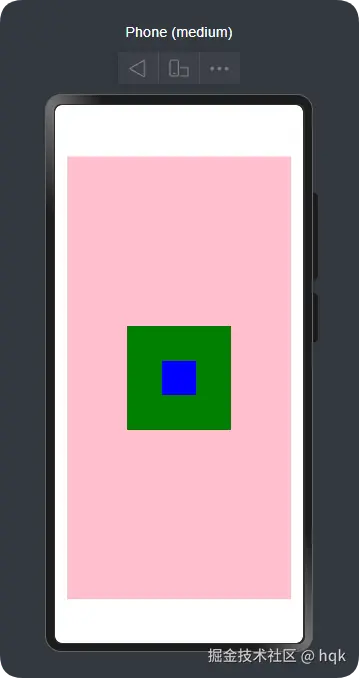
在这个案例中:
- 有三个大小不一的元素在里面通过
{alignContent: Alignment.Center}实现了所有元素居中对齐。(一共有9中对齐方式,读者可以亲自尝试) .zIndex(1)通过这个属性方法设置 层级的优先级,数字越大,层级越靠前。可以将这个理解为厨房叠盘子,数字越大盘子就越上面,如果上面的盘子比下面的大,那就看不到下面的盘子
这个没什么难度,继续下一个!
2.2.5 Grid容器组件
2.2.5.1 Grid案例一
ArkTS
@Entry
@Component
struct GridPage {
  build() {
    Grid() {
      GridItem() {
        Row() {
          Column() {
            Text('商品名称')
          }
          .width('100%')
        }
      }.width("100%").height(100).backgroundColor(Color.Gray)
      GridItem().width("100%").height(100).backgroundColor(Color.Gray)
      GridItem().width("100%").height(100).backgroundColor(Color.Gray)
      GridItem().width("100%").height(100).backgroundColor(Color.Gray)
      GridItem().width("100%").height(100).backgroundColor(Color.Gray)
      GridItem().width("100%").height(100).backgroundColor(Color.Gray)
      GridItem().width("100%").height(100).backgroundColor(Color.Gray)
      GridItem().width("100%").height(100).backgroundColor(Color.Gray)
    }
    .height('100%')
    .width('100%')
    .columnsTemplate('1fr 1fr 1fr 1fr')
    .rowsGap(10)
    .columnsGap(10)
  }
}
运行效果:
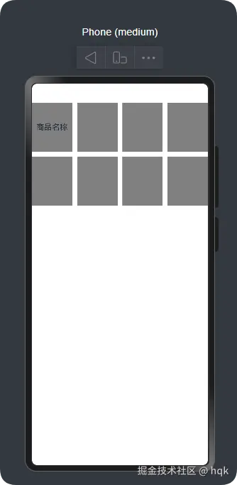
在这个案例中:
Grid组件需要结合GridItem组件一起使用,并且这两个组件都是容器组件。.columnsTemplate('1fr 1fr 1fr 1fr')属性方法表示该Grid组件分为几列数据,其中的1fr表示该列权重占比rowsGap与columnsGap分别表示设置 行间距以及列间距
那现在问题来了,案例一的GridItem组件就仅仅第一个添加了基本组件,而且还仅仅只是一个Text组件,结构层次就已经比较多了,试想一下,如果Item内容再复杂一点,那代码岂不是很冗余?
带着这样的问题,我们来看下一个案例:
2.2.5.2 Grid案例二
ArkTS
@Entry
@Component
struct GridPage {
  build() {
    Grid() {
      GirdItemComponent()
      GirdItemComponent()
      GirdItemComponent()
      GirdItemComponent()
      GirdItemComponent()
      GirdItemComponent()
      GirdItemComponent()
      GirdItemComponent()
      GirdItemComponent()
      GirdItemComponent()
      GirdItemComponent()
      GirdItemComponent()
    }
    .height('100%')
    .width('100%')
    .columnsTemplate('1fr 1fr 1fr 1fr')
    .rowsGap(10)
    .columnsGap(10)
  }
}

@Component
struct GirdItemComponent {
  build() {
    GridItem() {
      Row() {
        Column() {
          Text('商品名称')
        }.width('100%')
      }.height(100)
    }.borderRadius(4)
    .backgroundColor(Color.Pink)
  }
}
运行效果:
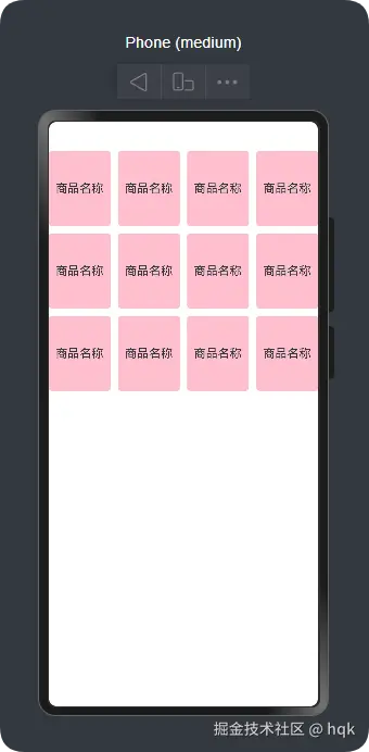
在这个案例中:
- 我们将
GridItem放在了新的struct GirdItemComponent里面,并且用@Component修饰,此时GirdItemComponent已经被我们封装成了自定义组件
不过现在还有个问题:GirdItemComponent()数量目前是代码写死的,如何通过数据源动态渲染呢?
2.2.5.3 Grid案例三
ArkTS
@Entry
@Component
struct GridPage {
  listData:Array<number>=[1,2,3,4,5,6,7,8,9,10,11,12]
  build() {
    Grid() {
      ForEach(this.listData,(item:number,index:number)=>{
        GirdItemComponent()
      })
    }
    .height('100%')
    .width('100%')
    .columnsTemplate('1fr 1fr 1fr 1fr')
    .rowsGap(10)
    .columnsGap(10)
  }
}
//部分代码省略......
在这个案例中
- 使用
ForEach循环,成功的通过数据源的数量动态渲染GridItem
接着讲下一个组件!
2.2.6 RelativeContainer 容器组件
相对布局组件,用于复杂场景中元素对齐的布局。它可以根据组件与组件的关系,设置并定位对应自己的不同的位置。
RelativeContainer 案例
ArkTS
@Entry
@Component
struct Page2 {
  build() {
    Row() {
      RelativeContainer() {
        Row(){Text('row1')}.justifyContent(FlexAlign.Center)
        .width(100).height(100)
        .backgroundColor("#FF3333")
        .alignRules({
          top: {anchor: "__container__", align: VerticalAlign.Top},
          left: {anchor: "__container__", align: HorizontalAlign.Start}
        })
        .id("row1")

        Row(){Text('row2')}.justifyContent(FlexAlign.Center)
        .width(100).height(100)
        .backgroundColor("#FFCC00")
        .alignRules({
          top: {anchor: "__container__", align: VerticalAlign.Top},
          right: {anchor: "__container__", align: HorizontalAlign.End}
        })
        .id("row2")

        Row(){Text('row3')}.justifyContent(FlexAlign.Center)
        .height(100)
        .backgroundColor("#FF6633")
        .alignRules({
          top: {anchor: "row1", align: VerticalAlign.Bottom},
          left: {anchor: "row1", align: HorizontalAlign.End},
          right: {anchor: "row2", align: HorizontalAlign.Start}
        })
        .id("row3")

        Row(){Text('row4')}.justifyContent(FlexAlign.Center)
        .backgroundColor("#FF9966")
        .alignRules({
          top: {anchor: "row3", align: VerticalAlign.Bottom},
          bottom: {anchor: "__container__", align: VerticalAlign.Bottom},
          left: {anchor: "__container__", align: HorizontalAlign.Start},
          right: {anchor: "row1", align: HorizontalAlign.End}
        })
        .id("row4")

        Row(){Text('row5')}.justifyContent(FlexAlign.Center)
        .backgroundColor("#FF66FF")
        .alignRules({
          top: {anchor: "row3", align: VerticalAlign.Bottom},
          bottom: {anchor: "__container__", align: VerticalAlign.Bottom},
          left: {anchor: "row2", align: HorizontalAlign.Start},
          right: {anchor: "__container__", align: HorizontalAlign.End}
        })
        .id("row5")
      }
      .width(300).height(300)
      .margin({left: 50})
      .border({width:2, color: "#6699FF"})
    }
    .height('100%')
  }
}
运行效果:
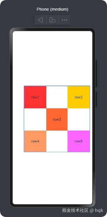
在这个案例中:
-
在
RelativeContainer组件里,子组件位置通过.alignRules(xx)属性方法,设置当前子组件的位置 -
在
.alignRules(xx)属性方法里,可以分别设置top、bottom、left、right、center、middle,不同方位以及居中对齐参数,但他们无非都是分为垂直方向以及水平方向top、bottom、center这三个是垂直方向left、right、middle这三个是水平方向
-
在
{anchor: "xxx", align: xxx}结构体中,不同的方向将会有不同的设置约束的方式,- 水平方向通过
align: HorizontalAlign.xxx赋值 - 垂直方向通过
align: VerticalAlign.xxx赋值
- 水平方向通过
-
在
{anchor: "xxx", align: xxx}结构体中,当前子组件可以通过anchor: "xxx"与其他子组件或父组件建立约束anchor: "__container__"这个表示与父容器建立约束anchor: "row3"这个表示与row3组件建立约束。而row3组件通过.id("row3")设置并命名了自己就是row3组件
-
在
Row4与Row5组件里,它俩分别建立了四个方位的约束,因此在没有设置width与height时,它也会自动根据约束生成对应的宽高长度
OK,常用的容器组件,已经讲完了。现在我们开始讲解基础组件。
2.2 基础组件
基础组件比较简单,我这准备用一些小案例来讲解基础组件如何使用
2.2.1 案例一:
ArkTS
@Entry
@Component
struct TextPage {
  @State message: string = 'Hello World';
  build() {
    RelativeContainer() {
      Text(this.message)
        .id('TextPageHelloWorld')
        .fontSize(50)
        .fontWeight(FontWeight.Bold)
        .alignRules({
          center: { anchor: '__container__', align: VerticalAlign.Center },
          middle: { anchor: '__container__', align: HorizontalAlign.Center }
        })

      Button('点我改变文本')
        .alignRules({
          top: { anchor: 'TextPageHelloWorld', align: VerticalAlign.Bottom },
          middle: { anchor: '__container__', align: HorizontalAlign.Center }
        })
        .onClick(() => {
          this.clickBtn()
        })
        .margin({ top: 20 })
    }
    .height('100%')
    .width('100%')
  }

  private clickBtn() {
    this.message = "我改变了Text"
  }
}
运行效果:
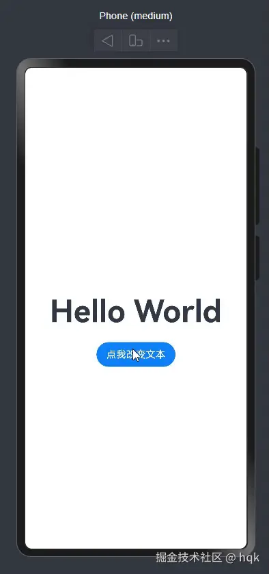
在这个示例中:
- 使用了
Text、Button组件,而Text文本是通过变量message赋值,这个变量使用了@State修饰符 @State又名:状态变量装饰器 ,被它修饰的变量message称为状态变量(让普通变量具备状态属性),也就是说当状态变量改变时,将会触发绑定的UI组件渲染更新- 因此在
Button点击事件里,改变了message状态变量,让Text组件渲染更新了最新的文本
这个很简单,现在逐渐上难度
2.2.2 案例二:
kotlin
import { promptAction } from '@kit.ArkUI';

@Entry
@Component
struct LoginPage {

  @State phone: string = ''
  @State password: string = ''
  @State smsCode: string = ''

  @State loginByPassword: boolean = true // true=密码登录,false=验证码登录

  // 验证码倒计时
  @State counter: number = 0
  private timerId: number = 0

  build() {
    Column({ space: 20 }) {

      Text("手机登录")
        .fontSize(30)
        .fontWeight(FontWeight.Bold)
        .margin({ top: 40 })

      /** 手机号输入框 */
      Row() {
        TextInput({ placeholder: '请输入手机号' })
          .type(InputType.Number)
          .maxLength(11)
          .onChange(v => this.phone = v)
      }
      .padding(12)
      .backgroundColor('#F7F7F7')
      .borderRadius(8)
      .width('85%')

      /** 密码登录区域 */
      if (this.loginByPassword) {
        Row() {
          TextInput({ placeholder: '请输入密码' })
            .type(InputType.Password)
            .onChange(v => this.password = v)
        }
        .padding(12)
        .backgroundColor('#F7F7F7')
        .borderRadius(8)
        .width('85%')
      }

      /** 验证码登录区域 */
      if (!this.loginByPassword) {
        Row({ space: 10 }) {
          TextInput({
            placeholder: '请输入验证码'
          })
            .onChange(v => this.smsCode = v)
            .width('60%')
          // 发送验证码按钮
          Button(
            this.counter > 0
              ? `${this.counter} 秒后重试`
              : '发送验证码'
          )
            .height(40)
            .borderRadius(6)
            .backgroundColor('#007DFF')
            .fontColor(Color.White)
            .onClick(() => this.onSendCode())
        }
        .padding(12)
        .backgroundColor('#F7F7F7')
        .borderRadius(8)
        .width('85%')
      }

      /** 登录按钮 */
      Button("登录")
        .width('85%')
        .height(45)
        .backgroundColor('#007DFF')
        .fontColor(Color.White)
        .borderRadius(8)
        .onClick(() => this.onLogin())

      /** 登录方式切换 */
      Row() {
        Text(this.loginByPassword ? "使用验证码登录" : "使用密码登录")
          .fontColor('#007DFF')
          .onClick(() => {
            this.loginByPassword = !this.loginByPassword
            this.password = ''
            this.smsCode = ''
          })
      }
    }
    .width('100%')
    .justifyContent(FlexAlign.Center)
  }

  /** ---------------- 功能逻辑 ---------------- */
  private show(msg: string) {
    this.toast(msg)
  }

  /** 登录按钮逻辑 */
  private onLogin() {
    if (this.phone.trim() === '') {
      this.show("请输入手机号")
      return
    }

    if (this.loginByPassword) {
      if (this.password.trim() === '') {
        this.show("请输入密码")
        return
      }
      this.show("密码登录成功(示例)")
    } else {
      if (this.smsCode.trim() === '') {
        this.show("请输入验证码")
        return
      }
      this.show("验证码登录成功(示例)")
    }
  }

  /** 发送验证码逻辑 */
  private onSendCode() {
    if (this.phone.trim() === '') {
      this.show("请先输入手机号")
      return
    }

    if (this.counter > 0) {
      this.show(`请等待 ${this.counter} 秒后再试`)
      return
    }

    // 模拟发送成功
    this.show("验证码已发送")

    this.counter = 60
    this.startTimer()
  }

  private toast(msg: string) {
    promptAction.showToast({ message: msg })
  }

  /** 60 秒倒计时定时器 */
  private startTimer() {
    clearInterval(this.timerId)
    this.timerId = setInterval(() => {
      if (this.counter > 0) {
        this.counter--
      } else {
        clearInterval(this.timerId)
      }
    }, 1000)
  }
}
运行效果:

这是一个非常典型的验证码、密码登录例子,在这个例子中:
-
使用的新组件
TextInput输入框组件,{ placeholder: 'xxxx' }表示该输入框组件,在没有输入内容之前提示文本.type(InputType.xxx)设置改输入框组件是什么类型的输入框
-
在UI描述区域可以使用
if语句来控制UI区域是否显示。(必须是@State修饰的状态变量)if (this.loginByPassword)显示密码登录区域;if (!this.loginByPassword)显示验证码登录区域
-
也可以在某个组件内使用三目运算符进行组件渲染。如案例中:
Text(this.loginByPassword ? "使用验证码登录" : "使用密码登录")等。(必须是@State修饰的状态变量) -
import { promptAction } from '@kit.ArkUI';这里导入了SDK开放能力,SDK对同一个Kit下的接口模块进行了封装。这句代码意思就是,导入@kit.ArkUI里面的promptAction接口能力
上面的俩个例子都是通过状态变量改变时影响布局的渲染,那能不能通过组件内容的更改从而改变变量的值呢?
2.2.3 案例三:
ArkTS
@Entry
@Component
struct PageMvvm {

  @State
  isChecked: boolean = false
  @State
  myDate: Date = new Date()
  @State
  sexMale: boolean = true
  @State
  sexFeMale: boolean = false
  @State
  mySearch: string = ''
  @State
  myToggle: boolean = false
  @State
  mySelect: string = 'aaa'

  build() {
    Column({space: 12}) {

      Column(){
        Text('CheckBox双向绑定')
        Checkbox().select($$this.isChecked)
        Text('' + this.isChecked)
      }

      MyDivider()

      Column(){
        Text('DatePicker双向绑定')
        DatePicker({selected: $$this.myDate})
        Text('' + this.myDate.toLocaleString())
      }
      MyDivider()
      Column(){
        Text('Radio双向绑定')
        Radio({value:'male',   group: 'sex'}).checked($$this.sexMale)
        Radio({value:'female', group: 'sex'}).checked($$this.sexFeMale)
        Text('' + this.sexMale)
      }
      MyDivider()
      Column(){
        Text('Search双向绑定')
        Search({value: $$this.mySearch})
        Text('' + this.mySearch)
      }

      MyDivider()
      Column() {
        Text('Toggle双向绑定')
        Toggle({ type: ToggleType.Switch,isOn:$$this.myToggle})
        Text('' + this.myToggle)
      }

      MyDivider()
      Column() {
        Text('Select双向绑定')
        Row(){
          Select([{ value: 'aaa' },
            { value: 'bbb'},
            { value: 'ccc'},
            { value: 'ddd'}])
            .value($$this.mySelect)
          Text('' + this.mySelect)
        }
      }
      MyDivider()
    }
    .height('100%')
    .width('100%')
  }
}

@Component
struct MyDivider {
  build() {
    Divider().height(3).backgroundColor(Color.Pink)
  }
}
运行效果:
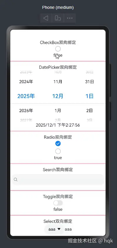
在该例子中:
- 使用了一系列不同的新组件(
Checkbox、DatePicker、Radio.....),在传值的时候,对应的变量前加了$$符号,当组件值改变时,也会同步改变对应变量。
在日常开发中,我们难免会根据不同的需求,封装自己的UI。
那该如何封装自定义UI呢?
2.3 自定义UI
在上面讲解Grid案例二的时候,就用过一次自定义UI,当时是用@Component封装了自定义组件。
而在鸿蒙ArkTS开发中,@Component和@Builder是构建UI最常用的两个装饰器。
虽然它们都用于生成 UI 界面,但它们在定位、能力、生命周期和性能上有本质的区别。
说了这么多,上案例讲解!
2.3.1 案例一
ArkTS
@Builder
function ValueBuilder(text: string) {
  Text(`值传递Builder,不会刷新UI: ${text}`)
    .fontSize(16)
    .fontColor(Color.Gray)
    .margin(5)
}

class Tmp {
  title: string = ''
}

@Builder
function QuoteBuilder(tmp: Tmp) {
  Column() {
    Row() {
      Image($r('app.media.startIcon')).width(20)
      Text(`引用传递Builder,会刷新UI: ${tmp.title}`).fontSize(18)
    }
    .margin(10)
  }
}

@Component
@Entry
struct ParentPage {
  @State parentMessage: string = "父组件状态";

  @Builder
  LocalBuilder() {
    Text(`这是LocalBuilder 能通过this刷新 ${this.parentMessage}`)
  }

  build() {
    Column() {

      //全局值传递Builder
      ValueBuilder(this.parentMessage)

      //全局引用传递Builder
      QuoteBuilder({ title: this.parentMessage })

      //局部 this 指向Builder
      this.LocalBuilder()
      Divider().strokeWidth(2).color(Color.Blue).margin({top:20})

      Button("修改父组件状态")
        .onClick(() => {
          this.parentMessage = "状态已更新";
          console.log(`parentMessage=${this.parentMessage}`)
        }).margin({top:20})

      Text(this.parentMessage).margin({top:20})

      Divider().strokeWidth(2).color(Color.Blue).margin({top:20})

      // 使用子组件
      ChildComponent().margin({top:20})
    }
    .width('100%')
    .height('100%')
  }
}


// 2. 定义一个子组件 Component (独立模块,有生命周期)
@Component
struct ChildComponent {
  @State message: string = "我是独立的子组件";

  // 生命周期演示
  aboutToAppear() {
    console.log("ChildComponent 初始化了");
  }

  build() {
    Column() {
      Text(this.message)
        .fontSize(20)
        .fontWeight(FontWeight.Bold)
        .backgroundColor(Color.Pink)
        .padding(10)
        .onClick(() => {
          this.message = "子组件被点击,只刷新我!";
        })
    }
  }
}
运行初始化日志:
markdown
ChildComponent 初始化了运行效果:
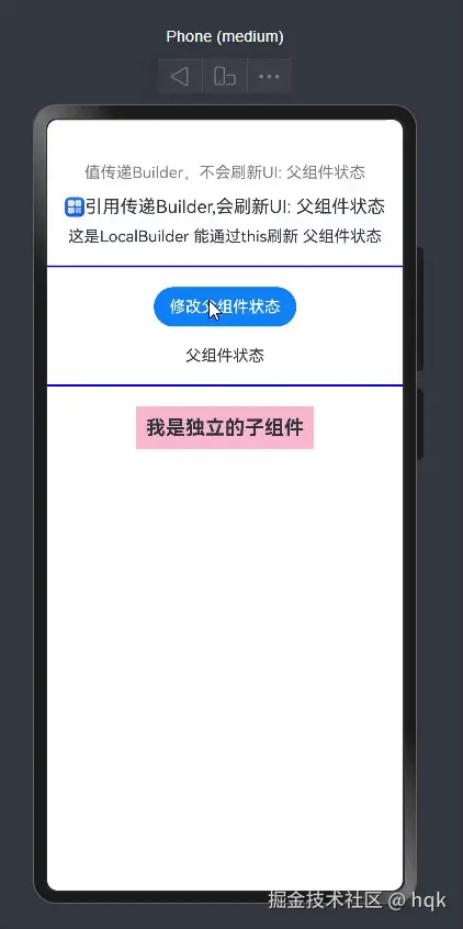
在该例子中:
| 特性 | @Component (自定义组件) | @Builder (UI 构建函数) |
|---|---|---|
| 本质 | 类/结构体 (struct) |
函数/方法 (function) |
| 生命周期 | 有 (aboutToAppear, aboutToDisappear 等) |
无 |
| 状态管理 | 拥有独立的状态 (@State, @Link 等) |
依赖传入参数或宿主组件的状态 |
| 渲染机制 | 独立的渲染节点,更新时只刷新自己 | 视为宿主组件的一部分,通常随宿主刷新 |
| 性能开销 | 较重 (需要创建实例、维护状态和生命周期) | 极轻 (仅仅是代码复用逻辑) |
| 复用范围 | 全局可复用,不仅限 UI,还封装逻辑 | 主要是 UI 结构的复用 (分为全局和局部) |
我们在开发过程中往往会出现大量的代码在进行重复样式的设置,因此这就涉及到样式的复用。
2.4 样式复用
2.4.1 @Styles 样式复用
案例:
ArkTS
import { promptAction } from '@kit.ArkUI';

enum PayType {
  WXPay, Alipay, BankPay, CreditCard
}

@Entry
@Component
struct PageStyle1 {
  @State
  heightValue: number = 50

  @Styles
  // payStyle(payType:PayType){  //编译报错,@Styles 方法不能含有参数
  payStyle(){
    .width('100%')
    .height(this.heightValue)
    .borderRadius(10)
    .backgroundColor('#FF1266e0')
    .onClick(() => {
      promptAction.showToast({ message: '支付成功!' })
    })
  }

  build() {
    Column() {
      Row() {
        Button('微信支付', { type: ButtonType.Normal })
          .payStyle()
      }
      .padding(10)

      Row() {
        Button('支付宝支付', { type: ButtonType.Normal })
          .payStyle()

      }
      .padding(10)

      Row() {
        Button('银行卡支付', { type: ButtonType.Normal })
          .payStyle()

      }
      .padding(10)

      Row() {
        Button('信用卡支付', { type: ButtonType.Normal })
          .payStyle()

      }
      .padding(10)

    }
    .width('100%')
    .height('100%')

  }
}
运行效果:
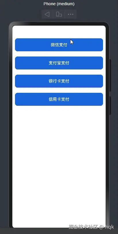
在该例子中:
- 通过
@Styles修饰的方法可以定义通用属性与通用事件,不支持参数传递(通用、通用、通用)
那如果说有多种情况,不同情况按钮颜色不一样,然而@Styles修饰的方法不可传参,区分不了按钮,那该怎么办呢?
2.4.2 @Extend 样式复用
案例:
ArkTS
import { promptAction } from '@kit.ArkUI';

@Entry
@Component
struct PageStyle2 {
  build() {
    Column({ space: 20 }) {
      Button("支付宝支付")
        .payButton("alipay")
      Button("微信支付")
        .payButton("wechat")
      Button("支付宝支付")
        .payButton("alipay")
      Button("微信支付")
        .payButton("wechat")
      Button("支付宝支付")
        .payButton("alipay")
      Button("微信支付")
        .payButton("wechat")
      Button("支付宝支付")
        .payButton("alipay")
    }
    .padding(20)
    .width('100%')
  }
}

@Extend(Button)
function payButton(type: 'alipay' | 'wechat'){
  .type(ButtonType.Normal)
  .fontColor(Color.White)
  .width('100%')
  .height(50)
  .borderRadius(4)
  .backgroundColor(type === 'wechat' ? '#00c168':'#ff1256e0')
  .onClick(()=>{
    if( type === 'alipay'){
      promptAction.showToast({message: '支付宝支付成功!'})
    }else{
      promptAction.showToast({message: '微信支付成功!'})
    }
  })
}
运行效果:
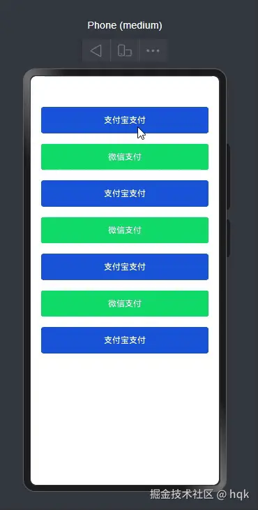
在该例子中:
- 使用
@Extend(Button)扩展了原生组件的样式,支持封装私有属性、通用属性、事件。 - 与
@Styles不同,@Extend(Button)支持参数传递,提供了更大的灵活性
虽然@Styles和@Extend(Button)提供了样式复用的能力,但是它们还是存在一些限制,因此就有了AttributeModifier。
我们来看看如何使用它。
2.4.3 AttributeModifier
案例:
ArkTS
@Entry
@Component
struct PageStyle3 {

  @State modifier: MyButtonModifier = new MyButtonModifier()
  @State modifier2: MyButtonModifier2 = new MyButtonModifier2()

  build() {

    Column({space: 20}){
      Button('点我试试').attributeModifier(this.modifier).onClick(()=>{
        this.modifier.isDark = !this.modifier.isDark
      })

      Divider().height(2).backgroundColor(Color.Pink)

      Button('点我试试').attributeModifier(this.modifier2)

    }
    .width('100%')
    .height('100%')
  }
}

class MyButtonModifier implements AttributeModifier<ButtonAttribute>{
  isDark: boolean  = false
  applyNormalAttribute(instance: ButtonAttribute): void {
    instance.backgroundColor(this.isDark ? Color.Black: Color.Red)
  }
}

class MyButtonModifier2 implements AttributeModifier<ButtonAttribute> {
  applyNormalAttribute(instance: ButtonAttribute): void {
    instance.backgroundColor(Color.Black)
  }
  applyPressedAttribute(instance: ButtonAttribute): void {
    instance.backgroundColor(Color.Red)

  }
}
运行效果
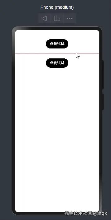
在这个例子中:
AttributeModifier<ButtonAttribute>其中ButtonAttribute是Button专有属性类,也就是按钮扩展属性applyNormalAttribute表示 按钮在正常情况下属性的表现applyPressedAttribute表示 按钮在按下的情况下属性的表现
2.4.4 多态样式stateStyles
案例:
ArkTS
@Entry
@Component
struct PageStyle4 {
  build() {
    Column(){
      Row(){
        Text('今天你心情怎么样!')
      }
      .padding(20)
      .height(80)
      .border({
        color: Color.Pink,
        width: 3
      })
      .borderRadius(4)
      .stateStyles({
        normal:{
          .backgroundColor(Color.Green)
        },
        pressed:{
          .backgroundColor('#eee')
          .border({
            width: 1,
            style: BorderStyle.Solid,
            color: Color.Red
          })
        }
      })

    }
    .width('100%')
    .height('100%')
  }
}
运行效果:

在这个例子中:
-
stateStyles可以依据组件的内部状态不同,快速设置不同样式
-
ArkUI提供以下五种状态
- focused:获取焦点时
- normal:正常情况
- pressed:按压时
- disabled:不可选中时
- selected:选中时
3、结束语
OK,看到这里的小伙伴相信你对ArkUI有了一定的了解! 下一篇讲解状态管理、应用程序结构以及路由相关讲解!