1、安装Matplotlib
bash
#卸载Matplotlib
pip uninstall matplotlib

#安装Matplotlib
pip install matplotlib==3.0.3
2、Matplotlib基础功能
准备好制图数据,传入参数。即可使用plt.plot(参数)、plt.show()
python
import matplotlib.pyplot as plt

x = [......]

y = [......]

plt.plot(x,y,label='图例')        #绘图,并且标注图例

plt.show()        #显示

plot.legend(prop=my_font)        #设置显示图例
2.1、绘制图像
**plt.plot()**参数设置:
color=' ' 线条颜色
linestyle='' 线条风格
linewidth= 线条粗细
alpha=0.5 透明度
2.2、设置图片大小
在绘制图片之前,使用plt.figure 函数设置图片大小,其中figsize 为元组,分别代表长宽,dpi(Dot Per Inch)为分辨率表示的单位之一
python
plt.figure(figsize=(20,8),dpi=150) #图片大小为20*8,每英寸150个像素点2.3、保存图片文件
python
plt.savefig("./t1.png") #将图片保存到本地引号里为文件路径和文件名( ./ 代表当前路径,png为文件后缀/格式)
2.4、设置X,Y轴刻度范围
设置x,y轴的范围可以使用多种方法
python
plt.xticks(x)        # 将x里的值作为刻度
plt.xticks(range(2,25))        #传入range数列
plt.yticks(range(min(y),max(y)+1))        #传入最小到最大值数列
自定义刻度内容
python
_x =list(x) [::3]
_xticks_labels = ["10点{ }分".format(i) for i in _x]
plt.xticks(_x,_xticks_labels)        #分别代表刻度范围和刻度内容
2.5、添加描述信息
python
plt.title("折线图")    #设置标题
plt.xlabel("时间")    #设置x轴标注
plt.ylabel("气温")    #设置y轴标注
2.6、示例
txt文件
bash
2025-11-27 15:00:00,39787
2025-11-27 16:00:00,39864
2025-11-27 17:00:00,40006
2025-11-27 18:00:00,39919
2025-11-27 19:00:00,39992
2025-11-27 20:00:00,39970
2025-11-27 21:00:00,39928
2025-11-27 22:00:00,40060
2025-11-27 23:00:00,39947
2025-11-27 24:00:00,39998
2025-11-28 00:00:00,39959
2025-11-28 01:00:00,39977
2025-11-28 02:00:00,39959
2025-11-28 03:00:00,39987
2025-11-28 04:00:00,39925
2025-11-28 05:00:00,39950
2025-11-28 06:00:00,40000
2025-11-28 07:00:00,39655
2025-11-28 08:00:00,39883
2025-11-28 09:00:00,39976
python
import matplotlib.pyplot as plt
# import seaborn as sns
import numpy as np
string_list = [""]
index_list = [0]
avg_list = [0.0]
x_list = []
y_list = []
# 打开文件
with open('3_perf3.txt', 'r') as file:
# 逐行读取
line = file.readline()
while line:
# print(line.strip()) # 打印行内容,并去除行尾的换行符
tmp_line = line.strip()
# string_list.append(tmp_line)
parts = tmp_line.split(',')
x_list.append(parts[0])
y_list.append(int(parts[1]))
line = file.readline()
print(x_list)
print(y_list)
# 创建图形和轴
# plt.figure(figsize=(12,4))
fig, ax = plt.subplots(figsize=(9,4))
ax.plot(x_list, y_list, marker='o',linewidth=1, markersize=3) # 绘制折线图
plt.ylim(20000, 50000)
# 自动调整x轴的显示范围以适应数据
fig.autofmt_xdate()
ax.set_xticks(x_list[::10])
# plt.ylim(-1.2, 1.2) # Y轴范围(留少量空白,避免数据贴边)
# 设置x轴和y轴的标签
plt.title("Topic Perf3 Throughput")
plt.xlabel('time')
plt.ylabel('throughput')
plt.savefig('topic_perf3.png', dpi=300, bbox_inches='tight')
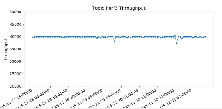
plt.show()结果:
3、绘图设置属性
参考文档: