布局1
xml
<style>
        .container{
            background-color:rgb(208, 164, 35);
            padding:50px;
            margin:50px;
            color:#fff;
            display:grid;
            height:80vh;
            box-sizing: border-box;
            grid-template-rows:repeat(2,50px) 1fr;
            grid-template-columns: 150px 1fr;
            gap:10px;
        }
        .item{
            border:1px solid red;
            background-color:orange;
            display:flex;
            justify-content: center;
            align-items: center;
        }
        .header{
            /* grid-column-start:1;
            grid-column-end:3;
            grid-row-start:1;
            grid-row-end:2; */

            /* 速写属性 */
            /* grid-column:1 / 3; */
            /* grid-row:1/2; */

            /* 该写法表示跨越两个格子 */
            /* grid-column:1 / span 2; */
            /* grid-row:1 / span 1; */
            /* grid-row:1; */

            /* 速写属性 grid-row和grid-column */
            /* 第1个数字是行的起始线,第2个数字是列的起始线,第3个数字是行的终止线,第4个数字是列的终止线, */
            /* grid-area:1/1 /2/3; */
            /* 第1个数字是行的起始线,第2个数字是列的起始线,第3个数字是行跨越几个格子,第4个数字是列跨越几个格子, */
            grid-area:1/1 /span 1/ span 2;

        }
        .aside {
            grid-area:2/1/span 2/ span 1;
        }
        .tab{
            grid-area:2/2;
        }
    </style>
</head>
<body>
    <div class="container">
        <div class="item main">main</div>
        <div class="item header">header</div>
        <div class="item aside">aside</div>
        <div class="item tab">tab</div>
    </div>
</body>
2.还有一种写法,
xml
<style>
.item{
border:1px solid red;
background-color:orange;
display:flex;
justify-content: center;
align-items: center;
}
.container{
background-color:rgb(208, 164, 35);
padding:50px;
margin:50px;
color:#fff;
display:grid;
height:80vh;
box-sizing: border-box;
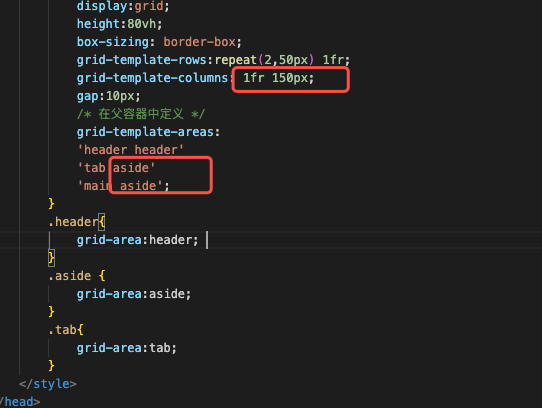
grid-template-rows:repeat(2,50px) 1fr;
grid-template-columns: 150px 1fr;
gap:10px;
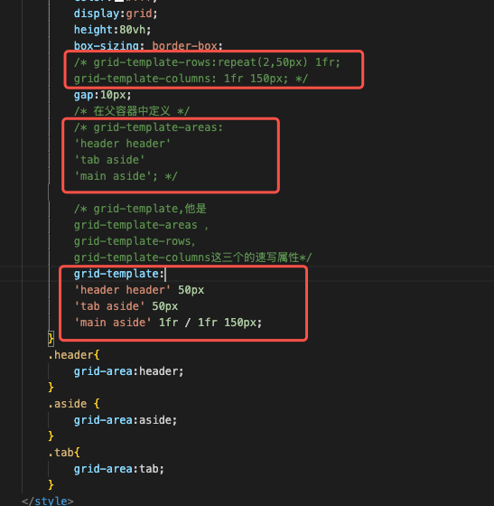
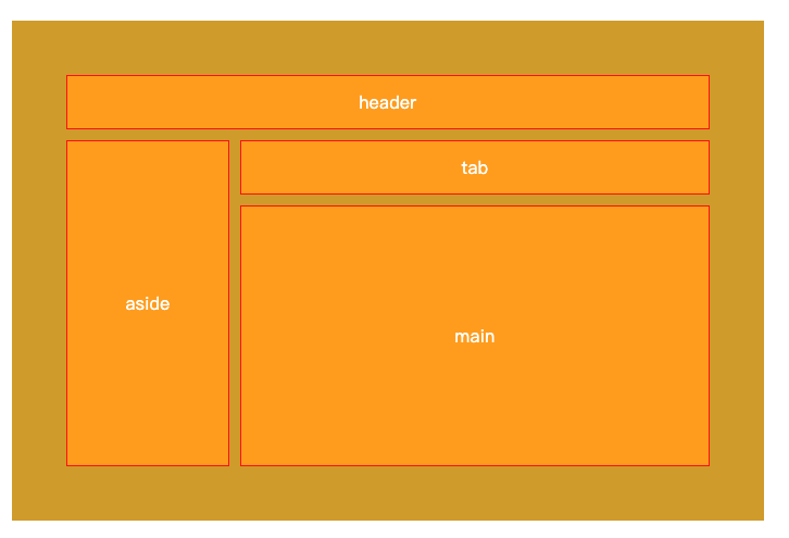
/* 在父容器中定义 */
grid-template-areas:
'header header'
'aside tab'
'aside main';
}
.header{
grid-area:header;
}
.aside {
grid-area:aside;
}
.tab{
grid-area:tab;
}
</style>
</head>
<body>
<div class="container">
<div class="item main">main</div>
<div class="item header">header</div>
<div class="item aside">aside</div>
<div class="item tab">tab</div>
</div>
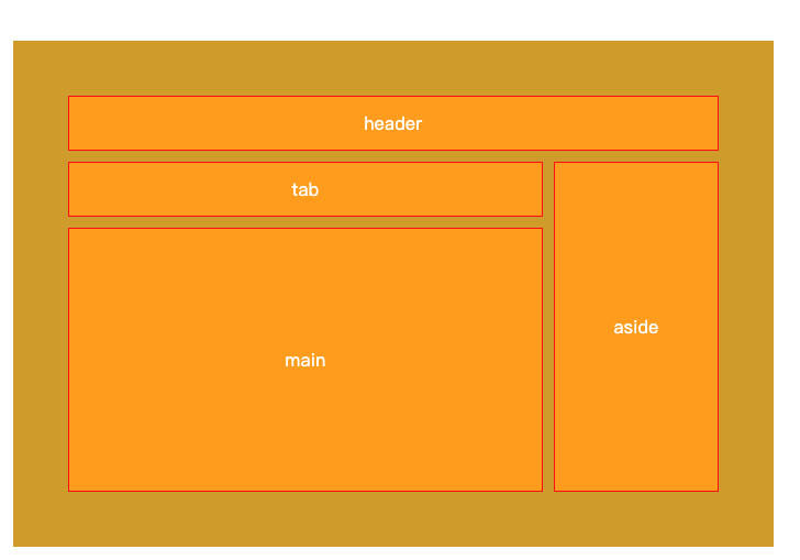
</body>第二种的写法比较灵活,假如后面想把aside的列放到右边,只需要改这块
效果如下
grid-template速写属性