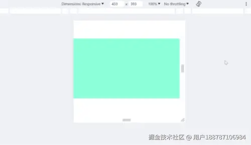
大屏项目中,一般需要在不同分辨率上显示居中显示大屏内容,且不出现滚动条。实际展示大屏的硬件设备比例不一,为了兼容,并且不出现UI被拉伸的情况,发现可以使用CSS3的transfrom-scale属性,并配合CSS变量实现。 其中transfrom-scale用在大屏绘制最外层盒子上,盒子内的样式按照UI给出的16:9的比例绘制。 效果图:
代码展示最外层盒子的缩放样式及比例计算:
style
xml
<style>
  :root {
    --transformScale: 1;
    --positionWidth: 1920px;
    --positionHeight: 1080px;
  }

  * {
    margin: 0;
    padding: 0;
  }

  .container {
    display: flex;
    align-items: center;
    justify-content: center;
    overflow: hidden;
    height: 100vh;
    width: 100vw;
  }

  .position {
    width: var(--positionWidth);
    height: var(--positionHeight);
  }

  .box {
    height: 1080px;
    width: 1920px;
    background-color: aquamarine;
    transform: scale(var(--transformScale));
    transform-origin: 0% 0%;
  }
</style>
html
xml
<!-- 为了获取屏幕宽高添加的元素 -->
<div class="container">
  <!-- 为了定位添加的元素 -->
  <div class="position">
    <div class="box"></div>
  </div>
</div>
script
ini
<script>
  // 全局缩放比基础宽
  const width = 1920;
  // 全局缩放比基础高
  const height = 1080;
  // 宽高比
  const ratio = 16 / 9;

  const getBaseScale = () => {
    const element = document.getElementsByClassName("container")[0];
    // 获取可视区域的宽度
    const w = element.clientWidth;
    // 获取可视区域的高
    const h = element.clientHeight;
    // 根据宽高计算比例
    let s = 1;
    if (w / h >= ratio) {
      // 设备左右留白 以高度为基础计算缩放比
      s = h / height;
    } else {
      s = w / width;
    }

    const pw = s * 1920 + "px";
    const ph = s * 1080 + "px";

    // 赋值
    document
      .getElementsByTagName("body")[0]
      .style.setProperty("--transformScale", s);
    document
      .getElementsByTagName("body")[0]
      .style.setProperty("--positionWidth", pw);
    document
      .getElementsByTagName("body")[0]
      .style.setProperty("--positionHeight", ph);
  };

  // 窗口变化
  onresize = getBaseScale;

  // 加载
  onload = getBaseScale;
</script>
补充
一、JavaScript 操作 CSS 变量
dart
const root = document.querySelector(":root");
// 设置 CSS 变量
root.style.setProperty("--transformScale", 0.2);
ini
// 读取 CSS 变量
const computedStyle = getComputedStyle(root);
const transformScale = computedStyle.getPropertyValue("--transformScale");
console.log(transformScale);
arduino
// 删除 CSS 变量
root.style.removeProperty("--transformScale");
二、CSS3 transform: scale
语法:transform: scale(x, y) transform: scaleX(x) transform: scaleY(y) 1、scale(x, y) 对元素进行缩放; ① x表示水平方向,y表示竖直方向; ② y是一个可选参数,如果不写的话,X,Y 两个方向缩放一样; 2、scaleX(x) 对元素只在x轴(水平方向)进行缩放; 3、scaleY(y) 对元素只在y轴(竖直方向)进行缩放; 4、存在 2D 转换或 3D 转换。
兼容性:参考 caniuse.com/?search=tra...
三、CSS3 transform-origin
语法:transform-origin: x y z; 1、改变被转换元素的位置; 2、存在 2D 转换或 3D 转换; 3、相对于父节点改变位置。
| 值 | 属性值 |
|---|---|
| x | left center right length % |
| y | top center bottom length % |
| z | length |
兼容性:参考 caniuse.com/?search=tra...
博客园地址:www.cnblogs.com/wttt123/p/1...
以上。