PySide6 的样式表(Qt Style Sheets,QSS)是模仿 CSS 语法的界面美化机制,用于统一控制 PySide6 控件的外观,从基础的颜色、字体到复杂的控件状态、自定义控件样式都能覆盖。
一、QSS 基础核心
1.1 基本语法结构
QSS 语法与 CSS 高度相似,核心结构为:选择器 { 属性: 值; },多个属性用分号分隔,注释用/* 注释内容 */。
from PySide6.QtWidgets import QApplication, QWidget, QPushButton, QVBoxLayout

app = QApplication([])
window = QWidget()
window.setWindowTitle("QSS基础示例")

# 直接给控件设置QSS
btn1 = QPushButton("按钮1")
btn2 = QPushButton("按钮2")


layout = QVBoxLayout(window)
layout.addWidget(btn1)
layout.addWidget(btn2)
btn1.setStyleSheet("""
    QPushButton {
        background-color: #4CAF50;  /* 背景色 */
        color: white;              /* 文字色 */
        font-size: 14px;           /* 字体大小 */
        padding: 8px 16px;         /* 内边距(上下 左右) */
        border: none;              /* 无边框 */
        border-radius: 4px;        /* 圆角 */
    }
    QPushButton:hover {
        background-color: #3e8e41;  /* 鼠标悬停时背景色 */
    }
    QPushButton:pressed {
        background-color: #297937;  /* 鼠标按下时背景色 */
    }
""")
window.resize(300, 200)
window.show()
app.exec()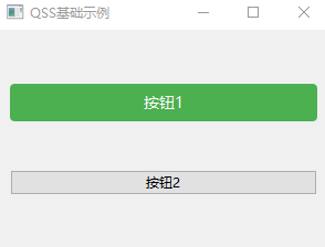
按钮1是设置了样式表的,按钮2是没有设置样式表。
1.2 核心选择器
在上例中,为按钮1单独设置了样式表,如果有很多相同的按钮,为每个按钮单独设置样式表就很繁琐,所以就要用到选择器来选择样式表的设置范围。
代码:
python
from PySide6.QtWidgets import QApplication, QWidget, QPushButton, QVBoxLayout

app = QApplication([])
window = QWidget()
window.setWindowTitle("QSS基础示例")

# 直接给控件设置QSS
btn1 = QPushButton("按钮1")
btn2 = QPushButton("按钮2")


layout = QVBoxLayout(window)
layout.addWidget(btn1)
layout.addWidget(btn2)
window.setStyleSheet("""
    QMainWindow {   /*设置主窗口*/
        background-color: #f0f0f0;
    }
    QPushButton {  /*设置窗口下的所有按钮*/
        background-color: #2196F3;
        color: white;
        border-radius: 5px;
        padding: 10px;
    }
    QPushButton:hover {   /*设置窗口下的所有按钮鼠标覆盖*/
        background-color: #1860a0;
    }
    QPushButton:pressed {   /*设置窗口下的所有按钮鼠标点击*/
        background-color: #123654;
    }

""")
window.resize(300, 200)
window.show()
app.exec()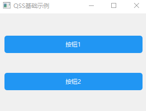
在上面的代码中,在窗口中通过类选择器的方法为所有按钮类定义了样式:
python
 QPushButton {  /*设置窗口下的所有按钮*/
        background-color: #2196F3;
        color: white;
        border-radius: 5px;
        padding: 10px;
    }
又通过伪状态选择器定义了按钮的悬浮和点击样式:
python
QPushButton:hover {   /*设置窗口下的所有按钮鼠标覆盖*/
        background-color: #1860a0;
    }
QPushButton:pressed {   /*设置窗口下的所有按钮鼠标点击*/
        background-color: #123654;
    }
除了类选择器和伪状态选择器,QSS 还支持以下常用选择器(优先级从高到低):
| 选择器类型 | 示例 | 说明 |
|---|---|---|
| 类选择器 | QPushButton |
匹配所有 QPushButton 及其子类控件 |
| ID 选择器 | QPushButton#myBtn |
匹配 objectName 为 myBtn 的 QPushButton |
| 属性选择器 | QPushButton[flat=true] |
匹配 flat 属性为 true 的 QPushButton |
| 后代选择器 | QWidget QPushButton |
匹配 QWidget 下所有后代 QPushButton |
| 子选择器 | QWidget > QPushButton |
匹配 QWidget 直接子级的 QPushButton |
| 伪状态选择器 | QPushButton:hover |
匹配鼠标悬浮状态的 QPushButton |
示例:多选择器组合
python
import sys

from PySide6.QtWidgets import QApplication, QWidget, QPushButton, QVBoxLayout

app = QApplication([])
window = QWidget()
window.setWindowTitle("QSS基础示例")

# 直接给控件设置QSS
btn1 = QPushButton("按钮1")
btn2 = QPushButton("按钮2")
btn3 = QPushButton("按钮3")
btn2.setObjectName("btn2")  # 设置对象名称
btn3.setFlat(True)   # 设置flat属性


layout = QVBoxLayout(window)
layout.addWidget(btn1)
layout.addWidget(btn2)
layout.addWidget(btn3)
window.setStyleSheet("""
    QMainWindow {   /*设置主窗口*/
        background-color: #f0f0f0;
    }
    QPushButton {  /*设置窗口下的所有按钮*/
        background-color: #2196F3;
        color: white;
        border-radius: 5px;
        padding: 10px;
    }
    QPushButton:hover {   /*设置窗口下的所有按钮鼠标覆盖*/
        background-color: #1860a0;
    }
    QPushButton:pressed {   /*设置窗口下的所有按钮鼠标点击*/
        background-color: #123654;
    }
    QPushButton#btn2 {   /*设置对象名称为btn2的按钮*/
        background-color: #FF9800;
    }
    QPushButton#btn2:hover {   /*设置对象名称为btn2的按钮鼠标覆盖*/
        background-color: #e67e00;
    }
    QPushButton#btn2:pressed {   /*设置对象名称为btn2的按钮鼠标点击*/
        background-color: #b25c00;
    }
    QPushButton[flat=true] {   /*设置flat属性为true的按钮*/
        background-color: #ee6600;
    }
    QPushButton[flat=true]:hover {   /*设置flat属性为true的按钮鼠标覆盖*/
        background-color: #aa4400;
    }
    QPushButton[flat=true]:pressed {   /*设置flat属性为true的按钮鼠标点击*/
        background-color: #883300;
    }

""")
window.resize(300, 200)
window.show()
sys.exit(app.exec())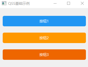
1.3 常用样式属性
QSS 覆盖控件的视觉属性,核心分类如下:
| 类别 | 常用属性 | 说明 |
|---|---|---|
| 背景 | background-color/background-image | 背景色 / 背景图 |
| 字体 | font-family/font-size/font-weight | 字体 / 大小 / 粗细 |
| 边框 | border/border-radius/border-color | 边框 / 圆角 / 边框色 |
| 内边距 | padding | 控件内容与边框的间距 |
| 文字 | color/text-align/text-decoration | 文字色 / 对齐 / 下划线 |
| 尺寸 | min-width/max-height | 最小宽度 / 最大高度 |
二、QSS 高级用法
2.1 状态伪选择器(复杂交互)
QSS 支持控件的各种状态(如悬浮、按下、选中、禁用等),可组合实现复杂交互效果,常用伪状态:
| 伪状态 | 说明 | 适用控件 |
|---|---|---|
:hover |
鼠标悬浮 | 所有可交互控件 |
:pressed |
鼠标按下(未释放) | 按钮、复选框等 |
:checked |
选中状态 | 复选框、单选框、切换按钮 |
:disabled |
禁用状态 | 所有控件 |
:focus |
获取焦点 | 输入框、按钮等 |
:indeterminate |
半选状态 | 复选框、进度条 |
:on/:off |
开关状态 | QCheckBox、QRadioButton |
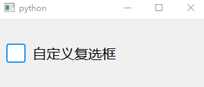
示例:自定义的复选框样式
python
import sys

from PySide6.QtWidgets import QApplication, QWidget, QCheckBox, QVBoxLayout

app = QApplication([])
window = QWidget()
window.setStyleSheet("""
    /* 1. 基础复选框样式(控制文字与框体间距) */
    QCheckBox {
        font-size: 20px;
        spacing: 10px;  /* 框体和文字的间距,避免重叠 */
    }

    /* 2. 复选框框体(必选:设置宽/高) */
    QCheckBox::indicator {
        width: 24px;    /* 宽度 */
        height: 24px;   /* 高度 */
        border: 2px solid #2196F3;  /* 未选中边框 */
        border-radius: 4px;         /* 圆角(可选) */
        background-color: white;    /* 未选中背景 */
    }

    /* 3. 选中态样式 */
    QCheckBox::indicator:checked {
        background-color: #2196F3;
    }
""")

checkbox = QCheckBox("自定义复选框")


layout = QVBoxLayout(window)
layout.addWidget(checkbox)
window.resize(300, 100)
window.show()
sys.exit(app.exec())

2.2 子控件选择器(精细化样式)
对于复合控件(如 QComboBox、QScrollBar、QSpinBox),需通过::子控件名定位内部子元素,实现精细化样式控制。常用子控件:
| 复合控件 | 子控件名 | 说明 |
|---|---|---|
| QComboBox | ::drop-down |
下拉箭头按钮 |
::down-arrow |
下拉箭头图标 | |
| QScrollBar | ::handle |
滚动条滑块 |
::add-page/::sub-page |
滚动条翻页区域 | |
::up-arrow/::down-arrow |
上下箭头 | |
| QSpinBox | ::up-button/::down-button |
上下调节按钮 |
| QSlider | ::handle |
滑块 |
| QTabWidget | ::tab |
标签页 |
| QProgressBar | ::chunk |
进度条已完成部分 |
示例 1:自定义进度条
python
import sys
from PySide6.QtWidgets import QTextEdit, QApplication, QWidget, QVBoxLayout

app = QApplication(sys.argv)
window = QWidget()
from PySide6.QtWidgets import QProgressBar
from PySide6.QtCore import QTimer

progress = QProgressBar()
progress.setRange(0, 100)
progress.setValue(50)
progress.setStyleSheet("""
    QProgressBar {
        height: 8px;
        border-radius: 4px;
        background-color: #e0e0e0;
        text-align: center;  /* 文字居中 */
        color: transparent;  /* 隐藏文字 */
    }
    /* 进度条进度块 */
    QProgressBar::chunk {
        border-radius: 4px;
        /* 渐变效果 */
        background: qlineargradient(x1:0, y1:0, x2:1, y2:0, stop:0 #4CAF50, stop:1 #285825);
    }
""")

# 模拟进度变化
timer = QTimer()
timer.timeout.connect(lambda: progress.setValue(progress.value() + 1 if progress.value() < 100 else 0))
timer.start(100)

layout = QVBoxLayout(window)

layout.addWidget(progress)


window.show()
sys.exit(app.exec())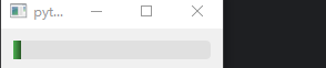
2.3 动态样式切换(运行时修改)
通过代码动态修改 QSS,实现主题切换、状态变更等效果,核心方法:
- 控件
setStyleSheet():直接覆盖控件样式 - 全局样式表:
QApplication.setStyleSheet() - 样式缓存:预定义多个样式字符串,按需切换
示例:明暗主题切换
python
import sys

from PySide6.QtWidgets import QPushButton, QHBoxLayout, QApplication, QWidget, QVBoxLayout

# 预定义主题
LIGHT_THEME = """
    QWidget { background-color: #ffffff; color: #333333; }
    QPushButton { background-color: #2196F3; color: white; border-radius: 4px; padding: 8px; }
    QPushButton:hover { background-color: #1976D2; }
"""

DARK_THEME = """
    QWidget { background-color: #212121; color: #ffffff; }
    QPushButton { background-color: #616161; color: white; border-radius: 4px; padding: 8px; }
    QPushButton:hover { background-color: #757575; }
"""

# 主题切换按钮
def switch_theme():
    current = app.styleSheet()
    if current == LIGHT_THEME:
        app.setStyleSheet(DARK_THEME)
    else:
        app.setStyleSheet(LIGHT_THEME)


# 初始化浅色主题
app = QApplication(sys.argv)
window = QWidget()
layout = QVBoxLayout(window)
theme_btn = QPushButton("切换主题")
theme_btn.clicked.connect(switch_theme)
layout.addWidget(theme_btn)
window.show()
app.setStyleSheet(LIGHT_THEME)
sys.exit(app.exec())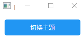
2.4 样式表继承与优先级
QSS 的优先级规则(高→低):
- 控件直接设置的样式(
widget.setStyleSheet()) > 父控件 / 全局样式 - ID 选择器 > 类选择器 > 通用选择器
- 伪状态 / 子控件选择器 > 基础选择器
- 后定义的样式覆盖先定义的同优先级样式
示例:优先级演示
# 全局样式(低优先级)
app.setStyleSheet("QPushButton { background-color: gray; }")

# 控件样式(高优先级)
btn = QPushButton("优先级测试")
# ID选择器(更高优先级)
btn.setObjectName("priorityBtn")
btn.setStyleSheet("""
    QPushButton#priorityBtn { background-color: red; }  /* 最终生效 */
    QPushButton { background-color: blue; }
""")
2.5 自定义控件的 QSS 支持
对于自定义控件(继承 QWidget),默认无法直接应用 QSS 背景等样式,需重写paintEvent或设置setAttribute(Qt.WA_StyledBackground, True)。
示例:支持 QSS 的自定义控件
python
import sys

from PySide6.QtCore import Qt
from PySide6.QtWidgets import QApplication
from PySide6.QtWidgets import QWidget


class CustomWidget(QWidget):
    def __init__(self, parent=None):
        super().__init__(parent)
        # 启用样式背景(关键)
        self.setAttribute(Qt.WA_StyledBackground, True)  # 启用样式背景,必需的


app = QApplication(sys.argv)
window = CustomWidget()
window.setStyleSheet("""
            CustomWidget {
                background-color: #ffeb3b;
                border: 2px solid #fbc02d;
                border-radius: 8px;
                padding: 16px;
            }
            CustomWidget:hover {
                background-color: #fff59d;
            }
        """)
window.resize(300, 200)
window.show()
sys.exit(app.exec())
2.6 QSS 变量与动态值(进阶)
QSS 本身不支持变量,但可通过字符串格式化实现 "伪变量",结合动态参数生成样式:
python
import sys

from PySide6.QtWidgets import QApplication, QPushButton, QVBoxLayout
from PySide6.QtWidgets import QWidget


def get_button_style(bg_color, hover_color, radius):
    return f"""
        QPushButton {{
            background-color: {bg_color};
            border-radius: {radius}px;
            padding: 8px 16px;
            color: white;
        }}
        QPushButton:hover {{
            background-color: {hover_color};
        }}
    """

app = QApplication(sys.argv)
window = QWidget()
layout = QVBoxLayout(window)
# 动态生成样式
btn_red = QPushButton("红色按钮")
btn_red.setStyleSheet(get_button_style("#f44336", "#d32f2f", 4))
btn_blue = QPushButton("蓝色按钮")
btn_blue.setStyleSheet(get_button_style("#2196F3", "#1976D2", 8))
layout.addWidget(btn_red)
layout.addWidget(btn_blue)
window.resize(300, 200)
window.show()
sys.exit(app.exec())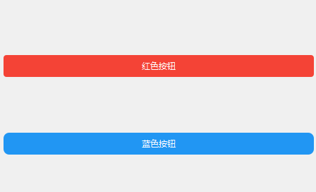
三、QSS 最佳实践
3.1 样式分离
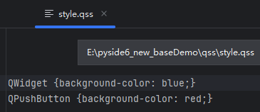
将 QSS 写入单独的.qss文件,通过读取文件加载,便于维护。
3.2 导入方法:
-
直接读取qss文件:
加载外部QSS文件
def load_style_sheet(file_path):
with open(file_path, "r", encoding="utf-8") as f:
return f.read()应用样式
app.setStyleSheet(load_style_sheet("style.qss"))
-
通过sys.argv导入:
首先创建qss文件,并输入以下内容
然后在sys.argv中指定qss文件的路径并加载qss,创建app
python
import sys
from PySide6.QtWidgets import QApplication, QWidget, QPushButton

if __name__ == "__main__":
    sys.argv = [sys.argv[0],
                   "-stylesheet", "../qss/style.qss"  # qss 文件路径
                   ]
    app = QApplication(sys.argv)
    window = QWidget()
    window.button = QPushButton("Click me!", window)  # 添加按钮
    window.resize(200, 100)
    window.show()
    sys.exit(app.exec())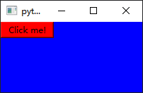
3.2 避免过度样式化
- 优先使用系统原生样式作为基础,仅定制关键部分
- 避免为每个控件单独写样式,使用类选择器统一控制
- 复杂交互优先用代码逻辑,而非纯 QSS
3.3 debug
- 使用
Qt Style Sheet Debugger(Qt Creator 内置)调试 QSS - 逐步添加样式,定位冲突的属性
四、总结
PySide6 的 QSS 是界面美化的核心工具,其核心能力包括:
- 基础样式控制(颜色、字体、边框)
- 状态与子控件的精细化样式
- 运行时动态切换样式
- 自定义控件的样式适配
高级用法的关键在于掌握选择器优先级 、子控件定位 、状态伪选择器,并结合 Python 代码实现动态样式逻辑。合理使用 QSS 可大幅提升界面美观度,同时保持代码的可维护性。
另, 在QT的官网,有大量的样式表范例可供学习:https://doc.qt.io/archives/qt-5.15/stylesheet-examples.html