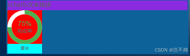
svg图形展示
vue3 + ts
图表顶部自定义编辑文本,圆环可自定义背景与颜色,底部为图表文本。
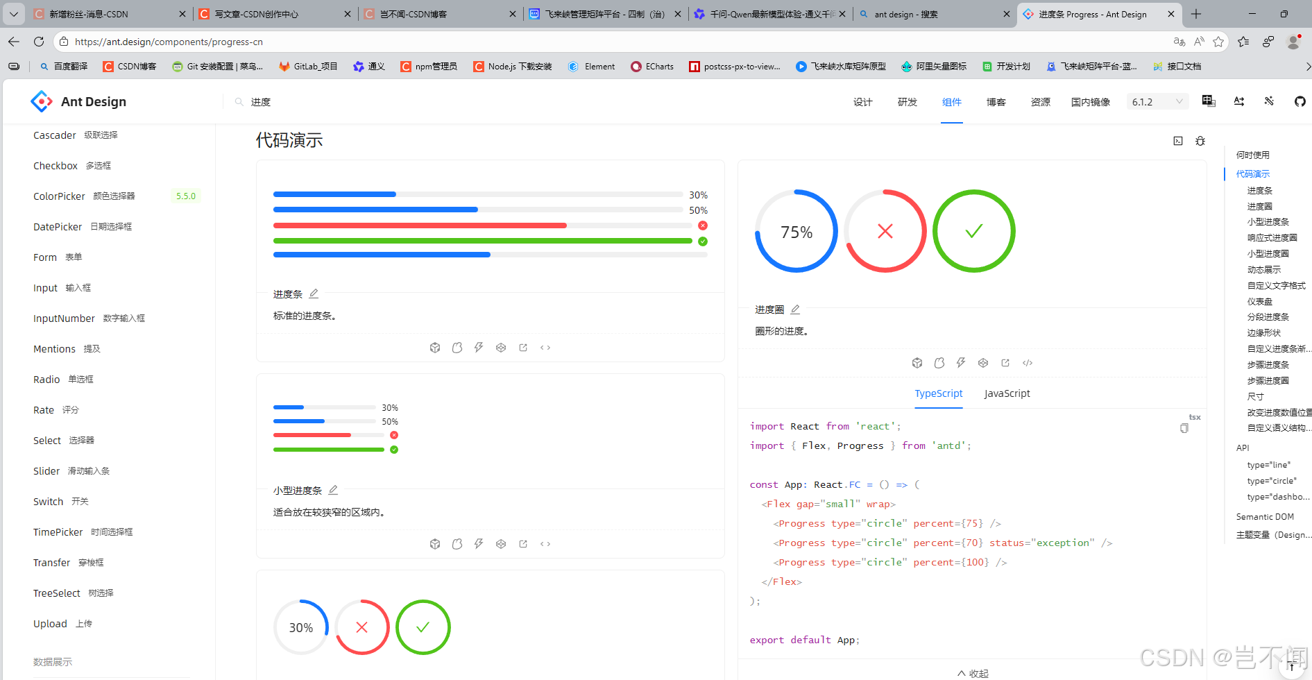
在ant 或echarts中也有类似的圆环进度
父组件调用
顶部自定义为文本描述信息
对应进度可计算为百分比,圆环宽度,进度以及背景颜色,百分比字体颜色,百分比底部文本,以及进度圆环开始渲染位置。
javascript
<template>
  <div class="content-all">
    <div class="content-top-text">echarts文本描述</div>
    <!-- echarts整体-(图表+底部文本)  -->
    <div class="echarts-all">
       <!-- echarts整体-图表 -->
      <div class="echarts-chart">
        <HDemoSon
          :progress="75"
          :strokeWidth="12"
          :progressColor="'#4CAF50'"
          :backgroundColor="'#FFF'"
          :percentageTextColor="'#4CAF50'"
          :title="'完成率'"
          direction="top"
        />
      </div>
      <!-- echarts整体-底部文本 -->
      <div class="echarts-bottom-text">累计</div>
    </div>
  </div>
</template>

<script setup>
import HDemoSon from './HDemoSon.vue'
</script>

<style scoped lang="scss">

@function vh($px) {
  @return calc($px / 1080) * 100vh;
}
// 整体样式
.content-all {
  padding: 2px;
  height: 100%;
  width: 100%;
  background-color: #0C6299;
}

// 顶部数据统计
.content-top-text{
  width: 100%;
  height: 20px;
  background-color: blueviolet;
}

// echarts整体-(图表+底部文本)
.echarts-all {
  width: 70px;
  height: 90px;
  background-color: red;
}

// echarts整体-图表
.echarts-chart {
  width: 70px;
  height: 70px;
}


// echarts整体-底部文本
.echarts-bottom-text {
  background-color: aqua;
  height: 20px;
  width: 100%;
  line-height: 20px;
  text-align: center;
  font-weight: 500;
  font-size: 10px;
}
</style>
子组件-进度svg图形
图表正常接收数据进行渲染,底部自定义文本信息或样式
javascript
<!-- 进度圆环组件 -->
<template>
  <div class="progress-ring">
    <!-- SVG -->
    <svg viewBox="0 0 100 100" preserveAspectRatio="xMidYMid meet">
      <!-- 背景圆环 -->
      <circle
        :stroke="backgroundColor"
        :stroke-width="strokeWidth"
        fill="transparent"
        :r="radius"
        cx="50"
        cy="50"
      />
      <!-- 进度圆环 -->
      <circle
        :stroke="progressColor"
        :stroke-width="strokeWidth"
        fill="transparent"
        :r="radius"
        cx="50"
        cy="50"
        :stroke-dasharray="circumference"
        :stroke-dashoffset="strokeDashoffset"
        :transform="rotationTransform"
      />
    </svg>
    <!-- 文本内容 -->
    <div class="progress-ring-text-container">
      <div class="progress-ring-percentage" :style="percentageStyle">
        {{ percentageText }}
      </div>
       <div v-if="title" class="progress-ring-title">
        {{ title }}
      </div>
    </div>
  </div>
</template>

<script setup>
import { computed } from 'vue'

const props = defineProps({
  progress: {
    type: Number,
    default: 0,
    validator: (v) => v >= 0 && v <= 100
  },
  // 圆环宽度
  strokeWidth: {
    type: Number,
  },
  // 进度圆环背景颜色
  progressColor: {
    type: String,
  },
  // 进度圆环背景颜色
  backgroundColor: {
    type: String,
  },
  // 字体
  title: {
    type: String,
    default: ''
  },
  // 百分比字体颜色
  percentageTextColor: {
    type: String,
  },
  // 进度圆环开始绘制方向
  direction: {
    type: String,
    default: 'top',
    validator: (v) => ['top', 'right', 'bottom', 'left'].includes(v)
  }
})

// 半径基于 viewBox 100x100
const radius = computed(() => 50 - props.strokeWidth / 2)
const circumference = computed(() => 2 * Math.PI * radius.value)

const strokeDashoffset = computed(() => {
  const p = Math.max(0, Math.min(100, props.progress))
  return circumference.value - (p / 100) * circumference.value
})

const rotationTransform = computed(() => {
  const map = { top: -90, right: 0, bottom: 90, left: 180 }
  return `rotate(${map[props.direction]} 50 50)`
})

// 百分比颜色
const percentageStyle = computed(() => ({
  color: props.percentageTextColor,
}))

// 百分比计算
const percentageText = computed(() => `${Math.round(props.progress)}%`)
</script>

<style scoped lang="scss">

@function vh($px) {
  @return calc($px / 1080) * 100vh;
}
/* 整体样式 */
.progress-ring {
  position: relative;
  width: 100%;
  height: 100%;
  display: flex;
  align-items: center;
  justify-content: center;
}

.progress-ring svg {
  position: absolute;
  top: 0;
  left: 0;
  width: 100%;
  height: 100%;
}

/* 中心文本内容 */
.progress-ring-text-container {
  position: relative;
  text-align: center;
  font-family: Arial, sans-serif;
  line-height: 1.2;
  z-index: 1;
}

/* 百分比 */
.progress-ring-percentage{
    font-size: 16px;
}

/* 文本 */
.progress-ring-title{
    font-size: 12px;
    color: #666;
}
</style>