#
前言
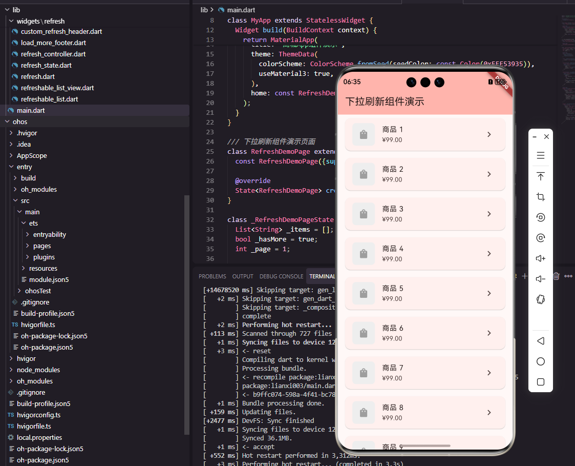
下拉刷新是移动应用中最常见的交互模式之一,用户通过下拉手势触发数据刷新,获取最新内容。在商城应用中,商品列表、订单列表、消息列表等页面都需要支持下拉刷新功能。一个设计良好的下拉刷新组件需要提供流畅的手势响应和清晰的状态反馈。本文将详细介绍如何在Flutter和OpenHarmony平台上开发下拉刷新组件。
下拉刷新的设计需要考虑手势的灵敏度、刷新状态的展示、刷新完成的反馈等多个方面。用户期望下拉时能够看到明确的视觉反馈,知道何时可以释放触发刷新,刷新过程中能够看到加载状态,刷新完成后能够得到结果提示。
Flutter下拉刷新基础实现
首先了解Flutter内置的RefreshIndicator:
dart
class RefreshableList extends StatefulWidget {
  final Future<void> Function() onRefresh;
  final Widget child;

  const RefreshableList({
    Key? key,
    required this.onRefresh,
    required this.child,
  }) : super(key: key);

  @override
  State<RefreshableList> createState() => _RefreshableListState();
}

class _RefreshableListState extends State<RefreshableList> {
  @override
  Widget build(BuildContext context) {
    return RefreshIndicator(
      onRefresh: widget.onRefresh,
      color: const Color(0xFFE53935),
      backgroundColor: Colors.white,
      displacement: 40,
      child: widget.child,
    );
  }
}
RefreshIndicator是Flutter提供的Material风格下拉刷新组件。onRefresh回调返回Future,刷新指示器会在Future完成后自动隐藏。color设置指示器颜色为主题红色,backgroundColor设置背景为白色。displacement设置指示器下拉的最大位移。child是需要支持下拉刷新的滚动组件。这种实现方式简单快捷,适合大多数场景。
自定义下拉刷新组件
dart
enum RefreshState {
  idle,       // 空闲
  pulling,    // 下拉中
  ready,      // 可以刷新
  refreshing, // 刷新中
  completed,  // 刷新完成
}

class CustomRefreshHeader extends StatelessWidget {
  final RefreshState state;
  final double pullDistance;
  final double refreshTriggerDistance;

  const CustomRefreshHeader({
    Key? key,
    required this.state,
    required this.pullDistance,
    this.refreshTriggerDistance = 80,
  }) : super(key: key);

  @override
  Widget build(BuildContext context) {
    return Container(
      height: pullDistance,
      alignment: Alignment.center,
      child: _buildContent(),
    );
  }
}
CustomRefreshHeader组件实现自定义的下拉刷新头部。RefreshState枚举定义了刷新的五种状态,从空闲到刷新完成覆盖了完整的刷新流程。pullDistance是当前下拉距离,refreshTriggerDistance是触发刷新的阈值距离。Container高度随下拉距离变化,_buildContent方法根据状态显示不同内容。这种设计提供了完全自定义的刷新头部样式。
刷新头部内容:
dart
Widget _buildContent() {
  switch (state) {
    case RefreshState.idle:
      return const SizedBox.shrink();
    case RefreshState.pulling:
      return Row(
        mainAxisSize: MainAxisSize.min,
        children: [
          Icon(
            Icons.arrow_downward,
            size: 18,
            color: Colors.grey[600],
          ),
          const SizedBox(width: 8),
          Text(
            '下拉刷新',
            style: TextStyle(
              fontSize: 13,
              color: Colors.grey[600],
            ),
          ),
        ],
      );
    case RefreshState.ready:
      return Row(
        mainAxisSize: MainAxisSize.min,
        children: [
          Icon(
            Icons.arrow_upward,
            size: 18,
            color: Colors.grey[600],
          ),
          const SizedBox(width: 8),
          Text(
            '释放刷新',
            style: TextStyle(
              fontSize: 13,
              color: Colors.grey[600],
            ),
          ),
        ],
      );
    case RefreshState.refreshing:
      return Row(
        mainAxisSize: MainAxisSize.min,
        children: [
          const SizedBox(
            width: 18,
            height: 18,
            child: CircularProgressIndicator(strokeWidth: 2),
          ),
          const SizedBox(width: 8),
          Text(
            '正在刷新...',
            style: TextStyle(
              fontSize: 13,
              color: Colors.grey[600],
            ),
          ),
        ],
      );
    case RefreshState.completed:
      return Row(
        mainAxisSize: MainAxisSize.min,
        children: [
          const Icon(
            Icons.check_circle,
            size: 18,
            color: Color(0xFF4CAF50),
          ),
          const SizedBox(width: 8),
          Text(
            '刷新完成',
            style: TextStyle(
              fontSize: 13,
              color: Colors.grey[600],
            ),
          ),
        ],
      );
  }
}
根据刷新状态显示不同的内容和图标。下拉中显示向下箭头和"下拉刷新"提示,可以刷新时显示向上箭头和"释放刷新"提示,刷新中显示加载指示器和"正在刷新..."提示,刷新完成显示绿色对勾和"刷新完成"提示。Row水平排列图标和文字,mainAxisSize.min使内容宽度自适应。这种状态反馈让用户清楚地知道当前的刷新进度。
下拉刷新控制器
dart
class RefreshController {
  RefreshState _state = RefreshState.idle;
  final _stateController = StreamController<RefreshState>.broadcast();

  Stream<RefreshState> get stateStream => _stateController.stream;
  RefreshState get state => _state;

  void startRefresh() {
    _state = RefreshState.refreshing;
    _stateController.add(_state);
  }

  void completeRefresh() {
    _state = RefreshState.completed;
    _stateController.add(_state);

    Future.delayed(const Duration(milliseconds: 500), () {
      _state = RefreshState.idle;
      _stateController.add(_state);
    });
  }

  void dispose() {
    _stateController.close();
  }
}
RefreshController管理刷新状态的变化。使用StreamController广播状态变化,组件可以通过监听stateStream获取状态更新。startRefresh方法开始刷新,completeRefresh方法完成刷新并在500毫秒后恢复空闲状态。dispose方法关闭流控制器释放资源。这种控制器模式使刷新状态的管理更加灵活,可以在任何地方触发刷新。
上拉加载更多组件
dart
class LoadMoreFooter extends StatelessWidget {
  final bool isLoading;
  final bool hasMore;
  final VoidCallback? onLoadMore;

  const LoadMoreFooter({
    Key? key,
    required this.isLoading,
    required this.hasMore,
    this.onLoadMore,
  }) : super(key: key);

  @override
  Widget build(BuildContext context) {
    if (!hasMore) {
      return Container(
        padding: const EdgeInsets.all(16),
        alignment: Alignment.center,
        child: Text(
          '没有更多了',
          style: TextStyle(
            fontSize: 13,
            color: Colors.grey[500],
          ),
        ),
      );
    }

    return GestureDetector(
      onTap: isLoading ? null : onLoadMore,
      child: Container(
        padding: const EdgeInsets.all(16),
        alignment: Alignment.center,
        child: isLoading
          ? Row(
              mainAxisSize: MainAxisSize.min,
              children: [
                const SizedBox(
                  width: 16,
                  height: 16,
                  child: CircularProgressIndicator(strokeWidth: 2),
                ),
                const SizedBox(width: 8),
                Text(
                  '加载中...',
                  style: TextStyle(
                    fontSize: 13,
                    color: Colors.grey[500],
                  ),
                ),
              ],
            )
          : Text(
              '上拉加载更多',
              style: TextStyle(
                fontSize: 13,
                color: Colors.grey[500],
              ),
            ),
      ),
    );
  }
}
LoadMoreFooter组件显示在列表底部,提供上拉加载更多功能。isLoading表示是否正在加载,hasMore表示是否还有更多数据。当没有更多数据时显示"没有更多了"提示,加载中时显示加载指示器和"加载中..."提示,空闲时显示"上拉加载更多"提示。GestureDetector处理点击事件,加载中时禁用点击。这种设计为用户提供了清晰的加载状态反馈。
OpenHarmony下拉刷新实现
typescript
@Component
struct RefreshableList {
  @State isRefreshing: boolean = false
  @State refreshState: string = 'idle'
  private onRefresh: () => Promise<void> = async () => {}
  @BuilderParam content: () => void

  build() {
    Refresh({ refreshing: $$this.isRefreshing }) {
      this.content()
    }
    .onStateChange((state: RefreshStatus) => {
      this.handleStateChange(state)
    })
    .onRefreshing(async () => {
      await this.onRefresh()
      this.isRefreshing = false
    })
  }

  handleStateChange(state: RefreshStatus) {
    switch (state) {
      case RefreshStatus.Inactive:
        this.refreshState = 'idle'
        break
      case RefreshStatus.Drag:
        this.refreshState = 'pulling'
        break
      case RefreshStatus.OverDrag:
        this.refreshState = 'ready'
        break
      case RefreshStatus.Refresh:
        this.refreshState = 'refreshing'
        break
      case RefreshStatus.Done:
        this.refreshState = 'completed'
        break
    }
  }
}
OpenHarmony提供了原生的Refresh组件实现下拉刷新。$$this.isRefreshing使用双向绑定,刷新状态会自动同步。onStateChange回调在刷新状态变化时触发,可以根据状态更新UI。onRefreshing回调在触发刷新时执行,完成后将isRefreshing设为false结束刷新。@BuilderParam接收列表内容作为子组件。这种实现方式比Flutter更加简洁。
自定义刷新头部ArkUI实现:
typescript
@Builder
RefreshHeader() {
  Row() {
    if (this.refreshState === 'pulling') {
      Image($r('app.media.arrow_down'))
        .width(18)
        .height(18)
      Text('下拉刷新')
        .fontSize(13)
        .fontColor('#999999')
        .margin({ left: 8 })
    } else if (this.refreshState === 'ready') {
      Image($r('app.media.arrow_up'))
        .width(18)
        .height(18)
      Text('释放刷新')
        .fontSize(13)
        .fontColor('#999999')
        .margin({ left: 8 })
    } else if (this.refreshState === 'refreshing') {
      LoadingProgress()
        .width(18)
        .height(18)
      Text('正在刷新...')
        .fontSize(13)
        .fontColor('#999999')
        .margin({ left: 8 })
    } else if (this.refreshState === 'completed') {
      Image($r('app.media.check'))
        .width(18)
        .height(18)
      Text('刷新完成')
        .fontSize(13)
        .fontColor('#999999')
        .margin({ left: 8 })
    }
  }
  .width('100%')
  .height(60)
  .justifyContent(FlexAlign.Center)
}
@Builder装饰器定义了自定义刷新头部的构建方法。根据refreshState显示不同的图标和文字。Image加载本地图标资源,LoadingProgress显示加载动画。Row水平排列图标和文字,justifyContent设为FlexAlign.Center使内容居中。这种实现方式与Flutter版本的视觉效果一致。
加载更多ArkUI实现
typescript
@Builder
LoadMoreFooter() {
  Row() {
    if (!this.hasMore) {
      Text('没有更多了')
        .fontSize(13)
        .fontColor('#999999')
    } else if (this.isLoadingMore) {
      LoadingProgress()
        .width(16)
        .height(16)
      Text('加载中...')
        .fontSize(13)
        .fontColor('#999999')
        .margin({ left: 8 })
    } else {
      Text('上拉加载更多')
        .fontSize(13)
        .fontColor('#999999')
    }
  }
  .width('100%')
  .height(50)
  .justifyContent(FlexAlign.Center)
}
加载更多底部组件根据加载状态和数据状态显示不同内容。hasMore为false时显示"没有更多了",isLoadingMore为true时显示加载动画和"加载中...",否则显示"上拉加载更多"。LoadingProgress是ArkUI提供的加载动画组件。这种实现方式简洁高效,与Flutter版本功能一致。
完整列表组件
dart
class RefreshableListView extends StatefulWidget {
  final Future<void> Function() onRefresh;
  final Future<void> Function()? onLoadMore;
  final bool hasMore;
  final List<Widget> children;

  const RefreshableListView({
    Key? key,
    required this.onRefresh,
    this.onLoadMore,
    this.hasMore = true,
    required this.children,
  }) : super(key: key);

  @override
  State<RefreshableListView> createState() => _RefreshableListViewState();
}

class _RefreshableListViewState extends State<RefreshableListView> {
  bool _isLoadingMore = false;
  final ScrollController _scrollController = ScrollController();

  @override
  void initState() {
    super.initState();
    _scrollController.addListener(_onScroll);
  }

  void _onScroll() {
    if (_scrollController.position.pixels >=
        _scrollController.position.maxScrollExtent - 100) {
      _loadMore();
    }
  }

  Future<void> _loadMore() async {
    if (_isLoadingMore || !widget.hasMore || widget.onLoadMore == null) {
      return;
    }

    setState(() => _isLoadingMore = true);
    await widget.onLoadMore!();
    setState(() => _isLoadingMore = false);
  }

  @override
  Widget build(BuildContext context) {
    return RefreshIndicator(
      onRefresh: widget.onRefresh,
      child: ListView(
        controller: _scrollController,
        children: [
          ...widget.children,
          LoadMoreFooter(
            isLoading: _isLoadingMore,
            hasMore: widget.hasMore,
          ),
        ],
      ),
    );
  }
}
RefreshableListView组件整合了下拉刷新和上拉加载更多功能。ScrollController监听滚动位置,当距离底部小于100像素时触发加载更多。_isLoadingMore防止重复加载,hasMore控制是否还有更多数据。RefreshIndicator包裹ListView提供下拉刷新,LoadMoreFooter放在列表底部显示加载状态。这种设计提供了完整的列表刷新和加载功能。
总结
本文详细介绍了Flutter和OpenHarmony平台上下拉刷新组件的开发过程。下拉刷新作为移动应用的基础交互模式,其设计质量直接影响用户的操作体验。通过自定义刷新头部、加载更多底部、刷新控制器等组件的合理设计,我们为用户提供了流畅的刷新交互体验。在实际项目中,还可以进一步添加刷新动画、震动反馈、刷新时间显示等功能。
欢迎加入开源鸿蒙跨平台社区:https://openharmonycrossplatform.csdn.net