总体是用的vue3去写的。这里我是按照不同分辨率、浏览器宽高改变后,算容器动态宽度,按照百分比去划分标尺刻度
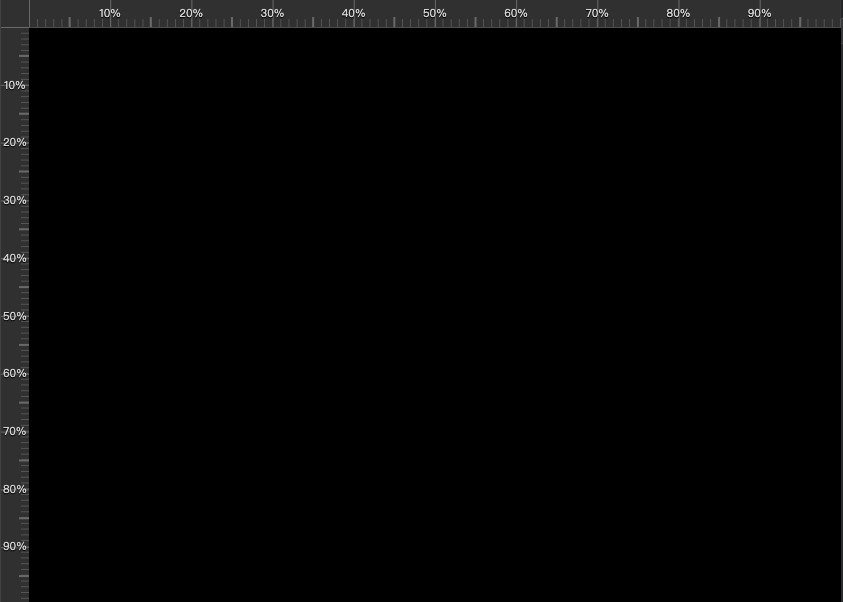
这个标尺刻度刻度我看了别人的写的,重点是background-image。所有代码如下
html部分
javascript
<div class="ruler-container" >
          <div class="placeholder-div"></div>
          <!--垂直的标尺-->
          <div class="ruler v" :style="verticalRulerStyle">
            <ul class="scale-vertical">
              <li
                v-for="(scale, index) in verticalScaleList"
                :key="index"
                :style="{ top: scale + '%' }"
              >
                <template v-if="index!==0 && index !== verticalScaleList.length - 1">{{ scale }}%</template>
              </li>
            </ul>
          </div>
          <!--横向的标尺-->
          <div class="ruler h" :style="horizontalRulerStyle">
            <ul class="scale">
              <li
                v-for="(scale, index) in scaleList"
                :key="index"
                :style="{ left: scale  + '%'  }"
              >
                <template v-if="index!==0 && index !== scaleList.length - 1">{{ scale }}%</template>
              </li>
            </ul>
          </div>
        </div>
script部分
javascript
// 计算刻度列表的函数(通用)
const calculateScaleList = (size, minSpacing = 50) => {
  if (size === 0) {
    return []
  }
  const maxScales = Math.floor(size / minSpacing) + 1
  let interval = 100
  const neededScales = maxScales - 2

  if (neededScales >= 9) {
    interval = 10
  } else if (neededScales >= 4) {
    interval = 20
  } else if (neededScales >= 3) {
    interval = 25
  } else if (neededScales >= 1) {
    interval = 50
  }

  const scales = []
  for (let i = 0; i <= 100; i += interval) {
    scales.push(i)
  }

  return scales
}

// 计算刻度列表(整数百分比)---横向
const scaleList = computed(() => {
  return calculateScaleList(bottomCenterWidth.value)
})

// 计算刻度列表(整数百分比)---纵向
const verticalScaleList = computed(() => {
  return calculateScaleList(bottomCenterHeight.value)
})

// 每个大刻度区间内的小刻度数量(例如 10 份)
const SUB_DIVISIONS = 10

// 横向标尺样式(通过 CSS 变量把每段刻度和小刻度的像素长度传给样式)
const horizontalRulerStyle = computed(() => {
  const count = scaleList.value.length > 1 ? scaleList.value.length - 1 : 1
  const segment = bottomCenterWidth.value > 0 ? bottomCenterWidth.value / count : 50
  const subSegment = segment / SUB_DIVISIONS
  return {
    width: bottomCenterWidth.value + 'px',
    left: '28px',
    top: 0,
    '--segment-size-x': segment + 'px',
    '--sub-segment-size-x': subSegment + 'px',
    '--major-tick-height': '30px',              // 大刻度高度 (盛满30px)
    '--minor-tick-height': '8px',               // 小刻度高度
    '--center-tick-height': '10px',             // 中刻度高度
    '--major-tick-color': '#696969',            // 大刻度颜色
    '--minor-tick-color': '#555'                // 小刻度颜色
  }
})

// 纵向标尺样式
const verticalRulerStyle = computed(() => {
  const count = verticalScaleList.value.length > 1 ? verticalScaleList.value.length - 1 : 1
  const segment = bottomCenterHeight.value > 0 ? bottomCenterHeight.value / count : 50
  const subSegment = segment / SUB_DIVISIONS
  return {
    height: bottomCenterHeight.value + 'px',
    left: 0,
    top: '29px',
    '--segment-size-y': segment + 'px',
    '--sub-segment-size-y': subSegment + 'px'
  }
})


onMounted(() => {
  nextTick(() => {
    updateBottomCenterWidth()
    if (bottomCenterRef.value) {
      resizeObserver = new ResizeObserver((entries) => {
        updateBottomCenterWidth()
      })
      resizeObserver.observe(bottomCenterRef.value)
    }
    window.addEventListener('resize', updateBottomCenterWidth)
  })
})
onUnmounted(() => {
  if (resizeObserver) {
    resizeObserver.disconnect()
    resizeObserver = null
  }
  window.removeEventListener('resize', updateBottomCenterWidth)
})
css部分
css
// 标尺相关样式
.placeholder-div{
  width: 28px;
  height: 29px;
  background-color: #303030;
}
.ruler-container{
  position: relative;
  width: 100%;
  height: 100%;
  //
}
// 横向标尺的刻度
.scale{
  list-style-type: none;
  position: relative;
  margin: 0;
  padding: 0;
  width: 100%;
  height: 30px;
  overflow: hidden;
  white-space: nowrap;
  color:$color-visual;
  font-size: 0;
  text-shadow: 0 1px 1px #000;
  -moz-user-select:none;/*火狐*/
  -webkit-user-select:none;/*webkit浏览器*/
  -ms-user-select:none;/*IE10*/
  user-select:none;
}
.scale li {
  position: absolute;
  transform: translateX(-50%);
  text-align: center;
  padding: 0 2px;
  font-size: 11px;
  white-space: nowrap;
  line-height: 30px;
}
// 纵向标尺的刻度
.scale-vertical{
  list-style-type: none;
  position: relative;
  margin: 0;
  padding: 0;
  width: 28px;
  height: 100%;
  overflow: hidden;
  color:$color-visual;
  font-size: 0;
  text-shadow: 0 1px 1px #000;
  -moz-user-select:none;
  -webkit-user-select:none;
  -ms-user-select:none;
  user-select:none;
}
.scale-vertical li {
  position: absolute;
  transform: translateY(-50%);
  text-align: center;
  padding: 0;
  font-size: 11px;
  white-space: nowrap;
  width: 28px;
  display: flex;
  align-items: center;
  justify-content: center;
}

.ruler.h {
  position: absolute;
  background-color: #303030;
  height: 30px;
  z-index: 100;
  border-bottom: 1px solid $form-border-color;
  box-sizing: border-box;

  // 使用多重背景绘制刻度线
  background-image:
    /* 大刻度 (Major) */
    linear-gradient(90deg, var(--major-tick-color) 1px, transparent 1px),
    /* 中刻度 (Center - 位于大刻度中间) */
    linear-gradient(90deg, transparent calc(50% - 0.5px), var(--major-tick-color) calc(50% - 0.5px), var(--major-tick-color) calc(50% + 0.5px), transparent calc(50% + 0.5px)),
    /* 小刻度 (Minor) */
    linear-gradient(90deg, var(--minor-tick-color) 1px, transparent 1px);

  background-size:
    var(--segment-size-x) var(--major-tick-height),
    var(--segment-size-x) var(--center-tick-height),
    var(--sub-segment-size-x) var(--minor-tick-height);

  background-position:
    0 bottom,
    0 bottom,
    0 bottom;

  background-repeat: repeat-x;
}
// 纵向标尺
// 纵向标尺
.ruler.v {
  position: absolute;
  border-bottom: 1px solid $form-border-color;
  background-color: #303030;

  background-image:
    /* 大刻度 */
    linear-gradient(180deg, #696969 1px, transparent 1px),
    /* 中刻度 */
    linear-gradient(180deg, transparent calc(50% - 0.5px), #696969 calc(50% - 0.5px), #696969 calc(50% + 0.5px), transparent calc(50% + 0.5px)),
    /* 小刻度 */
    linear-gradient(180deg, #555 1px, transparent 1px);

  background-size:
    100% var(--segment-size-y, 50px),
    10px var(--segment-size-y, 50px),
    8px var(--sub-segment-size-y, 5px);

  background-position:
    right 0,
    right 0,
    right 0;

  background-repeat: repeat-y;
  width: 28px;
  z-index: 100;
  box-sizing: border-box;
}