前言
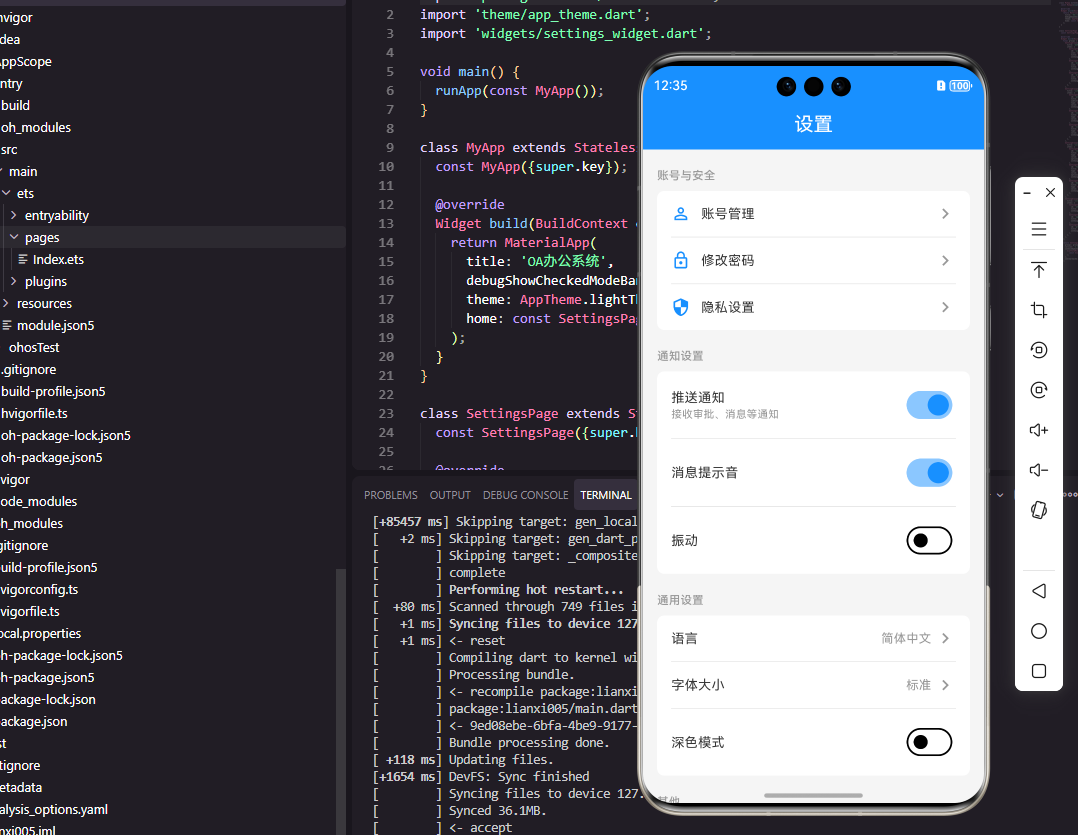
设置页面是OA系统中用户自定义应用行为的重要入口,它包含消息通知设置、隐私安全设置、显示设置、存储管理等功能。一个优秀的设置页面组件需要清晰的分组结构、直观的开关控件、即时的设置反馈。本文将详细介绍如何使用Flutter和OpenHarmony开发一个用户友好的设置页面组件。
组件功能设计
设置页面采用分组列表的布局,每个分组包含相关的设置项。设置项类型包括开关型、选择型、跳转型等。开关型设置使用Switch控件,选择型设置点击弹出选项列表,跳转型设置点击进入子页面。组件需要支持设置项的持久化存储和实时生效。
Flutter端实现
定义设置项数据模型:
dart
enum SettingType { toggle, select, navigate, action }

class SettingItem {
  final String id;
  final String title;
  final String? subtitle;
  final IconData? icon;
  final SettingType type;
  final dynamic value;
  final List<String>? options;
  final VoidCallback? onTap;

  SettingItem({
    required this.id,
    required this.title,
    this.subtitle,
    this.icon,
    required this.type,
    this.value,
    this.options,
    this.onTap,
  });
}

class SettingGroup {
  final String title;
  final List<SettingItem> items;

  SettingGroup({required this.title, required this.items});
}
SettingItem定义单个设置项,type决定设置项的交互方式。SettingGroup将相关设置项分组,便于组织和展示。options用于选择型设置的选项列表。
设置页面组件的基础结构:
dart
class SettingsWidget extends StatefulWidget {
  final List<SettingGroup> groups;
  final Function(String, dynamic) onSettingChanged;

  const SettingsWidget({
    Key? key,
    required this.groups,
    required this.onSettingChanged,
  }) : super(key: key);

  @override
  State<SettingsWidget> createState() => _SettingsWidgetState();
}
组件接收设置分组列表和设置变化回调函数。onSettingChanged在任何设置项变化时触发,传递设置项ID和新值。
设置分组构建:
dart
Widget _buildSettingGroup(SettingGroup group) {
  return Column(
    crossAxisAlignment: CrossAxisAlignment.start,
    children: [
      Padding(
        padding: EdgeInsets.fromLTRB(16, 16, 16, 8),
        child: Text(
          group.title,
          style: TextStyle(fontSize: 14, color: Colors.grey, fontWeight: FontWeight.w500),
        ),
      ),
      Container(
        decoration: BoxDecoration(
          color: Colors.white,
          border: Border(
            top: BorderSide(color: Colors.grey.shade200),
            bottom: BorderSide(color: Colors.grey.shade200),
          ),
        ),
        child: Column(
          children: group.items.map((item) => _buildSettingItem(item)).toList(),
        ),
      ),
    ],
  );
}
设置分组包含标题和设置项列表,标题使用灰色小字显示在分组上方。设置项使用白色背景,上下边框分隔不同分组。
设置项构建:
dart
Widget _buildSettingItem(SettingItem item) {
  return ListTile(
    leading: item.icon != null ? Icon(item.icon, color: Colors.blue) : null,
    title: Text(item.title),
    subtitle: item.subtitle != null ? Text(item.subtitle!) : null,
    trailing: _buildTrailing(item),
    onTap: () => _handleItemTap(item),
  );
}

Widget _buildTrailing(SettingItem item) {
  switch (item.type) {
    case SettingType.toggle:
      return Switch(
        value: item.value ?? false,
        onChanged: (value) => widget.onSettingChanged(item.id, value),
      );
    case SettingType.select:
      return Row(
        mainAxisSize: MainAxisSize.min,
        children: [
          Text(item.value ?? '', style: TextStyle(color: Colors.grey)),
          Icon(Icons.chevron_right, color: Colors.grey),
        ],
      );
    default:
      return Icon(Icons.chevron_right, color: Colors.grey);
  }
}
设置项根据类型显示不同的trailing控件,开关型显示Switch,选择型显示当前值和箭头,跳转型只显示箭头。
选择型设置的弹窗:
dart
void _showSelectDialog(SettingItem item) {
  showModalBottomSheet(
    context: context,
    builder: (context) => Column(
      mainAxisSize: MainAxisSize.min,
      children: [
        Padding(
          padding: EdgeInsets.all(16),
          child: Text(item.title, style: TextStyle(fontSize: 16, fontWeight: FontWeight.w500)),
        ),
        ...item.options!.map((option) => ListTile(
          title: Text(option),
          trailing: item.value == option ? Icon(Icons.check, color: Colors.blue) : null,
          onTap: () {
            widget.onSettingChanged(item.id, option);
            Navigator.pop(context);
          },
        )),
        SizedBox(height: 16),
      ],
    ),
  );
}
选择型设置点击后弹出底部选项列表,当前选中的选项显示勾选图标。选择后关闭弹窗并触发设置变化回调。
OpenHarmony鸿蒙端实现
定义设置项接口:
typescript
type SettingType = 'toggle' | 'select' | 'navigate' | 'action'

interface SettingItem {
  id: string
  title: string
  subtitle?: string
  icon?: Resource
  type: SettingType
  value?: any
  options?: string[]
}

interface SettingGroup {
  title: string
  items: SettingItem[]
}
使用联合类型定义设置项类型,SettingGroup将相关设置项分组。
设置页面组件的基础结构:
typescript
@Component
struct SettingsWidget {
  @Prop groups: SettingGroup[] = []
  private onSettingChanged: (id: string, value: any) => void = () => {}
}
使用@Prop接收设置分组数据,回调函数处理设置变化。
设置分组构建:
typescript
@Builder
SettingGroupView(group: SettingGroup) {
  Column() {
    Text(group.title)
      .fontSize(14)
      .fontColor('#999999')
      .fontWeight(FontWeight.Medium)
      .width('100%')
      .padding({ left: 16, top: 16, bottom: 8 })

    Column() {
      ForEach(group.items, (item: SettingItem, index: number) => {
        this.SettingItemView(item)
        if (index < group.items.length - 1) {
          Divider()
            .strokeWidth(1)
            .color('#F0F0F0')
            .margin({ left: 16 })
        }
      })
    }
    .backgroundColor(Color.White)
  }
}
设置分组显示标题和设置项列表,设置项之间使用Divider分隔。ForEach遍历设置项,最后一项不显示分隔线。
设置项构建:
typescript
@Builder
SettingItemView(item: SettingItem) {
  Row() {
    if (item.icon) {
      Image(item.icon)
        .width(24)
        .height(24)
        .margin({ right: 12 })
    }

    Column() {
      Text(item.title)
        .fontSize(16)
      if (item.subtitle) {
        Text(item.subtitle)
          .fontSize(12)
          .fontColor('#999999')
          .margin({ top: 2 })
      }
    }
    .alignItems(HorizontalAlign.Start)
    .layoutWeight(1)

    this.SettingTrailing(item)
  }
  .width('100%')
  .padding(16)
  .onClick(() => this.handleItemTap(item))
}
设置项水平排列图标、标题和trailing控件。layoutWeight(1)使标题区域占据剩余空间。
trailing控件构建:
typescript
@Builder
SettingTrailing(item: SettingItem) {
  if (item.type === 'toggle') {
    Toggle({ type: ToggleType.Switch, isOn: item.value || false })
      .onChange((isOn: boolean) => {
        this.onSettingChanged(item.id, isOn)
      })
  } else if (item.type === 'select') {
    Row() {
      Text(item.value || '')
        .fontSize(14)
        .fontColor('#999999')
      Image($r('app.media.arrow_right'))
        .width(16)
        .height(16)
        .margin({ left: 4 })
    }
  } else {
    Image($r('app.media.arrow_right'))
      .width(16)
      .height(16)
  }
}
根据设置项类型显示不同控件,toggle类型使用Toggle开关,select类型显示当前值和箭头,其他类型只显示箭头。
选择型设置的弹窗:
typescript
private showSelectSheet(item: SettingItem) {
  ActionSheet.show({
    title: item.title,
    sheets: item.options?.map(option => ({
      title: option,
      action: () => {
        this.onSettingChanged(item.id, option)
      }
    })) || []
  })
}
选择型设置使用ActionSheet显示选项列表,点击选项后触发设置变化回调。ActionSheet是鸿蒙提供的底部弹出选项组件。
消息通知设置示例:
typescript
private getNotificationSettings(): SettingGroup {
  return {
    title: '消息通知',
    items: [
      { id: 'push_enabled', title: '推送通知', type: 'toggle', value: true },
      { id: 'sound_enabled', title: '提示音', type: 'toggle', value: true },
      { id: 'vibrate_enabled', title: '振动', type: 'toggle', value: false },
      { id: 'quiet_hours', title: '免打扰时段', subtitle: '23:00 - 07:00', type: 'navigate' }
    ]
  }
}
消息通知设置分组包含推送开关、提示音开关、振动开关和免打扰时段设置。这是OA系统中常见的设置项组合。
总结
本文详细介绍了Flutter和OpenHarmony平台上设置页面组件的开发方法。设置页面是OA系统中用户自定义应用行为的入口,需要支持多种类型的设置项。两个平台都提供了开关、选择器等控件来实现设置功能,开发者需要注意设置的持久化存储和实时生效的处理。
欢迎加入开源鸿蒙跨平台社区:https://openharmonycrossplatform.csdn.net