前言
轮播图是移动应用中常见的内容展示组件,在打卡工具类应用中可以用于展示打卡成就、每日激励语、功能介绍等内容。一个设计良好的轮播图应该支持自动播放、手动滑动和指示器显示。本文将详细介绍如何在Flutter和OpenHarmony平台上实现功能完善的轮播图组件。
轮播图的设计需要考虑自动播放间隔、切换动画、指示器样式和触摸交互。我们将实现一个支持多种配置的轮播图组件,满足不同场景的展示需求。
Flutter轮播图实现
首先创建轮播图组件:
dart
class Carousel extends StatefulWidget {
  final List<Widget> items;
  final double height;
  final bool autoPlay;
  final Duration autoPlayInterval;
  final Duration animationDuration;

  const Carousel({
    Key? key,
    required this.items,
    this.height = 200,
    this.autoPlay = true,
    this.autoPlayInterval = const Duration(seconds: 3),
    this.animationDuration = const Duration(milliseconds: 300),
  }) : super(key: key);

  @override
  State<Carousel> createState() => _CarouselState();
}

class _CarouselState extends State<Carousel> {
  late PageController _pageController;
  int _currentPage = 0;
  Timer? _timer;

  @override
  void initState() {
    super.initState();
    _pageController = PageController();
    if (widget.autoPlay) _startAutoPlay();
  }

  void _startAutoPlay() {
    _timer = Timer.periodic(widget.autoPlayInterval, (_) {
      final nextPage = (_currentPage + 1) % widget.items.length;
      _pageController.animateToPage(
        nextPage,
        duration: widget.animationDuration,
        curve: Curves.easeInOut,
      );
    });
  }

  @override
  void dispose() {
    _timer?.cancel();
    _pageController.dispose();
    super.dispose();
  }

  @override
  Widget build(BuildContext context) {
    return Column(
      children: [
        SizedBox(
          height: widget.height,
          child: PageView.builder(
            controller: _pageController,
            onPageChanged: (index) => setState(() => _currentPage = index),
            itemCount: widget.items.length,
            itemBuilder: (context, index) => Padding(
              padding: const EdgeInsets.symmetric(horizontal: 16),
              child: widget.items[index],
            ),
          ),
        ),
        const SizedBox(height: 12),
        _buildIndicator(),
      ],
    );
  }

  Widget _buildIndicator() {
    return Row(
      mainAxisAlignment: MainAxisAlignment.center,
      children: List.generate(widget.items.length, (index) {
        return AnimatedContainer(
          duration: const Duration(milliseconds: 200),
          margin: const EdgeInsets.symmetric(horizontal: 4),
          width: _currentPage == index ? 24 : 8,
          height: 8,
          decoration: BoxDecoration(
            color: _currentPage == index ? Colors.blue : Colors.grey.shade300,
            borderRadius: BorderRadius.circular(4),
          ),
        );
      }),
    );
  }
}
Carousel组件使用PageView实现滑动切换,Timer实现自动播放。autoPlayInterval控制自动切换间隔,animationDuration控制切换动画时长。指示器使用AnimatedContainer实现平滑的宽度变化动画,当前页的指示器更宽更醒目。
OpenHarmony轮播图实现
在鸿蒙系统中创建轮播图组件:
typescript
@Component
struct Carousel {
  @Prop items: string[] = []  // 图片URL数组
  @Prop height: number = 200
  @Prop autoPlay: boolean = true
  @Prop interval: number = 3000
  @State currentIndex: number = 0
  private swiperController: SwiperController = new SwiperController()

  build() {
    Column() {
      Swiper(this.swiperController) {
        ForEach(this.items, (item: string) => {
          Image(item)
            .width('100%')
            .height(this.height)
            .borderRadius(12)
            .objectFit(ImageFit.Cover)
        })
      }
      .width('100%')
      .height(this.height)
      .autoPlay(this.autoPlay)
      .interval(this.interval)
      .indicator(false)
      .onChange((index: number) => {
        this.currentIndex = index
      })

      this.Indicator()
    }
  }

  @Builder
  Indicator() {
    Row() {
      ForEach(this.items, (item: string, index: number) => {
        Column()
          .width(index === this.currentIndex ? 24 : 8)
          .height(8)
          .borderRadius(4)
          .backgroundColor(index === this.currentIndex ? '#007AFF' : '#E0E0E0')
          .margin({ left: 4, right: 4 })
          .animation({ duration: 200 })
      })
    }
    .margin({ top: 12 })
    .justifyContent(FlexAlign.Center)
  }
}
鸿蒙使用Swiper组件实现轮播功能,内置了自动播放和手势滑动支持。autoPlay和interval属性控制自动播放,indicator(false)隐藏默认指示器以使用自定义样式。onChange回调在页面切换时更新currentIndex,驱动指示器更新。
打卡成就轮播
实现打卡成就展示轮播:
dart
class AchievementCarousel extends StatelessWidget {
final List<Achievement> achievements;
const AchievementCarousel({Key? key, required this.achievements}) : super(key: key);
@override
Widget build(BuildContext context) {
return Carousel(
height: 160,
autoPlayInterval: const Duration(seconds: 5),
items: achievements.map((achievement) => _buildAchievementCard(achievement)).toList(),
);
}
Widget _buildAchievementCard(Achievement achievement) {
return Container(
decoration: BoxDecoration(
gradient: LinearGradient(
colors: [achievement.color, achievement.color.withOpacity(0.7)],
begin: Alignment.topLeft,
end: Alignment.bottomRight,
),
borderRadius: BorderRadius.circular(16),
),
padding: const EdgeInsets.all(20),
child: Row(
children: [
Icon(achievement.icon, size: 48, color: Colors.white),
const SizedBox(width: 16),
Expanded(
child: Column(
crossAxisAlignment: CrossAxisAlignment.start,
mainAxisAlignment: MainAxisAlignment.center,
children: [
Text(
achievement.title,
style: const TextStyle(
fontSize: 20,
fontWeight: FontWeight.bold,
color: Colors.white,
),
),
const SizedBox(height: 4),
Text(
achievement.description,
style: TextStyle(
fontSize: 14,
color: Colors.white.withOpacity(0.9),
),
),
],
),
),
],
),
);
}
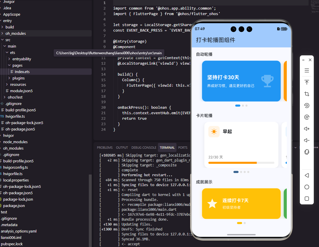
}成就轮播展示用户获得的打卡成就,每个成就卡片使用渐变背景和图标,视觉效果丰富。自动播放间隔设为5秒,给用户足够的阅读时间。这种展示方式能够有效激励用户继续坚持打卡。
每日激励轮播
实现每日激励语轮播:
dart
class MotivationCarousel extends StatelessWidget {
  static const motivations = [
    {'text': '坚持就是胜利,每一天的努力都在积累', 'author': '励志格言'},
    {'text': '习惯的力量是巨大的,它能改变你的人生', 'author': '成功学'},
    {'text': '不要等待机会,而要创造机会', 'author': '行动派'},
    {'text': '每天进步一点点,终将成就不凡', 'author': '成长思维'},
  ];

  const MotivationCarousel({Key? key}) : super(key: key);

  @override
  Widget build(BuildContext context) {
    return Carousel(
      height: 120,
      autoPlayInterval: const Duration(seconds: 6),
      items: motivations.map((m) => _buildMotivationCard(m)).toList(),
    );
  }

  Widget _buildMotivationCard(Map<String, String> motivation) {
    return Container(
      decoration: BoxDecoration(
        color: Colors.blue.shade50,
        borderRadius: BorderRadius.circular(12),
      ),
      padding: const EdgeInsets.all(16),
      child: Column(
        mainAxisAlignment: MainAxisAlignment.center,
        children: [
          Text(
            '"${motivation['text']}"',
            style: const TextStyle(
              fontSize: 16,
              fontStyle: FontStyle.italic,
              color: Colors.black87,
            ),
            textAlign: TextAlign.center,
          ),
          const SizedBox(height: 8),
          Text(
            '--- ${motivation['author']}',
            style: TextStyle(fontSize: 12, color: Colors.grey.shade600),
          ),
        ],
      ),
    );
  }
}
激励语轮播展示鼓励用户的名言警句,帮助用户保持打卡动力。斜体文字和引号样式突出引用的特点,作者署名增加可信度。浅蓝色背景营造积极向上的氛围。
功能引导轮播
实现新用户引导轮播:
dart
class OnboardingCarousel extends StatefulWidget {
  final VoidCallback onComplete;

  const OnboardingCarousel({Key? key, required this.onComplete}) : super(key: key);

  @override
  State<OnboardingCarousel> createState() => _OnboardingCarouselState();
}

class _OnboardingCarouselState extends State<OnboardingCarousel> {
  final _pageController = PageController();
  int _currentPage = 0;

  static const pages = [
    {'icon': Icons.add_task, 'title': '创建习惯', 'desc': '添加你想要养成的好习惯'},
    {'icon': Icons.check_circle, 'title': '每日打卡', 'desc': '完成习惯后点击打卡记录'},
    {'icon': Icons.emoji_events, 'title': '获得成就', 'desc': '坚持打卡解锁各种成就徽章'},
  ];

  @override
  Widget build(BuildContext context) {
    return Column(
      children: [
        Expanded(
          child: PageView.builder(
            controller: _pageController,
            onPageChanged: (index) => setState(() => _currentPage = index),
            itemCount: pages.length,
            itemBuilder: (context, index) => _buildPage(pages[index]),
          ),
        ),
        Padding(
          padding: const EdgeInsets.all(24),
          child: Row(
            mainAxisAlignment: MainAxisAlignment.spaceBetween,
            children: [
              _buildIndicator(),
              ElevatedButton(
                onPressed: _currentPage == pages.length - 1
                    ? widget.onComplete
                    : () => _pageController.nextPage(
                        duration: const Duration(milliseconds: 300),
                        curve: Curves.easeInOut,
                      ),
                child: Text(_currentPage == pages.length - 1 ? '开始使用' : '下一步'),
              ),
            ],
          ),
        ),
      ],
    );
  }

  Widget _buildPage(Map<String, dynamic> page) {
    return Column(
      mainAxisAlignment: MainAxisAlignment.center,
      children: [
        Icon(page['icon'] as IconData, size: 100, color: Colors.blue),
        const SizedBox(height: 32),
        Text(page['title'] as String, style: const TextStyle(fontSize: 24, fontWeight: FontWeight.bold)),
        const SizedBox(height: 12),
        Text(page['desc'] as String, style: TextStyle(fontSize: 16, color: Colors.grey.shade600)),
      ],
    );
  }

  Widget _buildIndicator() {
    return Row(
      children: List.generate(pages.length, (index) => Container(
        margin: const EdgeInsets.symmetric(horizontal: 4),
        width: 8,
        height: 8,
        decoration: BoxDecoration(
          shape: BoxShape.circle,
          color: _currentPage == index ? Colors.blue : Colors.grey.shade300,
        ),
      )),
    );
  }
}
引导轮播用于新用户首次使用时介绍应用功能。每页包含图标、标题和描述,最后一页的按钮变为"开始使用"。这种引导方式帮助用户快速了解应用的核心功能。
总结
本文详细介绍了在Flutter和OpenHarmony平台上实现轮播图组件的完整方案。轮播图通过自动播放、手动滑动和指示器显示,为用户提供了流畅的内容浏览体验。成就轮播、激励轮播和引导轮播展示了轮播图在打卡应用中的多种应用场景。两个平台的实现都注重动画效果和交互体验,确保轮播图展示美观流畅。
欢迎加入开源鸿蒙跨平台社区:https://openharmonycrossplatform.csdn.net