前言
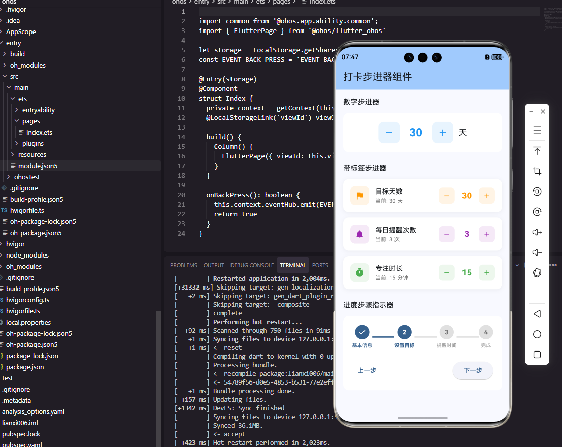
步进器是打卡工具类应用中用于数值调整的常用组件。在设置打卡目标次数、每日饮水杯数、运动时长等场景中,步进器提供了直观的数值增减操作。本文将详细介绍如何在Flutter和OpenHarmony平台上实现功能完善的步进器组件。
步进器的设计需要考虑数值范围、步进值、边界处理和视觉反馈。我们将实现支持自定义范围和步进值的步进器组件,同时提供良好的交互体验。
Flutter步进器实现
首先创建基础步进器组件:
dart
class Stepper extends StatelessWidget {
  final int value;
  final int min;
  final int max;
  final int step;
  final ValueChanged<int> onChanged;
  final String? unit;

  const Stepper({
    Key? key,
    required this.value,
    this.min = 0,
    this.max = 100,
    this.step = 1,
    required this.onChanged,
    this.unit,
  }) : super(key: key);

  void _increment() {
    if (value + step <= max) {
      onChanged(value + step);
    }
  }

  void _decrement() {
    if (value - step >= min) {
      onChanged(value - step);
    }
  }

  @override
  Widget build(BuildContext context) {
    return Row(
      mainAxisSize: MainAxisSize.min,
      children: [
        _buildButton(Icons.remove, _decrement, value <= min),
        Container(
          width: 80,
          alignment: Alignment.center,
          child: Text(
            unit != null ? '$value$unit' : '$value',
            style: const TextStyle(fontSize: 20, fontWeight: FontWeight.bold),
          ),
        ),
        _buildButton(Icons.add, _increment, value >= max),
      ],
    );
  }

  Widget _buildButton(IconData icon, VoidCallback onPressed, bool disabled) {
    return GestureDetector(
      onTap: disabled ? null : onPressed,
      child: Container(
        width: 40,
        height: 40,
        decoration: BoxDecoration(
          color: disabled ? Colors.grey.shade200 : Colors.blue,
          borderRadius: BorderRadius.circular(8),
        ),
        child: Icon(
          icon,
          color: disabled ? Colors.grey : Colors.white,
        ),
      ),
    );
  }
}
Stepper组件提供了完整的数值调整功能。min和max定义数值范围,step定义每次调整的步进值,unit可选地显示单位。按钮在达到边界时自动禁用,通过颜色变化提供视觉反馈。数值显示在中间,使用大号粗体字确保清晰可读。
实现带动画效果的步进器:
dart
class AnimatedStepper extends StatefulWidget {
  final int value;
  final int min;
  final int max;
  final ValueChanged<int> onChanged;

  const AnimatedStepper({
    Key? key,
    required this.value,
    this.min = 0,
    this.max = 100,
    required this.onChanged,
  }) : super(key: key);

  @override
  State<AnimatedStepper> createState() => _AnimatedStepperState();
}

class _AnimatedStepperState extends State<AnimatedStepper>
    with SingleTickerProviderStateMixin {
  late AnimationController _controller;
  late Animation<double> _scaleAnimation;

  @override
  void initState() {
    super.initState();
    _controller = AnimationController(
      duration: const Duration(milliseconds: 100),
      vsync: this,
    );
    _scaleAnimation = Tween<double>(begin: 1.0, end: 1.2).animate(_controller);
  }

  void _animateValue() {
    _controller.forward().then((_) => _controller.reverse());
  }

  @override
  Widget build(BuildContext context) {
    return Row(
      mainAxisSize: MainAxisSize.min,
      children: [
        _buildButton(Icons.remove, () {
          if (widget.value > widget.min) {
            widget.onChanged(widget.value - 1);
            _animateValue();
          }
        }),
        AnimatedBuilder(
          animation: _scaleAnimation,
          builder: (context, child) {
            return Transform.scale(
              scale: _scaleAnimation.value,
              child: Container(
                width: 80,
                alignment: Alignment.center,
                child: Text(
                  '${widget.value}',
                  style: const TextStyle(fontSize: 24, fontWeight: FontWeight.bold),
                ),
              ),
            );
          },
        ),
        _buildButton(Icons.add, () {
          if (widget.value < widget.max) {
            widget.onChanged(widget.value + 1);
            _animateValue();
          }
        }),
      ],
    );
  }

  Widget _buildButton(IconData icon, VoidCallback onPressed) {
    return IconButton(
      icon: Icon(icon),
      onPressed: onPressed,
      iconSize: 28,
    );
  }

  @override
  void dispose() {
    _controller.dispose();
    super.dispose();
  }
}
动画步进器在数值变化时添加缩放动画效果,让交互更加生动。AnimationController控制动画,forward和reverse实现放大后缩小的弹性效果。这种微妙的动画反馈能够增强用户的操作确认感。
OpenHarmony步进器实现
在鸿蒙系统中创建步进器组件:
typescript
@Component
struct NumberStepper {
  @Prop value: number = 0
  @Prop min: number = 0
  @Prop max: number = 100
  @Prop step: number = 1
  @Prop unit: string = ''
  private onChanged: (value: number) => void = () => {}
  @State scale: number = 1

  increment() {
    if (this.value + this.step <= this.max) {
      this.onChanged(this.value + this.step)
      this.animateValue()
    }
  }

  decrement() {
    if (this.value - this.step >= this.min) {
      this.onChanged(this.value - this.step)
      this.animateValue()
    }
  }

  animateValue() {
    animateTo({ duration: 50 }, () => { this.scale = 1.2 })
    setTimeout(() => {
      animateTo({ duration: 50 }, () => { this.scale = 1 })
    }, 50)
  }

  build() {
    Row() {
      this.StepButton('-', () => this.decrement(), this.value <= this.min)

      Text(this.unit ? `${this.value}${this.unit}` : `${this.value}`)
        .fontSize(20)
        .fontWeight(FontWeight.Bold)
        .width(80)
        .textAlign(TextAlign.Center)
        .scale({ x: this.scale, y: this.scale })

      this.StepButton('+', () => this.increment(), this.value >= this.max)
    }
  }

  @Builder
  StepButton(text: string, onClick: () => void, disabled: boolean) {
    Text(text)
      .width(40)
      .height(40)
      .fontSize(24)
      .fontWeight(FontWeight.Bold)
      .textAlign(TextAlign.Center)
      .fontColor(disabled ? '#999999' : Color.White)
      .backgroundColor(disabled ? '#E0E0E0' : '#007AFF')
      .borderRadius(8)
      .onClick(() => {
        if (!disabled) onClick()
      })
  }
}
鸿蒙的步进器使用相同的逻辑结构。animateTo函数实现数值变化时的缩放动画,setTimeout控制动画的时序。disabled状态通过颜色变化提供视觉反馈,禁用时按钮变灰且不响应点击。
目标设置步进器
实现打卡目标设置的步进器:
dart
class GoalStepper extends StatelessWidget {
  final String label;
  final int value;
  final int min;
  final int max;
  final String unit;
  final ValueChanged<int> onChanged;
  final List<int>? quickValues;

  const GoalStepper({
    Key? key,
    required this.label,
    required this.value,
    this.min = 1,
    this.max = 100,
    required this.unit,
    required this.onChanged,
    this.quickValues,
  }) : super(key: key);

  @override
  Widget build(BuildContext context) {
    return Column(
      crossAxisAlignment: CrossAxisAlignment.start,
      children: [
        Text(label, style: const TextStyle(fontSize: 16, fontWeight: FontWeight.w500)),
        const SizedBox(height: 12),
        Row(
          children: [
            Expanded(
              child: Stepper(
                value: value,
                min: min,
                max: max,
                unit: unit,
                onChanged: onChanged,
              ),
            ),
          ],
        ),
        if (quickValues != null) ...[
          const SizedBox(height: 12),
          Wrap(
            spacing: 8,
            children: quickValues!.map((v) => ChoiceChip(
              label: Text('$v$unit'),
              selected: value == v,
              onSelected: (_) => onChanged(v),
            )).toList(),
          ),
        ],
      ],
    );
  }
}
GoalStepper是打卡目标设置的专用组件,包含标签、步进器和快捷选择。quickValues提供常用数值的快捷按钮,用户可以直接点击选择而无需多次点击加减按钮。这种设计大大提升了设置效率。
使用示例:
dart
GoalStepper(
  label: '每日饮水目标',
  value: waterGoal,
  min: 1,
  max: 20,
  unit: '杯',
  quickValues: [4, 6, 8, 10],
  onChanged: (value) => setState(() => waterGoal = value),
)
时长步进器
实现时长设置的步进器:
dart
class DurationStepper extends StatelessWidget {
  final int minutes;
  final ValueChanged<int> onChanged;

  const DurationStepper({
    Key? key,
    required this.minutes,
    required this.onChanged,
  }) : super(key: key);

  String get formattedDuration {
    if (minutes < 60) return '$minutes分钟';
    final hours = minutes ~/ 60;
    final mins = minutes % 60;
    return mins > 0 ? '$hours小时$mins分钟' : '$hours小时';
  }

  @override
  Widget build(BuildContext context) {
    return Row(
      mainAxisSize: MainAxisSize.min,
      children: [
        IconButton(
          icon: const Icon(Icons.remove_circle_outline),
          onPressed: minutes > 5 ? () => onChanged(minutes - 5) : null,
        ),
        Container(
          width: 120,
          alignment: Alignment.center,
          child: Text(
            formattedDuration,
            style: const TextStyle(fontSize: 18, fontWeight: FontWeight.w600),
          ),
        ),
        IconButton(
          icon: const Icon(Icons.add_circle_outline),
          onPressed: minutes < 480 ? () => onChanged(minutes + 5) : null,
        ),
      ],
    );
  }
}
时长步进器专门用于设置时间长度,以5分钟为步进单位。formattedDuration方法将分钟数格式化为易读的时长文本,超过60分钟时显示小时和分钟的组合。最大值480分钟(8小时)覆盖了大多数习惯的时长需求。
总结
本文详细介绍了在Flutter和OpenHarmony平台上实现步进器组件的完整方案。步进器通过直观的加减按钮和清晰的数值显示,为用户提供了便捷的数值调整体验。动画效果增强了交互反馈,快捷选择提升了设置效率。两个平台的实现都注重边界处理和视觉反馈,确保步进器操作准确可靠。
欢迎加入开源鸿蒙跨平台社区:https://openharmonycrossplatform.csdn.net