在日常工作中,你是否遇到过这种情况:你辛辛苦苦跑完数据,画了一张图表发给老板或客户,结果对方盯着看了半天,问了一句:"所以,你想表达什么?"
这就像讲笑话没人笑一样尴尬。图表的本质不是 "画图" ,而是 "沟通"。
今天,我将分享 5 个提升可视化效果的原则,并用 Python 的 matplotlib 库手把手教你如何实现。
1. 原则1:展示数据,而非装饰
想象一下,你在阅读一本小说,但每页都充满了无关的插图,你会感到困惑和分心。
数据可视化也是如此------读者需要的是数据本身,而不是华丽的装饰。
所以,我们需要展示最重要 的数据,而不是尽可能多的数据。
让我们看看一个常见的错误做法和改进后的做法:
python
# 创建示例数据
np.random.seed(42)
categories = ["产品A", "产品B", "产品C", "产品D", "产品E"]
sales_bad = np.random.randint(50, 200, 5)
sales_good = np.random.randint(50, 200, 5)

# 错误做法:过度装饰,数据不突出
fig, (ax1, ax2) = plt.subplots(1, 2, figsize=(14, 6))

# 左侧:过度装饰的图表
ax1.bar(categories, sales_bad, color=["red", "blue", "green", "orange", "purple"])

# 添加不必要的元素
# ...

# 右侧:简洁聚焦的图表
ax2.bar(categories, sales_good, color="steelblue", alpha=0.8)
# 在柱子上直接标注数值
for i, v in enumerate(sales_good):
    ax2.text(i, v + 5, str(v), ha="center", fontweight="bold")

# 突出最高值
# ...
# 移除不必要的边框
# ...

plt.tight_layout()
plt.show()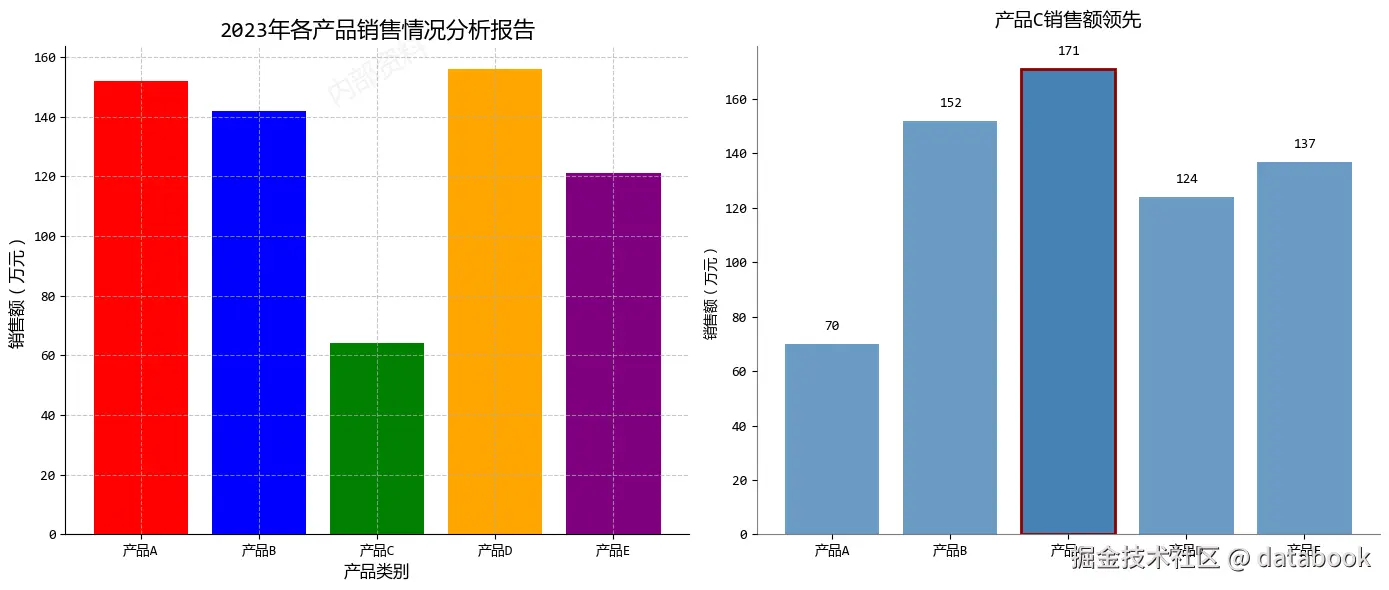
在这个示例中,根据原则1,我们主要改进了:
- 移除背景水印和过度装饰
- 直接在柱状图上标注数值,避免视线来回移动
- 突出显示最重要的数据点(产品C)
- 简化标题,直接传达核心信息
2. 原则2:减少混乱,保持简洁
想象一下一个杂乱无章的房间,你想找一本书,却要翻遍各个角落。
混乱的图表也会让读者经历同样的挫折。
所以,每个额外的视觉元素都应该有明确的目的,否则就应该移除。
python
# 创建示例数据
np.random.seed(123)
months = [
    "1月",
    #...
    "12月",
]
temperature = np.random.normal(20, 5, 12) + np.sin(np.linspace(0, 2 * np.pi, 12)) * 3
precipitation = (
    np.random.normal(50, 15, 12) + np.cos(np.linspace(0, 2 * np.pi, 12)) * 20
)

# 左侧:混乱的图表
ax1.plot(months, temperature, "ro-", linewidth=2, markersize=8, label="温度")
# ...

# 创建第二个y轴(混乱的常见来源)
ax1b = ax1.twinx()
ax1b.plot(months, precipitation, "bs--", linewidth=2, markersize=8, label="降水量")
# ...

# 添加网格和过多标签
# ...

# 右侧:简洁的图表
# 分开显示两个指标
ax2a = plt.subplot(grid[0, 1])
ax2b = plt.subplot(grid[1, 1])

# 温度图表
ax2a.plot(months, temperature, color="#E74C3C", linewidth=2.5)
ax2a.fill_between(months, temperature.min(), temperature, color="#E74C3C", alpha=0.1)

# 突出显示最高温度
max_temp_idx = np.argmax(temperature)
ax2a.plot(
    months[max_temp_idx], temperature[max_temp_idx], "o", color="#E74C3C", markersize=10
)
# ...

# 降水量图表
ax2b.bar(months, precipitation, color="#3498DB", alpha=0.7)
# 突出显示最高降水量
max_precip_idx = np.argmax(precipitation)
# ...

plt.show()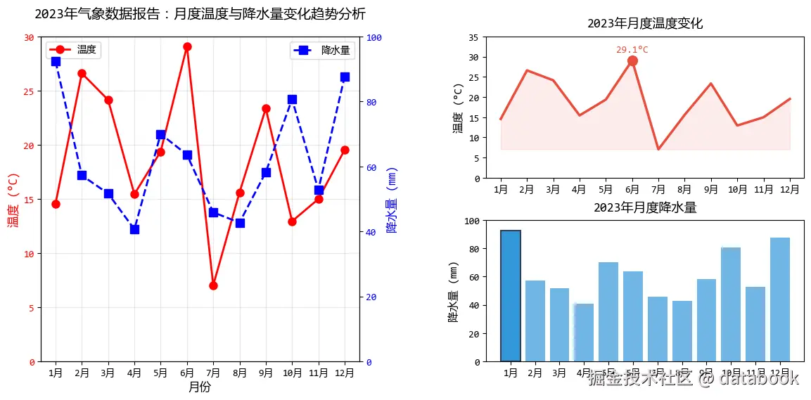
在这个示例中,根据原则2,我们主要改进了:
- 将双Y轴图表拆分为两个独立的图表
- 移除过多的图例和网格线
- 使用填充和标记突出关键数据点
- 简化标题,每个图表只表达一个核心信息
3. 原则3:图文结合,引导读者
好的可视化图表就像一个会讲故事的导游,而文字就是它的讲解词。
文字应该帮助读者理解数据,而不是制造障碍。
python
# 创建示例数据
np.random.seed(42)
years = np.arange(2010, 2023)
company_a = np.random.normal(100, 10, 13) + np.linspace(0, 50, 13)
company_b = np.random.normal(100, 10, 13) + np.linspace(0, 30, 13)

# 左侧:缺乏引导的图表
ax1.plot(years, company_a, "b-", linewidth=2, label="公司A")
ax1.plot(years, company_b, "r-", linewidth=2, label="公司B")

# 右侧:图文结合的图表
ax2.plot(years, company_a, color="#2E86C1", linewidth=3, alpha=0.8)
ax2.plot(years, company_b, color="#E74C3C", linewidth=3, alpha=0.8)

# 直接标注线条,避免图例
ax2.text(
    2022.2, company_a[-1], "公司A", color="#2E86C1", fontweight="bold", va="center"
)
ax2.text(
    2022.2, company_b[-1], "公司B", color="#E74C3C", fontweight="bold", va="center"
)

# 添加标题和副标题
# ...

# 添加关键事件注释
# ...

# 突出关键数据点
# ...

# 简洁的坐标轴
# ...

plt.show()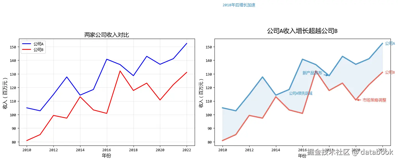
在这个示例中,根据原则3,我们主要改进了:
- 直接在线条旁标注,消除图例
- 使用标题直接传达核心发现
- 添加注释解释关键事件
- 使用填充区域突出重要差异
4. 原则4:避免意面图,分解复杂信息
"意面图"是指线条交错、难以分辨的图表,就像一碗缠在一起的意大利面。
当图表变得过于复杂时,最好的方法是分解它。
python
# 创建示例数据:多个产品多年的销售数据
np.random.seed(123)
years = np.arange(2015, 2024)
products = ['手机', '平板', '笔记本', '智能手表', '耳机']

# 生成数据
sales_data = {}
for product in products:
    base = np.random.randint(30, 80)
    trend = np.linspace(0, np.random.randint(20, 60), 9)
    noise = np.random.normal(0, 5, 9)
    sales_data[product] = base + trend + noise

# 左侧:意面图
colors = plt.cm.Set2(np.linspace(0, 1, len(products)))
for idx, (product, sales) in enumerate(sales_data.items()):
    ax1.plot(years, sales, color=colors[idx], linewidth=2, marker='o', label=product)

# 右侧:分解后的图表 - 使用子图
fig2, axes = plt.subplots(2, 3, figsize=(15, 8))
axes = axes.flatten()

# 绘制每个产品的独立图表
for idx, (product, sales) in enumerate(sales_data.items()):
    ax = axes[idx]
    ax.plot(years, sales, color='#2980B9', linewidth=2.5, marker='o', markersize=6)

    # 填充区域
    ax.fill_between(years, sales.min(), sales, color='#2980B9', alpha=0.1)

    # 设置标题和标签
    # ...

    # 标记最高点
    max_idx = np.argmax(sales)
    ax.plot(years[max_idx], sales[max_idx], 'o', color='#E74C3C', markersize=8)
    # ...

    # 简化网格
    # ...

# 隐藏最后一个子图(我们只有5个产品)
axes[-1].axis('off')

plt.show()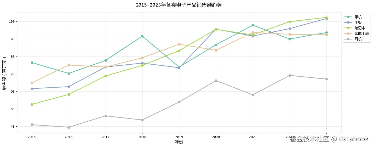
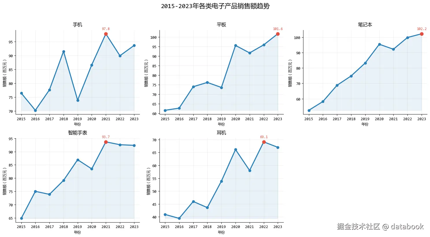
在这个示例中,根据原则4,我们主要改进了:
- 将复杂的多线条图表分解为多个简单图表
- 每个子图聚焦一个产品,避免线条交错
- 在每个子图中独立标注关键信息
- 保持一致的视觉风格便于比较
5. 原则5:从灰色开始,有策略地使用颜色
颜色是可视化中最强大的工具之一,但也是最容易被滥用的。
从灰度开始设计,可以确保你使用的每个颜色都有明确的目的。
python
# 创建示例数据
np.random.seed(123)
cities = ["北京", "上海", "广州", "深圳", "成都", "武汉", "西安", "杭州"]
months = [
    "1月",
    # ...
    "12月",
]

# 生成各城市的月度AQI数据
aqi_data = {}
for city in cities:
    base = np.random.randint(60, 100)  # 基础AQI值
    seasonal = np.sin(np.linspace(0, 2 * np.pi, 12)) * 20  # 季节性变化
    noise = np.random.normal(0, 10, 12)  # 随机噪声
    aqi_data[city] = np.clip(base + seasonal + noise, 30, 180)  # 限制在30-180之间

# 计算各城市的年平均AQI
avg_aqi = {city: np.mean(values) for city, values in aqi_data.items()}

# 创建图表对比
fig = plt.figure(figsize=(12, 6))

# 阶段1:全灰色基础图表
ax1 = plt.subplot(1, 2, 1)

# 全灰色版本
for city in cities:
    ax1.plot(months, aqi_data[city], color="#7F8C8D", linewidth=1.5, alpha=0.6)  # 灰色
# ...

# 阶段2:识别关键数据后添加初步颜色
ax2 = plt.subplot(1, 2, 2)

# 找出空气质量最好和最差的城市
sorted_cities = sorted(avg_aqi.items(), key=lambda x: x[1])
best_city = sorted_cities[0][0]  # AQI最低的城市
worst_city = sorted_cities[-1][0]  # AQI最高的城市
# ...

# 添加标签
# ...

# 添加空气质量标准线
# ...

plt.show()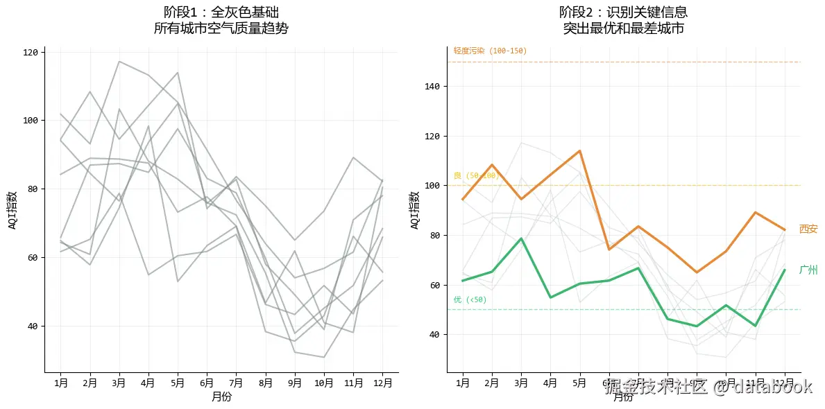
在这个示例中,根据原则5,我们主要改进了:
- 从全灰色开始,确保图表结构清晰
- 只对关键数据点使用强调色
- 使用颜色突出最重要的发现
- 通过细节点缀(如虚线、标记)提供额外上下文
6. 总结
数据可视化 不仅仅是关于 plt.plot() 的技术,更多的是关于心理学 和设计。
- 展示数据:把聚光灯打在重点上。
- 减少混乱:删掉一切不必要的墨水。
- 图文结合:标题就是结论,标注代替图例。
- 避免意面图:复杂问题拆解看。
- 从灰色开始:克制地使用颜色。
希望这些原则能帮你在下一次做图时,画出让人眼前一亮的作品!
文中的代码是一些核心的片段,完整的代码共享在:可视化5个黄金原则.ipynb (访问密码: 6872)