说实话,第一次听到"纸片组件"这个名字的时候,我也是一脸懵。这玩意儿和 Tag 标签有啥区别?
用了一段时间才搞明白:Tag 主要是展示用的,告诉你"这个东西属于什么类别";Chip 更偏交互,用户可以点它、选它、删它。
举几个例子你就懂了:
- 搜索历史里那些可以点击删除的关键词 ------ Chip
- 筛选条件里可以多选的选项 ------ Chip
- 输入框里已经选中的联系人,带个小叉叉 ------ Chip
- 文章底部那些只读的分类标签 ------ Tag
好,概念讲完,看代码。
源码在这
文件路径 src/components/ui/Chip.tsx,先整体过一遍:
tsx
import React from 'react';
import { View, Text, TouchableOpacity, StyleSheet, ViewStyle } from 'react-native';
import { UITheme, ColorType, SizeType } from './theme';

interface ChipProps {
  label: string;
  selected?: boolean;
  onPress?: () => void;
  onDelete?: () => void;
  color?: ColorType;
  size?: SizeType;
  variant?: 'filled' | 'outlined';
  avatar?: string;
  icon?: string;
  disabled?: boolean;
  style?: ViewStyle;
}

export const Chip: React.FC<ChipProps> = ({
  label,
  selected = false,
  onPress,
  onDelete,
  color = 'primary',
  size = 'md',
  variant = 'filled',
  avatar,
  icon,
  disabled = false,
  style,
}) => {
  const colorValue = UITheme.colors[color];
  const sizeMap: Record<SizeType, { height: number; fontSize: number; avatarSize: number }> = {
    sm: { height: 24, fontSize: 11, avatarSize: 18 },
    md: { height: 32, fontSize: 13, avatarSize: 24 },
    lg: { height: 40, fontSize: 15, avatarSize: 32 },
  };

  const isActive = selected || variant === 'filled';
  const bgColor = disabled
    ? UITheme.colors.gray[200]
    : isActive
    ? colorValue
    : 'transparent';
  const textColor = disabled
    ? UITheme.colors.gray[500]
    : isActive
    ? UITheme.colors.white
    : colorValue;
  const borderColor = disabled ? UITheme.colors.gray[300] : colorValue;

  const content = (
    <View
      style={[
        styles.container,
        {
          height: sizeMap[size].height,
          backgroundColor: bgColor,
          borderColor,
          borderWidth: variant === 'outlined' && !selected ? 1 : 0,
          borderRadius: sizeMap[size].height / 2,
          opacity: disabled ? 0.6 : 1,
        },
        style,
      ]}
    >
      {avatar && (
        <View
          style={[
            styles.avatar,
            {
              width: sizeMap[size].avatarSize,
              height: sizeMap[size].avatarSize,
              borderRadius: sizeMap[size].avatarSize / 2,
            },
          ]}
        >
          <Text style={{ fontSize: sizeMap[size].avatarSize * 0.5 }}>{avatar}</Text>
        </View>
      )}
      {icon && !avatar && <Text style={{ marginRight: 4 }}>{icon}</Text>}
      <Text style={[styles.label, { fontSize: sizeMap[size].fontSize, color: textColor }]}>
        {label}
      </Text>
      {onDelete && (
        <TouchableOpacity onPress={onDelete} disabled={disabled} style={styles.deleteBtn}>
          <Text style={[styles.deleteIcon, { color: textColor }]}>×</Text>
        </TouchableOpacity>
      )}
    </View>
  );

  if (onPress && !disabled) {
    return (
      <TouchableOpacity onPress={onPress} activeOpacity={0.7}>
        {content}
      </TouchableOpacity>
    );
  }

  return content;
};

const styles = StyleSheet.create({
  container: {
    flexDirection: 'row',
    alignItems: 'center',
    paddingHorizontal: UITheme.spacing.md,
    alignSelf: 'flex-start',
  },
  avatar: {
    backgroundColor: UITheme.colors.gray[200],
    alignItems: 'center',
    justifyContent: 'center',
    marginRight: UITheme.spacing.xs,
    marginLeft: -UITheme.spacing.xs,
  },
  label: { fontWeight: '500' },
  deleteBtn: { marginLeft: UITheme.spacing.xs },
  deleteIcon: { fontSize: 16, fontWeight: '600' },
});
100 行出头,功能挺多的。我们拆开看。
属性设计
tsx
interface ChipProps {
  label: string;
  selected?: boolean;
  onPress?: () => void;
  onDelete?: () => void;
  color?: ColorType;
  size?: SizeType;
  variant?: 'filled' | 'outlined';
  avatar?: string;
  icon?: string;
  disabled?: boolean;
  style?: ViewStyle;
}
11 个属性,看着多,其实分几类就清楚了。
必填的就一个 :label,纸片上显示的文字。
交互相关 :selected 控制选中状态,onPress 是点击回调,onDelete 是删除回调,disabled 禁用交互。
外观相关 :color 颜色,size 尺寸,variant 填充还是描边。
装饰相关 :avatar 头像,icon 图标。
兜底 :style 自定义样式。
这个设计挺合理的,把 Chip 的各种用法都覆盖了。
默认值和颜色计算
tsx
export const Chip: React.FC<ChipProps> = ({
  label,
  selected = false,
  onPress,
  onDelete,
  color = 'primary',
  size = 'md',
  variant = 'filled',
  avatar,
  icon,
  disabled = false,
  style,
}) => {
  const colorValue = UITheme.colors[color];
默认值的选择:
selected = false默认不选中color = 'primary'默认主题色size = 'md'默认中等大小variant = 'filled'默认填充样式disabled = false默认可交互
colorValue 从主题里取出具体的颜色值。比如 color = 'primary' 时,colorValue 就是主题里定义的主色调。
尺寸映射
tsx
const sizeMap: Record<SizeType, { height: number; fontSize: number; avatarSize: number }> = {
  sm: { height: 24, fontSize: 11, avatarSize: 18 },
  md: { height: 32, fontSize: 13, avatarSize: 24 },
  lg: { height: 40, fontSize: 15, avatarSize: 32 },
};
三种尺寸,每种尺寸定义三个数值:
sm 小号:高度 24,字号 11,头像 18。适合空间紧凑的地方,比如搜索建议列表。
md 中号:高度 32,字号 13,头像 24。通用尺寸,大多数场景都合适。
lg 大号:高度 40,字号 15,头像 32。适合需要强调的场景,或者触摸目标需要更大的时候。
为啥要单独定义 avatarSize?因为头像要和整体高度协调。如果头像太大会撑破容器,太小又显得不协调。
颜色逻辑,有点绕
tsx
const isActive = selected || variant === 'filled';
const bgColor = disabled
  ? UITheme.colors.gray[200]
  : isActive
  ? colorValue
  : 'transparent';
const textColor = disabled
  ? UITheme.colors.gray[500]
  : isActive
  ? UITheme.colors.white
  : colorValue;
const borderColor = disabled ? UITheme.colors.gray[300] : colorValue;
这段代码决定了 Chip 的颜色表现,我画个表格帮你理清:
| 状态 | 背景色 | 文字色 | 边框色 |
|---|---|---|---|
| disabled | 浅灰 | 深灰 | 灰色 |
| filled 或 selected | 主题色 | 白色 | 主题色 |
| outlined 未选中 | 透明 | 主题色 | 主题色 |
isActive 这个变量很关键。它把"填充样式"和"选中状态"统一处理了------两种情况下的视觉效果是一样的,都是有背景色的。
这样设计的好处是:outlined 样式的 Chip 选中后会变成 filled 的样子,视觉反馈很明确。
渲染内容
tsx
const content = (
  <View
    style={[
      styles.container,
      {
        height: sizeMap[size].height,
        backgroundColor: bgColor,
        borderColor,
        borderWidth: variant === 'outlined' && !selected ? 1 : 0,
        borderRadius: sizeMap[size].height / 2,
        opacity: disabled ? 0.6 : 1,
      },
      style,
    ]}
  >
外层容器的样式合并了好几个来源:
styles.container 是基础样式,定义了 flex 布局和内边距。
动态样式里有几个细节:
borderRadius: sizeMap[size].height / 2 让 Chip 变成胶囊形状。高度的一半作为圆角,两端就是完美的半圆。
borderWidth: variant === 'outlined' && !selected ? 1 : 0 只有描边样式且未选中时才显示边框。选中后边框消失,因为背景色已经填充了。
opacity: disabled ? 0.6 : 1 禁用时降低透明度,这是常见的禁用态视觉处理。
头像和图标
tsx
{avatar && (
  <View
    style={[
      styles.avatar,
      {
        width: sizeMap[size].avatarSize,
        height: sizeMap[size].avatarSize,
        borderRadius: sizeMap[size].avatarSize / 2,
      },
    ]}
  >
    <Text style={{ fontSize: sizeMap[size].avatarSize * 0.5 }}>{avatar}</Text>
  </View>
)}
{icon && !avatar && <Text style={{ marginRight: 4 }}>{icon}</Text>}头像和图标是互斥的,{icon && !avatar && ...} 这个条件保证了:有头像时不显示图标。
头像用一个圆形的 View 包裹,里面放 emoji。fontSize: sizeMap[size].avatarSize * 0.5 让 emoji 大小是头像容器的一半,看起来比较协调。
图标就简单多了,直接渲染 emoji,加个右边距和文字隔开。
头像的样式有个小技巧:
tsx
avatar: {
  // ...
  marginRight: UITheme.spacing.xs,
  marginLeft: -UITheme.spacing.xs,
},
marginLeft 是负值,让头像往左边"探出去"一点,紧贴 Chip 的左边缘。这样视觉上更紧凑。
删除按钮
tsx
{onDelete && (
  <TouchableOpacity onPress={onDelete} disabled={disabled} style={styles.deleteBtn}>
    <Text style={[styles.deleteIcon, { color: textColor }]}>×</Text>
  </TouchableOpacity>
)}
只有传了 onDelete 回调才显示删除按钮。
删除按钮是个独立的 TouchableOpacity,有自己的点击事件。注意它也受 disabled 控制,禁用状态下删除按钮也不能点。
删除图标用的是 × 字符,简单直接。颜色跟随文字颜色,保持视觉一致。
点击处理
tsx
if (onPress && !disabled) {
  return (
    <TouchableOpacity onPress={onPress} activeOpacity={0.7}>
      {content}
    </TouchableOpacity>
  );
}

return content;
这段代码决定了 Chip 是否可点击。
如果传了 onPress 且没有禁用,整个 Chip 都包在 TouchableOpacity 里,可以点击。
否则就直接返回 content,只是个静态展示。
activeOpacity={0.7} 让点击时有个轻微的透明度变化,给用户反馈。
样式定义
tsx
const styles = StyleSheet.create({
  container: {
    flexDirection: 'row',
    alignItems: 'center',
    paddingHorizontal: UITheme.spacing.md,
    alignSelf: 'flex-start',
  },
  avatar: {
    backgroundColor: UITheme.colors.gray[200],
    alignItems: 'center',
    justifyContent: 'center',
    marginRight: UITheme.spacing.xs,
    marginLeft: -UITheme.spacing.xs,
  },
  label: { fontWeight: '500' },
  deleteBtn: { marginLeft: UITheme.spacing.xs },
  deleteIcon: { fontSize: 16, fontWeight: '600' },
});
alignSelf: 'flex-start' 这个属性很重要。它让 Chip 的宽度由内容决定,而不是撑满父容器。没有这个属性,Chip 会变成一整行那么宽。
label 的 fontWeight: '500' 让文字稍微粗一点,在小尺寸下更清晰。
deleteIcon 的 fontWeight: '600' 让叉号更粗,更容易看到和点击。
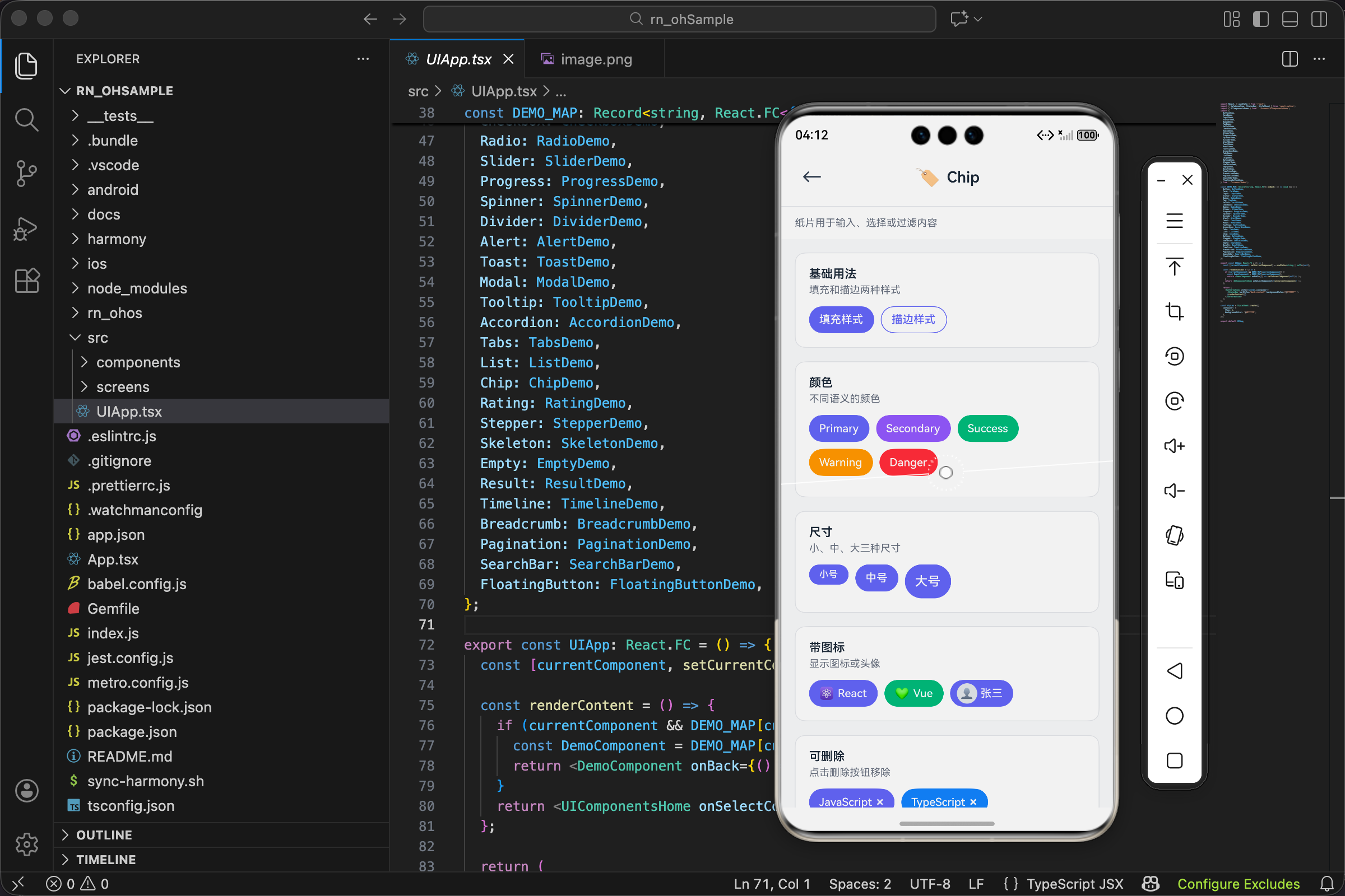
Demo 里的用法
看看实际怎么用,文件 src/screens/demos/ChipDemo.tsx。
基础样式
tsx
<Chip label="填充样式" variant="filled" />
<Chip label="描边样式" variant="outlined" style={styles.ml} />
两种基础样式并排展示。filled 有背景色,outlined 只有边框。
多种颜色
tsx
<Chip label="Primary" color="primary" style={styles.chip} />
<Chip label="Secondary" color="secondary" style={styles.chip} />
<Chip label="Success" color="success" style={styles.chip} />
<Chip label="Warning" color="warning" style={styles.chip} />
<Chip label="Danger" color="danger" style={styles.chip} />
五种语义颜色。实际项目里,不同颜色可以表示不同含义:success 表示已完成,warning 表示待处理,danger 表示有问题。
带图标和头像
tsx
<Chip label="React" icon="⚛️" />
<Chip label="Vue" icon="💚" color="success" style={styles.ml} />
<Chip label="张三" avatar="👤" style={styles.ml} />
icon 适合表示类别或状态,avatar 适合表示人。
可删除
tsx
<Chip label="JavaScript" onDelete={() => {}} />
<Chip label="TypeScript" onDelete={() => {}} color="info" style={styles.ml} />
传了 onDelete 就会显示删除按钮。实际使用时,回调里要处理删除逻辑。
可选择
tsx
const [selected, setSelected] = useState<string[]>(['react']);

const toggleSelect = (value: string) => {
  setSelected(prev => prev.includes(value) ? prev.filter(v => v !== value) : [...prev, value]);
};

// ...

{['react', 'vue', 'angular', 'svelte'].map(item => (
  <Chip
    key={item}
    label={item}
    selected={selected.includes(item)}
    onPress={() => toggleSelect(item)}
    variant="outlined"
    style={styles.chip}
  />
))}
这是 Chip 最常见的用法之一:多选筛选器。
selected 数组存储已选中的项。toggleSelect 函数处理选中/取消选中的逻辑。
每个 Chip 的 selected 属性根据是否在数组里来决定。点击时调用 toggleSelect 切换状态。
用 variant="outlined" 是因为描边样式在选中/未选中之间的视觉差异更明显。
实际场景
搜索历史
tsx
const SearchHistory = ({ history, onRemove, onSelect }) => (
  <View style={styles.historyWrap}>
    {history.map(keyword => (
      <Chip
        key={keyword}
        label={keyword}
        size="sm"
        variant="outlined"
        onPress={() => onSelect(keyword)}
        onDelete={() => onRemove(keyword)}
        style={styles.historyChip}
      />
    ))}
  </View>
);
搜索历史用小号 Chip,可以点击重新搜索,也可以删除。
标签输入
tsx
const TagInput = ({ tags, onAdd, onRemove }) => {
  const [input, setInput] = useState('');

  const handleSubmit = () => {
    if (input.trim()) {
      onAdd(input.trim());
      setInput('');
    }
  };

  return (
    <View>
      <View style={styles.tagsWrap}>
        {tags.map(tag => (
          <Chip
            key={tag}
            label={tag}
            onDelete={() => onRemove(tag)}
            style={styles.tagChip}
          />
        ))}
      </View>
      <Input
        value={input}
        onChangeText={setInput}
        onSubmitEditing={handleSubmit}
        placeholder="输入标签后回车"
      />
    </View>
  );
};
用户输入标签,回车添加,点叉删除。这种交互在很多表单里都能见到。
联系人选择
tsx
const ContactPicker = ({ selected, onRemove }) => (
  <View style={styles.selectedContacts}>
    {selected.map(contact => (
      <Chip
        key={contact.id}
        label={contact.name}
        avatar={contact.avatar || '👤'}
        onDelete={() => onRemove(contact.id)}
        style={styles.contactChip}
      />
    ))}
  </View>
);
选中的联系人显示为带头像的 Chip,可以删除。
和 Tag 的区别
写到这里,再总结一下 Chip 和 Tag 的区别:
| Chip | Tag | |
|---|---|---|
| 主要用途 | 交互(选择、删除) | 展示(分类、标记) |
| 可点击 | 通常可以 | 通常不行 |
| 可删除 | 支持 | 一般不支持 |
| 选中状态 | 有 | 没有 |
| 头像 | 支持 | 一般不支持 |
简单说:需要用户操作的用 Chip,只是看看的用 Tag。
写在后面
Chip 组件的代码量不算少,但每一部分都有它的用处。颜色计算那块可能有点绕,多看几遍就懂了。
这个组件的设计思路是:通过属性组合覆盖各种使用场景。同一个组件,传不同的属性,就能变成筛选器、标签输入、联系人选择器。
下次遇到类似的交互需求,别急着写新组件,先想想 Chip 能不能搞定。
欢迎加入开源鸿蒙跨平台社区:https://openharmonycrossplatform.csdn.net