Data Input(基础数据输入)
TextEdit(单行文本框)
<StackPanel Margin="0,0,0,24">
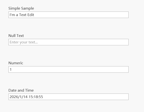
<Label Content="Simple Sample" />
<dxe:TextEdit x:Name="editor"
Text="I'm a Text Edit"
VerticalAlignment="Center"
MaxLength="{Binding ElementName=maxLength, Path=Value, Mode=TwoWay}"
IsReadOnly="{Binding ElementName=readOnly, Path=IsChecked, Mode=TwoWay}">
<dxe:TextEdit.CharacterCasing>
<Binding ElementName="casing" Path="SelectedItem" Mode="TwoWay" />
</dxe:TextEdit.CharacterCasing>
</dxe:TextEdit>
</StackPanel>
<StackPanel Margin="0,24" Grid.Row="1">
<Label Content="Null Text" />
<dxe:TextEdit x:Name="nullTextEditor"
EditValue="{Binding Path=EditValue, ElementName=txtEditValue, Mode=TwoWay}"
NullText="{Binding Path=EditValue, ElementName=txtNullText}"
NullValue="{Binding Path=EditValue, ElementName=txtNullValue}"
ShowNullText="{Binding Path=EditValue, ElementName=chShowNullText}"
ShowNullTextIfFocused="{Binding Path=EditValue, ElementName=chShowNullTextIfFocused}"/>
</StackPanel>
<StackPanel Margin="0,24" Grid.Row="2">
<Label Content="Numeric" />
<dxe:TextEdit x:Name="numericEditor"
MaskType="Numeric"
VerticalAlignment="Center"
EditValue="{Binding Path=EditValue, ElementName=numericValue, Mode=TwoWay}"
DisplayFormatString="{Binding Path=EditValue, ElementName=numericFormat, Mode=TwoWay}" />
</StackPanel>
<StackPanel Margin="0,24" Grid.Row="3">
<Label Content="Date and Time" />
<dxe:TextEdit x:Name="dateTimeEditor"
MaskType="DateTime"
VerticalAlignment="Center"
EditValue="{Binding Path=EditValue, ElementName=dDate, Mode=TwoWay}"
DisplayFormatString="{Binding Path=EditValue, ElementName=dateTimeFormat, Mode=TwoWay}" />
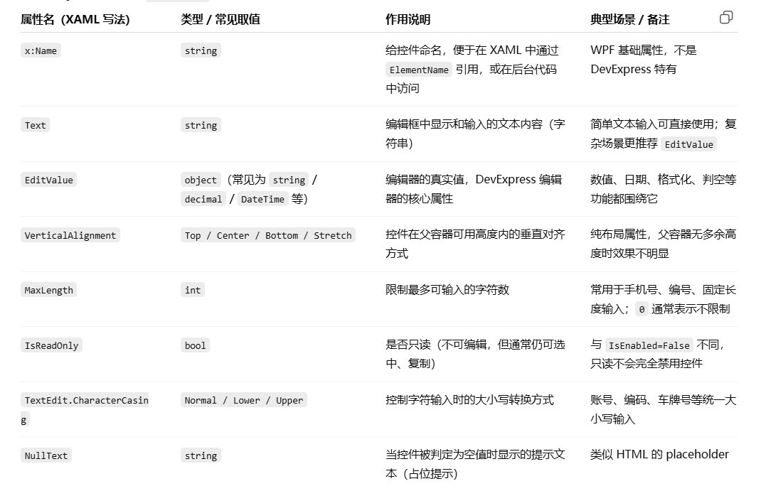
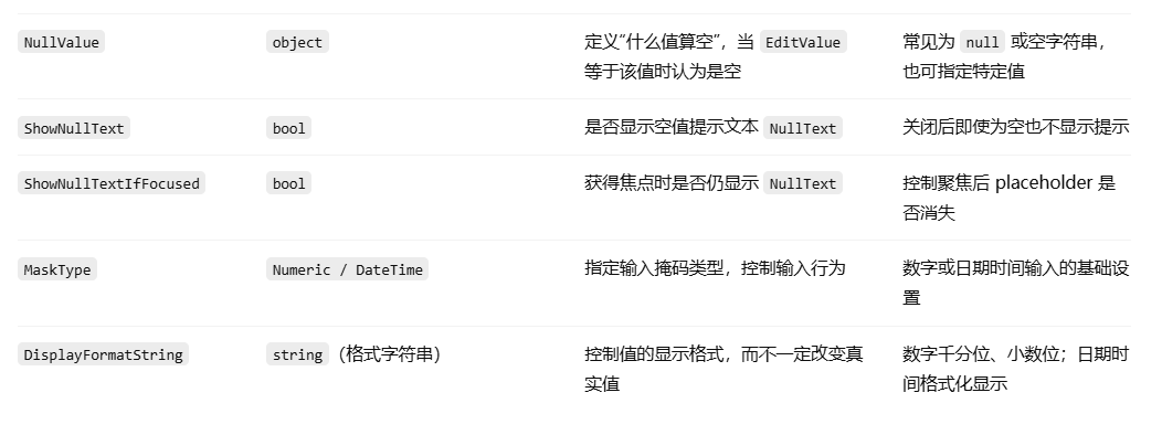
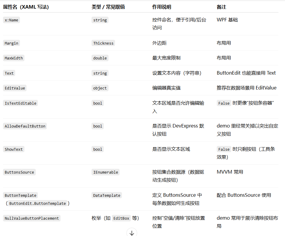
</StackPanel>常用属性对应表:
ButtonEdit(带按钮的输入框)
<StackPanel Grid.Row="1" MaxWidth="400" Margin="0,60,0,0">
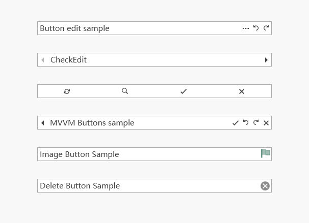
<dxe:ButtonEdit Margin="16,12,16,16" x:Name="editor1" IsTextEditable="True" AllowDefaultButton="False" Text="Button edit sample">
<dxe:ButtonInfo x:Name="regular" GlyphKind="Regular" ToolTipService.ToolTip="Button 1" />
<dxe:ButtonInfo x:Name="undo" GlyphKind="Undo" ToolTipService.ToolTip="Button 2" />
<dxe:ButtonInfo x:Name="redo" GlyphKind="Redo" ToolTipService.ToolTip="Button 3" />
</dxe:ButtonEdit>
<dxe:ButtonEdit Margin="16,12,16,16" x:Name="editor2" IsTextEditable="False" AllowDefaultButton="False">
<dxe:ButtonInfo x:Name="left" ButtonKind="Repeat" GlyphKind="Left" IsLeft="True" Click="LeftButtonClick" ToolTipService.ToolTip="Previous" />
<dxe:ButtonInfo x:Name="right" ButtonKind="Repeat" GlyphKind="Right" IsLeft="False" Click="RightButtonClick" ToolTipService.ToolTip="Next" />
</dxe:ButtonEdit>
<dxe:ButtonEdit Margin="16,12,16,16" x:Name="editor3" ShowText="False" AllowDefaultButton="False">
<dxe:ButtonInfo x:Name="refresh" GlyphKind="Refresh" ToolTipService.ToolTip="Refresh" />
<dxe:ButtonInfo x:Name="search" GlyphKind="Search" ToolTipService.ToolTip="Search" />
<dxe:ButtonInfo x:Name="apply" GlyphKind="Apply" ToolTipService.ToolTip="Apply" />
<dxe:ButtonInfo x:Name="cancel" GlyphKind="Cancel" ToolTipService.ToolTip="Cancel" />
</dxe:ButtonEdit>
<dxe:ButtonEdit Margin="16,12,16,16" AllowDefaultButton="false" EditValue="MVVM Buttons sample" ButtonsSource="{Binding}">
<dxe:ButtonEdit.ButtonTemplate>
<DataTemplate>
<ContentControl>
<dxe:ButtonInfo GlyphKind="{Binding GlyphKind}" ToolTip="{Binding ToolTip}" IsLeft="{Binding IsLeft}" Index="{Binding Index}" />
</ContentControl>
</DataTemplate>
</dxe:ButtonEdit.ButtonTemplate>
</dxe:ButtonEdit>
<dxe:ButtonEdit Margin="16,12,16,16" EditValue="Image Button Sample" AllowDefaultButton="False">
<dxe:ImageButtonInfo Glyph="/EditorsDemo;component/Images/CheckEdit/CheckEdit1Checked.svg" />
</dxe:ButtonEdit>
<dxe:ButtonEdit Margin="16,12,16,16" AllowDefaultButton="false" EditValue="Delete Button Sample" NullValueButtonPlacement="EditBox" />
</StackPanel>1. ButtonEdit 常见属性(本段用到的)
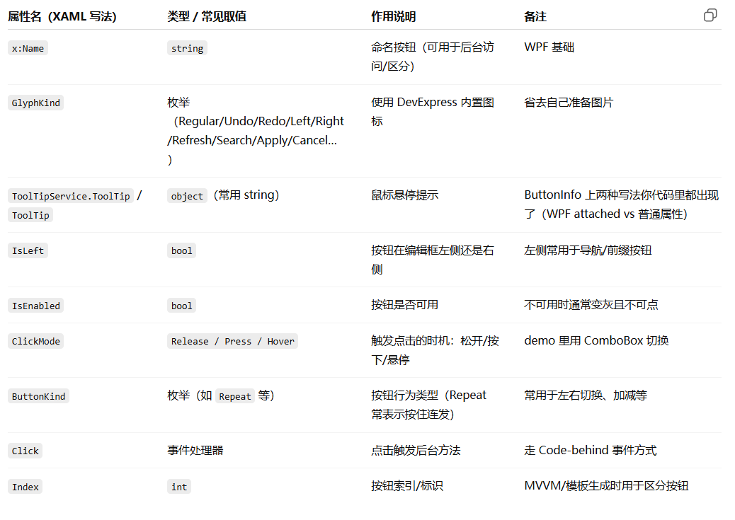
2. ButtonInfo 常见属性(本段用到的)
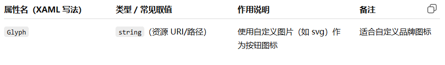
3. ImageButtonInfo(本段用到的)
BrowsePathEdit(路径选择框)
<StackPanel Margin="0,0,40,0">
<Grid Width="200" Height="150" >
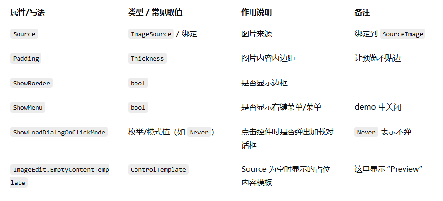
<dxe:ImageEdit Source="{Binding SourceImage}" Padding="20" ShowBorder="True" ShowMenu="False" ShowLoadDialogOnClickMode="Never" >
<dxe:ImageEdit.EmptyContentTemplate>
<ControlTemplate>
<TextBlock Text="Preview" HorizontalAlignment="Center" VerticalAlignment="Center" Foreground="#DFDFDF" />
</ControlTemplate>
</dxe:ImageEdit.EmptyContentTemplate>
</dxe:ImageEdit>
</Grid>
<TextBlock Text="{Binding ResultFileSizeKilobytes, Converter={local:PngSizeToTextConverter}}" HorizontalAlignment="Center" Margin="0,10,0,0" Foreground="#808080" />
</StackPanel>
<StackPanel Grid.Column="1">
<TextBlock Text="Select an SVG file:" />
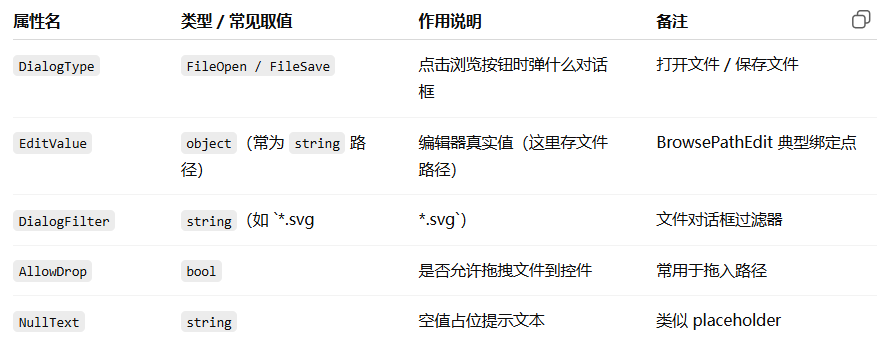
<dxe:BrowsePathEdit DialogType="FileOpen" EditValue="{Binding SourceFilePath, UpdateSourceTrigger=PropertyChanged}" DialogFilter="*.svg|*.svg" AllowDrop="True" NullText="Drop an SVG file here" />
<TextBlock Text="Save PNG as:" />
<dxe:BrowsePathEdit DialogType="FileSave" EditValue="{Binding ResultFilePath, UpdateSourceTrigger=PropertyChanged}" DialogFilter="*.png|*.png">
<dxe:ButtonInfo GlyphKind="Cancel" Command="{Binding ClearCommand}" />
</dxe:BrowsePathEdit>
<dx:SimpleButton Content="Convert" Command="{Binding ConvertCommand}" Margin="0,10,10,0" Width="150" HorizontalAlignment="Left" />
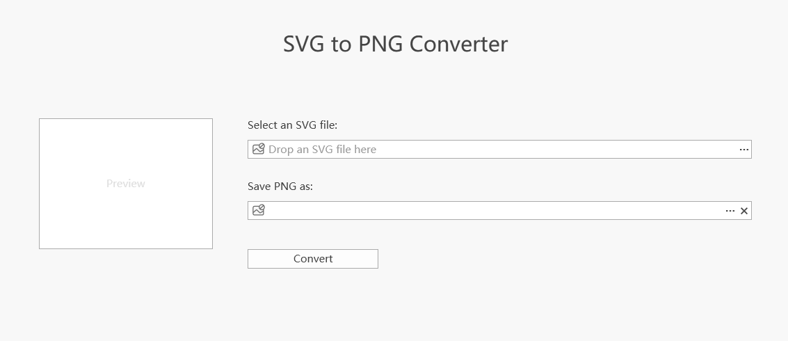
</StackPanel>1.ImageEdit 预览 SVG + 文件大小
- ImageEdit.Source 绑定到 SourceImage:当你选了 SVG,ViewModel 生成的预览图会显示在这里。
- EmptyContentTemplate:当 SourceImage 为空时显示"Preview"占位文本。
- 下方的 TextBlock:把 ResultFileSizeKilobytes 通过 PngSizeToTextConverter 转成可读文本(比如 "123 KB" 或 "---")。
2.两个 BrowsePathEdit + Convert 按钮
2.1 选择 SVG(FileOpen)
<dxe:BrowsePathEdit DialogType="FileOpen"
                    EditValue="{Binding SourceFilePath, UpdateSourceTrigger=PropertyChanged}"
                    DialogFilter="*.svg|*.svg"
                    AllowDrop="True"
NullText="Drop an SVG file here" />- DialogType="FileOpen":点击浏览按钮打开"选择文件"对话框
- EditValue 绑定到 SourceFilePath:保存选中的 SVG 路径
- DialogFilter=".svg|.svg":对话框里只显示/允许选择 svg
- AllowDrop="True":允许把文件拖到输入框里
- NullText:为空时显示占位提示:"Drop an SVG file here"
2.1 选择保存 PNG(FileSave)+ 清空按钮
<dxe:BrowsePathEdit DialogType="FileSave"
                    EditValue="{Binding ResultFilePath, UpdateSourceTrigger=PropertyChanged}"
                    DialogFilter="*.png|*.png">
    <dxe:ButtonInfo GlyphKind="Cancel" Command="{Binding ClearCommand}" />
</dxe:BrowsePathEdit>- DialogType="FileSave":点击浏览按钮打开"保存文件"对话框
- EditValue 绑定到 ResultFilePath:保存要输出的 png 路径
- DialogFilter=".png|.png":保存时默认 png
- 内部 ButtonInfo:在编辑框里加一个 Cancel 图标按钮,绑定 ClearCommand,通常用于清空路径/重置输入。
2.3 Convert 按钮
<dx:SimpleButton Content="Convert" Command="{Binding ConvertCommand}" ... />点击执行 ConvertCommand:ViewModel 里实现 SVG->PNG 转换逻辑(以及弹消息框/更新预览/更新文件大小等)。
3.ImageEdit(DevExpress 编辑器)属性
4.BrowsePathEdit(DevExpress 编辑器)属性
CheckEdit(复选框)
就是一个打钩的小方框。场景举例:"我已阅读用户协议"、"记住密码"。
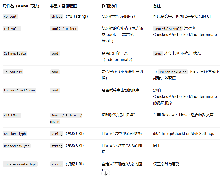
            <dxe:CheckEdit x:Name="editor"
                               Content="Sample check box"
                               IsThreeState="{Binding ElementName=chkIsThreeState, Path=IsChecked, Mode=OneWay}"
                               ReverseCheckOrder="{Binding ElementName=chkReverseCheckOrder, Path=IsChecked, Mode=OneWay}"
                               IsReadOnly="{Binding ElementName=chkIsReadOnly, Path=IsChecked, Mode=OneWay}"
                               ClickMode="{Binding ElementName=cboClickMode, Path=EditValue, Mode=OneWay}"
                               HorizontalAlignment="Center"
                               VerticalAlignment="Center">
                <ToolTipService.ToolTip>
                    <Border>
                        <StackPanel Orientation="Vertical">
                            <TextBlock Text="Mouse Operations" FontWeight="Bold" />
                            <TextBlock Text="Click Caption or Check Box" />
                            <TextBlock Text="Keyboard" FontWeight="Bold" />
                            <TextBlock Text="Press SPACE" />
                        </StackPanel>
                    </Border>
                </ToolTipService.ToolTip>
            </dxe:CheckEdit>
dxe:CheckEdit 关键属性

ToggleSwitch(开关切换)
1.ToggleSwitch主要属性
<dxe:ToggleSwitch x:Name="toggleSwitch"
                  VerticalAlignment="Center"
                  HorizontalAlignment="Center"
                  CheckedStateContent="On"
                  UncheckedStateContent="Off" />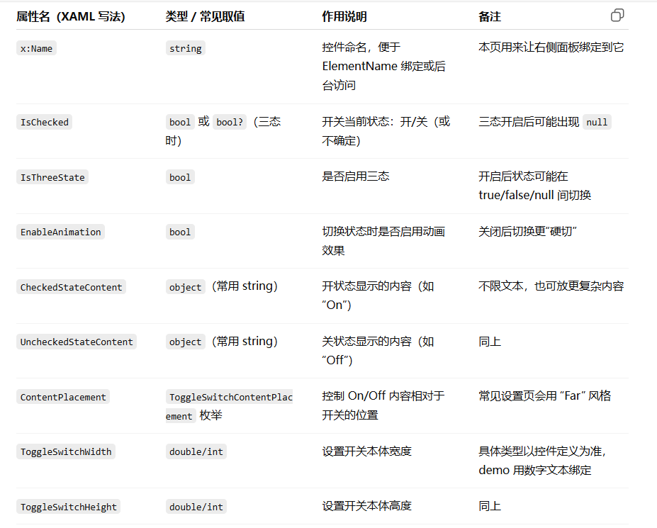
2.常用方式
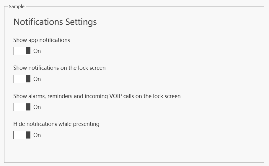
<GroupBox Header="Sample" Grid.Row="1" Margin="40,0,40,40">
<dxlc:LayoutControl TextElement.FontSize="14">
<dxlc:LayoutGroup Orientation="Vertical" ItemSpace="10">
<dxlc:LayoutItemLabel Content="Notifications Settings" FontSize="22" Margin="0,0,0,16" VerticalAlignment="Top" />
<dxlc:LayoutItemLabel Content="Show app notifications" VerticalAlignment="Top" />
<dxlc:LayoutItem Margin="0,0,0,16" VerticalAlignment="Top">
<dxe:ToggleSwitch ContentPlacement="Far" HorizontalAlignment="Left" CheckedStateContent="On" UncheckedStateContent="Off" IsChecked="True" />
</dxlc:LayoutItem>
<dxlc:LayoutItemLabel Content="Show notifications on the lock screen" VerticalAlignment="Top" />
<dxlc:LayoutItem Margin="0,0,0,16" VerticalAlignment="Top">
<dxe:ToggleSwitch ContentPlacement="Far" HorizontalAlignment="Left" CheckedStateContent="On" UncheckedStateContent="Off" IsChecked="True" />
</dxlc:LayoutItem>
<dxlc:LayoutItemLabel Content="Show alarms, reminders and incoming VOIP calls on the lock screen" VerticalAlignment="Top" />
<dxlc:LayoutItem Margin="0,0,0,16" VerticalAlignment="Top">
<dxe:ToggleSwitch ContentPlacement="Far" HorizontalAlignment="Left" CheckedStateContent="On" UncheckedStateContent="Off" IsChecked="True" />
</dxlc:LayoutItem>
<dxlc:LayoutItemLabel Content="Hide notifications while presenting" VerticalAlignment="Top" />
<dxlc:LayoutItem VerticalAlignment="Top">
<dxe:ToggleSwitch ContentPlacement="Far" HorizontalAlignment="Left" CheckedStateContent="On" UncheckedStateContent="Off" />
</dxlc:LayoutItem>
</dxlc:LayoutGroup>
</dxlc:LayoutControl>
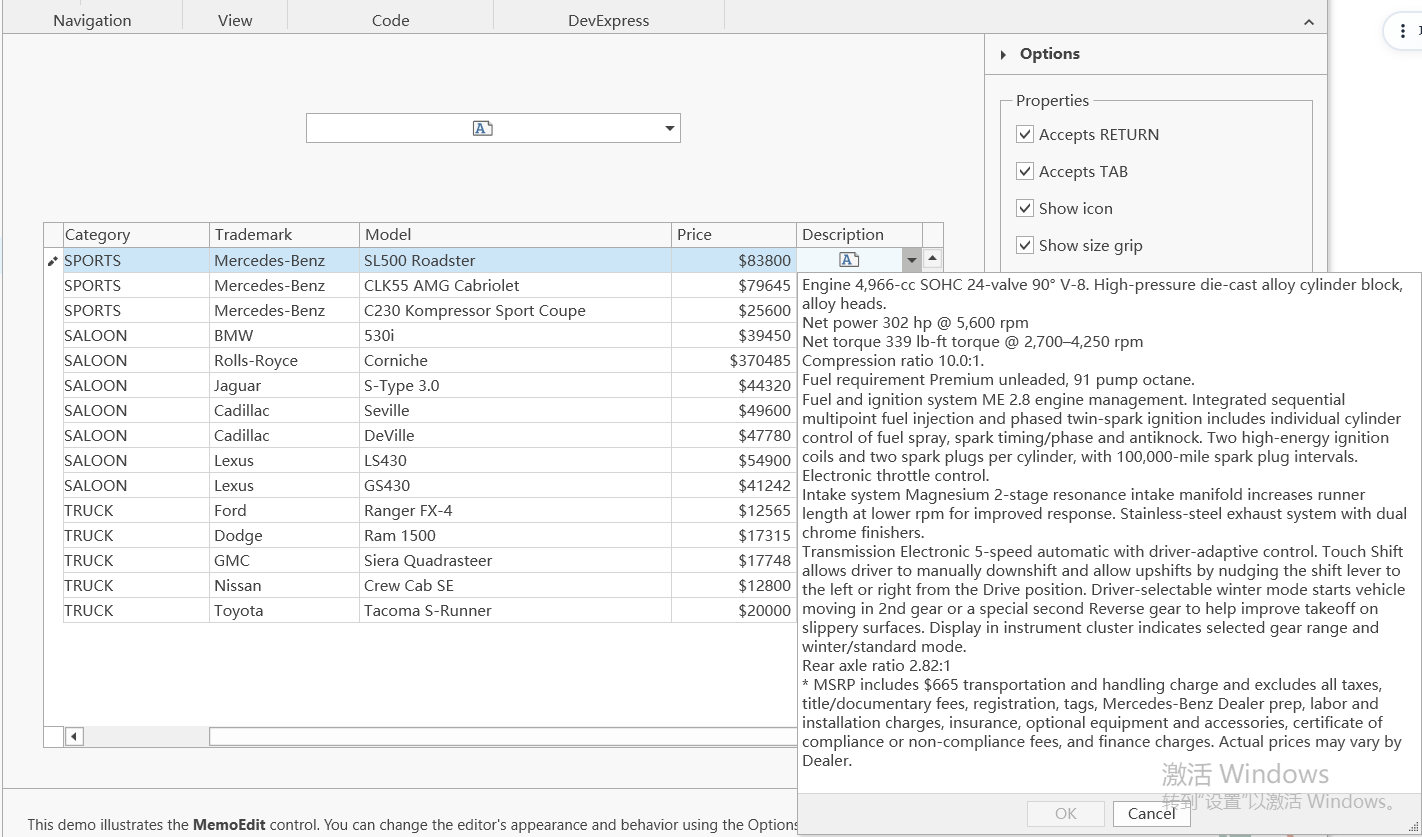
</GroupBox>MemoEdit(多行文本/备注框)
SpinEdit(数值微调框)
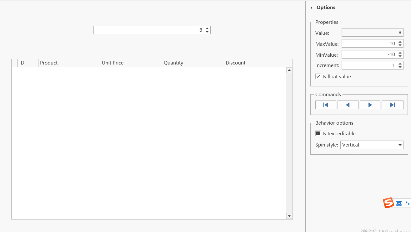
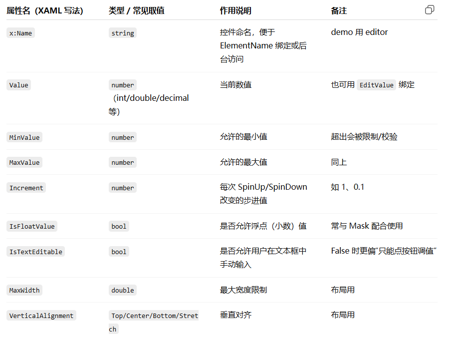
1.dxe:SpinEdit 主要属性
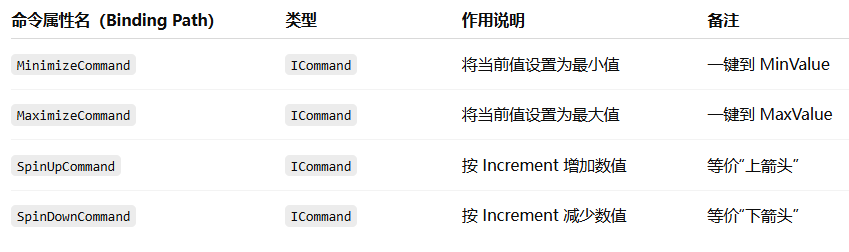
2.SpinEdit 的常用命令
3.dxe:SpinEditSettings主要属性
 <dxg:GridColumn Name="colUnitPrice" FieldName="UnitPrice" Width="3*">
          <dxg:GridColumn.EditSettings>
          <dxe:SpinEditSettings MaskType="Numeric" MaskUseAsDisplayFormat="True" Mask="c" MaskCulture="en-US" />
          </dxg:GridColumn.EditSettings>
</dxg:GridColumn>
PasswordBoxEdit(密码框)
<dxe:PasswordBoxEdit x:Name="editor"
Password="test"
HorizontalAlignment="Center"
VerticalAlignment="Center"
Width="300"
ShowPasswordButtonVisibility="{Binding Path=EditValue, Mode=TwoWay, ElementName=cbShowPasswordButton}"
PasswordChar="{Binding Path=EditValue, Mode=TwoWay, ElementName=cbPasswordChar}">
<dxe:PasswordBoxEdit.MaxLength>
<Binding Path="EditValue" Mode="TwoWay" ElementName="spMaxLength">
<Binding.Converter>
<utils:IConvertibleConverter ToType="System.Double" />
</Binding.Converter>
</Binding>
</dxe:PasswordBoxEdit.MaxLength>
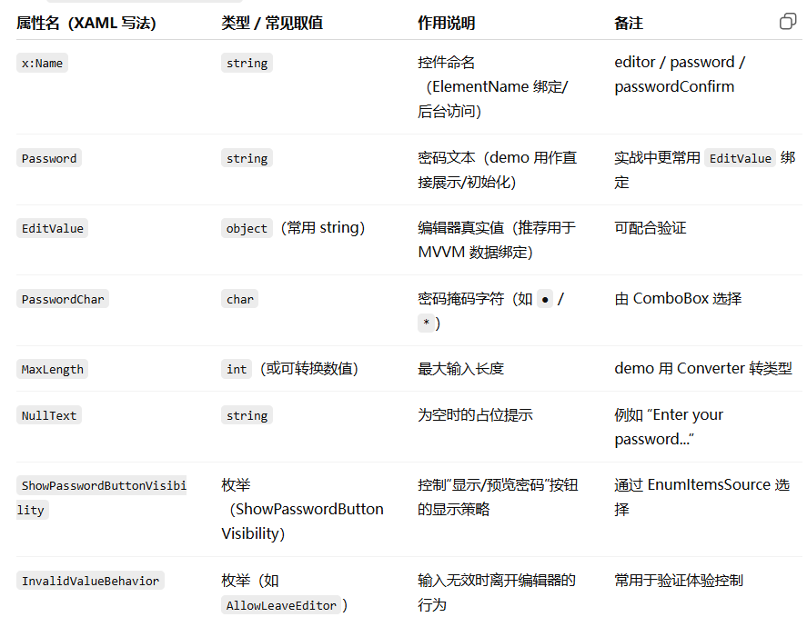
</dxe:PasswordBoxEdit>1.PasswordBoxEdit主要属性

Embedded Editor Labels(嵌入式标签)
