晚上躺在床上刷新闻,屏幕亮得刺眼,这体验谁受得了?
深色模式已经从"锦上添花"变成了"必备功能"。iOS和Android都在系统层面支持深色模式,用户期望App能跟随系统自动切换,或者手动选择喜欢的主题。
今天这篇文章,咱们就来聊聊Flutter里怎么做深色模式适配。不只是简单地换个背景色,而是从架构设计到细节打磨,做一套完整的主题系统。
深色模式的意义
先想想,为什么要做深色模式:
护眼:深色背景在暗光环境下对眼睛更友好,减少蓝光刺激。
省电:OLED屏幕显示黑色时像素不发光,能显著省电。
美观:很多用户就是喜欢深色界面,觉得更酷更专业。
无障碍:对于某些视觉障碍用户,深色模式更容易阅读。
所以深色模式不是可选项,而是现代App的标配。
Material 3与主题系统
Flutter的Material 3设计系统对主题支持非常完善。先看看项目里的主题是怎么定义的。
ThemeProvider的整体结构
dart
import 'package:flutter/material.dart';
import 'package:shared_preferences/shared_preferences.dart';

class ThemeProvider extends ChangeNotifier {
  ThemeMode _themeMode = ThemeMode.system;

  ThemeMode get themeMode => _themeMode;

  ThemeProvider() {
    _loadThemeMode();
}ThemeProvider继承自ChangeNotifier,这是Provider状态管理的标准做法。
_themeMode存储当前的主题模式,有三个可选值:
ThemeMode.light:始终使用浅色主题ThemeMode.dark:始终使用深色主题ThemeMode.system:跟随系统设置
默认值是ThemeMode.system,这是最友好的选择------用户在系统设置里选了什么,App就用什么。
构造函数里调用_loadThemeMode()从本地存储加载用户之前的选择。
加载和保存主题设置
dart
Future<void> _loadThemeMode() async {
  final prefs = await SharedPreferences.getInstance();
  final themeModeString = prefs.getString('themeMode') ?? 'system';
  _themeMode = ThemeMode.values.firstWhere(
    (e) => e.toString() == 'ThemeMode.$themeModeString',
    orElse: () => ThemeMode.system,
  );
  notifyListeners();
}

Future<void> setThemeMode(ThemeMode mode) async {
  _themeMode = mode;
  final prefs = await SharedPreferences.getInstance();
  await prefs.setString('themeMode', mode.toString().split('.').last);
  notifyListeners();
}_loadThemeMode从SharedPreferences读取存储的主题模式字符串,转换成ThemeMode枚举。
setThemeMode是公开方法,用户切换主题时调用。先更新内存中的值,再保存到本地,最后notifyListeners()通知UI刷新。
mode.toString().split('.').last把ThemeMode.dark转成dark,存储更简洁。
定义浅色主题
dart
ThemeData get lightTheme => ThemeData(
  useMaterial3: true,
  brightness: Brightness.light,
  colorScheme: ColorScheme.fromSeed(
    seedColor: Colors.blue,
    brightness: Brightness.light,
  ),
  appBarTheme: const AppBarTheme(
    centerTitle: true,
    elevation: 0,
  ),
  cardTheme: CardTheme(
    elevation: 2,
    shape: RoundedRectangleBorder(
      borderRadius: BorderRadius.circular(12),
    ),
  ),
);
这段代码定义了浅色主题,咱们逐个属性看。
useMaterial3: true启用Material 3设计语言。Material 3是Google最新的设计规范,视觉效果更现代,颜色更丰富。强烈建议新项目都用Material 3。
brightness: Brightness.light告诉Flutter这是浅色主题。Flutter会据此调整一些默认颜色,比如文字颜色、图标颜色等。
ColorScheme.fromSeed的魔力
dart
colorScheme: ColorScheme.fromSeed(
  seedColor: Colors.blue,
  brightness: Brightness.light,
),ColorScheme.fromSeed是Material 3的核心功能之一。你只需要提供一个种子颜色(seedColor),它会自动生成一整套协调的配色方案:
primary:主色,用于重要元素onPrimary:主色上的文字/图标颜色primaryContainer:主色容器,用于背景onPrimaryContainer:主色容器上的文字颜色secondary:次要色surface:表面颜色,用于卡片、对话框background:背景色error:错误色- 还有很多...
这套配色方案是经过专业设计的,颜色之间的对比度、和谐度都有保证。比手动配色省心多了。
AppBar和Card的主题
dart
appBarTheme: const AppBarTheme(
  centerTitle: true,
  elevation: 0,
),
cardTheme: CardTheme(
  elevation: 2,
  shape: RoundedRectangleBorder(
    borderRadius: BorderRadius.circular(12),
  ),
),appBarTheme定义所有AppBar的默认样式。centerTitle: true让标题居中,elevation: 0去掉阴影,看起来更扁平。
cardTheme定义所有Card的默认样式。圆角12像素,阴影2。这样每个Card都不用单独设置,保持一致性。
定义深色主题
dart
ThemeData get darkTheme => ThemeData(
  useMaterial3: true,
  brightness: Brightness.dark,
  colorScheme: ColorScheme.fromSeed(
    seedColor: Colors.blue,
    brightness: Brightness.dark,
  ),
  appBarTheme: const AppBarTheme(
    centerTitle: true,
    elevation: 0,
  ),
  cardTheme: CardTheme(
    elevation: 2,
    shape: RoundedRectangleBorder(
      borderRadius: BorderRadius.circular(12),
    ),
  ),
);深色主题和浅色主题结构完全一样,只是brightness改成了Brightness.dark。
ColorScheme.fromSeed会根据brightness自动生成适合深色模式的配色。同样的种子颜色Colors.blue,在深色模式下会生成更暗的背景色、更亮的前景色,保证可读性。
这就是Material 3的强大之处:你不需要手动为深色模式配一套颜色,系统自动帮你生成。
在MaterialApp中应用主题
主题定义好了,怎么应用到整个App呢?看main.dart:
dart
import 'package:flutter/material.dart';
import 'package:provider/provider.dart';
import 'providers/theme_provider.dart';
import 'providers/news_provider.dart';
import 'providers/favorites_provider.dart';
import 'screens/splash_screen.dart';

void main() {
  runApp(const MyApp());
}

class MyApp extends StatelessWidget {
  const MyApp({super.key});

  @override
  Widget build(BuildContext context) {
    return MultiProvider(
      providers: [
        ChangeNotifierProvider(create: (_) => ThemeProvider()),
        ChangeNotifierProvider(create: (_) => NewsProvider()),
        ChangeNotifierProvider(create: (_) => FavoritesProvider()),
      ],
      child: Consumer<ThemeProvider>(
        builder: (context, themeProvider, child) {
          return MaterialApp(
            title: '今日资讯',
            debugShowCheckedModeBanner: false,
            theme: themeProvider.lightTheme,
            darkTheme: themeProvider.darkTheme,
            themeMode: themeProvider.themeMode,
            home: const SplashScreen(),
          );
        },
      ),
    );
  }
}
Provider的注册
dart
MultiProvider(
  providers: [
    ChangeNotifierProvider(create: (_) => ThemeProvider()),
    ChangeNotifierProvider(create: (_) => NewsProvider()),
    ChangeNotifierProvider(create: (_) => FavoritesProvider()),
  ],
  // ...
)MultiProvider注册多个Provider。ThemeProvider放在最前面,因为主题是全局的,其他Provider可能也需要用到主题信息。
Consumer监听主题变化
dart
child: Consumer<ThemeProvider>(
  builder: (context, themeProvider, child) {
    return MaterialApp(
      title: '今日资讯',
      debugShowCheckedModeBanner: false,
      theme: themeProvider.lightTheme,
      darkTheme: themeProvider.darkTheme,
      themeMode: themeProvider.themeMode,
      home: const SplashScreen(),
    );
  },
),Consumer<ThemeProvider>监听ThemeProvider的变化。当用户切换主题时,notifyListeners()触发,Consumer重建,MaterialApp拿到新的主题,整个App的颜色就变了。
MaterialApp的三个主题相关参数:
theme:浅色主题darkTheme:深色主题themeMode:当前使用哪个主题
当themeMode是ThemeMode.system时,Flutter会根据系统设置自动选择theme或darkTheme。
主题切换的UI实现
用户怎么切换主题呢?项目里有两种方式。
方式一:设置页面的选择器
dart
Widget _buildThemeSelector(BuildContext context) {
  return Consumer<ThemeProvider>(
    builder: (context, themeProvider, child) {
      return ListTile(
        leading: const Icon(Icons.palette_outlined),
        title: const Text('主题模式'),
        subtitle: Text(_getThemeModeText(themeProvider.themeMode)),
        trailing: const Icon(Icons.chevron_right),
        onTap: () {
          _showThemeDialog(context, themeProvider);
        },
      );
    },
  );
}

String _getThemeModeText(ThemeMode mode) {
  switch (mode) {
    case ThemeMode.light:
      return '浅色';
    case ThemeMode.dark:
      return '深色';
    case ThemeMode.system:
      return '跟随系统';
  }
}ListTile显示当前主题模式,点击弹出选择对话框。
_getThemeModeText把枚举转成中文显示。
主题选择对话框
dart
void _showThemeDialog(BuildContext context, ThemeProvider provider) {
  showDialog(
    context: context,
    builder: (context) => AlertDialog(
      title: const Text('选择主题'),
      content: Column(
        mainAxisSize: MainAxisSize.min,
        children: [
          RadioListTile<ThemeMode>(
            title: const Text('浅色'),
            value: ThemeMode.light,
            groupValue: provider.themeMode,
            onChanged: (value) {
              if (value != null) {
                provider.setThemeMode(value);
                Navigator.pop(context);
              }
            },
          ),
          RadioListTile<ThemeMode>(
            title: const Text('深色'),
            value: ThemeMode.dark,
            groupValue: provider.themeMode,
            onChanged: (value) {
              if (value != null) {
                provider.setThemeMode(value);
                Navigator.pop(context);
              }
            },
          ),
          RadioListTile<ThemeMode>(
            title: const Text('跟随系统'),
            value: ThemeMode.system,
            groupValue: provider.themeMode,
            onChanged: (value) {
              if (value != null) {
                provider.setThemeMode(value);
                Navigator.pop(context);
              }
            },
          ),
        ],
      ),
    ),
  );
}RadioListTile是单选列表项,groupValue是当前选中的值,value是这个选项的值。
选中后调用provider.setThemeMode(value)切换主题,然后关闭对话框。
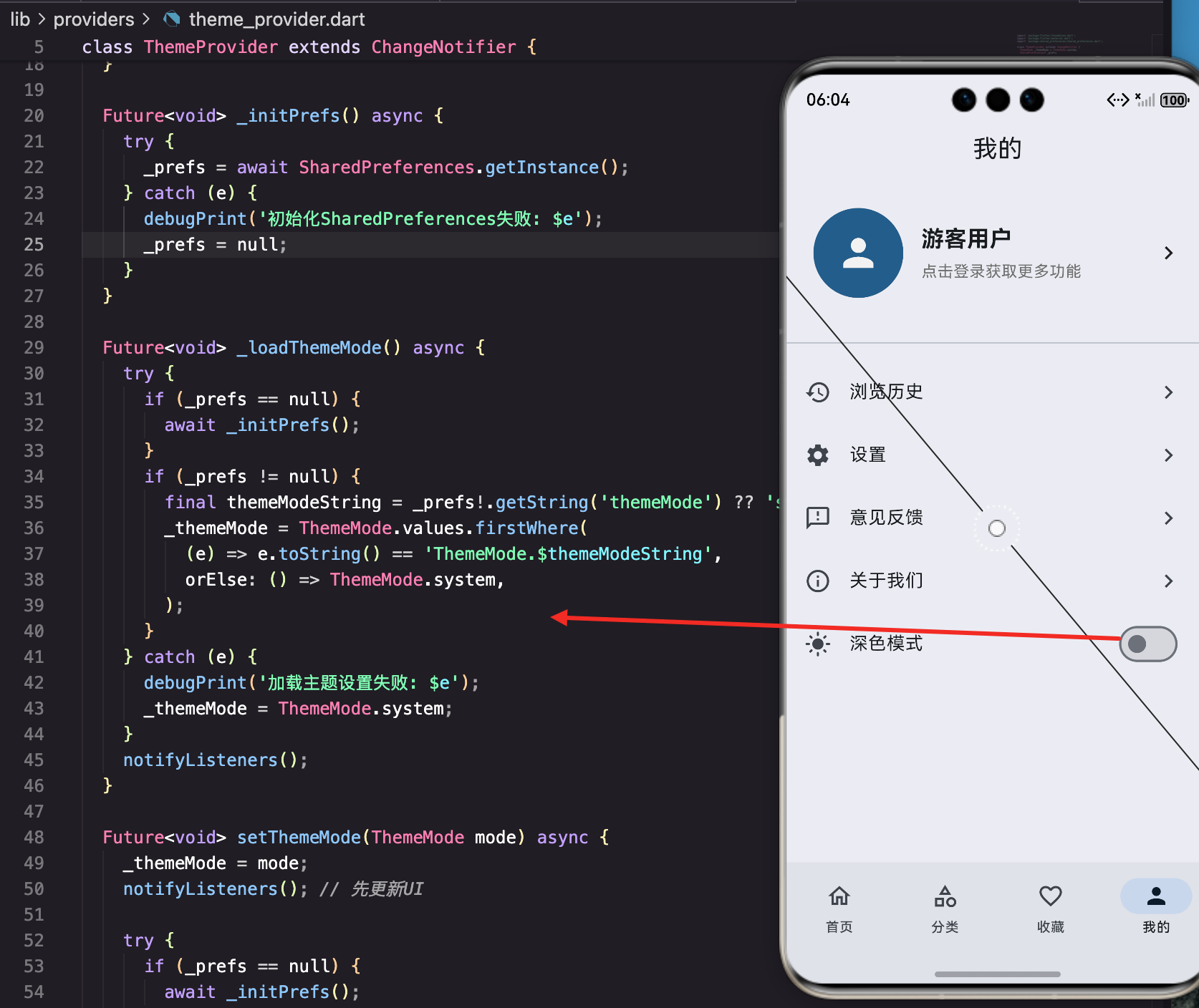
方式二:个人中心的快捷开关
dart
Widget _buildThemeSwitch(BuildContext context) {
  return Consumer<ThemeProvider>(
    builder: (context, themeProvider, child) {
      return SwitchListTile(
        secondary: Icon(
          themeProvider.themeMode == ThemeMode.dark
              ? Icons.dark_mode
              : Icons.light_mode,
        ),
        title: const Text('深色模式'),
        value: themeProvider.themeMode == ThemeMode.dark,
        onChanged: (value) {
          themeProvider.setThemeMode(
            value ? ThemeMode.dark : ThemeMode.light,
          );
        },
      );
    },
  );
}SwitchListTile是带开关的列表项,更直观。
图标根据当前主题动态变化:深色模式显示月亮图标,浅色模式显示太阳图标。
开关打开就是深色,关闭就是浅色。这种方式简单直接,但失去了"跟随系统"的选项。
在组件中使用主题颜色
主题定义好了,组件里怎么用呢?
使用Theme.of(context)
dart
Widget _buildMetadata(BuildContext context) {
  return Row(
    children: [
      Container(
        padding: const EdgeInsets.symmetric(horizontal: 8, vertical: 4),
        decoration: BoxDecoration(
          color: Theme.of(context).colorScheme.primaryContainer,
          borderRadius: BorderRadius.circular(4),
        ),
        child: Text(
          article.source,
          style: TextStyle(
            fontSize: 12,
            color: Theme.of(context).colorScheme.onPrimaryContainer,
          ),
        ),
      ),
      // ...
    ],
  );
}Theme.of(context)获取当前主题,.colorScheme获取配色方案。
primaryContainer是主色的容器色,适合做背景。onPrimaryContainer是容器上的文字颜色,保证可读性。
这样写的好处是:不管浅色还是深色模式,颜色都是协调的,不用写两套代码。
启动页的主题适配
dart
@override
Widget build(BuildContext context) {
  return Scaffold(
    body: Container(
      decoration: BoxDecoration(
        gradient: LinearGradient(
          begin: Alignment.topLeft,
          end: Alignment.bottomRight,
          colors: [
            Theme.of(context).colorScheme.primary,
            Theme.of(context).colorScheme.secondary,
          ],
        ),
      ),
      child: Center(
        child: FadeTransition(
          opacity: _fadeAnimation,
          child: Column(
            mainAxisAlignment: MainAxisAlignment.center,
            children: const [
              Icon(
                Icons.newspaper,
                size: 100,
                color: Colors.white,
              ),
              // ...
            ],
          ),
        ),
      ),
    ),
  );
}启动页用渐变背景,颜色从primary到secondary。这两个颜色在浅色和深色模式下都会自动调整,保持视觉效果。
处理硬编码颜色
有些地方可能写死了颜色,比如:
dart
Text(
  '点击登录获取更多功能',
  style: TextStyle(
    fontSize: 14,
    color: Colors.grey[600],
  ),
),Colors.grey[600]在浅色模式下没问题,但在深色模式下可能对比度不够。
解决方案一:使用主题颜色
dart
Text(
  '点击登录获取更多功能',
  style: TextStyle(
    fontSize: 14,
    color: Theme.of(context).colorScheme.onSurfaceVariant,
  ),
),onSurfaceVariant是专门用于次要文字的颜色,在两种模式下都有合适的对比度。
解决方案二:根据亮度判断
dart
Text(
  '点击登录获取更多功能',
  style: TextStyle(
    fontSize: 14,
    color: Theme.of(context).brightness == Brightness.dark
        ? Colors.grey[400]
        : Colors.grey[600],
  ),
),
根据当前主题的亮度选择不同的颜色。深色模式用更亮的灰色,浅色模式用更暗的灰色。
解决方案三:使用TextTheme
dart
Text(
  '点击登录获取更多功能',
  style: Theme.of(context).textTheme.bodySmall,
),textTheme定义了一套文字样式,包括颜色。用预定义的样式,不用操心颜色问题。
图片和图标的适配
图片和图标也需要考虑深色模式。
图标颜色
dart
Icon(
  Icons.access_time,
  size: 14,
  color: Colors.grey[600],
),
这个图标在深色模式下可能看不清。改成:
dart
Icon(
  Icons.access_time,
  size: 14,
  color: Theme.of(context).colorScheme.onSurfaceVariant,
),
或者不指定颜色,让图标继承父级的颜色:
dart
Icon(
  Icons.access_time,
  size: 14,
),
占位图的适配
dart
Widget _buildPlaceholder() {
  return Container(
    color: Colors.grey[200],
    child: Center(
      child: Column(
        mainAxisAlignment: MainAxisAlignment.center,
        children: [
          Icon(
            Icons.article_outlined,
            size: 48,
            color: Colors.grey[400],
          ),
          const SizedBox(height: 8),
          Text(
            '新闻图片',
            style: TextStyle(
              fontSize: 14,
              color: Colors.grey[500],
            ),
          ),
        ],
      ),
    ),
  );
}
这个占位图在深色模式下会很突兀。改成:
dart
Widget _buildPlaceholder(BuildContext context) {
  final isDark = Theme.of(context).brightness == Brightness.dark;
  return Container(
    color: isDark ? Colors.grey[800] : Colors.grey[200],
    child: Center(
      child: Column(
        mainAxisAlignment: MainAxisAlignment.center,
        children: [
          Icon(
            Icons.article_outlined,
            size: 48,
            color: isDark ? Colors.grey[600] : Colors.grey[400],
          ),
          const SizedBox(height: 8),
          Text(
            '新闻图片',
            style: TextStyle(
              fontSize: 14,
              color: isDark ? Colors.grey[500] : Colors.grey[500],
            ),
          ),
        ],
      ),
    ),
  );
}
根据当前主题选择合适的颜色。
分类卡片的渐变色
dart
Container(
  decoration: BoxDecoration(
    borderRadius: BorderRadius.circular(12),
    gradient: LinearGradient(
      begin: Alignment.topLeft,
      end: Alignment.bottomRight,
      colors: [
        color.withOpacity(0.7),
        color.withOpacity(0.9),
      ],
    ),
  ),
  child: Column(
    mainAxisAlignment: MainAxisAlignment.center,
    children: [
      Icon(
        icon,
        size: 48,
        color: Colors.white,
      ),
      const SizedBox(height: 12),
      Text(
        name,
        style: const TextStyle(
          fontSize: 16,
          fontWeight: FontWeight.bold,
          color: Colors.white,
        ),
      ),
    ],
  ),
)
分类卡片用了渐变背景,文字是白色。这种设计在两种模式下都能工作,因为背景色足够深,白色文字始终可读。
但如果想让深色模式下的卡片更暗一些:
dart
final isDark = Theme.of(context).brightness == Brightness.dark;
final baseOpacity = isDark ? 0.5 : 0.7;
final endOpacity = isDark ? 0.7 : 0.9;

Container(
  decoration: BoxDecoration(
    borderRadius: BorderRadius.circular(12),
    gradient: LinearGradient(
      begin: Alignment.topLeft,
      end: Alignment.bottomRight,
      colors: [
        color.withOpacity(baseOpacity),
        color.withOpacity(endOpacity),
      ],
    ),
  ),
  // ...
)
自定义主题扩展
如果需要更多自定义颜色,可以用ThemeExtension:
dart
class CustomColors extends ThemeExtension<CustomColors> {
  final Color? cardBackground;
  final Color? highlightText;

  CustomColors({
    this.cardBackground,
    this.highlightText,
  });

  @override
  CustomColors copyWith({
    Color? cardBackground,
    Color? highlightText,
  }) {
    return CustomColors(
      cardBackground: cardBackground ?? this.cardBackground,
      highlightText: highlightText ?? this.highlightText,
    );
  }

  @override
  CustomColors lerp(ThemeExtension<CustomColors>? other, double t) {
    if (other is! CustomColors) return this;
    return CustomColors(
      cardBackground: Color.lerp(cardBackground, other.cardBackground, t),
      highlightText: Color.lerp(highlightText, other.highlightText, t),
    );
  }
}
在主题里注册:
dart
ThemeData get lightTheme => ThemeData(
  // ...
  extensions: [
    CustomColors(
      cardBackground: Colors.white,
      highlightText: Colors.blue[700],
    ),
  ],
);

ThemeData get darkTheme => ThemeData(
  // ...
  extensions: [
    CustomColors(
      cardBackground: Colors.grey[850],
      highlightText: Colors.blue[300],
    ),
  ],
);
使用时:
dart
final customColors = Theme.of(context).extension<CustomColors>()!;
Container(
  color: customColors.cardBackground,
  child: Text(
    'Highlight',
    style: TextStyle(color: customColors.highlightText),
  ),
)
监听系统主题变化
当用户在系统设置里切换深色模式时,App应该实时响应:
dart
class _MyAppState extends State<MyApp> with WidgetsBindingObserver {
  @override
  void initState() {
    super.initState();
    WidgetsBinding.instance.addObserver(this);
  }

  @override
  void dispose() {
    WidgetsBinding.instance.removeObserver(this);
    super.dispose();
  }

  @override
  void didChangePlatformBrightness() {
    // 系统主题变化时调用
    setState(() {});
  }

  // ...
}不过如果用了ThemeMode.system,Flutter会自动处理这个,不需要手动监听。
深色模式的设计原则
做深色模式不只是把白色换成黑色,有一些设计原则要遵循:
不要用纯黑
纯黑(#000000)在OLED屏幕上虽然最省电,但和其他颜色对比太强烈,看起来不舒服。建议用深灰(#121212或类似)。
Material 3的ColorScheme.fromSeed生成的深色背景就不是纯黑。
保持层次感
浅色模式用阴影表示层次,深色模式可以用不同深度的灰色:
dart
// 深色模式下的层次
// 背景:#121212
// 卡片:#1E1E1E
// 弹窗:#2C2C2C
降低饱和度
深色背景上,高饱和度的颜色会很刺眼。深色模式下的强调色应该降低饱和度。
ColorScheme.fromSeed会自动处理这个。
保证对比度
文字和背景的对比度要足够,WCAG标准要求至少4.5:1。可以用在线工具检查对比度。
测试深色模式
开发时怎么测试深色模式?
方法一:切换系统设置
最真实的测试方式,但切换麻烦。
方法二:在App里切换
用前面实现的主题切换功能,直接在App里切换。
方法三:强制指定
开发时可以临时强制使用某个主题:
dart
MaterialApp(
  themeMode: ThemeMode.dark, // 强制深色
  // ...
)
方法四:DevTools
Flutter DevTools可以模拟不同的系统设置,包括深色模式。
常见问题排查
问题一:切换主题后部分颜色没变
检查是否有硬编码的颜色,改成使用Theme.of(context)。
问题二:深色模式下某些文字看不清
检查文字颜色的对比度,使用主题提供的颜色而不是固定值。
问题三:图片在深色模式下太亮
可以给图片加一层半透明遮罩,或者准备两套图片。
问题四:状态栏颜色不对
dart
appBarTheme: AppBarTheme(
  systemOverlayStyle: SystemUiOverlayStyle(
    statusBarColor: Colors.transparent,
    statusBarIconBrightness: Brightness.light, // 深色模式用亮色图标
  ),
),
写在最后
深色模式适配看起来简单,但要做好需要注意很多细节:
架构层面:用Provider管理主题状态,用ThemeData定义主题,让主题切换变得简单。
设计层面 :遵循Material 3的设计规范,用ColorScheme.fromSeed生成配色,保证颜色协调。
代码层面 :避免硬编码颜色,使用Theme.of(context)获取主题颜色,让组件自动适配。
细节层面:检查每个页面、每个组件在两种模式下的表现,确保可读性和美观性。
今日资讯App用ThemeProvider实现了完整的主题系统,支持浅色、深色、跟随系统三种模式,用户可以在设置里切换,也可以用快捷开关。
深色模式是用户体验的重要组成部分。做好了,用户会觉得App很专业;做不好,用户晚上用起来眼睛疼,可能就卸载了。
欢迎加入开源鸿蒙跨平台社区:https://openharmonycrossplatform.csdn.net
在这里你可以找到更多Flutter开发资源,与其他开发者交流经验,共同进步。