文章目录
- [基于 Flutter × OpenHarmony 开发的文本处理工具箱首页](#基于 Flutter × OpenHarmony 开发的文本处理工具箱首页)
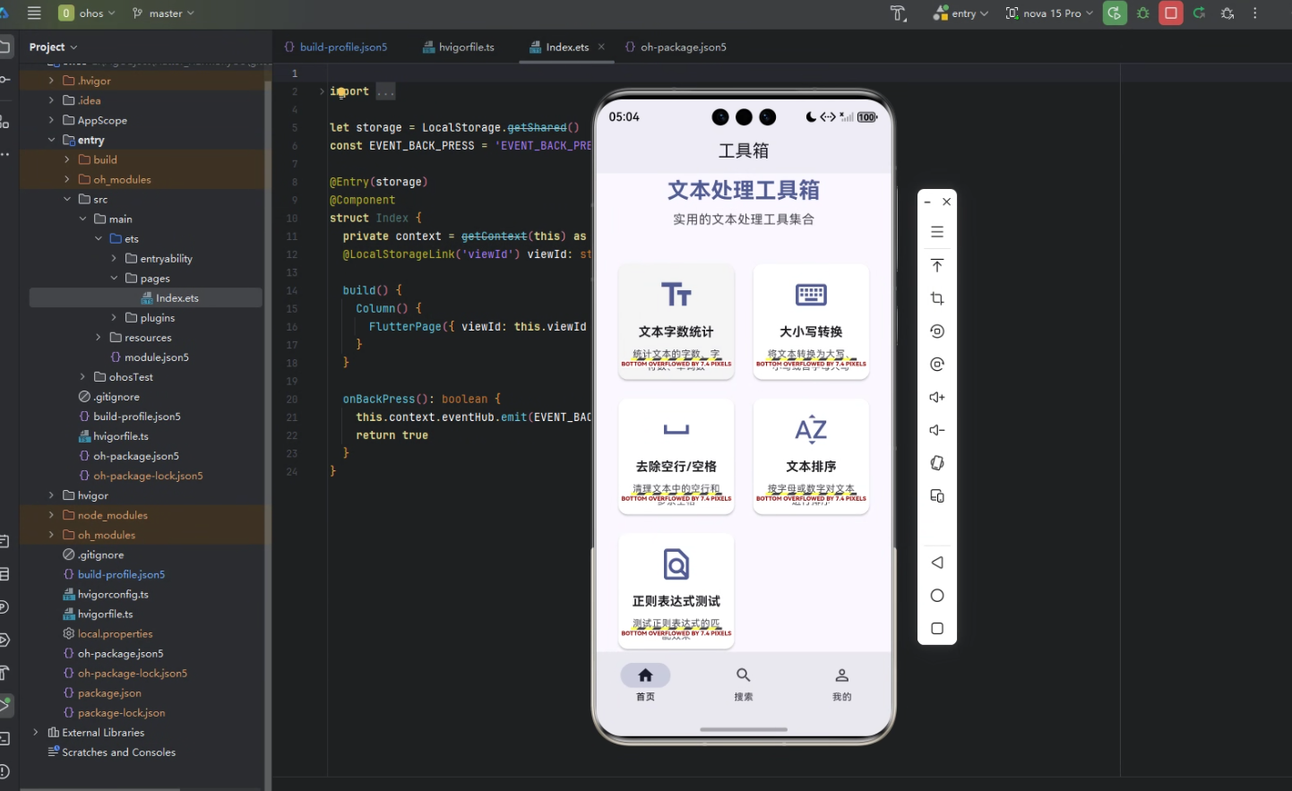
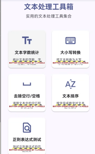
基于 Flutter × OpenHarmony 开发的文本处理工具箱首页
前言
随着移动设备和多端应用的普及,开发者对跨平台工具的需求越来越高。文本处理是日常开发与办公中非常常见的需求,包括字数统计、大小写转换、空行清理、文本排序以及正则表达式测试等。
本文将介绍如何基于 Flutter × OpenHarmony 构建一个轻量级的文本处理工具箱首页,实现多工具入口展示和跨端兼容,为开发者提供一个实用、统一的文本处理入口。
背景
在传统的移动开发中,每个平台(如 Android、iOS 或 HarmonyOS)通常需要单独开发界面和逻辑,维护成本高。Flutter 提供了统一的 UI 框架,而 OpenHarmony 提供跨设备能力,使得同一套代码可以运行在手机、平板甚至 IoT 设备上。
因此,基于 Flutter × OpenHarmony 开发工具箱首页不仅能够加速开发,还能保证良好的用户体验和跨端一致性。
Flutter × OpenHarmony 跨端开发介绍
Flutter 通过 Widget 树 构建 UI,拥有丰富的组件库和灵活的布局方式,而 OpenHarmony 提供了跨设备的运行环境和能力接口。将两者结合,可以实现:
- 跨设备适配:同一套 Flutter 代码在 HarmonyOS 手机、平板和其他设备上运行。
- 统一风格:借助 Material 组件体系,保证界面一致性。
- 高性能体验:Flutter 的渲染引擎保证了流畅的动画和交互。
- 模块化开发:工具箱每个功能可单独作为页面模块,便于维护和扩展。
开发核心代码
以下是工具箱首页的核心实现代码及解析。
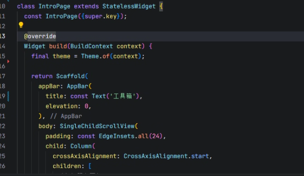
1. 首页结构
dart
class IntroPage extends StatelessWidget {
  const IntroPage({super.key});

  @override
  Widget build(BuildContext context) {
    final theme = Theme.of(context);

    return Scaffold(
      appBar: AppBar(
        title: const Text('工具箱'),
        elevation: 0,
      ),
      body: SingleChildScrollView(
        padding: const EdgeInsets.all(24),
        child: Column(
          crossAxisAlignment: CrossAxisAlignment.start,
          children: [
            _buildHeader(theme),
            const SizedBox(height: 40),
            _buildToolGrid(context),
            const SizedBox(height: 24),
            _buildVersionInfo(theme),
          ],
        ),
      ),
    );
  }
}- Scaffold:提供页面基本框架,包括顶部 AppBar 和内容区域。
- SingleChildScrollView:保证内容可滚动,适应多设备屏幕。
- Column:垂直排列标题、工具卡片和版本信息。
2. 工具箱标题区域
dart
Widget _buildHeader(ThemeData theme) {
  return Center(
    child: Column(
      children: [
        Icon(
          Icons.build_rounded,
          size: 80,
          color: theme.colorScheme.primary,
        ),
        const SizedBox(height: 16),
        Text(
          '文本处理工具箱',
          style: theme.textTheme.headlineMedium?.copyWith(
            fontWeight: FontWeight.bold,
            color: theme.colorScheme.primary,
          ),
        ),
        const SizedBox(height: 8),
        Text(
          '实用的文本处理工具集合',
          style: theme.textTheme.bodyLarge?.copyWith(
            color: theme.colorScheme.onSurfaceVariant,
          ),
        ),
      ],
    ),
  );
}- 使用 Icon + Text 展示工具箱主题。
- ThemeData 保证不同设备颜色和字体统一。
3. 工具卡片网格
dart
Widget _buildToolGrid(BuildContext context) {
  return GridView.count(
    crossAxisCount: 2,
    shrinkWrap: true,
    physics: const NeverScrollableScrollPhysics(),
    mainAxisSpacing: 16,
    crossAxisSpacing: 16,
    children: [
      _buildToolCard(context,
        title: '文本字数统计',
        icon: Icons.text_fields_outlined,
        description: '统计文本的字数、字符数、单词数',
        onTap: () {
          Navigator.push(context, MaterialPageRoute(builder: (_) => const WordCountPage()));
        },
      ),
      _buildToolCard(context,
        title: '大小写转换',
        icon: Icons.keyboard_outlined,
        description: '将文本转换为大写、小写或首字母大写',
        onTap: () {
          Navigator.push(context, MaterialPageRoute(builder: (_) => const CaseConverterPage()));
        },
      ),
      // 其他工具卡片同理
    ],
  );
}- GridView.count 实现两列网格布局。
- 每个工具卡片通过
_buildToolCard封装,便于复用。
4. 工具卡片组件
dart
Widget _buildToolCard(
  BuildContext context, {
  required String title,
  required IconData icon,
  required String description,
  required VoidCallback onTap,
}) {
  final theme = Theme.of(context);

  return Card(
    elevation: 2,
    shape: RoundedRectangleBorder(borderRadius: BorderRadius.circular(12)),
    child: InkWell(
      onTap: onTap,
      borderRadius: BorderRadius.circular(12),
      child: Padding(
        padding: const EdgeInsets.all(16),
        child: Column(
          mainAxisAlignment: MainAxisAlignment.center,
          children: [
            Icon(icon, size: 48, color: theme.colorScheme.primary),
            const SizedBox(height: 12),
            Text(title, style: theme.textTheme.titleMedium?.copyWith(fontWeight: FontWeight.bold), textAlign: TextAlign.center),
            const SizedBox(height: 8),
            Text(description, style: theme.textTheme.bodySmall?.copyWith(color: theme.colorScheme.onSurfaceVariant), textAlign: TextAlign.center),
          ],
        ),
      ),
    ),
  );
}- Card + InkWell 实现点击反馈和圆角样式。
- Icon + Title + Description 清晰展示工具功能。
- onTap 跳转到对应功能页面,实现模块化管理。
5. 版本信息
dart
Widget _buildVersionInfo(ThemeData theme) {
  return Center(
    child: Text(
      '版本 1.0.4',
      style: theme.textTheme.bodySmall?.copyWith(
        color: theme.colorScheme.onSurfaceVariant,
      ),
    ),
  );
}- 提供简单的版本展示,便于用户识别应用版本。
心得
- 模块化开发:每个工具单独页面,首页仅负责入口展示,方便后续功能扩展。
- 跨端适配:Flutter 与 OpenHarmony 联合使用,页面在手机、平板、电视等多端效果一致。
- 用户体验:网格布局 + 卡片点击反馈,让用户快速找到需要的工具。
- 主题统一:通过 ThemeData 调整颜色和字体,保证界面风格统一,易于维护。
总结
本文展示了如何使用 Flutter × OpenHarmony 构建一个实用的文本处理工具箱首页。核心思想是 模块化 + 跨端 + 统一主题,使得工具箱既美观又高效。
未来可以进一步扩展更多文本处理功能,例如:
- 文本翻译
- 文本加密/解密
- 文本批量处理
通过这一套架构,开发者能够快速构建跨端工具箱应用,实现多端统一管理和高质量用户体验。
欢迎加入开源鸿蒙跨平台社区:https://openharmonycrossplatform.csdn.net