Flutter for OpenHarmony 微动漫App实战:主题配置实现
通过网盘分享的文件:flutter1.zip
链接: https://pan.baidu.com/s/1jkLZ9mZXjNm0LgP6FTVRzw 提取码: 2t97
主题决定了 App 的视觉风格,包括颜色、字体、组件样式等。Flutter 的 ThemeData 提供了强大的主题配置能力,一处配置全 App 生效。
这篇文章会实现完整的主题配置,讲解 ThemeData 的各项配置、ColorScheme 颜色方案、Material 3 设计语言,以及如何设计一套协调的浅色和深色主题。
主题配置的意义
为什么要配置主题?
统一风格:所有组件使用相同的颜色和样式,视觉一致。
易于维护:修改主色只需要改一处,全 App 生效。
支持深色模式:定义两套主题,系统自动切换。
品牌识别:独特的配色让用户记住你的 App。
主题类的基础结构
dart
import 'package:flutter/material.dart';

class AppTheme {
  static const Color primaryColor = Color(0xFFFF6B9D);
  static const Color secondaryColor = Color(0xFF9B59B6);
  static const Color accentColor = Color(0xFFFFB347);
  static const Color darkBg = Color(0xFF1A1A2E);
  static const Color darkCard = Color(0xFF16213E);
先定义常用颜色常量:
primaryColor 是主色,粉红色,用于按钮、选中状态等。
secondaryColor 是次色,紫色,用于渐变和强调。
accentColor 是点缀色,橙色,用于特殊元素。
darkBg 和 darkCard 是深色模式的背景色和卡片色。
颜色选择的原则
主色:代表品牌,要有辨识度,不能太刺眼。
次色:和主色搭配,用于渐变或次要元素。
点缀色:少量使用,吸引注意力。
背景色:浅色模式用浅灰而不是纯白,深色模式用深蓝而不是纯黑,更舒适。
浅色主题配置
dart
static ThemeData lightTheme = ThemeData(
  useMaterial3: true,
  brightness: Brightness.light,
  primaryColor: primaryColor,
  colorScheme: ColorScheme.light(
    primary: primaryColor,
    secondary: secondaryColor,
    tertiary: accentColor,
    surface: Colors.white,
    background: const Color(0xFFF8F9FA),
  ),
useMaterial3: true 启用 Material 3 设计语言,组件样式更现代。
brightness: Brightness.light 告诉 Flutter 这是浅色主题。
ColorScheme 定义了一整套颜色,Flutter 组件会自动使用这些颜色。
ColorScheme 详解
dart
ColorScheme.light(
  primary: primaryColor,      // 主色,按钮、选中状态
  secondary: secondaryColor,  // 次色,FAB、进度条
  tertiary: accentColor,      // 第三色,特殊元素
  surface: Colors.white,      // 表面色,卡片、对话框
  background: const Color(0xFFF8F9FA),  // 背景色
)
primary 是最重要的颜色,用于按钮、AppBar、选中状态等。
secondary 用于 FloatingActionButton、进度条等。
surface 是卡片、对话框等表面的颜色。
background 是页面背景色。
Scaffold 背景色
dart
scaffoldBackgroundColor: const Color(0xFFF8F9FA),scaffoldBackgroundColor 设置 Scaffold 的背景色。
用浅灰色(#F8F9FA)而不是纯白,看起来更柔和,也能和白色卡片区分开。
AppBar 主题
dart
appBarTheme: const AppBarTheme(
  backgroundColor: Colors.white,
  foregroundColor: Colors.black87,
  elevation: 0,
  centerTitle: true,
),
backgroundColor 是 AppBar 背景色,浅色模式用白色。
foregroundColor 是标题和图标的颜色,用深灰色。
elevation: 0 去掉阴影,更扁平。
centerTitle: true 标题居中,这是很多 App 的常见设计。
Card 主题
dart
cardTheme: CardTheme(
  elevation: 2,
  shape: RoundedRectangleBorder(borderRadius: BorderRadius.circular(16)),
),
elevation: 2 设置卡片阴影,轻微的阴影让卡片有层次感。
shape 设置卡片形状,16 像素的圆角让卡片看起来更圆润。
底部导航栏主题
dart
bottomNavigationBarTheme: const BottomNavigationBarThemeData(
  backgroundColor: Colors.white,
  selectedItemColor: primaryColor,
  unselectedItemColor: Colors.grey,
),
backgroundColor 是导航栏背景色。
selectedItemColor 是选中项的颜色,用主色。
unselectedItemColor 是未选中项的颜色,用灰色。
深色主题配置
dart
static ThemeData darkTheme = ThemeData(
  useMaterial3: true,
  brightness: Brightness.dark,
  primaryColor: primaryColor,
  colorScheme: ColorScheme.dark(
    primary: primaryColor,
    secondary: secondaryColor,
    tertiary: accentColor,
    surface: darkCard,
    background: darkBg,
  ),
深色主题的结构和浅色一样,只是颜色不同。
brightness: Brightness.dark 告诉 Flutter 这是深色主题。
注意 primaryColor 保持不变,品牌色在两种主题下应该一致。
深色模式的背景色
dart
scaffoldBackgroundColor: darkBg,深色背景用深蓝色(#1A1A2E)而不是纯黑,更有层次感,也更护眼。
纯黑背景在 OLED 屏幕上虽然省电,但和其他元素对比太强烈。
深色模式的 AppBar
dart
appBarTheme: const AppBarTheme(
  backgroundColor: darkBg,
  foregroundColor: Colors.white,
  elevation: 0,
  centerTitle: true,
),
AppBar 背景和页面背景一致,形成整体感。
文字用白色,在深色背景上清晰可读。
深色模式的卡片
dart
cardTheme: CardTheme(
  color: darkCard,
  elevation: 2,
  shape: RoundedRectangleBorder(borderRadius: BorderRadius.circular(16)),
),
卡片用稍浅的深蓝色(#16213E),和背景区分开。
深色模式下卡片颜色要比背景浅一点,才能看出层次。
深色模式的底部导航栏
dart
bottomNavigationBarTheme: const BottomNavigationBarThemeData(
  backgroundColor: darkCard,
  selectedItemColor: primaryColor,
  unselectedItemColor: Colors.grey,
),
导航栏用卡片色,和页面背景有区分。
选中项依然用主色,保持品牌一致性。
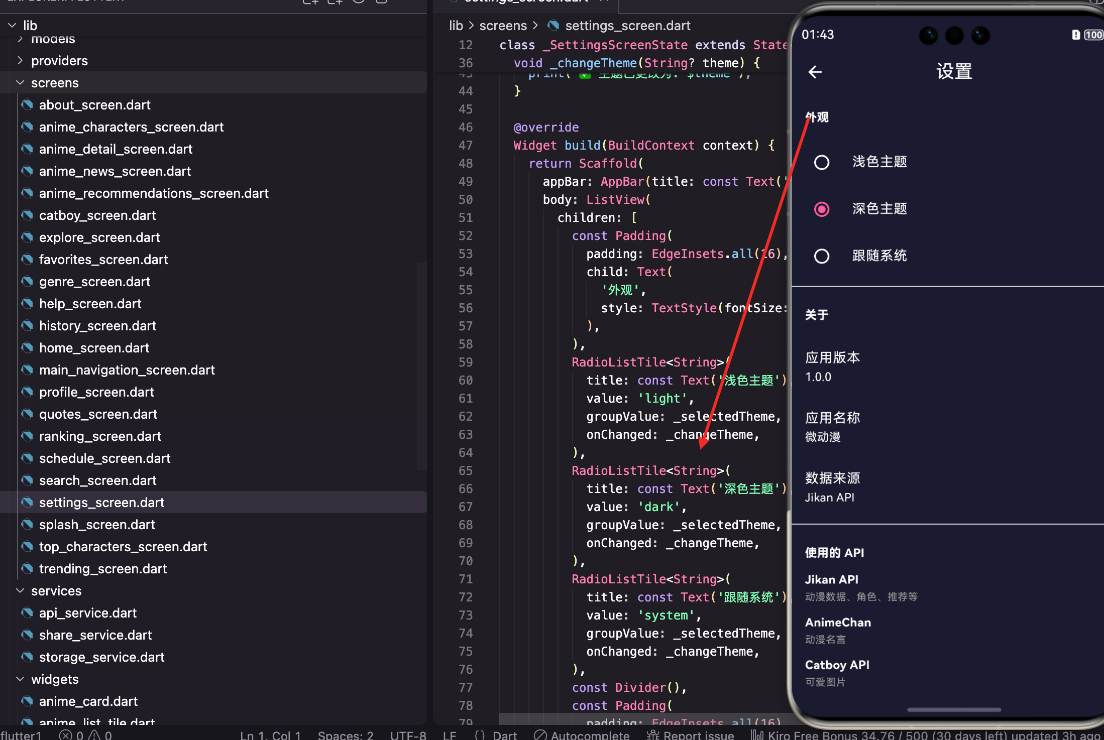
在 App 中应用主题
dart
MaterialApp(
  title: '微动漫',
  theme: AppTheme.lightTheme,
  darkTheme: AppTheme.darkTheme,
  themeMode: ThemeMode.system,
  home: const HomeScreen(),
)
theme 是浅色主题,darkTheme 是深色主题。
themeMode 控制使用哪个主题:
- ThemeMode.light:强制浅色
- ThemeMode.dark:强制深色
- ThemeMode.system:跟随系统
更多组件主题
可以配置更多组件的默认样式:
dart
static ThemeData lightTheme = ThemeData(
  // 基础配置

  // 按钮主题
  elevatedButtonTheme: ElevatedButtonThemeData(
    style: ElevatedButton.styleFrom(
      backgroundColor: primaryColor,
      foregroundColor: Colors.white,
      shape: RoundedRectangleBorder(
        borderRadius: BorderRadius.circular(12),
      ),
    ),
  ),

  // 输入框主题
  inputDecorationTheme: InputDecorationTheme(
    border: OutlineInputBorder(
      borderRadius: BorderRadius.circular(12),
    ),
    focusedBorder: OutlineInputBorder(
      borderRadius: BorderRadius.circular(12),
      borderSide: const BorderSide(color: primaryColor, width: 2),
    ),
  ),

  // 文本主题
  textTheme: const TextTheme(
    headlineLarge: TextStyle(fontWeight: FontWeight.bold),
    bodyLarge: TextStyle(height: 1.6),
  ),
);
elevatedButtonTheme 配置 ElevatedButton 的默认样式。
inputDecorationTheme 配置输入框的默认样式。
textTheme 配置各种文本样式。
获取主题颜色
在组件中获取主题颜色:
dart
// 获取主色
final primaryColor = Theme.of(context).primaryColor;

// 获取 ColorScheme
final colorScheme = Theme.of(context).colorScheme;
final secondary = colorScheme.secondary;

// 判断是否深色模式
final isDark = Theme.of(context).brightness == Brightness.dark;

// 获取文本主题
final textTheme = Theme.of(context).textTheme;
final headline = textTheme.headlineLarge;
Theme.of(context) 获取当前主题,然后访问各种属性。
动态切换主题
配合 Provider 实现动态切换:
dart
class ThemeProvider extends ChangeNotifier {
  ThemeMode _themeMode = ThemeMode.system;

  ThemeMode get themeMode => _themeMode;

  void setTheme(ThemeMode mode) {
    _themeMode = mode;
    notifyListeners();
  }
}
dart
Consumer<ThemeProvider>(
  builder: (context, themeProvider, child) {
    return MaterialApp(
      theme: AppTheme.lightTheme,
      darkTheme: AppTheme.darkTheme,
      themeMode: themeProvider.themeMode,
      home: const HomeScreen(),
    );
  },
)
Provider 管理主题状态,切换时通知 MaterialApp 重建。
主题扩展
可以添加自定义的主题属性:
dart
@immutable
class CustomColors extends ThemeExtension<CustomColors> {
  final Color? success;
  final Color? warning;
  final Color? error;

  const CustomColors({
    this.success,
    this.warning,
    this.error,
  });

  @override
  CustomColors copyWith({
    Color? success,
    Color? warning,
    Color? error,
  }) {
    return CustomColors(
      success: success ?? this.success,
      warning: warning ?? this.warning,
      error: error ?? this.error,
    );
  }

  @override
  CustomColors lerp(ThemeExtension<CustomColors>? other, double t) {
    if (other is! CustomColors) return this;
    return CustomColors(
      success: Color.lerp(success, other.success, t),
      warning: Color.lerp(warning, other.warning, t),
      error: Color.lerp(error, other.error, t),
    );
  }
}
dart
static ThemeData lightTheme = ThemeData(
  // 其他配置
  extensions: [
    const CustomColors(
      success: Colors.green,
      warning: Colors.orange,
      error: Colors.red,
    ),
  ],
);
使用时:
dart
final customColors = Theme.of(context).extension<CustomColors>()!;
final successColor = customColors.success;
小结
主题配置涉及的技术点:ThemeData 、ColorScheme 、Material 3 、各组件主题 、Theme.of(context) 、ThemeExtension。
主题设计原则:主色代表品牌、背景色不用纯色、深色模式卡片比背景浅、品牌色两种主题一致。
好的主题配置能让 App 视觉统一、易于维护、支持深色模式,是 Flutter 开发的重要基础。
欢迎加入开源鸿蒙跨平台社区:https://openharmonycrossplatform.csdn.net