文章目录
- [Flutter × OpenHarmony 实战:优雅构建确认对话框的组件化方案](#Flutter × OpenHarmony 实战:优雅构建确认对话框的组件化方案)
-
- 前言
- 背景
- [Flutter × OpenHarmony 跨端开发介绍](#Flutter × OpenHarmony 跨端开发介绍)
- 开发核心代码(详细解析)
- 心得
- 总结
Flutter × OpenHarmony 实战:优雅构建确认对话框的组件化方案
前言
在基于 Flutter × OpenHarmony 的跨端应用开发过程中,UI 组件不仅要"能用",更要结构清晰、风格统一、易于复用 。
确认对话框(Confirm Dialog)作为人机交互中最常见的组件之一,广泛应用于删除确认、提交确认、风险提示等关键业务场景。
本文将以一个 确认对话框示例卡片(Confirm Dialog Card) 为切入点,完整解析如何在 Flutter 中构建一个 符合 OpenHarmony 设计风格、具备良好扩展性的确认对话框展示组件。
背景
随着 OpenHarmony 在桌面端与移动端的逐步落地,Flutter 作为成熟的跨平台 UI 框架,正在成为 OpenHarmony 应用生态中的重要补充方案。
在实际项目中,我们往往会遇到以下问题:
- 对话框 UI 分散在各个页面,难以统一风格
- 业务示例与真实组件逻辑耦合,代码可读性差
- 演示型页面缺乏"卡片化"组织,不利于组件文档化
因此,将 对话框示例封装为独立卡片组件,既能用于 Demo 展示,又可直接迁移到业务代码中,是一种非常推荐的工程实践。
Flutter × OpenHarmony 跨端开发介绍
在 OpenHarmony 场景下使用 Flutter,通常具备以下优势:
- 一次开发,多端运行(Mobile / PC / Pad)
- 使用 Flutter Material / Cupertino / 自定义主题体系
- 可与 OpenHarmony 原生能力进行插件级集成
- UI 表现一致,减少多端适配成本
在 UI 层面,Flutter 的 AlertDialog、Card、ThemeData 等组件,能够很好地承载 OpenHarmony 对统一视觉风格与交互一致性的要求。
开发核心代码(详细解析)
示例目标
构建一个 示例卡片组件,用于展示:
- 对话框用途说明
- 触发按钮
- 点击后弹出「确认 / 取消」对话框
完整实现代码
dart
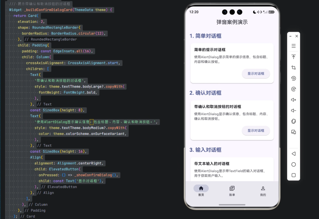
/// 构建确认对话框示例卡片
/// 展示带确认和取消按钮的对话框
Widget _buildConfirmDialogCard(ThemeData theme) {
  return Card(
    elevation: 2,
    shape: RoundedRectangleBorder(
      borderRadius: BorderRadius.circular(12),
    ),
    child: Padding(
      padding: const EdgeInsets.all(16),
      child: Column(
        crossAxisAlignment: CrossAxisAlignment.start,
        children: [
          Text(
            '带确认和取消按钮的对话框',
            style: theme.textTheme.bodyLarge?.copyWith(
              fontWeight: FontWeight.bold,
            ),
          ),
          const SizedBox(height: 8),
          Text(
            '使用AlertDialog显示确认信息,包含标题、内容、确认和取消按钮。',
            style: theme.textTheme.bodyMedium?.copyWith(
              color: theme.colorScheme.onSurfaceVariant,
            ),
          ),
          const SizedBox(height: 16),
          Align(
            alignment: Alignment.centerRight,
            child: ElevatedButton(
              onPressed: () => _showConfirmDialog(),
              child: const Text('显示对话框'),
            ),
          ),
        ],
      ),
    ),
  );
}
1️⃣ Card:组件容器设计
dart
Card(
  elevation: 2,
  shape: RoundedRectangleBorder(
    borderRadius: BorderRadius.circular(12),
  ),
)
设计要点:
Card用于构建示例单元,符合 Material / OpenHarmony 扁平化设计elevation: 2提供轻量阴影,避免视觉负担borderRadius: 12提升现代感,与系统 UI 保持一致
2️⃣ Padding + Column:内容结构布局
dart
Padding(
  padding: const EdgeInsets.all(16),
  child: Column(
    crossAxisAlignment: CrossAxisAlignment.start,
    children: [...]
  ),
)- 统一 16dp 内边距,符合 Flutter 与 OpenHarmony 推荐规范
crossAxisAlignment.start保证文本左对齐,阅读体验更好
3️⃣ 标题文本:语义与视觉强调
dart
Text(
  '带确认和取消按钮的对话框',
  style: theme.textTheme.bodyLarge?.copyWith(
    fontWeight: FontWeight.bold,
  ),
)- 使用
ThemeData中的字体体系,确保主题适配 fontWeight.bold强化标题层级- 避免硬编码字体大小,增强跨端一致性
4️⃣ 描述文本:弱化信息层级
dart
Text(
  '使用AlertDialog显示确认信息,包含标题、内容、确认和取消按钮。',
  style: theme.textTheme.bodyMedium?.copyWith(
    color: theme.colorScheme.onSurfaceVariant,
  ),
)- 使用
onSurfaceVariant颜色,弱化说明文字 - 清晰说明该组件的使用场景和功能
5️⃣ 操作按钮:触发对话框
dart
Align(
  alignment: Alignment.centerRight,
  child: ElevatedButton(
    onPressed: () => _showConfirmDialog(),
    child: const Text('显示对话框'),
  ),
)Align右对齐按钮,符合操作区设计习惯ElevatedButton提供明确的可点击反馈- 触发逻辑通过
_showConfirmDialog()解耦,便于维护
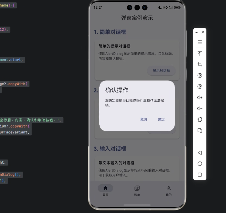
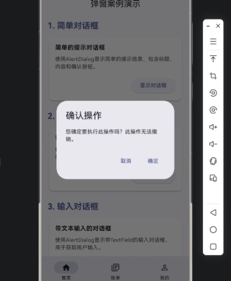
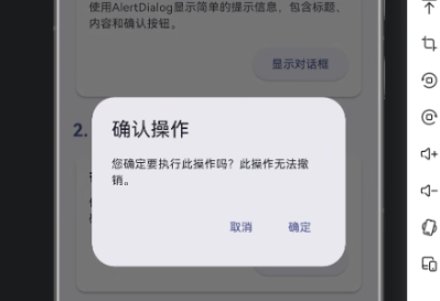
6️⃣ 对话框逻辑(示意)
dart
void _showConfirmDialog() {
  showDialog(
    context: context,
    builder: (context) {
      return AlertDialog(
        title: const Text('确认操作'),
        content: const Text('你确定要执行该操作吗?'),
        actions: [
          TextButton(
            onPressed: () => Navigator.pop(context),
            child: const Text('取消'),
          ),
          ElevatedButton(
            onPressed: () {
              Navigator.pop(context);
              // 执行确认逻辑
            },
            child: const Text('确认'),
          ),
        ],
      );
    },
  );
}
该结构在 OpenHarmony Flutter 环境中表现稳定,可直接用于业务场景。
心得
在 Flutter × OpenHarmony 的实际开发中,我越来越倾向于:
- UI 示例即组件
- 组件即文档
- 文档即代码
通过将对话框封装为「示例卡片」,不仅提升了页面可读性,也为团队协作和后续维护打下了良好基础。
总结
本文通过一个「确认对话框示例卡片」的实战案例,系统性地介绍了在 Flutter × OpenHarmony 场景下,如何构建一个结构清晰、风格统一、易复用的对话框组件。
这种 卡片化 + 组件化 + 主题化 的设计方式,非常适合用于:
- 组件示例页
- UI 规范展示
- 企业级 Flutter 应用开发
如果你正在进行 OpenHarmony 跨端 UI 开发,这种写法值得在项目中长期采用。

欢迎加入开源鸿蒙跨平台社区:https://openharmonycrossplatform.csdn.net