引言
意见反馈是收集用户建议和问题的重要渠道。本篇将实现意见反馈页面,支持选择反馈类型、输入内容和添加图片。通过完善的反馈机制,开发者可以及时了解用户的需求和问题,不断改进应用的功能和体验。意见反馈功能是应用与用户沟通的桥梁,通过收集用户的真实反馈,可以发现应用中存在的问题,了解用户的真实需求,从而指导产品的优化方向。
功能设计
意见反馈页面包含以下核心功能:
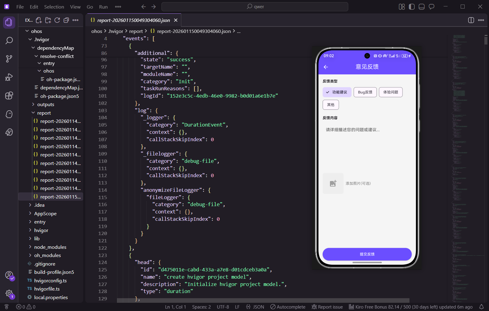
- 反馈类型选择:支持功能建议、Bug反馈、体验问题、其他等多种类型。不同的反馈类型帮助开发者快速分类和处理反馈
- 反馈内容输入框:提供充足的输入空间,支持多行文本输入。用户可以详细描述问题或建议
- 图片添加(可选):允许用户上传截图或相关图片作为附件。图片可以更直观地说明问题
- 提交按钮:提交反馈前进行表单验证,确保数据完整性。验证确保反馈的质量
数据模型定义
dart
import 'package:flutter/material.dart';
import 'package:get/get.dart';

enum FeedbackType { suggestion, bug, experience, other }

class FeedbackModel {
  final String id;
  final String type;
  final String content;
  final List<String> images;
  final DateTime createTime;
  final String status;

  FeedbackModel({
    required this.id,
    required this.type,
    required this.content,
    required this.images,
    required this.createTime,
    required this.status,
  });
}
定义了FeedbackType枚举来表示反馈的类型。FeedbackModel数据模型包含反馈的ID、类型、内容、图片列表、创建时间和处理状态。id是反馈的唯一标识,用于后端数据关联和查询。type字段存储反馈的类型,用于分类处理。content字段存储反馈的详细内容。images字段是一个字符串列表,存储附加图片的路径或URL。createTime记录反馈的创建时间。status字段表示反馈的处理状态,如"待处理"、"处理中"、"已处理"等。
dart
class FeedbackController extends GetxController {
  final feedbackType = '功能建议'.obs;
  final feedbackContent = ''.obs;
  final selectedImages = <String>[].obs;
  final isSubmitting = false.obs;
  final feedbackList = <FeedbackModel>[].obs;

  final List<String> feedbackTypes = ['功能建议', 'Bug反馈', '体验问题', '其他'];

  @override
  void onInit() {
    super.onInit();
    loadFeedbackHistory();
  }
FeedbackController继承GetxController,使用GetX框架的响应式编程模式。feedbackType是一个响应式变量,存储当前选中的反馈类型,默认值为"功能建议"。feedbackContent存储用户输入的反馈内容。selectedImages是一个响应式列表,存储用户选择的图片路径。isSubmitting表示是否正在提交反馈,用于控制提交按钮的状态。feedbackList存储所有的反馈记录。feedbackTypes是一个常量列表,包含所有可用的反馈类型。onInit方法在控制器初始化时调用,用于加载反馈历史记录。
dart
  void loadFeedbackHistory() {
    feedbackList.value = [
      FeedbackModel(
        id: '1',
        type: '功能建议',
        content: '希望能添加更多的剧本类型',
        images: [],
        createTime: DateTime.now().subtract(const Duration(days: 3)),
        status: '已处理',
      ),
      FeedbackModel(
        id: '2',
        type: 'Bug反馈',
        content: '组队时偶尔会出现加载失败',
        images: [],
        createTime: DateTime.now().subtract(const Duration(days: 1)),
        status: '处理中',
      ),
    ];
  }
loadFeedbackHistory方法加载反馈历史记录。在实际项目中,这里应该调用API接口从后端获取真实的反馈数据。方法创建了两条测试数据,一条是功能建议,已处理;另一条是Bug反馈,处理中。这些测试数据用于演示反馈列表的显示效果。
dart
  Future<void> submitFeedback() async {
    if (feedbackContent.value.trim().isEmpty) {
      Get.snackbar('提示', '请输入反馈内容');
      return;
    }

    isSubmitting.value = true;
    await Future.delayed(const Duration(seconds: 1));

    final newFeedback = FeedbackModel(
      id: DateTime.now().millisecondsSinceEpoch.toString(),
      type: feedbackType.value,
      content: feedbackContent.value,
      images: selectedImages.toList(),
      createTime: DateTime.now(),
      status: '待处理',
    );

    feedbackList.insert(0, newFeedback);
    feedbackContent.value = '';
    selectedImages.clear();
    isSubmitting.value = false;

    Get.back();
    Get.snackbar('成功', '感谢您的反馈!我们会尽快处理');
  }
submitFeedback方法处理反馈提交逻辑。首先检查反馈内容是否为空,如果为空则显示提示并返回。然后设置isSubmitting为true,显示加载状态。使用Future.delayed模拟网络请求延迟。创建一个新的FeedbackModel对象,包含当前的反馈类型、内容和图片。使用DateTime.now().millisecondsSinceEpoch生成唯一的ID。将新反馈插入到feedbackList的头部,使最新的反馈显示在最前面。清空反馈内容和图片列表,为下一次反馈做准备。设置isSubmitting为false,恢复提交按钮的状态。最后关闭当前页面并显示成功提示。
dart
  void addImage(String imagePath) {
    if (selectedImages.length < 3) {
      selectedImages.add(imagePath);
    } else {
      Get.snackbar('提示', '最多只能添加3张图片');
    }
  }

  void removeImage(int index) {
    selectedImages.removeAt(index);
  }
}
addImage方法用于添加图片。首先检查已选择的图片数量是否少于3张,如果是则添加新图片,否则显示提示信息。这个限制防止用户添加过多的图片,节省存储空间和网络带宽。removeImage方法用于删除指定索引的图片。
反馈页面UI实现
dart
class FeedbackPage extends StatelessWidget {
  FeedbackPage({super.key});
  final FeedbackController controller = Get.put(FeedbackController());

  @override
  Widget build(BuildContext context) {
    return Scaffold(
      appBar: AppBar(
        title: const Text('意见反馈'),
        backgroundColor: const Color(0xFF6B4EFF),
        foregroundColor: Colors.white,
        elevation: 0,
      ),
      body: SingleChildScrollView(
        padding: const EdgeInsets.all(16),
        child: Column(
          crossAxisAlignment: CrossAxisAlignment.start,
          children: [
FeedbackPage是一个StatelessWidget,使用Get.put(FeedbackController())在页面加载时创建并注入控制器。Scaffold提供了基本的页面结构。AppBar使用紫色背景,与应用的主题色保持一致。foregroundColor设置为白色,使标题和图标在紫色背景上清晰可见。elevation: 0移除AppBar的阴影效果。body使用SingleChildScrollView包装,支持页面内容的滚动。padding: 16为页面内容提供充足的边距。
dart
            // 反馈类型
            const Text(
              '反馈类型',
              style: TextStyle(fontWeight: FontWeight.bold, fontSize: 16),
            ),
            const SizedBox(height: 12),
            Obx(() => Wrap(
              spacing: 8,
              runSpacing: 8,
              children: controller.feedbackTypes.map((type) {
                return ChoiceChip(
                  label: Text(type),
                  selected: controller.feedbackType.value == type,
                  selectedColor: const Color(0xFF6B4EFF).withOpacity(0.2),
                  labelStyle: TextStyle(
                    color: controller.feedbackType.value == type
                        ? const Color(0xFF6B4EFF)
                        : Colors.grey[700],
                    fontWeight: controller.feedbackType.value == type
                        ? FontWeight.bold
                        : FontWeight.normal,
                  ),
                  onSelected: (selected) {
                    if (selected) {
                      controller.feedbackType.value = type;
                    }
                  },
                );
              }).toList(),
            )),
            const SizedBox(height: 24),
反馈类型部分使用一个标题和多个ChoiceChip组件。Wrap布局用于自动换行显示多个芯片。spacing: 8设置芯片之间的水平间距,runSpacing: 8设置行之间的垂直间距。使用Obx包装Wrap,使其能够响应feedbackType的变化。ChoiceChip是一个单选芯片组件,用户点击时会选中该类型。selectedColor使用紫色半透明背景表示选中状态。labelStyle根据选中状态改变文字颜色和粗细,选中时使用紫色加粗,未选中时使用灰色正常。onSelected回调在用户选择时更新feedbackType。
dart
            // 反馈内容
            const Text(
              '反馈内容',
              style: TextStyle(fontWeight: FontWeight.bold, fontSize: 16),
            ),
            const SizedBox(height: 12),
            Obx(() => TextField(
              onChanged: (value) => controller.feedbackContent.value = value,
              maxLines: 6,
              minLines: 6,
              decoration: InputDecoration(
                hintText: '请详细描述您的问题或建议...',
                hintStyle: TextStyle(color: Colors.grey[400]),
                filled: true,
                fillColor: Colors.grey[100],
                border: OutlineInputBorder(
                  borderRadius: BorderRadius.circular(8),
                  borderSide: BorderSide(color: Colors.grey[300]!),
                ),
                enabledBorder: OutlineInputBorder(
                  borderRadius: BorderRadius.circular(8),
                  borderSide: BorderSide(color: Colors.grey[300]!),
                ),
                focusedBorder: OutlineInputBorder(
                  borderRadius: BorderRadius.circular(8),
                  borderSide: const BorderSide(color: Color(0xFF6B4EFF), width: 2),
                ),
                contentPadding: const EdgeInsets.all(12),
              ),
            )),
            const SizedBox(height: 24),
反馈内容部分使用一个标题和一个多行TextField组件。maxLines和minLines都设置为6,确保输入框有充足的空间供用户输入详细的反馈内容。onChanged回调在用户输入时更新controller.feedbackContent。decoration设置了多种边框样式:enabledBorder用于未获焦点状态,focusedBorder用于获焦点状态(使用紫色边框宽度为2)。fillColor设置为浅灰色背景,提升输入框的可见性。hintText提供输入提示,引导用户输入详细的反馈内容。contentPadding: 12为输入框内容提供充足的内边距。
dart
            // 添加图片
            const Text(
              '添加图片(可选)',
              style: TextStyle(fontWeight: FontWeight.bold, fontSize: 16),
            ),
            const SizedBox(height: 12),
            Obx(() => SingleChildScrollView(
              scrollDirection: Axis.horizontal,
              child: Row(
                children: [
                  // 添加图片按钮
                  if (controller.selectedImages.length < 3)
                    GestureDetector(
                      onTap: () {
                        Get.snackbar('提示', '点击选择图片');
                        controller.addImage('image_${DateTime.now().millisecondsSinceEpoch}.jpg');
                      },
                      child: Container(
                        width: 80,
                        height: 80,
                        decoration: BoxDecoration(
                          color: Colors.grey[200],
                          borderRadius: BorderRadius.circular(8),
                          border: Border.all(color: Colors.grey[300]!, width: 2),
                        ),
                        child: const Icon(
                          Icons.add_photo_alternate,
                          color: Colors.grey,
                          size: 32,
                        ),
                      ),
                    ),
                  const SizedBox(width: 8),
添加图片部分使用一个标题和一个水平滚动的Row。SingleChildScrollView支持水平滚动,当图片过多时可以滚动查看。当已选择的图片数量少于3张时,显示添加图片按钮。按钮是一个80x80的正方形容器,使用灰色背景和虚线边框。点击按钮时调用controller.addImage()添加图片。在实际项目中,应该使用image_picker插件打开图片选择器。
dart
                  // 已选择的图片
                  ...controller.selectedImages.asMap().entries.map((entry) {
                    int index = entry.key;
                    String image = entry.value;
                    return Padding(
                      padding: const EdgeInsets.only(right: 8),
                      child: Stack(
                        children: [
                          Container(
                            width: 80,
                            height: 80,
                            decoration: BoxDecoration(
                              color: Colors.grey[300],
                              borderRadius: BorderRadius.circular(8),
                            ),
                            child: const Icon(
                              Icons.image,
                              color: Colors.grey,
                              size: 32,
                            ),
                          ),
                          Positioned(
                            top: -8,
                            right: -8,
                            child: GestureDetector(
                              onTap: () => controller.removeImage(index),
                              child: Container(
                                width: 24,
                                height: 24,
                                decoration: const BoxDecoration(
                                  color: Colors.red,
                                  shape: BoxShape.circle,
                                ),
                                child: const Icon(
                                  Icons.close,
                                  color: Colors.white,
                                  size: 16,
                                ),
                              ),
                            ),
                          ),
                        ],
                      ),
                    );
                  }).toList(),
                ],
              ),
            )),
            const SizedBox(height: 24),
已选择的图片部分使用asMap().entries.map()遍历selectedImages列表。对于每张图片,创建一个80x80的容器显示图片。使用Stack布局,在图片上方使用Positioned放置删除按钮。删除按钮是一个红色圆形容器,包含一个关闭图标。点击删除按钮时调用controller.removeImage()删除该图片。这个设计使得用户可以轻松管理已选择的图片。
dart
            // 反馈历史
            const Text(
              '反馈历史',
              style: TextStyle(fontWeight: FontWeight.bold, fontSize: 16),
            ),
            const SizedBox(height: 12),
            Obx(() => controller.feedbackList.isEmpty
                ? Center(
                    child: Padding(
                      padding: const EdgeInsets.symmetric(vertical: 32),
                      child: Text(
                        '暂无反馈记录',
                        style: TextStyle(color: Colors.grey[600]),
                      ),
                    ),
                  )
                : ListView.builder(
                    shrinkWrap: true,
                    physics: const NeverScrollableScrollPhysics(),
                    itemCount: controller.feedbackList.length,
                    itemBuilder: (context, index) {
                      final feedback = controller.feedbackList[index];
                      return _buildFeedbackItem(feedback);
                    },
                  )),
            const SizedBox(height: 24),
反馈历史部分使用Obx包装ListView.builder,使其能够响应feedbackList的变化。当列表为空时显示"暂无反馈记录"的提示。当列表不为空时,使用ListView.builder动态构建反馈记录列表。shrinkWrap: true使ListView只占据必要的高度。physics: const NeverScrollableScrollPhysics()禁用ListView的滚动,因为整个页面已经使用SingleChildScrollView支持滚动。
dart
            // 提交按钮
            Obx(() => SizedBox(
              width: double.infinity,
              height: 48,
              child: ElevatedButton(
                onPressed: controller.isSubmitting.value
                    ? null
                    : () => controller.submitFeedback(),
                style: ElevatedButton.styleFrom(
                  backgroundColor: const Color(0xFF6B4EFF),
                  disabledBackgroundColor: Colors.grey[300],
                  shape: RoundedRectangleBorder(
                    borderRadius: BorderRadius.circular(8),
                  ),
                ),
                child: controller.isSubmitting.value
                    ? const SizedBox(
                        width: 20,
                        height: 20,
                        child: CircularProgressIndicator(
                          strokeWidth: 2,
                          valueColor: AlwaysStoppedAnimation<Color>(Colors.white),
                        ),
                      )
                    : const Text(
                        '提交反馈',
                        style: TextStyle(color: Colors.white, fontSize: 16),
                      ),
              ),
            )),
          ],
        ),
      ),
    );
  }
提交按钮使用Obx包装,使其能够响应isSubmitting的变化。当isSubmitting为true时,按钮显示加载动画并禁用。当isSubmitting为false时,按钮显示"提交反馈"文本并启用。_buildFeedbackItem方法构建反馈记录项。使用Container创建卡片效果,包含反馈类型、处理状态、反馈内容和创建时间。处理状态使用不同的颜色表示:已处理为绿色,处理中为橙色,待处理为灰色。反馈内容使用maxLines: 2和overflow: TextOverflow.ellipsis显示前两行,超出部分用省略号表示。
dart
  Widget _buildFeedbackItem(FeedbackModel feedback) {
    return Container(
      margin: const EdgeInsets.only(bottom: 12),
      padding: const EdgeInsets.all(12),
      decoration: BoxDecoration(
        color: Colors.white,
        borderRadius: BorderRadius.circular(8),
        border: Border.all(color: Colors.grey[200]!),
      ),
      child: Column(
        crossAxisAlignment: CrossAxisAlignment.start,
        children: [
          Row(
            mainAxisAlignment: MainAxisAlignment.spaceBetween,
            children: [
              Text(
                feedback.type,
                style: const TextStyle(
                  fontWeight: FontWeight.bold,
                  color: Color(0xFF6B4EFF),
                ),
              ),
              Container(
                padding: const EdgeInsets.symmetric(horizontal: 8, vertical: 4),
                decoration: BoxDecoration(
                  color: feedback.status == '已处理'
                      ? Colors.green.withOpacity(0.1)
                      : feedback.status == '处理中'
                          ? Colors.orange.withOpacity(0.1)
                          : Colors.grey.withOpacity(0.1),
                  borderRadius: BorderRadius.circular(4),
                ),
                child: Text(
                  feedback.status,
                  style: TextStyle(
                    fontSize: 12,
                    color: feedback.status == '已处理'
                        ? Colors.green
                        : feedback.status == '处理中'
                            ? Colors.orange
                            : Colors.grey,
                  ),
                ),
              ),
            ],
          ),
        ],
      ),
    );
  }
}
技术要点
- ChoiceChip组件:单选芯片组件,用于反馈类型选择,支持自定义样式。ChoiceChip提供了简洁的单选界面
- 多行TextField:通过maxLines和minLines设置多行输入,提供充足的输入空间。用户可以详细描述问题或建议
- 表单验证:提交前检查内容是否为空,确保数据完整性。验证防止提交空反馈
- 图片管理:支持添加和删除图片,限制最多3张,提升用户体验。图片限制节省存储空间
- 状态管理:使用GetX的响应式编程实现数据的实时更新。当数据变化时,UI会自动刷新
- 加载状态:提交时显示加载动画,防止重复提交。加载动画提示用户正在处理
小结
本篇实现了意见反馈功能,用户可以选择反馈类型、输入详细内容并添加图片,帮助开发者收集用户建议。通过完善的表单验证和状态管理,提升了应用的交互体验。反馈历史记录展示了用户之前的反馈及其处理状态,增强了用户的参与感。意见反馈功能是应用与用户沟通的重要渠道,通过收集和分析用户反馈,可以不断改进应用的功能和体验。
欢迎加入开源鸿蒙跨平台社区:https://openharmonycrossplatform.csdn.net