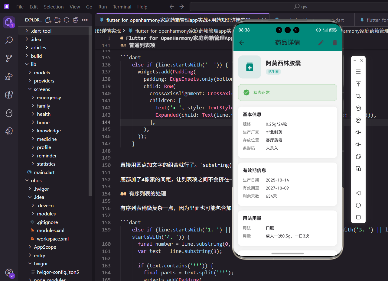
药品详情页面是用户查看药品完整信息的重要入口。在这里,用户可以查看药品的所有属性,包括基本信息、有效期、用法用量等,还可以进行编辑、删除和库存调整操作。
页面功能设计
详情页面需要实现:药品信息展示 、状态提醒 、库存调整 和编辑删除操作。信息按照逻辑分组展示,状态卡片醒目提示需要关注的问题,库存调整提供快捷的增减操作。
页面结构实现
详情页面使用StatelessWidget,因为数据通过参数传入:
dart
class MedicineDetailScreen extends StatelessWidget {
  final Medicine medicine;

  const MedicineDetailScreen({super.key, required this.medicine});

  @override
  Widget build(BuildContext context) {
    return Scaffold(
      appBar: AppBar(
        title: const Text('药品详情'),
        actions: [
          IconButton(
            icon: const Icon(Icons.edit),
            onPressed: () => Get.to(() => EditMedicineScreen(medicine: medicine)),
          ),
          IconButton(
            icon: const Icon(Icons.delete),
            onPressed: () => _showDeleteDialog(context),
          ),
        ],
      ),
      body: SingleChildScrollView(
        padding: EdgeInsets.all(16.w),
        child: Column(
          crossAxisAlignment: CrossAxisAlignment.start,
          children: [
            _buildHeader(),
            _buildStatusCard(),
            _buildInfoSection('基本信息', [...]),
            _buildQuantityControl(context),
          ],
        ),
      ),
    );
  }
}AppBar右侧提供编辑和删除按钮,让用户可以快速进行操作。页面主体使用SingleChildScrollView支持滚动,内容通过Column垂直排列。各个信息模块之间使用SizedBox添加间距,保持视觉上的分隔。
头部信息展示
头部展示药品名称和分类:
dart
Widget _buildHeader() {
  return Row(
    children: [
      Container(
        width: 80.w,
        height: 80.w,
        decoration: BoxDecoration(
          color: const Color(0xFF00897B).withOpacity(0.1),
          borderRadius: BorderRadius.circular(16.r),
        ),
        child: Icon(
          Icons.medication,
          color: const Color(0xFF00897B),
          size: 40.sp,
        ),
      ),
      SizedBox(width: 16.w),
      Expanded(
        child: Column(
          crossAxisAlignment: CrossAxisAlignment.start,
          children: [
            Text(
              medicine.name,
              style: TextStyle(
                fontSize: 20.sp,
                fontWeight: FontWeight.bold,
              ),
            ),
            SizedBox(height: 4.h),
            Container(
              padding: EdgeInsets.symmetric(horizontal: 8.w, vertical: 2.h),
              decoration: BoxDecoration(
                color: Colors.teal.withOpacity(0.1),
                borderRadius: BorderRadius.circular(10.r),
              ),
              child: Text(
                medicine.category,
                style: TextStyle(
                  fontSize: 12.sp,
                  color: Colors.teal,
                ),
              ),
            ),
          ],
        ),
      ),
    ],
  );
}
左侧是药品图标,使用80x80的正方形容器,主题色的半透明背景。右侧是药品名称和分类标签,名称使用20.sp的加粗字体,是页面中最醒目的文字。分类标签使用圆角矩形,背景色和文字颜色都使用青绿色,与应用主题保持一致。
状态提醒卡片
状态卡片根据药品状态显示不同的提示:
dart
Widget _buildStatusCard() {
  Color statusColor;
  String statusText;
  IconData statusIcon;

  if (medicine.isExpired) {
    statusColor = Colors.red;
    statusText = '已过期,请及时处理';
    statusIcon = Icons.warning;
  } else if (medicine.isExpiringSoon) {
    statusColor = Colors.orange;
    statusText = '即将在${medicine.daysUntilExpiry}天后过期';
    statusIcon = Icons.access_time;
  } else if (medicine.quantity <= medicine.lowStockThreshold) {
    statusColor = Colors.amber;
    statusText = '库存不足,请及时补充';
    statusIcon = Icons.inventory_2;
  } else {
    statusColor = Colors.green;
    statusText = '状态正常';
    statusIcon = Icons.check_circle;
  }

  return Container(
    padding: EdgeInsets.all(16.w),
    decoration: BoxDecoration(
      color: statusColor.withOpacity(0.1),
      borderRadius: BorderRadius.circular(12.r),
      border: Border.all(color: statusColor.withOpacity(0.3)),
    ),
    child: Row(
      children: [
        Icon(statusIcon, color: statusColor, size: 24.sp),
        SizedBox(width: 12.w),
        Expanded(
          child: Text(
            statusText,
            style: TextStyle(
              fontSize: 14.sp,
              color: statusColor,
              fontWeight: FontWeight.w500,
            ),
          ),
        ),
      ],
    ),
  );
}
状态判断按照优先级进行:已过期最严重,其次是即将过期,再次是库存不足,最后是正常状态。每种状态使用不同的颜色、图标和文字,让用户能够快速识别。卡片使用半透明背景和边框,既醒目又不会过于突兀。
信息分组展示
信息按照逻辑分组,每组使用独立的卡片:
dart
Widget _buildInfoSection(String title, List<Widget> children) {
  return Container(
    padding: EdgeInsets.all(16.w),
    decoration: BoxDecoration(
      color: Colors.white,
      borderRadius: BorderRadius.circular(12.r),
      boxShadow: [
        BoxShadow(
          color: Colors.black.withOpacity(0.05),
          blurRadius: 10,
          offset: const Offset(0, 2),
        ),
      ],
    ),
    child: Column(
      crossAxisAlignment: CrossAxisAlignment.start,
      children: [
        Text(
          title,
          style: TextStyle(
            fontSize: 16.sp,
            fontWeight: FontWeight.bold,
          ),
        ),
        SizedBox(height: 12.h),
        ...children,
      ],
    ),
  );
}每个信息组都是一个白色卡片,带有轻微的阴影效果。标题使用16.sp的加粗字体,与内容形成层次对比。使用展开运算符...children将子组件列表展开,这种方式让代码更加简洁。
信息行组件
单行信息展示采用标签-值的形式:
dart
Widget _buildInfoRow(String label, String value) {
  return Padding(
    padding: EdgeInsets.only(bottom: 8.h),
    child: Row(
      crossAxisAlignment: CrossAxisAlignment.start,
      children: [
        if (label.isNotEmpty) ...[
          SizedBox(
            width: 80.w,
            child: Text(
              label,
              style: TextStyle(
                fontSize: 14.sp,
                color: Colors.grey[600],
              ),
            ),
          ),
        ],
        Expanded(
          child: Text(
            value,
            style: TextStyle(
              fontSize: 14.sp,
            ),
          ),
        ),
      ],
    ),
  );
}标签固定宽度80.w,使用灰色字体,作为辅助说明。值使用Expanded占据剩余空间,使用默认黑色字体,是主要内容。当标签为空时不显示,这样可以用于展示长文本内容如副作用、禁忌等。
库存调整功能
库存调整提供加减按钮:
dart
Widget _buildQuantityControl(BuildContext context) {
  return Container(
    padding: EdgeInsets.all(16.w),
    decoration: BoxDecoration(
      color: Colors.white,
      borderRadius: BorderRadius.circular(12.r),
      boxShadow: [
        BoxShadow(
          color: Colors.black.withOpacity(0.05),
          blurRadius: 10,
          offset: const Offset(0, 2),
        ),
      ],
    ),
    child: Column(
      crossAxisAlignment: CrossAxisAlignment.start,
      children: [
        Text(
          '库存管理',
          style: TextStyle(
            fontSize: 16.sp,
            fontWeight: FontWeight.bold,
          ),
        ),
        SizedBox(height: 12.h),
        Row(
          mainAxisAlignment: MainAxisAlignment.center,
          children: [
            IconButton(
              onPressed: () {
                if (medicine.quantity > 0) {
                  context.read<MedicineProvider>().updateQuantity(
                        medicine.id,
                        medicine.quantity - 1,
                      );
                }
              },
              icon: Container(
                padding: EdgeInsets.all(8.w),
                decoration: BoxDecoration(
                  color: Colors.grey[200],
                  shape: BoxShape.circle,
                ),
                child: const Icon(Icons.remove),
              ),
            ),
            SizedBox(width: 20.w),
            Consumer<MedicineProvider>(
              builder: (context, provider, child) {
                final currentMedicine = provider.getMedicineById(medicine.id);
                return Text(
                  '${currentMedicine?.quantity ?? medicine.quantity}${medicine.unit}',
                  style: TextStyle(
                    fontSize: 24.sp,
                    fontWeight: FontWeight.bold,
                  ),
                );
              },
            ),
            SizedBox(width: 20.w),
            IconButton(
              onPressed: () {
                context.read<MedicineProvider>().updateQuantity(
                      medicine.id,
                      medicine.quantity + 1,
                    );
              },
              icon: Container(
                padding: EdgeInsets.all(8.w),
                decoration: BoxDecoration(
                  color: const Color(0xFF00897B),
                  shape: BoxShape.circle,
                ),
                child: const Icon(Icons.add, color: Colors.white),
              ),
            ),
          ],
        ),
      ],
    ),
  );
}减号按钮使用灰色背景,加号按钮使用主题色背景,形成视觉对比。中间的数量使用Consumer监听Provider,当数量变化时自动更新显示。减号按钮添加了判断,当数量为0时不能继续减少。按钮使用圆形容器包裹图标,提供更大的点击区域。
删除确认对话框
删除操作需要用户确认:
dart
void _showDeleteDialog(BuildContext context) {
  showDialog(
    context: context,
    builder: (context) => AlertDialog(
      title: const Text('删除药品'),
      content: Text('确定要删除"${medicine.name}"吗?'),
      actions: [
        TextButton(
          onPressed: () => Navigator.pop(context),
          child: const Text('取消'),
        ),
        TextButton(
          onPressed: () {
            context.read<MedicineProvider>().deleteMedicine(medicine.id);
            Navigator.pop(context);
            Get.back();
          },
          child: const Text('删除', style: TextStyle(color: Colors.red)),
        ),
      ],
    ),
  );
}使用AlertDialog显示确认对话框,标题和内容清晰说明操作。提供取消和删除两个按钮,删除按钮使用红色文字,警示用户这是危险操作。确认删除后,调用Provider的deleteMedicine方法,关闭对话框,返回上一页。
响应式数据更新
库存调整使用Consumer实现响应式更新。当用户点击加减按钮时,Provider中的数据立即更新,Consumer监听到变化后重建Widget,显示最新的数量。这种机制让UI始终与数据保持同步,用户体验流畅。
总结
药品详情页面通过分组展示、状态提醒和快捷操作,为用户提供了完整的药品信息查看和管理功能。使用Provider实现响应式更新,确保数据的实时性。通过颜色编码和图标,让状态信息一目了然。
欢迎加入开源鸿蒙跨平台社区:https://openharmonycrossplatform.csdn.net