Flutter for OpenHarmony 实战:AspectRatio/Center/Wrap等布局组件实用技巧
文章目录
- [Flutter for OpenHarmony 实战:AspectRatio/Center/Wrap等布局组件实用技巧](#Flutter for OpenHarmony 实战:AspectRatio/Center/Wrap等布局组件实用技巧)
-
- 摘要
- 前言
- 一、AspectRatio宽高比
-
- [1.1 基础用法](#1.1 基础用法)
- [1.2 图片保持宽高比](#1.2 图片保持宽高比)
- [1.3 卡片宽高比](#1.3 卡片宽高比)
- 二、Center居中
-
- [2.1 基础Center](#2.1 基础Center)
- [2.2 Center vs Align](#2.2 Center vs Align)
- [2.3 Center widthFactor和heightFactor](#2.3 Center widthFactor和heightFactor)
- 三、Wrap自动换行
-
- [3.1 基础Wrap](#3.1 基础Wrap)
- [3.2 Wrap方向和对齐](#3.2 Wrap方向和对齐)
- [3.3 Wrap间距](#3.3 Wrap间距)
- [3.4 标签云](#3.4 标签云)
- 四、其他布局组件
-
- [4.1 SafeArea安全区域](#4.1 SafeArea安全区域)
- [4.2 Expanded和Flexible](#4.2 Expanded和Flexible)
- [4.3 Overflow溢出处理](#4.3 Overflow溢出处理)
- [4.4 IndexedStack](#4.4 IndexedStack)
- [4.5 Transform变换](#4.5 Transform变换)
- [4.6 LayoutBuilder响应式布局](#4.6 LayoutBuilder响应式布局)
- 总结
摘要
Flutter提供了多种布局组件,AspectRatio设置宽高比,Center居中对齐,Wrap自动换行。这些组件在特定场景下非常有用。这篇文章我想讲解这些布局组件的使用方法和实用技巧。
前言
除了常用的Row、Column、Stack,Flutter还有很多布局组件。AspectRatio可以保持宽高比,Center很常用,Wrap能自动换行。
这些组件用好了,很多布局问题都能轻松解决。这篇文章我想分享这些布局组件的使用经验。
一、AspectRatio宽高比
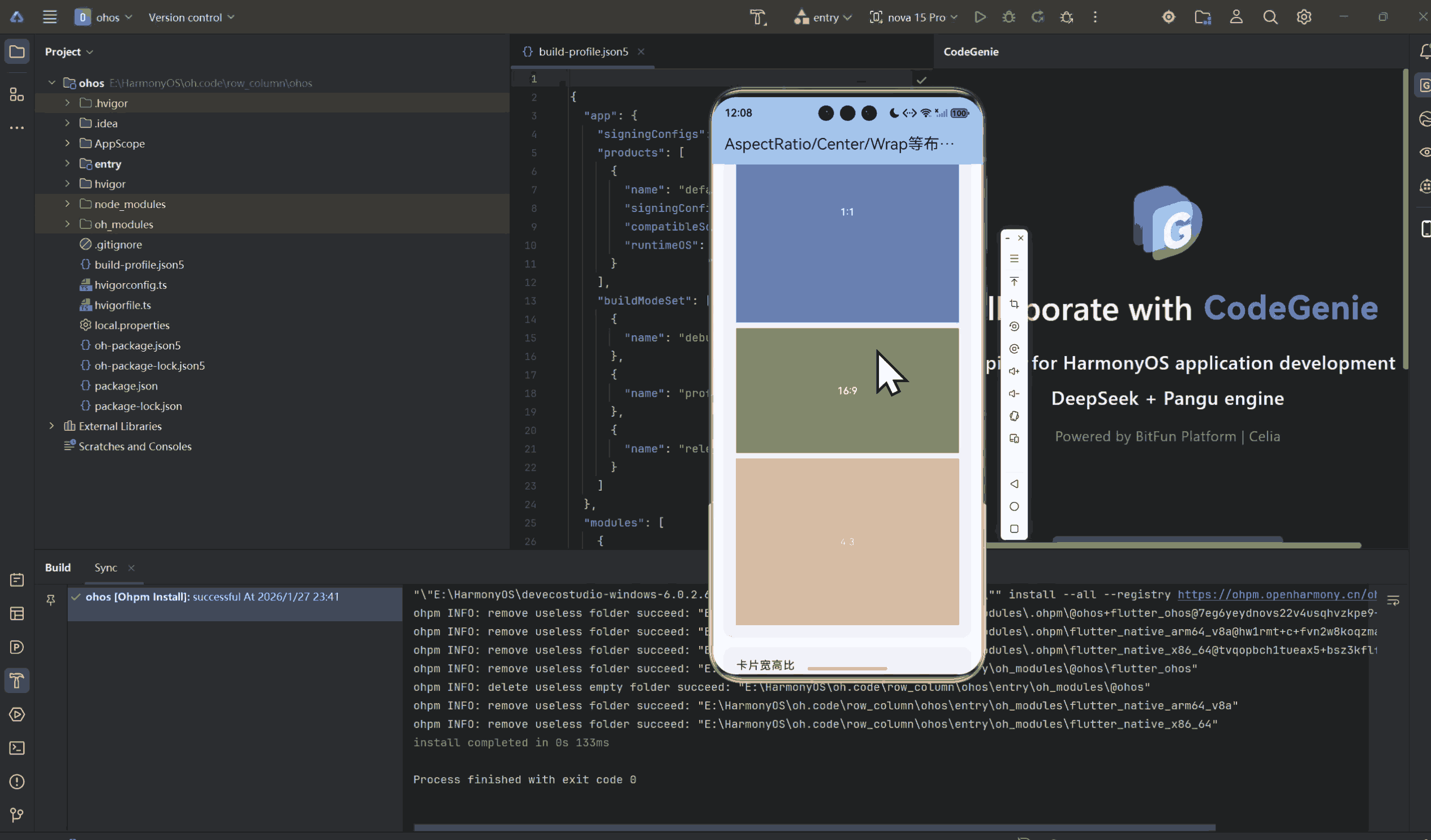
1.1 基础用法
dart
class BasicAspectRatio extends StatelessWidget {
  const BasicAspectRatio({super.key});

  @override
  Widget build(BuildContext context) {
    return Column(
      children: [
        // 1:1正方形
        AspectRatio(
          aspectRatio: 1.0,
          child: Container(
            color: Colors.blue,
            child: Center(
              child: Text('1:1'),
            ),
          ),
        ),

        // 16:9宽屏
        AspectRatio(
          aspectRatio: 16 / 9,
          child: Container(
            color: Colors.green,
            child: Center(
              child: Text('16:9'),
            ),
          ),
        ),

        // 4:3传统比例
        AspectRatio(
          aspectRatio: 4 / 3,
          child: Container(
            color: Colors.orange,
            child: Center(
              child: Text('4:3'),
            ),
          ),
        ),
      ],
    );
  }
}
1.2 图片保持宽高比
dart
class ImageAspectRatio extends StatelessWidget {
  const ImageAspectRatio({super.key});

  @override
  Widget build(BuildContext context) {
    return Column(
      children: [
        // 使用AspectRatio保持图片比例
        AspectRatio(
          aspectRatio: 16 / 9,
          child: Image.network(
            'https://flutter.dev/images/flutter-logo-sharing.png',
            fit: BoxFit.cover,
          ),
        ),
      ],
    );
  }
}
1.3 卡片宽高比
dart
class CardAspectRatio extends StatelessWidget {
  const CardAspectRatio({super.key});

  @override
  Widget build(BuildContext context) {
    return GridView.count(
      crossAxisCount: 2,
      children: List.generate(10, (index) {
        return Card(
          child: Column(
            children: [
              // 图片保持16:9
              AspectRatio(
                aspectRatio: 16 / 9,
                child: Container(
                  decoration: BoxDecoration(
                    color: Colors.primaries[index % Colors.primaries.length],
                    borderRadius: BorderRadius.vertical(
                      top: Radius.circular(12),
                    ),
                  ),
                ),
              ),
              // 内容
              Padding(
                padding: EdgeInsets.all(8),
                child: Text('卡片 $index'),
              ),
            ],
          ),
        );
      }),
    );
  }
}
二、Center居中
2.1 基础Center
dart
class BasicCenter extends StatelessWidget {
  const BasicCenter({super.key});

  @override
  Widget build(BuildContext context) {
    return Center(
      child: Container(
        color: Colors.blue,
        width: 100,
        height: 100,
      ),
    );
  }
}
2.2 Center vs Align
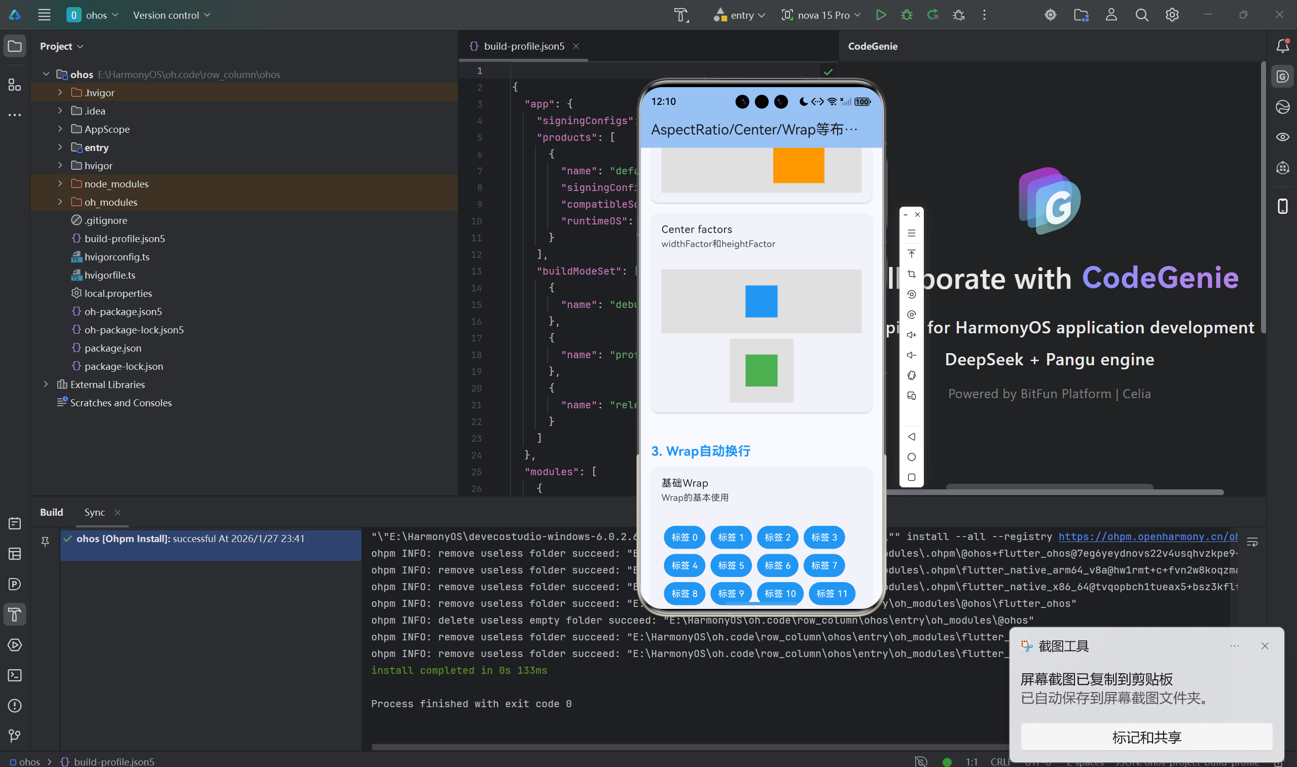
dart
class CenterVsAlign extends StatelessWidget {
  const CenterVsAlign({super.key});

  @override
  Widget build(BuildContext context) {
    return Column(
      children: [
        // Center居中
        Container(
          height: 200,
          color: Colors.grey,
          child: Center(
            child: Container(
              color: Colors.blue,
              width: 100,
              height: 100,
            ),
          ),
        ),

        // Align居中
        Container(
          height: 200,
          color: Colors.grey,
          child: Align(
            alignment: Alignment.center,
            child: Container(
              color: Colors.green,
              width: 100,
              height: 100,
            ),
          ),
        ),

        // Align自定义位置
        Container(
          height: 200,
          color: Colors.grey,
          child: Align(
            alignment: Alignment(0.5, -0.5),
            child: Container(
              color: Colors.orange,
              width: 100,
              height: 100,
            ),
          ),
        ),
      ],
    );
  }
}
2.3 Center widthFactor和heightFactor
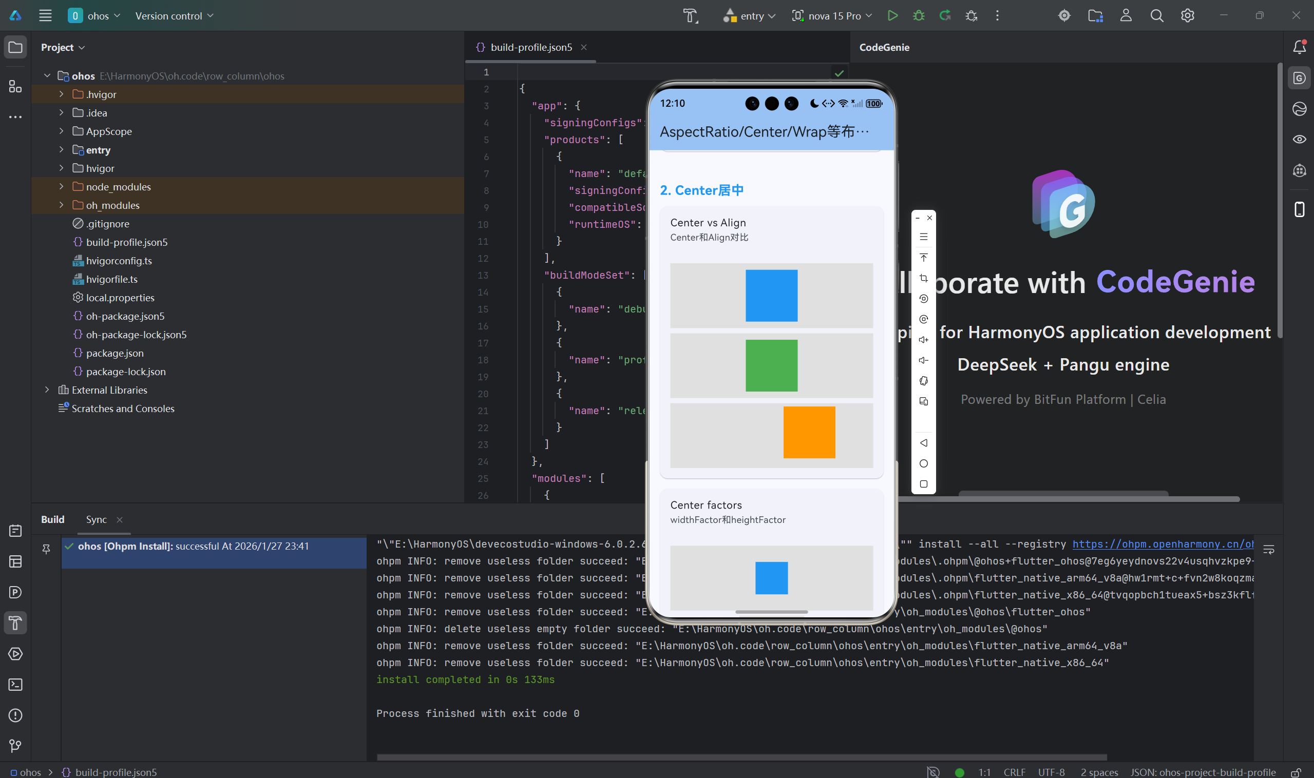
dart
class CenterFactors extends StatelessWidget {
  const CenterFactors({super.key});

  @override
  Widget build(BuildContext context) {
    return Column(
      children: [
        // 默认Center
        Container(
          height: 150,
          color: Colors.grey,
          child: Center(
            child: Container(color: Colors.blue, width: 50, height: 50),
          ),
        ),

        // 设置widthFactor和heightFactor
        Container(
          height: 150,
          color: Colors.grey,
          child: Center(
            widthFactor: 2,
            heightFactor: 2,
            child: Container(color: Colors.green, width: 50, height: 50),
          ),
        ),
      ],
    );
  }
}
三、Wrap自动换行
3.1 基础Wrap
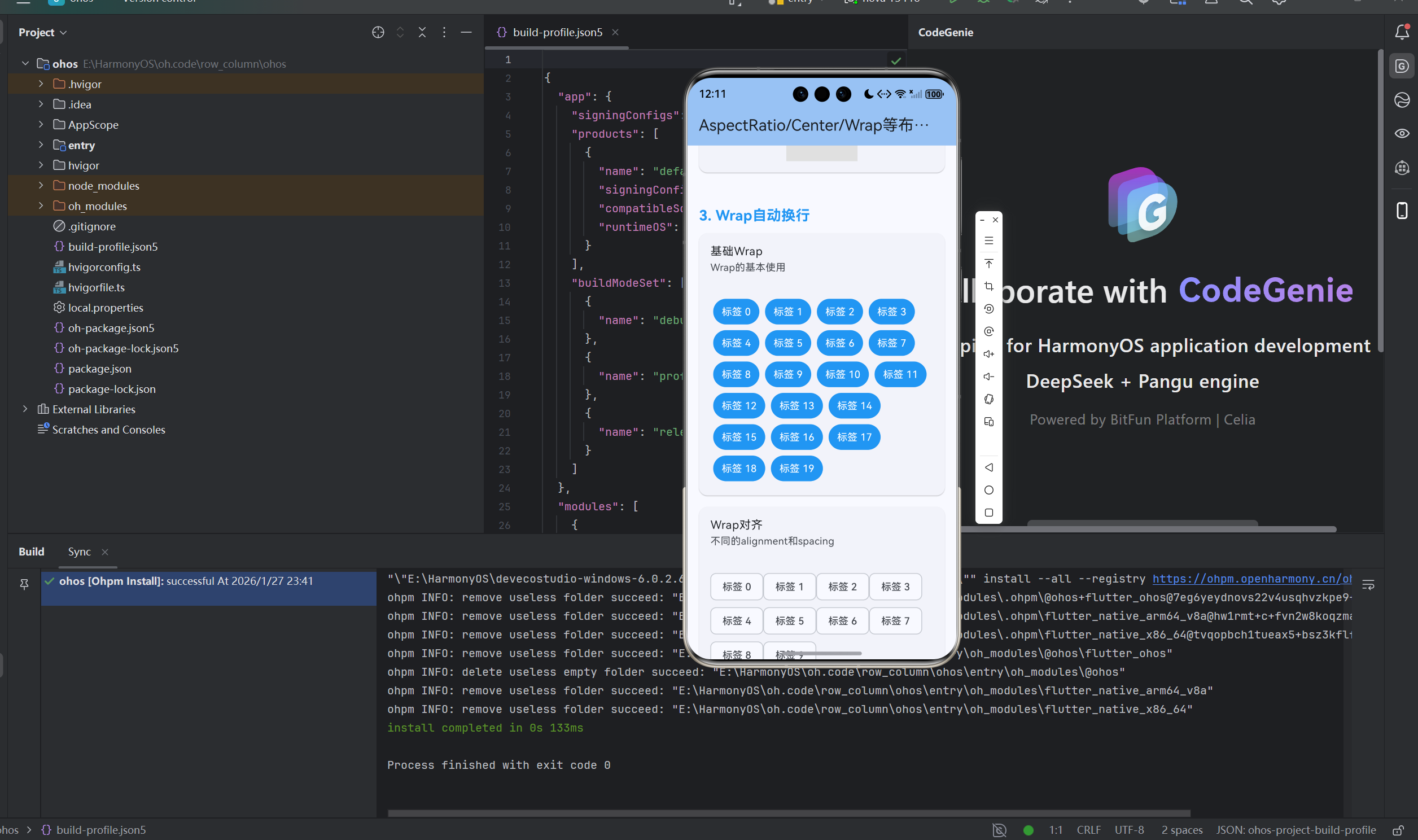
dart
class BasicWrap extends StatelessWidget {
  const BasicWrap({super.key});

  @override
  Widget build(BuildContext context) {
    return Wrap(
      children: List.generate(20, (index) {
        return Container(
          margin: EdgeInsets.all(4),
          padding: EdgeInsets.symmetric(horizontal: 12, vertical: 8),
          decoration: BoxDecoration(
            color: Colors.blue,
            borderRadius: BorderRadius.circular(20),
          ),
          child: Text(
            '标签 $index',
            style: TextStyle(color: Colors.white),
          ),
        );
      }),
    );
  }
}
3.2 Wrap方向和对齐
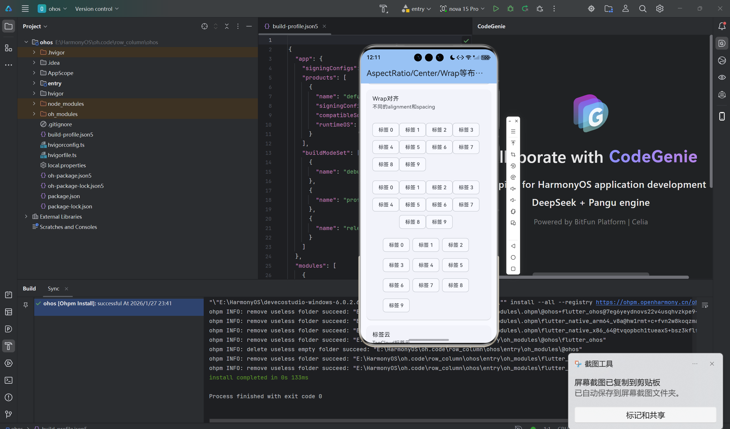
dart
class WrapAlignment extends StatelessWidget {
  const WrapAlignment({super.key});

  @override
  Widget build(BuildContext context) {
    return Column(
      children: [
        // 水平排列,自动换行
        Wrap(
          direction: Axis.horizontal,
          alignment: WrapAlignment.start,
          children: _chips(),
        ),

        // 水平居中
        Wrap(
          alignment: WrapAlignment.center,
          children: _chips(),
        ),

        // 水平两端对齐
        Wrap(
          alignment: WrapAlignment.spaceBetween,
          children: _chips(),
        ),

        // 垂直排列
        Wrap(
          direction: Axis.vertical,
          children: _chips(),
        ),
      ],
    );
  }

  List<Widget> _chips() {
    return List.generate(10, (index) {
      return Chip(label: Text('标签 $index'));
    });
  }
}
3.3 Wrap间距
dart
class WrapSpacing extends StatelessWidget {
  const WrapSpacing({super.key});

  @override
  Widget build(BuildContext context) {
    return Wrap(
      spacing: 8, // 主轴间距
      runSpacing: 8, // 交叉轴间距
      children: List.generate(20, (index) {
        return Container(
          width: 80,
          height: 80,
          decoration: BoxDecoration(
            color: Colors.primaries[index % Colors.primaries.length],
            borderRadius: BorderRadius.circular(8),
          ),
          child: Center(
            child: Text(
              '$index',
              style: TextStyle(color: Colors.white),
            ),
          ),
        );
      }),
    );
  }
}
3.4 标签云
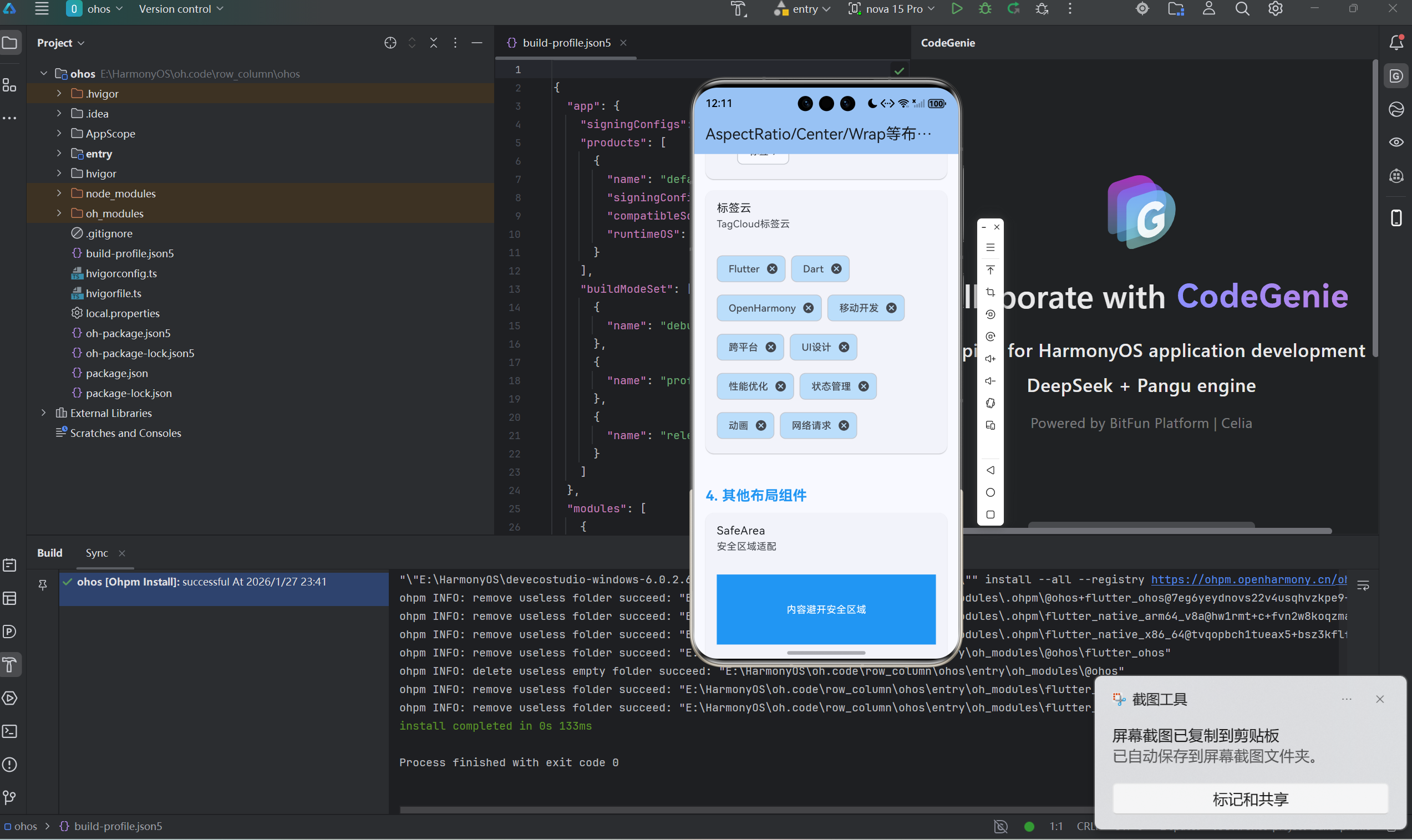
dart
class TagCloud extends StatelessWidget {
  const TagCloud({super.key});

  final List<String> tags = const [
    'Flutter', 'Dart', 'OpenHarmony', '移动开发', '跨平台',
    'UI设计', '性能优化', '状态管理', '动画', '网络请求',
  ];

  @override
  Widget build(BuildContext context) {
    return Wrap(
      spacing: 8,
      runSpacing: 8,
      children: tags.map((tag) {
        return Chip(
          label: Text(tag),
          onDeleted: () {},
          backgroundColor: Colors.blue.shade100,
        );
      }).toList(),
    );
  }
}
四、其他布局组件
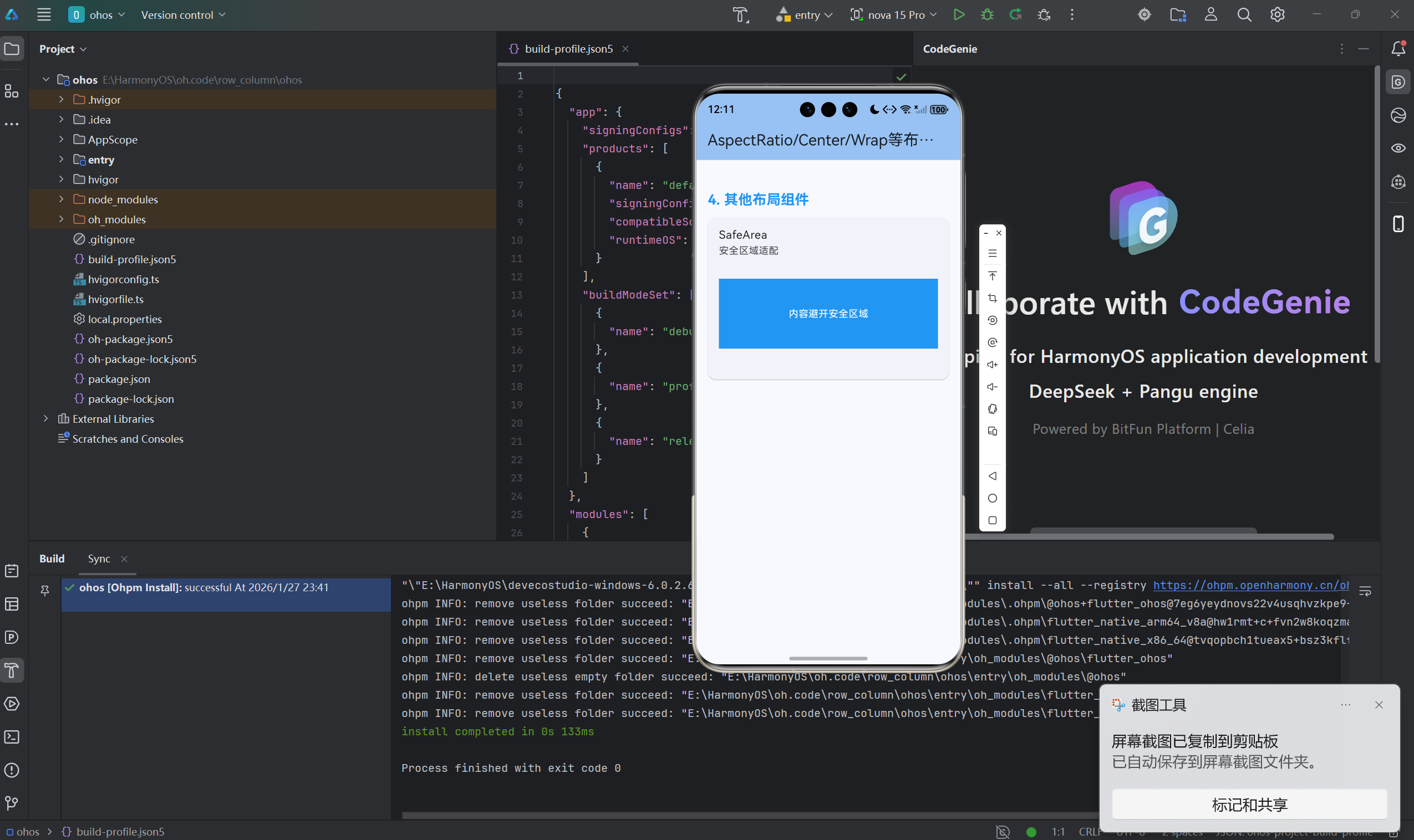
4.1 SafeArea安全区域
dart
class SafeAreaDemo extends StatelessWidget {
  const SafeAreaDemo({super.key});

  @override
  Widget build(BuildContext context) {
    return SafeArea(
      child: Container(
        color: Colors.blue,
        child: Center(
          child: Text('内容避开安全区域'),
        ),
      ),
    );
  }
}
4.2 Expanded和Flexible
dart
class ExpandedFlexible extends StatelessWidget {
  const ExpandedFlexible({super.key});

  @override
  Widget build(BuildContext context) {
    return Column(
      children: [
        // Expanded占满剩余空间
        Expanded(
          flex: 1,
          child: Container(color: Colors.red),
        ),
        Expanded(
          flex: 2,
          child: Container(color: Colors.green),
        ),

        // Flexible根据子Widget大小
        Flexible(
          flex: 1,
          child: Container(
            color: Colors.blue,
            width: 100,
          ),
        ),
      ],
    );
  }
}
4.3 Overflow溢出处理
dart
class OverflowHandling extends StatelessWidget {
  const OverflowHandling({super.key});

  @override
  Widget build(BuildContext context) {
    return Column(
      children: [
        // OverflowBox允许子Widget溢出
        Container(
          height: 100,
          color: Colors.grey,
          child: OverflowBox(
            maxHeight: 150,
            child: Container(
              height: 150,
              color: Colors.red,
            ),
          ),
        ),

        // SizedOverflowBox
        Container(
          color: Colors.grey,
          child: SizedOverflowBox(
            size: Size(100, 100),
            child: Container(
              width: 150,
              height: 150,
              color: Colors.blue,
            ),
          ),
        ),
      ],
    );
  }
}
4.4 IndexedStack
dart
class IndexedStackDemo extends StatefulWidget {
  const IndexedStackDemo({super.key});

  @override
  State<IndexedStackDemo> createState() => _IndexedStackDemoState();
}

class _IndexedStackDemoState extends State<IndexedStackDemo> {
  int _index = 0;

  @override
  Widget build(BuildContext context) {
    return Column(
      children: [
        SizedBox(
          height: 200,
          child: IndexedStack(
            index: _index,
            children: [
              Container(color: Colors.red, child: Center(child: Text('页面1'))),
              Container(color: Colors.green, child: Center(child: Text('页面2'))),
              Container(color: Colors.blue, child: Center(child: Text('页面3'))),
            ],
          ),
        ),
        Row(
          mainAxisAlignment: MainAxisAlignment.spaceAround,
          children: [
            ElevatedButton(
              onPressed: () => setState(() => _index = 0),
              child: Text('1'),
            ),
            ElevatedButton(
              onPressed: () => setState(() => _index = 1),
              child: Text('2'),
            ),
            ElevatedButton(
              onPressed: () => setState(() => _index = 2),
              child: Text('3'),
            ),
          ],
        ),
      ],
    );
  }
}
4.5 Transform变换
dart
class TransformDemo extends StatelessWidget {
  const TransformDemo({super.key});

  @override
  Widget build(BuildContext context) {
    return Row(
      mainAxisAlignment: MainAxisAlignment.spaceAround,
      children: [
        // 旋转
        Transform.rotate(
          angle: 0.5,
          child: Container(color: Colors.red, width: 80, height: 80),
        ),

        // 缩放
        Transform.scale(
          scale: 1.5,
          child: Container(color: Colors.green, width: 50, height: 50),
        ),

        // 平移
        Transform.translate(
          offset: Offset(20, 20),
          child: Container(color: Colors.blue, width: 60, height: 60),
        ),
      ],
    );
  }
}
4.6 LayoutBuilder响应式布局
dart
class LayoutBuilderDemo extends StatelessWidget {
  const LayoutBuilderDemo({super.key});

  @override
  Widget build(BuildContext context) {
    return LayoutBuilder(
      builder: (context, constraints) {
        if (constraints.maxWidth > 600) {
          return _buildWideLayout();
        } else {
          return _buildNarrowLayout();
        }
      },
    );
  }

  Widget _buildWideLayout() {
    return Row(
      children: [
        Expanded(child: Container(color: Colors.red, height: 100)),
        Expanded(child: Container(color: Colors.green, height: 100)),
      ],
    );
  }

  Widget _buildNarrowLayout() {
    return Column(
      children: [
        Container(color: Colors.red, height: 100),
        Container(color: Colors.green, height: 100),
      ],
    );
  }
}
总结
各种布局组件都有其适用场景。
核心要点:
- AspectRatio保持宽高比
- Center快速居中
- Wrap自动换行
- SafeArea避开安全区域
- LayoutBuilder响应式布局
最佳实践:
- 图片用AspectRatio保持比例
- Center比Align.center更简洁
- Wrap用于标签等自动换行场景
- SafeArea保护重要内容
- LayoutBuilder做响应式布局
合理选择布局组件让开发更高效。
欢迎加入开源鸿蒙跨平台社区:开源鸿蒙跨平台开发者社区