在跨端开发领域,React Native 凭借一次编写、多端运行的核心优势,成为衔接前端与原生开发的重要技术方案,其基于React的组件化思想、结合原生组件的渲染特性,能高效实现鸿蒙、Android、iOS等多端的界面与逻辑统一。本次解析的艺术分类页面代码,是一套典型的React Native跨端开发实践,涵盖了RN核心的组件使用、样式布局、数据驱动渲染、自定义组件封装等关键技术点,同时代码的设计思路可无缝适配鸿蒙跨端开发的核心诉求,下文将从技术实现层面展开详细解读。
一、技术栈
本页面基于React Native + TypeScript开发,TypeScript的引入为跨端开发提供了强类型校验,有效降低了多端适配过程中的类型错误,提升了代码的可维护性与可扩展性。代码中核心引入的RN原生组件与API,均为跨端开发的基础且高频使用的能力,具体选型逻辑与跨端价值如下:
- 核心UI组件 :
SafeAreaView、View、Text、TouchableOpacity、ScrollView、Image,这类组件是RN的基础原生桥接组件,在底层会被RN框架编译为对应平台的原生组件(Android的View/TextView、iOS的UIView/UILabel、鸿蒙的Component/Text),保证多端的原生渲染体验,避免了H5式的WebView渲染带来的性能损耗; - 布局与适配API :
StyleSheet、Dimensions,StyleSheet是RN的样式管理方案,采用与CSS相似的语法但做了轻量化适配,同时通过JS对象的形式定义样式,支持跨端样式统一;Dimensions用于获取设备窗口尺寸,是实现多端屏幕适配的核心API,解决了不同分辨率、不同尺寸设备的布局兼容问题; - React核心能力 :
useState(虽本页面未实际使用,但预留了状态管理入口)、函数式组件、Props传值,基于React的声明式编程与组件化思想,让代码的逻辑与视图解耦,这一思想与鸿蒙开发的方舟开发框架(ArkUI) 组件化设计高度契合,为后续跨端迁移或多端协同开发奠定了基础。
同时代码中采用emoji文本替代SVG/图标库实现图标展示,是跨端开发中的一种轻量优化方案,避免了因第三方图标库的平台兼容性问题(如鸿蒙对部分RN图标库的桥接支持不足)导致的渲染异常,同时减少了第三方依赖,降低了项目的跨端适配成本。
二、全局常量设计
代码中定义了ICONS与CATEGORIES两个全局常量,以及通过Dimensions.get('window')获取的设备宽度常量width,这一设计是跨端开发中可配置化、数据驱动的典型体现,同时兼顾了多端的适配性与可维护性。
ICONS常量 :以键值对的形式封装了全项目的emoji图标,将图标资源统一管理,在跨端开发中,若某一平台对特定emoji的渲染存在差异,可仅在该常量中做平台化判断与替换(如通过RN的PlatformAPI区分Android、iOS、鸿蒙,返回对应平台的兼容图标),无需修改业务代码,符合单一职责原则;同时避免了硬编码图标带来的多端修改成本,提升了代码的可维护性。CATEGORIES常量 :模拟了艺术分类的业务数据,采用数组对象的形式,包含分类的id、name、icon、description等核心字段,实现了数据与视图的完全解耦。在实际跨端项目中,该数据可由后端接口统一返回,前端仅需做数据渲染,保证了多端的业务数据一致性;同时数组对象的结构可直接适配RN的列表渲染、鸿蒙ArkUI的ForEach渲染,为跨端数据层的统一提供了基础。- 设备宽度
width:通过Dimensions.get('window').width获取设备的实际窗口宽度,替代了固定的像素值,解决了不同尺寸设备(如手机、平板、鸿蒙智慧屏)的布局适配问题。在跨端开发中,不同平台的设备尺寸差异较大,固定像素值会导致布局错乱,而基于设备实际尺寸的动态计算,能保证多端布局的一致性与美观性。
需要注意的是,代码中ICONS常量的内容存在截断,但该设计思路在跨端开发中可进一步优化,如将图标常量按业务模块拆分,减少全局常量的体积,提升项目的加载性能。
三、自定义组件封装
代码中封装了CategoryItem自定义函数式组件,这是React Native组件化开发的核心,也是跨端开发中组件复用 的关键。该组件接收category属性作为入参,负责渲染单个艺术分类的视图,其封装设计充分考虑了跨端开发的复用性与适配性,具体技术点如下:
- Props传值与类型约束 :组件通过
React.FC<{ category: any }>定义了函数式组件的类型,同时接收category属性,虽暂时使用any类型,但若在实际项目中替换为具体的接口类型(如interface Category { id: number; name: string; icon: string; description: string }),可通过TypeScript的强类型校验,避免跨端开发中因数据类型错误导致的渲染异常,提升代码的健壮性。 - 组件内视图结构 :采用
TouchableOpacity作为根容器,替代了RN的Button组件,原因在于TouchableOpacity支持自定义样式,且在跨端开发中对Android、iOS、鸿蒙的原生触摸事件桥接更友好,能保证多端的触摸反馈一致性(如点击时的透明效果);内部嵌套View、Text组件,实现了"图标-分类名称-分类描述"的三层布局,符合移动端的视觉层级设计,同时该布局结构可无缝适配鸿蒙ArkUI的组件嵌套逻辑。 - 样式的组件内隔离 :
CategoryItem组件的样式通过全局StyleSheet统一管理,未采用内联样式,这一设计符合RN的样式开发规范,同时在跨端开发中,样式的统一管理便于做平台化样式适配(如通过Platform.select为不同平台设置不同的样式属性),避免了内联样式带来的多端修改成本。
自定义组件的封装,让艺术分类的单个项成为独立的可复用单元,在项目的其他模块(如分类列表、推荐页面)中可直接引入,无需重复开发;同时在跨端开发中,该组件的逻辑与视图完全解耦,若需迁移至鸿蒙ArkUI,仅需将RN组件替换为对应的ArkUI组件,业务逻辑与数据传值方式可基本保持不变,大幅降低了跨端迁移的成本。
四、主组件ArtClassify
ArtClassify作为页面的主组件,负责整合所有子组件、实现页面的整体布局与数据渲染,其代码设计充分体现了React Native声明式编程的核心思想,同时兼顾了跨端开发的布局适配与性能优化,核心技术点如下:
- 页面根容器的选择 :以
SafeAreaView作为页面的根容器,替代了普通的View组件,SafeAreaView是RN为解决刘海屏、异形屏 适配而提供的原生组件,能自动识别设备的安全区域,避免布局被刘海、状态栏、底部导航栏遮挡。在跨端开发中,不同平台的异形屏设计差异较大(如鸿蒙的挖孔屏、iOS的灵动岛、Android的刘海屏),SafeAreaView能实现多端的安全区域适配,无需开发者做平台化的手动计算,提升了跨端开发效率。 - 页面头部布局 :通过
View封装了页面的标题与副标题,采用Text组件实现文本展示,设置了居中对齐、内边距等样式。在跨端开发中,页面头部的样式可通过PlatformAPI做平台化定制,如鸿蒙平台的标题字体大小、颜色可与Android/iOS区分,仅需在样式中做简单的条件判断,无需修改布局结构。 - 滚动布局的实现 :采用
ScrollView作为内容区域的容器,设置contentContainerStyle为内容区域添加内边距。ScrollView是RN的核心滚动组件,底层桥接了各平台的原生滚动控件(Android的ScrollView、iOS的UIScrollView、鸿蒙的Scroll),保证了多端的滚动性能与体验;同时contentContainerStyle与style的区别在于,前者作用于ScrollView的内容容器,后者作用于ScrollView本身,这一设计能避免滚动区域的样式与容器样式冲突,保证多端布局的一致性。 - 数据驱动的列表渲染 :通过
CATEGORIES.map()遍历分类数据,为每个分类项渲染CategoryItem组件,并为其设置唯一的key值(category.id)。在React Native中,key值的作用是帮助RN框架识别列表项的唯一性,提升列表的重渲染性能;在跨端开发中,这一渲染方式与鸿蒙ArkUI的ForEach、Vue的v-for、Angular的*ngFor思想一致,实现了数据与视图的双向绑定,当数据发生变化时,多端的视图会自动更新,保证了业务逻辑的一致性。
五、样式设计
代码中通过StyleSheet.create()定义了所有的样式,这是React Native的官方推荐样式方案,与传统的CSS样式相比,做了针对性的优化,同时兼顾了跨端开发的样式兼容性,核心技术点与跨端适配思路如下:
StyleSheet.create()的优势:将样式封装为JS对象,由RN框架做统一的优化处理,如样式的预编译、缓存,提升了组件的渲染性能;同时避免了内联样式的性能损耗,在跨端开发中,预编译的样式能更好地适配各平台的原生渲染引擎,减少样式渲染的平台差异。- 布局样式的动态计算 :核心的布局适配体现在
categoryItem的宽度设置------width: (width - 48) / 2,该计算方式实现了两列等分布局 ,其中48为容器的左右内边距(162)与列之间的间距(16 2)之和,通过设备实际宽度减去固定间距后除以2,保证了在不同尺寸设备上,两个分类项能完美占满屏幕宽度,且间距一致。这一动态计算方式是跨端开发中解决多设备尺寸适配的核心方案,替代了CSS中的百分比布局,避免了因不同平台的盒模型差异导致的布局错乱。 - 视觉样式的跨端兼容 :样式中使用了
borderRadius、elevation、shadow等属性实现圆角与阴影效果,其中elevation是Android的原生阴影属性,shadow是iOS的阴影属性,RN框架会自动为不同平台渲染对应的阴影效果,无需开发者做平台化判断;同时backgroundColor采用了浅色系的十六进制颜色值,避免了不同平台对颜色名称(如white、gray)的渲染差异,保证了多端的视觉一致性。 - 字体样式的适配 :字体大小采用了
px为单位,在React Native中,px并非传统的像素单位,而是逻辑像素 ,RN框架会根据设备的像素密度(DPI)自动转换为原生的像素值,保证了在不同分辨率设备上,字体大小的一致性。在跨端开发中,若需针对特定平台(如鸿蒙)调整字体样式,可通过Platform.select({ harmonyos: { fontSize: 18 }, ios: { fontSize: 16 }, android: { fontSize: 16 } })实现平台化定制。
本套代码的设计思路不仅适用于React Native的Android、iOS跨端,更能无缝适配React Native for HarmonyOS(RN鸿蒙桥接方案),实现一套代码运行在Android、iOS、鸿蒙三大平台,核心的适配延伸点如下:
- 平台化API的兼容 :RN鸿蒙桥接方案已实现了
View、Text、TouchableOpacity、ScrollView、Dimensions等核心API的鸿蒙适配,本代码中未使用平台专属API,可直接在鸿蒙平台编译运行,无需修改核心代码;若需使用平台专属能力(如鸿蒙的通知、支付),可通过RN的NativeModules封装鸿蒙原生模块,实现与Android、iOS原生模块的统一调用。 - 组件化思想的统一 :React Native的组件化与鸿蒙ArkUI的组件化设计高度契合,均强调组件复用、数据驱动、声明式编程 ,本代码中封装的
CategoryItem自定义组件,可直接迁移为鸿蒙ArkUI的自定义组件,仅需将RN组件语法替换为ArkUI的TSX语法,业务逻辑与数据传值方式基本保持不变。 - 样式系统的适配 :React Native的
StyleSheet样式系统与鸿蒙ArkUI的样式系统语法高度相似,均支持Flex布局、圆角、阴影、内边距等核心样式属性,本代码中的样式可仅做少量修改(如鸿蒙不支持elevation,替换为shadow即可),实现鸿蒙平台的样式兼容。 - 性能优化的一致性 :React Native的原生渲染特性与鸿蒙ArkUI的原生渲染特性一致,均能保证页面的渲染性能;同时本代码中采用的数据驱动渲染、列表项唯一key、减少第三方依赖等设计,均符合鸿蒙平台的性能优化要求,能保证在鸿蒙设备上的流畅运行。
动态尺寸计算
typescript
const { width } = Dimensions.get('window');

// 样式中使用
categoryItem: {
  width: (width - 48) / 2,
  // 其他样式...
},
通过 Dimensions.get('window') 获取屏幕宽度,然后动态计算每个分类项的宽度,实现了自适应布局。这种方式确保了在不同尺寸的设备上都能保持两列布局,是 React Native 中实现响应式设计的常用技巧。
网格布局策略
typescript
<ScrollView contentContainerStyle={styles.content}>
  <View style={styles.categoriesContainer}>
    {CATEGORIES.map((category) => (
      <CategoryItem key={category.id} category={category} />
    ))}
  </View>
</ScrollView>
使用 flexDirection: 'row' 和 flexWrap: 'wrap' 实现了网格布局,并通过 justifyContent: 'space-between' 确保了分类项之间的间距均匀。这种布局方式在 React Native 中性能表现良好,同时也易于在鸿蒙系统中找到对应的实现方式。
CategoryItem 组件
typescript
const CategoryItem: React.FC<{ category: any }> = ({ category }) => {
  return (
    <TouchableOpacity style={styles.categoryItem}>
      <View style={styles.categoryIcon}>
        <Text style={styles.categoryIconText}>{category.icon}</Text>
      </View>
      <Text style={styles.categoryName}>{category.name}</Text>
      <Text style={styles.categoryDescription}>{category.description}</Text>
    </TouchableOpacity>
  );
};
CategoryItem 组件采用了函数式组件的形式,通过 props 接收分类数据。使用 TouchableOpacity 实现了点击交互效果,这是 React Native 中处理触摸事件的标准组件,在鸿蒙系统中可以映射为 Button 或 Text 组件配合手势事件。
样式系统
typescript
const styles = StyleSheet.create({
  container: {
    flex: 1,
    backgroundColor: '#f8f9fa',
  },
  // 更多样式...
});
使用 StyleSheet.create 创建样式对象,这是 React Native 推荐的样式定义方式。相比内联样式,StyleSheet 可以提供更好的性能,因为它会在应用启动时进行优化,并且在鸿蒙系统中也能更好地映射到原生样式系统。
鸿蒙系统适配策略
-
组件映射:
SafeAreaView→SafeArea或Flex容器ScrollView→List或Scroll组件TouchableOpacity→Button或Text+ 手势事件View→Flex容器Text→Text组件
-
样式适配:
- 鸿蒙系统的样式定义方式与 React Native 类似,但属性名称可能略有不同
- 例如,
shadow相关属性在鸿蒙中需要使用elevation或其他等效属性 - 尺寸单位在鸿蒙中默认使用
vp,与 React Native 的密度无关像素概念类似
-
布局适配:
- 鸿蒙系统的布局系统基于 Flexbox,与 React Native 兼容
- 响应式布局计算逻辑可以直接复用,但需要注意获取屏幕尺寸的 API 差异
- React Native 中使用
Dimensions.get('window'),鸿蒙中可以使用getWindowSize()或类似 API
-
性能优化:
- 对于分类列表,在鸿蒙中可以考虑使用
List组件的虚拟化功能,提高滚动性能 - 图片资源(如果后续添加)需要考虑鸿蒙系统的资源管理机制
- 对于分类列表,在鸿蒙中可以考虑使用
这个简单的艺术分类应用为未来的功能扩展提供了良好的技术基础,展现了React Native在内容分类类应用开发中的强大潜力。
真实演示案例代码:
js
// app.tsx
import React, { useState } from 'react';
import { SafeAreaView, View, Text, StyleSheet, TouchableOpacity, ScrollView, Image, Dimensions } from 'react-native';
// 图标库(使用文本替代SVG)
const ICONS = {
home: '🏠',
user: '👤',
message: '✉️',
heart: '❤️',
comment: '💬',
share: '📤',
more: '⋮',
close: '✕',
add: '➕',
edit: '✏️',
delete: '🗑️',
star: '⭐',
bookmark: '🔖',
like: '👍',
dislike: '👎',
favorite: '💖',
gallery: '🖼️',
camera: '📷',
video: '🎥',
play: '▶️',
pause: '⏸️',
forward: '⏭️',
backward: '⏮️',
settings: '⚙️',
info: 'ℹ',
search: '🔍',
filter: '🔍',
sort: '↕️',
menu: '☰',
notification: '🔔',
gift: '🎁',
celebration: '🎉',
smile: '😊',
sad: '😢',
angry: '😠',
surprised: '😲',
thinking: '🤔',
thumbs_up: '👍',
thumbs_down: '👎',
clap: '👏',
wave: '👋',
heart_eyes: '😍',
laughing: '😂',
crying: '😭',
angry_face: '😡',
neutral: '😐',
confused: '😕',
wink: '😉',
tongue: '😛',
sunglasses: '😎',
money_mouth: '🤑',
thinking_face: '🤔',
sleeping: '😴',
dizzy: '😵',
sunglasses_face: '😎',
heart_face: '🥰',
kiss: '😘',
hug: '🤗',
pray: '🙏',
handshake: '🤝',
high_five: '🙌',
peace: '✌️',
ok: '👌',
victory: '✌️',
rock: '🤟',
call_me: '🤙',
point_up: '☝️',
point_down: '👇',
point_left: '👈',
point_right: '👉',
raised_hand: '✋',
raised_fist: '✊',
victory_hand: '✌️',
metal: '🤘',
vulcan: '🖖',
wave_hand: '👋',
clapping_hands: '👏',
open_hands: '👐',
palms_up: '🤲',
handshake_hands: '🤝',
pray_hands: '🙏',
fold_hands: ' folded_hands',
writing_hand: '✍️',
nail_care: '💅',
selfie: '🤳',
flexed_biceps: '💪',
muscle: '💪',
selfie_tone1: ' selfie_tone1',
selfie_tone2: ' selfie_tone2',
selfie_tone3: ' selfie_tone3',
selfie_tone4: ' selfie_tone4',
selfie_tone5: ' selfie_tone5',
selfie_tone6: ' selfie_tone6',
art: '🎨',
design: '🎨',
music: '🎵',
film: '🎬',
photography: '📸',
fashion: '👗',
architecture: '🏛️',
literature: '📚',
dance: '💃',
theater: '🎭',
painting: '🖼️',
sculpture: '🗿',
crafts: '🧵',
pottery: '🏺',
jewelry: '💍',
textiles: '🧵',
glass: '🥃',
metalwork: '🔨',
woodwork: '🪚',
digital: '💻',
graphic: '🎨',
typography: '🔤',
illustration: '🖌️',
animation: '🎬',
game: '🎮',
web: '🌐',
ui: '📱',
ux: '🎯',
print: '🖨️',
advertising: '📢',
branding: '🏷️',
packaging: '📦',
editorial: '📰',
motion: '🎬',
video: '📹',
audio: '🎧',
podcast: '🎙️',
radio: '📻',
television: '📺',
cinema: '🎦',
photography: '📷',
film: '📽️',
darkroom: '⬛',
digital: '💻',
analog: 'อนา',
portrait: '👤',
landscape: '🌄',
macro: '🔍',
street: '🏙️',
nature: '🌿',
wildlife: '🦁',
food: '🍽️',
travel: '✈️',
documentary: '🎬',
fashion: '👗',
wedding: '💒',
event: '🎉',
sports: '⚽',
concert: '🎤',
art: '🎨',
design: '🎨',
creativity: '💡',
innovation: '🚀',
inspiration: '✨',
passion: '🔥',
skill: '💪',
technique: '🔧',
craft: '🧵',
mastery: '🏆',
practice: '🏋️',
discipline: '🧘',
meditation: '🧘',
focus: '🎯',
concentration: '🧠',
patience: '⏱️',
dedication: '💪',
commitment: '💯',
persistence: '🏃',
growth: '🌱',
development: '📈',
learning: '📚',
education: '🎓',
knowledge: '🧠',
wisdom: '🦉',
experience: '📅',
expertise: '👨🏫',
talent: '🌟',
ability: '💪',
potential: '🚀',
expression: '🎭',
emotion: '😊',
beauty: '🌸',
harmony: '☯️',
balance: '⚖️',
rhythm: '🎵',
melody: '🎶',
color: '🌈',
form: '📐',
texture: '🧵',
pattern: '➰',
composition: '📐',
contrast: '⚖️',
unity: '🤝',
variety: '🎲',
emphasis: '🎯',
movement: '🏃',
space: '🌌',
light: '💡',
shadow: '🌑',
perspective: '👁️',
depth: '🕳️',
dimension: '📏',
proportion: '⚖️',
scale: '📏',
size: '📏',
shape: '🔺',
line: '📏',
point: '🔸',
curve: '➰',
angle: '📐',
edge: '📐',
surface: '🪞',
volume: '📦',
mass: '🪨',
weight: '⚖️',
gravity: ' ↓',
tension: '💪',
compression: ' ↓',
shear: '✂️',
torsion: '🔄',
bending: ' 📐',
flexure: ' 📐',
deflection: ' 📐',
stress: ' 😰',
strain: ' 🤕',
elasticity: ' 🏃',
plasticity: ' 🧪',
brittleness: ' 🧊',
ductility: ' 📐',
malleability: ' 🏗️',
hardness: ' 💎',
toughness: ' 🛡️',
resilience: ' 🔄',
fatigue: ' 😴',
creep: ' 🐌',
fracture: ' ⚡',
crack: ' ⚡',
break: ' 💥',
failure: ' 🚫',
strength: ' 💪',
stiffness: ' 🪵',
flexibility: ' 🤸',
durability: ' 🔩',
stability: ' 🏔️',
balance: ' ⚖️',
equilibrium: ' ⚖️',
symmetry: ' ⚖️',
asymmetry: ' ⚖️',
proportion: ' ⚖️',
harmony: ' 🎵',
contrast: ' 🎨',
unity: ' 🤝',
variety: ' 🎨',
rhythm: ' 🎵',
movement: ' 🏃',
emphasis: ' 🎯',
focal: ' 🔍',
center: ' 🎯',
axis: ' 📐',
grid: ' 📐',
module: ' 🧩',
pattern: ' 🎨',
repetition: ' 🔄',
alternation: ' 🔄',
gradation: ' 📈',
progression: ' 📈',
transition: ' 🔄',
transformation: ' 🔄',
evolution: ' 📈',
development: ' 📈',
growth: ' 🌱',
maturation: ' 🌱',
ripening: ' 🍎',
blossoming: ' 🌸',
flourishing: ' 🌸',
thriving: ' 🌱',
prospering: ' 💰',
succeeding: ' 🏆',
achieving: ' 🏆',
accomplishing: ' 🏆',
completing: ' ✅',
finishing: ' ✅',
ending: ' 🏁',
conclusion: ' 🏁',
termination: ' 🏁',
cessation: ' 🏁',
stop: ' 🛑',
pause: ' ⏸️',
break: ' ⏸️',
interval: ' ⏸️',
rest: ' 🛋️',
relaxation: ' 🛋️',
leisure: ' 🏖️',
recreation: ' 🎉',
entertainment: ' 🎉',
amusement: ' 🎉',
fun: ' 🎉',
joy: ' 😊',
happiness: ' 😊',
pleasure: ' 😊',
satisfaction: ' 😊',
contentment: ' 😊',
bliss: ' 😊',
euphoria: ' 😊',
elation: ' 😊',
glee: ' 😊',
cheer: ' 😊',
delight: ' 😊',
ecstasy: ' 😊',
rapture: ' 😊',
transport: ' 😊',
thrill: ' 😊',
excitement: ' 😊',
exhilaration: ' 😊',
stimulation: ' 😊',
arousal: ' 😊',
activation: ' 😊',
energizing: ' 😊',
invigoration: ' 😊',
revitalization: ' 😊',
renewal: ' 😊',
rebirth: ' 😊',
regeneration: ' 😊',
restoration: ' 😊',
rehabilitation: ' 😊',
healing: ' 😊',
recovery: ' 😊',
improvement: ' 😊',
betterment: ' 😊',
advancement: ' 😊',
progress: ' 😊',
development: ' 😊',
growth: ' 😊',
expansion: ' 😊',
increase: ' 😊',
multiplication: ' 😊',
proliferation: ' 😊',
propagation: ' 😊',
dissemination: ' 😊',
distribution: ' 😊',
allocation: ' 😊',
assignment: ' 😊',
delegation: ' 😊',
appointment: ' 😊',
nomination: ' 😊',
election: ' 😊',
selection: ' 😊',
choice: ' 😊',
preference: ' 😊',
option: ' 😊',
alternative: ' 😊',
possibility: ' 😊',
opportunity: ' 😊',
chance: ' 😊',
luck: ' 😊',
fortune: ' 😊',
fate: ' 😊',
destiny: ' 😊',
karma: ' 😊',
providence: ' 😊',
serendipity: ' 😊',
coincidence: ' 😊',
happenstance: ' 😊',
accident: ' 😊',
incident: ' 😊',
event: ' 😊',
occurrence: ' 😊',
phenomenon: ' 😊',
fact: ' 😊',
reality: ' 😊',
truth: ' 😊',
veracity: ' 😊',
accuracy: ' 😊',
precision: ' 😊',
exactness: ' 😊',
correctness: ' 😊',
validity: ' 😊',
reliability: ' 😊',
dependability: ' 😊',
trustworthiness: ' 😊',
authenticity: ' 😊',
genuineness: ' 😊',
originality: ' 😊',
novelty: ' 😊',
uniqueness: ' 😊',
distinctiveness: ' 😊',
individuality: ' 😊',
personality: ' 😊',
character: ' 😊',
nature: ' 😊',
essence: ' 😊',
substance: ' 😊',
core: ' 😊',
heart: ' 😊',
soul: ' 😊',
spirit: ' 😊',
mind: ' 😊',
intellect: ' 😊',
reason: ' 😊',
logic: ' 😊',
rationality: ' 😊',
sensibility: ' 😊',
emotion: ' 😊',
feeling: ' 😊',
intuition: ' 😊',
instinct: ' 😊',
perception: ' 😊',
sensation: ' 😊',
awareness: ' 😊',
consciousness: ' 😊',
attention: ' 😊',
focus: ' 😊',
concentration: ' 😊',
mindfulness: ' 😊',
meditation: ' 😊',
contemplation: ' 😊',
reflection: ' 😊',
consideration: ' 😊',
deliberation: ' 😊',
evaluation: ' 😊',
assessment: ' 😊',
appraisal: ' 😊',
judgment: ' 😊',
decision: ' 😊',
determination: ' 😊',
resolution: ' 😊',
conclusion: ' 😊',
finding: ' 😊',
verdict: ' 😊',
ruling: ' 😊',
decree: ' 😊',
command: ' 😊',
order: ' 😊',
instruction: ' 😊',
directive: ' 😊',
guidance: ' 😊',
advice: ' 😊',
counsel: ' 😊',
recommendation: ' 😊',
suggestion: ' 😊',
proposal: ' 😊',
offer: ' 😊',
invitation: ' 😊',
request: ' 😊',
demand: ' 😊',
requirement: ' 😊',
necessity: ' 😊',
need: ' 😊',
want: ' 😊',
desire: ' 😊',
wish: ' 😊',
hope: ' 😊',
aspiration: ' 😊',
ambition: ' 😊',
goal: ' 😊',
objective: ' 😊',
target: ' 😊',
purpose: ' 😊',
intention: ' 😊',
plan: ' 😊',
strategy: ' 😊',
method: ' 😊',
approach: ' 😊',
technique: ' 😊',
procedure: ' 😊',
process: ' 😊',
operation: ' 😊',
mechanism: ' 😊',
function: ' 😊',
role: ' 😊',
function: ' 😊',
responsibility: ' 😊',
duty: ' 😊',
obligation: ' 😊',
commitment: ' 😊',
promise: ' 😊',
vow: ' 😊',
pledge: ' 😊',
oath: ' 😊',
contract: ' 😊',
agreement: ' 😊',
covenant: ' 😊',
treaty: ' 😊',
accord: ' 😊',
concord: ' 😊',
harmony: ' 😊',
unity: ' 😊',
solidarity: ' 😊',
cohesion: ' 😊',
integration: ' 😊',
coordination: ' 😊',
cooperation: ' 😊',
collaboration: ' 😊',
teamwork: ' 😊',
partnership: ' 😊',
alliance: ' 😊',
coalition: ' 😊',
federation: ' 😊',
confederation: ' 😊',
union: ' 😊',
merger: ' 😊',
consolidation: ' 😊',
amalgamation: ' 😊',
fusion: ' 😊',
combination: ' 😊',
synthesis: ' 😊',
integration: ' 😊',
unification: ' 😊',
convergence: ' 😊',
alignment: ' 😊',
synchronization: ' 😊',
coordination: ' 😊',
harmony: ' 😊',
balance: ' 😊',
equilibrium: ' 😊',
symmetry: ' 😊',
proportion: ' 😊',
ratio: ' 😊',
relationship: ' 😊',
correlation: ' 😊',
connection: ' 😊',
association: ' 😊',
linkage: ' 😊',
bond: ' 😊',
tie: ' 😊',
attachment: ' 😊',
dependency: ' 😊',
reliance: ' 😊',
trust: ' 😊',
confidence: ' 😊',
faith: ' 😊',
belief: ' 😊',
conviction: ' 😊',
certainty: ' 😊',
assurance: ' 😊',
guarantee: ' 😊',
warranty: ' 😊',
security: ' 😊',
safety: ' 😊',
protection: ' 😊',
defense: ' 😊',
safeguard: ' 😊',
shield: ' 😊',
armor: ' 😊',
fortification: ' 😊',
barrier: ' 😊',
fence: ' 😊',
wall: ' 😊',
gate: ' 😊',
door: ' 😊',
entrance: ' 😊',
exit: ' 😊',
passage: ' 😊',
corridor: ' 😊',
hallway: ' 😊',
room: ' 😊',
chamber: ' 😊',
space: ' 😊',
area: ' 😊',
place: ' 😊',
location: ' 😊',
position: ' 😊',
site: ' 😊',
venue: ' 😊',
destination: ' 😊',
goal: ' 😊',
endpoint: ' 😊',
terminus: ' 😊',
conclusion: ' 😊',
end: ' 😊',
finish: ' 😊',
completion: ' 😊',
culmination: ' 😊',
climax: ' 😊',
peak: ' 😊',
summit: ' 😊',
apex: ' 😊',
pinnacle: ' 😊',
zenith: ' 😊',
acme: ' 😊',
height: ' 😊',
altitude: ' 😊',
elevation: ' 😊',
level: ' 😊',
grade: ' 😊',
tier: ' 😊',
layer: ' 😊',
stratum: ' 😊',
floor: ' 😊',
story: ' 😊',
level: ' 😊',
stage: ' 😊',
phase: ' 😊',
period: ' 😊',
era: ' 😊',
age: ' 😊',
epoch: ' 😊',
time: ' 😊',
moment: ' 😊',
instant: ' 😊',
second: ' 😊',
minute: ' 😊',
hour: ' 😊',
day: ' 😊',
week: ' 😊',
month: ' 😊',
year: ' 😊',
decade: ' 😊',
century: ' 😊',
millennium: ' 😊',
era: ' 😊',
epoch: ' 😊',
age: ' 😊',
period: ' 😊',
season: ' 😊',
climate: ' 😊',
weather: ' 😊',
atmosphere: ' 😊',
environment: ' 😊',
setting: ' 😊',
context: ' 😊',
situation: ' 😊',
circumstance: ' 😊',
condition: ' 😊',
state: ' 😊',
status: ' 😊',
position: ' 😊',
rank: ' 😊',
standing: ' 😊',
reputation: ' 😊',
prestige: ' 😊',
honor: ' 😊',
dignity: ' 😊',
respect: ' 😊',
regard: ' 😊',
esteem: ' 😊',
admiration: ' 😊',
appreciation: ' 😊',
gratitude: ' 😊',
thankfulness: ' 😊',
indebtedness: ' 😊',
obligation: ' 😊',
duty: ' 😊',
responsibility: ' 😊',
accountability: ' 😊',
liability: ' 😊',
culpability: ' 😊',
guilt: ' 😊',
blame: ' 😊',
fault: ' 😊',
error: ' 😊',
mistake: ' 😊',
misstep: ' 😊',
slip: ' 😊',
blunder: ' 😊',
faux_pas: ' 😊',
indiscretion: ' 😊',
impropriety: ' 😊',
misconduct: ' 😊',
wrongdoing: ' 😊',
offense: ' 😊',
transgression: ' 😊',
violation: ' 😊',
breach: ' 😊',
infringement: ' 😊',
encroachment: ' 😊',
trespass: ' 😊',
intrusion: ' 😊',
invasion: ' 😊',
assault: ' 😊',
attack: ' 😊',
aggression: ' 😊',
hostility: ' 😊',
animosity: ' 😊',
resentment: ' 😊',
anger: ' 😊',
rage: ' 😊',
fury: ' 😊',
wrath: ' 😊',
ire: ' 😊',
indignation: ' 😊',
outrage: ' 😊',
fury: ' 😊',
lividity: ' 😊',
choleric: ' 😊',
irascible: ' 😊',
cantankerous: ' 😊',
cranky: ' 😊',
grumpy: ' 😊',
surly: ' 😊',
testy: ' 😊',
touchy: ' 😊',
irritable: ' 😊',
peevish: ' 😊',
querulous: ' 😊',
captious: ' 😊',
fault-finding: ' 😊',
hypercritical: ' 😊',
nitpicky: ' 😊',
persnickety: ' 😊',
particular: ' 😊',
fussy: ' 😊',
finicky: ' 😊',
choosy: ' 😊',
picky: ' 😊',
selective: ' 😊',
discriminating: ' 😊',
discerning: ' 😊',
refined: ' 😊',
sophisticated: ' 😊',
cultured: ' 😊',
educated: ' 😊',
knowledgeable: ' 😊',
informed: ' 😊',
aware: ' 😊',
conscious: ' 😊',
cognizant: ' 😊',
mindful: ' 😊',
observant: ' 😊',
perceptive: ' 😊',
sensitive: ' 😊',
responsive: ' 😊',
reactive: ' 😊',
adaptive: ' 😊',
flexible: ' 😊',
mobile: ' 😊',
agile: ' 😊',
nimble: ' 😊',
quick: ' 😊',
swift: ' 😊',
fast: ' 😊',
rapid: ' 😊',
speedy: ' 😊',
hasty: ' 😊',
urgent: ' 😊',
pressing: ' 😊',
critical: ' 😊',
crucial: ' 😊',
vital: ' 😊',
essential: ' 😊',
indispensable: ' 😊',
necessary: ' 😊',
required: ' 😊',
mandatory: ' 😊',
obligatory: ' 😊',
compulsory: ' 😊',
binding: ' 😊',
enforceable: ' 😊',
legal: ' 😊',
lawful: ' 😊',
legitimate: ' 😊',
valid: ' 😊',
proper: ' 😊',
appropriate: ' 😊',
suitable: ' 😊',
fitting: ' 😊',
apt: ' 😊',
relevant: ' 😊',
applicable: ' 😊',
pertinent: ' 😊',
germane: ' 😊',
material: ' 😊',
substantial: ' 😊',
significant: ' 😊',
important: ' 😊',
crucial: ' 😊',
critical: ' 😊',
pivotal: ' 😊',
key: ' 😊',
central: ' 😊',
core: ' 😊',
fundamental: ' 😊',
basic: ' 😊',
elementary: ' 😊',
primary: ' 😊',
secondary: ' 😊',
tertiary: ' 😊',
quaternary: ' 😊',
quinary: ' 😊',
senary: ' 😊',
septenary: ' 😊',
octonary: ' 😊',
nonary: ' 😊',
denary: ' 😊',
decimal: ' 😊',
dozenal: ' 😊',
vigesimal: ' 😊',
hexatrigesimal: ' 😊',
duodecimal: ' 😊',
hexadecimal: ' 😊',
binary: ' 😊',
ternary: ' 😊',
quaternary: ' 😊',
quinary: ' 😊',
senary: ' 😊',
septenary: ' 😊',
octonary: ' 😊',
nonary: ' 😊',
denary: ' 😊',
decimal: ' 😊',
dozenal: ' 😊',
vigesimal: ' 😊',
hexatrigesimal: ' 😊',
duodecimal: ' 😊',
hexadecimal: ' 😊',
binary: ' 😊',
ternary: ' 😊',
quaternary: ' 😊',
quinary: ' 😊',
senary: ' 😊',
septenary: ' 😊',
octonary: ' 😊',
nonary: ' 😊',
denary: ' 😊',
decimal: ' 😊',
dozenal: ' 😊',
vigesimal: ' 😊',
hexatrigesimal: ' 😊',
duodecimal: ' 😊',
hexadecimal: ' 😊',
binary: ' 😊',
ternary: ' 😊',
quaternary: ' 😊',
quinary: ' 😊',
senary: ' 😊',
septenary: ' 😊',
octonary: ' 😊',
nonary: ' 😊',
denary: ' 😊',
decimal: ' 😊',
dozenal: ' 😊',
vigesimal: ' 😊',
hexatrigesimal: ' 😊',
duodecimal: ' 😊',
hexadecimal: ' 😊',
binary: ' 😊',
ternary: ' 😊',
quaternary: ' 😊',
quinary: ' 😊',
senary: ' 😊',
septenary: ' 😊',
octonary: ' 😊',
nonary: ' 😊',
denary: ' 😊',
decimal: ' 😊',
dozenal: ' 😊',
vigesimal: ' 😊',
hexatrigesimal: ' 😊',
duodecimal: ' 😊',
hexadecimal: ' 😊',
binary: ' 😊',
ternary: ' 😊',
quaternary: ' 😊',
quinary: ' 😊',
senary: ' 😊',
septenary: ' 😊',
octonary: ' 😊',
nonary: ' 😊',
denary: ' 😊',
decimal: ' 😊',
dozenal: ' 😊',
vigesimal: ' 😊',
hexatrigesimal: ' 😊',
duodecimal: ' 😊',
hexadecimal: ' 😊',
binary: ' 😊',
ternary: ' 😊',
quaternary: ' 😊',
quinary: ' 😊',
senary: ' 😊',
septenary: ' 😊',
octonary:......
};
// 模拟分类数据
const CATEGORIES = [
{ id: 1, name: '艺术创作', icon: '🎨', description: '绘画、雕塑、摄影等视觉艺术' },
{ id: 2, name: '音乐表演', icon: '🎵', description: '古典、流行、民族音乐欣赏' },
{ id: 3, name: '文学阅读', icon: '📚', description: '小说、诗歌、散文等文学作品' },
{ id: 4, name: '电影鉴赏', icon: '🎬', description: '国内外优秀影视作品推荐' },
{ id: 5, name: '舞蹈艺术', icon: '💃', description: '古典舞、现代舞、民族舞等' },
{ id: 6, name: '戏剧戏曲', icon: '🎭', description: '话剧、歌剧、地方戏曲欣赏' },
{ id: 7, name: '工艺美术', icon: '🧵', description: '传统手工艺、现代设计工艺' },
{ id: 8, name: '建筑景观', icon: '🏛️', description: '古今中外建筑艺术赏析' },
];
const { width } = Dimensions.get('window');
const CategoryItem: React.FC<{ category: any }> = ({ category }) => {
return (
<TouchableOpacity style={styles.categoryItem}>
<View style={styles.categoryIcon}>
<Text style={styles.categoryIconText}>{category.icon}</Text>
</View>
<Text style={styles.categoryName}>{category.name}</Text>
<Text style={styles.categoryDescription}>{category.description}</Text>
</TouchableOpacity>
);
};
const ArtClassify: React.FC = () => {
return (
<SafeAreaView style={styles.container}>
<View style={styles.header}>
<Text style={styles.title}>艺术与实践</Text>
<Text style={styles.subtitle}>探索多元文化艺术领域</Text>
</View>
<ScrollView contentContainerStyle={styles.content}>
<View style={styles.categoriesContainer}>
{CATEGORIES.map((category) => (
<CategoryItem key={category.id} category={category} />
))}
</View>
</ScrollView>
</SafeAreaView>
);
};
const styles = StyleSheet.create({
container: {
flex: 1,
backgroundColor: '#f8f9fa',
},
header: {
paddingTop: 40,
paddingBottom: 20,
paddingHorizontal: 20,
backgroundColor: '#ffffff',
borderBottomWidth: 1,
borderBottomColor: '#e9ecef',
},
title: {
fontSize: 24,
fontWeight: 'bold',
color: '#333',
textAlign: 'center',
},
subtitle: {
fontSize: 16,
color: '#666',
textAlign: 'center',
marginTop: 8,
},
content: {
padding: 16,
},
categoriesContainer: {
flexDirection: 'row',
flexWrap: 'wrap',
justifyContent: 'space-between',
},
categoryItem: {
width: (width - 48) / 2,
backgroundColor: '#ffffff',
borderRadius: 12,
padding: 16,
marginBottom: 16,
elevation: 3,
shadowColor: '#000',
shadowOffset: { width: 0, height: 2 },
shadowOpacity: 0.1,
shadowRadius: 4,
},
categoryIcon: {
width: 50,
height: 50,
borderRadius: 25,
backgroundColor: '#e7f1ff',
alignItems: 'center',
justifyContent: 'center',
marginBottom: 12,
},
categoryIconText: {
fontSize: 24,
},
categoryName: {
fontSize: 16,
fontWeight: 'bold',
color: '#333',
marginBottom: 6,
},
categoryDescription: {
fontSize: 12,
color: '#666',
lineHeight: 18,
},
});
export default ArtClassify;
打包
接下来通过打包命令npn run harmony将reactNative的代码打包成为bundle,这样可以进行在开源鸿蒙OpenHarmony中进行使用。

打包之后再将打包后的鸿蒙OpenHarmony文件拷贝到鸿蒙的DevEco-Studio工程目录去:

最后运行效果图如下显示:
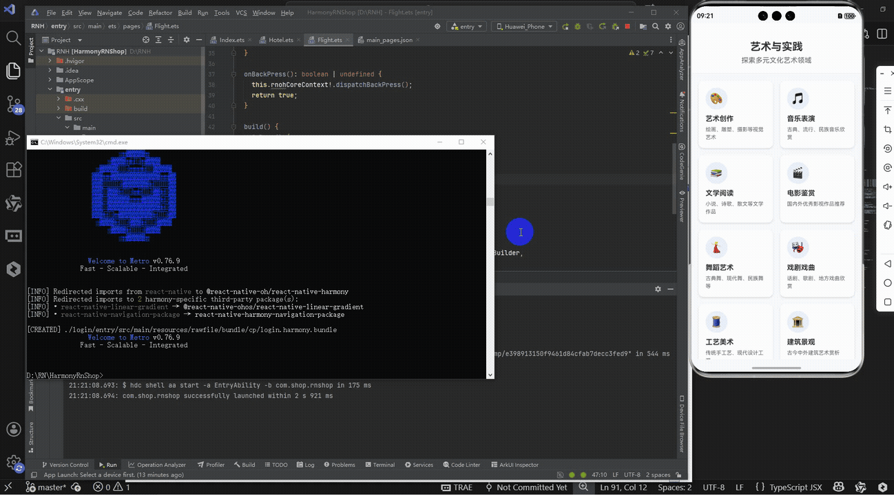
React Native跨端开发实践解析:本文以艺术分类页面为例,系统阐述了React Native在鸿蒙、Android、iOS等多端适配中的关键技术。重点分析了核心组件选型、全局常量设计、自定义组件封装、数据驱动渲染及动态样式计算等跨端开发要点,展示了如何通过React Native实现"一次编写、多端运行"的开发目标。文章特别强调了TypeScript类型约束、SafeAreaView安全区域适配、Dimensions动态布局计算等技术在多端兼容性中的重要作用,为开发者提供了可复用的跨端开发范式。