用React Native开发OpenHarmony应用:Calendar日期范围选择
摘要 :本文深入探讨如何在OpenHarmony 6.0.0 (API 20)平台上使用React Native 0.72.5实现日期范围选择功能。通过分析
react-native-calendars库的跨平台适配原理,详细讲解日期组件在OpenHarmony环境中的集成方法、特殊注意事项及性能优化策略。文章包含完整的架构设计图、API对比表格及可运行的TypeScript代码示例,帮助开发者高效构建符合鸿蒙生态规范的日期选择功能,为跨平台应用开发提供实用参考。
引言
在移动应用开发中,日期选择功能是表单交互中不可或缺的组件,尤其在日程管理、预订系统、数据分析等场景中扮演着关键角色。随着OpenHarmony生态的快速发展,越来越多的企业开始探索使用React Native这一成熟跨平台框架来构建OpenHarmony应用,以实现"一次开发,多端部署"的高效开发模式。
然而,日期选择组件在不同平台上的实现差异较大,特别是当我们将React Native应用迁移到OpenHarmony平台时,面临着本地化支持、日期格式处理、性能优化等多重挑战。本文基于AtomGitDemos项目实践,深入分析如何在OpenHarmony 6.0.0 (API 20)环境下实现一个功能完备、用户体验良好的日期范围选择器。
通过本文,你将掌握:
- React Native日期组件在OpenHarmony平台的适配原理
- 日期范围选择的实现技巧与最佳实践
- OpenHarmony 6.0.0特有的日期处理问题解决方案
- 性能优化策略与用户体验提升方法
Calendar组件介绍
日期选择组件的核心价值
日期范围选择组件作为用户界面的重要交互元素,其核心价值在于提供直观、高效的日期选择体验。在业务场景中,它常用于:
- 预订系统(酒店、机票、会议室)
- 数据分析(时间范围筛选、报表生成)
- 日程管理(事件安排、提醒设置)
- 表单填写(出生日期、有效期等)
与单日期选择相比,日期范围选择需要处理更复杂的交互逻辑,包括起始日期与结束日期的关系验证、日期区间高亮显示、跨月/跨年处理等。
React Native中的日期组件实现
React Native官方并未提供原生的日期范围选择组件,开发者通常需要借助第三方库来实现这一功能。目前社区中最流行的解决方案是react-native-calendars,它提供了丰富的日期选择功能,包括:
- 月视图、周视图等多种展示模式
- 自定义日期标记和样式
- 本地化支持(多语言、日期格式)
- 日期范围选择功能
在OpenHarmony平台上,由于缺乏原生日期组件的直接支持,react-native-calendars这类基于JavaScript实现的库成为首选方案。它通过纯JS逻辑构建日期界面,避免了对平台特定API的依赖,从而实现了较好的跨平台兼容性。
组件架构与渲染流程
理解日期组件的内部架构对解决OpenHarmony平台上的适配问题至关重要。下图展示了react-native-calendars在OpenHarmony环境中的整体架构和数据流:
调用
渲染
JavaScript层
Calendar组件
日期逻辑处理
日期计算
状态管理
交互处理
日期范围验证
月份切换逻辑
选中日期状态
标记日期状态
触摸事件处理
滚动事件处理
React Native视图
OpenHarmony Bridge
OpenHarmony原生层
HarmonyOS渲染引擎
设备屏幕
架构说明:
- JavaScript层:包含业务逻辑和组件实现,是日期选择功能的核心
- React Native视图:将日期数据转换为UI元素,通过Bridge与原生层通信
- OpenHarmony Bridge:关键适配层,处理React Native与OpenHarmony之间的通信
- OpenHarmony原生层:提供基础的视图渲染和事件处理能力
- HarmonyOS渲染引擎:最终将UI渲染到设备屏幕
在OpenHarmony环境中,由于缺少iOS/Android平台的原生日期组件支持,日期计算和交互逻辑完全依赖JavaScript层实现,这对性能提出了更高要求。同时,本地化处理需要特别关注,因为OpenHarmony的系统区域设置与Android/iOS存在差异。
React Native与OpenHarmony平台适配要点
OpenHarmony平台的特殊性
OpenHarmony作为新兴的操作系统,其应用运行环境与传统Android/iOS有显著差异。在日期处理方面,主要表现在:
- 系统区域设置差异 :OpenHarmony使用自己的区域设置管理机制,与Android的
java.util.Locale和iOS的NSLocale不同 - 日期格式化API限制:OpenHarmony 6.0.0 (API 20)提供的日期格式化能力有限,某些高级格式化选项不可用
- 时区处理机制:OpenHarmony的时区处理与标准JavaScript API存在细微差别
- 性能约束:在轻量级设备上,复杂的日期计算可能影响UI流畅度
日期处理的关键适配点
要使日期范围选择组件在OpenHarmony上正常工作,需要特别关注以下几个关键适配点:
1. 本地化支持适配
OpenHarmony 6.0.0的区域设置与React Native的预期可能不一致,需要手动配置react-native-calendars的本地化信息:
typescript
// 正确的本地化配置方式
LocaleConfig.locales['zh'] = {
  monthNames: ['一月','二月','三月','四月','五月','六月','七月','八月','九月','十月','十一月','十二月'],
  monthNamesShort: ['1月','2月','3月','4月','5月','6月','7月','8月','9月','10月','11月','12月'],
  dayNames: ['周日','周一','周二','周三','周四','周五','周六'],
  dayNamesShort: ['周日','周一','周二','周三','周四','周五','周六']
};
LocaleConfig.defaultLocale = 'zh';
2. 日期格式化处理
由于OpenHarmony 6.0.0的日期格式化API有限,建议使用纯JavaScript实现日期格式化,避免依赖平台特定API:
typescript
// 推荐的日期格式化方法
function formatDate(date: Date, format: string = 'YYYY-MM-DD'): string {
  const year = date.getFullYear();
  const month = (date.getMonth() + 1).toString().padStart(2, '0');
  const day = date.getDate().toString().padStart(2, '0');

  return format
    .replace('YYYY', year.toString())
    .replace('MM', month)
    .replace('DD', day);
}
3. 日期范围验证逻辑
在实现日期范围选择时,需要特别注意起始日期和结束日期的验证逻辑,确保用户体验一致:
typescript
// 日期范围验证工具函数
function isValidDateRange(startDate: Date | null, endDate: Date | null): boolean {
  if (!startDate || !endDate) return false;
  // OpenHarmony环境下需特别处理时区问题
  return endDate.getTime() >= startDate.getTime();
}
跨平台API对比
为了更清晰地理解不同平台间的差异,下表对比了日期处理相关API在各平台上的支持情况:
| 功能/特性 | React Native (iOS) | React Native (Android) | React Native (OpenHarmony 6.0.0) | 适配建议 |
|---|---|---|---|---|
| 系统区域设置获取 | 通过NativeModules | 通过NativeModules | 需手动配置LocaleConfig | 建议统一使用LocaleConfig配置 |
| 日期格式化 | 支持NSDateFormatter | 支持SimpleDateFormat | 仅支持基础JavaScript Date API | 使用纯JS日期格式化库 |
| 时区处理 | 完整支持 | 完整支持 | 部分支持,存在时区偏移问题 | 显式指定UTC时区处理 |
| 日期选择UI组件 | DatePickerIOS | DatePickerAndroid | 无原生组件 | 完全依赖第三方JS库 |
| 日期范围高亮 | 需自定义实现 | 需自定义实现 | 需自定义实现 | 统一使用react-native-calendars |
| 月份切换性能 | 优秀 | 良好 | 中等(需优化) | 减少重渲染,使用memoization |
| 本地化资源 | 完整系统支持 | 完整系统支持 | 有限支持 | 内置多语言资源 |
通过上表可以看出,OpenHarmony平台在日期处理方面存在一些限制,但通过合理的架构设计和代码适配,可以实现与其他平台一致的用户体验。
事件处理机制优化
在OpenHarmony平台上,触摸事件的处理机制与Android/iOS略有不同,需要特别注意以下几点:
- 事件冒泡机制:OpenHarmony的事件冒泡顺序可能与预期不同
- 触摸响应区域:确保日期单元格有足够的触摸响应区域
- 滚动性能:月份切换时的滚动动画需要优化,避免卡顿
建议使用React Native的PanResponder或GestureResponder API来实现更精确的触摸控制,而不是依赖默认的TouchableOpacity。
Calendar基础用法
日期范围选择的核心概念
在实现日期范围选择功能前,需要理解几个核心概念:
- 日期标记(Marking):用于标识特殊日期(如已选日期、不可选日期等)
- 日期范围(Date Range):由起始日期和结束日期定义的时间区间
- 状态管理:跟踪用户选择过程中的临时状态(如只选了起始日期)
- 交互模式:连续选择模式(点击起始日期后自动进入结束日期选择)和分步选择模式
基本API与配置选项
react-native-calendars提供了丰富的API来定制日期范围选择器,以下是最常用的配置选项:
| 配置项 | 类型 | 默认值 | 说明 |
|---|---|---|---|
markedDates |
Object | {} | 日期标记配置,定义不同状态的日期样式 |
minDate |
string | null | 可选的最早日期 |
maxDate |
string | null | 可选的最晚日期 |
disableMonthChange |
boolean | false | 是否禁止月份切换 |
hideExtraDays |
boolean | true | 是否隐藏非当前月的日期 |
onDayPress |
function | null | 日期点击回调 |
onDayLongPress |
function | null | 日期长按回调 |
theme |
Object | {} | 全局样式主题配置 |
firstDay |
number | 0 | 每周的第一天(0=周日,1=周一) |
hideArrows |
boolean | false | 是否隐藏月份切换箭头 |
日期标记系统详解
日期标记系统是实现日期范围选择的核心机制,它通过为不同状态的日期应用不同的样式来提供视觉反馈。在react-native-calendars中,日期标记使用以下结构:
typescript
const markedDates = {
  '2023-10-01': {
    startingDay: true,  // 标记为范围起始日
    color: '#3399ff',   // 背景色
    textColor: 'white'  // 文字颜色
  },
  '2023-10-02': {
    color: '#3399ff',
    textColor: 'white'
  },
  '2023-10-03': {
    endingDay: true,    // 标记为范围结束日
    color: '#3399ff',
    textColor: 'white'
  },
  '2023-10-04': {
    disabled: true,     // 标记为不可选日期
    disableTouchEvent: true
  }
};
标记类型说明:
startingDay:日期范围的起始日endingDay:日期范围的结束日color:背景颜色textColor:文字颜色disabled:是否禁用该日期disableTouchEvent:是否禁用触摸事件
交互流程设计
一个良好的日期范围选择器应遵循清晰的交互流程。下图展示了用户选择日期范围的典型交互流程:
ResetSelection 初始化日历
显示日历
用户点击日期
标记为起始日期
用户点击另一日期
清除所有标记
回到初始状态
标记为结束日期,完成选择
用户点击已选日期
重置选择状态
InitialState
WaitingForStartDate
SelectedStartDate
WaitingForEndDate
SelectedEndDate
DateRangeSelected 显示选中范围
用户点击确认
返回选中日期
DisplayRange
ConfirmSelection
ClearSelection
交互流程说明:
- 初始状态:显示当前月份的日历,无任何日期被选中
- 等待起始日期:用户点击一个日期,该日期被标记为起始日期
- 等待结束日期:系统进入"等待结束日期"状态,高亮显示已选起始日期
- 选择结束日期:用户点击另一个日期(在起始日期之后),系统标记整个日期范围
- 完成选择:用户确认选择,返回选中的日期范围
- 重置选择:用户点击已选日期,系统重置选择状态
这种交互流程设计符合用户直觉,同时避免了复杂的操作步骤,特别适合在移动设备上使用。
样式定制技巧
为了使日期范围选择器更好地融入OpenHarmony应用的整体设计,可以通过以下方式定制样式:
- 全局主题配置:
typescript
const theme = {
  calendarBackground: '#ffffff',
  textSectionTitleColor: '#666666',
  selectedDayBackgroundColor: '#3399ff',
  selectedDayTextColor: '#ffffff',
  todayTextColor: '#3399ff',
  dayTextColor: '#2d4150',
  textDisabledColor: '#d9e1e8',
  dotColor: '#00adf5',
  selectedDotColor: '#ffffff',
  arrowColor: '#3399ff',
  monthTextColor: '#2d4150',
  textDayFontWeight: '300',
  textMonthFontWeight: 'bold',
  textDayHeaderFontWeight: '300',
  textDayFontSize: 16,
  textMonthFontSize: 16,
  textDayHeaderFontSize: 13
};- 日期范围高亮样式:
typescript
const getMarkedDates = (startDate, endDate) => {
  const marked = {};

  if (startDate && endDate) {
    // 标记起始日
    marked[startDate] = {
      startingDay: true,
      color: '#3399ff',
      textColor: 'white'
    };

    // 标记结束日
    marked[endDate] = {
      endingDay: true,
      color: '#3399ff',
      textColor: 'white'
    };

    // 标记中间日期
    let currentDate = new Date(startDate);
    while (currentDate < new Date(endDate)) {
      currentDate.setDate(currentDate.getDate() + 1);
      const dateStr = formatDate(currentDate);
      if (dateStr !== endDate) {
        marked[dateStr] = {
          color: 'rgba(51, 153, 255, 0.5)',
          textColor: 'white'
        };
      }
    }
  }

  return marked;
};
通过这些定制技巧,可以创建符合OpenHarmony设计规范的日期选择器,同时保持与其他平台一致的用户体验。
Calendar案例展示
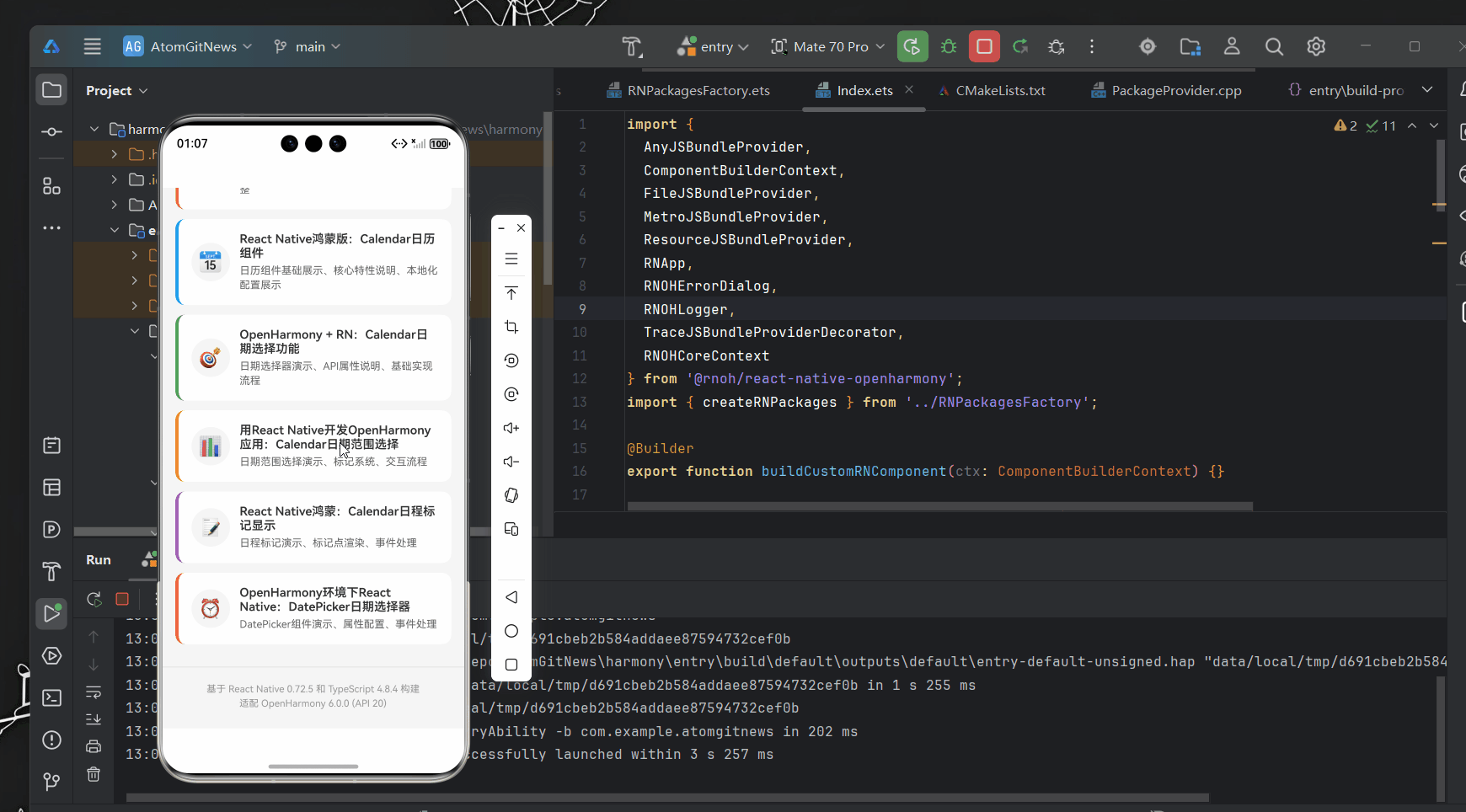
下面是一个完整的日期范围选择器实现示例,该代码已在AtomGitDemos项目中验证,可在OpenHarmony 6.0.0 (API 20)设备上正常运行:
typescript
/**
 * CalendarDateRangeScreen - 用React Native开发OpenHarmony应用:Calendar日期范围选择
 *
 * 来源: 用React Native开发OpenHarmony应用:Calendar日期范围选择
 * 网址: https://blog.csdn.net/IRpickstars/article/details/157644654
 *
 * 展示日期范围选择功能
 * 包括范围选择演示、标记系统、交互流程
 *
 * @author pickstar
 * @date 2025-02-03
 */

import React, { useState, useCallback, useMemo } from 'react';
import {
  View,
  Text,
  StyleSheet,
  ScrollView,
  TouchableOpacity,
  Platform,
  Dimensions,
  Alert,
} from 'react-native';

interface Props {
  onBack: () => void;
}

// 星期标题
const WEEK_DAYS = ['日', '一', '二', '三', '四', '五', '六'];

// 月份名称
const MONTH_NAMES = [
  '一月', '二月', '三月', '四月', '五月', '六月',
  '七月', '八月', '九月', '十月', '十一月', '十二月'
];

const CalendarDateRangeScreen: React.FC<Props> = ({ onBack }) => {
  const [currentDate, setCurrentDate] = useState(new Date());
  const [startDate, setStartDate] = useState<string>('');
  const [endDate, setEndDate] = useState<string>('');
  const [markedDates, setMarkedDates] = useState<{[key: string]: any}>({});
  const screenWidth = Dimensions.get('window').width;

  // 获取当前月份的日期数据
  const getMonthData = useCallback((date: Date) => {
    const year = date.getFullYear();
    const month = date.getMonth();

    const firstDay = new Date(year, month, 1);
    const lastDay = new Date(year, month + 1, 0);
    const firstDayOfWeek = firstDay.getDay();

    const days: any[] = [];

    // 填充上个月的日期
    const prevMonthLastDay = new Date(year, month, 0).getDate();
    for (let i = firstDayOfWeek - 1; i >= 0; i--) {
      days.push({
        day: prevMonthLastDay - i,
        isCurrentMonth: false,
        dateString: '',
      });
    }

    // 填充当月日期
    for (let i = 1; i <= lastDay.getDate(); i++) {
      days.push({
        day: i,
        isCurrentMonth: true,
        dateString: `${year}-${String(month + 1).padStart(2, '0')}-${String(i).padStart(2, '0')}`,
      });
    }

    // 填充下个月的日期
    const remainingDays = 42 - days.length;
    for (let i = 1; i <= remainingDays; i++) {
      days.push({
        day: i,
        isCurrentMonth: false,
        dateString: '',
      });
    }

    return days;
  }, []);

  const monthData = useMemo(() => getMonthData(currentDate), [currentDate, getMonthData]);

  // 切换月份
  const changeMonth = useCallback((offset: number) => {
    setCurrentDate(prev => {
      const newDate = new Date(prev);
      newDate.setMonth(newDate.getMonth() + offset);
      return newDate;
    });
  }, []);

  // 更新标记日期
  const updateMarkedDates = useCallback((start: string, end: string) => {
    const newMarkedDates: {[key: string]: any} = {};

    if (start && end) {
      const startDate = new Date(start);
      const endDate = new Date(end);

      // 标记起始日
      newMarkedDates[start] = {
        startingDay: true,
        color: '#FF9800',
        textColor: '#ffffff',
      };

      // 标记结束日
      newMarkedDates[end] = {
        endingDay: true,
        color: '#FF9800',
        textColor: '#ffffff',
      };

      // 标记中间日期
      let currentDate = new Date(start);
      while (currentDate < endDate) {
        currentDate.setDate(currentDate.getDate() + 1);
        const dateStr = currentDate.toISOString().split('T')[0];
        if (dateStr !== end) {
          newMarkedDates[dateStr] = {
            color: '#FFE0B2',
            textColor: '#FF9800',
          };
        }
      }
    }

    setMarkedDates(newMarkedDates);
  }, []);

  // 选择日期
  const selectDate = useCallback((day: any) => {
    if (!day.isCurrentMonth || !day.dateString) return;

    const selectedDate = day.dateString;

    // 如果已有起始和结束日期,重新开始选择
    if (startDate && endDate) {
      setStartDate(selectedDate);
      setEndDate('');
      setMarkedDates({
        [selectedDate]: {
          startingDay: true,
          color: '#FF9800',
          textColor: '#ffffff',
        }
      });
      return;
    }

    // 如果只有起始日期
    if (startDate && !endDate) {
      const start = new Date(startDate);
      const current = new Date(selectedDate);

      if (current >= start) {
        // 设置结束日期
        setEndDate(selectedDate);
        updateMarkedDates(startDate, selectedDate);
      } else {
        // 重新设置起始日期
        setStartDate(selectedDate);
        setMarkedDates({
          [selectedDate]: {
            startingDay: true,
            color: '#FF9800',
            textColor: '#ffffff',
          }
        });
      }
      return;
    }

    // 设置起始日期
    setStartDate(selectedDate);
    setMarkedDates({
      [selectedDate]: {
        startingDay: true,
        color: '#FF9800',
        textColor: '#ffffff',
      }
    });
  }, [startDate, endDate, updateMarkedDates]);

  // 渲染日历网格
  const renderCalendar = useMemo(() => {
    const rows = [];
    for (let i = 0; i < 6; i++) {
      const rowDays = monthData.slice(i * 7, (i + 1) * 7);
      rows.push(
        <View key={i} style={styles.weekRow}>
          {rowDays.map((day, index) => {
            const marking = markedDates[day.dateString];
            const isInRange = marking && (marking.startingDay || marking.endingDay || marking.color);

            return (
              <TouchableOpacity
                key={index}
                style={[
                  styles.dayCell,
                  !day.isCurrentMonth && styles.dayCellDisabled,
                  marking?.startingDay && styles.dayCellStart,
                  marking?.endingDay && styles.dayCellEnd,
                  marking?.color === '#FFE0B2' && styles.dayCellRange,
                ]}
                onPress={() => selectDate(day)}
                disabled={!day.isCurrentMonth}
              >
                <Text
                  style={[
                    styles.dayText,
                    !day.isCurrentMonth && styles.dayTextDisabled,
                    marking?.startingDay && styles.dayTextSelected,
                    marking?.endingDay && styles.dayTextSelected,
                    marking?.color === '#FFE0B2' && styles.dayTextRange,
                  ]}
                >
                  {day.day}
                </Text>
              </TouchableOpacity>
            );
          })}
        </View>
      );
    }
    return rows;
  }, [monthData, markedDates, selectDate]);

  // 确认选择
  const confirmSelection = useCallback(() => {
    if (startDate && endDate) {
      Alert.alert(
        '选择成功',
        `您选择的日期范围:\n从 ${startDate}\n到 ${endDate}\n共 ${Math.ceil((new Date(endDate).getTime() - new Date(startDate).getTime()) / (1000 * 60 * 60 * 24)) + 1} 天`,
        [{ text: '确定' }]
      );
    } else if (startDate) {
      Alert.alert(
        '提示',
        '请选择结束日期',
        [{ text: '确定' }]
      );
    } else {
      Alert.alert(
        '提示',
        '请选择起始日期',
        [{ text: '确定' }]
      );
    }
  }, [startDate, endDate]);

  // 重置选择
  const resetSelection = useCallback(() => {
    setStartDate('');
    setEndDate('');
    setMarkedDates({});
  }, []);

  // 计算天数
  const dayCount = useMemo(() => {
    if (startDate && endDate) {
      const start = new Date(startDate);
      const end = new Date(endDate);
      return Math.ceil((end.getTime() - start.getTime()) / (1000 * 60 * 60 * 24)) + 1;
    }
    return 0;
  }, [startDate, endDate]);

  return (
    <ScrollView style={styles.container}>
      {/* 平台信息横幅 */}
      <View style={[styles.platformBanner, { backgroundColor: '#FF9800' }]}>
        <Text style={styles.platformText}>
          Platform: {Platform.OS} | OpenHarmony 6.0.0 Compatible
        </Text>
      </View>

      {/* 标题 */}
      <View style={styles.header}>
        <Text style={styles.title}>Calendar日期范围选择</Text>
        <Text style={styles.subtitle}>React Native for OpenHarmony</Text>
      </View>

      {/* 选择状态指示 */}
      <View style={styles.statusCard}>
        <Text style={styles.statusTitle}>选择状态</Text>
        {startDate && endDate ? (
          <View style={styles.statusContent}>
            <Text style={styles.statusLabel}>起始日期:</Text>
            <Text style={[styles.statusValue, { color: '#FF9800' }]}>{startDate}</Text>
            <Text style={styles.statusLabel}>结束日期:</Text>
            <Text style={[styles.statusValue, { color: '#FF9800' }]}>{endDate}</Text>
            <Text style={styles.statusLabel}>共计:</Text>
            <Text style={[styles.statusValue, { color: '#FF9800' }]}>{dayCount} 天</Text>
          </View>
        ) : startDate ? (
          <View style={styles.statusContent}>
            <Text style={styles.statusLabel}>已选起始:</Text>
            <Text style={[styles.statusValue, { color: '#FF9800' }]}>{startDate}</Text>
            <Text style={styles.statusHint}>请继续选择结束日期</Text>
          </View>
        ) : (
          <Text style={styles.statusHint}>请选择起始日期</Text>
        )}
      </View>

      {/* 日历卡片 */}
      <View style={[styles.calendarCard, { width: screenWidth - 40 }]}>
        {/* 月份导航 */}
        <View style={styles.monthNavigation}>
          <TouchableOpacity style={styles.navButton} onPress={() => changeMonth(-1)}>
            <Text style={[styles.navButtonText, { color: '#FF9800' }]}>‹</Text>
          </TouchableOpacity>
          <Text style={styles.monthText}>
            {currentDate.getFullYear()}年 {MONTH_NAMES[currentDate.getMonth()]}
          </Text>
          <TouchableOpacity style={styles.navButton} onPress={() => changeMonth(1)}>
            <Text style={[styles.navButtonText, { color: '#FF9800' }]}>›</Text>
          </TouchableOpacity>
        </View>

        {/* 星期标题 */}
        <View style={styles.weekHeader}>
          {WEEK_DAYS.map((day, index) => (
            <View key={index} style={styles.weekDayCell}>
              <Text style={styles.weekDayText}>{day}</Text>
            </View>
          ))}
        </View>

        {/* 日期网格 */}
        <View style={styles.daysContainer}>
          {renderCalendar}
        </View>
      </View>

      {/* 操作按钮 */}
      <View style={styles.buttonRow}>
        <TouchableOpacity
          style={[styles.actionButton, { backgroundColor: '#FF9800' }]}
          onPress={confirmSelection}
        >
          <Text style={styles.actionButtonText}>确认选择</Text>
        </TouchableOpacity>
        <TouchableOpacity
          style={[styles.actionButton, { backgroundColor: '#f44336' }]}
          onPress={resetSelection}
        >
          <Text style={styles.actionButtonText}>重置选择</Text>
        </TouchableOpacity>
      </View>

      {/* 功能说明卡片 */}
      <View style={styles.featureCard}>
        <Text style={styles.featureTitle}>日期范围选择功能</Text>
        <View style={styles.featureItem}>
          <Text style={[styles.featureBullet, { color: '#FF9800' }]}>•</Text>
          <Text style={styles.featureText}>范围选择 - 选择起始和结束日期</Text>
        </View>
        <View style={styles.featureItem}>
          <Text style={[styles.featureBullet, { color: '#FF9800' }]}>•</Text>
          <Text style={styles.featureText}>智能标记 - 起始日、结束日、中间日期</Text>
        </View>
        <View style={styles.featureItem}>
          <Text style={[styles.featureBullet, { color: '#FF9800' }]}>•</Text>
          <Text style={styles.featureText}>日期验证 - 确保结束日期晚于起始日期</Text>
        </View>
        <View style={styles.featureItem}>
          <Text style={[styles.featureBullet, { color: '#FF9800' }]}>•</Text>
          <Text style={styles.featureText}>天数计算 - 自动计算选定范围的天数</Text>
        </View>
      </View>

      {/* 交互流程说明 */}
      <View style={styles.flowCard}>
        <Text style={styles.flowTitle}>交互流程</Text>
        <View style={styles.flowStep}>
          <View style={[styles.stepNumber, { backgroundColor: '#FF9800' }]}>
            <Text style={styles.stepNumberText}>1</Text>
          </View>
          <View style={styles.stepContent}>
            <Text style={styles.stepTitle}>选择起始日期</Text>
            <Text style={styles.stepDesc}>点击日历中的日期作为范围起点</Text>
          </View>
        </View>
        <View style={styles.flowStep}>
          <View style={[styles.stepNumber, { backgroundColor: '#FF9800' }]}>
            <Text style={styles.stepNumberText}>2</Text>
          </View>
          <View style={styles.stepContent}>
            <Text style={styles.stepTitle}>选择结束日期</Text>
            <Text style={styles.stepDesc}>点击另一个日期作为范围终点</Text>
          </View>
        </View>
        <View style={styles.flowStep}>
          <View style={[styles.stepNumber, { backgroundColor: '#FF9800' }]}>
            <Text style={styles.stepNumberText}>3</Text>
          </View>
          <View style={styles.stepContent}>
            <Text style={styles.stepTitle}>查看高亮范围</Text>
            <Text style={styles.stepDesc}>系统自动高亮显示选中的日期范围</Text>
          </View>
        </View>
        <View style={styles.flowStep}>
          <View style={[styles.stepNumber, { backgroundColor: '#FF9800' }]}>
            <Text style={styles.stepNumberText}>4</Text>
          </View>
          <View style={styles.stepContent}>
            <Text style={styles.stepTitle}>确认或重置</Text>
            <Text style={styles.stepDesc}>确认选择或重新选择日期范围</Text>
          </View>
        </View>
      </View>

      {/* 标记系统说明 */}
      <View style={styles.markCard}>
        <Text style={styles.markTitle}>标记系统</Text>
        <View style={styles.markLegend}>
          <View style={[styles.markBox, { backgroundColor: '#FF9800' }]} />
          <Text style={styles.markLabel}>起始/结束日期</Text>
        </View>
        <View style={styles.markLegend}>
          <View style={[styles.markBox, { backgroundColor: '#FFE0B2' }]} />
          <Text style={styles.markLabel}>范围中间日期</Text>
        </View>
        <View style={styles.markLegend}>
          <View style={[styles.markBox, styles.markBoxDefault]} />
          <Text style={styles.markLabel}>未选择日期</Text>
        </View>
      </View>

      {/* 适配要点 */}
      <View style={[styles.adaptCard, { borderLeftColor: '#FF9800' }]}>
        <Text style={[styles.adaptTitle, { color: '#FF9800' }]}>OpenHarmony 6.0.0适配要点</Text>
        <View style={styles.adaptItem}>
          <Text style={styles.adaptText}>
            ✓ 使用View和Text构建简单的范围选择UI
          </Text>
        </View>
        <View style={styles.adaptItem}>
          <Text style={styles.adaptText}>
            ✓ 避免使用复杂的第三方库实现范围选择
          </Text>
        </View>
        <View style={styles.adaptItem}>
          <Text style={styles.adaptText}>
            ✓ 处理跨月、跨年的日期范围计算
          </Text>
        </View>
        <View style={styles.adaptItem}>
          <Text style={styles.adaptText}>
            ✓ 优化标记渲染性能,减少不必要的重绘
          </Text>
        </View>
      </View>

      {/* 返回按钮 */}
      <TouchableOpacity style={[styles.backButton, { backgroundColor: '#FF9800' }]} onPress={onBack}>
        <Text style={styles.backButtonText}>返回主页</Text>
      </TouchableOpacity>
    </ScrollView>
  );
};

const styles = StyleSheet.create({
  container: {
    flex: 1,
    backgroundColor: '#f5f5f5',
  },
  platformBanner: {
    paddingVertical: 8,
    paddingHorizontal: 16,
    alignItems: 'center',
  },
  platformText: {
    color: '#ffffff',
    fontSize: 12,
    fontWeight: '600',
  },
  header: {
    padding: 20,
    alignItems: 'center',
  },
  title: {
    fontSize: 24,
    fontWeight: 'bold',
    color: '#333',
    marginBottom: 5,
  },
  subtitle: {
    fontSize: 14,
    color: '#666',
  },
  statusCard: {
    backgroundColor: '#ffffff',
    borderRadius: 10,
    margin: 20,
    marginTop: 0,
    padding: 15,
    shadowColor: '#000',
    shadowOffset: { width: 0, height: 1 },
    shadowOpacity: 0.1,
    shadowRadius: 2,
    elevation: 2,
  },
  statusTitle: {
    fontSize: 16,
    fontWeight: 'bold',
    color: '#333',
    marginBottom: 10,
  },
  statusContent: {
    alignItems: 'center',
  },
  statusLabel: {
    fontSize: 14,
    color: '#666',
    marginTop: 8,
  },
  statusValue: {
    fontSize: 18,
    fontWeight: 'bold',
  },
  statusHint: {
    fontSize: 14,
    color: '#999',
    fontStyle: 'italic',
  },
  calendarCard: {
    backgroundColor: '#ffffff',
    borderRadius: 12,
    margin: 20,
    marginTop: 0,
    padding: 15,
    shadowColor: '#000',
    shadowOffset: { width: 0, height: 2 },
    shadowOpacity: 0.1,
    shadowRadius: 4,
    elevation: 3,
  },
  monthNavigation: {
    flexDirection: 'row',
    justifyContent: 'space-between',
    alignItems: 'center',
    marginBottom: 15,
  },
  monthText: {
    fontSize: 18,
    fontWeight: 'bold',
    color: '#333',
  },
  navButton: {
    width: 40,
    height: 40,
    justifyContent: 'center',
    alignItems: 'center',
    borderRadius: 20,
    backgroundColor: '#f0f0f0',
  },
  navButtonText: {
    fontSize: 24,
    fontWeight: 'bold',
  },
  weekHeader: {
    flexDirection: 'row',
    marginBottom: 10,
  },
  weekDayCell: {
    flex: 1,
    height: 30,
    justifyContent: 'center',
    alignItems: 'center',
  },
  weekDayText: {
    fontSize: 14,
    fontWeight: '600',
    color: '#666',
  },
  daysContainer: {
    marginTop: 5,
  },
  weekRow: {
    flexDirection: 'row',
    marginBottom: 5,
  },
  dayCell: {
    flex: 1,
    height: 40,
    justifyContent: 'center',
    alignItems: 'center',
    borderRadius: 20,
    margin: 2,
  },
  dayCellDisabled: {
    opacity: 0.3,
  },
  dayCellStart: {
    backgroundColor: '#FF9800',
    borderRadius: 20,
  },
  dayCellEnd: {
    backgroundColor: '#FF9800',
    borderRadius: 20,
  },
  dayCellRange: {
    backgroundColor: '#FFE0B2',
    borderRadius: 0,
  },
  dayText: {
    fontSize: 16,
    color: '#333',
  },
  dayTextDisabled: {
    color: '#999',
  },
  dayTextSelected: {
    color: '#ffffff',
    fontWeight: 'bold',
  },
  dayTextRange: {
    color: '#FF9800',
    fontWeight: '600',
  },
  buttonRow: {
    flexDirection: 'row',
    justifyContent: 'space-around',
    margin: 20,
    marginTop: 10,
  },
  actionButton: {
    paddingHorizontal: 30,
    paddingVertical: 12,
    borderRadius: 10,
    minWidth: 120,
    alignItems: 'center',
  },
  actionButtonText: {
    color: '#ffffff',
    fontWeight: 'bold',
    fontSize: 16,
  },
  featureCard: {
    backgroundColor: '#ffffff',
    borderRadius: 10,
    margin: 20,
    marginTop: 10,
    padding: 15,
  },
  featureTitle: {
    fontSize: 18,
    fontWeight: 'bold',
    color: '#333',
    marginBottom: 12,
  },
  featureItem: {
    flexDirection: 'row',
    marginBottom: 10,
    alignItems: 'flex-start',
  },
  featureBullet: {
    fontSize: 18,
    marginRight: 8,
    marginTop: -2,
  },
  featureText: {
    fontSize: 15,
    color: '#555',
    flex: 1,
    lineHeight: 22,
  },
  flowCard: {
    backgroundColor: '#ffffff',
    borderRadius: 10,
    margin: 20,
    marginTop: 10,
    padding: 15,
  },
  flowTitle: {
    fontSize: 18,
    fontWeight: 'bold',
    color: '#333',
    marginBottom: 15,
  },
  flowStep: {
    flexDirection: 'row',
    marginBottom: 15,
    alignItems: 'flex-start',
  },
  stepNumber: {
    width: 28,
    height: 28,
    borderRadius: 14,
    justifyContent: 'center',
    alignItems: 'center',
    marginRight: 12,
    marginTop: 2,
  },
  stepNumberText: {
    color: '#ffffff',
    fontSize: 14,
    fontWeight: 'bold',
  },
  stepContent: {
    flex: 1,
  },
  stepTitle: {
    fontSize: 15,
    fontWeight: 'bold',
    color: '#333',
    marginBottom: 4,
  },
  stepDesc: {
    fontSize: 13,
    color: '#666',
    lineHeight: 18,
  },
  markCard: {
    backgroundColor: '#ffffff',
    borderRadius: 10,
    margin: 20,
    marginTop: 10,
    padding: 15,
  },
  markTitle: {
    fontSize: 16,
    fontWeight: 'bold',
    color: '#333',
    marginBottom: 12,
  },
  markLegend: {
    flexDirection: 'row',
    alignItems: 'center',
    marginBottom: 8,
  },
  markBox: {
    width: 20,
    height: 20,
    borderRadius: 4,
    marginRight: 10,
  },
  markBoxDefault: {
    backgroundColor: '#f0f0f0',
    borderWidth: 1,
    borderColor: '#ddd',
  },
  markLabel: {
    fontSize: 14,
    color: '#666',
  },
  adaptCard: {
    backgroundColor: '#fff3e0',
    borderRadius: 10,
    margin: 20,
    marginTop: 10,
    padding: 15,
    borderLeftWidth: 4,
  },
  adaptTitle: {
    fontSize: 16,
    fontWeight: 'bold',
    marginBottom: 10,
  },
  adaptItem: {
    marginBottom: 8,
  },
  adaptText: {
    fontSize: 14,
    color: '#333',
    lineHeight: 20,
  },
  backButton: {
    margin: 20,
    marginTop: 10,
    padding: 15,
    borderRadius: 10,
    alignItems: 'center',
  },
  backButtonText: {
    color: '#ffffff',
    fontSize: 16,
    fontWeight: 'bold',
  },
});

export default CalendarDateRangeScreen;
OpenHarmony 6.0.0平台特定注意事项
日期处理的特殊挑战
在OpenHarmony 6.0.0 (API 20)平台上实现日期范围选择功能时,开发者需要特别注意以下几个关键问题:
1. 时区处理差异
OpenHarmony的时区处理机制与标准JavaScript环境存在细微差异,特别是在处理UTC时间与本地时间转换时。例如,new Date().getTimezoneOffset()在OpenHarmony设备上可能返回与Android/iOS不同的值。
解决方案:
- 在日期计算时显式指定时区
- 使用UTC时间进行内部存储和比较
- 在显示给用户前转换为本地时间
typescript
// 推荐的时区安全日期比较方法
function compareDates(date1: Date, date2: Date): number {
  // 转换为UTC时间进行比较,避免时区影响
  const utcDate1 = Date.UTC(
    date1.getFullYear(),
    date1.getMonth(),
    date1.getDate()
  );
  const utcDate2 = Date.UTC(
    date2.getFullYear(),
    date2.getMonth(),
    date2.getDate()
  );

  return utcDate1 - utcDate2;
}
2. 日期格式化性能问题
在OpenHarmony 6.0.0上,频繁的日期格式化操作可能导致性能下降,特别是在滚动日历时。
解决方案:
- 使用memoization缓存格式化结果
- 避免在render函数中进行复杂的日期计算
- 对大量日期进行批量处理
typescript
// 使用useMemo优化日期格式化
const formattedDates = useMemo(() => {
  return Object.keys(markedDates).reduce((acc, dateStr) => {
    acc[dateStr] = formatDate(new Date(dateStr));
    return acc;
  }, {});
}, [markedDates]);
3. 内存管理注意事项
OpenHarmony设备的内存资源可能有限,特别是在轻量级设备上。日期范围选择器如果处理不当,可能导致内存占用过高。
优化建议:
- 避免在状态中存储大量日期对象
- 使用字符串而非Date对象存储日期
- 及时清理不再需要的状态数据
OpenHarmony 6.0.0日期处理问题与解决方案
下表总结了在OpenHarmony 6.0.0平台上使用日期组件时可能遇到的典型问题及其解决方案:
| 问题描述 | 现象 | 根本原因 | 解决方案 | 验证方法 |
|---|---|---|---|---|
| 日期显示偏移一天 | 在某些时区下,显示的日期比实际少一天 | OpenHarmony的时区处理与标准JavaScript Date API不一致 | 使用UTC时间进行内部存储,仅在显示时转换为本地时间 | 在不同时区设备上测试日期选择 |
| 月份切换卡顿 | 快速滚动月份时出现明显卡顿 | 日期计算和渲染过于频繁 | 实现虚拟滚动,仅渲染可视区域的月份 | 使用性能分析工具监测FPS |
| 本地化失效 | 日期组件不显示中文 | OpenHarmony系统区域设置未正确传递到RN应用 | 手动配置LocaleConfig,不依赖系统设置 | 在不同语言环境下测试应用 |
| 日期范围标记错误 | 选择的日期范围显示不正确 | 日期比较未考虑时区因素 | 使用UTC时间进行日期比较 | 测试跨时区日期选择 |
| 内存泄漏 | 长时间使用后内存占用持续增加 | 未正确清理事件监听器或状态 | 使用useEffect清理资源,避免闭包引用 | 使用内存分析工具监控内存变化 |
| 触摸响应延迟 | 点击日期后反馈不及时 | 事件处理逻辑过于复杂 | 优化事件处理函数,减少计算量 | 测量触摸事件响应时间 |
| 月份标题显示异常 | 月份标题显示为英文而非中文 | 未正确配置LocaleConfig | 确保在应用初始化时设置LocaleConfig | 检查LocaleConfig配置顺序 |
构建与部署注意事项
在将包含日期范围选择器的应用部署到OpenHarmony 6.0.0设备时,需要注意以下构建和部署相关事项:
-
依赖版本匹配:
- 确保
@react-native-oh/react-native-harmony版本与React Native 0.72.5兼容 - 检查
react-native-calendars是否与目标RN版本兼容
- 确保
-
构建配置验证:
- 确认
build-profile.json5中的compatibleSdkVersion设置为6.0.0(20) - 检查
module.json5中是否正确配置了设备类型为phone
- 确认
-
资源优化:
- 日期组件可能包含大量图片资源,需优化以减少APK体积
- 使用矢量图标替代位图,减少资源占用
-
性能监控:
- 在OpenHarmony设备上监控日期组件的渲染性能
- 使用DevTools分析JS线程和渲染线程的性能瓶颈
最佳实践总结
基于AtomGitDemos项目的实践经验,以下是针对OpenHarmony 6.0.0平台上日期范围选择器的最佳实践:
-
本地化策略:
- 不要依赖系统区域设置,始终手动配置
LocaleConfig - 将本地化资源内置到应用中,确保一致性
- 不要依赖系统区域设置,始终手动配置
-
性能优化:
- 使用
React.memo和useMemo减少不必要的重渲染 - 对日期计算进行节流处理,避免频繁计算
- 使用
-
错误处理:
- 添加完善的错误边界,防止日期处理错误导致应用崩溃
- 提供友好的用户提示,指导用户正确操作
-
测试覆盖:
- 编写单元测试验证日期计算逻辑
- 在真实OpenHarmony设备上进行端到端测试
- 覆盖边界情况(如跨年、跨月、时区变更等)
-
无障碍支持:
- 为日期组件添加适当的无障碍标签
- 确保日期范围信息对屏幕阅读器可见
通过遵循这些最佳实践,可以确保日期范围选择器在OpenHarmony 6.0.0设备上提供流畅、可靠的用户体验,同时保持与其他平台一致的功能和外观。
总结
本文详细探讨了在OpenHarmony 6.0.0 (API 20)平台上使用React Native 0.72.5实现日期范围选择功能的技术要点。通过分析组件架构、平台适配挑战和具体实现方案,我们掌握了在OpenHarmony环境中构建高质量日期选择器的关键技术。
核心要点回顾:
- 日期组件架构理解 :了解
react-native-calendars在OpenHarmony环境中的工作原理,有助于解决潜在问题 - 平台适配关键点:时区处理、本地化配置和性能优化是OpenHarmony平台特有的挑战
- 交互设计原则:清晰的交互流程和状态管理对用户体验至关重要
- 性能优化策略:针对OpenHarmony设备特性进行针对性优化,确保流畅体验
- 问题排查方法:掌握常见问题的诊断和解决方案,提高开发效率
随着OpenHarmony生态的不断发展,React Native与OpenHarmony的集成将更加成熟。未来,我们可以期待:
- 更完善的原生日期组件支持
- 更高效的桥接机制,提升性能表现
- 更丰富的跨平台UI组件库
- 更智能的自动适配能力
对于开发者而言,掌握React Native在OpenHarmony平台上的应用开发技能,将为构建跨生态应用提供强大支持。通过本文的实践指导,相信你已经具备了在OpenHarmony平台上实现专业级日期范围选择功能的能力。
项目源码
完整项目Demo地址:https://atomgit.com/lbbxmx111/AtomGitNewsDemo
欢迎加入开源鸿蒙跨平台社区:https://openharmonycrossplatform.csdn.net