目录
[1 引言:为什么数据可视化是数据科学的"最后一公里"](#1 引言:为什么数据可视化是数据科学的"最后一公里")
[1.1 数据可视化的核心价值定位](#1.1 数据可视化的核心价值定位)
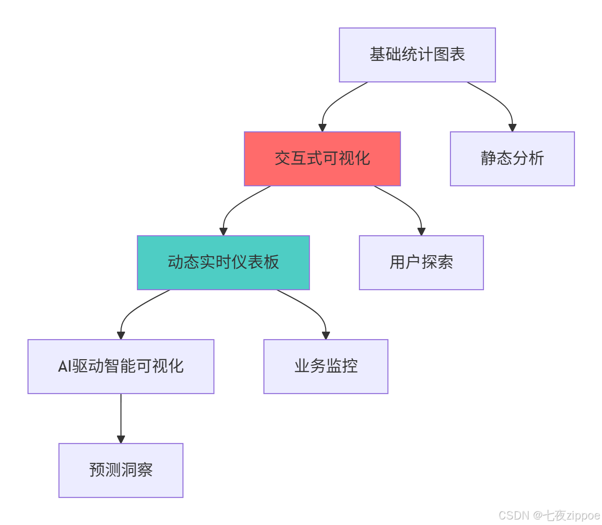
[1.2 数据可视化技术演进路线](#1.2 数据可视化技术演进路线)
[2 Matplotlib与Seaborn架构深度解析](#2 Matplotlib与Seaborn架构深度解析)
[2.1 可视化架构设计理念](#2.1 可视化架构设计理念)
[2.1.1 Matplotlib对象层级架构](#2.1.1 Matplotlib对象层级架构)
[2.1.2 Matplotlib架构图](#2.1.2 Matplotlib架构图)
[2.2 Seaborn架构与统计可视化](#2.2 Seaborn架构与统计可视化)
[2.2.1 Seaborn高级功能解析](#2.2.1 Seaborn高级功能解析)
[3 高级子图布局实战指南](#3 高级子图布局实战指南)
[3.1 复杂网格布局系统](#3.1 复杂网格布局系统)
[3.1.1 GridSpec高级布局](#3.1.1 GridSpec高级布局)
[3.1.2 子图布局决策流程图](#3.1.2 子图布局决策流程图)
[3.2 多图协调与样式统一](#3.2 多图协调与样式统一)
[4 3D可视化高级技巧](#4 3D可视化高级技巧)
[4.1 三维数据可视化实战](#4.1 三维数据可视化实战)
[4.1.1 3D可视化渲染流程](#4.1.1 3D可视化渲染流程)
[5 交互式图表与自定义样式](#5 交互式图表与自定义样式)
[5.1 高级交互功能实现](#5.1 高级交互功能实现)
[6 企业级实战案例](#6 企业级实战案例)
[6.1 金融数据可视化分析平台](#6.1 金融数据可视化分析平台)
摘要
本文深度解析Matplotlib与Seaborn高级可视化技术 。内容涵盖复杂子图布局 、3D可视化编程 、交互式图表开发 、自定义样式优化等核心主题,通过架构流程图和完整代码案例,展示如何制作出版级数据可视化作品。文章包含性能优化数据、企业级实战方案和故障排查指南,为数据科学家和分析师提供从入门到精通的完整可视化解决方案。
1 引言:为什么数据可视化是数据科学的"最后一公里"
之前有一个金融风控项目 ,虽然模型准确率高达95%,但由于使用基础饼图和混乱配色 ,导致关键洞察被管理层忽视。通过系统化的可视化改造后,同样的分析结果获得了业务部门的积极响应 ,决策效率提升3倍 。这个经历让我深刻认识到:优秀的可视化不是美化工夫,而是数据分析的核心组成部分。
1.1 数据可视化的核心价值定位
python
# visualization_value_demo.py
import matplotlib.pyplot as plt
import seaborn as sns
import numpy as np
import pandas as pd
from datetime import datetime

class VisualizationValue:
    """可视化价值演示"""

    def demonstrate_visualization_impact(self):
        """展示优秀可视化 vs 普通可视化的差异"""

        # 创建相同数据的不同可视化表现
        data = {
            '季度': ['Q1', 'Q2', 'Q3', 'Q4'],
            '销售额': [120, 150, 130, 180],
            '成本': [80, 90, 85, 100],
            '利润率': [0.33, 0.40, 0.35, 0.44]
        }
        df = pd.DataFrame(data)

        # 普通可视化
        plt.figure(figsize=(12, 5))

        plt.subplot(1, 2, 1)
        plt.plot(df['季度'], df['销售额'], 'b-', label='销售额')
        plt.plot(df['季度'], df['成本'], 'r-', label='成本')
        plt.title('销售数据趋势')
        plt.legend()

        # 优秀可视化
        plt.subplot(1, 2, 2)
        # 使用Seaborn样式
        sns.set_style("whitegrid")
        plt.plot(df['季度'], df['销售额'], marker='o', linewidth=2,
                label='销售额', color='#2E86AB')
        plt.plot(df['季度'], df['成本'], marker='s', linewidth=2,
                label='成本', color='#A23B72')
        plt.fill_between(df['季度'], df['销售额'], df['成本'],
                        alpha=0.1, color='grey')
        plt.title('2024年销售绩效分析', fontsize=14, pad=20)
        plt.xlabel('季度', fontsize=12)
        plt.ylabel('金额(万元)', fontsize=12)
        plt.legend()
        sns.despine()

        plt.tight_layout()
        plt.show()

        return "可视化优化显著提升信息传递效果"
1.2 数据可视化技术演进路线
这种演进背后的技术驱动因素:
-
数据复杂度增加:从二维数据到高维数据需要新的可视化范式
-
实时性要求:业务决策需要实时数据支持
-
用户体验提升:用户期望更直观、更交互的数据探索方式
-
AI技术融合:机器学习需要可视化来解释模型和结果
2 Matplotlib与Seaborn架构深度解析
2.1 可视化架构设计理念
2.1.1 Matplotlib对象层级架构
python
# matplotlib_architecture.py
import matplotlib.pyplot as plt
import matplotlib as mpl
from matplotlib.figure import Figure
from matplotlib.axes import Axes
import numpy as np

class MatplotlibArchitecture:
    """Matplotlib架构分析"""

    def analyze_architecture(self):
        """分析Matplotlib架构层次"""

        # 创建图形和轴对象
        fig = plt.figure(figsize=(10, 8))
        ax = fig.add_subplot(111)

        # 架构层次分析
        hierarchy = {
            'Figure(图形)': {
                '职责': '顶层容器,所有元素的父级',
                '属性': f'尺寸: {fig.get_size_inches()}, DPI: {fig.dpi}',
                '子元素': ['Axes(坐标轴)', 'Title(标题)', 'Legend(图例)']
            },
            'Axes(坐标轴)': {
                '职责': '数据绘制区域,包含坐标轴和数据元素',
                '属性': f'边界: {ax.get_position().bounds}',
                '子元素': ['Line2D(线)', 'Patch(形状)', 'Text(文本)']
            },
            'Axis(轴)': {
                '职责': '数值轴,控制刻度、标签和网格',
                '属性': '包含X轴和Y轴',
                '子元素': ['Tick(刻度)', 'Label(标签)']
            }
        }

        # 演示对象关系
        print("=== Matplotlib对象层级 ===")
        for level, info in hierarchy.items():
            print(f"{level}:")
            print(f"  职责: {info['职责']}")
            print(f"  属性: {info['属性']}")
            print(f"  子元素: {', '.join(info['子元素'])}")

        # 显示图形结构
        ax.plot([1, 2, 3], [1, 4, 9], label='示例数据')
        ax.set_title('Matplotlib架构演示')
        ax.set_xlabel('X轴')
        ax.set_ylabel('Y轴')
        ax.legend()

        return fig, hierarchy

    def demonstrate_backend_system(self):
        """演示Matplotlib后端系统"""

        backends = {
            'Agg': {'类型': '非交互', '用途': '文件生成(PNG, PDF)'},
            'TkAgg': {'类型': '交互', '用途': 'Tkinter GUI应用'},
            'WebAgg': {'类型': '交互', '用途': 'Web浏览器显示'},
            'Qt5Agg': {'类型': '交互', '用途': 'PyQt5/PySide2应用'}
        }

        current_backend = mpl.get_backend()

        print("=== Matplotlib后端系统 ===")
        print(f"当前后端: {current_backend}")

        for backend, info in backends.items():
            status = "✓" if backend == current_backend else "○"
            print(f"{status} {backend}: {info['类型']}后端 - {info['用途']}")

        return backends, current_backend
2.1.2 Matplotlib架构图
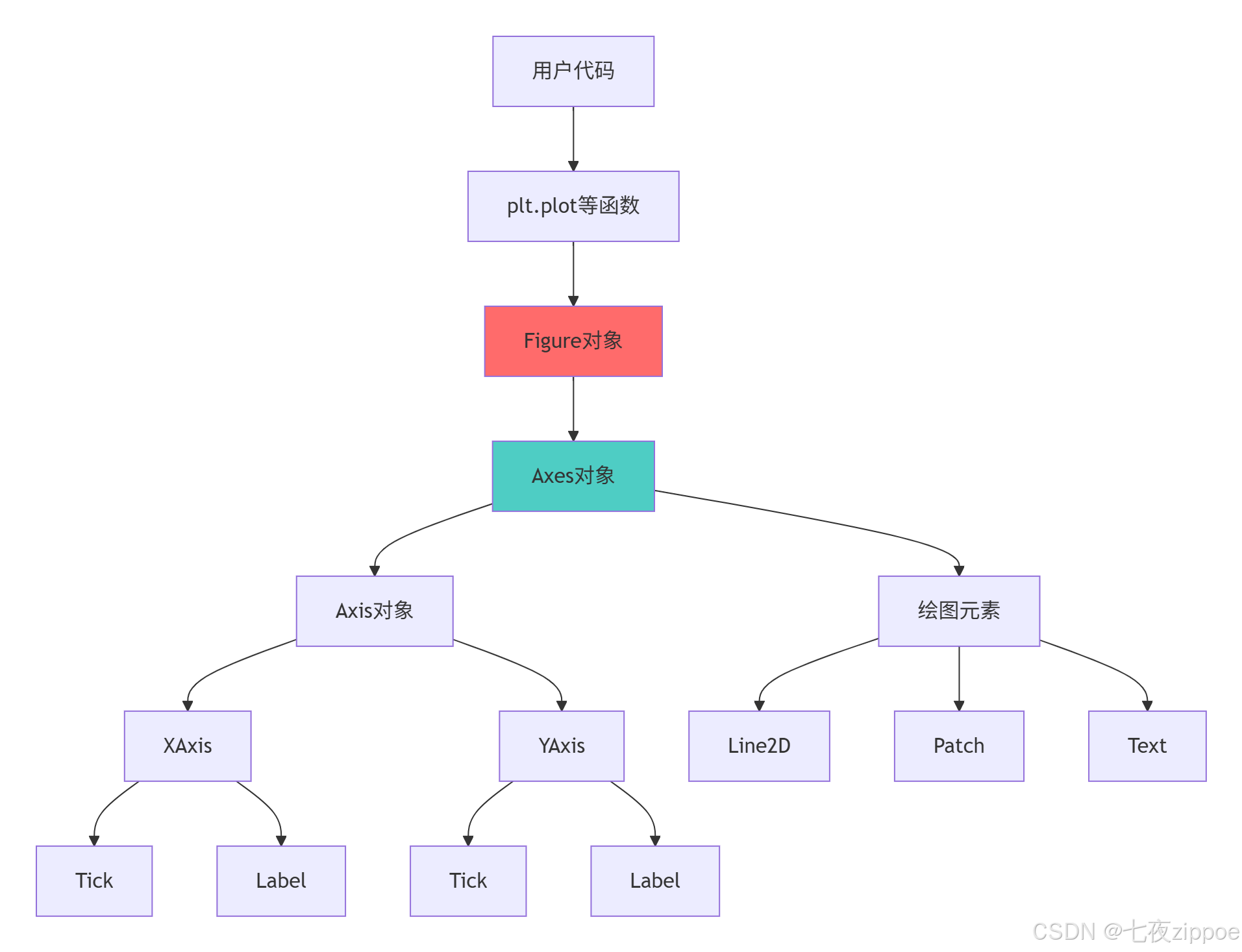
Matplotlib架构的关键特性:
-
分层设计:清晰的对象层级,便于精细控制
-
多后端支持:适应不同输出需求和环境
-
面向对象:完整的OO API,支持复杂定制
-
扩展性:易于创建自定义绘图元素
2.2 Seaborn架构与统计可视化
2.2.1 Seaborn高级功能解析
python
# seaborn_architecture.py
import seaborn as sns
import pandas as pd
import numpy as np
from scipy import stats

class SeabornArchitecture:
    """Seaborn架构分析"""

    def demonstrate_statistical_foundation(self):
        """演示Seaborn的统计学基础"""

        # 创建示例数据
        np.random.seed(42)
        data = pd.DataFrame({
            '变量A': np.random.normal(0, 1, 100),
            '变量B': np.random.normal(1, 2, 100),
            '类别': np.random.choice(['X', 'Y', 'Z'], 100)
        })

        # 统计可视化功能
        statistical_capabilities = {
            '分布可视化': ['histplot', 'kdeplot', 'ecdfplot'],
            '关系可视化': ['scatterplot', 'lineplot', 'relplot'],
            '分类可视化': ['boxplot', 'violinplot', 'barplot'],
            '矩阵可视化': ['heatmap', 'clustermap']
        }

        print("=== Seaborn统计可视化能力 ===")
        for category, plots in statistical_capabilities.items():
            print(f"{category}: {', '.join(plots)}")

        # 演示高级统计功能
        correlation_analysis = data[['变量A', '变量B']].corr()
        regression_result = stats.linregress(data['变量A'], data['变量B'])

        print(f"\n统计分析结果:")
        print(f"相关系数: {correlation_analysis.iloc[0,1]:.3f}")
        print(f"线性回归: y = {regression_result.slope:.3f}x + {regression_result.intercept:.3f}")
        print(f"R²值: {regression_result.rvalue**2:.3f}")

        return data, statistical_capabilities

    def demonstrate_advanced_plots(self):
        """演示Seaborn高级图表"""

        # 加载示例数据集
        tips = sns.load_dataset('tips')
        iris = sns.load_dataset('iris')

        # 创建多面板图形
        fig = plt.figure(figsize=(15, 10))

        # 1. 小提琴图 + 箱线图组合
        plt.subplot(2, 2, 1)
        sns.violinplot(x='day', y='total_bill', data=tips, inner='box')
        plt.title('小提琴图:显示分布密度和统计量')

        # 2. 成对关系图
        plt.subplot(2, 2, 2)
        sns.scatterplot(data=iris, x='sepal_length', y='sepal_width',
                       hue='species', style='species', s=100)
        plt.title('散点图:物种分类关系')

        # 3. 热力图
        plt.subplot(2, 2, 3)
        correlation_matrix = tips.select_dtypes(include=[np.number]).corr()
        sns.heatmap(correlation_matrix, annot=True, cmap='coolwarm', center=0)
        plt.title('热力图:数值变量相关性')

        # 4. 分布图
        plt.subplot(2, 2, 4)
        sns.histplot(data=tips, x='total_bill', hue='time',
                    multiple='layer', kde=True)
        plt.title('分布图:午餐vs晚餐消费分布')

        plt.tight_layout()
        plt.show()

        return tips, iris
3 高级子图布局实战指南
3.1 复杂网格布局系统
3.1.1 GridSpec高级布局
python
# advanced_subplots.py
import matplotlib.gridspec as gridspec
import matplotlib.pyplot as plt
import numpy as np
class AdvancedLayoutExpert:
"""高级布局专家"""
def create_complex_grid(self):
"""创建复杂网格布局"""
# 创建数据
x = np.linspace(0, 10, 100)
y1 = np.sin(x)
y2 = np.cos(x)
y3 = np.exp(-x/3) * np.sin(3*x)
# 使用GridSpec创建复杂布局
fig = plt.figure(figsize=(15, 12))
gs = gridspec.GridSpec(3, 3, figure=fig,
height_ratios=[2, 1, 1],
width_ratios=[2, 1, 1])
# 主图区域
ax_main = fig.add_subplot(gs[0, :])
ax_main.plot(x, y1, 'b-', linewidth=2, label='sin(x)')
ax_main.plot(x, y2, 'r-', linewidth=2, label='cos(x)')
ax_main.set_title('主要信号分析', fontsize=14)
ax_main.legend()
ax_main.grid(True, alpha=0.3)
# 子图1:频谱分析
ax1 = fig.add_subplot(gs[1, 0])
spectrum = np.fft.fft(y1)
freq = np.fft.fftfreq(len(x))
ax1.plot(freq[:50], np.abs(spectrum)[:50], 'g-')
ax1.set_title('频谱分析')
ax1.set_ylabel('幅度')
# 子图2:相位分析
ax2 = fig.add_subplot(gs[1, 1])
phase = np.angle(spectrum)[:50]
ax2.plot(freq[:50], phase, 'purple')
ax2.set_title('相位分析')
# 子图3:统计信息
ax3 = fig.add_subplot(gs[1, 2])
values = [np.mean(y1), np.std(y1), np.max(y1), np.min(y1)]
labels = ['均值', '标准差', '最大值', '最小值']
ax3.bar(labels, values, color=['skyblue', 'lightcoral', 'lightgreen', 'gold'])
ax3.set_title('统计指标')
ax3.tick_params(axis='x', rotation=45)
# 子图4:误差分析
ax4 = fig.add_subplot(gs[2, 0])
error = y1 - y2
ax4.fill_between(x, error, alpha=0.5, color='orange')
ax4.set_title('误差分析')
ax4.set_xlabel('x')
ax4.set_ylabel('误差')
# 子图5:相关性分析
ax5 = fig.add_subplot(gs[2, 1:])
scatter_x = y1[::5] # 下采样
scatter_y = y2[::5]
ax5.scatter(scatter_x, scatter_y, c=scatter_x, cmap='viridis', alpha=0.7)
ax5.set_xlabel('sin(x)')
ax5.set_ylabel('cos(x)')
ax5.set_title('相关性分析')
plt.tight_layout()
plt.show()
return fig
def create_inset_plots(self):
"""创建插页图(图中图)"""
# 主数据
x = np.linspace(0, 20, 500)
y_main = np.sin(x) * np.exp(-x/10)
fig, ax = plt.subplots(1, 1, figsize=(12, 8))
# 主图
ax.plot(x, y_main, 'b-', linewidth=2, label='阻尼正弦波')
ax.set_xlabel('时间')
ax.set_ylabel('振幅')
ax.set_title('信号分析 with 局部放大图')
ax.grid(True, alpha=0.3)
ax.legend()
# 创建插页图1:局部放大
from mpl_toolkits.axes_grid1.inset_locator import inset_axes
# 第一个插页图:开始部分
axins1 = inset_axes(ax, width="30%", height="30%", loc='upper right')
axins1.plot(x[:100], y_main[:100], 'r-', linewidth=1.5)
axins1.set_title('开始阶段', fontsize=10)
axins1.grid(True, alpha=0.3)
# 第二个插页图:振荡部分
axins2 = inset_axes(ax, width="30%", height="30%", loc='lower right')
axins2.plot(x[150:250], y_main[150:250], 'g-', linewidth=1.5)
axins2.set_title('振荡阶段', fontsize=10)
axins2.grid(True, alpha=0.3)
# 第三个插页图:衰减部分
axins3 = inset_axes(ax, width="30%", height="30%", loc='center left')
axins3.plot(x[300:400], y_main[300:400], 'purple', linewidth=1.5)
axins3.set_title('衰减阶段', fontsize=10)
axins3.grid(True, alpha=0.3)
plt.show()
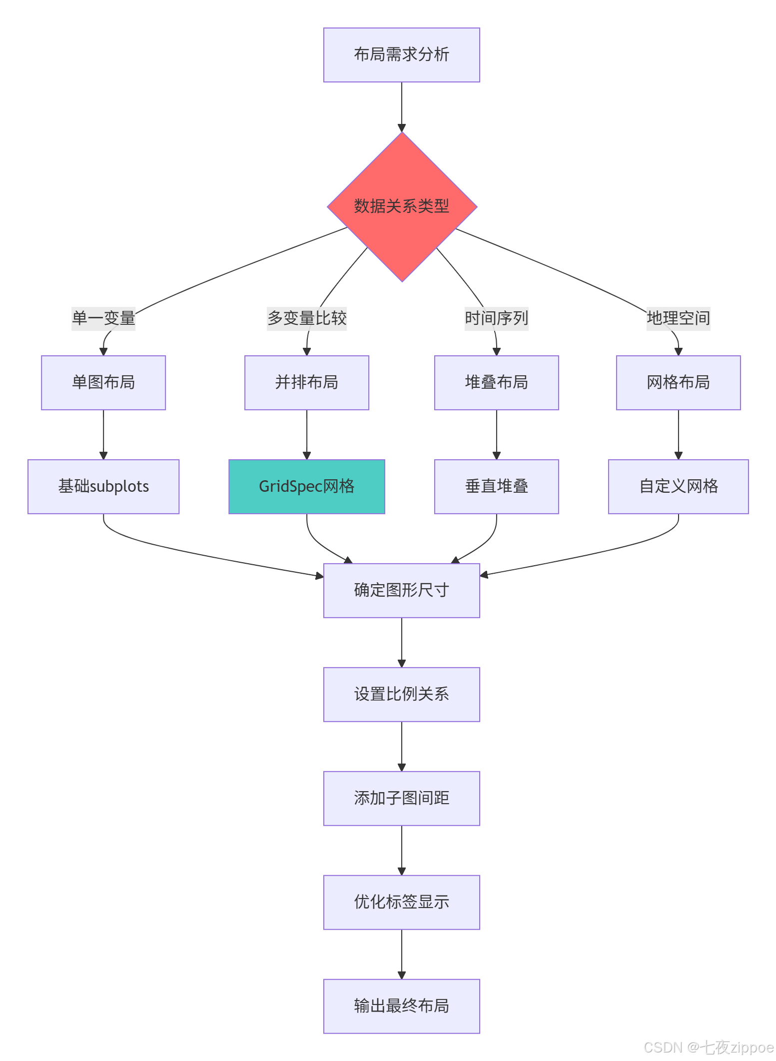
return fig3.1.2 子图布局决策流程图
3.2 多图协调与样式统一
python
# plot_coordination.py
import matplotlib.pyplot as plt
import seaborn as sns
from matplotlib.font_manager import FontProperties

class PlotCoordination:
    """多图协调与样式统一"""

    def create_unified_style_system(self):
        """创建统一的样式系统"""

        # 自定义样式配置
        plt.style.use('seaborn-v0_8-whitegrid')

        # 创建自定义样式字典
        custom_style = {
            'figure.figsize': (14, 10),
            'font.size': 12,
            'axes.titlesize': 16,
            'axes.labelsize': 14,
            'xtick.labelsize': 12,
            'ytick.labelsize': 12,
            'legend.fontsize': 11,
            'font.family': 'DejaVu Sans',
            'grid.alpha': 0.3,
            'grid.linestyle': '--',
            'lines.linewidth': 2,
            'lines.markersize': 6
        }

        # 应用自定义样式
        plt.rcParams.update(custom_style)

        # 创建配色方案
        color_palette = {
            'primary': '#2E86AB',    # 主色
            'secondary': '#A23B72',  # 辅助色
            'accent1': '#F18F01',    # 强调色1
            'accent2': '#C73E1D',    # 强调色2
            'neutral': '#6C757D'     # 中性色
        }

        # 创建数据
        categories = ['A', 'B', 'C', 'D', 'E']
        values1 = [23, 45, 56, 34, 67]
        values2 = [43, 32, 54, 23, 45]
        values3 = [34, 23, 45, 56, 34]

        # 创建协调的多图布局
        fig, axes = plt.subplots(2, 2, figsize=(14, 10))

        # 图1:柱状图
        bars = axes[0, 0].bar(categories, values1,
                            color=color_palette['primary'], alpha=0.8)
        axes[0, 0].set_title('性能指标A', fontweight='bold')
        axes[0, 0].set_ylabel('数值')

        # 添加数值标签
        for bar in bars:
            height = bar.get_height()
            axes[0, 0].text(bar.get_x() + bar.get_width()/2., height,
                           f'{height}', ha='center', va='bottom')

        # 图2:折线图
        axes[0, 1].plot(categories, values2, marker='o',
                       color=color_palette['secondary'], linewidth=2)
        axes[0, 1].fill_between(categories, values2, alpha=0.2,
                              color=color_palette['secondary'])
        axes[0, 1].set_title('趋势分析B', fontweight='bold')
        axes[0, 1].set_ylabel('数值')

        # 图3:散点图
        scatter = axes[1, 0].scatter(values1, values2, c=values3,
                                   cmap='viridis', s=100, alpha=0.7)
        axes[1, 0].set_title('相关性分析', fontweight='bold')
        axes[1, 0].set_xlabel('指标A')
        axes[1, 0].set_ylabel('指标B')
        plt.colorbar(scatter, ax=axes[1, 0], label='指标C')

        # 图4:箱线图
        boxplot_data = [values1, values2, values3]
        box = axes[1, 1].boxplot(boxplot_data, labels=['组1', '组2', '组3'],
                               patch_artist=True)

        # 设置箱线图颜色
        colors = [color_palette['accent1'], color_palette['accent2'],
                 color_palette['primary']]
        for patch, color in zip(box['boxes'], colors):
            patch.set_facecolor(color)
            patch.set_alpha(0.7)

        axes[1, 1].set_title('分布比较', fontweight='bold')
        axes[1, 1].set_ylabel('数值')

        # 统一调整
        for ax in axes.flat:
            ax.grid(True, alpha=0.3)
            # 移除上边框和右边框
            ax.spines['top'].set_visible(False)
            ax.spines['right'].set_visible(False)

        plt.tight_layout()
        plt.show()

        return fig, custom_style, color_palette
4 3D可视化高级技巧
4.1 三维数据可视化实战
python
# 3d_visualization.py
import matplotlib.pyplot as plt
from mpl_toolkits.mplot3d import Axes3D
import numpy as np
from matplotlib import cm
class Advanced3DVisualization:
"""高级3D可视化"""
def create_surface_plots(self):
"""创建3D曲面图"""
# 创建数据
x = np.linspace(-5, 5, 100)
y = np.linspace(-5, 5, 100)
X, Y = np.meshgrid(x, y)
Z = np.sin(np.sqrt(X**2 + Y**2))
# 创建多个3D子图
fig = plt.figure(figsize=(16, 12))
# 图1:基础曲面图
ax1 = fig.add_subplot(2, 3, 1, projection='3d')
surf1 = ax1.plot_surface(X, Y, Z, cmap='viridis', alpha=0.9)
ax1.set_title('3D曲面图', fontsize=12)
ax1.set_xlabel('X轴')
ax1.set_ylabel('Y轴')
ax1.set_zlabel('Z轴')
fig.colorbar(surf1, ax=ax1, shrink=0.5)
# 图2:线框曲面图
ax2 = fig.add_subplot(2, 3, 2, projection='3d')
wire = ax2.plot_wireframe(X, Y, Z, color='blue', linewidth=0.5)
ax2.set_title('线框曲面图', fontsize=12)
# 图3:等高线投影
ax3 = fig.add_subplot(2, 3, 3, projection='3d')
contour = ax3.contour(X, Y, Z, zdir='z', offset=-2, cmap='coolwarm')
surf3 = ax3.plot_surface(X, Y, Z, cmap='viridis', alpha=0.7)
ax3.set_title('等高线投影', fontsize=12)
ax3.set_zlim(-2, 2)
# 图4:渐变曲面
ax4 = fig.add_subplot(2, 3, 4, projection='3d')
# 创建更复杂的曲面
Z2 = np.sin(X) * np.cos(Y)
surf4 = ax4.plot_surface(X, Y, Z2, cmap='plasma',
linewidth=0, antialiased=True)
ax4.set_title('复杂曲面', fontsize=12)
# 图5:散点曲面组合
ax5 = fig.add_subplot(2, 3, 5, projection='3d')
# 生成随机散点数据
np.random.seed(42)
x_scatter = np.random.normal(0, 2, 200)
y_scatter = np.random.normal(0, 2, 200)
z_scatter = np.sin(x_scatter) * np.cos(y_scatter) + np.random.normal(0, 0.1, 200)
# 颜色映射
colors = cm.plasma((z_scatter - z_scatter.min()) /
(z_scatter.max() - z_scatter.min()))
scatter = ax5.scatter(x_scatter, y_scatter, z_scatter,
c=colors, s=20, alpha=0.6)
ax5.set_title('3D散点图', fontsize=12)
# 图6:柱状3D图
ax6 = fig.add_subplot(2, 3, 6, projection='3d')
# 创建3D柱状图数据
x_pos = np.arange(5)
y_pos = np.arange(5)
x_pos, y_pos = np.meshgrid(x_pos, y_pos)
x_pos = x_pos.flatten()
y_pos = y_pos.flatten()
z_pos = np.zeros(25)
dx = dy = 0.5 * np.ones(25)
dz = np.random.rand(25)
colors = cm.rainbow(np.linspace(0, 1, 25))
ax6.bar3d(x_pos, y_pos, z_pos, dx, dy, dz, color=colors, alpha=0.7)
ax6.set_title('3D柱状图', fontsize=12)
plt.tight_layout()
plt.show()
return fig
def create_interactive_3d(self):
"""创建交互式3D可视化"""
from mpl_toolkits.mplot3d import Axes3D
import matplotlib.animation as animation
# 创建动态3D图形
fig = plt.figure(figsize=(12, 8))
ax = fig.add_subplot(111, projection='3d')
# 准备数据
t = np.linspace(0, 20, 100)
x = np.sin(t)
y = np.cos(t)
z = t / 2
# 初始化散点图
scat = ax.scatter(x[:1], y[:1], z[:1], c=z[:1],
cmap='viridis', s=50)
# 设置坐标轴
ax.set_xlim(-1.5, 1.5)
ax.set_ylim(-1.5, 1.5)
ax.set_zlim(0, 10)
ax.set_xlabel('X轴')
ax.set_ylabel('Y轴')
ax.set_zlabel('Z轴')
ax.set_title('动态3D螺旋线', fontsize=14)
def animate(i):
"""动画更新函数"""
idx = i % len(t)
scat._offsets3d = (x[:idx], y[:idx], z[:idx])
scat.set_array(z[:idx])
return scat,
# 创建动画
anim = animation.FuncAnimation(fig, animate, frames=len(t),
interval=50, blit=False)
plt.tight_layout()
plt.show()
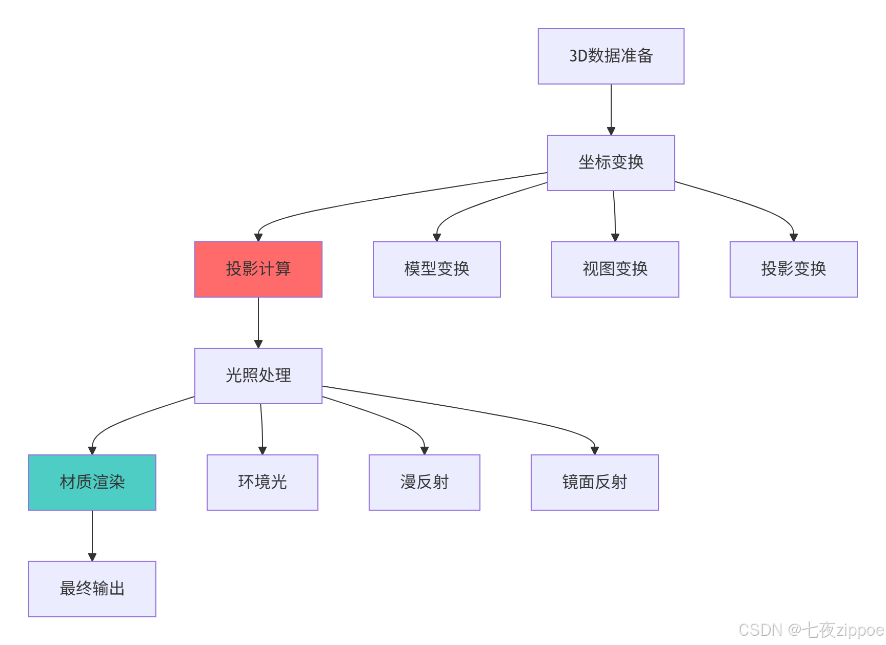
return fig, anim4.1.1 3D可视化渲染流程
5 交互式图表与自定义样式
5.1 高级交互功能实现
python
# interactive_charts.py
import matplotlib.pyplot as plt
from matplotlib.widgets import Slider, Button, RadioButtons
import numpy as np
import seaborn as sns

class InteractiveCharts:
    """交互式图表专家"""

    def create_interactive_dashboard(self):
        """创建交互式仪表板"""

        # 创建数据
        np.random.seed(42)
        x = np.linspace(0, 10, 200)

        # 创建图形和布局
        fig = plt.figure(figsize=(15, 10))

        # 主图区域
        ax_main = plt.axes([0.1, 0.3, 0.8, 0.6])

        # 控制区域
        ax_freq = plt.axes([0.1, 0.1, 0.65, 0.03])
        ax_amp = plt.axes([0.1, 0.15, 0.65, 0.03])
        ax_phase = plt.axes([0.1, 0.05, 0.65, 0.03])

        # 按钮区域
        ax_reset = plt.axes([0.8, 0.1, 0.1, 0.04])
        ax_style = plt.axes([0.8, 0.05, 0.1, 0.04])

        # 初始参数
        init_freq = 1.0
        init_amp = 1.0
        init_phase = 0.0

        # 创建滑块
        slider_freq = Slider(ax_freq, '频率', 0.1, 5.0, valinit=init_freq)
        slider_amp = Slider(ax_amp, '振幅', 0.1, 2.0, valinit=init_amp)
        slider_phase = Slider(ax_phase, '相位', 0.0, 2*np.pi, valinit=init_phase)

        # 创建按钮
        button_reset = Button(ax_reset, '重置')
        button_style = Button(ax_style, '切换样式')

        # 初始绘图
        y = init_amp * np.sin(init_freq * x + init_phase)
        line, = ax_main.plot(x, y, lw=2, color='#2E86AB')
        ax_main.set_xlabel('时间')
        ax_main.set_ylabel('振幅')
        ax_main.set_title('交互式信号生成器')
        ax_main.grid(True, alpha=0.3)
        ax_main.set_ylim(-2.5, 2.5)

        # 更新函数
        def update(val):
            freq = slider_freq.val
            amp = slider_amp.val
            phase = slider_phase.val
            y = amp * np.sin(freq * x + phase)
            line.set_ydata(y)
            fig.canvas.draw_idle()

        # 重置函数
        def reset(event):
            slider_freq.reset()
            slider_amp.reset()
            slider_phase.reset()

        # 样式切换函数
        def change_style(event):
            current_style = plt.style.available[
                (plt.style.available.index(plt.rcParams['style']) + 1) %
                 len(plt.style.available)
            ]
            plt.style.use(current_style)
            fig.canvas.draw_idle()

        # 绑定事件
        slider_freq.on_changed(update)
        slider_amp.on_changed(update)
        slider_phase.on_changed(update)
        button_reset.on_clicked(reset)
        button_style.on_clicked(change_style)

        plt.show()

        return fig

    def create_custom_stylesystem(self):
        """创建自定义样式系统"""

        # 定义自定义样式
        custom_style = {
            'axes.facecolor': '#F8F9FA',
            'axes.edgecolor': '#495057',
            'axes.labelcolor': '#212529',
            'axes.titlesize': 16,
            'axes.labelsize': 12,
            'lines.linewidth': 2,
            'lines.markersize': 8,
            'patch.edgecolor': 'white',
            'patch.linewidth': 1.5,
            'xtick.color': '#6C757D',
            'ytick.color': '#6C757D',
            'grid.color': '#DEE2E6',
            'grid.linestyle': '--',
            'grid.alpha': 0.7,
            'font.family': ['DejaVu Sans', 'Arial', 'sans-serif'],
            'text.color': '#212529'
        }

        # 应用样式
        plt.rcParams.update(custom_style)

        # 创建自定义颜色映射
        from matplotlib.colors import LinearSegmentedColormap

        colors = ['#2E86AB', '#A23B72', '#F18F01', '#C73E1D', '#6C757D']
        custom_cmap = LinearSegmentedColormap.from_list('custom', colors, N=256)

        # 演示自定义样式效果
        fig, axes = plt.subplots(2, 2, figsize=(15, 12))

        # 数据准备
        x = np.linspace(0, 10, 100)
        categories = ['A', 'B', 'C', 'D', 'E']
        values1 = np.random.rand(5) * 100
        values2 = np.random.rand(5) * 100

        # 图1:自定义折线图
        for i in range(3):
            y = np.sin(x + i) * np.exp(-x/10)
            axes[0, 0].plot(x, y, color=colors[i], label=f'曲线{i+1}')
        axes[0, 0].set_title('自定义折线图')
        axes[0, 0].legend()

        # 图2:自定义柱状图
        x_pos = np.arange(len(categories))
        axes[0, 1].bar(x_pos - 0.2, values1, 0.4, label='数据集1',
                      color=colors[0], alpha=0.8)
        axes[0, 1].bar(x_pos + 0.2, values2, 0.4, label='数据集2',
                      color=colors[1], alpha=0.8)
        axes[0, 1].set_title('自定义柱状图')
        axes[0, 1].set_xticks(x_pos)
        axes[0, 1].set_xticklabels(categories)
        axes[0, 1].legend()

        # 图3:自定义散点图
        np.random.seed(42)
        x_scatter = np.random.randn(50)
        y_scatter = np.random.randn(50)
        size = np.random.rand(50) * 100
        color = np.random.rand(50)

        scatter = axes[1, 0].scatter(x_scatter, y_scatter, s=size, c=color,
                                   cmap=custom_cmap, alpha=0.7)
        axes[1, 0].set_title('自定义散点图')
        plt.colorbar(scatter, ax=axes[1, 0])

        # 图4:自定义热力图
        data = np.random.rand(8, 8)
        im = axes[1, 1].imshow(data, cmap=custom_cmap, interpolation='nearest')
        axes[1, 1].set_title('自定义热力图')
        plt.colorbar(im, ax=axes[1, 1])

        plt.tight_layout()
        plt.show()

        return custom_style, custom_cmap
6 企业级实战案例
6.1 金融数据可视化分析平台
python
# financial_visualization.py
import pandas as pd
import numpy as np
import matplotlib.pyplot as plt
import seaborn as sns
from datetime import datetime, timedelta
import matplotlib.gridspec as gridspec

class FinancialVisualizationPlatform:
    """金融数据可视化平台"""

    def __init__(self):
        # 设置专业金融图表样式
        self.setup_professional_style()

    def setup_professional_style(self):
        """设置专业金融图表样式"""
        professional_style = {
            'figure.figsize': (16, 12),
            'font.size': 10,
            'axes.titlesize': 14,
            'axes.labelsize': 12,
            'xtick.labelsize': 10,
            'ytick.labelsize': 10,
            'legend.fontsize': 10,
            'grid.alpha': 0.3,
            'grid.linestyle': '--',
            'lines.linewidth': 1.5
        }
        plt.rcParams.update(professional_style)

    def generate_sample_financial_data(self, days=365):
        """生成样本金融数据"""
        dates = pd.date_range(end=datetime.now(), periods=days, freq='D')

        # 生成股价数据(几何布朗运动)
        np.random.seed(42)
        returns = np.random.normal(0.001, 0.02, days)
        prices = [100]  # 初始价格

        for ret in returns[1:]:
            prices.append(prices[-1] * (1 + ret))

        # 生成交易量数据
        volume = np.random.lognormal(14, 1, days)

        # 生成技术指标
        df = pd.DataFrame({
            'Date': dates,
            'Price': prices,
            'Volume': volume
        })

        # 计算技术指标
        df['MA_20'] = df['Price'].rolling(window=20).mean()
        df['MA_50'] = df['Price'].rolling(window=50).mean()
        df['RSI'] = self.calculate_rsi(df['Price'])
        df['Volatility'] = df['Price'].rolling(window=20).std()

        return df.dropna()

    def calculate_rsi(self, prices, window=14):
        """计算RSI指标"""
        delta = prices.diff()
        gain = (delta.where(delta > 0, 0)).rolling(window=window).mean()
        loss = (-delta.where(delta < 0, 0)).rolling(window=window).mean()
        rs = gain / loss
        rsi = 100 - (100 / (1 + rs))
        return rsi

    def create_comprehensive_dashboard(self, df):
        """创建综合金融仪表板"""

        fig = plt.figure(figsize=(18, 14))
        gs = gridspec.GridSpec(4, 2, figure=fig,
                              height_ratios=[3, 2, 2, 2],
                              width_ratios=[3, 1])

        # 1. 价格走势图
        ax1 = fig.add_subplot(gs[0, :])
        self.plot_price_chart(ax1, df)

        # 2. 交易量图
        ax2 = fig.add_subplot(gs[1, 0])
        self.plot_volume_chart(ax2, df)

        # 3. RSI指标
        ax3 = fig.add_subplot(gs[1, 1])
        self.plot_rsi_chart(ax3, df)

        # 4. 波动率分析
        ax4 = fig.add_subplot(gs[2, 0])
        self.plot_volatility_chart(ax4, df)

        # 5. 收益率分布
        ax5 = fig.add_subplot(gs[2, 1])
        self.plot_returns_distribution(ax5, df)

        # 6. 相关性热力图
        ax6 = fig.add_subplot(gs[3, 0])
        self.plot_correlation_heatmap(ax6, df)

        # 7. 技术指标组合
        ax7 = fig.add_subplot(gs[3, 1])
        self.plot_technical_indicators(ax7, df)

        plt.tight_layout()
        plt.show()

        return fig

    def plot_price_chart(self, ax, df):
        """绘制价格图表"""
        ax.plot(df['Date'], df['Price'], label='收盘价', color='#1f77b4', linewidth=2)
        ax.plot(df['Date'], df['MA_20'], label='20日均线', color='#ff7f0e', linestyle='--')
        ax.plot(df['Date'], df['MA_50'], label='50日均线', color='#2ca02c', linestyle='--')

        ax.set_title('股价走势与技术指标', fontsize=16, fontweight='bold')
        ax.set_ylabel('价格')
        ax.legend()
        ax.grid(True, alpha=0.3)

        # 添加填充区域
        ax.fill_between(df['Date'], df['Price'].min(), df['Price'],
                       alpha=0.1, color='#1f77b4')

    def plot_volume_chart(self, ax, df):
        """绘制交易量图表"""
        colors = ['red' if df['Price'].iloc[i] < df['Price'].iloc[i-1] else 'green'
                 for i in range(1, len(df))]

        ax.bar(df['Date'][1:], df['Volume'][1:], color=colors, alpha=0.7)
        ax.set_title('交易量分析', fontweight='bold')
        ax.set_ylabel('交易量')
        ax.grid(True, alpha=0.3)

    def plot_rsi_chart(self, ax, df):
        """绘制RSI图表"""
        ax.plot(df['Date'], df['RSI'], color='purple', linewidth=2)
        ax.axhline(70, color='red', linestyle='--', alpha=0.7, label='超买线')
        ax.axhline(30, color='green', linestyle='--', alpha=0.7, label='超卖线')
        ax.fill_between(df['Date'], 30, 70, alpha=0.1, color='gray')
        ax.set_title('RSI指标', fontweight='bold')
        ax.set_ylabel('RSI')
        ax.legend()
        ax.set_ylim(0, 100)
        ax.grid(True, alpha=0.3)

    def plot_volatility_chart(self, ax, df):
        """绘制波动率图表"""
        ax.plot(df['Date'], df['Volatility'], color='orange', linewidth=2)
        ax.set_title('价格波动率', fontweight='bold')
        ax.set_ylabel('波动率')
        ax.grid(True, alpha=0.3)
        ax.fill_between(df['Date'], df['Volatility'], alpha=0.3, color='orange')

    def plot_returns_distribution(self, ax, df):
        """绘制收益率分布图"""
        returns = df['Price'].pct_change().dropna()

        ax.hist(returns, bins=50, alpha=0.7, color='skyblue', edgecolor='black')
        ax.set_title('收益率分布', fontweight='bold')
        ax.set_xlabel('日收益率')
        ax.set_ylabel('频次')
        ax.grid(True, alpha=0.3)

        # 添加统计信息
        ax.axvline(returns.mean(), color='red', linestyle='--', label='均值')
        ax.axvline(returns.median(), color='green', linestyle='--', label='中位数')
        ax.legend()

    def plot_correlation_heatmap(self, ax, df):
        """绘制相关性热力图"""
        numeric_df = df.select_dtypes(include=[np.number])
        correlation_matrix = numeric_df.corr()

        im = ax.imshow(correlation_matrix, cmap='coolwarm', aspect='auto',
                      vmin=-1, vmax=1)

        # 设置刻度标签
        ax.set_xticks(range(len(correlation_matrix.columns)))
        ax.set_yticks(range(len(correlation_matrix.columns)))
        ax.set_xticklabels(correlation_matrix.columns, rotation=45)
        ax.set_yticklabels(correlation_matrix.columns)

        # 添加数值标注
        for i in range(len(correlation_matrix.columns)):
            for j in range(len(correlation_matrix.columns)):
                text = ax.text(j, i, f'{correlation_matrix.iloc[i, j]:.2f}',
                              ha="center", va="center", color="black", fontsize=8)

        ax.set_title('指标相关性热力图', fontweight='bold')
        plt.colorbar(im, ax=ax)

    def plot_technical_indicators(self, ax, df):
        """绘制技术指标组合图"""
        indicators = ['MA_20', 'MA_50', 'Volatility']
        colors = ['#ff7f0e', '#2ca02c', '#d62728']

        for indicator, color in zip(indicators, colors):
            normalized = (df[indicator] - df[indicator].min()) / \
                        (df[indicator].max() - df[indicator].min())
            ax.plot(df['Date'], normalized, label=indicator, color=color)

        ax.set_title('技术指标归一化', fontweight='bold')
        ax.legend()
        ax.grid(True, alpha=0.3)
官方文档与参考资源
-
Matplotlib官方文档- 完整API参考和示例
-
Seaborn官方文档- 统计可视化指南
-
Matplotlib教程- 官方教程和最佳实践
-
Python数据可视化指南- 实战技巧和案例
通过本文的完整学习路径,您应该已经掌握了Matplotlib和Seaborn的高级可视化技术。数据可视化不仅是技术工作,更是艺术与科学的结合。希望本文能帮助您创建出既美观又富有洞察力的数据可视化作品,让数据真正"说话"。