前传
上一章我们讲到了做好一个界面开发的教程,那么接下来就是另一个界面开发的教程,目前我们只开发一个APP中的教程
微信开发教程
对于如何在按下一个按钮后,打开另一个的界面,这就需要我们的: Connections连接功能,具体代码为(写在主项目中):
 Connections{
        target: loader.item

        function onMessage(msg)
        {
            console.log("msg: " + msg)
            if(msg === "Home")
            {
                loader.source = "Home.qml"
            }
            else if(msg === "WeChat")
            {
                loader.source = "Wechat.qml"
            }
        }
    }
这样当按下微信界面时自会跳转到另一个界面中的。
下一个界面的开发
有了前面的基础,我们能更好的开发微信界面的开发,这里就是简单的开发一个,不涉及复杂的界面,
cpp
Rectangle {
id: root
width: 480
height: 820
color: "#FFFFFF"
signal message(string msg)
Image {
id: backImage
width: 30
height: 30
fillMode: Image.PreserveAspectFit
source: "./Images/ArrowLeft.png"
anchors.left: parent.left
anchors.leftMargin: 10
anchors.top: parent.top
anchors.topMargin: 20
MouseArea {
anchors.fill: parent
onPressed: {
backImage.opacity = 0.5
}
onReleased: {
backImage.opacity = 1
}
onClicked: {
message("Home")
}
}
}
Label{
id:wechat
width: 90
height: 90
text: "微信"
anchors.left: backImage.right
anchors.leftMargin: 25
anchors.top: backImage.top
anchors.topMargin: -12
font.pixelSize: 35
}
Label{
id:root1
width: 50
height: 50
text: "用户"
anchors.horizontalCenter: parent.horizontalCenter
anchors.top: parent.top
anchors.topMargin: 250
font.pixelSize: 20
}
Label{
id:root2
width: 50
height: 50
text: "密码"
anchors.horizontalCenter: parent.horizontalCenter
anchors.top: parent.top
anchors.topMargin: 350
font.pixelSize: 20
}
Rectangle{
id:rect1
width: 260
height: 50
border.color: "darkgreen"
radius: height / 2
anchors.horizontalCenter: parent.horizontalCenter
anchors.top: parent.top
anchors.topMargin: 280
color: "lightgray"
TextInput{
anchors.fill: rect1
id:text1
font.pixelSize: 20
font.bold: true
focus: true
verticalAlignment: Text.AlignVCenter
leftPadding: 16
rightPadding: 25
clip: true//裁剪
}
}
Rectangle{
id:rect2
width: 260
height: 50
border.color: "darkgreen"
radius: height / 2
anchors.top: root2.top
anchors.topMargin: 30
anchors.horizontalCenter: parent.horizontalCenter
color: "lightgray"
TextInput{
anchors.fill: rect2
id:text2
font.pixelSize: 20
font.bold: true
focus: true
verticalAlignment: Text.AlignVCenter
leftPadding: 16
rightPadding: 25
clip: true//裁剪
echoMode: TextInput.Password//输入密码
onEditingFinished: {
console.log(text)
}
}
}
Label{
id:root3
width: rect1.width / 2
height: rect1.height / 2
text: "找回账号或密码"
color: "darkblue"
anchors.top: root2.top
anchors.topMargin: 90
anchors.left: root2.left
anchors.leftMargin: -20
anchors.horizontalCenter: root2.horizontalCenter
}
QuickButton {
id: loginButton
width: 260
height: 50
radius: height / 2
normalColor: "#16D468"
pressedColor: Qt.darker(normalColor)
imageVisible: false
buttonText: "登录"
fontPixelSize: 32
textColor: "#FFFFFF"
fontFamily: "Alibaba PuHuiTi 3.0"
anchors.top: parent.top
anchors.topMargin: 500
anchors.left: rect2.left
anchors.leftMargin: 25
onClicked: {
console.log(text)
}
}
QuickButton {
id: registerButton
width: 260
height: 50
radius: height / 2
normalColor: "#AAAAAA"
pressedColor: Qt.darker(normalColor)
imageVisible: false
buttonText: "注册"
fontPixelSize: 32
textColor: "#FFFFFF"
fontFamily: "Alibaba PuHuiTi 3.0"
anchors.top: loginButton.bottom
anchors.topMargin: 20
anchors.left: rect2.left
anchors.leftMargin: 25
onClicked: {
console.log(text)
}
}
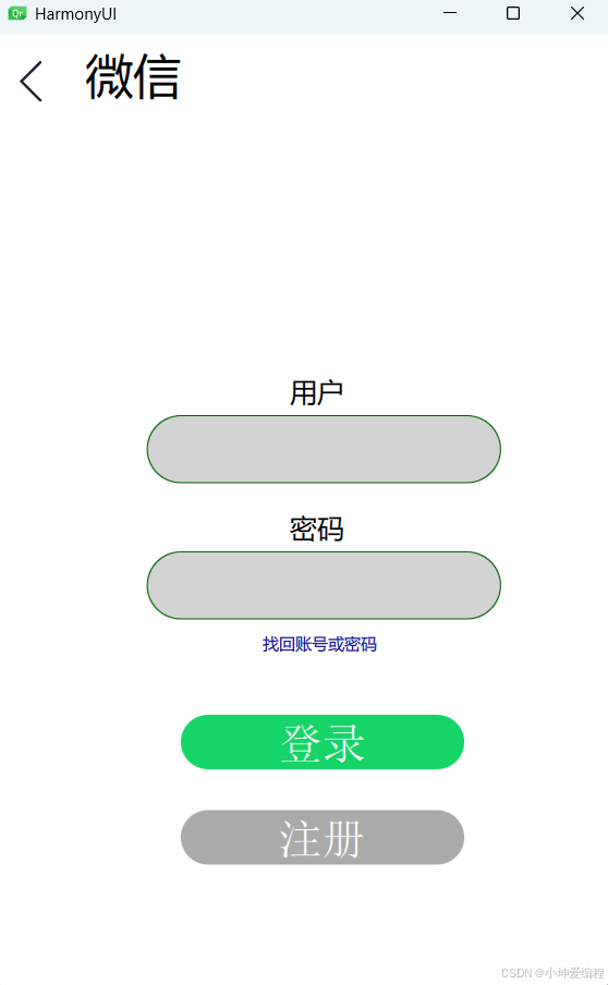
}这些代码就是利用了Rectangle、Label、Button等的控件组合而成,不涉及太复杂的内容,最终的效果为:
补充内容
对于HarmonyUI界面的开发,是想一下我们手机中是不是还有向下划的界面等的控件,这就需要我们的SwipeArea.qml事件的开发,设置x、y坐标,具体代码为:
cs
MouseArea {
property point origin
property int threshold: 10
signal swipe(string direction) // 上、下、左、右
// 设置原点坐标
// 设置拖动方向
onPressed: (mouse) => {
origin = Qt.point(mouse.x, mouse.y)
drag.axis = Drag.XAndYAxis
}
// 根据坐标变化的方向设置拖动的方向(x/y)
onPositionChanged: (mouse) => {
switch(drag.axis)
{
case Drag.XAndYAxis:
{
if(Math.abs(mouse.x - origin.x) > threshold)
{
drag.axis = Drag.XAxis
}
else if(Math.abs(mouse.y - origin.y) > threshold)
{
drag.axis = Drag.YAxis
}
} break
}
}
// 释放时根据移动坐标、原点坐标和阈值产生对应的方向信号
onReleased: (mouse) => {
switch(drag.axis)
{
case Drag.XAndYAxis:
{
canceled(mouse)
} break
case Drag.XAxis:
{
swipe((mouse.x - origin.x) < threshold ? "left" : "right")
} break
case Drag.YAxis:
{
swipe((mouse.y - origin.y) < threshold ? "up" : "down")
} break
}
}
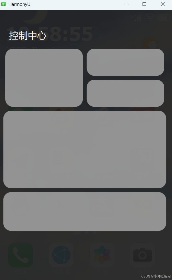
}这里就是运用了C语言的知识来创作的。然后在结合动画效果就可以做出这种效果了
具体代码为:
cs
SwipeArea{
        id:swipeArea
        anchors.fill: parent
        threshold: 50
        propagateComposedEvents: true

        onPressed:(mouse) => {
            mouse.accepted = true
        }
        onReleased:(mouse) => {
            mouse.accepted = true
        }
        onClicked:(mouse) => {
            mouse.accepted = true
        }
        onSwipe: {
            switch(direction)
            {
            case "up":
             {
                swipeArea.z = swipeArea.z - 30
                testRectangle.z = testRectangle.z - 30
                upMoveAnimation.start()
             }break;
            case "down":
             {
                swipeArea.z = swipeArea.z + 30
                testRectangle.z = testRectangle.z + 30
                downMoveAnimation.start()
             }break;

            }
        }
    }
    Label{
        id:timerlabel
        anchors.top: parent.top
        anchors.topMargin: 30
        anchors.left: parent.left
        anchors.leftMargin: 20
        color: "white"
        font.pixelSize: 50
        font.bold: true
        font.family: "Alibaba PuHuiTi 3.0"
        Component.onCompleted: {
            timer.start()
        }
    }
    Label{
        id:datelabel
        anchors.left: timerlabel.left
        anchors.top: timerlabel.bottom
        anchors.topMargin: 1
        anchors.horizontalCenter: timerlabel.horizontalCenter
        color: "white"
        font.pixelSize: 18
        Component.onCompleted: {
            timer1.start()
        }

    }
    Timer{
        id:timer
        interval:1
        repeat: true
        onTriggered: {
            timerlabel.text = Qt.formatDateTime(new Date,"hh:mm:ss")
        }
    }
    Timer{
        id:timer1
        interval: 1
        repeat: true
        onTriggered: {
            datelabel.text = Qt.formatDateTime(new Date,"M月d日  dddd")
        }
    }
    Grid{
        columns: 4
        spacing: 25
        anchors.bottom: parent.bottom
        anchors.bottomMargin: 380
        anchors.horizontalCenter: parent.horizontalCenter

        QuickButton{
            width: 80
            height: 80
            source: "./Images/WeChat.png"
            text: "微信"
            fontPixelSize: 16
            fontFamily: "楷体"
            bolder: true
            onClicked: {
                console.log("WeChat")
                message("WeChat")
            }
        }
        QuickButton{
            width: 80
            height: 80
            source: "./Images/Weibo.png"
            text: "微博"
            fontPixelSize: 16
            fontFamily: "楷体"
            bolder: true
            onClicked: {
                message("微博")
            }
        }
        QuickButton{
            width: 80
            height: 80
            source: "./Images/Xiecheng.png"
            text: "携程"
            fontPixelSize: 16
            fontFamily: "楷体"
            bolder: true
            onClicked: {
                message("携程")
            }

        }
        QuickButton{
            width: 80
            height: 80
            source: "./Images/Toutiao.png"
            text: "今日头条"
            fontPixelSize: 16
            fontFamily: "楷体"
            bolder: true
            onClicked: {
                message("今日头条")
            }
        }
    }
    Grid{
        columns: 4
        spacing: 25
        anchors.bottom: parent.bottom
        anchors.bottomMargin: 265
        anchors.horizontalCenter: parent.horizontalCenter

        QuickButton{
            width: 80
            height: 80
            source: "./Images/Amap.png"
            text: "高德地图"
            fontPixelSize: 16
            fontFamily: "楷体"
            bolder: true
            onClicked: {
                message("高德地图")
            }
        }
        QuickButton{
            width: 80
            height: 80
            source: "./Images/Notepad.png"
            text: "备忘录"
            fontPixelSize: 16
            fontFamily: "楷体"
            bolder: true
            onClicked: {
                message("备忘录")
            }
        }
        QuickButton{
            width: 80
            height: 80
            source: "./Images/Pupu.png"
            text: "扑扑超市"
            fontPixelSize: 16
            fontFamily: "楷体"
            bolder: true
            onClicked: {
                message("扑扑超市")
            }

        }
        QuickButton{
            width: 80
            height: 80
            source: "./Images/Taobao.png"
            text: "淘宝"
            fontPixelSize: 16
            fontFamily: "楷体"
            bolder: true
            onClicked: {
                message("淘宝")
            }
        }
    }
    Grid{
        columns: 4//列
        spacing: 25
        anchors.bottom: parent.bottom
        anchors.bottomMargin: 150
        anchors.horizontalCenter: parent.horizontalCenter

        QuickButton{
            width: 80
            height: 80
            source: "./Images/QQ.png"
            text: "QQ"
            fontPixelSize: 16
            fontFamily: "楷体"
            bolder: true
            onClicked: {
                message("QQ")
            }
        }
        QuickButton{
            width: 80
            height: 80
            source: "./Images/Kugou.png"
            text: "酷狗"
            fontPixelSize: 16
            fontFamily: "楷体"
            bolder: true
            onClicked: {
                message("酷狗")
            }
        }
        QuickButton{
            width: 80
            height: 80
            source: "./Images/Alipay.png"
            text: "支付宝"
            fontPixelSize: 16
            fontFamily: "楷体"
            bolder: true
            onClicked: {
                message("支付宝")
            }

        }
        QuickButton{
            width: 80
            height: 80
            source: "./Images/Meituan.png"
            text: "美团"
            fontPixelSize: 16
            fontFamily: "楷体"
            bolder: true
            onClicked: {
                message("美团")
            }
        }
    }
    //行
    Row{
        spacing: 10
        anchors.bottom: parent.bottom
        anchors.bottomMargin: 120
        anchors.horizontalCenter: parent.horizontalCenter

        Rectangle{
            width: 20
            height: 10
            radius:height / 2
            color: "white"
        }
        Rectangle{
            width: 10
            height: 10
            radius:height / 2
            color: "white"
        }
        Rectangle{
            width: 10
            height: 10
            radius:height / 2
            color: "white"
        }
    }
    Grid{
        columns: 4
        spacing: 25
        anchors.bottom: parent.bottom
        anchors.bottomMargin: 20
        anchors.horizontalCenter: parent.horizontalCenter

        QuickButton{
            width: 80
            height: 80
            source: "./Images/Phone.png"
            text: "电话"
            fontPixelSize: 16
            fontFamily: "楷体"
            bolder: true
            onClicked: {
                message("电话")
            }
        }
        QuickButton{
            width: 80
            height: 80
            source: "./Images/Browser.png"
            text: "浏览器"
            fontPixelSize: 16
            fontFamily: "楷体"
            bolder: true
            onClicked: {
                message("浏览器")
            }
        }
        QuickButton{
            width: 80
            height: 80
            source: "./Images/Gallery.png"
            text: "图库"
            fontPixelSize: 16
            fontFamily: "楷体"
            bolder: true
            onClicked: {
                message("图库")
            }
        }
        QuickButton{
            width: 80
            height: 80
            source: "./Images/Camera.png"
            text: "相机"
            fontPixelSize: 16
            fontFamily: "楷体"
            bolder: true
            onClicked: {
                message("相机")
            }
        }
    }

    Rectangle {
        id: testRectangle
        width: parent.width
        height: parent.height
        x: 0
        y: -parent.height
        color: "#F0222222"
        z: swipeArea.z + 1

        Label {
            text: qsTr("控制中心")
            anchors.top: parent.top
            anchors.topMargin: 50
            anchors.left: parent.left
            anchors.leftMargin: 30
            font.pixelSize: 24
            color: "#FFFFFF"
        }

        Rectangle {
            width: 200
            height: 150
            radius: 20
            anchors.top: parent.top
            anchors.topMargin: 100
            anchors.left: parent.left
            anchors.leftMargin: 20
            color: "#F0999999"
        }

        Rectangle {
            width: 200
            height: 70
            radius: 20
            anchors.top: parent.top
            anchors.topMargin: 100
            anchors.right: parent.right
            anchors.rightMargin: 20
            color: "#F0999999"
        }

        Rectangle {
            width: 200
            height: 70
            radius: 20
            anchors.top: parent.top
            anchors.topMargin: 180
            anchors.right: parent.right
            anchors.rightMargin: 20
            color: "#F0999999"
        }

        Rectangle {
            width: 420
            height: 200
            radius: 20
            anchors.top: parent.top
            anchors.topMargin: 260
            anchors.horizontalCenter: parent.horizontalCenter
            color: "#F0999999"
        }

        Rectangle {
            width: 420
            height: 100
            radius: 20
            anchors.top: parent.top
            anchors.topMargin: 470
            anchors.horizontalCenter: parent.horizontalCenter
            color: "#F0999999"
        }


        // 向下显示动画
        NumberAnimation {
            id: downMoveAnimation
            target: testRectangle
            properties: "y"
            from: -root.height
            to: 0
            duration: 1000
            easing {type: Easing.OutQuad}
        }

        // 向上隐藏动画
        NumberAnimation {
            id: upMoveAnimation
            target: testRectangle
            properties: "y"
            from: 0
            to: -root.height
            duration: 1000
            easing {type: Easing.OutQuad}
        }
    }


}
代码有点多,但是不妨的都是一点简单的代码。
总结
对于QML语言来说,是比widget语言来的简单一点,但是不学的话,还是很难的,还是要多思考、多敲代码。