2D变换
CSS transform 是元素进行2D/3D变换的核心属性,支持平移、旋转、缩放、倾斜等效果,且不破坏原有文档流布局。体验网站CSS Transform Functions Visualizer
平移translate
基于原位置,沿X/Y轴移动元素位置,不改变元素的实际布局,原位置保留
html
<!DOCTYPE html>
<html lang="en">

<head>
    <meta charset="UTF-8">
    <meta name="viewport" content="width=device-width, initial-scale=1.0">
    <title>Hello Page</title>
    <style>
        .box1 {
            width: 200px;
            height: 200px;
            background-color: pink;
            /* 添加过渡 */
            transition: all .3s;
        }

        .box1:hover {
            /* 位移 */
            transform: translate(100px, 100px);
        }

        .box2 {
            width: 200px;
            height: 200px;
            background-color: aquamarine;
            transition: all .3s;
        }

        .box2:hover {
            /* 相对自身宽度的50% */
            transform: translateX(50%);
        }
    </style>
</head>

<body>
    <div class="box1"></div>
    <div class="box2"></div>
</body>

</html>
将鼠标放到方格上会展示移动动画
旋转rotate
改变元素在平面或空间中的角度实现视觉效果
行内元素不能做旋转效果,需转换为行内块或块级元素
html
<!DOCTYPE html>
<html lang="en">

<head>
    <meta charset="UTF-8">
    <meta name="viewport" content="width=device-width, initial-scale=1.0">
    <title>Hello Page</title>
    <style>
        img {
            width: 200px;
            border-radius: 50%;
            border: 1px solid black;
            margin: 130px;
            transition: all 3s;
            /* 旋转中心设为左上角 */
            transform-origin: left top;
        }

        img:hover {
            transform: rotate(360deg);
        }
    </style>
</head>

<body>
    <img src="spring.jpg" alt="">
</body>

</html>
缩放scale
用于调整元素尺寸,且不改变元素在文档流中的原始占位
html
<!DOCTYPE html>
<html lang="en">

<head>
    <meta charset="UTF-8">
    <meta name="viewport" content="width=device-width, initial-scale=1.0">
    <title>Hello Page</title>
    <style>
        .box1 {
            width: 200px;
            height: 200px;
            background-color: pink;
            transition: all 1s;
        }

        .box1:hover {
            /* 整体放大1.5倍 */
            transform: scale(1.5);
        }

        .box2 {
            width: 200px;
            height: 200px;
            background-color: aquamarine;
            transition: all 1s;
        }

        .box2:hover {
            /* X轴放大1.5倍,Y轴不变 */
            transform: scale(1.5, 1);
        }
    </style>
</head>

<body>
    <div class="box1"></div>
    <div class="box2"></div>
</body>

</html>
倾斜skew
二维倾斜变换,通过沿X轴或Y轴扭曲元素的几何形状
html
<!DOCTYPE html>
<html lang="en">

<head>
    <meta charset="UTF-8">
    <meta name="viewport" content="width=device-width, initial-scale=1.0">
    <title>Hello Page</title>
    <style>
        .box {
            width: 200px;
            height: 50px;
            text-align: center;
            line-height: 55px;
            color: white;
            background-color: pink;
            /* 盒子倾斜效果 */
            transform: skewX(-20deg);
        }

        .card {
            /* 父盒子相对定位 */
            position: relative;
            width: 240px;
            height: 280px;
            margin: 50px;
        }

        .card div {
            /* 子盒子绝对定位 */
            position: absolute;
            top: 0;
            left: 0;
            width: 240px;
            height: 280px;
            /* 圆角 */
            border-radius: 0px 30px 40px 40px;
            /* 设置倾斜中心点 */
            transform-origin: top left;
            /* 添加过渡 */
            transition: all .3s;
        }

        .card .front {
            z-index: 1;
            background-color: rgba(0, 0, 0, 0.5);
        }

        .card .back {
            background-color: purple;
             /* 沿着Y轴倾斜 */
            transform: skewY(8deg);
        }

        .card:hover .front {
            /* 往上平移 */
            transform: translateY(-3px);
        }

        .card:hover .back {
            transform: skewY(15deg);
            width: 200px;
        }
    </style>
</head>

<body>
    <div class="box">英雄联盟</div>
    <div class="card">
        <div class="front"></div>
        <div class="back"></div>
    </div>
</body>

</html>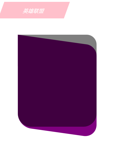
过渡transition
transition:过渡属性 持续时间 速度曲线 延迟时间
html
<!DOCTYPE html>
<html lang="en">

<head>
    <meta charset="UTF-8">
    <meta name="viewport" content="width=device-width, initial-scale=1.0">
    <title>Hello Page</title>
    <style>
        .box {
            width: 200px;
            height: 50px;
            text-align: center;
            line-height: 55px;
            color: white;
            background-color: pink;
            transform: skewX(-20deg);
        }

        .card {
            position: relative;
            width: 240px;
            height: 280px;
            margin: 50px;
        }

        .card div {
            position: absolute;
            top: 0;
            left: 0;
            width: 240px;
            height: 280px;
            border-radius: 0px 30px 40px 40px;
            transform-origin: top left;
            /* 持续时间 贝塞尔曲线 */
            transition: 0.8s cubic-bezier(0.075, 0.82, 0.165, 1);
        }

        .card .front {
            z-index: 1;
            background-color: rgba(0, 0, 0, 0.5);
        }

        .card .back {
            background-color: purple;
            transform: skewY(8deg);
        }

        .card:hover .front {
            transform: translateY(-3px);
        }

        .card:hover .back {
            transform: skewY(15deg);
            width: 200px;
        }
    </style>
</head>

<body>
    <div class="box">英雄联盟</div>
    <div class="card">
        <div class="front"></div>
        <div class="back"></div>
    </div>
</body>

</html>
虽然我感觉没啥特别大的变换呀,但还是展示一下吧
复合写法
多个变换函数组合使用,从右到左的执行
如:transform: translateX(600px) rotate(720deg);先执行平移
3D变换与透视
CSS 3D用于将二位元素在三维空间中进行变换,为网页添加立体感和动态交互体验。相比JavaScript和WebGL,CSS 3D利用GPU加速,动画更流畅,性能更高效
旋转rotate
通过改变元素在3D空间中的角度实现视觉效果
html
<!DOCTYPE html>
<html lang="en">

<head>
    <meta charset="UTF-8">
    <meta name="viewport" content="width=device-width, initial-scale=1.0">
    <title>Hello Page</title>
    <style>
        img {
            width: 230px;
            transition: all .5s;
        }

        .x:hover {
            transform: rotateX(180deg);
        }

        .z:hover {
            transform: rotateZ(180deg);
        }
    </style>
</head>

<body>
    <img src="spring.jpg" alt="" class="x">
    <br>
    <img src="antumn.jpg" alt="" class="z">
</body>

</html>
透视perspective
用于模拟人眼观察3D空间时的近大远小效果。数值越小(视距),透视效果越强;给父元素添加,里面所有子元素都会添加透视效果;给子元素添加,perspective必须作为transform属性的第一个函数
html
<!DOCTYPE html>
<html lang="en">

<head>
    <meta charset="UTF-8">
    <meta name="viewport" content="width=device-width, initial-scale=1.0">
    <title>Hello Page</title>
    <style>
        /* 给父元素添加透视效果 */
        body {
            perspective: 500px;
        }

        img {
            display: block;
            margin: 0 auto;
            width: 230px;
        }

        .x {
            transform: rotateX(20deg);
        }

        .z {
            transform: rotateX(40deg);
        }
    </style>
</head>

<body>
    <img src="spring.jpg" alt="" class="x">
    <br>
    <img src="antumn.jpg" alt="" class="z">
</body>

</html>
html
<!DOCTYPE html>
<html lang="en">

<head>
    <meta charset="UTF-8">
    <meta name="viewport" content="width=device-width, initial-scale=1.0">
    <title>Hello Page</title>
    <style>
        img {
            display: block;
            margin: 0 auto;
            width: 230px;
        }

        .x {
            /* 给子元素添加透视 */
            transform: perspective(500px) rotateX(40deg);
        }
    </style>
</head>

<body>
    <img src="spring.jpg" alt="" class="x">
</body>

</html>
案例-两面翻转的盒子
html
<!DOCTYPE html>
<html lang="en">

<head>
    <meta charset="UTF-8">
    <meta name="viewport" content="width=device-width, initial-scale=1.0">
    <title>Hello Page</title>
    <style>
        .box {
            /* 父相 */
            position: relative;
            width: 300px;
            height: 450px;
            border: 1px solid blue;
            margin: 100px auto;
            /* 添加透视效果 */
            perspective: 1000px;
        }

        .box>div {
            /* 加绝对定位,叠到一起 */
            position: absolute;
            width: 100%;
            height: 100%;
            text-align: center;
            font-size: 30px;
            color: white;
            line-height: 450px;
            transition: all .7s;
        }

        .box .front {
            z-index: 1;
            background-color: pink;
            /* 转到背面,隐藏盒子 */
            backface-visibility: hidden;
        }

        .box .back {
            background-color: aquamarine;
            transform: rotateY(180deg);
        }

        .box:hover .front {
            transform: rotateY(-180deg);
        }

        .box:hover .back {
            /* 转回到0° */
            transform: rotateY(0deg);
        }
    </style>
</head>

<body>
    <div class="box">
        <div class="front">前面</div>
        <div class="back">背面</div>
    </div>
</body>

</html>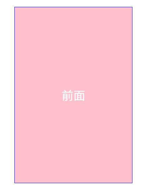
位移translate3d()
在三维空间中同时沿X、Y、Z轴平移元素,启用GPU渲染,提升动画流畅度
也可单独沿Z轴平移translateZ(),实现近大远小的立体效果,正值靠近观察者(放大),需父元素设置perspective属性才能生效
html
<!DOCTYPE html>
<html lang="en">

<head>
    <meta charset="UTF-8">
    <meta name="viewport" content="width=device-width, initial-scale=1.0">
    <title>Hello Page</title>
    <style>
        * {
            margin: 0;
            padding: 0;
            box-sizing: border-box;
        }

        body {
            background-color: #ccc;
        }

        .box {
            /* 父相 */
            position: relative;
            width: 300px;
            height: 450px;
            border: 1px solid blue;
            margin: 100px auto;
            /* 添加透视效果 */
            perspective: 1000px;
        }

        .box>div {
            /* 加绝对定位,叠到一起 */
            position: absolute;
            width: 100%;
            height: 100%;
            text-align: center;
            font-size: 30px;
            color: white;
            line-height: 450px;
            transition: all 4s;
            /* 开启子元素的3d空间效果(给文字),写到直接父元素 */
            transform-style: preserve-3d;
        }

        .box .front {
            z-index: 1;
            background-color: pink;
            /* 转到背面,隐藏盒子 */
            backface-visibility: hidden;
        }

        .box .front h3 {
            /* 沿Z轴 */
            transform: translateZ(60px);
            backface-visibility: hidden;
        }

        .box .back {
            padding-top: 100px;
            background-color: aquamarine;
            transform: rotateY(180deg);
        }

        .box .back p {
            line-height: 30px;
            font-size: 20px;
            /* translate3d写法 */
            transform: translate3d(0, 0, 60px);
            backface-visibility: hidden;
        }

        .box:hover .front {
            transform: rotateY(-180deg);
        }

        .box:hover .back {
            /* 转回到0° */
            transform: rotateY(0deg);
        }
    </style>
</head>

<body>
    <div class="box">
        <div class="front">
            <h3>春风吹</h3>
        </div>
        <div class="back">
            <p>吹红了桃花吹绿了柳树</p>
            <p>你在路上总会安慰谁</p>
            <p>吹醒了青蛙吹来了燕子</p>
            <p>我在城里刚好缺了谁</p>
            <p>你纵然带来地下的玫瑰</p>
            <p>能否收回地上的滋味</p>
        </div>
    </div>
</body>

</html>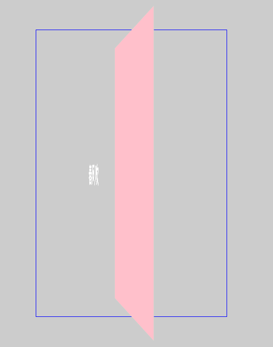
动画
是一种通过定义关键帧和动画属性来实现元素动态效果的技术,利用GPU加速渲染,避免频繁的JavaScript计算开销。
关键帧是动画和视频制作中用于定义动作或状态变化的核心节点,它决定了动画的起始、转折和结束状态。中间帧通过算法自动生成,形成连贯的动画效果。
html
<!DOCTYPE html>
<html lang="en">

<head>
    <meta charset="UTF-8">
    <meta name="viewport" content="width=device-width, initial-scale=1.0">
    <title>Hello Page</title>
    <style>
        /* 定义动画 */
        @keyframes move {

            /* 起始状态 */
            0% {
                transform: translate(0, 0);
            }

            /* 结束状态 */
            100% {
                transform: translate(300px, 300px);
                border-radius: 50%;
            }
        }

        /* 使用动画 */
        .box {
            width: 100px;
            height: 100px;
            background-color: pink;
            /* 动画名称 动画市场 */
            animation: move 4s;
        }
    </style>
</head>

<body>
    <div class="box"></div>
</body>

</html>
点击刷新就能重复播放动画(图为移动过程中)
animation属性
animation属性完整写法,前两个必写,其余可省略,但要保证书写顺序,写到目标元素里面。
animation:动画名称 动画时长 速度曲线 延迟时间 播放次数 播放方向 执行完毕状态;
html
<!DOCTYPE html>
<html lang="en">

<head>
    <meta charset="UTF-8">
    <meta name="viewport" content="width=device-width, initial-scale=1.0">
    <title>Hello Page</title>
    <style>
        @keyframes move {
            0% {
                transform: translate(0, 0);
            }

            100% {
                transform: translate(400px, 0);
            }
        }

        .box {
            width: 100px;
            height: 100px;
            background-color: pink;
                                    /* 无限循环  播放方向交替 保留最后一帧*/
            animation: move 4s ease 0s infinite alternate forwards;
        }
    </style>
</head>

<body>
    <div class="box"></div>
</body>

</html>
animation-play-state属性,可以控制暂停或继续动画,默认running
html
<!DOCTYPE html>
<html lang="en">

<head>
    <meta charset="UTF-8">
    <meta name="viewport" content="width=device-width, initial-scale=1.0">
    <title>Hello Page</title>
    <style>
        @keyframes move {
            0% {
                transform: translate(0, 0);
            }

            100% {
                transform: translate(400px, 0);
            }
        }

        .box {
            width: 100px;
            height: 100px;
            background-color: pink;
            animation: move 4s ease 0s infinite alternate forwards;
        }

        .box:hover {
            /* 鼠标经过暂动画 */
            animation-play-state: paused;
        }
    </style>
</head>

<body>
    <div class="box"></div>
</body>

</html>
逐帧动画
steps()是CSS动画中用于控制动画分段执行的计时函数,通过将动画分割为离散的步骤,实现类似传统帧动画的跳跃效果,经常搭配精灵图一起实现
动效案例
流光渐变边框效果
实际是使用彩色盒子来回移动做动画,再使用一个文字盒子做遮挡
html
<!DOCTYPE html>
<html lang="en">

<head>
    <meta charset="UTF-8">
    <meta name="viewport" content="width=device-width, initial-scale=1.0">
    <title>Hello Page</title>
    <style>
        a {
            text-decoration: none;
            color: white;
            font-size: 20px;
        }

        .btn1 {
            overflow: hidden;
            position: relative;
            display: block;
            width: 148px;
            height: 60px;
            margin: 100px;
            /* 内边距 */
            padding: 4px;
            border-radius: 6px;
            text-align: center;
            line-height: 57px;
            background-color: pink;
        }

        /* 彩色盒子 */
        .btn1::before {
            content: '';
            position: absolute;
            /* 定位 */
            top: 0;
            left: 0;
            /* 增大一倍 */
            width: 200%;
            height: 100%;
            background: linear-gradient(115deg, #4fcf70, #fad648, #a767e5, #12bcfe, #4fcf70);
            background-size: 50% 100%;
            animation: move .75s linear infinite;
        }

        @keyframes move {
            to {
                /* 走一半 */
                transform: translateX(-50%);
            }
        }

        .btn1 span {
            position: relative;
            display: block;
            width: 100%;
            height: 100%;
            background-color: black;
            border-radius: 3px;
        }
    </style>
</head>

<body>
    <a href="#" class="btn1">
        <span>开始</span>
    </a>
</body>

</html>
径向渐变一直转圈,实现旋转效果,再加一个黑色遮挡盒子,再加一个内容盒子(里面可能有文字、图片,所以单独做一个)
html
<!DOCTYPE html>
<html lang="en">

<head>
    <meta charset="UTF-8">
    <meta name="viewport" content="width=device-width, initial-scale=1.0">
    <title>Hello Page</title>
    <style>
        body {
            background-color: black;
        }

        .btn2 {
            overflow: hidden;
            display: flex;
            justify-content: center;
            align-items: center;
            position: relative;
            width: 300px;
            height: 200px;
            border: 1px solid #333;
            border-radius: 10px;
            margin: 50px;
            color: white;
            font-size: 24px;
            font-weight: bold;
            text-align: center;
            line-height: 200px;
        }

        /* 径向渐变盒子 */
        .btn2::before {
            content: '';
            position: absolute;
            width: 500px;
            height: 500px;
            background-image: conic-gradient(transparent, transparent, transparent, #00ccff);
            ;
            animation: rotate 1s linear infinite;
            z-index: -1;
        }

        @keyframes rotate {
            to {
                transform: rotate(360deg);
            }
        }

        /* 黑色遮挡盒子 */
        .btn2::after {
            content: '';
            position: absolute;
            /* top: 3px;
            left: 3px;
            right: 3px;
            bottom: 3px; */
            /* 等价于上面四行 */
            inset: 3px;
            background-color: black;
            border-radius: 10px;
            z-index: -1;
        }
    </style>
</head>

<body>
    <div class="btn2">渐变边框</div>
</body>

</html>
卡片折叠效果
使用grid分成急等份,当鼠标经过某个子盒子时修改份数
html
<!DOCTYPE html>
<html lang="en">

<head>
    <meta charset="UTF-8">
    <meta name="viewport" content="width=device-width, initial-scale=1.0">
    <title>Hello Page</title>
    <style>
        * {
            margin: 0;
            padding: 0;
            box-sizing: border-box;
        }

        ul,
        li {
            list-style: none;
        }

        .box {
            overflow: hidden;
            max-width: 1320px;
            height: 527px;
            margin: 100px auto;
        }

        .box ul {
            display: grid;
            grid-template-columns: 2fr 1fr 1fr 1fr;
            grid-template-rows: 527px;
            gap: 8px;
            transition: all .6s;
        }

        .box .item {
            position: relative;
            /* 放在50%中间的位置 */
            background: url(spring.jpg) no-repeat 50%/cover;
        }

        .box .item:nth-child(2) {
            background-image: url(summer.jpeg);
        }

        .box .item:nth-child(3) {
            background-image: url(antumn.jpg);
        }

        .box .item:nth-child(4) {
            background-image: url(winter.jpg);
        }

        /* 父亲选择器 鼠标经过li,让ul修改里面的份数*/
        .box ul:has(.item:nth-child(1):hover) {
            grid-template-columns: 2fr 1fr 1fr 1fr;
        }

        .box ul:has(.item:nth-child(2):hover) {
            grid-template-columns: 1fr 2fr 1fr 1fr;
        }

        .box ul:has(.item:nth-child(3):hover) {
            grid-template-columns: 1fr 1fr 2fr 1fr;
        }

        .box ul:has(.item:nth-child(4):hover) {
            grid-template-columns: 1fr 1fr 1fr 2fr;
        }

        .item p {
            position: absolute;
            left: 0;
            bottom: -100px;
            color: white;
            padding: 20px;
        }

        /* 鼠标经过,文字升上来 */
        .item:hover p {
            bottom: 0;
            transition: all .6s;
        }
    </style>
</head>

<body>
    <div class="box">
        <ul>
            <li class="item">
                <p>超长屏保</p>
            </li>
            <li class="item">
                <p>超长屏保</p>
            </li>
            <li class="item">
                <p>超长屏保</p>
            </li>
            <li class="item">
                <p>超长屏保</p>
            </li>
        </ul>
    </div>
</body>

</html>
多元素实现动画效果
图片最好用透明的svg格式,这样背景才会显示出来(苯人为了方便就不找了)
html
<!DOCTYPE html>
<html lang="en">

<head>
    <meta charset="UTF-8">
    <meta name="viewport" content="width=device-width, initial-scale=1.0">
    <title>Hello Page</title>
    <style>
        * {
            margin: 0;
            padding: 0;
            box-sizing: border-box;
        }

        html,
        body {
            width: 100%;
            height: 100%;
        }

        body {
            background: linear-gradient(190deg, rgb(67, 22, 219) 13.57%, rgb(144, 118, 231) 98.38%) no-repeat;
        }

        .box {
            position: relative;
            width: 674px;
            height: 500px;
            margin: 0 auto;
        }

        .card1 {
            background: radial-gradient(218.51% 281.09% at 100% 100%, rgba(253, 63, 51, 0.6) 0%, rgba(76, 0, 200, 0.6) 45.83%, rgba(76, 0, 200, 0.6)100%);
            width: 183px;
            height: 120px;
            position: absolute;
            top: 150px;
            left: -37px;
            border-radius: 10px;
        }

        .card2 {
            background: rgba(23, 12, 61, 0.3);
            backdrop-filter: blur(10px);
            width: 183px;
            height: 120px;
            position: absolute;
            top: 150px;
            left: 176px;
            border-radius: 10px;
        }

        .card3 {
            background: rgba(23, 12, 61, 0.3);
            width: 701px;
            height: 428px;
            position: absolute;
            top: 200px;
            left: 0px;
            border-radius: 10px;
            backdrop-filter: blur(10px);
        }

        .card4 {
            background: rgba(23, 12, 61, 0.3);
            width: 400px;
            height: 273px;
            position: absolute;
            top: 370px;
            left: 40px;
            border-radius: 10px;
            backdrop-filter: blur(10px);
            box-shadow: rgba(255, 255, 255, 0.2) 0px 0px 0px 0.5px inset;
        }

        .card5 {
            background: rgba(23, 12, 61, 0.2);
            width: 414px;
            height: 273px;
            position: absolute;
            top: 400px;
            left: 340px;
            border-radius: 10px;
            backdrop-filter: blur(10px);
            box-shadow: rgba(255, 255, 255, 0.2) 0px 0px 0px 0.5px inset;
        }

        .box img {
            width: 100%;
            height: 100%;
            object-fit: cover;
            display: block;
        }

        .box>div {
            transform: skewX(-8deg);
            transition: all 2s cubic-bezier(0.075, 0.82, 0.165, 1);
        }

        /* 鼠标经过卡片,移动位置,去掉倾斜 */
        .box:hover .card1 {
            transform: translate3d(-30px, -30px, 0);
        }

        .box:hover .card2 {
            transform: translate3d(0, -30px, 0);
        }

        .box:hover .card3 {
            transform: translate3d(0, 0, 0);
        }

        .box:hover .card4 {
            transform: translate3d(-120px, 60px, 0);
        }

        .box:hover .card5 {
            transform: translate3d(30px, 30px, 0);
        }
    </style>
</head>

<body>
    <div class="box">
        <div class="card1">
            <img src="spring.jpg" alt="">
        </div>
        <div class="card2">
            <img src="spring.jpg" alt="">
        </div>
        <div class="card3">
            <img src="spring.jpg" alt="">
        </div>
        <div class="card4">
            <img src="spring.jpg" alt="">
        </div>
        <div class="card5">
            <img src="spring.jpg" alt="">
        </div>
    </div>
</body>

</html>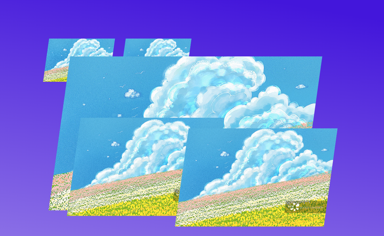
图片轮播效果
复制一个原盒子,用两倍盒子实现轮播效果
html
<!DOCTYPE html>
<html lang="en">

<head>
    <meta charset="UTF-8">
    <meta name="viewport" content="width=device-width, initial-scale=1.0">
    <title>Hello Page</title>
    <style>
        * {
            margin: 0;
            padding: 0;
            box-sizing: border-box;
        }

        body {
            background-color: white;
        }

        .box {
            overflow: hidden;
            width: 1180px;
            margin: 100px auto;
            border: 2px solid red;
        }

        .box:hover .scroll {
            animation-play-state: paused;
        }

        .scroll img {
            width: 180px;
            height: 90px;
            border-radius: 6px;
        }

        .scroll {
            display: flex;
            animation: move 20s linear infinite;
        }

        .scroll .ad1 {
            display: grid;
            grid-template-columns: repeat(6, 180px);
            grid-template-rows: repeat(4, 90px);
            gap: 16px 20px;
            margin-right: 20px;
        }

        @keyframes move {
            0% {
                transform: translateX(0);
            }

            100% {
                transform: translateX(-1200px);
            }
        }
    </style>
</head>

<body>
    <div class="box">
        <div class="scroll">
            <div class="ad1">
                <img src="spring.jpg" alt="">
                <img src="summer.jpeg" alt="">
                <img src="antumn.jpg" alt="">
                <img src="winter.jpg" alt="">
                <img src="spring.jpg" alt="">
                <img src="summer.jpeg" alt="">
                <img src="antumn.jpg" alt="">
                <img src="winter.jpg" alt="">
                <img src="spring.jpg" alt="">
                <img src="summer.jpeg" alt="">
                <img src="antumn.jpg" alt="">
                <img src="winter.jpg" alt="">
                <img src="spring.jpg" alt="">
                <img src="summer.jpeg" alt="">
                <img src="antumn.jpg" alt="">
                <img src="winter.jpg" alt="">
                <img src="spring.jpg" alt="">
                <img src="summer.jpeg" alt="">
                <img src="antumn.jpg" alt="">
                <img src="winter.jpg" alt="">
                <img src="spring.jpg" alt="">
                <img src="summer.jpeg" alt="">
                <img src="antumn.jpg" alt="">
                <img src="winter.jpg" alt="">
            </div>
        </div>
    </div>
</body>

</html>
鼠标经过动效+倒影效果
html
<!DOCTYPE html>
<html lang="en">

<head>
    <meta charset="UTF-8">
    <meta name="viewport" content="width=device-width, initial-scale=1.0">
    <title>Hello Page</title>
    <style>
        * {
            margin: 0;
            padding: 0;
            box-sizing: border-box;
        }

        body {
            background-color: black;
        }

        .box {
            margin: 200px auto;
            display: flex;
            justify-content: center;
            align-items: center;
        }

        .box .item {
            position: relative;
            width: 120px;
            height: 120px;
            margin: 0 2px;
            cursor: pointer;
            /* 添加倒影效果 */
            -webkit-box-reflect: below 1px linear-gradient(transparent #0002);
            transition: all .6s;
        }

        img {
            width: 100%;
            height: 100%;
            border-radius: 5px;
        }

        .box .item:hover {
            transform: scale(1.2);
            z-index: 1;
        }

        /* 鼠标经过某个盒子,其余的盒子都变形 */
        .box:hover .item:not(:hover) {
            transform: perspective(500px) scale(0.9) rotateY(45deg);
            margin: 0 -20px;
        }

        /* 鼠标经过盒子的后面兄弟 */
        .box .item:hover~.item {
            transform: perspective(500px) scale(0.9) rotateY(-45deg);
        }
    </style>
</head>

<body>
    <div class="box">
        <div class="item"><img src="spring.jpg"></div>
        <div class="item"><img src="summer.jpeg"></div>
        <div class="item"><img src="antumn.jpg"></div>
        <div class="item"><img src="winter.jpg"></div>
        <div class="item"><img src="spring.jpg"></div>
    </div>
</body>

</html>
3D导航栏
需要一个两面盒子,前面盒子translateZ,底面盒子translateY,大盒子rotateX
html
<!DOCTYPE html>
<html lang="en">

<head>
    <meta charset="UTF-8">
    <meta name="viewport" content="width=device-width, initial-scale=1.0">
    <title>Hello Page</title>
    <style>
        * {
            margin: 0;
            padding: 0;
            box-sizing: border-box;
        }

        body {
            background-color: gray;
        }

        ul {
            position: absolute;
            top: 50%;
            left: 50%;
            transform: translate(-50%, -50%);
            display: flex;
            list-style: none;
            gap: 5px;
        }

        ul li {
            position: relative;
            width: 80px;
            height: 40px;
            /* 开启子元素的3d空间 */
            transform-style: preserve-3d;
            transition: all .5s;
        }

        ul li span {
            position: absolute;
            top: 0;
            left: 0;
            display: block;
            width: 100%;
            height: 100%;
            line-height: 40px;
            font-size: 14px;
            background: white;
            color: black;
            text-align: center;
        }

        .front {
            background: white;
            color: blue;
            transform: translateZ(20px);
        }

        .bottom {
            background: blue;
            color: white;
            transform: translateY(20px) rotateX(-90deg);
        }

        ul li:hover {
            transform: rotateX(90deg);
        }
    </style>
</head>

<body>
    <ul>
        <li>
            <span class="front 1">QQ</span>
            <span class="bottom 1">QQ</span>
        </li>
        <li>
            <span class="front 2">WeChat</span>
            <span class="bottom 2">WeChat</span>
        </li>
    </ul>
</body>

</html>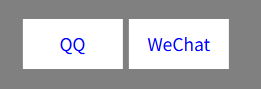
拓展
SVG动画
SVG是一种矢量图形的格式,支持无损缩放、交互性和动态效果。由<svg>根元素和<path>路径组成
还是可以去iconfont官网下载,在购物车处,点击"下载素材"
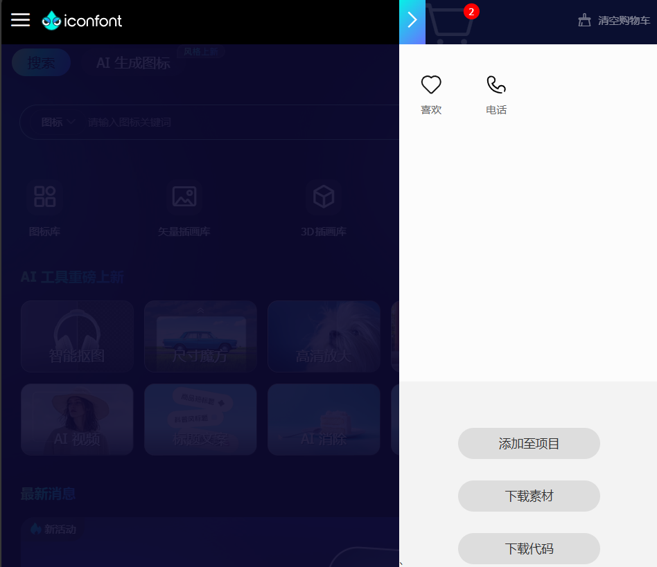
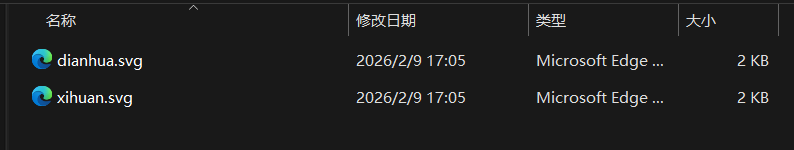
点击下方的"SVG",然后将压缩包解压缩,双击打开要使用的图标
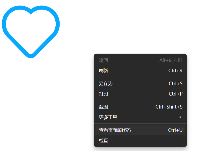
右键,点击"查看网页源代码",勾选左上角的"换行"
从<svg>开始复制代码,就是svg图片的格式了
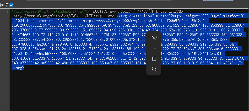
将复制好的代码粘贴到光标位置
html
<!DOCTYPE html>
<html lang="en">
<head>
<meta charset="UTF-8">
<meta name="viewport" content="width=device-width, initial-scale=1.0">
<title>Hello Page</title>
<style>
* {
margin: 0;
padding: 0;
box-sizing: border-box;
}
ul {
list-style: none;
}
a {
text-decoration: none;
}
.nav {
display: flex;
width: 500px;
margin: 50px;
gap: 20px;
}
.nav li a {
display: flex;
flex-direction: column;
align-items: center;
justify-content: center;
}
.nav li svg {
/* svg图片通过宽高修改大小 */
width: 30px;
height: 30px;
}
.nav li:hover svg {
animation: move .6s;
}
@keyframes move {
0% {
transform: translateY(0);
}
50% {
transform: translateY(-5px);
}
100% {
transform: translateY(0);
}
}
</style>
</head>
<body>
<ul class="nav">
<li>
<a href="#">
<svg class="icon" width="200px" height="200.00px" viewBox="0 0 1024 1024" version="1.1"
xmlns="http://www.w3.org/2000/svg">
<path fill="#09a9fe"
d="M518.4 149.290667c112.597333-80.789333 267.882667-69.397333 368.128 32 53.866667 54.528 84.138667 128.853333 84.138667 206.378666 0 77.525333-30.293333 151.850667-84.096 206.336l-294.421334 299.52a110.976 110.976 0 0 1-80.213333 34.474667 110.72 110.72 0 0 1-79.914667-34.176L137.322667 593.770667C83.562667 539.242667 53.333333 464.981333 53.333333 387.541333s30.229333-151.722667 84.010667-206.272c100.224-101.376 255.530667-112.768 368.128-31.978666l6.442667 4.778666 6.485333-4.778666z m322.602667 76.970666c-84.629333-85.589333-219.157333-88.64-307.328-6.954666l-21.76 20.138666-21.717334-20.138666c-88.192-81.685333-222.72-78.634667-307.306666 6.933333-41.92 42.496-65.557333 100.608-65.557334 161.28 0 60.693333 23.637333 118.805333 65.6 161.344l295.04 300.416c9.045333 9.450667 21.269333 14.72 33.962667 14.72 12.693333 0 24.917333-5.269333 34.261333-15.04L840.96 549.077333c42.005333-42.496 65.685333-100.650667 65.685333-161.408 0-60.736-23.68-118.912-65.664-161.408z" />
</svg>
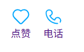
<span>点赞</span>
</a>
</li>
<li>
<a href="#">
<svg class="icon" width="200px" height="200.00px" viewBox="0 0 1024 1024" version="1.1"
xmlns="http://www.w3.org/2000/svg">
<path fill="#09a9fe"
d="M446.272 573.44a509.653333 509.653333 0 0 1-81.92-100.650667c67.786667-30.474667 112.138667-93.461333 112.138667-169.792C476.48 194.592 388.96 106.666667 280.906667 106.666667 170.058667 106.666667 85.333333 188.746667 85.333333 302.997333c0 158.250667 82.56 328.554667 200.618667 439.658667 100.010667 94.122667 258.986667 161.738667 413.461333 174.570667 0.832 0.074667 1.674667 0.106667 2.517334 0.106666h41.162666a30.517333 30.517333 0 0 0 0-61.045333h-39.872c-140.672-11.978667-286.026667-73.930667-375.456-158.090667-106.410667-100.16-181.408-254.837333-181.408-395.2 0-80.106667 56.981333-135.285333 134.549334-135.285333 74.282667 0 134.549333 60.533333 134.549333 135.285333 0 60.309333-40.896 107.989333-103.008 123.349334a30.517333 30.517333 0 0 0-19.786667 43.658666c27.573333 53.312 66.037333 104.426667 111.573334 147.690667 51.264 48.693333 109.941333 86.112 172.053333 108.16a30.506667 30.506667 0 0 0 40.362667-24.064c10.453333-67.093333 61.621333-114.026667 126.442666-114.026667 74.272 0 134.549333 60.544 134.549334 135.285334 0 25.578667-7.04 50.026667-20.149334 71.253333a30.528 30.528 0 0 0 51.925334 32.074667A196.096 196.096 0 0 0 938.666667 723.050667c0-108.394667-87.530667-196.330667-195.573334-196.330667-83.072 0-151.210667 52.384-177.621333 128.864-42.368-19.552-82.773333-47.541333-119.2-82.144z" />
</svg>
<span>电话</span>
</a>
</li>
</ul>
</body>
</html>鼠标移到li上,图标会上浮再下降
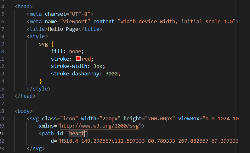
svg图标常见CSS属性
html
<!DOCTYPE html>
<html lang="en">

<head>
    <meta charset="UTF-8">
    <meta name="viewport" content="width=device-width, initial-scale=1.0">
    <title>Hello Page</title>
    <style>
        svg {
            /* 填充颜色(需删除SVGpath中的fill) */
            fill: red;
            /* 描边颜色 */
            stroke: blue;
            /* 描边宽度 */
            stroke-width: 10px;
            /* 虚线模式(实线长度 间隔长度) */
            stroke-dasharray: 100px;
        }
    </style>
</head>

<body>
    <svg class="icon" width="200px" height="200.00px" viewBox="0 0 1024 1024" version="1.1"
        xmlns="http://www.w3.org/2000/svg">
        <path
            d="M518.4 149.290667c112.597333-80.789333 267.882667-69.397333 368.128 32 53.866667 54.528 84.138667 128.853333 84.138667 206.378666 0 77.525333-30.293333 151.850667-84.096 206.336l-294.421334 299.52a110.976 110.976 0 0 1-80.213333 34.474667 110.72 110.72 0 0 1-79.914667-34.176L137.322667 593.770667C83.562667 539.242667 53.333333 464.981333 53.333333 387.541333s30.229333-151.722667 84.010667-206.272c100.224-101.376 255.530667-112.768 368.128-31.978666l6.442667 4.778666 6.485333-4.778666z m322.602667 76.970666c-84.629333-85.589333-219.157333-88.64-307.328-6.954666l-21.76 20.138666-21.717334-20.138666c-88.192-81.685333-222.72-78.634667-307.306666 6.933333-41.92 42.496-65.557333 100.608-65.557334 161.28 0 60.693333 23.637333 118.805333 65.6 161.344l295.04 300.416c9.045333 9.450667 21.269333 14.72 33.962667 14.72 12.693333 0 24.917333-5.269333 34.261333-15.04L840.96 549.077333c42.005333-42.496 65.685333-100.650667 65.685333-161.408 0-60.736-23.68-118.912-65.664-161.408z" />
    </svg>
</body>

</html>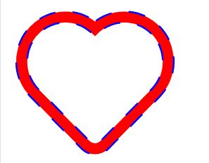
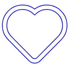
线条变换效果
html
<!DOCTYPE html>
<html lang="en">

<head>
    <meta charset="UTF-8">
    <meta name="viewport" content="width=device-width, initial-scale=1.0">
    <title>Hello Page</title>
    <style>
        svg {
            fill: none;
            stroke: blue;
            stroke-width: 10px;
        }

        svg:hover {
            animation: move 2s;
        }

        @keyframes move {
            0% {
                /* 没有描边 */
                stroke-dasharray: 0 600;
            }

            100% {
                /* 全都是实线 */
                stroke-dasharray: 600 0;
            }
        }
    </style>
</head>

<body>
    <svg class="icon" width="200px" height="200.00px" viewBox="0 0 1024 1024" version="1.1"
        xmlns="http://www.w3.org/2000/svg">
        <path
            d="M518.4 149.290667c112.597333-80.789333 267.882667-69.397333 368.128 32 53.866667 54.528 84.138667 128.853333 84.138667 206.378666 0 77.525333-30.293333 151.850667-84.096 206.336l-294.421334 299.52a110.976 110.976 0 0 1-80.213333 34.474667 110.72 110.72 0 0 1-79.914667-34.176L137.322667 593.770667C83.562667 539.242667 53.333333 464.981333 53.333333 387.541333s30.229333-151.722667 84.010667-206.272c100.224-101.376 255.530667-112.768 368.128-31.978666l6.442667 4.778666 6.485333-4.778666z m322.602667 76.970666c-84.629333-85.589333-219.157333-88.64-307.328-6.954666l-21.76 20.138666-21.717334-20.138666c-88.192-81.685333-222.72-78.634667-307.306666 6.933333-41.92 42.496-65.557333 100.608-65.557334 161.28 0 60.693333 23.637333 118.805333 65.6 161.344l295.04 300.416c9.045333 9.450667 21.269333 14.72 33.962667 14.72 12.693333 0 24.917333-5.269333 34.261333-15.04L840.96 549.077333c42.005333-42.496 65.685333-100.650667 65.685333-161.408 0-60.736-23.68-118.912-65.664-161.408z" />
    </svg>
</body>

</html>
鼠标经过画线
注意,要在iconfont里找实心的图标
stroke-dashoffset
用于调整虚线模式的起始偏移量,增大会使许仙模式向路径起点移动,视觉上像线条被"擦除"
获得形状的长度
在path后面加一个id属性,名字随便取
右键"检查",打开控制台面板,如下输入,输出即为长度
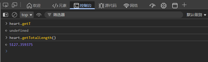
html
<!DOCTYPE html>
<html lang="en">

<head>
    <meta charset="UTF-8">
    <meta name="viewport" content="width=device-width, initial-scale=1.0">
    <title>Hello Page</title>
    <style>
        svg {
            fill: none;
            stroke: red;
            stroke-width: 3px;
            stroke-dasharray: 5127;
            /* 相当于空白 */
            stroke-dashoffset: 5127;
            animation: heart 4s linear infinite;
        }

        @keyframes heart {
            0% {
                stroke-dashoffset: 5127;
            }

            100% {
                stroke-dashoffset: 0;
            }
        }
    </style>
</head>

<body>
    <svg class="icon" width="200px" height="200.00px" viewBox="0 0 1024 1024" version="1.1"
        xmlns="http://www.w3.org/2000/svg">
        <path id="heart"
            d="M518.4 149.290667c112.597333-80.789333 267.882667-69.397333 368.128 32 53.866667 54.528 84.138667 128.853333 84.138667 206.378666 0 77.525333-30.293333 151.850667-84.096 206.336l-294.421334 299.52a110.976 110.976 0 0 1-80.213333 34.474667 110.72 110.72 0 0 1-79.914667-34.176L137.322667 593.770667C83.562667 539.242667 53.333333 464.981333 53.333333 387.541333s30.229333-151.722667 84.010667-206.272c100.224-101.376 255.530667-112.768 368.128-31.978666l6.442667 4.778666 6.485333-4.778666z m322.602667 76.970666c-84.629333-85.589333-219.157333-88.64-307.328-6.954666l-21.76 20.138666-21.717334-20.138666c-88.192-81.685333-222.72-78.634667-307.306666 6.933333-41.92 42.496-65.557333 100.608-65.557334 161.28 0 60.693333 23.637333 118.805333 65.6 161.344l295.04 300.416c9.045333 9.450667 21.269333 14.72 33.962667 14.72 12.693333 0 24.917333-5.269333 34.261333-15.04L840.96 549.077333c42.005333-42.496 65.685333-100.650667 65.685333-161.408 0-60.736-23.68-118.912-65.664-161.408z" />
    </svg>
</body>

</html>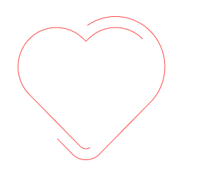
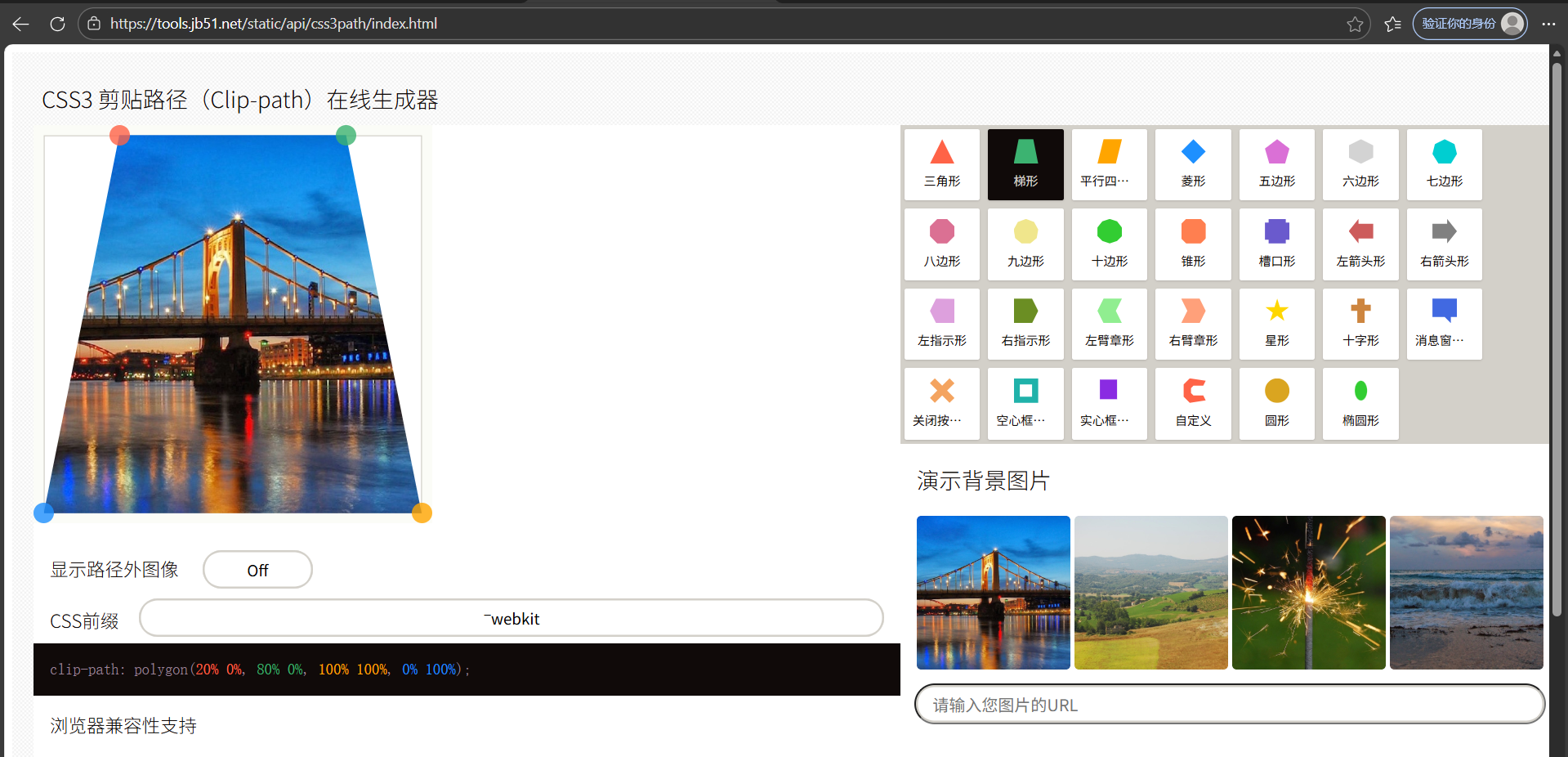
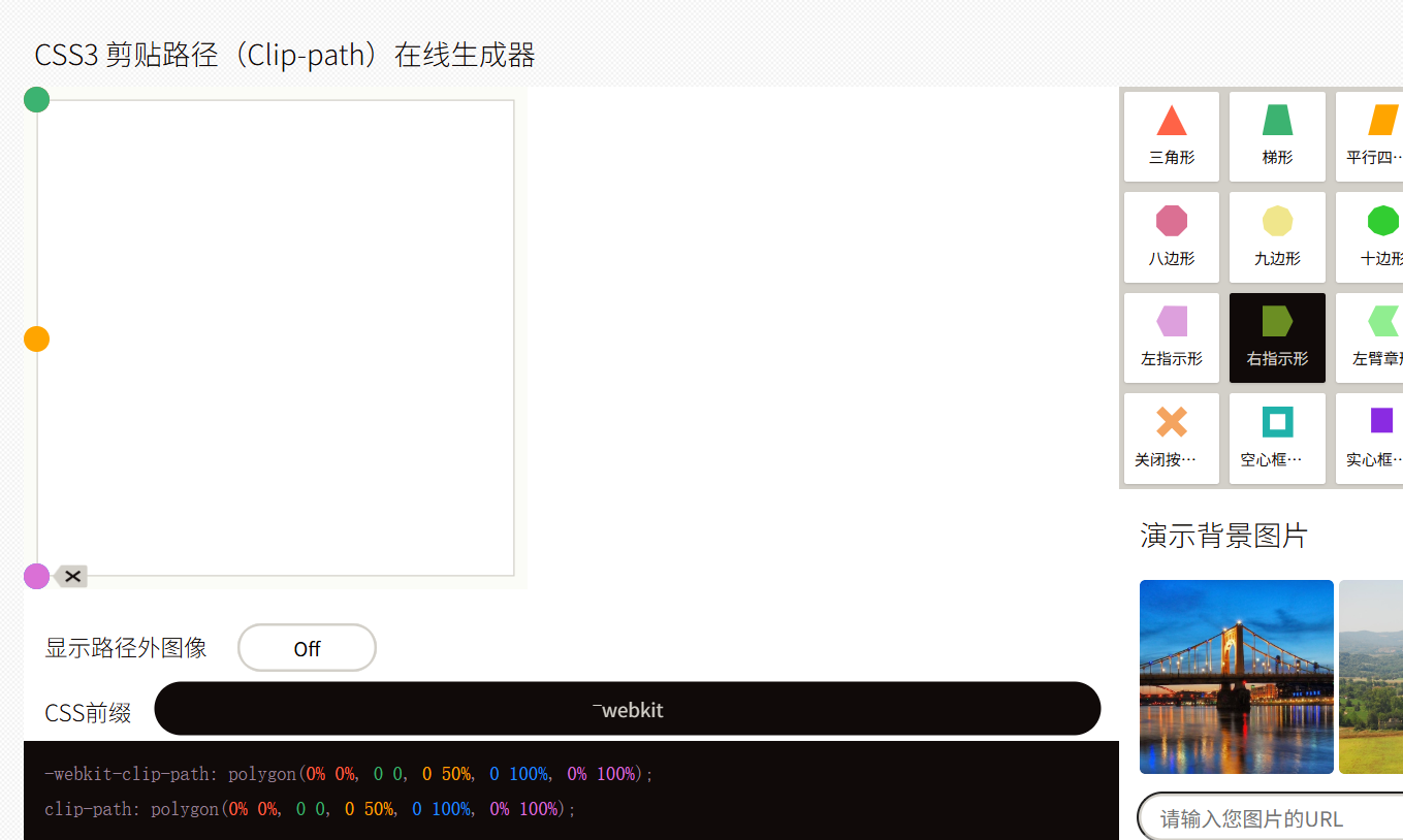
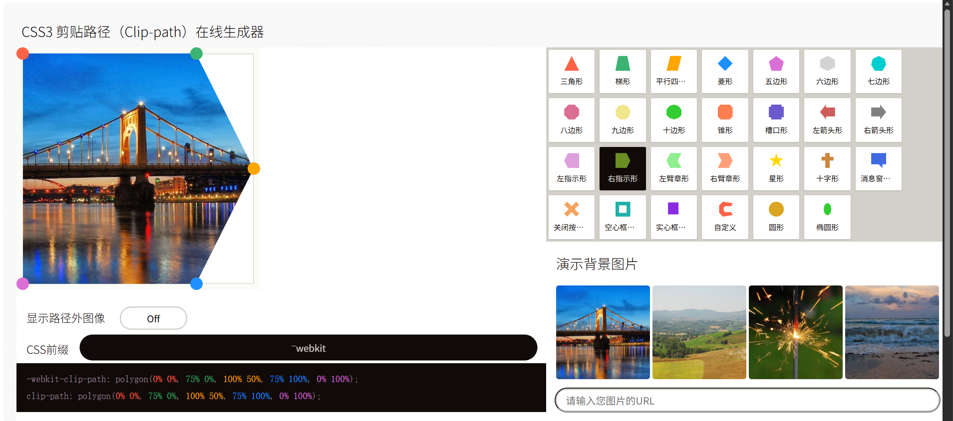
clip-path裁剪
创建复制的裁剪形状,使元素仅显示被裁剪区域内的部分
可视化工具:HTML5在线工具 。在该页面可直接构造想要的形状并获取CSS格式
来个刚开始啥都看不见
鼠标经过时,按如下形状变身
html
<!DOCTYPE html>
<html lang="en">

<head>
    <meta charset="UTF-8">
    <meta name="viewport" content="width=device-width, initial-scale=1.0">
    <title>Hello Page</title>
    <style>
        .box img {
            position: absolute;
            top: 0;
            left: 0;
            width: 700px;
            transition: all 5s;
        }

        .box img:nth-child(2) {
            -webkit-clip-path: polygon(0% 0%, 0 0, 0 50%, 0 100%, 0% 100%);
            clip-path: polygon(0% 0%, 0 0, 0 50%, 0 100%, 0% 100%);
        }

        .box:hover img:nth-child(2) {
            -webkit-clip-path: polygon(0% 0%, 75% 0%, 100% 50%, 75% 100%, 0% 100%);
            clip-path: polygon(0% 0%, 75% 0%, 100% 50%, 75% 100%, 0% 100%);
        }
    </style>
</head>

<body>
    <div class="box">
        <img src="spring.jpg" alt="">
        <img src="antumn.jpg" alt="">
    </div>
</body>

</html>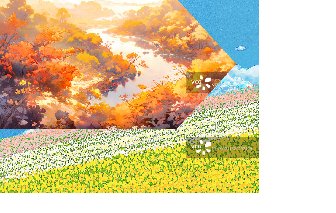
文字灯光效果
html
<!DOCTYPE html>
<html lang="en">

<head>
    <meta charset="UTF-8">
    <meta name="viewport" content="width=device-width, initial-scale=1.0">
    <title>Hello Page</title>
    <style>
        body {
            background-color: black;
        }

        h1 {
            color: #292929;
            font-size: 200px;
            position: relative;
        }

        h1::after {
            content: "HOLLOWORLD";
            /* 透明颜色 */
            color: transparent;
            /* 彩色背景 */
            background: linear-gradient(to right, #ff69b3, #fe0000, #ffff01, #008102, #40e1d2, #410898, #9400d4);
            /* 文字裁剪 */
            background-clip: text;
            /* 覆盖 */
            position: absolute;
            top: 0;
            left: 0;
            /* 裁剪 */
            clip-path: circle(100px at 0% 50%);
            animation: move 5s linear infinite;
        }

        @keyframes move {
            0% {
                clip-path: circle(100px at 0% 50%)
            }

            50% {
                clip-path: circle(100px at 100% 50%)
            }

            100% {
                clip-path: circle(100px at 0% 50%)
            }
        }
    </style>
</head>

<body>
    <h1>HOLLOWORLD</h1>
</body>

</html>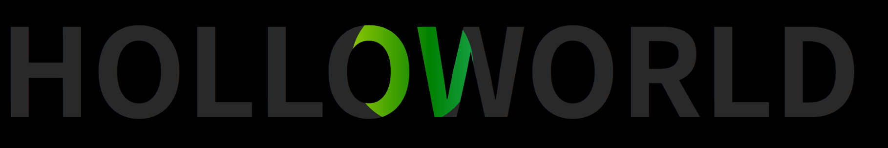
背景滤镜
滤镜
滤镜通过filter属性实现,可对元素及其子元素进行实时图像处理,无需修改原始素材
滤镜阴影会给整个盒子添加阴影,盒子阴影只给指定盒子添加
backdrop-filter
对元素背后的区域(背景)应用滤镜效果,通常与半透明背景配合使用,能实现类似"毛玻璃"的视觉效果