Kuikly是腾讯广泛应用的跨端开发框架,基于Kotlin Multiplatform技术构建,为开发者提供了技术栈更统一的跨端开发体验,由腾讯大前端领域 Oteam(公司级)推出。目前已有20+业务深度使用,页面数1000+,日活用户超5亿,满足了这些业务在众多场景下的各类复杂需求(应用场景案例)。Kuikly 作为腾讯端服务联盟(http://tds.qq.com)的重要成员,将持续推动跨端开发的技术创新和生态建设。
我比较看好它是因为它的一次性跨六端(PC、Web、小程序、鸿蒙、IOS、Android),当然性能也不差。还有就是它支持Jetpack Compose这种新的现代化的UI开发规范。(目前的android主流就是使用的Jetpack Compose UI,一种新的现代化的UI开发范式。)
目前它在Android、iOS、鸿蒙开源基础上,将新增开源Web版,支持H5和微信小程序,进一步扩展多端适配场景。Kuikly适配的H5和微信小程序已接入腾讯多款业务,如搜狗输入法、鹅毛市集、QQ小游戏等。
主流的基于终端技术栈的跨端框架,缺少官方微信小程序运行方案支持,Kuikly Web版微信小程序的出现填补了这部分空白。
详细介绍可看下这个文章:https://zhuanlan.zhihu.com/p/1941458295081664606
一、Kuikly框架简介
Kuikly是基于Kotlin MultiPlatform(KMP)构建的跨端开发框架。它利用了KMP逻辑跨平台的能力, 并抽象出通用的跨平台UI渲染接口,复用平台的UI组件,从而达到UI跨平台,具有轻量、高性能、可动态化等优点;同时,KuiklyBase基建同样支持逻辑跨端。
官网地址 :https://kuikly.tds.qq.com/Introduction/arch.html
github地址: https://github.com/Tencent-TDS/KuiklyUI
其特点包括:
- 兼容原生Compose API
- 内置路由管理、状态管理等基础能力
- 提供企业级项目脚手架
- 支持多模块资源管理
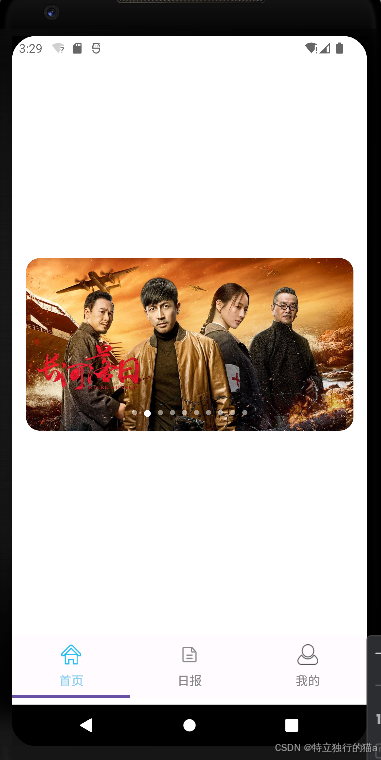
基于腾讯Kuikly框架实现Material3风格底部导航栏:
示例项目地址 :https://gitcode.com/qq8864/kuiklytest
Kuikly整体架构
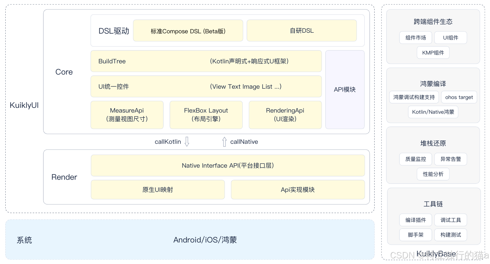
组件生态兼容标准的Kotlin Multiplatform组件,可复用业界成熟的KMP组件生态。强大的多线程协程能力,支持跨端并行处理复杂业务逻辑,满足高性能场景需求。提供标准的Kotlin多线程协程能力,并扩展鸿蒙端支持。
二、核心组件说明
使用jectpack compose的Tab组件实现。
注意:不能引入androidx.compose.material3.Tab(这是android开发独有的),而是使用Kuikly框架实现的对应的compose组件com.tencent.kuikly.compose.material3.Tab(跨多端)。
1. TabRow + Tab
kotlin
TabRow(
    selectedTabIndex = pagerState.currentPage,
    modifier = Modifier.padding(vertical = 8.dp).fillMaxWidth(),
    divider = { }
) {
    mainTabs.forEachIndexed { index, (title, icon) ->
        Tab(
            selected = isSelected,
            onClick = { /* 切换逻辑 */ },
            icon = { /* 图标组件 */ },
            text = { Text(title) }
        )
    }
}- TabRow:导航栏容器,自动处理Tab布局与选中状态
- Tab:单个导航项,支持图标+文字组合
- 参数说明:
- selectedTabIndex:当前选中索引
- divider:分隔线(示例中设置为空)
2. HorizontalPager
kotlin
HorizontalPager(
    state = pagerState,
    modifier = Modifier.fillMaxWidth().weight(1f),
    userScrollEnabled = false
) {
    when(it) {
        0 -> HomeScreen()
        //...其他页面
    }
}- 实现横向页面滑动
- 关键配置:
- userScrollEnabled:禁用手动滑动(纯Tab切换)
- weight:占满剩余空间
三、图标资源管理
图标资源固定放置在shared\src\commonMain\assets目录下。
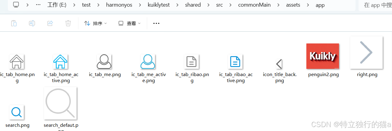
1. 资源路径规范
kotlin
import androidx.compose.runtime.Composable
import androidx.compose.runtime.LaunchedEffect
import androidx.compose.runtime.getValue
import androidx.compose.runtime.mutableStateOf
import androidx.compose.runtime.remember
import androidx.compose.runtime.rememberCoroutineScope
import androidx.compose.runtime.setValue
......
import com.tencent.kuikly.compose.foundation.layout.padding
import com.tencent.kuikly.compose.foundation.pager.HorizontalPager
import com.tencent.kuikly.compose.foundation.pager.rememberPagerState
import com.tencent.kuikly.compose.foundation.Image
import com.tencent.kuikly.compose.foundation.layout.size
import com.tencent.kuikly.compose.material3.Tab
import com.tencent.kuikly.compose.material3.TabRow
import com.tencent.kuikly.compose.material3.Text
import com.tencent.kuikly.compose.resources.DrawableResource
import com.tencent.kuikly.compose.resources.InternalResourceApi
import com.tencent.kuikly.compose.resources.painterResource
import com.tencent.kuikly.compose.setContent
import com.tencent.kuikly.compose.ui.Modifier
import com.tencent.kuikly.compose.ui.graphics.Color
......
val img = DrawableResource(ImageUri.pageAssets(iconPath).toUrl("app"))- 路径格式:
"${icon}_active.png"(选中态) - 资源应放置在模块的assets目录下
2. 动态图标加载
kotlin
val iconPath = remember(isSelected, icon) {
    if (isSelected) "${icon}_active.png" else "${icon}.png"
}- 使用remember优化性能,避免重复计算
- 根据选中状态切换图标后缀
3. 图片组件
kotlin
Image(
    painter = painterResource(img),
    contentDescription = "Kuikly icon image",
    modifier = Modifier.size(24.dp)
)- 尺寸控制:24dp标准Material图标尺寸
- 内容描述:无障碍支持
四、完整实现步骤
1. 定义导航数据结构
kotlin
data class TabItem(
    val title: String,
    val icon: String
)

private val mainTabs = listOf(
    TabItem("首页", HOME_ICON),
    TabItem("日报", ZHIHU_ICON),
    TabItem("我的", MINE_ICON),
)
2. 状态管理
kotlin
val pagerState = rememberPagerState(pageCount = { mainTabs.size })
val coroutineScope = rememberCoroutineScope()
3. 页面联动
kotlin
// Tab点击切换
onClick = {
    coroutineScope.launch {
        pagerState.scrollToPage(index)
    }
}

// Pager状态同步
selectedTabIndex = pagerState.currentPage
4. 样式定制
kotlin
Tab(
    selectedContentColor = Color(0xFF87CEEB),
    unselectedContentColor = Color.Gray,
    //...
)
5.完整tab栏实现代码
kotlin
package com.example.kuiklytest

import androidx.compose.runtime.Composable
import androidx.compose.runtime.LaunchedEffect
import androidx.compose.runtime.getValue
import androidx.compose.runtime.mutableStateOf
import androidx.compose.runtime.remember
import androidx.compose.runtime.rememberCoroutineScope
import androidx.compose.runtime.setValue
import com.example.kuiklytest.app.home.HomeScreen
import com.example.kuiklytest.base.BasePager
import com.tencent.kuikly.compose.foundation.layout.Column
import com.tencent.kuikly.compose.foundation.layout.fillMaxSize
import com.tencent.kuikly.compose.foundation.layout.fillMaxWidth
import com.tencent.kuikly.compose.foundation.layout.padding
import com.tencent.kuikly.compose.foundation.pager.HorizontalPager
import com.tencent.kuikly.compose.foundation.pager.rememberPagerState
import com.tencent.kuikly.compose.foundation.Image
import com.tencent.kuikly.compose.foundation.layout.size
import com.tencent.kuikly.compose.material3.Tab
import com.tencent.kuikly.compose.material3.TabRow
import com.tencent.kuikly.compose.material3.Text
import com.tencent.kuikly.compose.resources.DrawableResource
import com.tencent.kuikly.compose.resources.InternalResourceApi
import com.tencent.kuikly.compose.resources.painterResource
import com.tencent.kuikly.compose.setContent
import com.tencent.kuikly.compose.ui.Modifier
import com.tencent.kuikly.compose.ui.graphics.Color
import com.tencent.kuikly.compose.ui.semantics.Role.Companion.Image
import com.tencent.kuikly.compose.ui.unit.dp
import com.tencent.kuikly.core.annotations.Page
import com.tencent.kuikly.core.base.attr.ImageUri
import kotlinx.coroutines.Dispatchers
import kotlinx.coroutines.launch
import kotlinx.coroutines.withContext

@Page("router", supportInLocal = true)
internal class ComposeRoutePager : BasePager() {

    override fun willInit() {
        super.willInit()
        setContent {
            MainTabRow()
        }
    }

    data class TabItem(
        val title: String,
        val icon: String
    )

    private val mainTabs = listOf(
        TabItem("首页", HOME_ICON),
        TabItem("日报", ZHIHU_ICON),
        TabItem("我的", MINE_ICON),
    )

    @Composable
    private fun MainTabRow() {
        //val tabs = listOf("首页", "日报", "我的")
        val pagerState = rememberPagerState(pageCount = { mainTabs.size })
        val coroutineScope = rememberCoroutineScope()
        var textFieldValue by remember { mutableStateOf("") }

        LaunchedEffect(1) {
            withContext(Dispatchers.Main) {
                textFieldValue = ""
            }
        }
        Column(
            modifier =
                Modifier
                    .padding(top = pageData.statusBarHeight.dp)
                    .fillMaxSize(),
        ) {
            HorizontalPager(
                state = pagerState,
                modifier = Modifier.fillMaxWidth().weight(1f),
                key = { index -> mainTabs[index] },
                userScrollEnabled = false
            ) {
                when (it) {
                    0 -> HomeScreen()
                    1 -> ZhihuPageView()
                    2 -> MinePageView()
                }
            }
            TabRow(
                selectedTabIndex = pagerState.currentPage,
                modifier = Modifier.padding(vertical = 8.dp).fillMaxWidth(),
                divider = { }
            ) {
                mainTabs.forEachIndexed { index, (title, icon) ->
                    val isSelected = pagerState.currentPage == index
                    Tab(
                        selected = isSelected,
                        onClick = {
                            coroutineScope.launch {
                                pagerState.scrollToPage(index)
                            }
                        },

                        icon = {
                            //使用 remember 锁定路径,避免无效重绘
                            val iconPath = remember(isSelected, icon) {
                                if (isSelected) "${icon}_active.png" else "${icon}.png"
                            }
                            @OptIn(InternalResourceApi::class)
                            val img = DrawableResource(ImageUri.pageAssets(iconPath).toUrl("app"))
                            Image(
                                painter = painterResource(img),
                                contentDescription = "Kuikly icon image",
                                modifier = Modifier.size(24.dp),
                            )
                        },
                        text = { Text(title) },
                        selectedContentColor = Color(0xFF87CEEB),  // 选中时的图标和文字颜色
                        unselectedContentColor = Color.Gray, // 未选中时的颜色
                    )
                }
            }
        }

    }

    companion object {
        private const val HOME_ICON = "ic_tab_home"
        private const val ZHIHU_ICON = "ic_tab_ribao"
        private const val MINE_ICON = "ic_tab_me"
    }

}

@Composable
fun MinePageView() {
    Text("mine blog.csdn.net/qq8864")
}


@Composable
fun ZhihuPageView() {
    Text("MessagePageView blog.csdn.net/qq8864")
}
@Composable
fun PlaygroundView() {
    Text("PlaygroundView")
}


@Composable
fun HomePageView() {
    Text("HomePageView")
}
五、最佳实践建议
-
资源优化:
- 使用WebP格式减小体积
- 双倍图适配(@2x, @3x)
-
性能优化:
kotlinHorizontalPager( key = { index -> mainTabs[index] } )- 设置唯一key避免重组
-
扩展能力:
- 添加波纹动画效果
- 集成红点通知系统
- 支持动态配置导航项
六、总结
本文演示了在腾讯Kuikly框架下实现Material3风格底部导航栏的完整方案,结合TabRow+HorizontalPager实现页面导航功能,通过Kuikly特有的资源管理机制处理多态图标资源。该方案具有以下优势:
- 声明式UI开发范式
- 完善的页面状态管理
- 高性能的渲染机制
- 良好的多平台兼容性
完整代码示例已在文章开头给出,开发者可根据实际需求进行个性化扩展。
注意事项:
- 确保Kuikly框架版本 ≥ 2.7.0 (因为低于此版本的不支持viewModel)
- assets目录需要预先创建
- 建议使用SVG图标转换为VectorDrawable
- 需要添加页面切换动画可集成Accompanist库
参考链接
腾讯Kuikly框架进一步开源,新增支持Web,开启一码五端新体验
Jetpack Compose 实战:打造高性能轮播图 (Carousel) 组件
https://github.com/qdsfdhvh/compose-imageloader
http://49.235.52.102:8000/static/docs/swagger/swagger-ui.html