整理一下做大屏项目时用到的 ECharts 常用配置、开发技巧和一些踩坑点。这里不追求全面,主要记录实际开发里高频出现、也确实容易写乱的部分。
1. 初始化、容器和自适应
初始化过程:
- 准备容器
echarts.init(dom)chart.setOption(option)
页面尺寸会变化,就补:
js
window.addEventListener('resize', () => chart.resize())另外一个实际开发里经常踩的点是 setOption 的合并策略。默认是合并更新,所以如果图表结构变了,只是局部传一段配置,很容易把旧系列、旧 legend 或旧坐标轴残留在页面上。
这种情况一般直接考虑:
js
chart.setOption(option, { notMerge: true })或者:
js
chart.setOption(option, { replaceMerge: ['series'] })最简单的 index 示例大概这样:
html
<!doctype html>
<html lang="zh-CN">
  <head>
    <meta charset="UTF-8" />
    <meta name="viewport" content="width=device-width, initial-scale=1.0" />
    <title>ECharts Demo</title>
    <script src="https://cdn.jsdelivr.net/npm/echarts@5/dist/echarts.min.js"></script>
    <style>
      #chart {
        width: 100%;
        height: 400px;
      }
    </style>
  </head>
  <body>
    <div id="chart"></div>

    <script>
      const chart = echarts.init(document.getElementById('chart'))

      chart.setOption({
        xAxis: {
          type: 'category',
          data: ['Mon', 'Tue', 'Wed', 'Thu', 'Fri']
        },
        yAxis: {
          type: 'value'
        },
        series: [
          {
            type: 'bar',
            data: [120, 200, 150, 80, 70]
          }
        ]
      })

      window.addEventListener('resize', () => chart.resize())
    </script>
  </body>
</html>
2. 折线图、柱状图、饼图
2.1 折线图
type: 'line'
折线图常用配置:
smooth- 作用:是否平滑曲线
- 常见值:
true/false - 默认值:
false
areaStyle- 作用:给折线下方补面积
- 常见值:对象 /
{}/ 配合渐变色
markPoint- 作用:标注特殊点,比如最大值、最小值
markLine- 作用:标注参考线,比如平均线、预警线
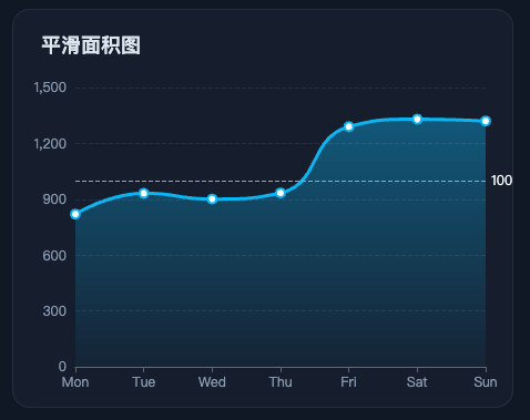
一个常见的平滑面积图配置大概这样:
js
series: [
  {
    type: 'line', // 图表类型:折线图
    smooth: true, // 是否平滑曲线
    data: [820, 932, 901, 934, 1290, 1330, 1320], // 数据
    lineStyle: { width: 3, color: '#38bdf8' }, // 线条样式
    itemStyle: { color: '#38bdf8' }, // 拐点颜色
    areaStyle: {
      // 面积填充色,下面是一个从上到下的线性渐变
      color: new echarts.graphic.LinearGradient(0, 0, 0, 1, [
        { offset: 0, color: 'rgba(56, 189, 248, 0.55)' },
        { offset: 1, color: 'rgba(56, 189, 248, 0.06)' }
      ])
    },
    markLine: {
      symbol: 'none', // 不显示两端小图标
      data: [{ yAxis: 1000, name: '预警线' }] // 在 y=1000 的位置画参考线
    }
  }
]
示例图:
2.2 柱状图
type: 'bar'
柱状图常见配置:
stack- 作用:堆叠同组系列
- 常见写法:多个系列写同一个字符串,比如
stack: 'total' - 说明:这个值不是固定枚举,只要名字相同就会堆叠
barWidth- 作用:控制柱子宽度,可以是绝对值例如
40或者百分数例如'60%'。不设时自适应。
- 作用:控制柱子宽度,可以是绝对值例如
itemStyle.borderRadius- 作用:控制柱子圆角
- 常见写法:
[6, 6, 0, 0]
yAxisIndex- 作用:指定系列使用第几个 Y 轴,从
0开始。 - 常见值:
0/1
- 作用:指定系列使用第几个 Y 轴,从
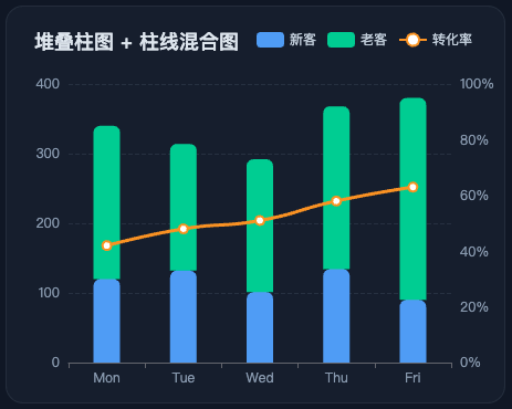
一个常见的堆叠柱图 + 折线混合配置大概这样:
js
option = {
  title: {
    text: '堆叠柱图 + 柱线混合图' // 标题
  },
  tooltip: {
    trigger: 'axis' // 坐标轴触发提示框
  },
  legend: {
    data: ['新客', '老客', '转化率'] // 图例数据
  },
  grid: {
    left: 56,
    right: 48,
    top: 70,
    bottom: 36 // 图表绘制区域
  },
  xAxis: {
    type: 'category',
    data: ['Mon', 'Tue', 'Wed', 'Thu', 'Fri'] // 类目轴
  },
  yAxis: [
    {
      type: 'value', // 左侧 Y 轴:人数
      name: '人数'
    },
    {
      type: 'value', // 右侧 Y 轴:转化率
      name: '转化率',
      min: 0,
      max: 100,
      axisLabel: {
        formatter: '{value}%'
      }
    }
  ],
  series: [
    {
      name: '新客',
      type: 'bar',
      stack: 'total', // 和老客写同一个 stack,表示堆叠
      barWidth: 24, // 柱宽
      itemStyle: {
        color: '#60a5fa',
        borderRadius: [6, 6, 0, 0] // 柱子圆角
      },
      data: [120, 132, 101, 134, 90] // 数据
    },
    {
      name: '老客',
      type: 'bar',
      stack: 'total',
      barWidth: 24,
      itemStyle: {
        color: '#34d399',
        borderRadius: [6, 6, 0, 0]
      },
      data: [220, 182, 191, 234, 290]
    },
    {
      name: '转化率',
      type: 'line',
      yAxisIndex: 1, // 使用第 2 个 Y 轴
      smooth: true,
      symbolSize: 8,
      lineStyle: {
        width: 3,
        color: '#f59e0b'
      },
      itemStyle: {
        color: '#f59e0b'
      },
      data: [42, 48, 51, 58, 63]
    }
  ]
}
示例图:
2.3 饼图
type: 'pie'
饼图常用配置:
radius- 作用:控制饼图半径
- 常见值:
- 单个值,比如
'60%',表示普通饼图 - 数组,比如
['40%', '70%'],表示环形图
- 单个值,比如
center- 作用:控制饼图在容器里的位置
label- 作用:控制扇区文字
labelLine- 作用:控制引导线
roseType- 作用:切换玫瑰图模式
- 常见值:
'radius''area'
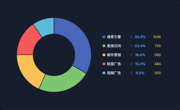
嵌套饼图适合表达总分关系或者层级关系。比如:
- 内圈放大类
- 外圈放子类
一个嵌套饼图的基本写法大概这样:
js
option = {
  color: ['#60a5fa', '#34d399', '#93c5fd', '#7dd3fc', '#6ee7b7', '#86efac'],
  tooltip: {
    trigger: 'item', // 鼠标移到扇区时显示提示
    formatter: '{b}: {c} ({d}%)'
  },
  series: [
    {
      name: '一级分类',
      type: 'pie',
      radius: ['12%', '30%'], // 内圈半径
      center: ['50%', '45%'], // 图表中心位置
      label: {
        position: 'inside',
        color: '#0f172a',
        formatter: '{b}\\n{d}%'
      },
      labelLine: {
        show: false
      },
      data: [
        { value: 58, name: '线上渠道' },
        { value: 42, name: '线下渠道' }
      ]
    },
    {
      name: '二级分类',
      type: 'pie',
      radius: ['42%', '68%'], // 外圈半径
      center: ['50%', '45%'],
      label: {
        color: '#e2e8f0',
        formatter: '{b}\\n{c} / {d}%'
      },
      labelLine: {
        length: 12,
        length2: 14,
        lineStyle: {
          color: '#64748b'
        }
      },
      data: [
        { value: 24, name: '官网' },
        { value: 18, name: '小程序' },
        { value: 16, name: '电商平台' },
        { value: 20, name: '直营网点' },
        { value: 12, name: '经销商' },
        { value: 10, name: '活动销售' }
      ]
    }
  ],
    // graphic 这块后面会说到
  graphic: [
    {
      type: 'text',
      left: 'center',
      top: '43%',
      z: 100,
      style: {
        text: '总销售额', // 中心标题
        fill: '#94a3b8',
        fontSize: 14,
        textAlign: 'center'
      }
    },
    {
      type: 'text',
      left: 'center',
      top: '49%',
      z: 100,
      style: {
        text: '100', // 中心数值
        fill: '#f8fafc',
        fontSize: 30,
        fontWeight: 700,
        textAlign: 'center'
      }
    }
  ]
}
示例图:

3. 图例
图例基础用法不复杂,但大屏里经常不只是显示名字,还要承担:对齐信息、展示占比、展示数值和充当信息面板的作用。
所以这里高频配置一般是:
legend.orient- 作用:控制排列方向
- 常见值:
'horizontal':水平'vertical':垂直
legend.type- 作用:控制普通图例还是滚动图例
- 常见值:
'plain''scroll'
legend.icon- 作用:控制图例图标形状
- 常见值:
'circle'、'rect'、'roundRect'、'triangle'、'diamond'、'pin'、'arrow'、'none' - 也可以直接写自定义
path://...
legend.itemWidth、legend.itemHeight- 作用:图例图标宽度、高度
legend.itemGap- 作用:图例每一项之间的间距
legend.width- 作用:控制图例整体宽度,富文本内容多的时候比较常用
legend.formatter- 作用:自定义图例显示内容
富文本图例的典型写法大概这样:
js
legend: {
  orient: 'vertical', // 垂直排列
  right: '10%', // 距离右侧位置
  top: 'center', // 垂直居中
  itemGap: 20, // 每一项图例之间的间距
  itemWidth: 14, // 图例图标宽度
  itemHeight: 14, // 图例图标高度
  icon: 'circle', // 图例图标形状
  formatter: name => {
    const target = rawData.find(item => item.name === name)
    const p = ((target.value / total) * 100).toFixed(1)
    return `{name|${name}}  |  {percent|${p}%}  {value|${target.value}}`
  },
  textStyle: {
    color: '#94a3b8', // 默认文字颜色
    rich: {
      name: { color: '#e2e8f0', fontSize: 14, width: 88, align: 'left' },
      percent: { color: '#60a5fa', fontSize: 14, fontWeight: 'bold', width: 52, align: 'right' },
      value: { color: '#fbbf24', fontSize: 14, width: 48, align: 'right' }
    }
  }
}
示例图:
4. 常见问题
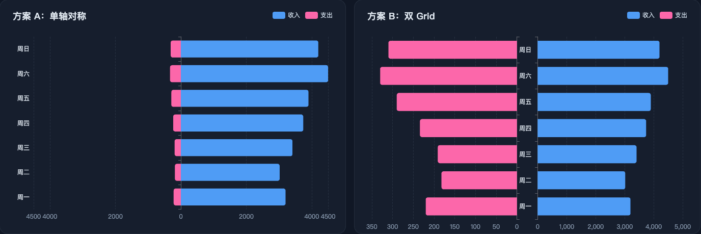
4.1 正负条形图怎么让 0 轴居中
有几种做法:
- 单轴对称:代码简单,思路直观
- 双 grid:空间利用率更高,尤其适合两边数值量级差很大的场景
单轴对称思路:先取左右两边绝对值的最大值,再让 min 和 max 以这个值对称展开,这样 0 轴自然就被推到中间了。
核心其实就这一段:
js
xAxis: {
  type: 'value',
  min: value => -Math.max(Math.abs(value.min), Math.abs(value.max)),
  max: value => Math.max(Math.abs(value.min), Math.abs(value.max)),
  axisLabel: {
    formatter: val => Math.abs(val)
  }
}
如果更在意空间利用率,就拆双 grid,让左右两边各自拥有独立刻度。核心配置大概这样:
js
// 注意这个 grid
grid: [
  { left: '5%', width: '42%', top: 72, bottom: '6%' },
  { right: '5%', width: '42%', top: 72, bottom: '6%' }
],
xAxis: [
  {
    type: 'value',
    inverse: true,
    gridIndex: 0
  },
  {
    type: 'value',
    gridIndex: 1
  }
],
yAxis: [
  {
    type: 'category',
    gridIndex: 0,
    data: categories,
    position: 'right',
    axisLabel: { show: false }
  },
  {
    type: 'category',
    gridIndex: 1,
    data: categories,
    position: 'left'
  }
],
series: [
  {
    name: '支出',
    type: 'bar',
    xAxisIndex: 0,
    yAxisIndex: 0,
    data: expenseData
  },
  {
    name: '收入',
    type: 'bar',
    xAxisIndex: 1,
    yAxisIndex: 1,
    data: incomeData
  }
]
这套方案的核心不是把一组数据转成负值,而是把左右两边拆成两个坐标区域,各自画、各自算。
示例图:
4.2 graphic 是干嘛的
graphic 不是图表系列本身,它更像是在图表上层额外画一层辅助元素。比较常见的用法有:中心文字、装饰元素和信息补充。
比如饼图中间那种总数、标题、说明文字,就很适合用 graphic 去放:
js
graphic: [
  {
    type: 'text',
    left: 'center',
    top: '43%',
    z: 100,
    style: {
      text: '总销售额',
      fill: '#94a3b8',
      fontSize: 14
    }
  }
]
如果写了 graphic 却感觉"加了和没加一样",一般也就两种情况:
-
没显示出来
-
被别的图形盖住了
示例图:

4.3 渐变色怎么用,方向参数怎么理解
ECharts 里常用的就是两种渐变:LinearGradient(线性渐变)、RadialGradient(径向渐变)。
先看线性渐变的参数:
js
new echarts.graphic.LinearGradient(x0, y0, x1, y1, colorStops)这 4 个坐标用的是 0 到 1 的相对比例,不是具体像素。
x0, y0:渐变起点的 x、y 坐标,定义"从哪里开始"x1, y1:渐变终点的 x、y 坐标,定义"往哪里结束"
注意:这里的坐标系可以直接按浏览器二维坐标系理解,原点在左上角,x 往右是正方向,y 往下是正方向。
比如:
(0, 0, 0, 1):起点在上方,终点在下方(0, 0, 1, 0):起点在左侧,终点在右侧
几个常见的方向参数:
(0, 0, 0, 1):从上到下(0, 0, 1, 0):从左到右(0, 0, 1, 1):左上到右下(1, 0, 0, 1):右上到左下
径向渐变的参数是:
js
new echarts.graphic.RadialGradient(cx, cy, r, colorStops)cx、cy:表示圆心位置r:表示扩散半径
一般 0.5, 0.5, 0.8 这种写法比较常见,也就是高光在中间,再向四周扩散。
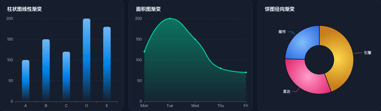
柱图、面积图、饼图里常见的写法分别是:
js
// 柱图:上实下虚
color: new echarts.graphic.LinearGradient(0, 0, 0, 1, [
  { offset: 0, color: '#83bff6' },
  { offset: 1, color: 'rgba(24, 141, 240, 0)' }
])

// 面积图:从上到下透明衰减
color: new echarts.graphic.LinearGradient(0, 0, 0, 1, [
  { offset: 0, color: 'rgba(52, 211, 153, 0.7)' },
  { offset: 1, color: 'rgba(52, 211, 153, 0.06)' }
])

// 饼图:中心高光、边缘变暗
color: new echarts.graphic.RadialGradient(0.5, 0.5, 0.8, [
  { offset: 0, color: '#fde047' },
  { offset: 1, color: '#ca8a04' }
])
示例图:
5. 总结
这篇主要就是把常用配置、常见图表套路和几个开发里容易碰到的问题收一遍,方便后面继续做图或者查配置的时候直接回来翻。
参考
本文经 AI 润色。
首发地址:https://blog.xchive.top/2026/echarts-big-screen-review-and-pitfalls.html