整理一下 ECharts 里 3D 图表到底怎么做。
这篇不铺太多无关理论,主要讲两件事:柱状图为什么一般做成伪 3D,饼图为什么最后通常会走到 echarts-gl,以及中间最关键的实现思路到底是什么。
1. 伪 3D 柱状图怎么做
1.1 柱状图更适合做伪 3D
柱状图本身就是比较规则的几何结构,目标通常也不是做成一个可以随意旋转的三维场景,而是让画面更有立体感一点。放在 ECharts 这个语境里,柱状图走伪 3D 会更顺手,因为它的结构足够规整,拆分和拼接都比较直接,成本也比真 3D 低很多。对大屏来说,已经够用了。
1.2 先把一根柱子拆成三个面
伪 3D 的核心,其实就是先把一根柱子拆成三个面:左侧面、右侧面、顶面。只要这三个面的顶点关系对了,立体感就已经出来了,后面的渐变、高光、阴影,都只是继续往上加视觉包装。
这一块核心就是 echarts.graphic.extendShape。如果你现在只是想先把图做出来,其实不用一开始就把 CubeLeft、CubeRight、CubeTop 的路径细节全吃透,先把它当成一套固定模板来用就够了。更重要的是知道 offsetX 和 offsetY 在控制什么。
js
const offsetX = 12 // 顶面相对柱体正面,水平方向错开的距离
const offsetY = 6 // 顶面相对柱体正面,垂直方向抬起的距离

const CubeLeft = echarts.graphic.extendShape({
  shape: { x: 0, y: 0 },
  buildPath: function (ctx, shape) {
    const xAxisPoint = shape.xAxisPoint
    const c0 = [shape.x, shape.y] // 左侧面的上前点
    const c1 = [shape.x - offsetX, shape.y - offsetY] // 左侧面的上后点
    const c2 = [xAxisPoint[0] - offsetX, xAxisPoint[1] - offsetY] // 左侧面的下后点
    const c3 = [xAxisPoint[0], xAxisPoint[1]] // 左侧面的下前点

    ctx.moveTo(c0[0], c0[1])
    ctx.lineTo(c1[0], c1[1])
    ctx.lineTo(c2[0], c2[1])
    ctx.lineTo(c3[0], c3[1])
    ctx.closePath()
  }
})

const CubeRight = echarts.graphic.extendShape({
  shape: { x: 0, y: 0 },
  buildPath: function (ctx, shape) {
    const xAxisPoint = shape.xAxisPoint
    const c1 = [shape.x, shape.y] // 右侧面的上前点
    const c2 = [xAxisPoint[0], xAxisPoint[1]] // 右侧面的下前点
    const c3 = [xAxisPoint[0] + offsetX, xAxisPoint[1] - offsetY] // 右侧面的下后点
    const c4 = [shape.x + offsetX, shape.y - offsetY] // 右侧面的上后点

    ctx.moveTo(c1[0], c1[1])
    ctx.lineTo(c2[0], c2[1])
    ctx.lineTo(c3[0], c3[1])
    ctx.lineTo(c4[0], c4[1])
    ctx.closePath()
  }
})

const CubeTop = echarts.graphic.extendShape({
  shape: { x: 0, y: 0 },
  buildPath: function (ctx, shape) {
    const c1 = [shape.x, shape.y] // 顶面的前点
    const c2 = [shape.x + offsetX, shape.y - offsetY] // 顶面的右点
    const c3 = [shape.x, shape.y - offsetY * 2] // 顶面的后点
    const c4 = [shape.x - offsetX, shape.y - offsetY] // 顶面的左点

    ctx.moveTo(c1[0], c1[1])
    ctx.lineTo(c2[0], c2[1])
    ctx.lineTo(c3[0], c3[1])
    ctx.lineTo(c4[0], c4[1])
    ctx.closePath()
  }
})

echarts.graphic.registerShape('CubeLeft', CubeLeft)
echarts.graphic.registerShape('CubeRight', CubeRight)
echarts.graphic.registerShape('CubeTop', CubeTop)
这里真正要抓住的是 offsetX 和 offsetY。可以把它理解成:本来柱子正面只是一个竖着的矩形,现在我们把顶部那一圈顶点,额外往右上角挪了一下,于是就多出了左侧面、右侧面和顶面。
offsetX 控制横向挪多少,值越大,左右侧面看起来越宽;offsetY 控制纵向抬多少,值越大,顶面看起来越高。两个值一起看,就是这根柱子"斜出去"多少。
1.3 再用 renderItem 把三个面拼回去
上面只是把三个零件定义出来了,真正把它们拼成一根柱子,是在 renderItem 里做的。这里最重要的是先拿到底部坐标和顶部坐标,再把同一个点分别传给三个面。
js
series: [
  {
    type: 'custom',
    renderItem: function (params, api) {
      const xAxisPoint = api.coord([api.value(0), 0]) // 当前类目在底部的位置
      const topPoint = api.coord([api.value(0), api.value(1)]) // 当前柱子的顶部位置

      return {
        type: 'group',
        children: [
          {
            type: 'CubeLeft',
            shape: {
              xAxisPoint,
              x: topPoint[0],
              y: topPoint[1]
            },
            style: { fill: leftColor }
          },
          {
            type: 'CubeRight',
            shape: {
              xAxisPoint,
              x: topPoint[0],
              y: topPoint[1]
            },
            style: { fill: rightColor }
          },
          {
            type: 'CubeTop',
            shape: {
              xAxisPoint,
              x: topPoint[0],
              y: topPoint[1]
            },
            style: { fill: topColor }
          }
        ]
      }
    },
    data: values.map((value, index) => [index, value])
  }
]
这一段里真正需要看懂的,是 api.coord() 在做什么。它负责把数据坐标转成画布坐标,所以 topPoint 和 xAxisPoint 才能真正落到图上。只要这两个关键点的坐标关系对了,三个面就能被拼成一根完整的伪 3D 柱子。
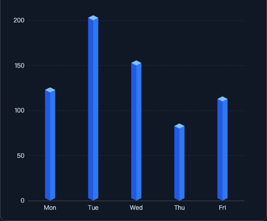
示例图:
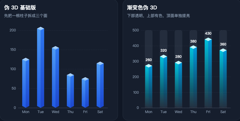
1.4 渐变色的伪 3D 柱图
改每个面的 fill。侧面用线性渐变,底部透明一点,顶部颜色重一点;顶面一般单独用更亮的纯色或者亮一点的渐变。
js
const leftColor = new echarts.graphic.LinearGradient(0, 1, 0, 0, [
  { offset: 0, color: 'rgba(34, 211, 238, 0.02)' },
  { offset: 1, color: 'rgba(34, 211, 238, 0.92)' }
])

const rightColor = new echarts.graphic.LinearGradient(0, 1, 0, 0, [
  { offset: 0, color: 'rgba(14, 165, 233, 0.03)' },
  { offset: 1, color: 'rgba(14, 165, 233, 0.95)' }
])

const topColor = '#cffafe'
1.5 最小可运行示例
html
<!doctype html>
<html lang="zh-CN">
  <head>
    <meta charset="UTF-8" />
    <meta name="viewport" content="width=device-width, initial-scale=1.0" />
    <title>最基础的伪 3D 柱状图</title>
    <script src="https://unpkg.com/echarts@5.4.3/dist/echarts.min.js"></script>
    <style>
      * {
        box-sizing: border-box;
      }

      body {
        margin: 0;
        background: #0f172a;
        color: #e2e8f0;
        font-family: "Microsoft YaHei", sans-serif;
      }

      #chart {
        width: 100%;
        height: 100vh;
      }
    </style>
  </head>
  <body>
    <div id="chart"></div>

    <script>
      const chart = echarts.init(document.getElementById('chart'))

      const offsetX = 10
      const offsetY = 5
      const categories = ['Mon', 'Tue', 'Wed', 'Thu', 'Fri']
      const values = [120, 200, 150, 80, 110]

      const CubeLeft = echarts.graphic.extendShape({
        shape: { x: 0, y: 0 },
        buildPath: function (ctx, shape) {
          const xAxisPoint = shape.xAxisPoint
          const c0 = [shape.x, shape.y]
          const c1 = [shape.x - offsetX, shape.y - offsetY]
          const c2 = [xAxisPoint[0] - offsetX, xAxisPoint[1] - offsetY]
          const c3 = [xAxisPoint[0], xAxisPoint[1]]

          ctx.moveTo(c0[0], c0[1])
          ctx.lineTo(c1[0], c1[1])
          ctx.lineTo(c2[0], c2[1])
          ctx.lineTo(c3[0], c3[1])
          ctx.closePath()
        }
      })

      const CubeRight = echarts.graphic.extendShape({
        shape: { x: 0, y: 0 },
        buildPath: function (ctx, shape) {
          const xAxisPoint = shape.xAxisPoint
          const c1 = [shape.x, shape.y]
          const c2 = [xAxisPoint[0], xAxisPoint[1]]
          const c3 = [xAxisPoint[0] + offsetX, xAxisPoint[1] - offsetY]
          const c4 = [shape.x + offsetX, shape.y - offsetY]

          ctx.moveTo(c1[0], c1[1])
          ctx.lineTo(c2[0], c2[1])
          ctx.lineTo(c3[0], c3[1])
          ctx.lineTo(c4[0], c4[1])
          ctx.closePath()
        }
      })

      const CubeTop = echarts.graphic.extendShape({
        shape: { x: 0, y: 0 },
        buildPath: function (ctx, shape) {
          const c1 = [shape.x, shape.y]
          const c2 = [shape.x + offsetX, shape.y - offsetY]
          const c3 = [shape.x, shape.y - offsetY * 2]
          const c4 = [shape.x - offsetX, shape.y - offsetY]

          ctx.moveTo(c1[0], c1[1])
          ctx.lineTo(c2[0], c2[1])
          ctx.lineTo(c3[0], c3[1])
          ctx.lineTo(c4[0], c4[1])
          ctx.closePath()
        }
      })

      echarts.graphic.registerShape('CubeLeftBasic', CubeLeft)
      echarts.graphic.registerShape('CubeRightBasic', CubeRight)
      echarts.graphic.registerShape('CubeTopBasic', CubeTop)

      chart.setOption({
        tooltip: {
          trigger: 'axis',
          axisPointer: { type: 'shadow' }
        },
        grid: {
          left: 56,
          right: 30,
          top: 40,
          bottom: 40
        },
        xAxis: {
          type: 'category',
          data: categories,
          axisTick: { show: false },
          axisLine: { lineStyle: { color: 'rgba(148, 163, 184, 0.35)' } },
          axisLabel: { color: '#cbd5e1' }
        },
        yAxis: {
          type: 'value',
          splitLine: { lineStyle: { color: 'rgba(148, 163, 184, 0.15)', type: 'dashed' } },
          axisLabel: { color: '#cbd5e1' }
        },
        series: [
          {
            name: '访问量',
            type: 'custom',
            renderItem: function (params, api) {
              const xAxisPoint = api.coord([api.value(0), 0])
              const topPoint = api.coord([api.value(0), api.value(1)])

              return {
                type: 'group',
                children: [
                  {
                    type: 'CubeLeftBasic',
                    shape: { xAxisPoint, x: topPoint[0], y: topPoint[1] },
                    style: { fill: '#2563eb' }
                  },
                  {
                    type: 'CubeRightBasic',
                    shape: { xAxisPoint, x: topPoint[0], y: topPoint[1] },
                    style: { fill: '#3b82f6' }
                  },
                  {
                    type: 'CubeTopBasic',
                    shape: { xAxisPoint, x: topPoint[0], y: topPoint[1] },
                    style: { fill: '#93c5fd' }
                  }
                ]
              }
            },
            data: values.map((value, index) => [index, value])
          }
        ]
      })

      window.addEventListener('resize', () => chart.resize())
    </script>
  </body>
</html>
1.6 伪 3D 柱状图注意点
第一,renderItem 里拿到的不是最终像素值,而是数据坐标,要靠 api.coord() 转成画布坐标。这里一旦坐标拿错,三个面就会错位,看起来像"散架"了一样。
第二,底部基准点一般取 api.coord([api.value(0), 0])。这里的 0 不是随便写的,它表示柱子落在数值轴的 0 位置。如果你后面做的是正负值混合柱,底部基准点怎么算,需要跟着坐标轴逻辑一起改。
第三,offsetX 和 offsetY 不要乱拉。值太小,立体感不明显;值太大,柱子就会显得很扁,甚至把相邻类目挤在一起。常见做法还是让它保持一个比较稳定的倾斜比例,比如 12 : 6、10 : 5 这种接近 2 : 1 的关系。
2. 3D 饼图怎么做
2.1 饼图为什么一般会用 echarts-gl
柱状图是规则直线结构,拆三面很自然;但饼图不一样。饼图一旦开始追求厚度、弧面和旋转,继续用 2D 去硬拼,成本就会越来越高,效果也不一定稳。所以到了这里,通常就会换到 echarts-gl,直接按三维曲面的思路来做。
2.2 关于 echarts-gl 版本
我这份示例里用的是下面这组版本:
html
<script src="https://unpkg.com/echarts@5.4.3/dist/echarts.min.js"></script>
<script src="https://unpkg.com/echarts-gl@2.0.8/dist/echarts-gl.min.js"></script>
这里写出来,不是说后面别的版本一定不能用,而是这组版本在我这套代码里是跑通的。后面如果你升级版本,最好还是自己再过一遍兼容性。
2.3 每个扇区其实都是一个 surface
3D 饼图这里,真正起作用的不是普通的 type: 'pie',而是 type: 'surface'。也就是说,每一个扇区其实都是一个单独的 series,然后再通过参数方程把它画成空间曲面。
js
{
  name: item.name,
  type: 'surface',
  parametric: true,
  wireframe: { show: false },
  itemStyle: { color: item.color },
  parametricEquation: getParametricEquation(...)
}
所以整个思路其实可以简单理解成三步:先把原始数据转成起止比例,再让每一块数据生成一个独立的 series,最后再用参数方程把每个扇区画出来。
2.4 getParametricEquation 简单理解一下
这一块没必要往数学里钻太深,真正需要看懂的是这些参数到底在控制什么。startRatio 和 endRatio 决定当前扇区从哪里开始、到哪里结束;k 控制内外径关系,也就是更像实心饼还是环形饼;h 控制厚度;isSelected 和 isHovered 控制状态变化。公式本身可以当成一个模板来看,但这些参数和最后效果之间的对应关系,最好还是要有数。
js
function getParametricEquation(startRatio, endRatio, isSelected, isHovered, k, h) {
  const startRadian = startRatio * Math.PI * 2
  const endRadian = endRatio * Math.PI * 2

  return {
    u: { min: -Math.PI, max: Math.PI * 3, step: Math.PI / 32 },
    v: { min: 0, max: Math.PI * 2, step: Math.PI / 20 },
    x: (u, v) => {
      if (u < startRadian) return Math.cos(startRadian) * (1 + Math.cos(v) * k)
      if (u > endRadian) return Math.cos(endRadian) * (1 + Math.cos(v) * k)
      return Math.cos(u) * (1 + Math.cos(v) * k)
    },
    y: (u, v) => {
      if (u < startRadian) return Math.sin(startRadian) * (1 + Math.cos(v) * k)
      if (u > endRadian) return Math.sin(endRadian) * (1 + Math.cos(v) * k)
      return Math.sin(u) * (1 + Math.cos(v) * k)
    },
    z: (u, v) => (Math.sin(v) > 0 ? h * 0.1 : -1)
  }
}
上面这段不需要你现在逐行推公式,先知道它是在把"扇区范围、内外径和厚度"转成一块能画出来的曲面就够了。真正需要先记住的,还是 startRatio、endRatio、k、h 这几个参数分别控制什么。
2.5 从基础到实战
只把扇区画出来,当然已经能形成一个基础版 3D 饼图了。如果继续往下做,常见还会再加几种处理。
一个是数据驱动高度。不是所有扇区都保持同样的厚度,而是先把数值归一化,再映射到一个合理的厚度区间,这样空间维度就真正参与了表达。这里的重点不是"厚度越夸张越好",而是让差异可见,同时又不至于把图形拉得太怪。
js
const maxVal = Math.max(...data.map(item => item.value))
const minVal = Math.min(...data.map(item => item.value))

const normalizeH = value => {
  if (maxVal === minVal) return 3
  return 1 + ((value - minVal) / (maxVal - minVal)) * 4
}
还有一个是外置 DOM 图例。默认 legend 当然也能用,但到了 3D 饼图这里,经常会遇到几个问题:一是图例和 3D 主体容易互相抢空间,二是名称、数值、颜色块、布局有时候要拆开控制,三是你可能还想做两列、分组、强调值这种更自由的排版。这时候直接在图表外面用 HTML 拼一层图例,反而更直接,控制权也更大。思路其实很简单,就是把数据循环一遍,然后用 DOM 把颜色、名称、数值渲染出来。
还有一种写法,是在饼图下面垫一个几乎看不见的承接盘,也就是这里的 mouseoutSeries。这样鼠标从某个扇区移开的时候,不会一下子掉到空白区域,hover 切换会顺一点。深圳医保那套整理出来的代码里,也保留了这一层写法。
js
series.push({
  name: 'mouseoutSeries',
  type: 'surface',
  parametric: true,
  wireframe: { show: false },
  itemStyle: { opacity: 0.005, color: '#0f172a' },
  parametricEquation: { ... }
})
如果只想直接复制一份最基础、能跑起来的 3D 饼图,可以直接看这个文件:
2.6 最小可运行示例

html
<!doctype html>
<html lang="zh-CN">
  <head>
    <meta charset="UTF-8" />
    <meta name="viewport" content="width=device-width, initial-scale=1.0" />
    <title>最基础的 3D 饼图</title>
    <script src="https://unpkg.com/echarts@5.4.3/dist/echarts.min.js"></script>
    <script src="https://unpkg.com/echarts-gl@2.0.8/dist/echarts-gl.min.js"></script>
    <style>
      * {
        box-sizing: border-box;
      }

      body {
        margin: 0;
        background: #0f172a;
      }

      #chart {
        width: 100%;
        height: 100vh;
      }
    </style>
  </head>
  <body>
    <div id="chart"></div>

    <script>
      const chart = echarts.init(document.getElementById('chart'))

      function getParametricEquation(startRatio, endRatio, k, h) {
        const startRadian = startRatio * Math.PI * 2
        const endRadian = endRatio * Math.PI * 2

        return {
          u: { min: -Math.PI, max: Math.PI * 3, step: Math.PI / 32 },
          v: { min: 0, max: Math.PI * 2, step: Math.PI / 20 },
          x: (u, v) => {
            if (u < startRadian) return Math.cos(startRadian) * (1 + Math.cos(v) * k)
            if (u > endRadian) return Math.cos(endRadian) * (1 + Math.cos(v) * k)
            return Math.cos(u) * (1 + Math.cos(v) * k)
          },
          y: (u, v) => {
            if (u < startRadian) return Math.sin(startRadian) * (1 + Math.cos(v) * k)
            if (u > endRadian) return Math.sin(endRadian) * (1 + Math.cos(v) * k)
            return Math.sin(u) * (1 + Math.cos(v) * k)
          },
          z: (u, v) => (Math.sin(v) > 0 ? h * 0.1 : -1)
        }
      }

      function buildPie3DSeries(data, internalRatio, height) {
        const total = data.reduce((sum, item) => sum + item.value, 0)
        const k = (1 - internalRatio) / (1 + internalRatio)
        let currentValue = 0

        return data.map(item => {
          const startRatio = currentValue / total
          currentValue += item.value
          const endRatio = currentValue / total

          return {
            name: item.name,
            type: 'surface',
            parametric: true,
            wireframe: { show: false },
            itemStyle: { color: item.color, opacity: 0.95 },
            parametricEquation: getParametricEquation(startRatio, endRatio, k, height)
          }
        })
      }

      const data = [
        { name: '研发', value: 40, color: '#3b82f6' },
        { name: '销售', value: 28, color: '#10b981' },
        { name: '市场', value: 18, color: '#f59e0b' },
        { name: '运营', value: 14, color: '#ef4444' }
      ]

      chart.setOption({
        tooltip: {
          formatter: params => {
            const item = data.find(entry => entry.name === params.seriesName)
            return item ? `${item.name}:${item.value}` : ''
          }
        },
        xAxis3D: { min: -1, max: 1 },
        yAxis3D: { min: -1, max: 1 },
        zAxis3D: { min: -1, max: 1 },
        grid3D: {
          show: false,
          boxHeight: 16,
          viewControl: {
            alpha: 28,
            beta: 32,
            distance: 220,
            rotateSensitivity: 0,
            zoomSensitivity: 0
          }
        },
        series: buildPie3DSeries(data, 0.55, 2)
      })

      window.addEventListener('resize', () => chart.resize())
    </script>
  </body>
</html>
3. 总结
如果只看柱状图这边,核心其实很明确,就是先把一根柱子拆成左侧面、右侧面和顶面,再用 renderItem 把三个面拼回去。后面不管你是换纯色、加渐变,还是做底部透明、顶部提亮,本质上都还是在这套结构上继续做表现。
饼图这边就不是这个路子了。因为它要处理的是弧面、厚度和旋转,所以更适合直接交给 echarts-gl。真正需要看懂的,不是把公式硬背下来,而是知道每个扇区本质上都是一个曲面,后面的高度、图例、hover 这些东西,都是围着这个基础继续往下加。
所以这篇想说的重点其实就两句:柱状图做 3D,优先考虑伪 3D;饼图如果要做 3D,重点不只是公式,而是整套展示效果怎么控制住。
本文经 AI 润色。
首发地址:https://blog.xchive.top/2026/how-to-build-echarts-3d-bar-and-pie-charts.html