文章目录
1.核心特性
| 特性 | 说明 |
|---|---|
| 适用版本 | HarmonyOS API 10+ |
| 支持组件 | Image、Text、Button、Span、ImageSpan |
| 核心能力 | 提供9类滤镜效果,支持动态参数调节 |
| 类型要求 | 所有对象参数需显式声明完整结构,禁止空对象 {} |
DropShadowOption 结构说明
| 子参数 | 类型 | 说明 |
|---|---|---|
| blurRadius | number | 阴影模糊半径,非负值 |
| color | string | 阴影颜色(支持rgba/十六进制) |
| offsetX | number | 阴影X轴偏移量 |
| offsetY | number | 阴影Y轴偏移量 |
2. 完整示例代码解析
2.1 代码结构说明
以下代码实现了 filter 属性的全参数动态调节,包含状态管理、交互控制、参数重置等核心功能,适配 ArkTS 严格类型检查规则:
typescript
@Entry
@Component
struct FilterDemo {
// 状态变量(避免与内置方法重名)
@State blurSwitch: boolean = false;
@State brightnessVal: number = 1.0;
@State contrastVal: number = 1.0;
@State graySwitch: boolean = false;
@State hueVal: number = 0;
@State invertSwitch: boolean = false;
@State saturateVal: number = 1.0;
@State sepiaSwitch: boolean = false;
@State shadowSwitch: boolean = false;
build() {
// 主布局
Column() {
// 标题
Text('HarmonyOS6 滤镜演示(兼容版)')
.fontSize(22)
.fontWeight(700) // 直接用数字,避免FontWeight导入
.margin({ top: 20, bottom: 15 });
// 图片展示区(API 10+ 启用filter)
Image('https://picsum.photos/300/200')
.width(300)
.height(200)
.borderRadius(12)
.backgroundColor('#f5f5f5')
// ========== filter 核心配置(API 10+ 启用)==========
.filter({
blur: this.blurSwitch ? '5px' : '0px',
brightness: this.brightnessVal,
contrast: this.contrastVal,
grayscale: this.graySwitch ? 1 : 0,
hueRotate: `${this.hueVal}deg`,
invert: this.invertSwitch ? 1 : 0,
saturate: this.saturateVal,
sepia: this.sepiaSwitch ? 1 : 0,
dropShadow: this.shadowSwitch ? {
blurRadius: 8,
color: '#66000000',
offsetX: 4,
offsetY: 4
} : {
blurRadius: 0,
color: '#00000000',
offsetX: 0,
offsetY: 0
}
})
// ====================================================
// 控制区(滚动布局适配屏幕)
Scroll() {
Column({ space: 10 }) {
// 1. 模糊控制
Button(this.blurSwitch ? '关闭模糊' : '开启模糊(5px)')
.width('90%')
.onClick(() => this.blurSwitch = !this.blurSwitch);
// 2. 亮度调节
Text(`亮度:${this.brightnessVal.toFixed(1)}`)
.fontSize(14)
.margin(15);
Slider({
value: this.brightnessVal,
min: 0,
max: 2,
step: 0.1,
style: SliderStyle.OutSet
})
.width('90%')
.onChange((v) => this.brightnessVal = v);
// 3. 对比度调节
Text(`对比度:${this.contrastVal.toFixed(1)}`)
.fontSize(14)
.margin(15);
Slider({
value: this.contrastVal,
min: 0,
max: 2,
step: 0.1,
style: SliderStyle.OutSet
})
.width('90%')
.onChange((v) => this.contrastVal = v);
// 4. 灰度控制
Button(this.graySwitch ? '关闭灰度' : '开启灰度')
.width('90%')
.onClick(() => this.graySwitch = !this.graySwitch);
// 5. 色相旋转调节
Text(`色相旋转:${this.hueVal}°`)
.fontSize(14)
.margin(15);
Slider({
value: this.hueVal,
min: 0,
max: 360,
step: 10,
style: SliderStyle.OutSet
})
.width('90%')
.onChange((v) => this.hueVal = v);
// 6. 反色控制
Button(this.invertSwitch ? '关闭反色' : '开启反色')
.width('90%')
.onClick(() => this.invertSwitch = !this.invertSwitch);
// 7. 饱和度调节
Text(`饱和度:${this.saturateVal.toFixed(1)}`)
.fontSize(14)
.margin(15);
Slider({
value: this.saturateVal,
min: 0,
max: 3,
step: 0.1,
style: SliderStyle.OutSet
})
.width('90%')
.onChange((v) => this.saturateVal = v);
// 8. 复古控制
Button(this.sepiaSwitch ? '关闭复古' : '开启复古')
.width('90%')
.onClick(() => this.sepiaSwitch = !this.sepiaSwitch);
// 9. 阴影控制
Button(this.shadowSwitch ? '关闭阴影' : '开启阴影')
.width('90%')
.onClick(() => this.shadowSwitch = !this.shadowSwitch);
// 重置按钮
Button('重置所有参数')
.width('90%')
.backgroundColor('#ff4d4f')
.fontColor('#ffffff')
.margin(10)
.onClick(() => {
this.blurSwitch = false;
this.brightnessVal = 1.0;
this.contrastVal = 1.0;
this.graySwitch = false;
this.hueVal = 0;
this.invertSwitch = false;
this.saturateVal = 1.0;
this.sepiaSwitch = false;
this.shadowSwitch = false;
});
}
.padding(10)
}
.height('60%')
}
.width('100%')
.padding(10)
.justifyContent(0)
}
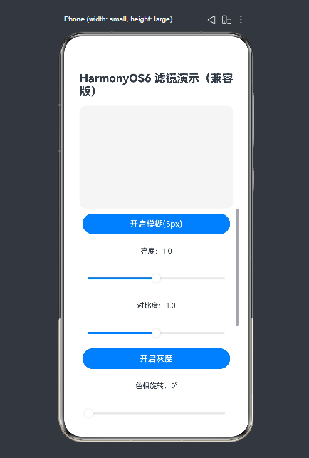
}运行效果如图:
2.2 关键代码解析
-
状态变量设计:
- 变量名添加
Switch/Val后缀(如blurSwitch、brightnessVal),避免与 ArkUI 内置方法(如brightness())重名。 - 所有变量通过
@State装饰,实现参数修改后滤镜效果实时刷新。
- 变量名添加
-
filter 核心配置:
blur:通过布尔值切换5px/0px,控制模糊开关。- 数值型参数(如
brightness/contrast)直接绑定滑块值,支持连续调节。 dropShadow始终返回完整结构(无空对象{}),符合 ArkTS 严格类型检查规则。
-
交互控制:
- 开关类滤镜(模糊/灰度/反色等)通过 Button 切换布尔值。
- 连续调节类滤镜(亮度/对比度/色相)通过 Slider 组件绑定数值。
- 重置按钮一键恢复所有参数默认值。
3. 运行前置条件
3.1 环境配置
-
DevEco Studio 版本 ≥ 4.0。
-
工程 API 版本配置(
entry/build-profile.json5):json{ "apiType": "stageMode", "compileSdkVersion": 10, "compatibleSdkVersion": 10 } -
同步 SDK:点击 DevEco Studio 右上角
Sync Now,确保 API 10 相关依赖下载完成。
3.2 运行方式
- 优先选择 API 10+ 远程模拟器/真机 运行(预览器可能存在兼容性问题)。
- 若使用低版本 API(<10),需注释
filter相关代码,仅保留交互框架。
4. 常见问题及解决方案
| 问题 | 原因 | 解决方案 |
|---|---|---|
Property 'filter' does not exist on type 'ImageAttribute' |
API 版本 < 10 | 升级工程 API 版本至 10+ |
Object literal must correspond to some explicitly declared class or interface |
dropShadow 使用空对象 {} |
声明完整的 DropShadowOption 结构(即使参数为0) |
Property 'brightness' is not assignable to base type |
变量名与内置方法重名 | 变量名添加后缀(如 brightnessVal) |
Cannot find module '@ohos.public.ArkUI' |
导入路径错误 | 移除特殊导入,用数字替代枚举(如 700 替代 FontWeight.Bold) |
总结
filter是 HarmonyOS API 10+ 提供的强大视觉滤镜属性,支持9类常用滤镜效果。- 使用时需注意组件兼容性(仅支持显示类组件)和类型检查规则(禁止空对象)。
- 示例代码实现了全参数动态调节,可直接复用至实际项目,适配严格模式语法规范。
- 低版本工程需升级 API 或使用
imageEffect做降级处理。
如果这篇文章对你有帮助,欢迎点赞、收藏、关注,你的支持是持续创作的动力!