matplotlib多子图与复杂布局实战
在实际业务分析中,经常需要在一个画布上展示多个图表进行对比分析。
Matplotlib 提供了多种子图布局方式:subplot(规则网格)、subplot2grid(网格合并)、GridSpec(精细控制)、subplot_mosaic(命名布局)。
开发思路:
- 使用四种不同的子图布局方法,对应四种业务场景。
- 每个场景都包含实际业务数据和完整的图表元素。
- 展示如何在复杂布局中统一处理中文和坐标轴对齐。
- 包含高级技巧:共享坐标轴、隐藏刻度、嵌套布局等。
准备
python
"""
chapter_9_multi_subplots_layouts.py
开发思路:
1. 使用四种不同的子图布局方法,对应四种业务场景。
2. 每个场景都包含实际业务数据和完整的图表元素。
3. 展示如何在复杂布局中统一处理中文和坐标轴对齐。
4. 包含高级技巧:共享坐标轴、隐藏刻度、嵌套布局等。
"""

import matplotlib.pyplot as plt
import numpy as np
import pandas as pd
from matplotlib.gridspec import GridSpec

# ================== 全局中文配置 ==================
plt.rcParams['font.sans-serif'] = ['SimHei', 'Microsoft YaHei', 'DejaVu Sans']
plt.rcParams['axes.unicode_minus'] = False

# ================== 准备通用数据 ==================
np.random.seed(2026)
# 时间序列数据
dates = pd.date_range('2026-01-01', '2026-03-31', freq='D')
sales_daily = 100 + np.cumsum(np.random.randn(len(dates)) * 2) + 20 * np.sin(np.linspace(0, 4*np.pi, len(dates)))
# 分类数据
products = ['智能手机', '笔记本电脑', '平板电脑', '智能手表']
quarters = ['Q1', 'Q2', 'Q3', 'Q4']
sales_matrix = np.random.randint(80, 200, size=(len(products), len(quarters)))
# 分布数据
customer_ages = np.random.normal(35, 12, 1000)
customer_spending = np.random.normal(500, 200, 1000)
案例1:subplot - 规则网格布局 =
python
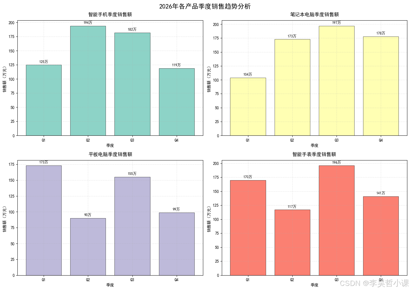
# ================== 案例1:subplot - 规则网格布局 ==================
# 业务场景:产品总监需要同时查看4款产品的季度销售趋势
print("="*60)
print("案例1:subplot - 2x2规则网格布局(产品季度销售分析)")
print("="*60)

fig, axes = plt.subplots(2, 2, figsize=(14, 10))
fig.suptitle('2026年各产品季度销售趋势分析', fontsize=16, fontweight='bold', y=0.98)

# 将2x2的axes数组展平,方便遍历
axes_flat = axes.flatten()

for i, (product, ax) in enumerate(zip(products, axes_flat)):
    # 为每个产品生成不同的销售趋势
    trend = sales_matrix[i] + np.random.randint(-10, 10, 4)

    # 绘制柱状图
    bars = ax.bar(quarters, trend, color=plt.cm.Set3(i), edgecolor='black', linewidth=0.5)
    ax.set_title(f'{product}季度销售额', fontsize=12, pad=10)
    ax.set_xlabel('季度', fontsize=10)
    ax.set_ylabel('销售额(万元)', fontsize=10)
    ax.grid(True, alpha=0.3, linestyle='--')

    # 在柱子上添加数值标签
    for bar, val in zip(bars, trend):
        ax.text(bar.get_x() + bar.get_width()/2, bar.get_height() + 2,
                f'{val}万', ha='center', va='bottom', fontsize=9)

plt.tight_layout()
plt.show()============================================================
案例1:subplot - 2x2规则网格布局(产品季度销售分析)
============================================================
案例2:subplot2grid - 网格合并布局
python
# ================== 案例2:subplot2grid - 网格合并布局 ==================
# 业务场景:市场部需要突出显示总销售额,同时展示各产品占比和趋势
print("\n" + "="*60)
print("案例2:subplot2grid - 合并单元格布局(市场综合分析看板)")
print("="*60)

fig = plt.figure(figsize=(15, 9))
fig.suptitle('2026年市场综合分析看板', fontsize=18, fontweight='bold', y=0.98)

# 创建3x3的网格,并分配不同大小的子图
# 左上角大图:总销售额趋势 (占2行2列)
ax1 = plt.subplot2grid((3, 3), (0, 0), rowspan=2, colspan=2)
# 右上角:产品占比饼图 (占1行1列)
ax2 = plt.subplot2grid((3, 3), (0, 2), rowspan=1, colspan=1)
# 中右:季度环比折线图 (占1行1列)
ax3 = plt.subplot2grid((3, 3), (1, 2), rowspan=1, colspan=1)
# 底部:三个小图并排 (各占1列)
ax4 = plt.subplot2grid((3, 3), (2, 0), rowspan=1, colspan=1)
ax5 = plt.subplot2grid((3, 3), (2, 1), rowspan=1, colspan=1)
ax6 = plt.subplot2grid((3, 3), (2, 2), rowspan=1, colspan=1)

# ===== 图1:总销售额趋势 =====
weeks = np.arange(1, 13)
total_sales = 500 + np.cumsum(np.random.randn(12) * 20) + 10 * np.sin(np.linspace(0, 3*np.pi, 12))
ax1.plot(weeks, total_sales, 'o-', color='darkblue', linewidth=2, markersize=6)
ax1.fill_between(weeks, total_sales, 450, alpha=0.3, color='skyblue')
ax1.set_title('2026年Q1 周度总销售额趋势', fontsize=12)
ax1.set_xlabel('周数', fontsize=10)
ax1.set_ylabel('销售额(万元)', fontsize=10)
ax1.grid(True, alpha=0.3)
ax1.axhline(y=total_sales.mean(), color='red', linestyle='--', label=f'均值: {total_sales.mean():.0f}万')
ax1.legend()

# ===== 图2:产品占比饼图 =====
product_shares = sales_matrix.sum(axis=1)
colors = plt.cm.Pastel1(np.linspace(0, 1, len(products)))
wedges, texts, autotexts = ax2.pie(product_shares, labels=products, autopct='%1.1f%%',
                                    colors=colors, startangle=90)
for autotext in autotexts:
    autotext.set_color('white')
    autotext.set_fontweight('bold')
ax2.set_title('产品销售额占比', fontsize=12)

# ===== 图3:季度环比折线图 =====
qoq_growth = np.diff(sales_matrix.sum(axis=0)) / sales_matrix.sum(axis=0)[:-1] * 100
ax3.plot(quarters[1:], qoq_growth, 'rs-', linewidth=2, markersize=8)
ax3.axhline(y=0, color='gray', linestyle='-', linewidth=0.5)
ax3.set_title('季度环比增长率', fontsize=12)
ax3.set_xlabel('季度', fontsize=10)
ax3.set_ylabel('增长率 (%)', fontsize=10)
ax3.grid(True, alpha=0.3)
for i, (q, g) in enumerate(zip(quarters[1:], qoq_growth)):
    ax3.annotate(f'{g:.1f}%', xy=(i, g), xytext=(i, g+2 if g>0 else g-4),
                ha='center', fontsize=9, color='darkred')

# ===== 图4-6:三个产品详细卡片 =====
product_details = [
    ('智能手机', 'black', [85, 120, 150, 180]),
    ('笔记本电脑', 'blue', [95, 140, 135, 170]),
    ('平板电脑', 'green', [70, 95, 130, 160])
]

for ax, (product, color, trends) in zip([ax4, ax5, ax6], product_details):
    ax.plot(quarters, trends, marker='o', color=color, linewidth=2)
    ax.fill_between(quarters, trends, min(trends)-10, alpha=0.2, color=color)
    ax.set_title(f'{product}趋势', fontsize=10)
    ax.set_xlabel('季度', fontsize=8)
    ax.set_ylabel('销售额', fontsize=8)
    ax.tick_params(labelsize=8)
    ax.grid(True, alpha=0.2)

plt.tight_layout()
plt.show()============================================================
案例2:subplot2grid - 合并单元格布局(市场综合分析看板)
============================================================
案例3:GridSpec - 精细化布局
python
# ================== 案例3:GridSpec - 精细化布局 ==================
# 业务场景:数据分析师需要制作一份包含原始数据分布、箱线图和Q-Q图的统计报告
print("\n" + "="*60)
print("案例3:GridSpec - 精细化布局(数据分布统计报告)")
print("="*60)

fig = plt.figure(figsize=(16, 10))
fig.suptitle('客户消费行为深度统计分析报告', fontsize=18, fontweight='bold', y=0.98)

# 创建3x3的网格,但每行高度不同,列宽也不同
gs = GridSpec(3, 3, figure=fig,
              height_ratios=[1.5, 1, 1.2],  # 行高比例
              width_ratios=[1.2, 1, 1],     # 列宽比例
              hspace=0.3, wspace=0.3)        # 间距

# 分配子图
ax_hist = fig.add_subplot(gs[0, :])      # 第一行,占全部3列
ax_box1 = fig.add_subplot(gs[1, 0])      # 第二行第一列
ax_box2 = fig.add_subplot(gs[1, 1])      # 第二行第二列
ax_box3 = fig.add_subplot(gs[1, 2])      # 第二行第三列
ax_scatter = fig.add_subplot(gs[2, :2])  # 第三行前两列
ax_qq = fig.add_subplot(gs[2, 2])        # 第三行第三列

# ===== 直方图+KDE:整体分布 =====
ax_hist.hist(customer_spending, bins=30, density=True, alpha=0.6, color='steelblue', edgecolor='black')
# 添加核密度估计
from scipy import stats
kde = stats.gaussian_kde(customer_spending)
x_range = np.linspace(customer_spending.min(), customer_spending.max(), 200)
ax_hist.plot(x_range, kde(x_range), 'r-', linewidth=2, label='核密度估计')
ax_hist.axvline(customer_spending.mean(), color='green', linestyle='--',
                linewidth=2, label=f'均值: {customer_spending.mean():.0f}')
ax_hist.axvline(np.median(customer_spending), color='orange', linestyle=':',
                linewidth=2, label=f'中位数: {np.median(customer_spending):.0f}')
ax_hist.set_title('客户消费金额分布(含KDE)', fontsize=14)
ax_hist.set_xlabel('消费金额(元)', fontsize=11)
ax_hist.set_ylabel('概率密度', fontsize=11)
ax_hist.legend()
ax_hist.grid(True, alpha=0.2)

# ===== 三个箱线图:不同年龄段的消费分布 =====
# 划分年龄段
young_mask = customer_ages < 30
middle_mask = (customer_ages >= 30) & (customer_ages < 45)
old_mask = customer_ages >= 45

age_groups = [
    (young_mask, '年轻客户 (<30岁)', ax_box1, 'lightcoral'),
    (middle_mask, '中年客户 (30-45岁)', ax_box2, 'lightgreen'),
    (old_mask, '成熟客户 (≥45岁)', ax_box3, 'lightskyblue')
]

for mask, title, ax, color in age_groups:
    if np.sum(mask) > 0:
        data = customer_spending[mask]
        bp = ax.boxplot(data, patch_artist=True, widths=0.6)
        bp['boxes'][0].set_facecolor(color)
        bp['boxes'][0].set_alpha(0.7)
        ax.set_title(title, fontsize=11)
        ax.set_ylabel('消费金额', fontsize=9)
        ax.set_xticks([])
        ax.grid(True, alpha=0.2, axis='y')

        # 添加统计信息
        ax.text(0.5, 0.05, f'n={len(data)}', transform=ax.transAxes,
                ha='center', fontsize=9, bbox=dict(boxstyle='round', facecolor='wheat', alpha=0.8))

# ===== 散点图:年龄与消费的关系 =====
scatter = ax_scatter.scatter(customer_ages, customer_spending, c=customer_ages,
                             cmap='viridis', alpha=0.5, s=30)
plt.colorbar(scatter, ax=ax_scatter, label='年龄')
ax_scatter.set_xlabel('年龄(岁)', fontsize=11)
ax_scatter.set_ylabel('消费金额(元)', fontsize=11)
ax_scatter.set_title('年龄与消费金额关系散点图', fontsize=12)
ax_scatter.grid(True, alpha=0.2)

# 添加线性回归线
z = np.polyfit(customer_ages, customer_spending, 1)
p = np.poly1d(z)
ax_scatter.plot(np.sort(customer_ages), p(np.sort(customer_ages)),
               'r--', linewidth=2, label=f'趋势线 (斜率={z[0]:.2f})')
ax_scatter.legend()

# ===== Q-Q图:正态性检验 =====
# 计算理论分位数和样本分位数
from scipy import stats
quantiles = np.linspace(0.01, 0.99, 100)
theoretical = stats.norm.ppf(quantiles, loc=customer_spending.mean(),
                             scale=customer_spending.std())
sample = np.percentile(customer_spending, quantiles * 100)

ax_qq.scatter(theoretical, sample, alpha=0.6, s=20)
# 添加y=x参考线
min_val = min(theoretical.min(), sample.min())
max_val = max(theoretical.max(), sample.max())
ax_qq.plot([min_val, max_val], [min_val, max_val], 'r--', linewidth=2)
ax_qq.set_xlabel('理论分位数', fontsize=10)
ax_qq.set_ylabel('样本分位数', fontsize=10)
ax_qq.set_title('Q-Q图(正态性检验)', fontsize=12)
ax_qq.grid(True, alpha=0.2)

# GridSpec 布局与 tight_layout 不完全兼容,直接显示
plt.show()============================================================
案例3:GridSpec - 精细化布局(数据分布统计报告)
============================================================
案例4:subplot_mosaic - 命名布局
python
# ================== 案例4:subplot_mosaic - 命名布局(Python 3.12+ 推荐) ==================
# 业务场景:运营团队需要制作一个综合运营看板,包含核心指标
print("\n" + "="*60)
print("案例4:subplot_mosaic - 命名布局(运营核心指标看板)")
print("="*60)

# 使用mosaic定义布局,这是Matplotlib 3.3+引入的现代布局方式
# 特别适合Python 3.12环境,代码可读性极高
mosaic = [
    ['header', 'header', 'header'],      # 第一行:标题区
    ['kpi1', 'kpi2', 'kpi3'],            # 第二行:三个KPI指标
    ['trend', 'trend', 'pie'],            # 第三行:趋势图和饼图
    ['detail1', 'detail2', 'detail3']     # 第四行:三个细节图
]

fig, axes_dict = plt.subplot_mosaic(mosaic, figsize=(15, 12),
                                     constrained_layout=True,
                                     height_ratios=[0.4, 0.7, 1.2, 0.8])

fig.suptitle('运营核心指标看板 (2026年3月)', fontsize=20, fontweight='bold', y=1.02)

# ===== header:标题区域,不实际绘图,只放文字 =====
axes_dict['header'].axis('off')
header_text = """总体运营状况:本月活跃用户 128.5万 | 总交易额 3,842万 | 订单量 45.2万
同比增长 +15.3% | 环比增长 +3.8% | 目标完成率 92%"""
axes_dict['header'].text(0.5, 0.5, header_text, ha='center', va='center',
                         fontsize=12, bbox=dict(boxstyle='round', facecolor='lightblue', alpha=0.5))

# ===== KPI指标卡 =====
kpi_data = [
    ('kpi1', 'DAU (万)', '128.5', '+5.2%', '#ff6b6b'),
    ('kpi2', 'ARPU (元)', '84.3', '+2.1%', '#4ecdc4'),
    ('kpi3', '转化率', '3.85%', '-0.3%', '#ffe66d')
]

for kpi_key, title, value, change, color in kpi_data:
    ax = axes_dict[kpi_key]
    ax.axis('off')
    ax.set_facecolor(color)

    # 绘制KPI卡片
    ax.text(0.5, 0.7, title, ha='center', va='center', fontsize=12, fontweight='bold')
    ax.text(0.5, 0.4, value, ha='center', va='center', fontsize=24, fontweight='bold')
    ax.text(0.5, 0.15, change, ha='center', va='center', fontsize=11,
           color='green' if '+' in change else 'red')

# ===== 趋势图 =====
ax_trend = axes_dict['trend']
days = np.arange(1, 31)
# 模拟DAU趋势
dau = 120 + 8 * np.sin(np.linspace(0, 4*np.pi, 30)) + np.random.randn(30) * 2
ax_trend.plot(days, dau, 'o-', color='darkblue', linewidth=2, markersize=4)
ax_trend.fill_between(days, 110, dau, where=(dau>115), color='lightgreen', alpha=0.3, label='高于基准')
ax_trend.fill_between(days, dau, 110, where=(dau<=115), color='lightsalmon', alpha=0.3, label='低于基准')
ax_trend.axhline(y=115, color='gray', linestyle='--', linewidth=1, label='基准线')
ax_trend.set_title('3月DAU趋势', fontsize=14, fontweight='bold')
ax_trend.set_xlabel('日期', fontsize=11)
ax_trend.set_ylabel('DAU (万)', fontsize=11)
ax_trend.legend(loc='upper right')
ax_trend.grid(True, alpha=0.2)

# 标记峰值
max_day = np.argmax(dau) + 1
ax_trend.annotate(f'峰值: {dau[max_day-1]:.1f}万',
                 xy=(max_day, dau[max_day-1]),
                 xytext=(max_day+2, dau[max_day-1]+2),
                 arrowprops=dict(arrowstyle='->', color='red'))

# ===== 饼图 =====
ax_pie = axes_dict['pie']
channels = ['自然流量', '社交媒体', '付费广告', '老客复购', '活动引流']
channel_data = [45, 28, 35, 42, 20]
wedges, texts, autotexts = ax_pie.pie(channel_data, labels=channels, autopct='%1.1f%%',
                                       startangle=90, colors=plt.cm.Set3(np.linspace(0, 1, 5)))
for autotext in autotexts:
    autotext.set_color('white')
    autotext.set_fontweight('bold')
ax_pie.set_title('用户来源渠道分析', fontsize=14, fontweight='bold')

# ===== 三个细节图 =====
detail_data = [
    ('detail1', '时段活跃分布', ['0-6点', '6-12点', '12-18点', '18-24点'], [12, 38, 45, 62]),
    ('detail2', '设备分布', ['iOS', 'Android', 'Web'], [850, 1200, 320]),
    ('detail3', '城市等级分布', ['一线', '新一线', '二线', '其他'], [42, 38, 28, 20])
]

for detail_key, title, labels, values in detail_data:
    ax = axes_dict[detail_key]
    bars = ax.bar(labels, values, color=plt.cm.Pastel2(np.linspace(0, 1, len(labels))))
    ax.set_title(title, fontsize=11, fontweight='bold')
    ax.tick_params(axis='x', rotation=15)
    ax.grid(True, alpha=0.2, axis='y')

    # 添加数值标签
    for bar in bars:
        height = bar.get_height()
        ax.text(bar.get_x() + bar.get_width()/2., height + 1,
                f'{height}', ha='center', va='bottom', fontsize=8)

# 调整布局并显示
plt.show()============================================================
案例4:subplot_mosaic - 命名布局(运营核心指标看板)
============================================================
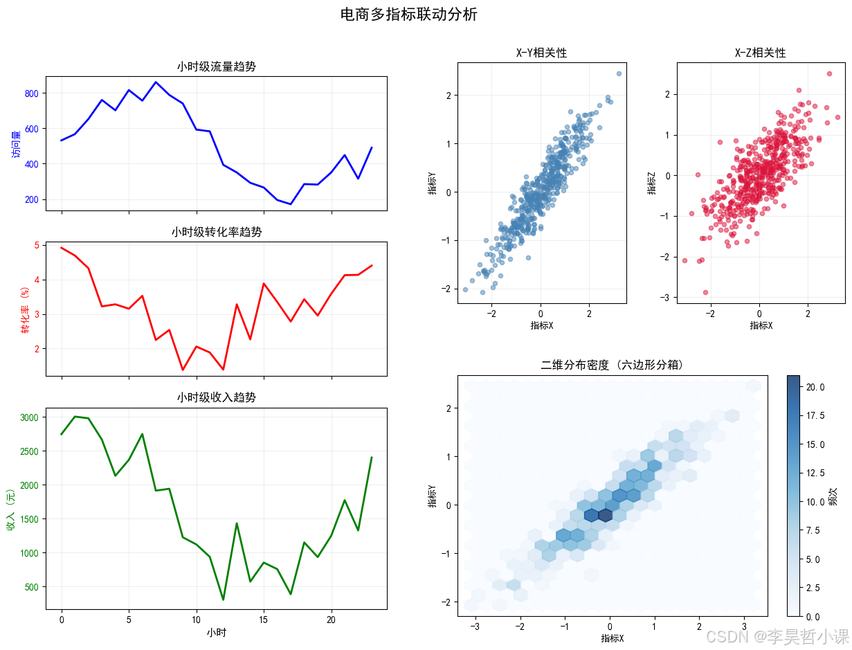
案例5:嵌套布局与坐标轴共享
python
# ================== 案例5:嵌套布局与坐标轴共享 ==================
# 业务场景:时间序列分析需要对比多个相关指标,同时查看细节
print("\n" + "="*60)
print("案例5:嵌套布局与坐标轴共享(多指标对比分析)")
print("="*60)

fig = plt.figure(figsize=(14, 10))
fig.suptitle('电商多指标联动分析', fontsize=16, fontweight='bold', y=0.98)

# 使用GridSpec创建主布局
gs_main = GridSpec(3, 2, figure=fig, height_ratios=[1, 1, 1.5])

# 左侧创建一个垂直布局,包含两个共享X轴的子图
# 右侧是一个大图,包含多个子图的嵌套

# ===== 左侧:共享X轴的时间序列 =====
# 第一个子图:流量
ax_traffic = fig.add_subplot(gs_main[0, 0])
# 第二个子图:转化,共享X轴
ax_conversion = fig.add_subplot(gs_main[1, 0], sharex=ax_traffic)
# 第三个子图:收入,共享X轴
ax_revenue = fig.add_subplot(gs_main[2, 0], sharex=ax_traffic)

# 生成共享的时间轴
time_hours = np.arange(24)
traffic = 500 + 300 * np.sin(np.linspace(0, 2*np.pi, 24)) + np.random.randn(24)*50
conversion = 0.03 + 0.01 * np.sin(np.linspace(0, 2*np.pi, 24) + np.pi/2) + np.random.randn(24)*0.005
revenue = traffic * conversion * 100 + np.random.randn(24)*200

# 绘制三个共享X轴的图
ax_traffic.plot(time_hours, traffic, 'b-', linewidth=2)
ax_traffic.set_ylabel('访问量', color='b')
ax_traffic.tick_params(axis='y', labelcolor='b')
ax_traffic.set_title('小时级流量趋势')
ax_traffic.grid(True, alpha=0.2)

ax_conversion.plot(time_hours, conversion*100, 'r-', linewidth=2)
ax_conversion.set_ylabel('转化率 (%)', color='r')
ax_conversion.tick_params(axis='y', labelcolor='r')
ax_conversion.set_title('小时级转化率趋势')
ax_conversion.grid(True, alpha=0.2)

ax_revenue.plot(time_hours, revenue, 'g-', linewidth=2)
ax_revenue.set_xlabel('小时', fontsize=11)
ax_revenue.set_ylabel('收入 (元)', color='g')
ax_revenue.tick_params(axis='y', labelcolor='g')
ax_revenue.set_title('小时级收入趋势')
ax_revenue.grid(True, alpha=0.2)

# 隐藏中间的x轴标签,只保留最后一个
plt.setp(ax_traffic.get_xticklabels(), visible=False)
plt.setp(ax_conversion.get_xticklabels(), visible=False)

# ===== 右侧:嵌套布局 =====
# 创建一个嵌套的GridSpec,占据右侧两列
gs_right = GridSpec(2, 2, figure=fig, left=0.55, right=0.95, top=0.9, bottom=0.1,
                    hspace=0.3, wspace=0.3)

# 右上:散点图矩阵的简化版(只画两个)
ax_scatter1 = fig.add_subplot(gs_right[0, 0])
ax_scatter2 = fig.add_subplot(gs_right[0, 1])
ax_hist2d = fig.add_subplot(gs_right[1, :])  # 底部合并单元格

# 生成一些相关数据
x = np.random.randn(500)
y = 0.7 * x + 0.3 * np.random.randn(500)
z = 0.5 * x + 0.5 * np.random.randn(500)

ax_scatter1.scatter(x, y, alpha=0.5, s=20, c='steelblue')
ax_scatter1.set_xlabel('指标X')
ax_scatter1.set_ylabel('指标Y')
ax_scatter1.set_title('X-Y相关性')
ax_scatter1.grid(True, alpha=0.2)

ax_scatter2.scatter(x, z, alpha=0.5, s=20, c='crimson')
ax_scatter2.set_xlabel('指标X')
ax_scatter2.set_ylabel('指标Z')
ax_scatter2.set_title('X-Z相关性')
ax_scatter2.grid(True, alpha=0.2)

# 二维直方图
hb = ax_hist2d.hexbin(x, y, gridsize=20, cmap='Blues', alpha=0.8)
plt.colorbar(hb, ax=ax_hist2d, label='频次')
ax_hist2d.set_xlabel('指标X')
ax_hist2d.set_ylabel('指标Y')
ax_hist2d.set_title('二维分布密度 (六边形分箱)')

# GridSpec 嵌套布局与 tight_layout 不完全兼容,直接显示
plt.show()============================================================
案例5:嵌套布局与坐标轴共享(多指标对比分析)
============================================================
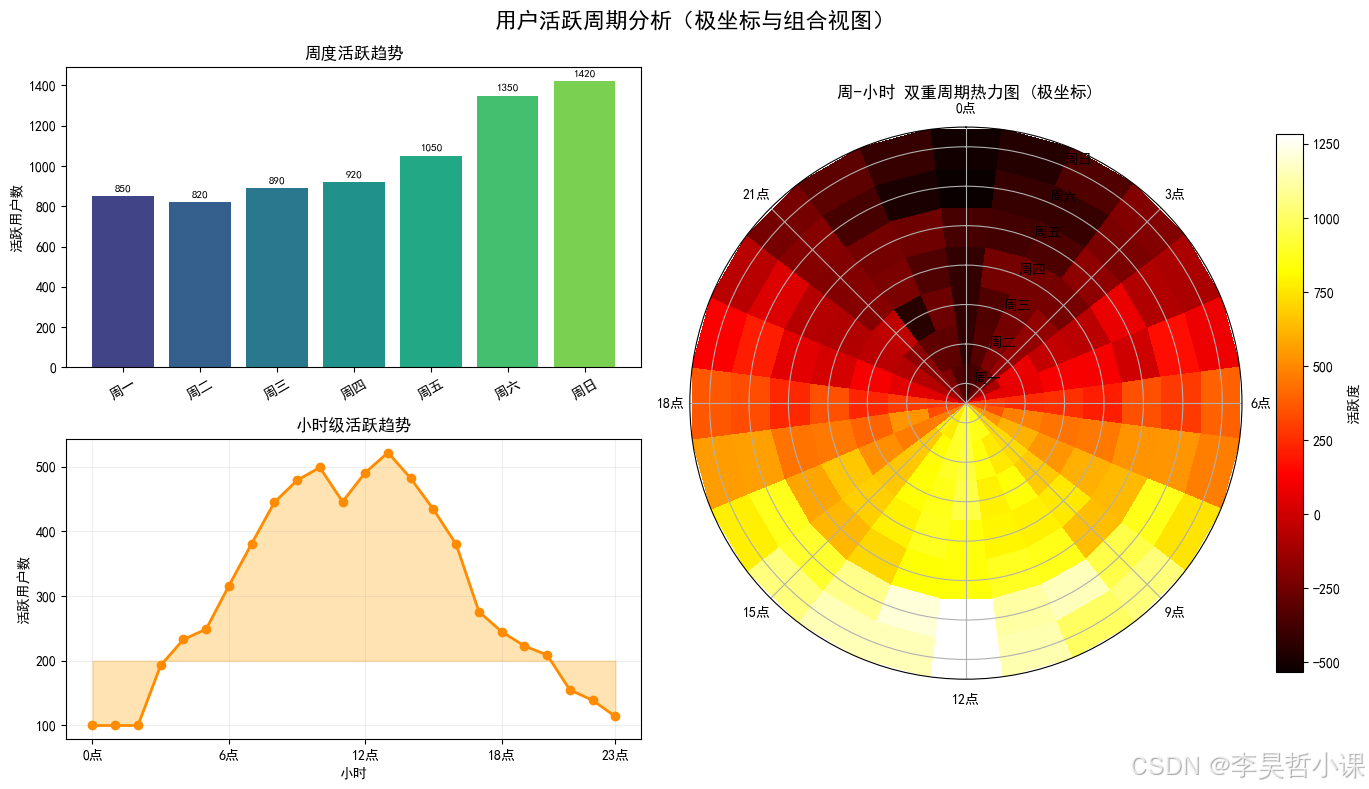
案例6:极坐标系与组合布局
python
# ================== 案例6:极坐标系与组合布局 ==================
# 业务场景:展示周期性数据(如一周各天、一天各小时的周期性规律)
print("\n" + "="*60)
print("案例6:极坐标系与组合布局(周期数据分析)")
print("="*60)

fig = plt.figure(figsize=(14, 8))
fig.suptitle('用户活跃周期分析(极坐标与组合视图)', fontsize=16, fontweight='bold')

# 创建2x2的布局,其中一个使用极坐标
gs = GridSpec(2, 2, figure=fig, width_ratios=[1, 1.2])

# 笛卡尔坐标系的子图
ax1 = fig.add_subplot(gs[0, 0])  # 周趋势
ax2 = fig.add_subplot(gs[1, 0])  # 日趋势
# 极坐标子图
ax3 = fig.add_subplot(gs[:, 1], projection='polar')  # 极坐标,合并两行

# ===== 周趋势 =====
days = ['周一', '周二', '周三', '周四', '周五', '周六', '周日']
weekly_activity = [850, 820, 890, 920, 1050, 1350, 1420]
bars1 = ax1.bar(days, weekly_activity, color=plt.cm.viridis(np.linspace(0.2, 0.8, 7)))
ax1.set_title('周度活跃趋势', fontsize=12)
ax1.set_ylabel('活跃用户数')
ax1.tick_params(axis='x', rotation=30)
for bar, val in zip(bars1, weekly_activity):
    ax1.text(bar.get_x() + bar.get_width()/2, bar.get_height() + 20, str(val),
            ha='center', va='bottom', fontsize=8)

# ===== 日趋势(24小时)=====
hours = np.arange(24)
hourly_activity = 300 + 200 * np.sin(np.linspace(0, 2*np.pi, 24) - np.pi/2)
hourly_activity = np.clip(hourly_activity + np.random.randn(24)*30, 100, 600).astype(int)

ax2.plot(hours, hourly_activity, 'o-', color='darkorange', linewidth=2)
ax2.fill_between(hours, hourly_activity, 200, alpha=0.3, color='orange')
ax2.set_title('小时级活跃趋势', fontsize=12)
ax2.set_xlabel('小时')
ax2.set_ylabel('活跃用户数')
ax2.grid(True, alpha=0.2)
ax2.set_xticks([0, 6, 12, 18, 23])
ax2.set_xticklabels(['0点', '6点', '12点', '18点', '23点'])

# ===== 极坐标:双重周期 =====
# 生成一周每天24小时的数据(7x24矩阵)
weekly_hourly = np.zeros((7, 24))
for day in range(7):
    # 基础模式:周末高,工作日低
    day_factor = 1.2 if day >= 5 else 0.9
    for hour in range(24):
        hour_factor = 0.3 + 0.7 * np.sin(np.pi * hour / 12 - np.pi/2)
        weekly_hourly[day, hour] = day_factor * hour_factor * 1000 + np.random.randn()*50

# 在极坐标中绘制热力图
theta, r = np.meshgrid(np.linspace(0, 2*np.pi, 24, endpoint=False),  # 角度:小时
                       np.arange(7))  # 半径:星期

# 使用pcolormesh在极坐标中绘制
mesh = ax3.pcolormesh(theta, r, weekly_hourly, cmap='hot', shading='auto')
plt.colorbar(mesh, ax=ax3, label='活跃度', shrink=0.8)

# 设置极坐标标签
ax3.set_theta_zero_location('N')  # 0度指向北方
ax3.set_theta_direction(-1)  # 顺时针方向
ax3.set_rgrids([0, 1, 2, 3, 4, 5, 6], labels=['周一', '周二', '周三', '周四', '周五', '周六', '周日'])
ax3.set_title('周-小时 双重周期热力图 (极坐标)', fontsize=12, pad=20)

# 添加角度刻度标签(小时)
hour_labels = ['0点', '3点', '6点', '9点', '12点', '15点', '18点', '21点']
hour_angles = np.linspace(0, 2*np.pi, 8, endpoint=False)
ax3.set_xticks(hour_angles)
ax3.set_xticklabels(hour_labels)

plt.tight_layout()
plt.show()

print("\n" + "="*60)
print("✅ 多子图布局教程完成!共展示6种不同布局场景")
print("="*60)============================================================
案例6:极坐标系与组合布局(周期数据分析)
============================================================
============================================================
✅ 多子图布局教程完成!共展示6种不同布局场景
============================================================