旅游数据多维度分析平台
这是一个完善的旅游行业数据分析Dashboard项目,基于Streamlit构建。
一、架构
1.1 技术栈组成
| 类别 | 技术/库 | 用途 |
|---|---|---|
| 前端框架 | Streamlit | 快速构建交互式Web应用 |
| 数据处理 | Pandas, NumPy | 数据清洗、转换、分析 |
| 可视化 | Plotly (Express, Graph Objects, Subplots) | 交互式图表绘制 |
| 机器学习 | Scikit-learn | 聚类、回归、分类模型 |
| 数据处理 | warnings | 抑制警告信息 |
1.2 项目结构概览
旅游数据多维度分析平台
├── 页面配置 (CSS样式、页面布局)
├── 数据加载 (CSV读取、日期转换、缓存)
├── 侧边栏筛选 (年份、月份、省份)
├── 顶部指标卡 (4个核心KPI)
└── 7个功能选项卡
    ├── Tab1: 游客特征分析
    ├── Tab2: 消费行为分析
    ├── Tab3: 景点/景区分析
    ├── Tab4: 时间维度分析
    ├── Tab5: 满意度与情感分析
    ├── Tab6: 高级分析模型
    └── Tab7: 综合可视化展示
二、各模块解析
2.1 数据加载模块
python
@st.cache_data
def load_data():
    df = pd.read_csv('dataset.csv')
    df['游玩日期'] = pd.to_datetime(df['游玩日期'])
    df['年月'] = pd.to_datetime(df['年月'], format='%y-%b', errors='coerce')
    return df
关键点分析:
@st.cache_data:Streamlit缓存装饰器,避免每次交互都重新加载数据- 日期转换:处理两种日期格式,
errors='coerce'处理异常值 - 潜在问题:数据文件路径硬编码,建议改为文件上传器
2.2 侧边栏筛选
python
selected_year = st.sidebar.multiselect("选择年份", sorted(df['年份'].unique()), default=...)
selected_month = st.sidebar.multiselect("选择月份", sorted(df['月份'].unique()), default=...)
selected_province = st.sidebar.multiselect("选择省份", sorted(df['省份'].unique()), default=...)
设计亮点:
- 多选控件支持灵活筛选
- 默认选中全部/部分选项
- 筛选结果实时应用到所有图表
改进建议:
python
# 添加"全选"功能
if st.sidebar.button("全选"):
    selected_year = sorted(df['年份'].unique())
2.3 核心指标卡 (KPI Dashboard)
| 指标 | 计算方式 | 业务意义 |
|---|---|---|
| 总游客数 | nunique() |
去重后的独立游客数量 |
| 总消费金额 | sum() |
平台总收入 |
| 平均满意度 | mean() |
服务质量核心指标 |
| 热门景点数 | nunique() |
景点覆盖范围 |
三、功能模块
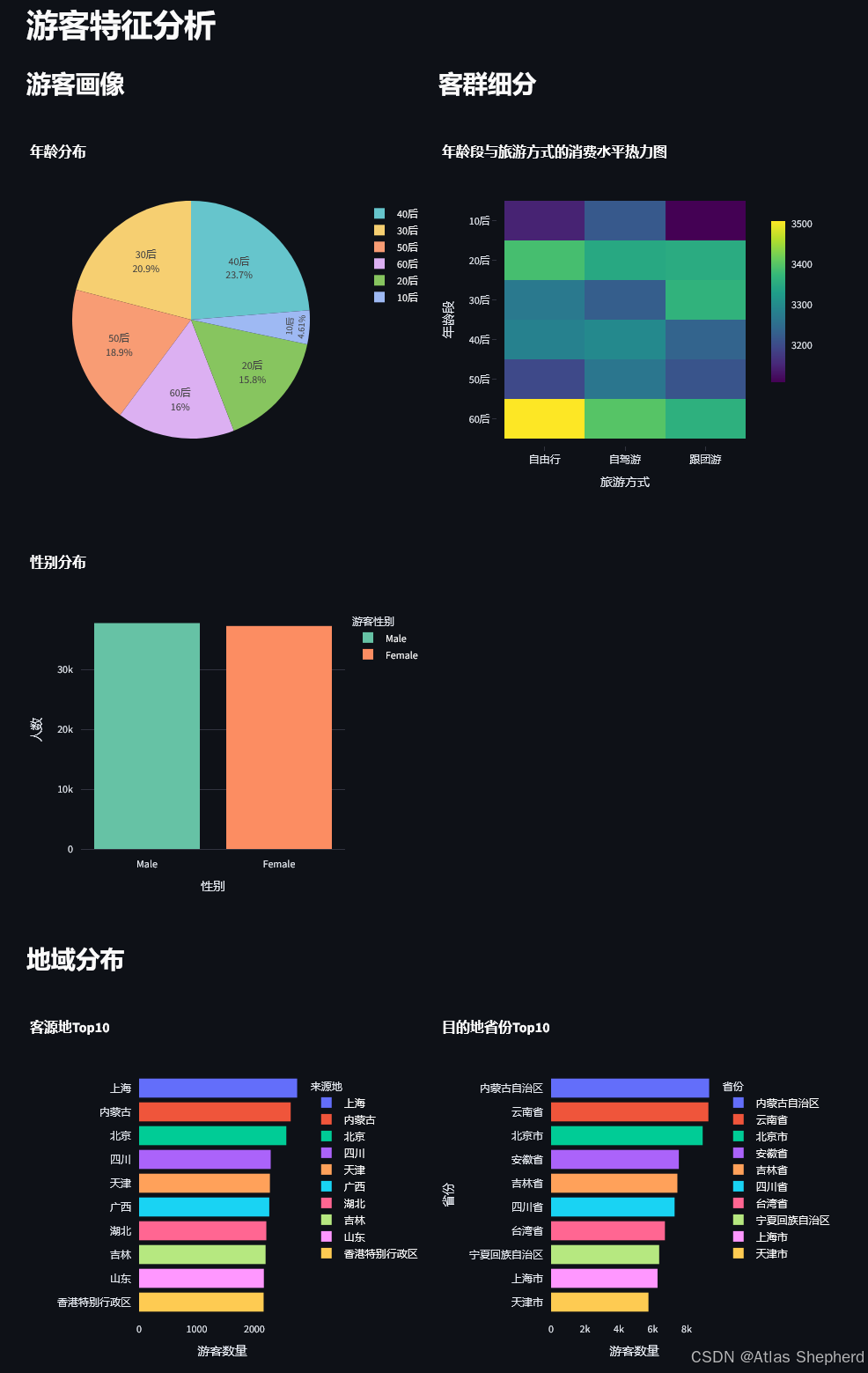
Tab1: 游客特征分析
分析维度:
-
人口统计学特征
- 年龄分布(饼图)
- 性别分布(柱状图)
-
客群细分
- 年龄段×旅游方式×消费金额(热力图)
- 揭示不同客群的消费偏好
-
地域分布
- 客源地Top10
- 目的地省份Top10
业务价值: 帮助制定精准营销策略,识别核心客群
Tab2: 消费行为分析
分析内容:
python
# 消费分布
px.histogram(x='消费金额(元)', nbins=50)

# 箱线图分析异常值
px.box(x='游客性别', y='消费金额(元)')
px.box(x='旅游方式', y='消费金额(元)')

# 价格敏感度
px.scatter(x='门票价格', y='消费金额', size='满意度')
关键洞察:
- 消费金额分布形态(是否正态/偏态)
- 不同群体的消费差异
- 价格与消费的相关性
Tab3: 景点/景区分析
核心图表:
| 图表类型 | 分析目的 |
|---|---|
| 热门景点Top20 | 识别流量高地 |
| 景区销量Top20 | 识别收入高地 |
| 景点类型偏好 | 产品优化方向 |
| 综合表现散点图 | 销量vs满意度矩阵 |
业务应用:
- 高销量低满意度 → 需要改进服务
- 低销量高满意度 → 需要加强营销
- 双高 → 明星产品,可复制经验
Tab4: 时间维度分析
时间粒度分析:
python
# 月度趋势
monthly_visitors = df_filtered.groupby('月份')['游客编号'].count()

# 季度分析(双Y轴)
fig_quarterly.add_trace(go.Bar(...))  # 游客量
fig_quarterly.add_trace(go.Scatter(...))  # 消费金额

# 周度规律
weekday_names = {1: '周一', 2: '周二', ...}
业务价值:
- 识别旅游旺季/淡季
- 周末vs工作日差异
- 人力资源调度依据
Tab5: 满意度与情感分析
分析框架:
满意度分析
├── 分布统计 (直方图 + 统计表格)
├── 情感倾向 (饼图)
├── 驱动因素
│   ├── 消费金额 vs 满意度
│   ├── 游玩时长 vs 满意度
│   └── 景点数量 vs 满意度
└── 问题诊断 (低满意度 < 3.0)
    ├── 低满意度景点类型
    └── 低满意度旅游方式
关键代码:
python
low_satisfaction = df_filtered[df_filtered['满意度评分'] < 3.0]Tab6: 分析模型
这是项目的技术核心,包含6种分析方法:
1. 关联规则分析
python
association_data = df_filtered.groupby(['旅游方式', '景点类型']).size().unstack()
px.imshow(association_data)  # 热力图
2. K-Means聚类分析
python
cluster_features = df_filtered[['消费金额(元)', '游玩时长(天)', '景点数量', '满意度评分']]
scaler = StandardScaler()
cluster_scaled = scaler.fit_transform(cluster_features)
kmeans = KMeans(n_clusters=4, random_state=42)
聚类业务意义:
| 客群 | 特征 | 营销策略 |
|---|---|---|
| 高消费长停留 | 高端客户 | VIP服务 |
| 低消费短停留 | 价格敏感 | 优惠促销 |
| 高满意度 | 忠诚客户 | 会员计划 |
| 低满意度 | 风险客户 | 服务改进 |
3. 线性回归分析
python
lr_model = LinearRegression()
lr_model.fit(X_train, y_train)
feature_importance = pd.DataFrame({'特征': [...], '系数': lr_model.coef_})
预测目标: 消费金额
影响因素: 年龄、游玩时长、景点数量、门票价格
4. 随机森林分类
python
rf_model = RandomForestClassifier(n_estimators=100)
df_filtered['满意度标签'] = pd.cut(df_filtered['满意度评分'],
                                    bins=[0, 3, 4, 5],
                                    labels=['低', '中', '高'])
预测目标: 满意度等级
评估指标: 训练/测试集准确率
5. 时间序列预测
python
monthly_data['3月移动平均'] = monthly_data['游客编号'].rolling(window=3, center=True).mean()6. 路径分析
python
px.treemap(path=['来源地', '省份'], values='游客数量')Tab7: 综合可视化展示
高级图表类型:
| 图表 | 用途 | 技术要点 |
|---|---|---|
| 雷达图 | 多维度对比 | go.Scatterpolar |
| 漏斗图 | 转化分析 | px.funnel |
| 散点图矩阵 | 变量关系 | px.scatter_matrix |
| 热力图 | 密度分布 | px.imshow |
| 子图组合 | 综合趋势 | make_subplots |
雷达图归一化代码:
python
for col in columns:
    type_radar_norm[col] = (type_radar[col] - type_radar[col].min()) / (type_radar[col].max() - type_radar[col].min())
四、后期优化方向
4.1 性能优化
python
# 问题:每次筛选都重新计算所有图表
# 建议:使用@st.cache_data缓存处理后的数据

@st.cache_data
def filter_data(df, year, month, province):
    return df[(df['年份'].isin(year)) & ...]
4.2 错误处理
python
# 当前代码缺少空数据检查
if df_filtered.empty:
    st.warning(" 当前筛选条件下无数据,请调整筛选条件")
    st.stop()
4.3 数据上传功能
python
# 替代硬编码路径
uploaded_file = st.sidebar.file_uploader("上传数据文件", type=['csv'])
if uploaded_file:
    df = pd.read_csv(uploaded_file)
4.4 模型持久化
python
# 当前模型每次运行都重新训练
# 建议:保存训练好的模型
import joblib
joblib.dump(lr_model, 'models/regression_model.pkl')
4.5 代码结构优化
python
# 建议将每个Tab封装为函数
def render_visitor_tab(df_filtered):
    st.header("游客特征分析")
    ...

def render_consumption_tab(df_filtered):
    st.header("消费行为分析")
    ...
五、场景
5.1 旅游平台运营
| 场景 | 使用模块 | 决策支持 |
|---|---|---|
| 营销活动策划 | Tab1游客特征 | 目标客群定位 |
| 定价策略优化 | Tab2消费行为 | 价格敏感度分析 |
| 产品推荐 | Tab3景点分析 | 热门景点推荐 |
| 资源调度 | Tab4时间维度 | 旺季人力安排 |
| 服务改进 | Tab5满意度 | 问题诊断 |
| 客户分群 | Tab6聚类模型 | 精准营销 |
5.2 景区管理
- 游客流量预测
- 满意度监控预警
- 景点组合优化
- 收入结构分析
六、后期扩展方向
6.1 数据层面
python
# 添加更多数据源
- 天气数据(影响旅游决策)
- 节假日日历
- 竞品数据
- 社交媒体情感数据
6.2 模型层面
python
# 高级模型
- Prophet时间序列预测
- XGBoost/LightGBM分类
- 关联规则(Apriori)
- 用户行为序列分析
6.3 功能层面
python
# 交互功能
- 数据导出(Excel/CSV)
- 报告自动生成(PDF)
- 预警系统(邮件/短信)
- 权限管理(多用户)
6.4 部署层面
python
# 生产部署
- Docker容器化
- 数据库连接(SQL/MySQL)
- 定时数据更新
- 负载均衡
七、运行
7.1 环境准备
bash
# 创建虚拟环境
python -m venv tourism_env
source tourism_env/bin/activate  # Windows: tourism_env\Scripts\activate

# 安装依赖
pip install pandas numpy streamlit plotly scikit-learn
7.2 数据准备
python
# dataset.csv 应包含以下字段
必需字段:
- 游客编号, 游玩日期, 年份, 月份, 省份
- 消费金额(元), 满意度评分, 景点名称
- 游客性别, 年龄段, 旅游方式, 来源地
- 景点类型, 景点门票价格(元), 景区销量
- 游玩时长(天), 景点数量, 评论情感倾向
- 星期, 年月, 游客年龄
7.3 运行命令
bash
streamlit run app.py7.4 访问地址
http://localhost:8501八、代码
import pandas as pd
import numpy as np
import streamlit as st
import plotly.express as px
import plotly.graph_objects as go
from plotly.subplots import make_subplots
import plotly.figure_factory as ff
from sklearn.cluster import KMeans
from sklearn.preprocessing import StandardScaler
from sklearn.linear_model import LinearRegression
from sklearn.ensemble import RandomForestClassifier
from sklearn.model_selection import train_test_split
from sklearn.metrics import classification_report
import warnings
warnings.filterwarnings('ignore')
# 页面配置
st.set_page_config(
page_title="旅游数据多维度分析平台",
page_icon="🏔️",
layout="wide",
initial_sidebar_state="expanded"
)
# 自定义CSS
st.markdown("""
<style>
.main-title {
font-size: 2.5rem;
font-weight: bold;
color: #1f77b4;
text-align: center;
margin-bottom: 1rem;
}
.metric-card {
background: linear-gradient(135deg, #667eea 0%, #764ba2 100%);
padding: 1rem;
border-radius: 10px;
color: white;
text-align: center;
}
.stMetric {
background-color: #f0f2f6;
padding: 1rem;
border-radius: 10px;
}
</style>
""", unsafe_allow_html=True)
# 标题
st.markdown('<p class="main-title">🏔️ 旅游数据多维度分析平台</p>', unsafe_allow_html=True)
st.markdown("---")
# 加载数据
@st.cache_data
def load_data():
df = pd.read_csv('dataset.csv')
# 转换日期
df['游玩日期'] = pd.to_datetime(df['游玩日期'])
df['年月'] = pd.to_datetime(df['年月'], format='%y-%b', errors='coerce')
return df
df = load_data()
# 侧边栏筛选
st.sidebar.header("📊 数据筛选")
selected_year = st.sidebar.multiselect("选择年份", sorted(df['年份'].unique()), default=sorted(df['年份'].unique()))
selected_month = st.sidebar.multiselect("选择月份", sorted(df['月份'].unique()), default=sorted(df['月份'].unique()))
selected_province = st.sidebar.multiselect("选择省份", sorted(df['省份'].unique()), default=sorted(df['省份'].unique())[:10])
# 应用筛选
df_filtered = df[
(df['年份'].isin(selected_year)) &
(df['月份'].isin(selected_month)) &
(df['省份'].isin(selected_province))
]
# 顶部指标卡
col1, col2, col3, col4 = st.columns(4)
with col1:
st.metric("总游客数", f"{df_filtered['游客编号'].nunique():,}")
with col2:
st.metric("总消费金额", f"¥{df_filtered['消费金额(元)'].sum():,.0f}")
with col3:
st.metric("平均满意度", f"{df_filtered['满意度评分'].mean():.2f}")
with col4:
st.metric("热门景点数", f"{df_filtered['景点名称'].nunique():,}")
st.markdown("---")
# 选项卡
tab1, tab2, tab3, tab4, tab5, tab6, tab7 = st.tabs([
"👥 游客特征", "💰 消费行为", "🏛️ 景点分析",
"📅 时间维度", "😊 满意度分析", "🤖 高级模型", "🗺️ 可视化"
])
# ==================== 选项卡1: 游客特征分析 ====================
with tab1:
st.header("游客特征分析")
col1, col2 = st.columns(2)
with col1:
st.subheader("游客画像")
# 年龄分布
fig_age = px.pie(
df_filtered,
values='游客编号',
names='年龄段',
title='年龄分布',
color_discrete_sequence=px.colors.qualitative.Pastel
)
fig_age.update_traces(textposition='inside', textinfo='percent+label')
st.plotly_chart(fig_age, use_container_width=True)
# 性别分布
gender_data = df_filtered['游客性别'].value_counts().reset_index()
gender_data.columns = ['游客性别', 'count']
fig_gender = px.bar(
gender_data,
x='游客性别',
y='count',
title='性别分布',
color='游客性别',
color_discrete_sequence=px.colors.qualitative.Set2
)
fig_gender.update_layout(xaxis_title="性别", yaxis_title="人数")
st.plotly_chart(fig_gender, use_container_width=True)
with col2:
st.subheader("客群细分")
# 年龄段+旅游方式+消费金额热力图
heatmap_data = df_filtered.groupby(['年龄段', '旅游方式'])['消费金额(元)'].mean().reset_index()
heatmap_pivot = heatmap_data.pivot(index='年龄段', columns='旅游方式', values='消费金额(元)')
fig_heatmap = px.imshow(
heatmap_pivot,
title='年龄段与旅游方式的消费水平热力图',
color_continuous_scale='Viridis',
aspect="auto"
)
st.plotly_chart(fig_heatmap, use_container_width=True)
# 地域分布
st.subheader("地域分布")
col1, col2 = st.columns(2)
with col1:
# 客源地Top10
source_top10 = df_filtered['来源地'].value_counts().head(10).reset_index()
source_top10.columns = ['来源地', 'count']
fig_source = px.bar(
source_top10,
x='count',
y='来源地',
orientation='h',
title='客源地Top10',
color='来源地',
color_discrete_sequence=px.colors.qualitative.Plotly
)
fig_source.update_layout(yaxis_title="", xaxis_title="游客数量")
st.plotly_chart(fig_source, use_container_width=True)
with col2:
# 目的地省份Top10
province_top10 = df_filtered['省份'].value_counts().head(10).reset_index()
province_top10.columns = ['省份', 'count']
fig_province = px.bar(
province_top10,
x='count',
y='省份',
title='目的地省份Top10',
color='省份',
color_discrete_sequence=px.colors.qualitative.Plotly
)
fig_province.update_layout(xaxis_title="游客数量", yaxis_title="省份")
st.plotly_chart(fig_province, use_container_width=True)
# ==================== 选项卡2: 消费行为分析 ====================
with tab2:
st.header("消费行为分析")
col1, col2 = st.columns(2)
with col1:
st.subheader("消费水平分析")
# 消费金额分布
fig_spending_dist = px.histogram(
df_filtered,
x='消费金额(元)',
nbins=50,
title='消费金额分布',
color_discrete_sequence=['#1f77b4']
)
st.plotly_chart(fig_spending_dist, use_container_width=True)
# 消费统计
st.markdown("### 消费统计")
stats_data = {
'指标': ['平均消费', '中位数消费', '最高消费', '最低消费'],
'金额': [
f"¥{df_filtered['消费金额(元)'].mean():,.2f}",
f"¥{df_filtered['消费金额(元)'].median():,.2f}",
f"¥{df_filtered['消费金额(元)'].max():,.2f}",
f"¥{df_filtered['消费金额(元)'].min():,.2f}"
]
}
st.table(pd.DataFrame(stats_data))
with col2:
st.subheader("消费影响因素")
# 性别与消费
fig_gender_spending = px.box(
df_filtered,
x='游客性别',
y='消费金额(元)',
title='性别与消费金额关系',
color='游客性别'
)
st.plotly_chart(fig_gender_spending, use_container_width=True)
# 旅游方式与消费
fig_travel_spending = px.box(
df_filtered,
x='旅游方式',
y='消费金额(元)',
title='旅游方式与消费金额关系',
color='旅游方式'
)
st.plotly_chart(fig_travel_spending, use_container_width=True)
# 价格敏感度分析
st.subheader("价格敏感度分析")
price_sensitivity = df_filtered.groupby('景点类型').agg({
'景点门票价格(元)': 'mean',
'消费金额(元)': 'mean',
'满意度评分': 'mean'
}).reset_index()
fig_price = px.scatter(
price_sensitivity,
x='景点门票价格(元)',
y='消费金额(元)',
size='满意度评分',
hover_name='景点类型',
title='门票价格与消费金额关系(气泡大小表示满意度)',
size_max=50,
color='满意度评分',
color_continuous_scale='RdYlGn'
)
st.plotly_chart(fig_price, use_container_width=True)
# ==================== 选项卡3: 景点/景区分析 ====================
with tab3:
st.header("景点/景区分析")
col1, col2 = st.columns(2)
with col1:
st.subheader("热门景点Top20")
scenic_top20 = df_filtered.groupby('景点名称').agg({
'景点数量': 'count',
'景区销量': 'first',
'满意度评分': 'mean'
}).sort_values('景点数量', ascending=False).head(20).reset_index()
fig_scenic = px.bar(
scenic_top20,
x='景点数量',
y='景点名称',
orientation='h',
title='热门景点Top20(按游客量)',
color='满意度评分',
color_continuous_scale='RdYlGn',
hover_data=['景区销量']
)
fig_scenic.update_layout(yaxis_title="", xaxis_title="游客数量")
st.plotly_chart(fig_scenic, use_container_width=True)
with col2:
st.subheader("景区销量Top20")
sales_top20 = df_filtered.groupby('景点名称').agg({
'景区销量': 'first',
'满意度评分': 'mean'
}).sort_values('景区销量', ascending=False).head(20).reset_index()
fig_sales = px.bar(
sales_top20,
x='景区销量',
y='景点名称',
orientation='h',
title='景区销量Top20',
color='满意度评分',
color_continuous_scale='RdYlGn'
)
fig_sales.update_layout(yaxis_title="", xaxis_title="销量")
st.plotly_chart(fig_sales, use_container_width=True)
# 景点类型偏好
st.subheader("景点类型偏好分析")
col1, col2 = st.columns(2)
with col1:
# 各类型景点游客量
type_count = df_filtered['景点类型'].value_counts().reset_index()
type_count.columns = ['景点类型', 'count']
fig_type_count = px.pie(
type_count,
values='count',
names='景点类型',
title='各类型景点游客占比',
hole=0.4
)
st.plotly_chart(fig_type_count, use_container_width=True)
with col2:
# 各类型景点满意度
type_satisfaction = df_filtered.groupby('景点类型')['满意度评分'].mean().sort_values(ascending=False).reset_index()
fig_type_satisfaction = px.bar(
type_satisfaction,
x='景点类型',
y='满意度评分',
title='各类型景点满意度评分',
color='满意度评分',
color_continuous_scale='RdYlGn'
)
fig_type_satisfaction.update_layout(xaxis_title="景点类型", yaxis_title="满意度评分")
st.plotly_chart(fig_type_satisfaction, use_container_width=True)
# 景区综合表现
st.subheader("景区综合表现分析")
scenic_performance = df_filtered.groupby('景点名称').agg({
'景区销量': 'first',
'满意度评分': 'mean',
'景点门票价格(元)': 'mean'
}).reset_index()
fig_performance = px.scatter(
scenic_performance,
x='景区销量',
y='满意度评分',
size='景点门票价格(元)',
hover_name='景点名称',
title='景区销量与满意度关系(气泡大小表示平均门票价格)',
size_max=60,
color='满意度评分',
color_continuous_scale='RdYlGn'
)
st.plotly_chart(fig_performance, use_container_width=True)
# ==================== 选项卡4: 时间维度分析 ====================
with tab4:
st.header("时间维度分析")
# 季节性分析
st.subheader("季节性分析")
col1, col2 = st.columns(2)
with col1:
# 月度游客量趋势
monthly_visitors = df_filtered.groupby('月份')['游客编号'].count().reset_index()
fig_monthly = px.line(
monthly_visitors,
x='月份',
y='游客编号',
title='月度游客量趋势',
markers=True,
line_shape='spline'
)
fig_monthly.update_layout(xaxis_title="月份", yaxis_title="游客数量")
st.plotly_chart(fig_monthly, use_container_width=True)
with col2:
# 季度分析
quarterly_data = df_filtered.groupby('季度').agg({
'游客编号': 'count',
'消费金额(元)': 'sum'
}).reset_index()
fig_quarterly = go.Figure()
fig_quarterly.add_trace(go.Bar(
x=quarterly_data['季度'],
y=quarterly_data['游客编号'],
name='游客数量',
marker_color='#1f77b4'
))
fig_quarterly.add_trace(go.Scatter(
x=quarterly_data['季度'],
y=quarterly_data['消费金额(元)'] / 1000,
name='消费金额(千元)',
yaxis='y2',
line=dict(color='#ff7f0e', width=3)
))
fig_quarterly.update_layout(
title='季度游客量与消费趋势',
xaxis=dict(title='季度'),
yaxis=dict(title='游客数量', side='left'),
yaxis2=dict(title='消费金额(千元)', side='right', overlaying='y'),
barmode='group'
)
st.plotly_chart(fig_quarterly, use_container_width=True)
# 周度规律
st.subheader("周度规律分析")
col1, col2 = st.columns(2)
with col1:
# 星期游客分布
weekday_names = {1: '周一', 2: '周二', 3: '周三', 4: '周四', 5: '周五', 6: '周六', 7: '周日'}
weekday_data = df_filtered.groupby('星期').agg({
'游客编号': 'count',
'消费金额(元)': 'mean'
}).reset_index()
weekday_data['星期名称'] = weekday_data['星期'].map(weekday_names)
fig_weekday = px.bar(
weekday_data,
x='星期名称',
y='游客编号',
title='星期游客量分布',
color='游客编号',
color_continuous_scale='Blues'
)
st.plotly_chart(fig_weekday, use_container_width=True)
with col2:
# 周末vs工作日消费对比
weekday_data['是否周末'] = weekday_data['星期'].apply(lambda x: '周末' if x in [6, 7] else '工作日')
weekend_spending = weekday_data.groupby('是否周末').agg({
'游客编号': 'sum',
'消费金额(元)': 'mean'
}).reset_index()
fig_weekend = px.bar(
weekend_spending,
x='是否周末',
y='消费金额(元)',
title='周末与工作日平均消费对比',
color='是否周末',
text='消费金额(元)'
)
fig_weekend.update_traces(texttemplate='%{text:.0f}', textposition='outside')
st.plotly_chart(fig_weekend, use_container_width=True)
# 趋势分析
st.subheader("趋势分析")
monthly_trend = df_filtered.groupby('年月').agg({
'游客编号': 'count',
'消费金额(元)': 'sum',
'满意度评分': 'mean'
}).reset_index()
fig_trend = make_subplots(
rows=2, cols=2,
subplot_titles=('游客量趋势', '消费金额趋势', '满意度趋势', '综合趋势'),
specs=[[{"secondary_y": True}, {"secondary_y": True}],
[{"secondary_y": True}, {"type": "scatter"}]]
)
fig_trend.add_trace(
go.Scatter(x=monthly_trend['年月'], y=monthly_trend['游客编号'], name='游客量'),
row=1, col=1
)
fig_trend.add_trace(
go.Scatter(x=monthly_trend['年月'], y=monthly_trend['消费金额(元)'], name='消费金额'),
row=1, col=2
)
fig_trend.add_trace(
go.Scatter(x=monthly_trend['年月'], y=monthly_trend['满意度评分'], name='满意度'),
row=2, col=1
)
fig_trend.add_trace(
go.Scatter(x=monthly_trend['年月'], y=monthly_trend['游客编号'], name='游客量'),
row=2, col=2
)
fig_trend.add_trace(
go.Scatter(x=monthly_trend['年月'], y=monthly_trend['消费金额(元)']/1000, name='消费(千)'),
row=2, col=2
)
fig_trend.update_layout(height=800, showlegend=True, title_text="业务趋势综合分析")
st.plotly_chart(fig_trend, use_container_width=True)
# ==================== 选项卡5: 满意度与情感分析 ====================
with tab5:
st.header("满意度与情感分析")
col1, col2 = st.columns(2)
with col1:
st.subheader("满意度评分分布")
fig_satisfaction_dist = px.histogram(
df_filtered,
x='满意度评分',
nbins=20,
title='满意度评分分布',
color_discrete_sequence=['#2ecc71']
)
st.plotly_chart(fig_satisfaction_dist, use_container_width=True)
# 满意度统计
sat_stats = {
'指标': ['平均满意度', '最高满意度', '最低满意度', '标准差'],
'数值': [
f"{df_filtered['满意度评分'].mean():.2f}",
f"{df_filtered['满意度评分'].max():.2f}",
f"{df_filtered['满意度评分'].min():.2f}",
f"{df_filtered['满意度评分'].std():.2f}"
]
}
st.table(pd.DataFrame(sat_stats))
with col2:
st.subheader("情感倾向分析")
sentiment_data = df_filtered['评论情感倾向'].value_counts().reset_index()
sentiment_data.columns = ['评论情感倾向', 'count']
fig_sentiment = px.pie(
sentiment_data,
values='count',
names='评论情感倾向',
title='评论情感倾向分布',
hole=0.4,
color_discrete_sequence=px.colors.qualitative.Pastel
)
st.plotly_chart(fig_sentiment, use_container_width=True)
# 满意度驱动因素
st.subheader("满意度驱动因素分析")
col1, col2 = st.columns(2)
with col1:
# 消费金额与满意度关系
fig_spending_sat = px.scatter(
df_filtered.sample(min(5000, len(df_filtered))),
x='消费金额(元)',
y='满意度评分',
title='消费金额与满意度关系',
color='旅游方式',
opacity=0.6
)
st.plotly_chart(fig_spending_sat, use_container_width=True)
with col2:
# 游玩时长与满意度关系
fig_duration_sat = px.box(
df_filtered,
x='游玩时长(天)',
y='满意度评分',
title='游玩时长与满意度关系',
color='游玩时长(天)'
)
st.plotly_chart(fig_duration_sat, use_container_width=True)
# 景点数量与满意度
st.subheader("景点数量与满意度关系")
scenic_count_sat = df_filtered.groupby('景点数量')['满意度评分'].mean().reset_index()
fig_scenic_sat = px.line(
scenic_count_sat,
x='景点数量',
y='满意度评分',
title='景点数量与平均满意度关系',
markers=True,
line_shape='spline'
)
fig_scenic_sat.update_layout(xaxis_title="景点数量", yaxis_title="平均满意度")
st.plotly_chart(fig_scenic_sat, use_container_width=True)
# 问题诊断 - 低满意度分析
st.subheader("问题诊断 - 低满意度分析")
low_satisfaction = df_filtered[df_filtered['满意度评分'] < 3.0]
col1, col2 = st.columns(2)
with col1:
# 低满意度景点类型
low_sat_type = low_satisfaction['景点类型'].value_counts().head(10).reset_index()
low_sat_type.columns = ['景点类型', 'count']
fig_low_sat_type = px.bar(
low_sat_type,
x='count',
y='景点类型',
orientation='h',
title='低满意度景点类型Top10',
color='景点类型',
color_discrete_sequence=px.colors.qualitative.Plotly
)
st.plotly_chart(fig_low_sat_type, use_container_width=True)
with col2:
# 低满意度旅游方式
low_sat_travel = low_satisfaction['旅游方式'].value_counts().reset_index()
low_sat_travel.columns = ['旅游方式', 'count']
fig_low_sat_travel = px.pie(
low_sat_travel,
values='count',
names='旅游方式',
title='低满意度旅游方式分布',
hole=0.4
)
st.plotly_chart(fig_low_sat_travel, use_container_width=True)
# ==================== 选项卡6: 高级分析模型 ====================
with tab6:
st.header("高级分析模型")
# 1. 关联规则分析(简化版)
st.subheader("1. 旅游方式与景点类型偏好关联分析")
association_data = df_filtered.groupby(['旅游方式', '景点类型']).size().unstack(fill_value=0)
association_heatmap = px.imshow(
association_data,
title='旅游方式与景点类型偏好热力图',
color_continuous_scale='YlOrRd',
aspect="auto",
text_auto=True
)
st.plotly_chart(association_heatmap, use_container_width=True)
# 2. 聚类分析 - 客群分群
st.subheader("2. 基于消费行为的客群聚类分析")
# 准备聚类数据
cluster_features = df_filtered[['消费金额(元)', '游玩时长(天)', '景点数量', '满意度评分']].dropna()
scaler = StandardScaler()
cluster_scaled = scaler.fit_transform(cluster_features)
# 执行K-means聚类
kmeans = KMeans(n_clusters=4, random_state=42, n_init=10)
df_filtered.loc[cluster_features.index, '客群'] = kmeans.fit_predict(cluster_scaled)
# 可视化聚类结果
fig_cluster = px.scatter_3d(
df_filtered.sample(min(2000, len(df_filtered))),
x='消费金额(元)',
y='游玩时长(天)',
z='景点数量',
color='客群',
title='客群聚类3D可视化',
hover_data=['满意度评分', '旅游方式'],
color_discrete_sequence=px.colors.qualitative.Set3
)
st.plotly_chart(fig_cluster, use_container_width=True)
# 客群特征分析
cluster_summary = df_filtered.groupby('客群').agg({
'消费金额(元)': ['mean', 'std'],
'游玩时长(天)': 'mean',
'景点数量': 'mean',
'满意度评分': 'mean',
'游客编号': 'count'
}).round(2)
st.write("客群特征汇总:")
st.dataframe(cluster_summary)
# 3. 回归分析 - 预测消费金额
st.subheader("3. 消费金额影响因素回归分析")
# 准备回归数据
regression_df = df_filtered[['消费金额(元)', '游客年龄', '游玩时长(天)', '景点数量', '景点门票价格(元)']].dropna()
X = regression_df[['游客年龄', '游玩时长(天)', '景点数量', '景点门票价格(元)']]
y = regression_df['消费金额(元)']
X_train, X_test, y_train, y_test = train_test_split(X, y, test_size=0.2, random_state=42)
# 训练模型
lr_model = LinearRegression()
lr_model.fit(X_train, y_train)
# 特征重要性
feature_importance = pd.DataFrame({
'特征': ['游客年龄', '游玩时长', '景点数量', '门票价格'],
'系数': lr_model.coef_
})
fig_importance = px.bar(
feature_importance,
x='系数',
y='特征',
orientation='h',
title='消费金额影响因素回归系数',
color='系数',
color_continuous_scale='RdYlGn'
)
st.plotly_chart(fig_importance, use_container_width=True)
# 模型评估
train_score = lr_model.score(X_train, y_train)
test_score = lr_model.score(X_test, y_test)
st.write(f"训练集R²得分: {train_score:.4f}")
st.write(f"测试集R²得分: {test_score:.4f}")
# 4. 分类模型 - 预测满意度高低
st.subheader("4. 满意度预测分类模型")
# 创建满意度标签
df_filtered['满意度标签'] = pd.cut(df_filtered['满意度评分'],
bins=[0, 3, 4, 5],
labels=['低满意度', '中满意度', '高满意度'])
# 准备分类数据
classification_df = df_filtered[['消费金额(元)', '游玩时长(天)', '景点数量', '满意度标签']].dropna()
if len(classification_df) > 1000:
classification_sample = classification_df.sample(5000, random_state=42)
X_clf = classification_sample[['消费金额(元)', '游玩时长(天)', '景点数量']]
y_clf = classification_sample['满意度标签']
X_train_clf, X_test_clf, y_train_clf, y_test_clf = train_test_split(X_clf, y_clf, test_size=0.2, random_state=42)
# 训练随机森林分类器
rf_model = RandomForestClassifier(n_estimators=100, random_state=42)
rf_model.fit(X_train_clf, y_train_clf)
# 特征重要性
rf_importance = pd.DataFrame({
'特征': ['消费金额', '游玩时长', '景点数量'],
'重要性': rf_model.feature_importances_
})
fig_rf_importance = px.bar(
rf_importance,
x='重要性',
y='特征',
orientation='h',
title='满意度预测特征重要性',
color='重要性',
color_continuous_scale='Viridis'
)
st.plotly_chart(fig_rf_importance, use_container_width=True)
# 模型性能
train_score_clf = rf_model.score(X_train_clf, y_train_clf)
test_score_clf = rf_model.score(X_test_clf, y_test_clf)
st.write(f"分类模型训练集准确率: {train_score_clf:.4f}")
st.write(f"分类模型测试集准确率: {test_score_clf:.4f}")
# 5. 时间序列预测(简化版)
st.subheader("5. 游客量趋势预测")
monthly_data = df_filtered.groupby('年月')['游客编号'].count().reset_index()
fig_forecast = px.line(
monthly_data,
x='年月',
y='游客编号',
title='游客量月度趋势',
markers=True
)
# 添加趋势线
fig_forecast.add_scatter(
x=monthly_data['年月'],
y=monthly_data['游客编号'].rolling(window=3, center=True).mean(),
mode='lines',
name='3月移动平均',
line=dict(color='red', dash='dash')
)
st.plotly_chart(fig_forecast, use_container_width=True)
# 6. 路径分析
st.subheader("6. 游客路径分析 - 客源地→目的地")
# 计算客源地到目的地的流量
path_data = df_filtered.groupby(['来源地', '省份']).size().reset_index(name='游客数量')
path_data = path_data.sort_values('游客数量', ascending=False).head(20)
fig_path = px.treemap(
path_data,
path=['来源地', '省份'],
values='游客数量',
title='客源地→目的地流量Top20',
color='游客数量',
color_continuous_scale='YlOrRd'
)
st.plotly_chart(fig_path, use_container_width=True)
# ==================== 选项卡7: 可视化展示 ====================
with tab7:
st.header("综合可视化展示")
# 1. 景点类型多维度对比 - 雷达图
st.subheader("景点类型多维度对比")
type_radar = df_filtered.groupby('景点类型').agg({
'游客编号': 'count',
'消费金额(元)': 'mean',
'满意度评分': 'mean',
'景点门票价格(元)': 'mean',
'景区销量': 'mean'
}).reset_index()
# 归一化数据
type_radar_norm = type_radar.copy()
for col in ['游客编号', '消费金额(元)', '满意度评分', '景点门票价格(元)', '景区销量']:
type_radar_norm[col] = (type_radar[col] - type_radar[col].min()) / (type_radar[col].max() - type_radar[col].min())
# 重命名列以简化显示
type_radar_norm = type_radar_norm.rename(columns={
'游客编号': '游客数量',
'消费金额(元)': '消费水平',
'满意度评分': '满意度',
'景点门票价格(元)': '门票价格',
'景区销量': '景区销量'
})
# 选择Top5景点类型
top5_types = type_radar.nlargest(5, '游客编号')['景点类型']
radar_data = type_radar_norm[type_radar_norm['景点类型'].isin(top5_types)]
fig_radar = go.Figure()
categories = ['游客数量', '消费水平', '满意度', '门票价格', '景区销量']
for attraction_type in radar_data['景点类型'].unique():
values = radar_data[radar_data['景点类型'] == attraction_type][categories].values[0]
values = list(values) + [values[0]] # 闭合雷达图
fig_radar.add_trace(go.Scatterpolar(
r=values,
theta=categories + [categories[0]],
fill='toself',
name=attraction_type
))
fig_radar.update_layout(
polar=dict(radialaxis=dict(visible=True, range=[0, 1])),
showlegend=True,
title="景点类型多维度对比雷达图"
)
st.plotly_chart(fig_radar, use_container_width=True)
# 2. 旅游方式转化漏斗图
st.subheader("旅游方式转化漏斗图")
travel_funnel = df_filtered['旅游方式'].value_counts().reset_index()
travel_funnel.columns = ['旅游方式', '游客数量']
fig_funnel = px.funnel(
travel_funnel,
x='游客数量',
y='旅游方式',
title='各旅游方式游客数量漏斗图',
color_discrete_sequence=px.colors.qualitative.Pastel
)
st.plotly_chart(fig_funnel, use_container_width=True)
# 3. 消费与满意度散点图矩阵
st.subheader("消费与满意度散点图矩阵")
scatter_df = df_filtered.sample(min(2000, len(df_filtered)), random_state=42)
fig_scatter_matrix = px.scatter_matrix(
scatter_df,
dimensions=['消费金额(元)', '游玩时长(天)', '景点数量', '满意度评分'],
color='旅游方式',
title='消费与满意度关键指标散点图矩阵'
)
st.plotly_chart(fig_scatter_matrix, use_container_width=True)
# 4. 地理分布热力图(简化版 - 按省份)
st.subheader("目的地省份景点类型游客量热力图")
province_heatmap = df_filtered.groupby(['省份', '景点类型'])['游客编号'].count().reset_index()
province_pivot = province_heatmap.pivot(index='省份', columns='景点类型', values='游客编号').fillna(0)
fig_province_heatmap = px.imshow(
province_pivot,
title='各省份景点类型游客量热力图',
color_continuous_scale='YlOrRd',
aspect="auto"
)
st.plotly_chart(fig_province_heatmap, use_container_width=True)
# 5. 综合趋势图
st.subheader("综合趋势分析 - 月度多指标")
comprehensive_trend = df_filtered.groupby('年月').agg({
'游客编号': 'count',
'消费金额(元)': 'sum',
'满意度评分': 'mean',
'游玩时长(天)': 'mean'
}).reset_index()
fig_comprehensive = make_subplots(
rows=2, cols=2,
subplot_titles=('月度游客量', '月度消费总额', '月度满意度', '月度平均游玩时长')
)
fig_comprehensive.add_trace(
go.Scatter(x=comprehensive_trend['年月'], y=comprehensive_trend['游客编号'], name='游客量'),
row=1, col=1
)
fig_comprehensive.add_trace(
go.Scatter(x=comprehensive_trend['年月'], y=comprehensive_trend['消费金额(元)'], name='消费额'),
row=1, col=2
)
fig_comprehensive.add_trace(
go.Scatter(x=comprehensive_trend['年月'], y=comprehensive_trend['满意度评分'], name='满意度'),
row=2, col=1
)
fig_comprehensive.add_trace(
go.Scatter(x=comprehensive_trend['年月'], y=comprehensive_trend['游玩时长(天)'], name='游玩时长'),
row=2, col=2
)
fig_comprehensive.update_layout(height=600, showlegend=False, title_text="月度综合趋势分析")
st.plotly_chart(fig_comprehensive, use_container_width=True)
# 页脚
st.markdown("---")
st.markdown("""
<div style='text-align: center; color: #666;'>
<p>🏔️ 旅游数据多维度分析平台 | 基于 Streamlit & Plotly 构建</p>
</div>
""", unsafe_allow_html=True)