踩坑记录07:Progress进度条从手工拼装到原生组件的重构
阅读时长 :9分钟 | 难度等级 :中级 | 适用版本 :HarmonyOS NEXT (API 12+)
关键词 :Progress、原生组件重构、手工拼装
声明:本文基于真实项目开发经历编写,所有代码片段均来自实际踩坑场景。
欢迎加入开源鸿蒙PC社区 :https://harmonypc.csdn.net/
项目 Git 仓库 :https://atomgit.com/Dgr111-space/HarmonyOS
📖 前言导读
在 HarmonyOS 的 ArkTS 开发中,踩坑记录07:Progress 进度条从手工拼装到原生组件的重构 是很多新手都会遇到的问题。本文记录了完整的踩坑经历------从错误复现到根因定位再到解决方案,希望能帮助你在遇到类似问题时快速定位方向。
踩坑记录07:Progress 进度条从手工拼装到原生组件的重构
严重程度 :⭐⭐⭐ | 发生频率 :中
涉及模块:自定义组件重构、性能优化
一、问题现象
Progress 进度条显示为一个巨大的蓝色方块,完全失去进度条应有的形态。
实际效果
█
巨大蓝色矩形
期望效果
▬▬▬▬▬▬▬▬▬▬ 65%
二、问题代码(重构前的手工实现)
typescript
@Component
export struct HProgress {
  @Prop progressPercent: number = 0

  build() {
    Column() {          // ← 无尺寸约束!
      Stack() {         // ← 也无尺寸约束!
        Column()         // 背景
          .height(8)
          .borderRadius(4)
          .backgroundColor('#EBEEF5')

        Column()          // 进度条
          .height(8)
          .borderRadius(4)
          .width(`${this.progressPercent}%`)
          .backgroundColor('#409EFF')
      }.width('100%')

      Text(`${this.progressPercent}%`)  // 百分比文字
        .fontSize(12)
    }
    // ← 整体没有固定高度,Row 内部被无限撑开
  }
}
三、根因分析
| 问题 | 影响 |
|---|---|
外层 Column / Stack 无 .height() 约束 |
子组件按内容自适应 → 异常撑开 |
| 无明确布局方向和尺寸策略 | 在 Flex/Grid 等容器中表现不可预测 |
| 手工模拟进度条过于脆弱 | 圆角、颜色、动画都需要自己维护 |
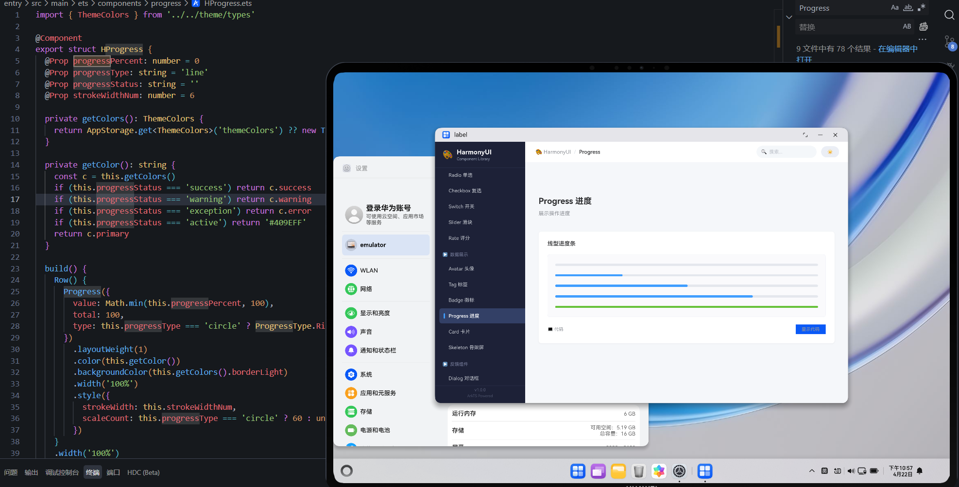
四、解决方案:改用原生 Progress 组件
typescript
import { ThemeColors } from './theme/types'

@Component
export struct HProgress {
  @Prop progressPercent: number = 0
  @Prop strokeWidthNum: number = 8
  @Prop progressStatus: '' | 'success' | 'warning' | 'exception' = ''
  private getColors(): ThemeColors {
    return AppStorage.get<ThemeColors>('themeColors') ?? new ThemeColors()
  }

  getColor(): string {
    switch (this.progressStatus) {
      case 'success': return '#67C23A'
      case 'warning': return '#E6A23C'
      case 'exception': return '#F56C6C'
      default: return this.getColors().primary
    }
  }

  build() {
    Row({ space: 10 }).width('100%').alignItems(VerticalAlign.Center) {
      // 原生 Progress 组件
      Progress({
        value: this.progressPercent,
        total: 100,
        type: ProgressType.Linear
      })
        .layoutWeight(1)
        .color(this.getColor())
        .backgroundColor(this.getColors().borderLight)
        .strokeWidth(this.strokeWidthNum)
        // ✅ 固定高度 = strokeWidth + padding

      if (this.progressStatus === '' || this.progressStatus === 'success') {
        Text(`${this.progressPercent}%`)
          .fontSize(12)
          .fontColor(this.getColors().textSecondary)
          .width(36)
      } else if (this.progressStatus === 'exception') {
        Text('\u2715').fontSize(14).fontColor('#F56C6C').width(20).textAlign(TextAlign.Center)
      }
    }
    .height(this.strokeWidthNum + 8)  // ✅ 明确高度约束
  }
}
五、重构前后对比
| 维度 | 手工拼装 | 原生 Progress |
|---|---|---|
| 代码量 | ~60 行 | ~35 行 |
| 尺寸稳定性 | 易溢出异常 | 固定可控 |
| 性能 | 多层嵌套渲染 | 原生优化 |
| 功能丰富度 | 仅线性 | Linear + Ring |
| 状态管理 | 自己维护颜色映射 | 内置 status 语义 |
| 可访问性 | 无 | 系统级支持 |
六、支持的进度状态
渲染错误: Mermaid 渲染失败: Parse error on line 2: ...gram-v2 \* --> Default: 默认蓝色 De ----------------------^ Expecting 'ID', 'EDGE_STATE', got 'DEFAULT'
七、经验总结
- 优先使用原生组件:除非有极其特殊的定制需求,否则不要重新发明轮子
- 尺寸约束是必须的:任何自定义组件都必须在外层声明明确的尺寸策略
- 渐进式重构 :保留原有接口签名不变(如
@Prop progressPercent),内部实现可以随时替换
参考资源与延伸阅读
官方文档
> 系列导航:本文是「HarmonyOS 开发踩坑记录」系列的第 07 篇。该系列共 30 篇,涵盖 ArkTS 语法、组件开发、状态管理、网络请求、数据库、多端适配等全方位实战经验。
工具与资源### 工具与资源
- DevEco Studio 官方下载 --- HarmonyOS 官方IDE
- HarmonyOS 开发者社区 --- 技术问答与经验分享
👇 如果这篇对你有帮助,欢迎点赞、收藏、评论!
你的支持是我持续输出高质量技术内容的动力 💪