描述
当数据集中有多个变量中, 除了关心每一个变量的类型、取值集合、分布情况, 还关心变量之间的关系, 观测的分组情况等。
为表现两个变量之间的关系, 最常用的是散点图。 多个变量之间可以用散点图矩阵、相关图, 可以在散点图中用符号大小、符号颜色、符号形状表示更多维数。
对于高维数据, 经常需要利用降维方法, 如主成分分析(PCA)对数据降维, 对降维数据作图。
R
library(ggplot2)
library(GGally)
library(dplyr)

iris = read.csv('../../seaborn-data/iris.csv')
tips = read.csv('../../seaborn-data/tips.csv')Attaching package: 'dplyr'
The following objects are masked from 'package:stats':
filter, lag
The following objects are masked from 'package:base':
intersect, setdiff, setequal, union散点图
geom_point()与geom_jitter()都可以绘制散点图,geom_point严格按照坐标位置绘制,不考虑重叠。geom_jitter可以避免点重叠(当然是针对有少量重叠数据的情况。如果数据量很大,考虑使用蜂窝图)
R
p <- ggplot(data = iris,mapping = aes(x = petal_length,y=petal_width,color=species))
p + geom_point()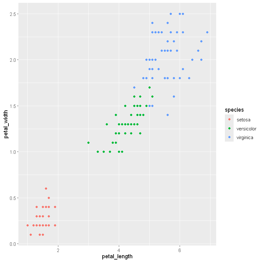
R
p <- ggplot(data = iris,mapping = aes(x = petal_length,y=petal_width,color=species,size=sepal_width))
p + geom_jitter(alpha=0.4)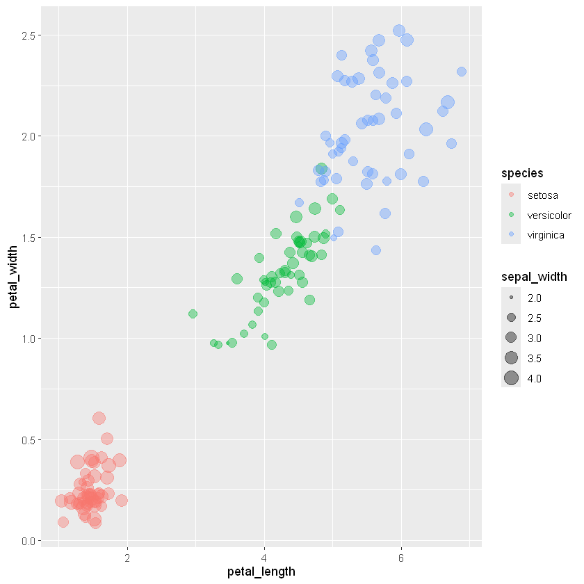
geom_jiter()中的width和height是左右和上下抖动的幅度百分比, 以数据间的最小差距为单位, 默认的抖动比例是40%, 一般不超过50%。
R
p <- ggplot(data = iris,mapping = aes(x = petal_length,y=petal_width,color=species,size=sepal_width))
p + geom_jitter(alpha=0.4,width = 0.04,height = 0.05)
R
str(iris)'data.frame': 150 obs. of 5 variables:
$ sepal_length: num 5.1 4.9 4.7 4.6 5 5.4 4.6 5 4.4 4.9 ...
$ sepal_width : num 3.5 3 3.2 3.1 3.6 3.9 3.4 3.4 2.9 3.1 ...
$ petal_length: num 1.4 1.4 1.3 1.5 1.4 1.7 1.4 1.5 1.4 1.5 ...
$ petal_width : num 0.2 0.2 0.2 0.2 0.2 0.4 0.3 0.2 0.2 0.1 ...
$ species : chr "setosa" "setosa" "setosa" "setosa" ...散点矩阵图
多个变量之间的关系经常用散点图矩阵表示。 ggplot2包没有提供专门的散点图矩阵, 基础R图形中提供了pairs函数作散点图矩阵, GGally包提供了一个ggscatmat()函数作散点图矩阵。
R
ggscatmat(data = iris, columns = 1:4,color='species',alpha = 0.8)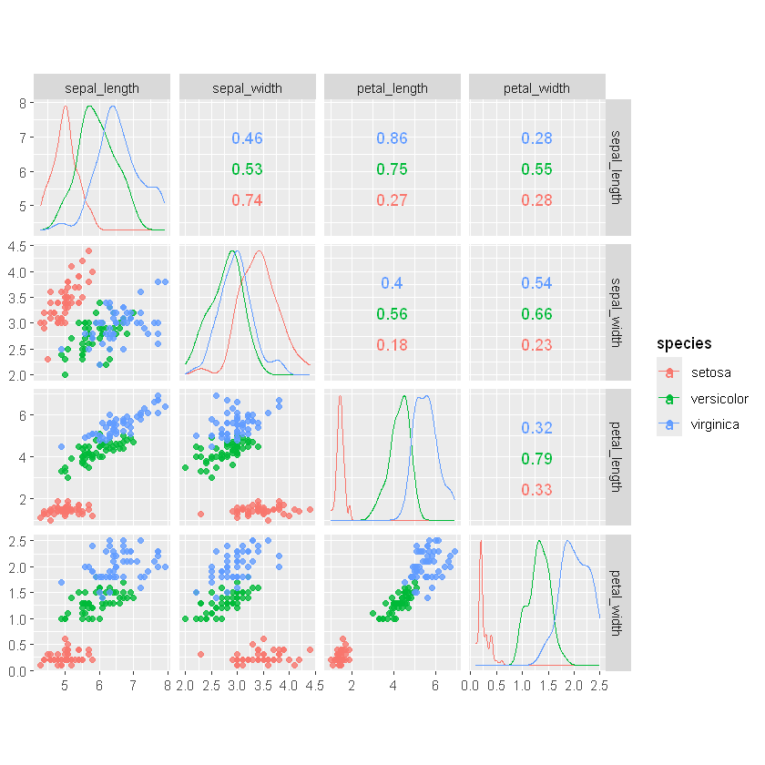
GGally的ggpairs()函数提供了另一种矩阵图, 可以比较变量两两分布或者关系。
R
ggpairs(
  data = iris,
columns = c("petal_length", "sepal_length", "species"))[1m[22m`stat_bin()` using `bins = 30`. Pick better value `binwidth`.
[1m[22m`stat_bin()` using `bins = 30`. Pick better value `binwidth`.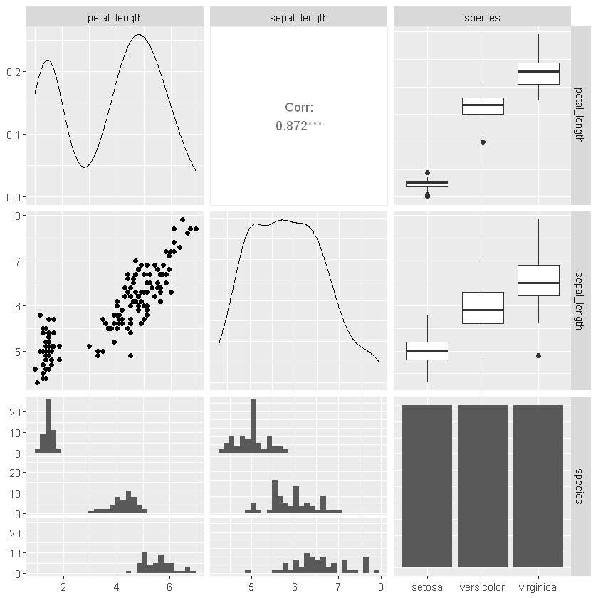
相关系数矩阵图
多个变量之间的相关系数矩阵可以用色块图表示, ggcorrplot包提供了这样的功能
R
library(ggcorrplot)
data(mtcars)
ggcorrplot(cor(mtcars),
hc.order=TRUE)Warning message:
"[1m[22m`aes_string()` was deprecated in ggplot2 3.0.0.
[36mℹ[39m Please use tidy evaluation idioms with `aes()`.
[36mℹ[39m See also `vignette("ggplot2-in-packages")` for more information.
[36mℹ[39m The deprecated feature was likely used in the [34mggcorrplot[39m package.
Please report the issue at [3m[34m<https://github.com/kassambara/ggcorrplot/issues>[39m[23m."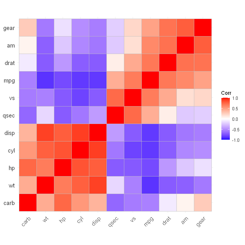
R
iris_tmp= select(iris,sepal_length,sepal_width,petal_length,petal_width)
ggcorrplot(cor(iris_tmp),hc.order = TRUE)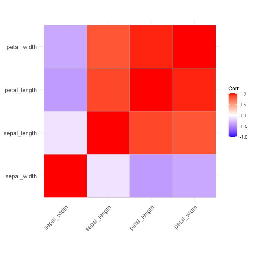
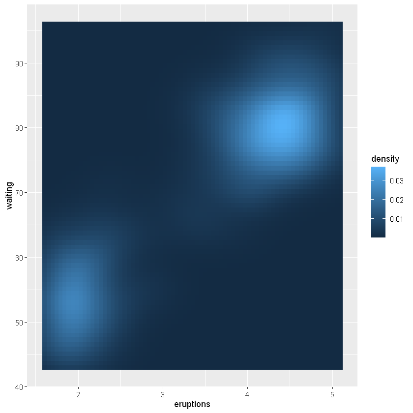
等值线图和热力图
对于已经估计的二元密度曲面, 可以用geom_contour()作等值线图, 用geom_raster()作密度热力图。
R
p <- ggplot(faithfuld, aes(
  x = eruptions, y = waiting, z = density))
p + geom_contour()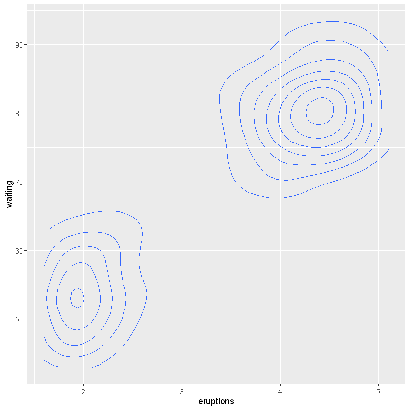
R
p + geom_contour(mapping = aes(
  z = density, color = after_stat(level)))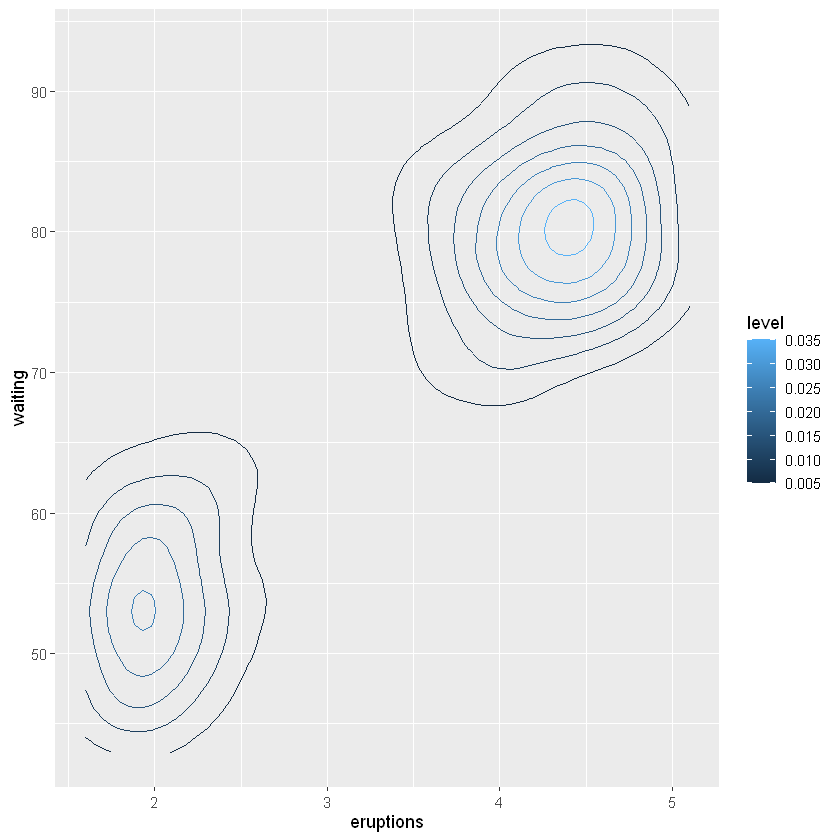
R
p + geom_raster(mapping = aes(
  fill = density))